Posted on

Photography Prints With a Story: Read the Weathered Hull in Doomed

Image of Doomed by Noel Fenech Photography

photography prints becomes more useful when the picture solves a real placement question. Doomed offers a clear starting point because the abandoned wooden vessel carries visible age while the broad shore, mountains and moving cloud open the story beyond the hull.

photography prints - Doomed

Judge photography prints by what keeps you looking

Start at the foreground. The worn timber provides grain, broken edges and evidence of exposure. Then follow the shoreline towards the distant mountains. That change of scale gives the eye a route and prevents the photograph from becoming only a picture of decay.

Viewing questionWhat to examine
Does the subject hold attention?Look for detail in the hull, shore and patches of water.
Is there enough distance?Check how the mountains and sky balance the strong foreground.
Will the room light help?Test glazing reflections across dark timber and soft cloud.
Which scale works?Compare the finished outlines of the 400, 500, 600 and 700 mm widths.

Place the photograph where there is time to pause: above a sideboard, opposite a reading chair or on a landing with a clear approach. Avoid surrounding it with rope, anchors or other maritime props. The vessel already carries the theme.

A narrative photograph should leave enough unanswered for the viewer to return and notice something new.

Protect texture across a wide tonal range

Doomed depends on separation between weathered timber, muted shore, distant land and soft cloud. Controlled fine-art printing preserves those transitions. Bespoke in-house framing can support the photograph without adding a showy maritime border.

For wider context on preserving Britain’s historic vessels, visit National Historic Ships UK’s maritime heritage resources. You can also browse the Noel Fenech Photography collection or view the exact framed product.

Photography prints earn their wall space through more than sharpness. Doomed combines material detail, open landscape and an unfinished story, making it a considered focal point rather than a quick coastal reference.

Posted on

Scottish Landscape Prints for a Railway Enthusiast: Magical Glenfinnan

Magical Glenfinnan: A whimsical painting of the iconic steam train crossing a stone viaduct above mountains, forests, a river, and a castle under a vibrant sunset sky.

Scottish landscape prints becomes more useful when the picture solves a real placement question. Magical Glenfinnan offers a clear starting point because its steam train, stone viaduct, water, mountains and vivid sky create a layered Highland story rather than a simple locomotive portrait.

Scottish landscape prints - Magical Glenfinnan

Choose Scottish landscape prints by the recipient’s connection

A good railway gift begins with the person’s interests. Some collectors respond to engineering detail. Others remember journeys, family holidays or the sound of a steam train crossing open country. Magical Glenfinnan suits the second group because the railway sits within a complete landscape.

For the railway story

The train and viaduct provide recognition without turning the wall into a display of logos, timetables or reproduction signs.

For the Highland setting

Mountains, woodland, water and sunset colour give the picture enough depth to remain interesting after the occasion has passed.

Ask where the recipient could enjoy a landscape-format picture. A study or wall above low furniture often provides a better sightline than a crowded hobby room. Mark the complete frame on paper and check it from the usual chair.

  • Choose it for a genuine Glenfinnan or railway connection.
  • Keep models and memorabilia on another surface.
  • Allow the colourful scene enough plain wall around it.
  • Use a card to explain the memory behind the choice.

Turn a shared interest into a finished artwork

Rob Hain builds lively places from architecture, landscape and human stories. Colour-managed Giclée production helps the sunset and detailed scene remain distinct. A hand-finished frame makes the gift ready to hang, with all work completed in-house in Falkirk.

For history and visitor context around the location, explore the National Trust for Scotland’s Glenfinnan Monument guide. You can also browse the Rob Hain collection or view the exact framed product.

Scottish landscape prints make stronger gifts when place and personal interest meet. Magical Glenfinnan celebrates railway history within a broader Highland view, so it can stay meaningful long after the wrapping is gone.

Posted on

Black and White Wall Art for a Dark Academia Study: Greyfriars Kirkyard

Greyfriars Kirkyard: a black and white watercolor featuring gravestones, a bare tree, and a distant church spire, all softly blurred for an ethereal effect.

black and white wall art for a dark academia study works best when the artwork answers a practical need rather than merely filling a gap. Greyfriars Kirkyard offers a useful example because the monochrome gravestones, bare tree and distant church spire provide genuine Edinburgh history and atmosphere without invented gothic decoration.

black and white wall art for a dark academia study - Greyfriars Kirkyard

Ground black and white wall art for a dark academia study

Start with the working desk and reading chair. Place the artwork where it can be seen during a pause, not where a monitor or tall book stack cuts across the scene. The kirkyard subject has enough narrative weight to lead the room, so old maps, candles and faux antiquities do not all need to compete beside it.

Study elementMeasured response
Dark wallChoose a mount and frame that separate the monochrome image from the paint.
Timber shelvesLet real books provide texture; avoid colour-sorting everything to match.
Desk lampAngle warm light across the wall without creating a bright glazing reflection.
Historic objectsUse one item with personal meaning instead of a staged collection.

The soft black-and-white treatment offers quieter detail than a sharp architectural photograph. Give it enough light for the tree, stones and spire to remain legible. A pale wall can make the work contemplative; a deep wall can intensify it, provided the frame creates a clear boundary.

History feels more convincing when one real place carries the story and the room remains useful.

Preserve the soft range within monochrome

Black and white art still contains many tonal steps. Colour-managed Giclée production helps keep pale stone, dark branches and softened distance separate. Bespoke in-house framing can then relate the image to timber, leather or painted joinery without swallowing it.

For visitor information and the history of this Edinburgh site, read Greyfriars Kirk’s guide to the historic kirkyard. Browse the Ismael Pinteño Visuara collection, or view the exact product and framing choices.

Black and white wall art for a dark academia study should add substance, not stage scenery. Greyfriars Kirkyard supplies real place and layered tone while warm light and edited furnishings keep the study comfortable for daily use.

Posted on

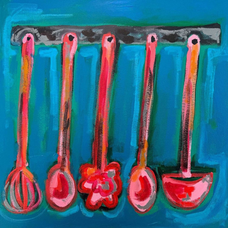
Kitchen Wall Art for a Pantry Door Sightline: Put Ladels on Display

Image of Ladels by David Short

kitchen wall art for a pantry door sightline works best when the artwork answers a practical need rather than merely filling a gap. Ladels offers a useful example because an artwork based on familiar utensils can make the view into a pantry feel purposeful while the square format stays separate from busy work surfaces.

kitchen wall art for a pantry door sightline - Ladels

Plan kitchen wall art for a pantry door sightline

Prop the door in its normal open position and stand at the kitchen entrance. The artwork should be visible without being clipped by the door leaf. Inside the pantry, keep it away from sinks, steam, heat and shelves where jars or appliances could strike the frame.

  1. Photograph the normal view with the pantry stocked.
  2. Mark 265, 500 and 800 mm print squares, adding the proposed frame.
  3. Open drawers and cupboards to confirm working clearance.
  4. Remove hanging utensils that duplicate the artwork directly.
  5. Check the sightline in daytime and under task lighting.

The smallest size can reward a compact pantry. The middle square may relate well to a preparation zone seen from farther away. An 800 x 800 mm print needs a genuinely broad, dry wall and enough distance to be read comfortably; it should not be chosen merely because the room is busy.

Should real ladles hang beside the print?

Only if they are used and the arrangement stays clear. The artwork already supplies the playful repetition, so a large decorative utensil display is unnecessary.

Frame everyday objects with lasting colour

David Short’s work celebrates familiar objects, colour and memory. A colour-managed print keeps that playful character clear, while a hand-finished frame gives the subject enough authority to sit beside hardworking kitchen materials.

For wider design context around the changing domestic kitchen, explore the V&A’s exploration of kitchen design history. Browse the David Short collection, or view the exact product and framing choices.

Kitchen wall art for a pantry door sightline can make an ordinary task route memorable. Ladels turns practical objects into the picture, while careful positioning keeps the real kitchen efficient.

Posted on

Narrow Wall Art Between Bookcases: Make Space for Golden Cloud

Image of Golden Cloud by Emily Little

narrow wall art between bookcases works best when the artwork answers a practical need rather than merely filling a gap. Golden Cloud offers a useful example because its unusually slim 120 x 280 mm and 240 x 560 mm formats can use vertical space that a standard square or broad landscape cannot resolve.

narrow wall art between bookcases - Golden Cloud

Template narrow wall art between bookcases

Measure the clear plaster between the outermost shelf edges at several heights. Bookcases can lean, walls can taper and cornices can reduce the usable width. Build paper templates for both prints, including realistic allowances for mount and frame.

Protect the vertical route

  • Keep books and ornaments from projecting across the frame edge.
  • Align the artwork with the occupied shelving, not automatically with the ceiling.
  • Check that a library light does not cast a shelf-shaped shadow.
  • Leave visible wall on both sides of the complete frame.

The narrower print can create a small pause in close shelving. The larger version can make the central strip feel architectural when the bookcases are tall enough to support it. Reduce colour-coded objects nearby so the cloud-like abstract remains the visual release.

A narrow wall is not failed storage. It can be the breathing space that gives two full bookcases structure.

Keep a slim composition open and luminous

A narrow semi-abstract image depends on subtle transitions remaining visible. Colour-managed printing protects those relationships, while accurate in-house framing keeps the long vertical edges true between strong lines of shelving.

For accessible background on abstraction and ways of looking, read National Galleries of Scotland’s introduction to abstract art. Browse the Emily Little collection, or view the exact product and framing choices.

Narrow wall art between bookcases can make shelving feel intentional rather than crowded. Golden Cloud uses height and atmosphere to turn a leftover strip into the quiet centre of the arrangement.

Posted on

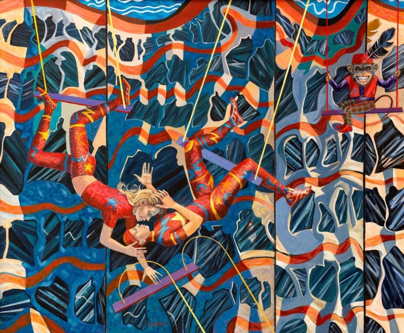
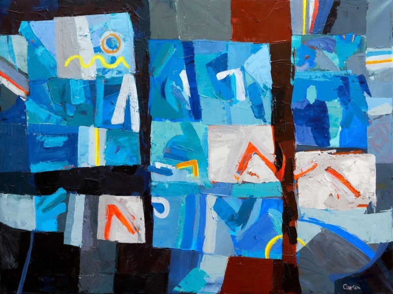
Modern Framed Wall Art for a Conversation Corner: Suspended Desire

Image of Suspended Desire by Fred Carson

modern framed wall art for a conversation corner works best when the artwork answers a practical need rather than merely filling a gap. Suspended Desire offers a useful example because its landscape proportions and evocative title can hold the space between two seats while leaving room for different interpretations.

modern framed wall art for a conversation corner - Suspended Desire

Measure modern framed wall art for a conversation corner

Arrange the chairs for comfortable conversation before measuring. Include the gap between them, any permanent side table and the reach of a reading lamp. The artwork should belong to that complete group rather than being centred mechanically on the wall.

Print optionUseful test
400 x 330 mmTry it where the chairs are compact or another architectural detail already has presence.
560 x 460 mmUse a paper template to judge whether the broader option connects both seats.
Finished frameAdd the mount and moulding before comparing either outline with furniture.
LightingCheck lamp and window reflections from both chairs after dark.

The title invites conversation without prescribing a single story. Keep the table surface simple and avoid placing figurines directly below the image. One artwork can create more cohesion than several small objects competing for attention between the chairs.

Use the frame to hold visual tension

Fred Carson’s contemporary practice draws on colour, figure and geometric form. Controlled Giclée output and a precise bespoke frame provide a stable boundary, allowing the composition to remain expressive without making the seating area restless.

To explore the Edinburgh-based artist’s wider work and background, visit Fred Carson’s official website. Browse the Fred Carson collection, or view the exact product and framing choices.

Modern framed wall art for a conversation corner should connect the seats and invite looking. Suspended Desire can give a small social zone identity while preserving enough clear wall for the composition to breathe.

Posted on

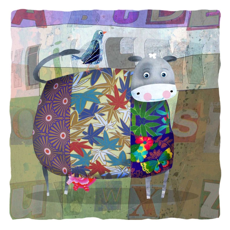
Highland Cow Art for a Utility Room: Let Cool Coo Add Character

Image of Cool Coo by Rikki O'Neill

Highland cow art for a utility room works best when the artwork answers a practical need rather than merely filling a gap. Cool Coo offers a useful example because a compact square animal portrait can bring humour and Scottish character to a working room without taking over useful storage.

Highland cow art for a utility room - Cool Coo

Place Highland cow art for a utility room safely

  1. Open every cupboard and external door to mark their full swing.
  2. Exclude the sink splash zone and any wall affected by persistent condensation.
  3. Load coat hooks and drying rails before choosing the hanging point.
  4. Mark the complete framed outline, not only the 265 x 265 mm print.
  5. Check the view from the doorway when baskets and boots are in place.

A utility room already contains labels, products and practical equipment. Let Cool Coo provide the visual joke by itself. Tartan storage, multiple animal signs and novelty wording would turn one lively picture into a theme. Plain baskets and one repeated colour are enough support.

What if the room is regularly damp?

Choose another room. Good extraction, a dry wall and reliable distance from direct water are essential before framed artwork is introduced.

Give a playful subject a properly made frame

A compact artwork is often seen at close range, so neat mounting, sound corners and a considered moulding matter. First 4 Frames completes production and framing in-house, giving a humorous subject a durable, ready-to-hang presentation.

For background on the hardy Scottish breed behind the subject, read NatureScot’s introduction to Highland cattle. Browse the Rikki O’Neill collection, or view the exact product and framing choices.

Highland cow art for a utility room can reward an everyday route without compromising it. Cool Coo adds one clear point of character when moisture, storage and door movement are planned first.

Posted on

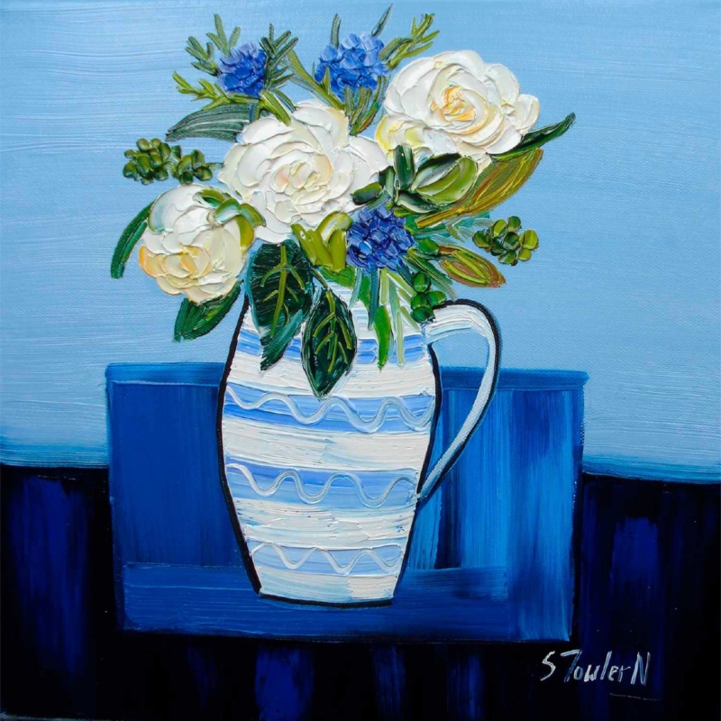
Floral Wall Art for Open Shelving: Give an Orkney Jug Room to Breathe

Image of Roses in an Orkney Jug by Sheila Fowler

floral wall art for open shelving works best when the artwork answers a practical need rather than merely filling a gap. Roses in an Orkney Jug offers a useful example because the roses and distinctive vessel can lead a still-life arrangement without asking every shelf to carry flowers or patterned ceramics.

floral wall art for open shelving - Roses in an Orkney Jug

Balance floral wall art for open shelving

Begin by clearing the shelves rather than adding to them. Return only objects used or genuinely valued, then leave gaps around the proposed frame. The artwork should be read as one complete still life. It should not disappear into a row of vases, plant pots and floral book jackets.

At 265 x 265 mm

Use the smaller print on a short wall return or in a defined gap beside shelving. Keep shelf edges outside the finished frame.

At 500 x 500 mm

Let the larger square anchor a broader bank of shelves. Test it from the room entrance as well as close range.

An Orkney-made or handmade ceramic can make a quiet connection, but it need not copy the painted jug. One object with a related material is stronger than a fully coordinated shelf. Keep trailing plants clear of the frame and confirm that adjustable shelves will not interrupt the artwork later.

Separate petals, pottery and shelf detail

Expressive flowers and a characterful jug depend on clear colour and texture. Colour-managed Giclée production helps retain those distinctions. A hand-finished frame then gives the square image a calm edge beside changing shelf displays.

For more floral paintings and Scottish landscapes by the artist, visit Sheila Fowler’s official website. Browse the Sheila Fowler collection, or view the exact product and framing choices.

Floral wall art for open shelving should create focus, not another layer of clutter. Roses in an Orkney Jug can organise the display when objects are edited and the complete framed square is given clear space.

Posted on

Contemporary Art Prints for a North-Facing Breakfast Room: Morning Light

An impressionistic painting depicting a vibrant street scene with buildings, vehicles, and reflections on a wet road. By Kate Philp

contemporary art prints should answer a real question about the room or recipient. Morning Light is useful here because its impressionistic street, vehicles and wet-road reflections carry changing light and activity into a room with cooler daylight.

contemporary art prints - Morning Light

Use contemporary art prints to warm cool morning light

North-facing light can flatten a room if every surface is pale and cool. Morning Light adds warmth through depicted atmosphere rather than bright paint. The reflected road also creates depth, so the eye travels through the street instead of stopping at the wall.

Beside the table

The upright format can suit a wall return. Keep chair movement clear of the lower frame.

Beyond the table

Use the street as a longer kitchen view. Check that a pendant or tall jug does not interrupt the reflected road.

Compare the 230 x 322 mm and 360 x 500 mm prints as complete frames. Warm timber, off-white walls and one muted scene colour are enough support. Avoid compensating with yellow walls, orange blinds and several bright accessories at once.

Let the artwork describe light; the whole room does not need to imitate sunshine.

Preserve the shifts within reflected colour

An impressionistic street depends on relationships between reflection, damp road, vehicles and buildings. Colour-managed Giclée production keeps those transitions legible, while bespoke framing gives the moving scene a steady portrait boundary.

For background on the artistic approach to fleeting light and everyday scenes, read Tate’s introduction to Impressionism. Browse the Emily Little collection, or view the exact product and framing choices.

Contemporary art prints can enliven a north-facing breakfast room without forcing a sunny scheme. Morning Light contributes movement, warmth and depth while the furniture and walls remain calm.

Posted on

Custom Framed Prints Above a Long Sideboard: Find Weightless Balance

Image of Weightless by Fred Carson

custom framed prints should answer a real question about the room or recipient. Weightless is useful here because three landscape sizes allow careful proportion testing rather than assuming a broad piece of furniture always needs the largest option.

custom framed prints - Weightless

Measure custom framed prints from the furniture zone

Clear the sideboard to its normal state, then measure the occupied furniture width. Include any lamp that always remains, but ignore seasonal objects. Make templates for the 400 x 300 mm, 560 x 418 mm and 750 x 560 mm prints with an allowance for mount and frame.

CheckWhat to look for
WidthRelate the frame to the sideboard without copying its full span.
HeightLeave a deliberate gap above furniture and below the ceiling.
LampsKeep shades outside key image areas and test reflections.
DistanceStep back to the doorway as well as standing directly in front.

The middle size may add authority while preserving wall around the frame. The largest can anchor a broad wall only when there is enough viewing distance. Scale should make the title’s sense of lightness convincing, not crowd it out.

Use frame choice to support visual lightness

Custom presentation lets mount, moulding and finished size be judged together. First 4 Frames handles colour-managed output and hand finishing in-house, defining the artwork without making a light composition feel boxed in.

For more of the artist’s work across painting and mixed media, visit Fred Carson’s official website. Browse the Fred Carson collection, or view the exact product and framing choices.

Custom framed prints succeed above long furniture when finished proportions are tested first. Weightless offers enough choice to create a focal point while leaving the sideboard and wall room to breathe.