
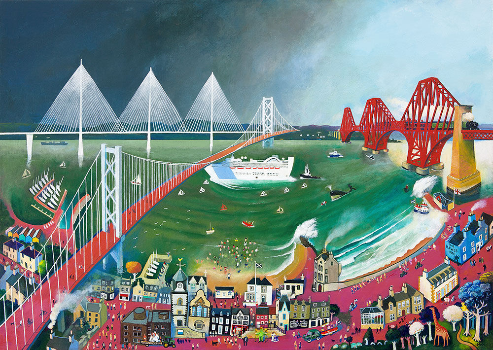
If you want frame styles explained in a way that feels practical, Cruising the Bridges is an excellent example. It has enough line, movement, and architectural structure to show how a frame can make the same artwork feel crisper, softer, bolder, or more relaxed.
That is often what people need when they are choosing framed wall art online. The image stays the same, but the mood can shift quite noticeably depending on the presentation.
Why Frame Styles Explained Matters So Much
A print with this kind of rhythm makes frame choice easier to understand because every change reads clearly on the wall.
- A slimmer frame can make the piece feel cleaner and more contemporary.
- A heavier frame can give the artwork more presence and a stronger anchor.
- A warmer finish can soften the graphic energy, while darker tones can sharpen it.
Why Cruising the Bridges Works So Well for This Comparison
The bridge forms and river movement give the artwork enough structure to respond beautifully to different frame directions. That makes it particularly helpful for buyers who want to understand framing, not simply pick a default option.
How First 4 Frames Supports Better Decisions
First 4 Frames brings bespoke framing and colour-managed Giclee production together in-house, which means the final result can be tailored properly rather than treated as an afterthought. You can view the exact framed product here, and browse more from Rob Hain if you enjoy lively city scenes with the same bold structure.
For buyers looking for frame styles explained through a real example, this print makes the differences easier to see and far easier to judge.