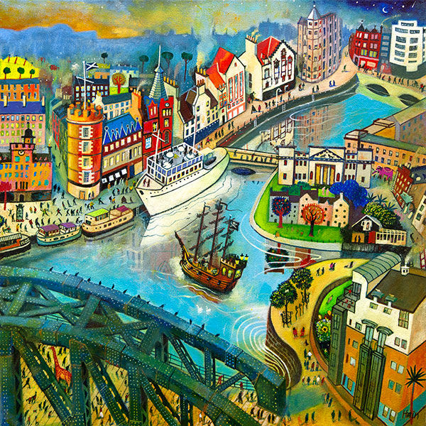
Edinburgh wall art for a family room should earn its place by answering a real question about the room or recipient. Pirates of Leith is a useful starting point because its boats, bridge, crowds and curved waterfront gather the energy of a social place into one contained composition.
Use Edinburgh wall art for a family room as organised energy
A family room already contains movement, conversation and useful objects. That does not mean its artwork must be nearly empty. A detailed city scene can work well when the surrounding display is disciplined and the picture has one uninterrupted wall.
From the sofa
Check that the curved riverbank reads as one shape and that a floor lamp does not cover the busiest area.
From the doorway
Let the brighter buildings and dynamic sky welcome the eye before smaller people and boats are discovered.
Keep toys, photographs and books in defined zones rather than spreading them around the frame. The artwork can carry plenty of narrative because its edge contains that activity. Elsewhere, repeat only one blue, red or warm building colour so the room feels connected rather than copied.
Give a busy painted city a calm boundary
Rob Hain’s many figures, buildings and boats need clarity as well as colour. A colour-managed print and carefully proportioned mount preserve the smaller incidents, while hand-finished framing in Falkirk gives the lively scene enough visual order for daily family use.
Edinburgh wall art for a family room can celebrate activity instead of pretending the room is always quiet. Pirates of Leith brings community, colour and humour, while clear placement prevents that energy from becoming clutter.
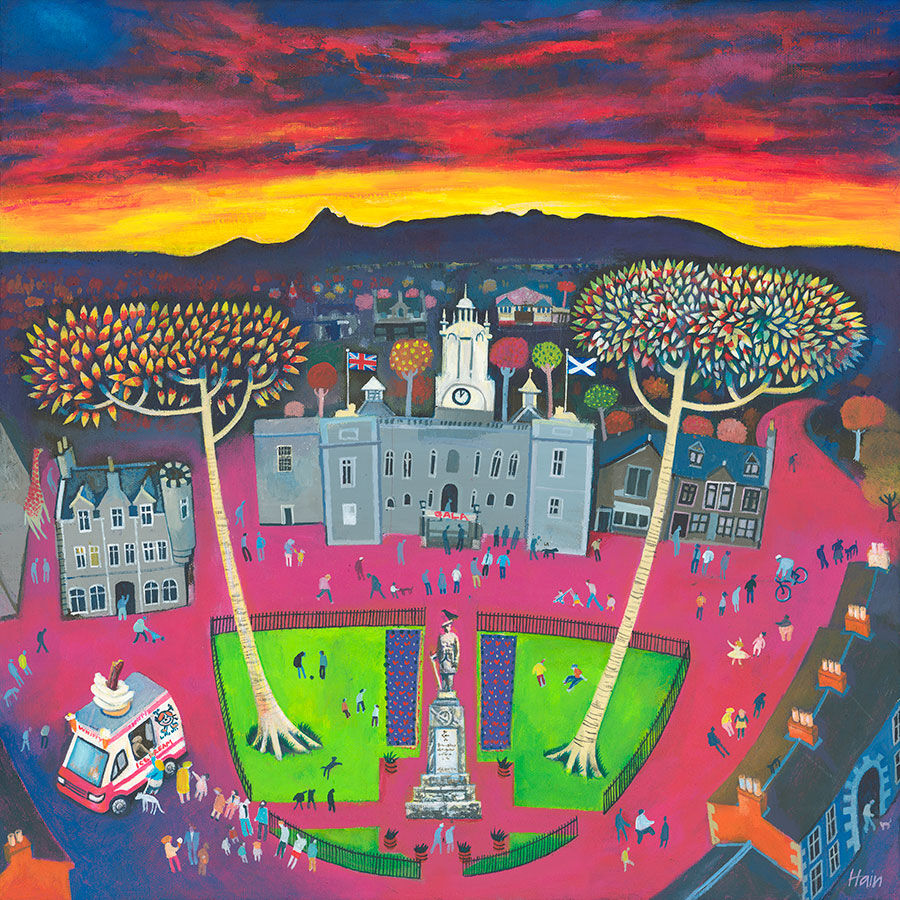
wall art for a community café should make the room feel connected to people rather than decorated by formula. The Ice Cream Lady by Rob Hain is centred on an ordinary pleasure shared in public. An ice cream van, walkers, cyclists, trees, colourful buildings, and a glowing evening sky turn the square into a lively neighbourhood scene with many small stories.
Why wall art for a community café needs real social energy
A community café may host a quick morning coffee, a parent meeting, a volunteer shift, an informal class, or a quiet lunch. Its artwork therefore has to welcome many kinds of visitor. Generic coffee slogans can make the room feel interchangeable. A scene of people moving through shared space says something broader: this is a place where everyday life happens.
In The Ice Cream Lady, the figures are not posed around a formal occasion. They walk, cycle, stop, and gather beneath a dramatic orange-red sky. The ice cream van gives the scene a clear centre, but streets, trees, and varied buildings keep it from feeling like product advertising. That mix suits a café built around local connection.
Place the picture where it supports the room
Choose a wall that is visible during natural pauses: opposite the queue, beside a communal table, or in a quieter seating zone. Avoid using the artwork as a background for mandatory notices, menus, and fire-safety information. Those items need clarity. The framed print needs enough separation to create atmosphere without weakening operational messages.
Map the busiest route. Keep the frame away from chair backs, carried trays, and places where queues tighten.
Check every main seat. Look for glare from windows and ceiling lights at morning, lunchtime, and late afternoon.
Mark the outer dimensions. Include the mount and moulding rather than measuring only the print.
Keep signs in their own zone. Let instructions remain legible and allow the art to provide warmth.
Use secure fixings. Match them to the wall construction and the demands of a public space.
The print is offered in square sizes of 250, 500, and 700 millimetres before framing. The smaller option can suit an intimate seating corner. A larger version has the presence needed for a communal table or open wall, but the full framed size should be tested in the room before ordering.
Use colour to organise, not overwhelm
The orange-red sky provides warmth from a distance. Greens, blues, and building colours then reward closer viewing. In a café with several chairs, signs, shelves, and serving equipment, repeat only a small part of that palette. A muted green bench, warm timber tabletop, or terracotta planter can create a link without turning the room into a replica of the print.
Existing café finish
Possible framing response
Effect
Warm timber tables
Simple wood moulding
Connects the town scene to natural furniture
Painted dark joinery
Slim dark frame with a clear mount
Sharpens the square composition without adding bulk
Pale neutral walls
Stronger outer edge
Gives the colourful image a confident boundary
Several accent colours
Quiet frame and neutral mount
Prevents the presentation from competing with the room
Make a public interior feel particular to its people
A café earns character through use, but its interior can prepare the ground. Figurative art signals that people matter. A busy square can also reflect the different rhythms of the day: arrivals, chance meetings, errands, children, older neighbours, and people passing through. Visitors do not need to identify the exact town to recognise the social pattern.
That narrative quality can help a new community space avoid feeling overly corporate. It also creates an easy conversation starter without demanding attention from someone who wants a quiet table. The picture works at two levels: a warm block of colour from across the room and a collection of small incidents up close.
People and place in Rob Hain’s work
Rob Hain works from the Scottish Borders and is known for paintings of cities, towns, and villages animated by their inhabitants. His buildings establish the setting, while people give each scene its life and rhythm. Explore more on Rob Hain’s official website, or browse the Rob Hain collection at First 4 Frames.
Finish the piece for repeated public use
First 4 Frames produces colour-managed Giclée prints and hand-finishes bespoke framing at its Falkirk workshop. That in-house approach helps the vivid sky, small figures, and varied architecture retain their separation. It also allows the presentation and hanging context to be considered together for a busy customer-facing interior.
Effective wall art for a community café should make visitors feel that the room belongs to a real place and a real group of people. View the framed The Ice Cream Lady print for a sociable town scene that brings colour, humour, and professionally finished character to a shared café.
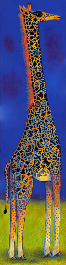
wall art UK should answer a practical need in the room, not simply fill an empty wall. Fred is a useful example because Rob Hain’s tall stylised giraffe concentrates deep blue, black pattern and an orange-red mane inside one confident portrait composition.
How wall art UK interiors can handle confident colour
Bold artwork feels most assured when the rest of the room gives it a clear role.
Fred already provides several strong notes. The blue ground establishes depth, the black markings add graphic rhythm, and the glowing mane supplies heat. Choose one of those relationships to echo elsewhere. A small orange object or a dark furniture line is enough; copying every colour will dilute the focal point.
Use the height
The upright giraffe can animate a narrow wall, a reading corner or the space beside low furniture. Keep switches and shelves away from its outline.
Control the company
Avoid surrounding Fred with novelty animal objects. One distinctive image feels more confident and allows the artist’s pattern to remain the source of character.
Give expressive colour a precise outer edge
A bespoke frame can organise Fred’s energetic surface without muting it. First 4 Frames combines colour-managed Giclée production with in-house, hand-finished framing, supporting the strong blue, black and orange-red relationships with a dependable final presentation.
Wall art UK homes live with successfully does not need to be cautious. Fred shows that one colourful, well-framed portrait can add humour and energy while the wider room remains composed.
A gift for someone starting a new chapter should acknowledge change without pretending to know exactly how the next stage will unfold. Brand New Day by Rob Hain strikes that balance. Its optimistic title and lively Edinburgh scene can celebrate a move, a new role, retirement, recovery, or a personal decision while still working as art in its own right.
What makes a gift for someone starting a new chapter feel genuine?
The occasion may be happy, complicated, or a mixture of both. That is why a lasting object can be more thoughtful than a message built around certainty or instant success. Artwork offers encouragement while giving the recipient freedom to attach their own meaning to it over time.
The title Brand New Day feels hopeful without being prescriptive. The busy city composition also keeps the idea grounded. It suggests people, place, and daily life rather than presenting optimism as a slogan. For someone with a link to Edinburgh, Scotland, or city life, that setting adds another personal layer.
Match the artwork to the change being marked
A new home: choose it as one finished piece that can bring colour to an unfamiliar room immediately.
A new job or business: let the lively city scene signal momentum without giving another desk accessory.
Retirement: focus on the title as an opening rather than an ending.
A move away from Edinburgh: use the recognisable view as a connection to place that is easy to display.
A personal fresh start: include a private card and allow the artwork to carry the public message quietly.
Specificity matters. Mention why you chose the work and what part reminded you of the recipient. A short handwritten note about the title, the city, or the colour can make the gift feel considered. It does not need a long explanation or a motivational quotation.
Plan for a home you may not know well
Giving framed art can feel difficult when you have not seen the new room. Look for clues in furniture, favourite clothes, or pictures the person already owns. A colourful city scene can suit a hallway, sitting room, dining area, or home office, which gives the recipient several possible placements.
Avoid choosing solely to match one temporary wall colour. Instead, consider whether the subject has meaning and whether the overall energy suits the person. If the recipient prefers an uncluttered home, leave the picture as a single focal point. Someone with an eclectic interior may enjoy it among books, collected objects, and other art.
Why presentation matters for a milestone gift
A print intended to mark a significant transition should feel complete when it is given. Bespoke framing removes the need for the recipient to find the right size later. It also signals that the gift was selected as a lasting object, not picked as an afterthought on the way to the celebration.
First 4 Frames uses colour-managed Giclée production and completes its framing by hand in Falkirk. The in-house process supports the bright colour and small details in the scene, while creating a ready-to-hang finish suited to a meaningful occasion.
Art that leaves room for the recipient’s own story
The best gift for someone starting a new chapter offers support while leaving space for individual meaning. View the framed Brand New Day print for a positive, colourful piece that can mark a beginning and become part of the life that follows it.
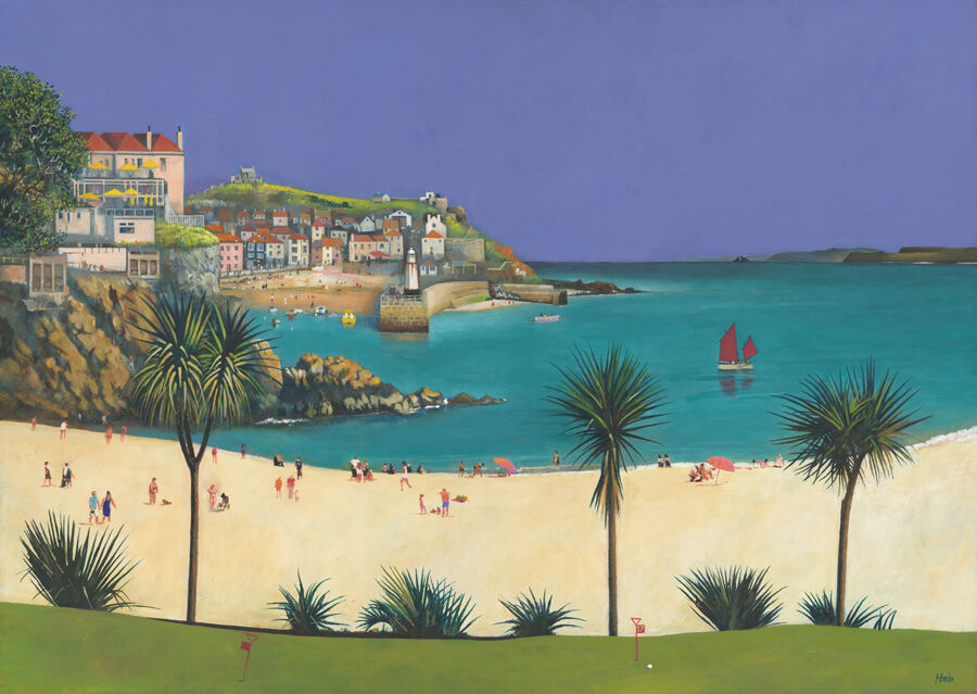
colourful wall art for a glass kitchen extension needs enough presence to hold its own beside broad views and changing daylight. In a heavily glazed room, the few solid walls matter more, not less. Sun, Sea and St Ives by Rob Hain can give one of those walls a clear purpose. Its busy beach, turquoise water, boats, palms, and clustered buildings bring human energy to a space that can otherwise feel architecturally impressive but visually unfinished.
Give a glazed room an indoor point of focus
Glass extensions naturally direct attention outside. That is part of their appeal, but it can leave the interior without a visual stopping point, especially after dark. A lively framed image offers somewhere for the eye to rest when the garden becomes reflective glass. It also makes the room feel furnished rather than simply added to the house.
Sun, Sea and St Ives works because it contains movement at several scales. People animate the foreground, boats carry the eye across the water, and the town forms a substantial backdrop. The result feels sociable and expansive, qualities that suit a kitchen-dining extension used for family meals and informal gatherings.
Where colourful wall art for a glass kitchen extension works best
Possible wall
Why it works
What to check
Above a dining bench
Creates a destination at the social end of the room
Allow comfortable head clearance
On the original house wall
Connects the extension back to the older interior
Keep clear of doors and switches
Beside tall kitchen units
Softens a large block of cabinetry
Leave breathing space around the frame
On a short return wall
Adds colour without competing with the main view
Check the picture in strong side light
Avoid a position directly over a hob, sink, or regular source of steam. Also watch how sunlight travels across the room through the seasons. A wall that seems shaded in September may receive strong direct light at another time of year. Thoughtful placement protects the artwork and reduces distracting glare.
Borrow colour without creating a seaside theme
The artwork can introduce blue-green, sandy, and warm architectural tones without dictating every finish. Repeat one or two notes in small ways: a ceramic bowl, seat fabric, or planter may be enough. Keeping those echoes limited lets the picture remain the focal point and avoids a coordinated holiday-home look.
Natural timber is an especially useful bridge between the print and a garden view. It can appear in the dining table, shelving, or frame. Dark metal offers a sharper alternative when the glazing bars, lights, or door frames are black. The best moulding should connect to the permanent finishes rather than to a temporary accessory colour.
Judge scale against the furniture, not the glass
A glass wall can make any picture seem small if it becomes the reference point. Instead, relate the finished frame to the table, bench, sideboard, or cabinet below it. A generous horizontal format can define a dining zone, while clear margins stop the solid wall from feeling overfilled.
First 4 Frames uses colour-managed Giclée production and completes bespoke framing in-house in Falkirk. That quality-led approach supports the print’s many bright details and gives it enough finish to sit confidently within a contemporary extension.
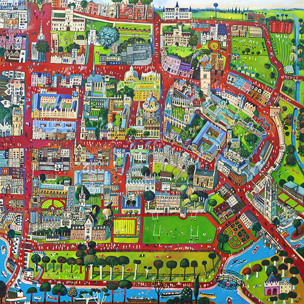
City wall art can celebrate an important place without depending on a date or slogan. Oxford gathers historic buildings, green spaces, sports grounds, roads, and river into one lively illustrated map. It suits graduation, relocation, or a first home because the story remains interesting after the occasion.
Choose city wall art with stories to revisit
Begin with the connection. Think about study, work, family, or a memorable visit.
Look beyond the centre. Parks, bridges, playing fields, and bends in the river give the eye many routes.
Plan its long-term home. A study, hallway, or reading corner invites repeat viewing.
A gift that does not expire
A graduation gift often focuses on one day. This print points backwards and forwards. Familiar streets recall a formative period, while the finished frame can move naturally into a later home or workspace.
Give the detailed composition a quiet wall and some viewing distance. A restrained moulding will contain the red routes and varied landmarks without making the map feel busy.
First 4 Frames handles colour-managed Giclée production and bespoke framing in-house in Falkirk. That care keeps small illustrated details legible and turns a place-led image into a substantial, ready-to-hang gift.
Well-chosen animal wall art can solve a difficult wall as well as add personality. Ginger uses a tall giraffe silhouette, intricate markings, and a deep blue field. Its upright shape gives a narrow landing or slim wall beside a doorway a clear purpose.
Use animal wall art to work with vertical proportion
Measure the useful width
Measure between switches, architraves, and furniture. Leave clear wall at each side so the frame looks deliberate rather than squeezed into the last available strip.
Keep the styling grown up
Let the giraffe provide the wit. Plain paint, one confident frame, and a small echo of orange or blue are enough. Extra safari motifs would make the artwork feel themed.
The maze-like pattern rewards close viewing on a landing, where people naturally slow down. From farther away, the clean outline still reads clearly. That change of scale gives the piece more staying power than a novelty illustration.
A narrow wall does not need a small idea; it needs artwork whose proportion belongs there.
First 4 Frames produces the Giclée print and bespoke frame in-house in Falkirk. Colour management keeps the orange, green, and blue distinct, while a hand-finished frame gives the playful subject a crisp architectural edge.
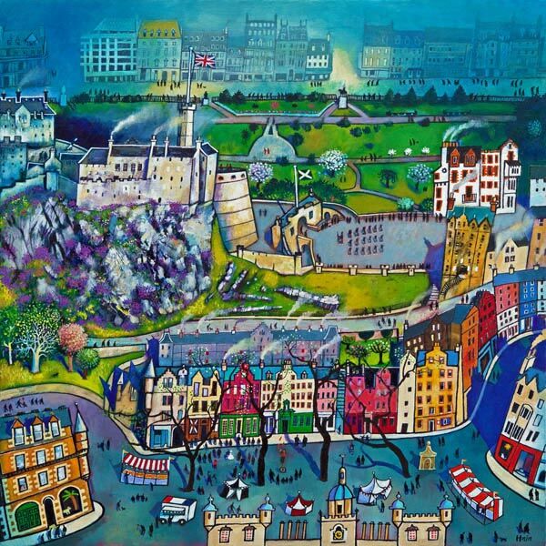
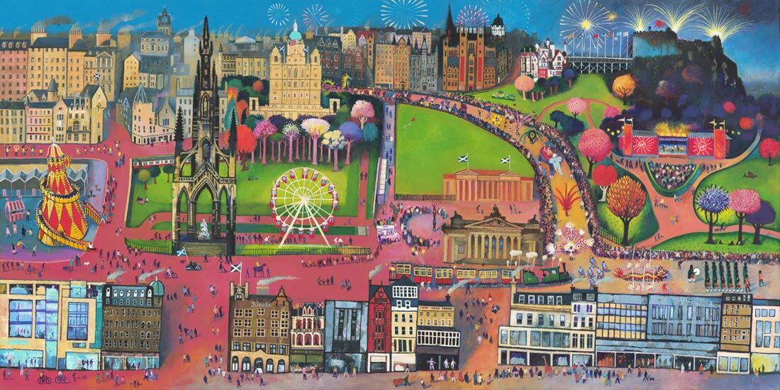
An Edinburgh Festival gift is most successful when it recalls how the city felt, not just where someone visited. Edinburgh Festival by Rob Hain captures Edinburgh as a lively shared experience. The busy composition, bright colour, and recognisable setting make it a thoughtful choice for a performer, regular visitor, student, or friend with a strong festival memory.
Begin with the memory behind the Edinburgh Festival gift
Before choosing any present, think about the recipient’s connection to the festival. Did they perform, work backstage, discover a favourite show, or make an annual trip with family? A picture becomes more meaningful when it marks a specific chapter. A short note explaining that connection can turn the framed print into a record of time as well as place.
This approach avoids the weakness of generic city merchandise. The artwork can stand on its own after the ticket stubs and programmes have been stored away. It belongs in the home because the image has colour, movement, and composition, while its subject still carries a private story.
Who might appreciate this particular city print?
The energetic scene suits people who remember Edinburgh at its busiest and most creative. It could celebrate a first Fringe performance, thank a generous host, mark graduation in the city, or remind someone of an annual August tradition. It also works as a leaving gift for a colleague whose festival stories have become part of the workplace.
The strongest art gift connects a recognisable subject with a memory only the giver and recipient fully understand.
Choose presentation for their home, not your own
A colourful print does not require a colourful frame. A restrained dark moulding can define the city detail and suit a modern flat. A lighter timber can soften the image for a relaxed living room or home office. If you are uncertain, consider the furniture and wall colours the recipient already owns rather than guessing from your own taste.
Scale is equally important. A framed piece needs enough presence to hold a wall, but it should not create a problem for someone with limited space. Ask discreetly about the intended room, or involve the recipient in the final framing choice while keeping the artwork itself as the surprise.
Why craftsmanship matters in a lasting gift
A meaningful subject deserves a finish intended for long-term display. First 4 Frames uses colour-managed Giclée production and completes the framing in-house in Falkirk. The hand-finished presentation supports the smaller details in the image and gives the recipient something ready to place in their home.
When the occasion calls for an Edinburgh Festival gift that will outlast the event itself, see the framed Edinburgh Festival print. Add a personal note about the moment it represents, and the gift becomes both artwork and shared history.
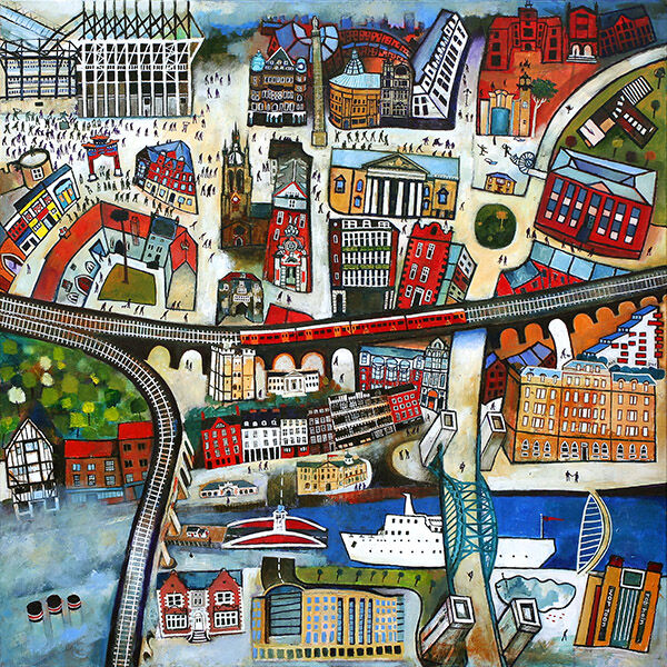
When people search for framed artwork UK, they are often looking for more than a decorative filler piece. They want something with enough identity to hold the wall and enough quality to feel worth living with. Welcome to Newcastle answers that well, bringing recognisable place and a stronger sense of character into the room.
Why Welcome to Newcastle works as framed artwork UK buyers can trust
Welcome to Newcastle succeeds because it feels specific rather than generic. That sense of place helps the framed piece carry more personality in a hallway, study, or sitting room where customers often want artwork that sparks recognition without becoming too narrow or novelty led.
It adds British character without feeling mass-produced.
It suits rooms that need colour and identity in equal measure.
It works well for buyers who want something current but still lasting.
First 4 Frames completes the artwork in-house in Falkirk with bespoke framing and colour-managed Giclée production. That matters because framed artwork UK buyers are often comparing not only images, but also how polished and dependable the final presentation will feel once it reaches the wall.
If the location itself interests you, NewcastleGateshead offers a useful starting point. You can also browse more work by Rob Hain and see the exact framed product here.
For anyone weighing up framed artwork UK options and wanting something characterful, practical, and properly finished, Welcome to Newcastle is a very appealing choice.
The most useful modern wall art trends are not really about chasing what is fashionable for a season. They are about choosing artwork with enough personality to feel current while still being easy to live with. The Ice Cream Lady is a strong example of that balance, combining movement, humour, and visual confidence in a way that feels fresh rather than forced.
How The Ice Cream Lady reflects better modern wall art trends
The Ice Cream Lady feels modern because it has energy and narrative, not because it depends on a passing trick. That makes it useful in a living room, hallway, or creative workspace where the décor benefits from something contemporary but still grounded in recognisable subject matter.
The strongest modern wall art trends favour individuality and room presence, not trendiness for its own sake.
That is also why framing matters. First 4 Frames completes the piece in-house with bespoke presentation and colour-managed Giclée quality, helping the finished artwork feel crafted and lasting rather than quickly consumed. The frame gives the image enough authority to hold the wall properly.
If you want broader context around the style, Tate’s guide to contemporary art is useful reading. You can also browse more work by Rob Hain and view the exact framed print here.
For buyers exploring modern wall art trends and wanting something lively, characterful, and well finished, The Ice Cream Lady makes a persuasive case.