
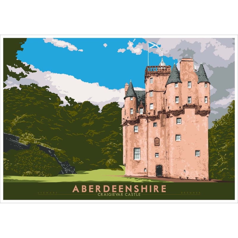
pink Scottish castle wall art can introduce unusual colour and architectural character without making a room feel like a castle display. Aberdeenshire: Craigievar Castle by Stewart Bremner presents Craigievar’s famous pink walls through crisp shapes, deep green trees and a clear blue sky. Its travel-poster influence makes the building feel graphic and immediate. The result is rooted in a real Aberdeenshire landmark, yet composed strongly enough to work in a modern home.
Start with architecture rather than pink
The castle’s colour is memorable, but the structure gives the image its authority. Tall towers, small windows and varied rooflines create a strong silhouette. Dark woodland anchors the lower half, while the sky provides open space. Thinking first about those shapes helps the print sit comfortably beside clean-lined furniture, traditional joinery or a mixture of both.
This is useful when pink is not already part of the decorating scheme. The picture does not require a pink wall, cushions or curtains. Its green, charcoal, cream and blue offer several quieter connections. One well-chosen relationship will make the artwork belong more naturally than repeating the castle colour across every accessory.
Style pink Scottish castle wall art without a theme
Begin by giving the print one clear job. It might add colour above a sideboard, bring structure to an otherwise plain dining wall or create a destination at the end of a landing. Keep souvenir objects, tartan patterns and miniature buildings away from its immediate edge. The landmark already supplies all the location and history the wall needs.
| Existing room detail | Connection to use | What to avoid |
|---|---|---|
| Dark timber furniture | Echo the roofs or deep woodland tones | A heavy frame that closes in the bright sky |
| Green upholstery | Draw on the trees and lawn | Trying to match every shade exactly |
| Warm neutral walls | Let the pink architecture provide the accent | Adding several competing pastel colours |
| Contemporary furniture | Emphasise the clean poster geometry | Surrounding the print with novelty castle decor |
Leave a calm margin around the finished frame. The clear border allows the castle’s irregular outline to read from across the room. If the wall also holds lamps, shelves or a television, mark the proposed frame with low-tack tape and check whether the towers still have space above them.
Let the poster palette guide, not dictate
A limited palette is one reason poster art is easy to place. Here, salmon pink is balanced by large areas of green and blue. Use that balance rather than treating the brightest colour as an instruction. A dark green chair, a blue ceramic or a small warm textile can establish a connection while the rest of the room remains quiet.
- Repeat one secondary colour once or twice, rather than copying the complete palette.
- Keep patterns simple when they sit directly below or beside the print.
- Use warm, even light so the pink walls stay lively without looking washed out.
- Check the picture in daylight and after dark before fixing its final position.
The typography along the lower edge also contributes to the design. It gives the image the confidence of a destination poster and makes the subject easy to identify. Avoid placing another word-heavy artwork immediately beside it. Clear wall space will preserve the graphic impact and keep the room from feeling overly labelled.
Choose a frame that supports the silhouette
A darker moulding can relate to the roofs and woodland. A lighter option may give the bright sky more openness. The right choice depends on the wall, the furniture and the finished size, not simply the dominant pink. A mount can add a visual pause between the strong poster border and a colourful painted wall.
First 4 Frames produces colour-managed Giclée prints and completes bespoke, hand-finished framing in-house at its Falkirk workshop. A one-to-one consultation allows the artwork to be compared with mouldings and mounts at its real scale. This helps the clean colour areas, small windows and crisp lettering retain their definition.
Explore the artist’s Scottish poster style
Stewart Bremner draws on twentieth-century travel graphics to celebrate Scottish places through bold shapes and controlled colour. Visit Stewart Bremner’s official website for more background, then browse the Stewart Bremner collection at First 4 Frames to compare castles, landscapes and other heritage subjects.
Well-placed pink Scottish castle wall art can feel architectural, colourful and contemporary at the same time. View the framed Aberdeenshire: Craigievar Castle print for a distinctive landmark presented with the clarity and optimism of a classic destination poster.