
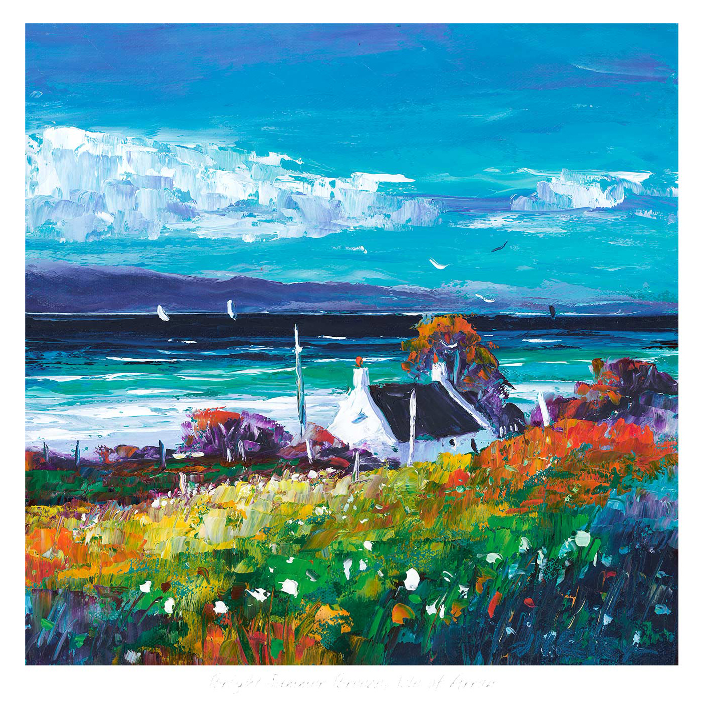
The challenge with colourful art prints is knowing when colour will feel uplifting and when it will simply feel too much. Bright Summer Breeze, Isle of Arran gets that balance right. It brings clear colour and movement into the room, but it still feels open, coastal, and easy to live with from day to day.
Why Bright Summer Breeze, Isle of Arran keeps colourful art prints feeling balanced
Bright Summer Breeze, Isle of Arran proves that stronger colour does not need to feel heavy. The light, the breeze through the scene, and the sense of distance stop the palette becoming dense. That makes it a strong option for rooms that need more life, especially if the rest of the interior already leans neutral, pale, or softly textured.
Where brighter artwork often works best
- In a living space that needs lift without harsh contrast.
- In a dining area that benefits from more energy and warmth.
- In a hallway that needs a stronger first impression.
Because the work is framed and produced in-house by First 4 Frames, the finish helps the colour stay refined rather than loud. The bespoke framing gives the print definition, while the colour-managed Giclée process keeps the transitions clean and confident.
For more on the island setting behind the piece, Visit Arran is worth a look. You can also browse more work by Jean Feeney and see the exact framed print here.
If you are narrowing down colourful art prints, Bright Summer Breeze, Isle of Arran is a strong example of colour used with real breathing space and judgement.