
Posted on

Colourful Art Prints Can Make a Kitchen Feel Sociable: Ashton Lane

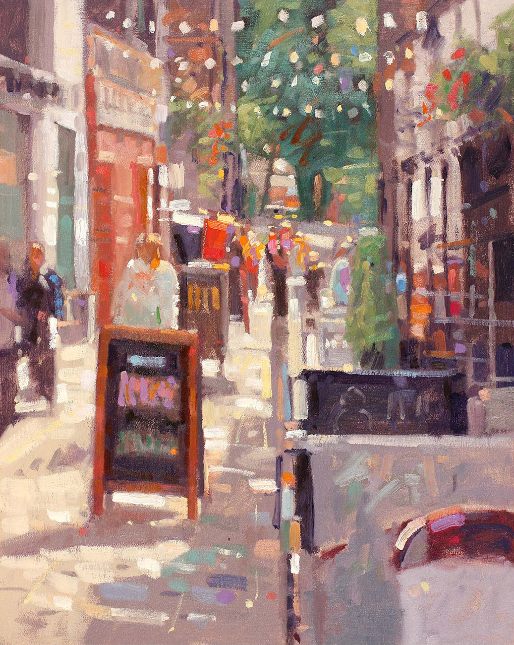
Ashton Lane captures a vibrant, sunlit urban scene with colorful impressionistic art featuring people walking, outdoor seating, café signs, string lights above, and trees in the background.

Colourful art prints can make a kitchen feel more sociable when their palette connects with how the room is used. Ashton Lane brings the glow and energy of a Glasgow lane into an eating corner. Its evening character suits coffee, supper, and conversation.

colourful art prints - Ashton Lane

Connect colourful art prints with kitchen light

Judge the picture in daylight and under evening lamps. Warm pendants can draw out the lane’s glow, while natural light reveals brighter notes. Choose one connection, such as a cabinet or stool, instead of matching every colour.

  1. Keep the artwork away from heat, steam, and cooking splashes.
  2. Hang it where diners can enjoy the detail without blocking a route.
  3. Use a frame with enough definition against tiles or patterned surfaces.

The subject also supports conversation. People who know Glasgow may recognise it, but the appeal does not depend on local knowledge. Lights, façades, and the sense of an evening out create a welcoming narrative.

First 4 Frames creates the Giclée print and bespoke frame in-house in Falkirk. Colour management keeps the varied palette balanced, and hand finishing makes the work feel integrated rather than like a casual kitchen poster.

For useful background, visit Visit Glasgow’s guide to the West End. You can also browse more work by Peter Foyle or view the exact Ashton Lane print.

For colourful art prints in a kitchen dining space, Ashton Lane offers practical colour, evening warmth, and a sociable sense of place.

Posted on

Colourful Art Prints Stay Airy With Bright Summer Breeze, Isle of Arran

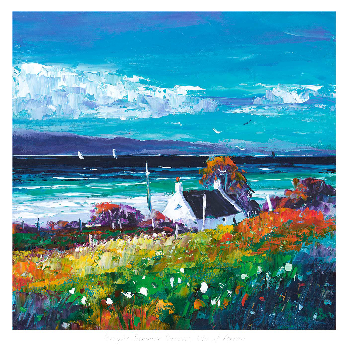
Bright Summer Breeze, Isle of Arran" depicts a white cottage with a dark roof among dazzling wildflowers, overlooking the sea and distant hills, beneath a vivid blue sky scattered with clouds and birds.

The challenge with colourful art prints is knowing when colour will feel uplifting and when it will simply feel too much. Bright Summer Breeze, Isle of Arran gets that balance right. It brings clear colour and movement into the room, but it still feels open, coastal, and easy to live with from day to day.

colourful art prints - Bright Summer Breeze, Isle of Arran

Why Bright Summer Breeze, Isle of Arran keeps colourful art prints feeling balanced

Bright Summer Breeze, Isle of Arran proves that stronger colour does not need to feel heavy. The light, the breeze through the scene, and the sense of distance stop the palette becoming dense. That makes it a strong option for rooms that need more life, especially if the rest of the interior already leans neutral, pale, or softly textured.

Where brighter artwork often works best

  1. In a living space that needs lift without harsh contrast.
  2. In a dining area that benefits from more energy and warmth.
  3. In a hallway that needs a stronger first impression.

Because the work is framed and produced in-house by First 4 Frames, the finish helps the colour stay refined rather than loud. The bespoke framing gives the print definition, while the colour-managed Giclée process keeps the transitions clean and confident.

For more on the island setting behind the piece, Visit Arran is worth a look. You can also browse more work by Jean Feeney and see the exact framed print here.

If you are narrowing down colourful art prints, Bright Summer Breeze, Isle of Arran is a strong example of colour used with real breathing space and judgement.

Posted on

Colourful Art Prints That Stay Elegant, Why Spring Yellows Works

Image of Spring Yellows by Colin Robertson

The best colourful art prints lift a room without exhausting it. Spring Yellows does that beautifully, bringing warmth and freshness while keeping the overall mood soft enough for everyday living.

That balance matters in homes where colour should feel welcoming rather than demanding. A brighter piece works best when it supports the room instead of trying to dominate it.

Why The Colour Feels So Liveable

Spring Yellows has brightness, but it is controlled brightness. The colour gives the wall energy while the landscape character keeps the piece grounded and easy to place.

  • It wakes up a quieter scheme without making it feel noisy.
  • It feels cheerful without slipping into something sugary.
  • It works for buyers who want uplift as well as calm.

Rooms Where It Makes Particular Sense

This piece would suit a kitchen-dining room, breakfast area, guest room, or family living space where natural light already helps colour breathe. It pairs especially well with pale timber, cream, soft green, and warm stone because the artwork already carries an easy seasonal warmth.

Why The Finish Helps The Colour Land Properly

Brighter artwork depends on print quality and presentation. First 4 Frames handles the bespoke framing and colour-managed Giclee production in-house, helping the lighter yellows and softer transitions feel convincing rather than thin.

You can view the exact framed product here, and browse more from Colin Robertson if you enjoy landscapes with the same fresh, welcoming colour.

For buyers comparing colourful art prints that feel optimistic, polished, and genuinely easy to live with, Spring Yellows is an excellent option.