Posted on

Floral Wall Art for a Blue Dining Room: Let Poppies Create the Contrast

Poppies" is a vibrant watercolor artwork featuring red poppies with green stems and leaves in the foreground, set against a blue lake and distant mountains under a partly cloudy sky, creating vivid contrast and movement.

floral wall art works best when the subject solves a real decorating or buying question. Poppies offers a useful example because vivid red flowers and green stems sit against blue water and distant mountains, creating contrast as well as a clear sense of depth.

floral wall art - Poppies

Use floral wall art to interrupt an all-blue scheme

A blue dining room can become flat when the artwork, upholstery and tableware all stay within the same narrow range. Red poppies provide a deliberate interruption. Their green stems bridge back to nature, while the lake and mountains keep the picture connected to the wall colour.

Build the room in three measured steps

  1. View a product image beside the actual paint in daylight and evening light.
  2. Choose a frame that separates the blue background from the blue wall.
  3. Repeat one poppy red in a small table detail, then stop.

Do not add floral curtains, patterned chair pads and flowered china simply because the subject is botanical. One painted arrangement has more impact when the surrounding surfaces are calm. Plain linen, timber and simple glassware let the colour remain lively without making meals feel visually busy.

Where should a floral picture sit in a dining room?

A sideboard wall often gives the best combination of viewing distance and protection. Keep the complete frame clear of serving dishes, candles and chair movement, and check reflections from the main evening light.

Preserve the movement in floral wall art

Watercolour depends on transparent colour and lively edges. Controlled Giclée production helps the red flowers, green stems and blue landscape retain their relationships. In-house mounting and framing provide a steady boundary that does not flatten Clare Arbuthnott’s movement.

For practical botanical context about the flower itself, explore the Royal Horticultural Society’s poppy guide. Browse the Clare Arbuthnott collection, or view the exact framed product and its options.

Floral wall art can do more than soften a room. Poppies gives a blue dining space useful contrast and depth, while restrained repetition keeps the result confident rather than overly matched.

Posted on

Bathroom Wall Art: Bring Choppy Waters Into a Well-Ventilated Room

Choppy Waters, Yellowcraigs" is a colorful painting of grassy sand dunes, energetic blue skies and waves, with distant island buildings and a lighthouse—capturing the vibrant coastal spirit.

bathroom wall art works best when it responds to the room rather than filling a convenient gap. Choppy Waters, Yellowcraigs gives this decision a specific starting point because its active waves, grassy dunes, blue sky and distant lighthouse bring movement without asking the room to imitate a quiet spa.

bathroom wall art - Choppy Waters, Yellowcraigs

Plan bathroom wall art around moisture first

Start by ruling out walls beside a shower, bath or basin where splashes are likely. Then observe the room after normal use. A surface that remains misted or damp is not a suitable position for framed paper-based art, however well the colour fits.

CheckAction
VentilationConfirm that the extractor works and is used long enough after bathing.
Splash distanceKeep the full frame outside direct spray and wet towel movement.
CondensationInspect the proposed wall at the room’s steamiest time.
ScaleTemplate the chosen print plus mount and moulding between fittings.

The lively coast can balance plain tile and simple sanitaryware. Repeat one blue or dune-green tone in a towel if desired, but avoid shells, rope-edged mirrors and lighthouse ornaments. The artwork already establishes the location.

If the room cannot stay properly ventilated and the wall cannot remain dry, choose another room for the print.

Protect bathroom wall art with honest placement

Good framing supports presentation, but it cannot make paper art immune to persistent damp. In a suitable dry position, colour-managed Giclée production preserves Clare Arbuthnott’s energetic coastal colour, and precise in-house framing gives the busy scene a clean edge against tile or paint.

For practical advice that helps manage the room environment, read NHS guidance on reducing condensation in the home. Browse the Clare Arbuthnott collection, or inspect the exact framed product and its available options.

Bathroom wall art can be lively and personal when the room conditions are right. Choppy Waters adds weather, movement and distance, while sensible ventilation and placement protect the finished piece.

Posted on

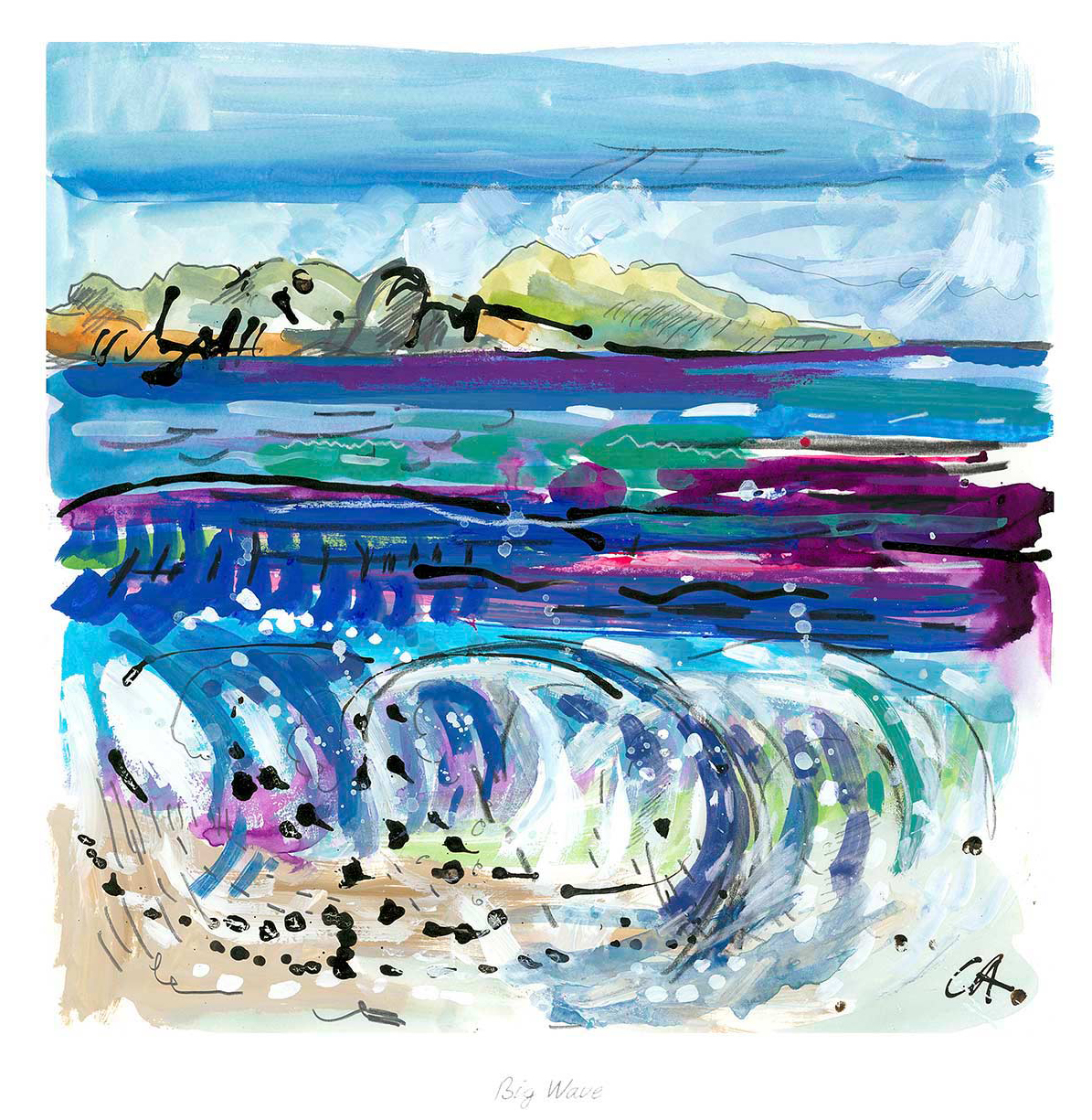
Big Wave Shows How a Coastal Statement Piece Can Hold a Room

Big Wave is a colorful painting featuring a crashing wave with white and blue splashes, purple highlights, and a distant green island beneath a cloudy sky in the background.

Coastal statement wall art does not need anchors, ropes, or a row of small beach pictures. Big Wave creates impact through the wave itself. White and blue spray rises through purple highlights, while a distant green island and clouded sky give the movement somewhere to settle.

coastal statement wall art - Big Wave

Give coastal statement wall art enough clear space

A statement piece earns attention through composition; the room does not need to repeat its subject.

Begin with the wall’s usable width, excluding curtains, tall lamps, and open doors. The frame should feel generous but retain a clear margin. Over a sideboard, relate it to the furniture below rather than the full width of the room.

For a quiet room

Use the print as the main movement. Soft grey, chalky white, and plain upholstery let the wave remain energetic without creating noise.

For a colourful room

Repeat one purple or green note in a small object. Avoid collecting every blue, as that can flatten the painting into a colour chart.

Clare Arbuthnott’s watercolour depends on clean colour separation and lively marks. First 4 Frames uses colour-managed Giclée production and hand-finishes the bespoke frame in Falkirk, helping the spray and distant landscape retain definition at display scale.

For further context, visit the Royal Scottish Society of Painters in Watercolour. You can also explore the Clare Arbuthnott collection or see the exact Big Wave framed print.

For coastal statement wall art that feels expressive rather than themed, Big Wave gives one wall movement, freshness, and a confident focal point.

Posted on

Landscape Wall Art Can Make a Dining Space Breathe With Green Sea, Iona

“Green Sea, Iona” is a vibrant watercolor painting of a rocky coastline, featuring turquoise waters, sandy shores, distant hills, and a partly cloudy sky—capturing the lively atmosphere of a bright seaside day.

Landscape wall art can give a dining room something valuable between meals: a view that lets the eye travel. Green Sea, Iona offers a clear horizon, fresh green-blue water, and expressive movement. It can open the feeling of the room without demanding attention from everyone around the table.

landscape wall art - Green Sea, Iona

Use landscape wall art to extend the dining-room view

Hang the picture where it can be appreciated from a seated position. A composition placed too high may feel detached from the table. Set its visual centre lower than you might in a hallway, then check it from several chairs. The horizon should feel connected to the room rather than floating above it.

Should coastal art match the dining-room colours?

Not exactly. Choose one or two relationships instead. Green glass, pale ceramics, or a natural linen can echo the image while leaving the rest of the palette independent and relaxed.

Green Sea, Iona can refresh warm timber furniture because its cooler notes create contrast. In a paler room, the richer green areas provide enough substance to prevent the space feeling washed out. Keep overtly nautical objects to a minimum; the painting already communicates sea and island atmosphere.


A dining room is used in both daylight and softer evening light. Check that the frame gives the horizon definition after dark. First 4 Frames can advise on that balance, then produce the colour-managed Giclée print and bespoke, hand-finished frame entirely in-house at its Falkirk workshop.

Discover more about the island through an overview of Iona and its setting. You can also explore Clare Arbuthnott’s other work and view Green Sea, Iona.

As landscape wall art, Green Sea, Iona brings freshness, distance, and an easy focal point to a room built around shared time.

Posted on

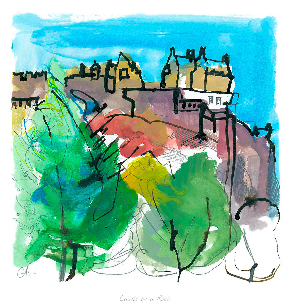
Scottish Art Prints Feel More Architectural With Castle on a Rock

Castle on a Rock is a colorful abstract painting of a castle atop a rocky hill, surrounded by green trees and set against a bright blue sky, with loose brushstrokes creating a lively, whimsical landscape feel.

Strong Scottish art prints often do more than add scenery. They can also give a room a sense of structure and place. Castle on a Rock is a good example. The composition has enough edge, height, and atmosphere to make a landing, upper hall, or quieter sitting area feel more intentional without tipping into something too formal.

Scottish art prints - Castle on a Rock

Why Castle on a Rock suits Scottish art prints so well

Castle on a Rock works especially well where a wall needs a little more definition. A castle subject naturally brings line and presence, while the surrounding landscape keeps the feeling open rather than severe. That balance is useful in transitional spaces where you want the artwork to guide the eye and make the wall feel finished.

  • It adds Scottish character without feeling novelty led.
  • It gives a taller wall more visual structure.
  • It keeps the room atmospheric while still easy to live with.

The framed finish matters here too. First 4 Frames completes each piece in-house in Falkirk with bespoke framing and colour-managed Giclée printing, so the final work feels hand-finished and settled rather than like a loose print still waiting for a decision.

For anyone who enjoys the wider story behind this kind of subject, Historic Environment Scotland’s guide to Scottish places and castles is worth exploring. You can also browse more work by Clare Arbuthnott and view the exact framed print here.

If you are comparing Scottish art prints for a wall that needs presence and place in equal measure, Castle on a Rock is a persuasive choice.

Posted on

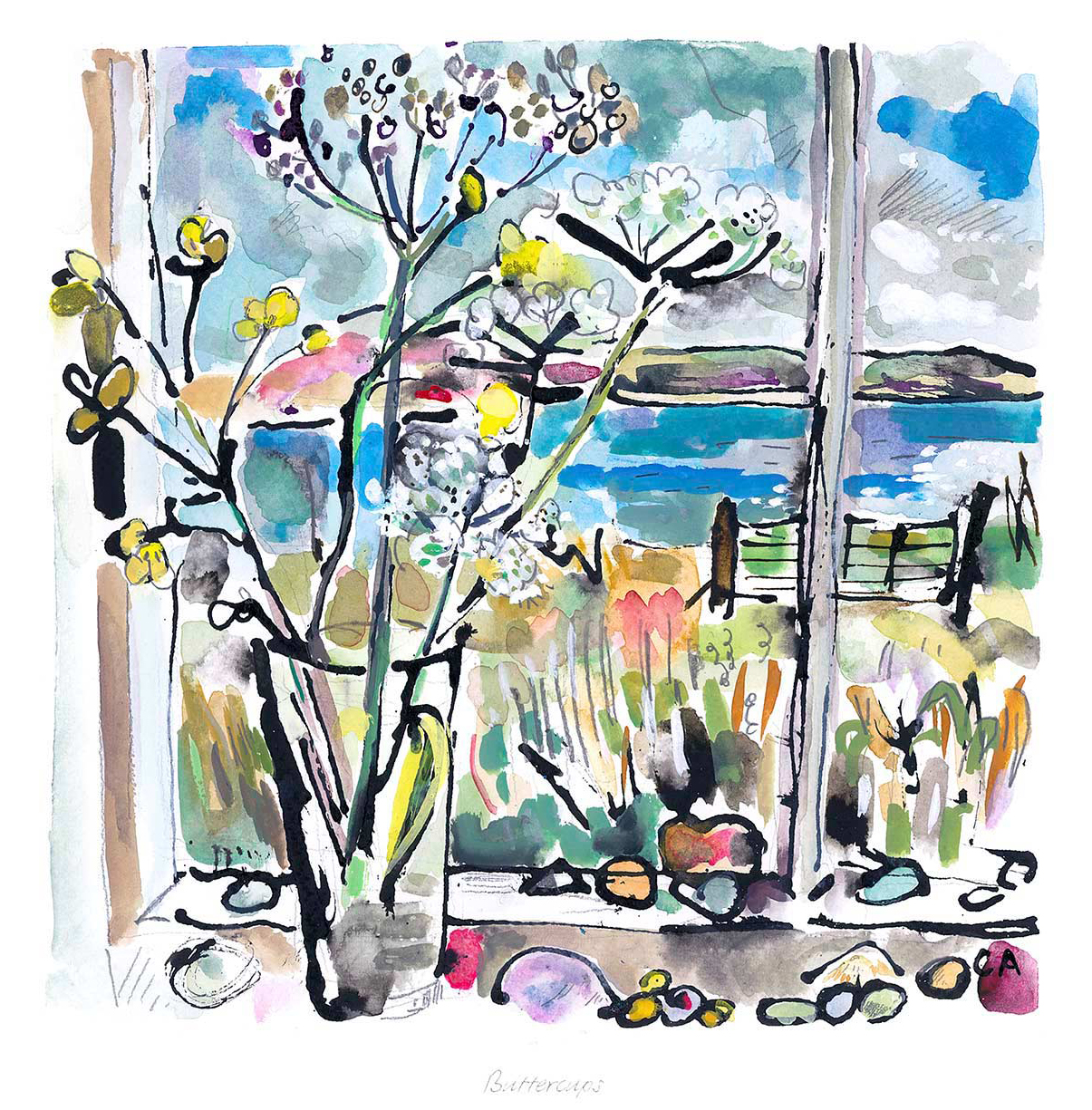
Why Buttercups Works Beautifully as Wall Art for Painted Cabinetry

Buttercups: Watercolor painting of wildflowers in a vase on a windowsill, with views of a blue lake, grassy fields, and a cloudy sky in the colorful landscape outside.

The best wall art for painted cabinetry should give a room some definition without fighting the softer character that painted furniture already creates. Buttercups works especially well here because it brings freshness, colour, and a clear focal point while still keeping the overall look welcoming rather than overly formal.

wall art for painted cabinetry featuring Buttercups

Why wall art for painted cabinetry needs balance as well as colour

Painted cabinetry often gives a room warmth and personality straight away, whether it appears in a kitchen, pantry, dining space, or country-style sitting room. The challenge is making sure the scheme still feels shaped and complete. Artwork helps most when it adds lift and contrast without making the room feel too busy or too carefully matched.

Buttercups suits that job beautifully. The floral subject feels light and easy to live with, while the composition still has enough presence to hold the wall confidently. That makes it a strong fit for interiors where cabinetry, shelving, or painted woodwork already carry much of the room’s character.

Why Buttercups suits wall art for painted cabinetry so naturally

  • It introduces freshness without making a softer scheme feel overly sweet.
  • It helps painted cupboards and joinery feel connected to the rest of the room.
  • It adds a brighter focal point that still feels calm and easy to live with.

First 4 Frames completes each piece in-house in Falkirk with bespoke framing, colour-managed Giclee printing, and hand-finished craftsmanship. That superior finish matters in rooms with painted cabinetry because these interiors depend on detail, balance, and presentation rather than sheer scale.

You can discover more about the artist at Clare Arbuthnott, browse more work by Clare Arbuthnott, and view the exact framed print here.

If you are comparing wall art for painted cabinetry and want something fresh, balanced, and quietly uplifting, Buttercups is a very strong option.

Posted on

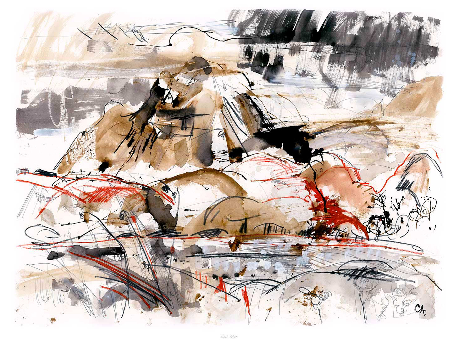
Grey Wall Art Gains More Depth With Cul Mor

Cul Mor is an abstract landscape painting featuring loose, expressive brushstrokes in brown, black, and red tones that capture the rugged forms of Cul Mor’s rocky mountains and flowing water under a lively, cloud-filled sky.

The best grey wall art should do more than match a neutral room. Cul Mor shows how a quieter palette can still add depth, movement, and a clearer focal point without overwhelming the rest of the scheme.

grey wall art - Cul Mor

Why Cul Mor helps grey wall art feel layered rather than flat

Neutral interiors often need artwork that keeps the room calm while still separating the wall from the furniture and flooring around it. Cul Mor does that well. The landscape offers tonal variation and a sense of distance, which means the piece reads as intentional and atmospheric rather than simply another grey surface.

  • It works especially well with pebble, stone, and soft timber schemes.
  • It adds interest without pulling a restful room off balance.
  • It suits living rooms, bedrooms, and hallways that need a quieter focal point.

At First 4 Frames, each piece is completed in-house with bespoke framing and colour-managed Giclee production. That quality-led finish matters in tonal work like this, because subtle shifts in grey and light need to stay crisp if the image is going to keep its atmosphere once framed.

If you want more context on the mountain itself, Walkhighlands on Cul Mor is useful. You can also browse more work by Clare Arbuthnott and view the exact framed product here.

If you are looking at grey wall art and want something with calm presence instead of flat neutrality, Cul Mor is an excellent option.

Posted on

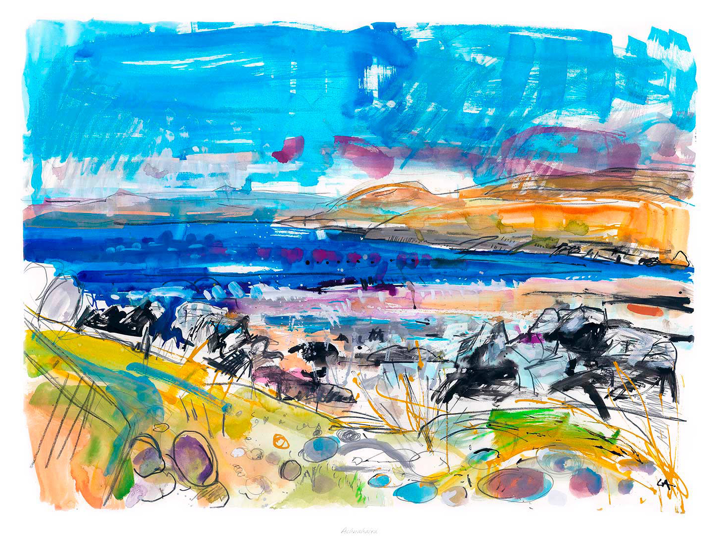
Why Achnahaird Works Beautifully as Wall Art for a Room With Slipcovered Sofas

Achnahaird is a vibrant watercolor landscape featuring a rocky shoreline, bright blue sky, distant orange hills, and dynamic blues, purples, and greens in the water and foreground. Bold brushstrokes express energy and movement.

The best wall art for a room with slipcovered sofas should bring enough structure to the room without disrupting the softness that makes it feel easy to live in. Slipcovered sofas have a relaxed charm, but that same ease can leave a space looking slightly adrift if the artwork is too faint or too formal. Achnahaird works especially well because it adds calm coastal colour and a clear focal point while still keeping the room gentle and unforced.

wall art for a room with slipcovered sofas featuring Achnahaird

Why wall art for a room with slipcovered sofas needs quiet structure

Rooms built around slipcovered seating often feel light, welcoming, and comfortable from the start. The challenge is making sure they do not tip into looking too loose or slightly under-finished. One well-judged framed print can provide the visual anchor that pulls upholstery, flooring, and softer accessories into one calmer whole.

Achnahaird does that beautifully. Its sense of open space and coastal atmosphere brings freshness to the scheme, while the composition still feels grounded enough to hold the wall with confidence. It suits sitting rooms, garden rooms, and relaxed bedrooms where comfort matters just as much as presentation.

Why Achnahaird suits a relaxed interior so naturally

  • It introduces a calm focal point without disturbing the room’s softer mood.
  • It helps slipcovered furniture feel styled rather than simply practical.
  • It brings colour and place in a way that still feels easy to live with every day.

First 4 Frames completes each piece in-house in Falkirk with bespoke framing, colour-managed Giclee printing, and hand-finished craftsmanship. That superior finish matters in a room built around texture and comfort, where the final presentation needs to feel deliberate rather than decorative for its own sake.

You can discover more about the artist at Clare Arbuthnott, browse more work by Clare Arbuthnott, and view the exact framed print here.

If you are comparing wall art for a room with slipcovered sofas and want something airy, balanced, and quietly distinctive, Achnahaird is a very strong option.

Posted on

Why Conservation Framing Matters With Achnahaird

Achnahaird is a vibrant watercolor landscape featuring a rocky shoreline, bright blue sky, distant orange hills, and dynamic blues, purples, and greens in the water and foreground. Bold brushstrokes express energy and movement.

The appeal of conservation framing is not only technical. It is also visual. Achnahaird is a strong example because the image depends on calm tonal balance, open space, and a freshness that deserves to be preserved as well as displayed beautifully.

conservation framing - Achnahaird

Why conservation framing matters for calm landscape work

Some prints rely on impact, but others rely on atmosphere and longevity. Achnahaird falls into the second group. When artwork is chosen for its quietness and balance, protecting the print properly becomes part of protecting what you liked about it in the first place.

  • It helps the artwork remain display-worthy for longer.
  • It supports cleaner presentation for rooms where calm detail matters.
  • It suits buyers who want craftsmanship as well as visual appeal.

Why Achnahaird benefits from a more careful finish

The scene already brings space, air, and coastal stillness, so the presentation needs to respect that restraint. First 4 Frames completes the work in-house with bespoke framing and colour-managed Giclee printing, helping the final piece feel archival in outlook, hand-finished in character, and easy to enjoy for years.

You can browse more work by Clare Arbuthnott, learn more about the artist at Clare Arbuthnott, and view the exact framed product here.

If you are considering conservation framing and want a print that rewards that level of care, Achnahaird is a very fitting choice.

Posted on

Relaxing Bedroom Art That Still Has Character, Why Buttercups Works

Buttercups: Watercolor painting of wildflowers in a vase on a windowsill, with views of a blue lake, grassy fields, and a cloudy sky in the colorful landscape outside.

The best relaxing bedroom art does not have to be bland. Buttercups shows that beautifully, using soft floral colour and a gentler rhythm to make the room feel more settled while still keeping enough personality to matter.

That is often the right balance for a bedroom. You want the artwork to support rest, but you also want the room to feel properly considered rather than washed out or forgettable.

Why Floral Work Can Feel Restful Rather Than Fussy

A floral subject works best in a bedroom when it carries movement softly instead of demanding attention. Buttercups has that quieter quality, which makes it feel inviting rather than sugary.

  • It softens the room without flattening it.
  • It adds colour in a measured, sleep-friendly way.
  • It keeps the bedroom warm and personal rather than generic.

How To Use It In A Bedroom Scheme

This piece would sit naturally above a chest of drawers, beside the bed, or on a wall that needs a calmer focal point. It works especially well with ivory, oat, sage, muted pinks, and natural timber because the artwork brings freshness without pushing contrast too hard.

Why Quality Printing Matters Here

Subtle floral work can lose its effect if the colour handling feels thin. First 4 Frames frames and produces pieces like this in-house with colour-managed Giclee quality, helping the finished result keep its softness and tonal detail.

You can view the exact framed product here, and browse more from Clare Arbuthnott if you enjoy floral artwork with the same calm, room-friendly feel.

If you are looking for relaxing bedroom art that feels restful but not anonymous, Buttercups is a lovely choice.