Posted on

Why In Time With A Moment Is a Strong Choice for Art in a Room With Sea Views

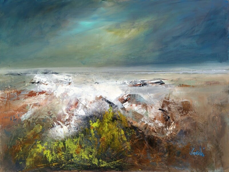
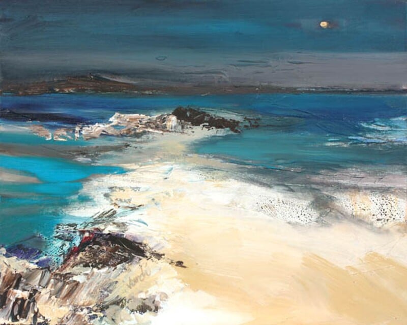
Image of In Time With A Moment by Arie Vardi

Finding the right art for a room with sea views can be harder than it sounds. If the artwork is too loud, it competes with the window. If it is too bland, it disappears entirely. In Time With A Moment sits in that valuable middle ground.

Why this kind of room needs restraint

Rooms with a coastal outlook already have movement, light, and changing colour built into them. The artwork should echo that atmosphere rather than trying to overpower it. This piece works because it feels contemplative and spacious, with enough depth to hold attention when the blinds are closed and enough calm to live alongside a real view.

When it is especially effective

It is a particularly good choice for bedrooms, upstairs sitting rooms, and quieter corners where the view matters. The darker tones and shoreline mood can help tie the inside and outside together, especially when the room includes muted textiles, weathered timber, or cooler painted walls.

  • It supports a sea-facing room without turning the décor into a theme.
  • It brings atmosphere for evenings, when the view outside is less visible.
  • It suits people who prefer coastal art with depth and quiet drama.

Why the framed result matters

First 4 Frames produces the piece in-house in Falkirk using colour-managed Giclée printing and bespoke hand-finished framing. In a room with a strong natural outlook, the finish needs to feel every bit as considered as the architecture around it. That craftsmanship helps the print hold its own in a subtle, confident way.

The artwork is by Arie Vardi, and you can view the exact framed product here.

If you want art for a room with sea views that feels calm, atmospheric, and intelligently chosen, In Time With A Moment is a very strong fit.

Posted on

How Rock Pool, Port Ann Helps a Blue Room Feel Layered Rather Than Flat

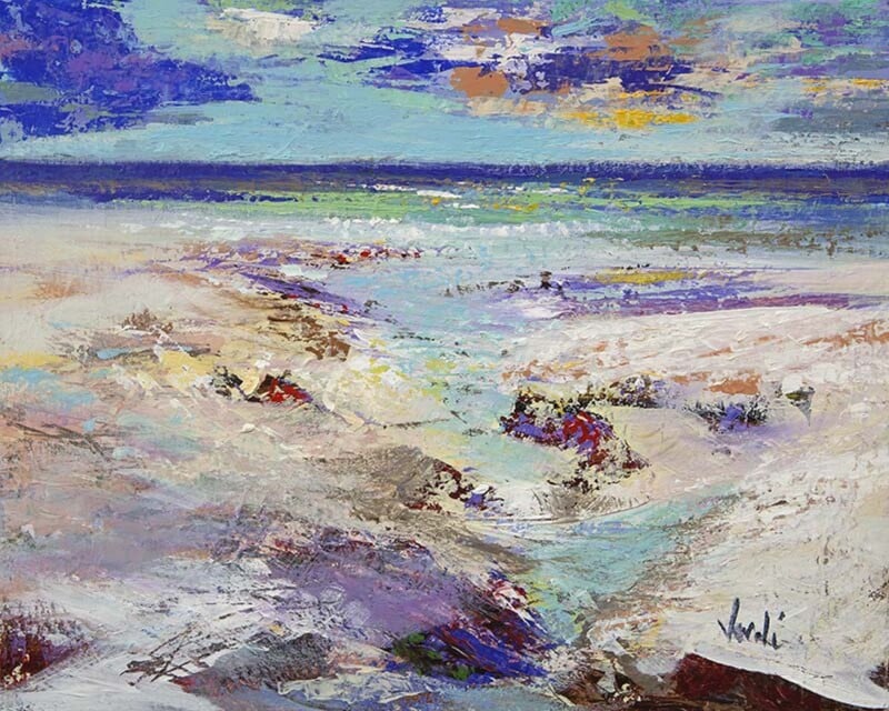
Image of Rock Pool, Port Ann by Arie Vardi

Finding the right art for a blue room is often harder than it sounds. Too close a match and the walls and artwork blur together. Too much contrast and the room can feel broken up. Rock Pool, Port Ann gets that balance right.

Why blue rooms need texture as much as colour

Rooms built around blue tones can feel calm and elegant, but they can also feel flat if every surface sits in the same visual register. This artwork introduces movement, shoreline detail, and tonal variation, which helps the room feel layered instead of one-note.

  • It works with pale blue walls that need more depth.
  • It also suits darker blue schemes that need a little lift rather than another heavy element.
  • It gives a coastal or contemporary room more character without overpowering it.

A practical choice for everyday rooms

This kind of piece can sit well in a bedroom, sitting room, or hallway where the colour scheme is already doing a lot of the work. Because the subject feels open and natural, it adds interest while still keeping the room relaxed and easy to live with.

Why framing helps the palette hold together

First 4 Frames produces the piece in-house in Falkirk with colour-managed Giclée printing and bespoke framing. That cleaner, hand-finished presentation helps the artwork sit more confidently within a blue-led room, rather than feeling like a last-minute addition.

The artwork is by Arie Vardi, and you can view the exact framed piece here.

For anyone choosing art for a blue room, Rock Pool, Port Ann is a smart way to add depth, movement, and a more complete finish.