Posted on

Colourful Wall Art That Still Feels Sophisticated, Why The Botanics Works

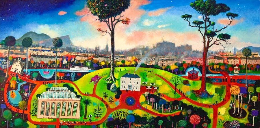
The Botanics: a vibrant, whimsical painting featuring colorful trees, winding paths, and the iconic greenhouse in a lush park with distant castle and mountains beneath a blue-pink sky.

The challenge with colourful wall art is getting enough lift without losing restraint. The Botanics handles that beautifully, bringing greenery, movement, and city character together in a way that feels bright but still refined.

That gives it a wider usefulness than louder decorative pieces. Instead of dominating the room, it helps the space feel fresher and more alive.

Why This Stays Fresh Without Feeling Too Sweet

Colour works best when it is carried by rhythm and setting, not only intensity. The botanical subject and Edinburgh context give this piece natural structure, which keeps the energy feeling purposeful rather than random.

  • It lifts a neutral scheme without shouting.
  • It feels lively, but still easy to live with.
  • It adds personality without tipping into novelty.

Rooms That Benefit Most From It

The Botanics would work especially well in a hallway, kitchen-dining space, guest room, or living room corner that needs more colour and friendliness. It also pairs well with pale walls, brushed brass, leafy plants, natural wood, and darker painted details because the artwork already bridges freshness and depth.

That makes it useful when the room wants colour, but not clutter.

Why Good Printing Keeps The Colour Credible

Brighter work only stays elegant when the print quality keeps the tonal transitions clean. First 4 Frames produces and frames pieces like this in-house with colour-managed Giclee quality, helping the final result feel richer and more dependable on the wall.

You can view the exact framed product here, and browse more by Rob Hain if you enjoy Scottish scenes with the same lively but balanced character.

For buyers looking for colourful wall art that still feels composed and room-aware, The Botanics is an excellent choice.

Posted on

Festival Fireworks Shows How Colourful Wall Art Can Lift a Neutral Room

Festival Fireworks light up the sky behind a castle silhouette on a hill, with dramatic clouds and a glowing sky creating a festive, magical atmosphere.

Many people search for colourful wall art because the room feels a little too safe, not because they want to overwhelm it. The challenge is choosing a piece with enough energy to shift the mood while still feeling anchored in the wider scheme. Festival Fireworks does that very well, bringing brightness and movement without tipping the room into noise.

Why neutral rooms often need one stronger visual note

A calm palette can be beautiful, but it can also drift into flatness if every finish stays equally quiet. One bolder framed piece helps break that up. Festival Fireworks introduces a more joyful rhythm, giving the wall personality while still allowing the room to feel lived in rather than staged.

  • It adds lift to beige, grey, and off-white interiors.
  • It gives the room a clearer focal point.
  • It works well where the furniture is simple and the wall needs more life.

This approach is especially effective in living rooms, hallways, and dining spaces where the rest of the scheme is already calm enough to support a brighter note. The colour feels intentional because the rest of the room gives it space.

First 4 Frames completes every piece in-house in Falkirk with bespoke framing, colour-managed Giclee printing, and hand-finished care. That superior quality keeps a brighter artwork feeling polished and lasting rather than fleeting.

You can browse more from Esther Cohen and see the exact framed print here.

If you are weighing up colourful wall art, Festival Fireworks is a strong reminder that brighter artwork can still feel balanced and refined.