
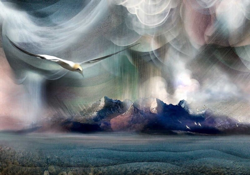
Finding the right art for dusty blue walls is usually about balance. Blue can feel calm, elegant, and very easy to live with, but it can also leave a room looking slightly flat if the artwork does not bring enough warmth or contrast. Goatfell, Arran works beautifully because it lifts the cooler base colour without breaking the room’s quieter mood.
Why cooler wall colours need some visual warmth
Dusty blue often looks at its best when the room has more than one temperature in play. Artwork can do that job very effectively. The right framed print keeps the scheme from feeling overly soft or one-note, while still respecting the calm quality that made blue appealing in the first place.
- It suits bedrooms, sitting rooms, and smarter guest spaces.
- It adds warmth without making the palette feel busy.
- It helps a blue scheme feel considered rather than simply safe.
Why this subject works so naturally
Goatfell, Arran brings landscape character and a wider sense of space, which is often exactly what a blue room benefits from. It gives the wall a clear focal point, but it still feels relaxed and easy to place. That makes it especially useful when the room already leans toward softer tones and restrained materials.
Why a hand-finished framed print elevates the result
First 4 Frames completes each piece in-house with bespoke framing, colour-managed Giclée printing, and hand-finished craftsmanship. In a colour-led room, that better finish matters because cleaner framing and stronger print quality help the artwork feel intentional rather than incidental.
This artwork is by Esther Cohen, and you can view the exact framed product here.
If you need art for dusty blue walls that feels warm, composed, and professionally finished, Goatfell, Arran is a very strong option.