Posted on

Why PINK SPARKLE, PRINCES STREET Works So Well as Wall Art for a Room With Brass Accents

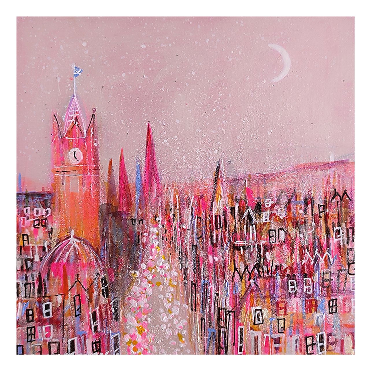
PINK SPARKLE, PRINCES STREET is a whimsical, colorful painting of Princes Street at dusk with tall buildings and a clock tower, glowing with vibrant oranges and pink sparkles beneath a crescent moon in a soft pastel sky.

Choosing wall art for a room with brass accents is often about getting the finish of the room to feel richer rather than simply shinier. Brass details can add warmth and polish, but they work best when the artwork nearby shares that sense of glow without becoming overly formal. PINK SPARKLE, PRINCES STREET does that beautifully, bringing colour, light, and a lively city character that helps metallic details feel fully part of the room.

wall art for a room with brass accents featuring PINK SPARKLE, PRINCES STREET

Why wall art for a room with brass accents needs warmth as well as contrast

Brass tends to work best when the rest of the room does not leave it carrying all the warmth on its own. If the walls, upholstery, or joinery are too restrained, metal finishes can start to feel isolated. Artwork helps bridge that gap by introducing colour, movement, and visual rhythm that makes the room feel more complete.

PINK SPARKLE, PRINCES STREET is especially effective because it has brightness and atmosphere, but it still feels composed. That makes it a good fit for rooms where brass appears in lighting, mirror frames, handles, or side tables and you want those elements to feel deliberate rather than dotted around the space.

  • It adds warmth that sits naturally alongside brass finishes.
  • It introduces sparkle and colour without making the room feel busy.
  • It suits spaces that need a brighter focal point with a more individual feel.

Why a hand-finished Edinburgh print feels more considered in the room

At First 4 Frames, every piece is completed in-house in Falkirk using bespoke framing, colour-managed Giclee printing, and hand-finished craftsmanship. That superior quality matters in a room where finishes have been chosen carefully. The artwork needs to feel equal to the rest of the scheme rather than like an afterthought.

You can view the exact framed print here and explore more of Nikki Monaghan‘s work for related colour and atmosphere.

If you are looking for wall art for a room with brass accents that adds warmth, sparkle, and a more distinctive focal point, PINK SPARKLE, PRINCES STREET is well worth considering.
Posted on

Wall Art for Limestone Flooring, Why Culross, Fluffy Clouds And Spring Flowers Works

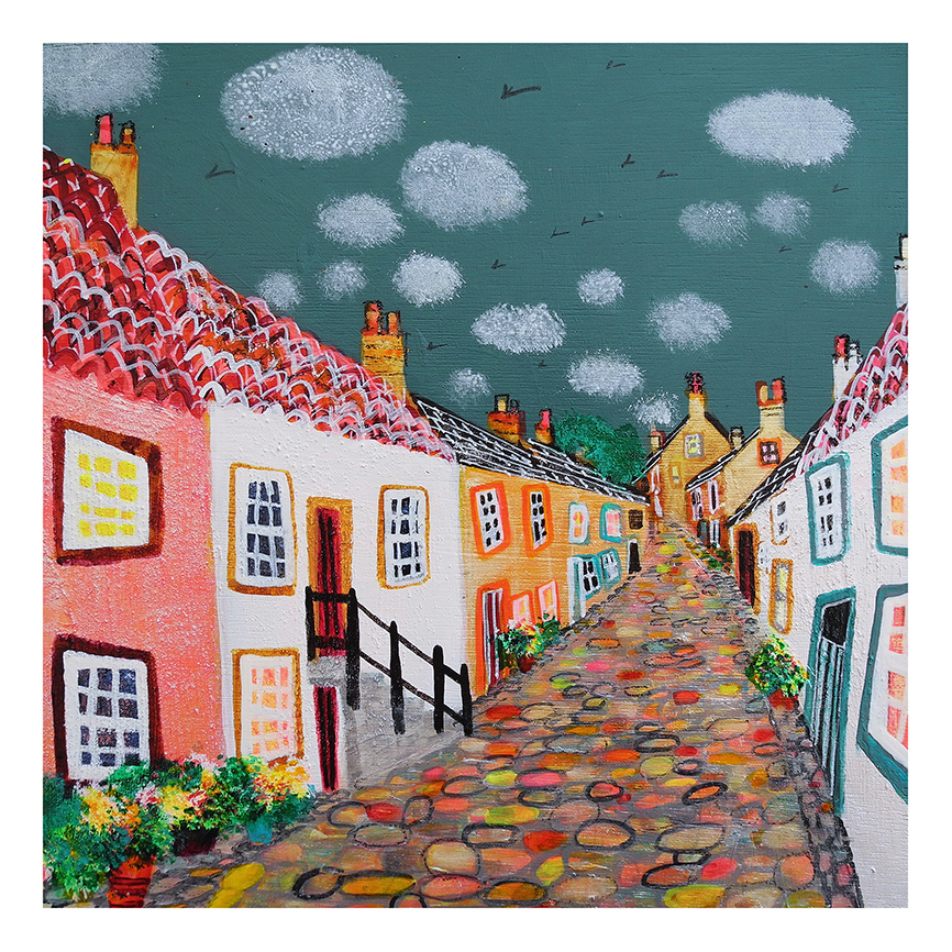
Culross, Fluffy Clouds And Spring Flowers is a colorful painting of a quaint cobblestone street lined with bright houses, red-tiled roofs, blooming window boxes, and birds soaring among fluffy clouds for a whimsical look.

Good wall art for limestone flooring should soften the room without fighting the natural calm of the stone. Culross, Fluffy Clouds And Spring Flowers works beautifully because it brings warmth, colour, and gentle structure while still feeling light enough for a paler space.

That balance matters in kitchens, garden rooms, and open-plan interiors where limestone flooring can look elegant but occasionally a little bare if the walls do not contribute enough life or variation.

Why This Kind Of Colour Helps

Pale stone surfaces often benefit from artwork that introduces warmth in a controlled way. This piece lifts the room without pushing it into something overly sweet or overly busy.

  • It stops limestone tones from feeling too cool or uniform.
  • It adds colour while keeping the overall room airy and welcoming.
  • It suits spaces that already use natural light, painted joinery, and softer finishes.

Where It Can Be Most Effective

Culross, Fluffy Clouds And Spring Flowers would sit naturally above a console, opposite a dining table, or on the wall that needs to warm up a stone-floored kitchen living space. It is particularly well suited to rooms where pale flooring, soft paint, and garden-facing light already set the tone.

Why A Quality Framed Finish Completes The Scheme

First 4 Frames produces the finished piece in-house with bespoke framing and colour-managed Giclee craftsmanship, helping the artwork feel equal to the quality of the surrounding materials. In a room with limestone flooring, that finish matters because the overall look depends on surfaces working together well.

You can view the exact framed product here, and browse more from Nikki Monaghan if you enjoy Scottish scenes with the same bright, welcoming character.

For anyone choosing wall art for limestone flooring that should feel warm, balanced, and easy to place, Culross, Fluffy Clouds And Spring Flowers is a very smart option.

Posted on

Why PORTREE, ISLE OF SKYE Stands Out Among Isle of Skye Prints

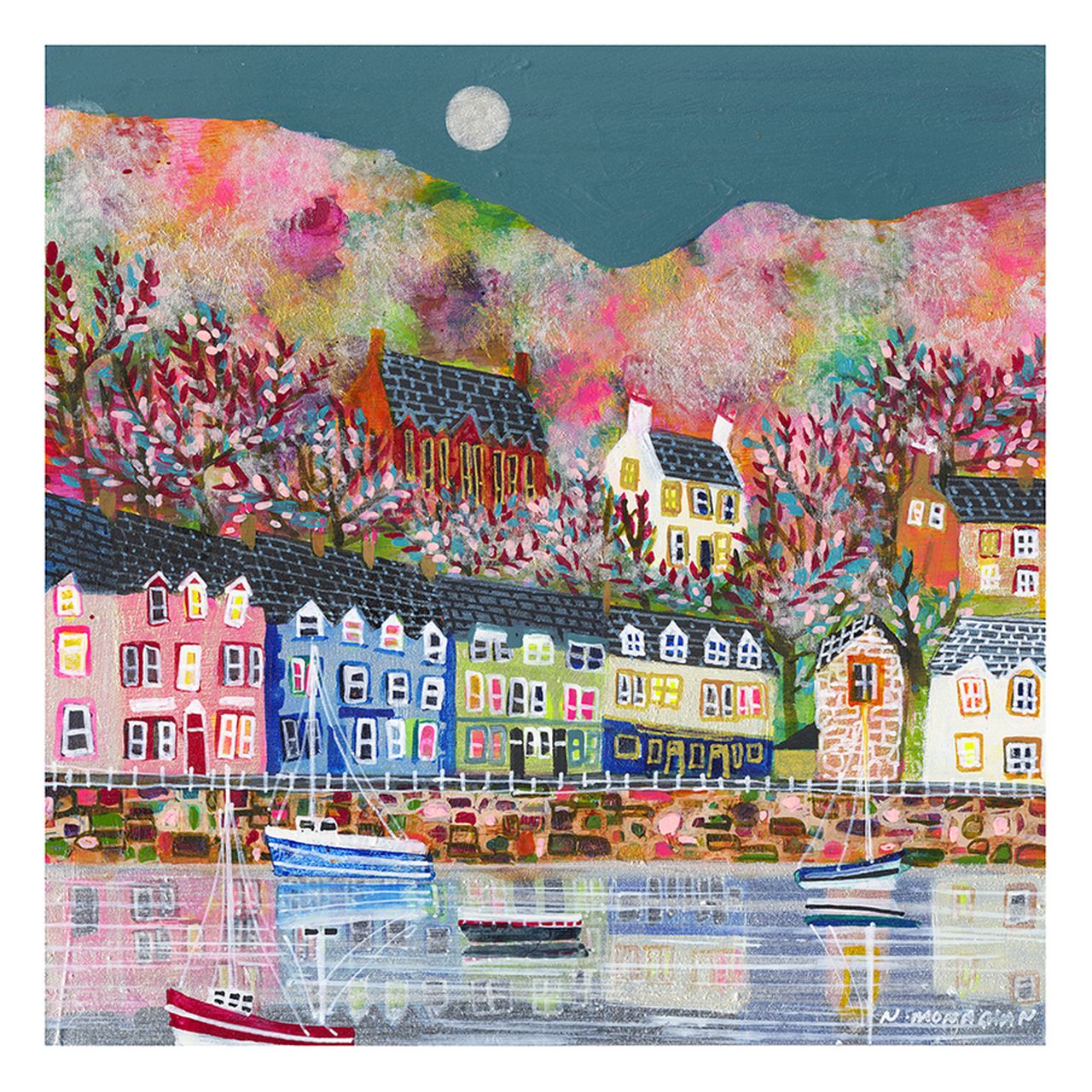
PORTREE, ISLE OF SKYE: A colorful painting featuring boats on calm water, vibrant multicolored houses along the shore, blooming trees, and a moon above pastel hills in the background.

The best Isle of Skye prints do more than show a well-known location. PORTREE, ISLE OF SKYE stands out because it captures place with enough colour and energy to feel personal in the home, not simply familiar.

That matters when buyers want Scottish artwork with local character but do not want it to slip into something that feels generic or purely gift-shop led. A framed piece should still feel thoughtful and lasting once it is on the wall.

What Makes This Kind Of Skye Print More Convincing

A good Skye image needs atmosphere as well as recognisable subject matter. This piece has that liveliness, which makes it easier to place in a real room rather than admire only for location value.

  • It brings a sense of place without feeling stiff or overly formal.
  • It offers enough colour to lift a room, but still feels grounded.
  • It works well for buyers who want Scottish art with more personality and movement.

Where It Can Work Best

PORTREE, ISLE OF SKYE would sit beautifully in a sitting room, hallway, holiday cottage, or upstairs landing that needs one piece with stronger local identity. It is especially useful where the room already has quiet furnishings and needs artwork that can carry more warmth and recognition.

Why First 4 Frames Strengthens The Result

Because First 4 Frames handles bespoke framing and colour-managed Giclee production in-house, the final presentation feels polished enough to suit a permanent space rather than a temporary decorative choice. That superior finish is part of what makes a place-based print feel more substantial.

You can view the exact framed product here, and browse more from Nikki Monaghan if you enjoy Scottish scenes with the same lively sense of place.

If you are comparing Isle of Skye prints and want one that feels display-worthy, rooted, and easy to live with, PORTREE, ISLE OF SKYE is a very appealing choice.

Posted on

Why Ashton Lane, Early Morning Works So Well as Wall Art for a Glasgow Tenement Flat

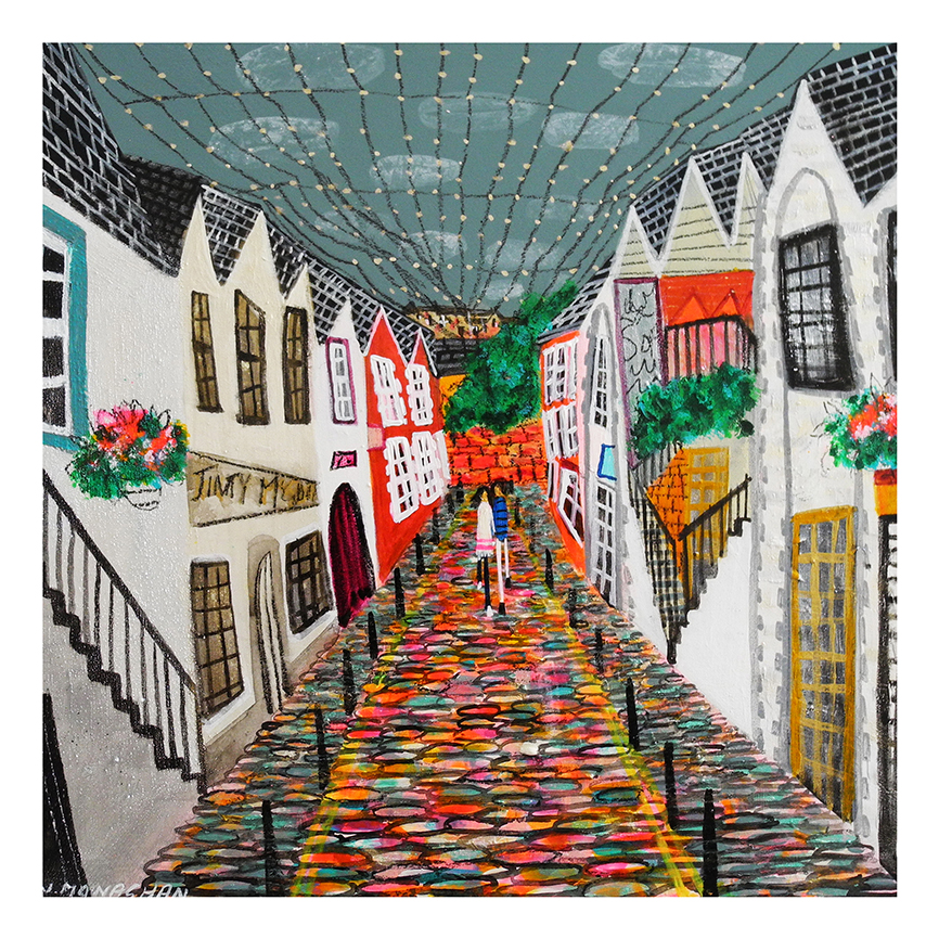
Ashton Lane, Early Morning: a colorful artwork portraying two people walking along a cobblestone street with vibrant angular buildings, flower boxes, greenery, and string lights overhead.

Choosing wall art for a Glasgow tenement flat is often about respecting what already makes the home special. Tenement flats usually have more character built in than newer properties, from higher ceilings to older woodwork and a stronger sense of proportion. Ashton Lane, Early Morning is a particularly good fit because it adds place and atmosphere without competing with that existing character.

Why older Glasgow interiors benefit from artwork with a real sense of place

A Glasgow tenement flat often works best when the interior feels lived in rather than over-styled. The right artwork helps connect the room to the city outside while still feeling easy to live with every day. That matters in hall spaces, sitting rooms, dining corners, and studies where the architecture already does part of the visual work.

Ashton Lane, Early Morning suits that balance well. It brings a clear local identity, but it does not feel forced or souvenir led. Instead, it helps the home feel more rooted and more personal. In a flat with original features or a mixture of old and new furniture, that quieter confidence can make a real difference.

  • It adds Glasgow character without making the room feel themed.
  • It suits older interiors that already have texture, detail, and history.
  • It helps a tenement flat feel personal and visually connected to its setting.

Why hand-finished framing matters in a period home

In a home with stronger architectural detail, finish matters. First 4 Frames completes each piece in-house in Falkirk using bespoke framing, colour-managed Giclee printing, and hand-finished craftsmanship. That superior quality helps the artwork sit comfortably in a room where cheaper presentation could quickly feel out of step.

You can explore more work by Nikki Monaghan and view the exact framed print here.

If you are looking for wall art for a Glasgow tenement flat that feels local, warm, and properly at home in a character property, Ashton Lane, Early Morning is well worth considering.

Posted on

Why Evening Sparkle On The Loch Works Beautifully as Conservatory Wall Art

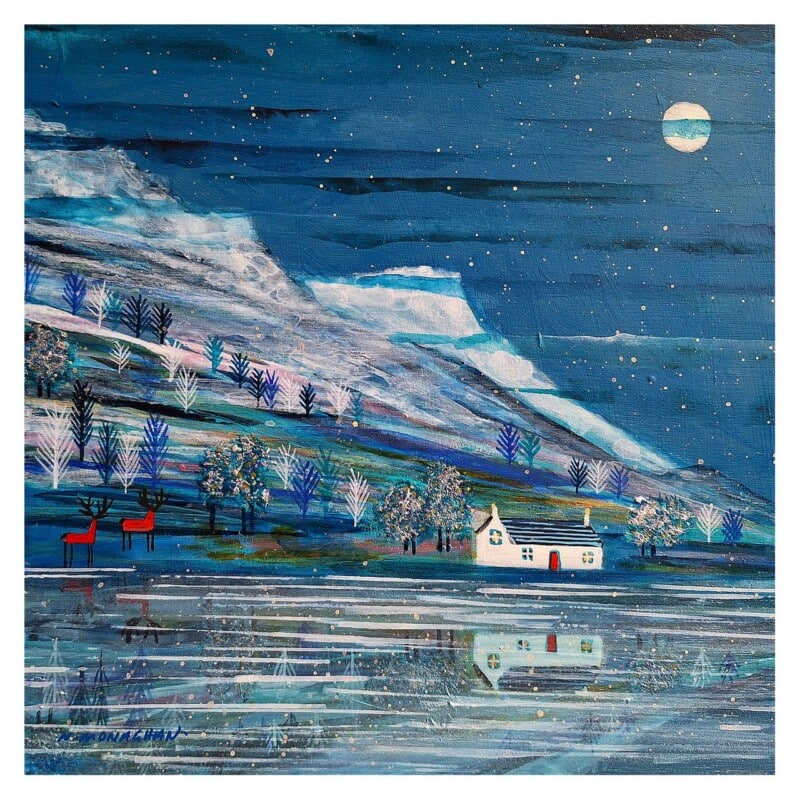
Image of Evening Sparkle On The Loch by Nikki Monaghan

Finding the right conservatory wall art is often about balancing brightness with enough visual weight to hold the room together. Evening Sparkle On The Loch works especially well because it brings calm colour and reflection without fighting with natural light.

That is useful in a garden-facing room where daylight changes throughout the day. The artwork needs to stay pleasant in softer morning light, brighter afternoon conditions, and gentler evening hours.

Why This Mood Suits A Light-Filled Room

A conservatory usually benefits from artwork that feels settled rather than loud. This piece helps the room feel grounded, but still leaves plenty of space for airiness and outdoor connection.

  • It introduces colour without competing with garden views.
  • It keeps a bright room from feeling visually hard or under-furnished.
  • It suits relaxed spaces used for reading, coffee, or informal entertaining.

Where It Can Sit Naturally

Evening Sparkle On The Loch would work beautifully above a sideboard, beside a bistro table, or on the wall that anchors the main seating area. It is particularly effective where rattan, painted timber, pale upholstery, or stone flooring already give the room a lighter structure.

Why The Finished Presentation Counts

First 4 Frames completes the framing and colour-managed Giclee production in-house in Falkirk, which helps the final piece feel substantial enough for a room full of glass and daylight. The hand-finished presentation gives the artwork more presence and longevity.

You can view the exact framed product here, and browse more from Nikki Monaghan if you enjoy Scottish scenes with the same calm sense of light and place.

For anyone comparing conservatory wall art that should feel airy, restful, and still properly anchored, Evening Sparkle On The Loch is a strong choice.

Posted on

Art for Hotels Feels More Memorable With Place, Why St Monan’s, Two Boats Works

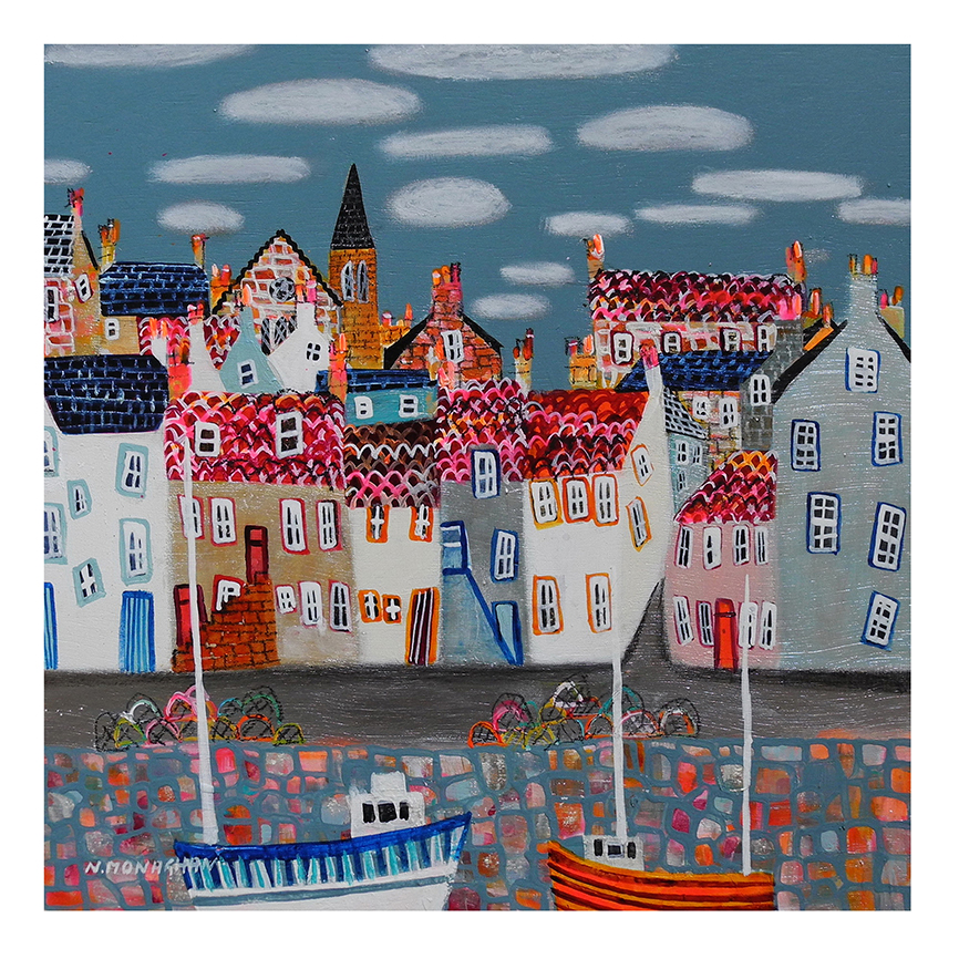
St Monan’s, Two Boats is a colorful painting depicting two white boats in a lively coastal village with red-roofed houses, cobblestone walls, and a cloudy sky. Bright patterns and whimsical details bring the harbor scene to life.

Good art for hotels should help guests remember the place they stayed, not simply fill empty walls. St Monan’s, Two Boats works particularly well because it brings local character and a restful harbour mood that feels welcoming from the first glance.

That matters in hospitality settings where the artwork often helps shape the overall impression of care, calm, and quality.

Why This Kind Of Scene Suits Guest Spaces

A harbour subject gives the room identity without becoming too literal or theme led. It offers colour, place, and softness together, which is useful in lounges, bedrooms, corridors, and reception areas.

  • It helps a guest space feel distinctive without feeling busy.
  • It adds local flavour in a polished, professional way.
  • It supports a calmer and more memorable atmosphere.

Where It Can Be Especially Effective

St Monan’s, Two Boats would work well in a boutique hotel lounge, bedroom corridor, breakfast area, or coastal guest suite where softer colour and a stronger sense of place can make the interior feel more considered.

Why The Finish Still Matters

Hospitality artwork has to stand up visually at close range and across repeated use. First 4 Frames handles bespoke framing and colour-managed Giclee production in-house, helping the finished piece look polished and dependable in a professional setting.

You can view the exact framed product here, and browse more from Nikki Monaghan if you enjoy Scottish coastal scenes with the same welcoming, place-led character.

If you are comparing art for hotels that should feel local and lasting rather than generic, St Monan’s, Two Boats is a very strong candidate.

Posted on

Wall Art for Interiors Feels Better With Place, Why Summer Day’s Portobello Works

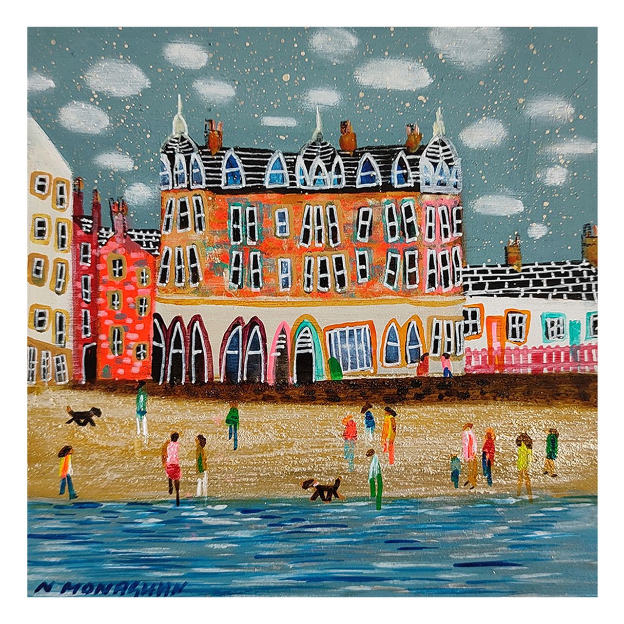
SUMMER DAY’S PORTOBELLO is a colorful painting of people and dogs strolling on a sandy beach in Edinburgh, with tall, ornate buildings and pointed roofs beneath a cloudy sky.

The best wall art for interiors rarely feels detached from everyday life. SUMMER DAY’S PORTOBELLO works so well because it brings colour, place, and a familiar sense of ease that can lift a room without making it feel contrived.

That kind of warmth is useful in homes that already have good furniture and finishes but still need something on the wall to make the scheme feel complete.

Why Place Gives The Room More Personality

A recognisable seaside setting gives the artwork life. It feels open and cheerful, but it still carries enough structure to anchor the wall rather than simply floating as a splash of colour.

  • It brightens a room without becoming sugary.
  • It feels welcoming rather than overly styled.
  • It brings movement and atmosphere into calmer schemes.

A Good Match For Relaxed Everyday Rooms

This piece would suit a kitchen, breakfast area, sitting room, hallway, or holiday home where lighter walls, painted furniture, natural wood, or woven textures already shape the interior. It helps the space feel friendlier and more individual.

Why The Presentation Counts

A lively piece still needs control in the final finish. First 4 Frames completes bespoke framing and colour-managed Giclee production in-house, helping the colour feel clear and the framed piece feel ready to live with straight away.

You can view the exact framed product here, and browse more from Nikki Monaghan if you enjoy Scottish scenes with the same bright, welcoming appeal.

For anyone choosing wall art for interiors that should feel warm rather than remote, Summer Day’s Portobello is a particularly easy piece to place.

Posted on

Why Evening Sparkle On The Loch Works Beautifully as Wall Art for a Room With Built-In Bookshelves

Image of Evening Sparkle On The Loch by Nikki Monaghan

Choosing wall art for a room with built-in bookshelves is often about balance. Built-in shelves already give a room structure, storage, and visual rhythm, but they can also make the walls feel busier than expected. Evening Sparkle On The Loch works especially well in that setting because it adds atmosphere and softness without losing the sense of finish that shelving-heavy rooms need.

Why shelving-rich rooms need a calmer focal point

Rooms with built-in bookshelves often have plenty of personality already. Books, objects, timber lines, and painted cabinetry all contribute to the look. That means the artwork has a slightly different job. It should not compete with the shelving or feel fussy beside it. Instead, it should give the eye somewhere to settle and help the room feel more gathered together.

Evening Sparkle On The Loch does that beautifully. The subject feels open and restful, which helps counterbalance the denser character that shelving can create. At the same time, the colour and movement give the piece enough presence to hold its own among stronger joinery and collected objects.

  • It softens a room that already has plenty of visual detail.
  • It suits reading rooms, sitting rooms, and studies with fitted shelving.
  • It helps built-in joinery feel atmospheric rather than heavy.

Why a hand-finished framed piece matters here

When a room includes bespoke shelving or painted cabinetry, presentation matters. First 4 Frames completes each piece in-house in Falkirk using bespoke framing, colour-managed Giclee printing, and hand-finished craftsmanship. That superior quality helps the artwork feel properly integrated with a room where the joinery and details have already been carefully considered.

You can explore more work by Nikki Monaghan and view the exact framed print here.

If you are looking for wall art for a room with built-in bookshelves that keeps a fuller room calm, polished, and easy to live with, Evening Sparkle On The Loch is a very strong choice.

Posted on

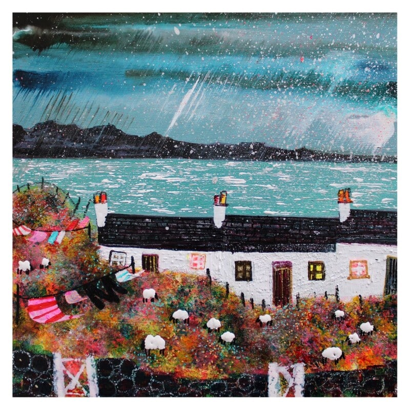
Why Washing’s Oot, Rain’s Coming Works Beautifully as Scottish Cottage Wall Art

Image of Washing’s Oot, Rain’s Coming by Nikki Monaghan

The most effective Scottish cottage wall art usually carries some sense of real life rather than looking too polished or generic. A cottage interior often benefits from artwork that feels warm, familiar, and quietly characterful. Washing’s Oot, Rain’s Coming does that especially well, bringing humour and place into the room without making the walls feel overly themed.

Why cottage interiors suit artwork with personality

Cottages often feel best when they are allowed to keep some individuality. Whether the space is rural, coastal, or village based, the aim is usually comfort rather than formality. Artwork can strengthen that mood by adding story and local flavour. Washing's Oot, Rain's Coming has an easy charm that helps a room feel lived in and welcoming, rather than decorated to a formula.

That makes it a strong choice for a kitchen wall, stair landing, snug, or entrance where a little humour and everyday warmth can make the whole home feel more personal. It gives the space identity without demanding too much attention or pushing the room toward novelty.

  • It adds character and local flavour without becoming over themed.
  • It suits cottage rooms that benefit from warmth rather than strict formality.
  • It offers a more lasting and display-worthy finish than generic rustic wall decor.

Why a hand-finished print suits a characterful home

First 4 Frames completes each piece in-house in Falkirk using bespoke framing, colour-managed Giclee printing, and hand-finished craftsmanship. That level of finish helps the artwork feel settled and substantial in the home, which matters when the goal is to choose something with real staying power rather than a temporary decorative nod.

You can explore more work by Nikki Monaghan and view the exact framed print here.

If you are looking for Scottish cottage wall art that feels warm, witty, and genuinely rooted in place, Washing’s Oot, Rain’s Coming is well worth a look.

Posted on

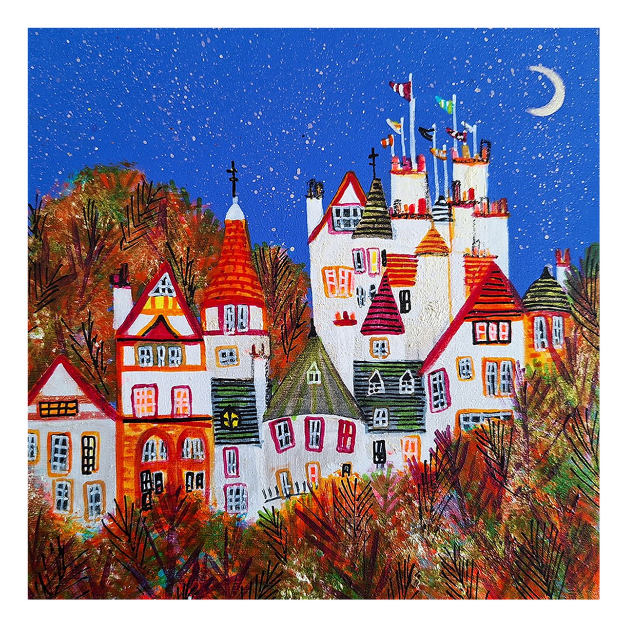
Interior Design Wall Art, Why AUTUMN NIGHTS, RAMSAY GARDENS Feels So Considered

A whimsical, colorful painting titled AUTUMN NIGHTS, RAMSAY GARDENS depicts tall quirky houses with red roofs and towers, surrounded by autumn trees under a starry sky with a crescent moon and flags atop the tallest building.

The best interior design wall art helps several parts of a room speak to each other at once. AUTUMN NIGHTS, RAMSAY GARDENS does that particularly well, combining architecture, evening atmosphere, and autumn colour in a way that feels considered rather than merely decorative.

That makes it a useful piece for interiors that want mood and polish without relying on safe, forgettable filler art.

Why Designers Often Want More Than A Colour Match

Artwork becomes more valuable in a scheme when it can connect palette, line, and emotion together. This Edinburgh scene has enough structure to support furniture and finishes, but enough warmth to stop the room feeling too arranged.

  • It adds architectural shape as well as colour.
  • It brings evening atmosphere without darkening the whole room.
  • It suits buyers who want a more designed, less generic finish.

Where This Kind Of Piece Works Naturally

AUTUMN NIGHTS, RAMSAY GARDENS would work especially well in a sitting room, dining area, hallway, or study where the artwork needs to add both place and polish. It pairs particularly well with olive, aubergine, charcoal, walnut, and brushed metal because the image already balances warmth with structure.

That gives the room a stronger identity without making the wall feel too busy.

Why The Craftsmanship Keeps It Elegant

A scene with this much evening colour can quickly lose sophistication if the print or framing feels weak. First 4 Frames completes the bespoke framing and colour-managed Giclee production in-house, helping the finished piece keep its richness and clarity.

You can view the exact framed product here, and browse more from Nikki Monaghan if you enjoy Scottish city scenes with the same colour-led atmosphere.

For buyers searching for interior design wall art that feels composed, atmospheric, and genuinely useful in a scheme, AUTUMN NIGHTS, RAMSAY GARDENS is a strong choice.