online frame designer is most useful when it helps you test a real artwork against the wall rather than encouraging a frame choice in isolation. Concorde (Blue) gives the decision a specific image, palette and finished product.
Test Concorde Blue in an online frame designer as a complete object
Preview decision
What to test
Tonal separation
Make sure the blue aircraft remains distinct from mount, frame and wall.
Graphic alignment
Use the jet’s central axis and V-shaped shadow to spot a frame that feels visually skewed.
Finished size
Judge the outer frame, not only the printed image shown on screen.
Viewing distance
Step back to the normal doorway, desk or seating position before deciding.
Peter McDermott presents Concorde from above, reducing a famous aircraft to a crisp silhouette, shadow and strong field of blue. The wording about twice the speed of sound adds another graphic element. A busy moulding can interrupt that economy, while a frame with no tonal boundary can let the image disappear into a blue or grey wall.
Should the frame match the aircraft blue?
Usually, exact matching is less useful than separation. Compare a quieter pale direction, a darker defining edge and one warmer option. The preview should reveal which treatment keeps the aircraft clear without surrounding it with another competing statement.
Photograph the wall in even daylight.
Enter the artwork and likely outer dimensions accurately.
Save three genuinely different frame directions.
View each option at room scale, not only close up.
Check the preferred result against nearby screens, shelving and metal finishes.
Confirm the online frame designer result with real room materials
A digital preview helps narrow the choice, but colour and proportion still deserve a careful final check. Concorde’s hard edges and blue field benefit from colour-managed Giclée production. Bespoke framing completed in-house can then preserve the alignment and clean separation seen in the chosen preview.
An online frame designer should make comparison easier, not replace judgement. Concorde Blue provides a disciplined test: keep the geometry precise, the blue distinct and the complete framed size right for the wall.
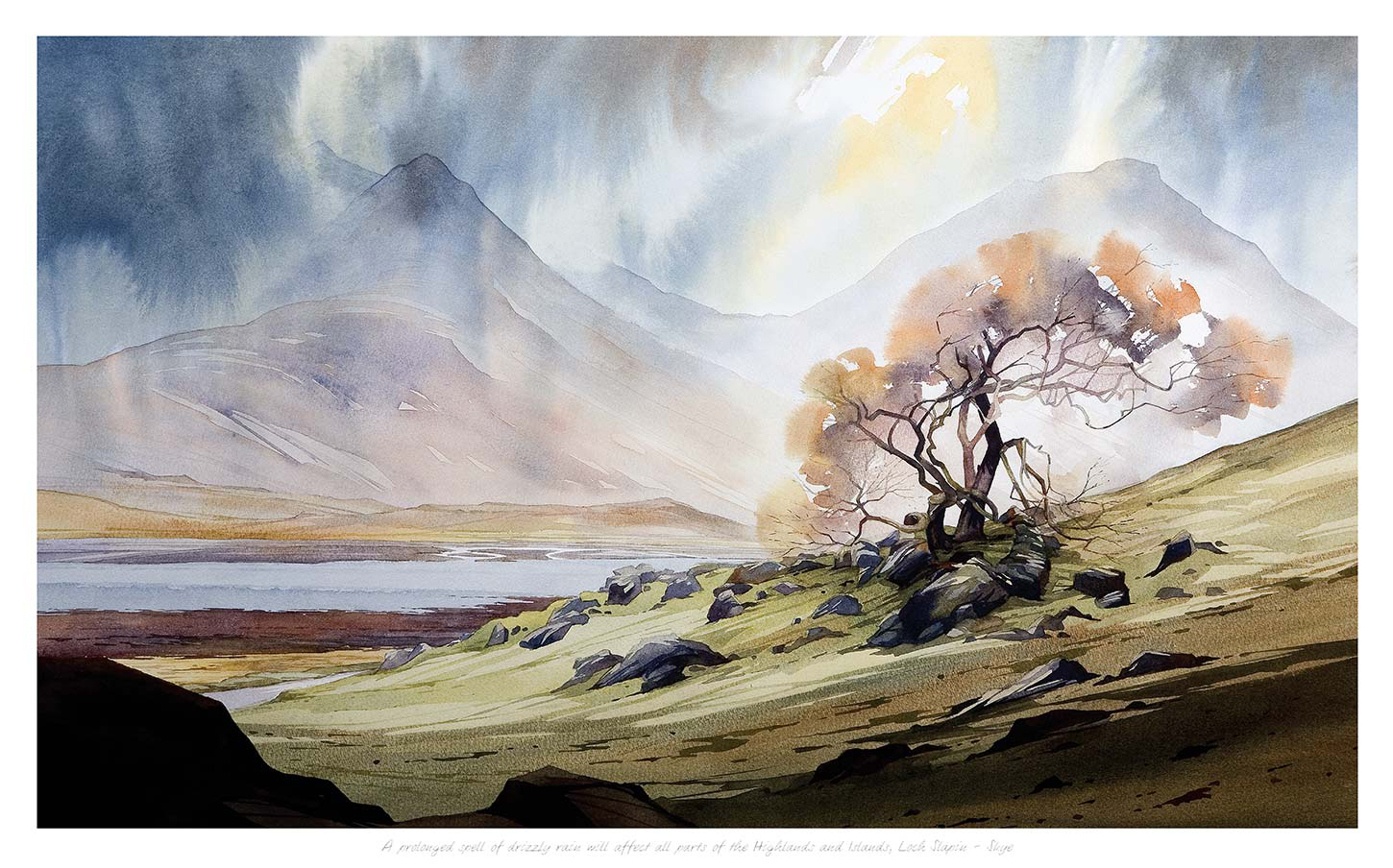
A gift for a meteorologist should recognise a fascination with real weather, not simply add another cloud-shaped ornament to a desk. A prolonged spell of drizzly rain will affect all parts of the Highlands and Islands by Peter McDermott offers a more observant idea. Its long, knowingly precise title sounds like a forecast, while the Highland scene shows why those words matter: shifting visibility, damp atmosphere and light moving through a dramatic landscape.
Why this landscape makes a meaningful gift for a meteorologist
Meteorology begins with attention. Cloud layers, moisture, wind and visibility continually alter how a place appears. This print rewards the same kind of looking. The landscape is not a fixed postcard view under a perfect blue sky. It feels exposed to a passing system, with the weather actively shaping depth, tone and mood.
The title adds dry humour without turning the picture into a joke. Anyone who has read a detailed regional forecast will recognise its formal rhythm. Yet the artwork remains substantial enough to hang in a home, forecast office or study after the occasion has passed. That balance makes it suitable for a professional milestone as well as a personal celebration.
Match the print to the occasion
Occasion
Why the print fits
Personal detail to add
Graduation
Connects scientific training with the landscape it helps explain
Name the course, field trip or first forecasting role
Retirement
Marks years spent reading conditions and communicating uncertainty
Mention a memorable storm, station or region
New job
Offers a polished focal point for a home study or office
Write the date and location of the new post
Thank you
Feels specific without being overly formal
Recall the forecast or practical advice that helped
A short card can supply the exact story. Perhaps the recipient is known for explaining Atlantic systems clearly, always carries a rain gauge, or has a special connection to Skye and the Highlands. Let that note carry the private reference. The framed image can stay visually strong and useful in its own right.
Look beyond novelty weather gifts
Forecast-symbol mugs and slogan T-shirts can be amusing, but they often reduce a skilled profession to a familiar cliché. Landscape art approaches the subject from another direction. It shows the visual consequences of weather and leaves room for the recipient’s own knowledge. A meteorologist can read more in the sky and terrain than another viewer, which gives the piece an added private layer.
Professionally relevant: the image depends on changing atmosphere rather than a generic weather icon.
Connected to place: the Highlands and Islands make the forecast-like title geographically specific.
Made for display: a framed Giclée print has a lasting role in a room.
Quietly humorous: the wording raises a smile without overwhelming the artwork.
Choose a display position with changing light
A home office or study is a natural destination, especially when the recipient checks charts or writes at a desk. Place the artwork where it can be seen from the main chair but does not sit directly opposite a bright window. Soft daylight can reveal the tonal shifts in the clouds and land, while careful positioning reduces reflections in the glazing.
The print could also suit a staff room, university office or reading corner. Leave enough clear wall around it for the long title and broad landscape to register as one idea. Avoid surrounding it with several small weather diagrams or instruments. One barometer nearby may feel relevant; a whole themed display will compete with the subtler atmosphere.
Use framing to hold the unsettled scene
A simple dark moulding can relate to the deeper landforms and give the changeable sky a firm boundary. A natural timber frame may feel warmer in a domestic study. A measured pale mount can separate the damp, layered colours from a stronger wall tone. The best choice should respond to the room rather than imitate the grey of a rain cloud.
First 4 Frames uses colour-managed Giclée production and completes bespoke framing in-house at its Falkirk workshop. That careful process helps preserve the small tonal differences that make cloud, rain and distant land readable. Hand-finished presentation turns the witty title and atmospheric image into a complete, ready-to-hang gift.
aviation wall art for a home cinema needs enough presence to hold its own in a darkened room, but it should not make the space feel like a themed attraction. Concorde by Peter McDermott offers a disciplined solution. The aircraft is reduced to a powerful frontal silhouette, set against layered blue-grey clouds. Its poster-like clarity brings drama from a distance, while the restrained palette remains easy to live with when the screen is off.
Why aviation wall art for a home cinema works
A home cinema often contains broad, quiet surfaces. Dark paint, acoustic panels and low furniture support viewing, yet they can leave the room looking unfinished in daylight. Concorde introduces a recognisable subject without adding lots of small detail. The near-symmetrical aircraft and centred lettering feel deliberate, much like a carefully composed film poster.
The portrait format is helpful too. It can occupy a narrower wall beside the screen, between doors or above a low equipment cabinet. The image creates height without requiring a wide gallery arrangement. Blue-grey colour also sits comfortably with charcoal, navy, black and natural timber, which are common choices for cinema rooms.
Choose a wall outside the main viewing cone
Artwork should enrich the room when people enter, then recede while a film is playing. Avoid placing glazed work directly beside the screen where it can reflect bright scenes. A side wall near the entrance or the wall behind the seating usually offers a better balance. The print remains visible during conversation without competing for attention during viewing.
Mark the finished frame size. Use paper to judge the portrait proportions beside doors, speakers and cabinets.
Sit in every seat. Check that the glazing does not catch the projector or television from an angle.
Test the lights. View the paper template with task lighting, wall lights and the screen on.
Protect the sound treatment. Fix into a suitable wall rather than attaching the frame to an acoustic panel.
Keep controls clear. Leave comfortable access to switches, sockets and ventilation.
Build the palette from the clouded blue
The artwork is dark, but it is not simply black. Its blue-grey ground can soften a cinema scheme that might otherwise feel severe. Deep navy walls will create a close tonal relationship. Charcoal walls will make the cooler blue more visible. On a lighter grey wall, a dark frame can connect the silhouette to nearby speakers or equipment.
Room finish
Useful response
Effect
Navy walls
Choose a slim dark frame
Keeps the poster-like image integrated and calm
Charcoal walls
Allow a modest pale mount
Separates the aircraft outline from the darker room
Timber panelling
Echo the black silhouette in small details
Balances warm material with graphic precision
Mid-grey paint
Use the blue ground as the main colour accent
Avoids adding unnecessary cinema-red accessories
Use low light without creating glare
A narrow picture light can look impressive, but it may reflect in the glazing or remain distracting during a film. Dimmable ambient lighting is usually more flexible. Let a wall washer or shaded lamp reveal the aircraft before viewing, then lower it fully with the rest of the room. The cloud shapes should remain visible without becoming a luminous rectangle.
Check the artwork when the screen shows a very bright image. Reflections change with seating position, so one standing test is not enough. If necessary, move the frame farther from the screen or adjust the angle of the nearby light. Careful placement protects both the viewing experience and the print’s strong graphic effect.
Let one aircraft image carry the theme
Concorde has enough cultural and engineering presence to work alone. It does not need model aircraft, airport signs or a row of transport photographs around it. Keeping the surrounding wall clear makes the room feel designed rather than collected around a theme. A few materials from the image, such as dark metal and smoky blue fabric, can create connection more subtly.
First 4 Frames uses colour-managed Giclée production and completes bespoke framing in-house at its Falkirk workshop. That precise, hand-finished presentation suits the clean outline and subtle shifts in the blue-grey background. It also ensures the finished piece arrives ready to become a properly resolved part of the room.
Well-positioned aviation wall art for a home cinema can give a viewing room character before the opening credits without distracting from the screen. View the framed Concorde print for a bold focal point built on speed, form and controlled colour.
blue wall art for an industrial home office should earn its place by answering a real question about the room or recipient. Clifton Suspension Bridge (Blue) is a useful starting point because Peter McDermott’s treatment of a great engineering landmark can relate to steel, timber and functional furniture while giving the workspace a measured field of colour.
Place blue wall art for an industrial home office with structure
An industrial interior already contains strong lines. Align the finished frame with a desk, low cabinet or shelving bay, but do not force every edge into rigid symmetry. The bridge can provide direction while the room retains the practical irregularity of a working space.
Clear temporary papers from the proposed sightline.
Mark the complete framed outline above low furniture.
Check it from the seated desk position and doorway.
Move monitor glare and task lights away from the glass.
Keep cable routes clear of the lower frame.
Blue need not make the office cold. Natural timber, warm lamp light and one tactile fabric can balance the image. Avoid repeating its hue across every storage box and chair; the artwork should remain the intentional colour statement.
Why choose a bridge instead of office typography?
Engineering conveys span, connection and purpose through the subject itself. It can suggest ambition without instructing the viewer through a printed slogan.
Let engineering and craftsmanship share a precise edge
Architectural subjects reveal weak alignment quickly. Colour-managed Giclée production supports clean distinctions in the blue treatment, while accurate mounting and a bespoke frame made in-house give the bridge enough definition alongside metal and timber furniture.
Blue wall art for an industrial home office can provide both order and personality. Clifton Suspension Bridge contributes a recognisable structure, while restrained colour repetition keeps the workspace warm and usable.
ready to hang wall art for a traditional study should earn its place by answering a real question about the room or recipient. Urquhart Castle is a useful starting point because its castle, green headland, Loch Ness and dramatic cloud bring place and history into the room in one clearly defined illustration.
Choose ready to hang wall art for a traditional study with restraint
A study may already contain timber, books and objects gathered over time. The picture should have a clear role rather than join a loose historical collection. Give it one visible wall above low shelving or beside the desk, then remove small souvenirs from the immediate area.
Connect through material
A natural timber frame can speak to existing furniture, while a darker finish can separate the green hill and water from warm walls. The choice should support the illustration, not imitate castle stone.
The printed title beneath the image gives the location enough explanation. Additional maps, tartan and heraldic objects are unnecessary. Let books supply the layered setting and allow the colourful landscape to provide the study’s open view.
Measure the complete framed dimensions.
Check the picture from the desk chair and doorway.
Keep the lower edge clear of leaning books.
Angle reading lamps away from the glazing.
Make historic subject matter feel complete, not themed
Ready-to-hang presentation removes uncertainty only when the mount, frame and colour are resolved together. First 4 Frames completes Giclée production and bespoke framing in-house, giving the castle illustration a durable finish suited to close study.
Ready to hang wall art for a traditional study should add depth without demanding a whole decorative theme. Urquhart Castle brings Scottish place, colour and history, while disciplined surroundings keep the room useful and personal.
How to choose a frame for artwork becomes a more interesting question when the subject is moving decisively through the composition. Peter McDermott’s Concorde shows the aircraft climbing against dark cloud. The frame must contain that energy, but it should not make the aircraft feel boxed in or interrupt the sense of ascent.
How to choose a frame for artwork with a strong diagonal
Identify the direction of travel before looking at mouldings.
Preserve clear visual space in front of the aircraft and around its nose.
Compare a narrow dark edge with a lighter neutral frame beside the actual wall colour.
Judge the full framed size from the intended desk, doorway or reading chair.
A dark frame
A slim charcoal or black moulding can connect with the cloud and sharpen the silhouette. Keep it narrow so the dark boundary does not close down the sky.
A pale or natural frame
A lighter edge can separate the moody image from a deep wall. It also gives the upward aircraft a little more visual air, especially in a compact study.
Aviation memorabilia nearby should be edited carefully. One model or technical book can support the subject. A wall of signs, clocks and aircraft objects would turn a precise image into part of a theme display.
Test finish and reflection before committing
The aircraft silhouette and subtle cloud need clean definition. Colour-managed Giclée production retains both crisp edges and quieter tonal changes. In-house bespoke framing also allows the moulding, mount and glazing to be considered together. That is especially valuable in a study, where window and monitor reflections can otherwise obscure the darker sky.
Learning how to choose a frame for artwork is partly about respecting the picture’s internal movement. With Concorde, a measured border, enough space around the aircraft and controlled lighting will keep the climb feeling open and purposeful.
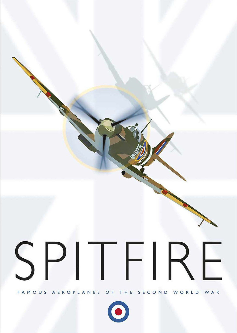
Vintage poster prints can bring history and forward motion to a study when they are treated as artwork rather than memorabilia. Spitfire places a stylised fighter aircraft above a faded Union Jack, with a second aircraft in shadow. The strong diagonal movement can energise a desk wall without needing a crowded display.
Balance vintage poster prints with quiet furniture lines
Above a desk
Set the picture slightly above the monitor line and leave room for the aircraft to appear to travel across the wall. Keep cables and tall desk accessories out of that visual route.
Above a low cabinet
Relate the framed width to the furniture below. One model or book stack is enough; a full row of aviation objects would turn the arrangement into a themed exhibit.
Does the room need red, white and blue accessories?
No. The faded flag already establishes that palette. Dark timber, leather, warm grey or muted blue can support the print without repeating every colour literally.
The subject also works on a video-call backdrop if it is offset from the sitter rather than centred behind the head. That placement keeps the aircraft readable and lets the image convey interest without distracting from conversation.
Frame graphic movement without making it heavier
The aircraft outline, shadow form and weathered flag require both crisp edges and controlled softer passages. Colour-managed Giclée production preserves that contrast. A hand-finished frame can then contain the diagonal energy while giving the print the polished finish expected in a working room.
Among vintage poster prints, Spitfire offers a useful mix of graphic strength and aviation history, provided the surrounding study gives its movement room to breathe.
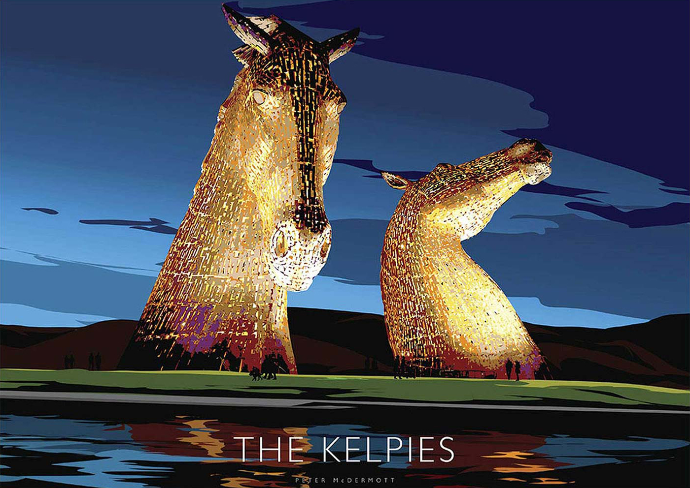
Kelpies wall art for a room with statement lighting needs more than a shared dramatic mood. The Kelpies at Night by Peter McDermott presents the Falkirk landmark after dark, when illumination shapes the sculpture. It can echo a pendant or sculptural lamp beautifully, provided neither focal point blocks the other.
Position Kelpies wall art for a room with statement lighting carefully
Separate the focal points
Place the framed work beyond the outer edge of a large pendant when viewed from the main seat. This preserves the full silhouettes and prevents the fitting from appearing to hang inside the image.
Control reflected light
Switch on every evening light before fixing the frame. Move the artwork or adjust the beam if a bright bulb reflection lands across either horse’s head.
The night subject can anchor a dining room, stair hall, or lounge where lighting already has a sculptural role. Keep nearby furniture simpler. A dark console, quiet upholstery, and one metallic detail can support the scene without turning the room into a display of competing shiny surfaces.
Judge the position in daylight and after dark.
Keep the frame clear of pendant drops and wall-light spill.
Repeat one cool or warm light note, not every colour in the image.
Leave enough plain wall for the landmark silhouette to remain legible.
Let controlled reproduction hold the night-time detail
Dark scenes need clear separation between structure, sky, and artificial light. Colour-managed Giclée production preserves those differences. A hand-finished bespoke frame gives the image definition under changing room light, while in-house assembly allows the presentation to feel precise rather than theatrical.
As Kelpies wall art for a room with statement lighting, The Kelpies at Night works best when illumination is treated as part of the hanging plan, not as an afterthought.
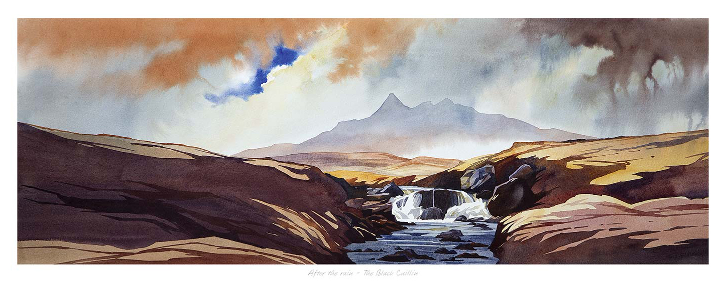
Panoramic Scottish wall art for a low-ceiling living room can create breadth without pretending the room is taller than it is. After the rain, The Black Cuilllin by Peter McDermott draws the eye laterally across rocks, running water, the Black Cuillin, and a vivid break in the weather. That wide movement makes the architecture feel intentional rather than compressed.
Hang panoramic Scottish wall art for a low-ceiling living room by width
Start with the furniture, not the ceiling. Above a sofa or long sideboard, centre the framed work on the piece below and leave a comfortable gap between them. Pushing art close to the cornice usually emphasises a low ceiling. A lower, properly connected position lets the long composition do the widening work.
Check
Useful response
Wall width
Leave clear space at both ends so the panorama does not look squeezed.
Seated view
Judge the mountain line from the sofa, not only while standing.
Lighting
Use side lighting and test the glazing for reflections after dark.
Colour
Repeat one slate, rust, or blue note instead of copying the whole sky.
The waterfall gives the scene a vertical counterpoint, but the dominant reading remains horizontal. Keep tall accessories away from the frame ends. A low lamp, simple ceramics, and uncluttered upholstery allow the changing orange and blue sky to provide the drama.
Use a quiet frame to contain dramatic Highland weather
A panoramic image exposes any weakness in alignment or finish. Colour-managed Giclée production keeps the bright sky separate from the dark mountain silhouette and rocky foreground. Bespoke framing, completed in-house in Falkirk, gives the long limited-edition print a precise edge and dependable presence.
As panoramic Scottish wall art for a low-ceiling living room, After the rain, The Black Cuilllin creates openness through composition, not decorating tricks, while keeping the room comfortable and grounded.
Choosing wall art for a room with natural textures calls for more than matching brown with brown. A prolonged spell of drizzly rain will affect all parts of the Highlands and Islands layers misty mountains, still water, scattered rock, and a lone tree beneath changing cloud. Those elements relate naturally to timber, wool, linen, and woven blinds while bringing cool distance into the scheme.
Build wall art for a room with natural textures through contrast
Echo materials gently
Rocky ground can connect with stone or flecked wool. The tree relates to timber, but the relationship stays subtle because the landscape remains the focus.
Add visual distance
Mist and open water prevent a tactile room from feeling visually dense. They give the eye somewhere quieter to travel beyond the furniture.
A warm natural-timber frame can strengthen the organic character. A charcoal edge offers more definition beside paler oak and cream fabric. Judge the choice against the room’s real daylight, especially where woven blinds soften it.
Texture feels most convincing when artwork adds atmosphere as well as another surface.
First 4 Frames produces the limited-edition Giclée print and bespoke frame in-house in Falkirk. Colour-managed printing protects the fine shifts between cloud, water, and hillside, while hand-finished framing gives the soft watercolour a clear outer edge.
As wall art for a room with natural textures, A prolonged spell of drizzly rain will affect all parts of the Highlands and Islands brings weather, stillness, and depth to an organic interior without turning it into a theme.