
Posted on

How to Choose a Frame for Artwork, Why Resting Boats Is a Useful Example

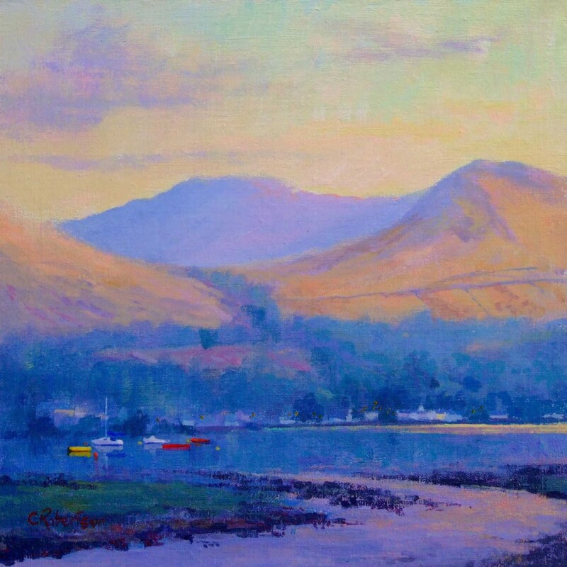
Image of Resting Boats by Colin Robertson

If you are wondering how to choose a frame for artwork, it helps to look at a piece where the mood is subtle enough for the frame to make a visible difference. Resting Boats is a strong example because the image can lean cleaner, warmer, softer, or more structured depending on the framing direction.

That is often what customers miss at first. The picture is important, but the frame decides how the artwork will actually sit in the room and how complete it feels on the wall.

What The Frame Changes Most

With a calm coastal piece like this, frame choice has a direct effect on mood. A darker frame can add definition and confidence, while a lighter or warmer finish can keep the overall look softer and more relaxed.

  • It changes whether the piece feels crisp or gentle.
  • It affects how much contrast the artwork brings to the room.
  • It helps connect the print to timber, paint, and furniture already in place.

Why A Harbour Scene Makes The Lesson Clearer

Resting Boats has enough tonal variation to show framing differences clearly, but it is not so loud that the image overwhelms the decision. That makes it a useful reference point for buyers trying to think about frame colour, weight, and finish more deliberately.

Why In-House Framing Matters

First 4 Frames completes bespoke framing and colour-managed Giclee production in-house, which means the final decisions about presentation are treated as part of the artwork rather than an afterthought. That is where a well-chosen image becomes a properly resolved framed piece.

You can view the exact framed product here, and browse more from Colin Robertson if you want more examples of artwork that responds beautifully to thoughtful framing.

For anyone learning how to choose a frame for artwork in a more confident way, Resting Boats is a very helpful example.

Posted on

Why Resting Boats Works Beautifully as Wall Art for Painted Panelling

Image of Resting Boats by Colin Robertson

Good wall art for painted panelling should work with the architecture rather than fight it. Painted panelling gives a room shape and structure, but it can also make the walls feel more formal unless the artwork introduces some ease. Resting Boats is especially effective because it brings calm and openness without losing definition.

Why panelled rooms need a little softness

Joinery brings welcome detail, yet it also creates lines, edges, and repetition. Artwork can balance that by introducing atmosphere and a more relaxed focal point. The aim is not to erase the character of the room, but to stop it feeling overly mannered.

  • It suits dining rooms, stair halls, and sitting rooms with painted panelling.
  • It softens stronger architectural lines.
  • It helps a traditional room feel lighter and more lived in.

Why Resting Boats feels so successful

The composition has enough clarity to stand up to a detailed wall treatment, but the overall mood remains calm. That makes it ideal where the room already has structure and simply needs a more relaxed centre of attention.

Why the First 4 Frames finish matters

First 4 Frames completes every piece in-house in Falkirk using bespoke framing, colour-managed Giclée printing, and hand-finished craftsmanship. That superior presentation helps the finished piece feel worthy of a room with thoughtful joinery and traditional detail.

This artwork is by Colin Robertson, and you can view the exact framed product here.

If you are looking for wall art for painted panelling that feels composed, gentle, and timeless, Resting Boats is a lovely option.