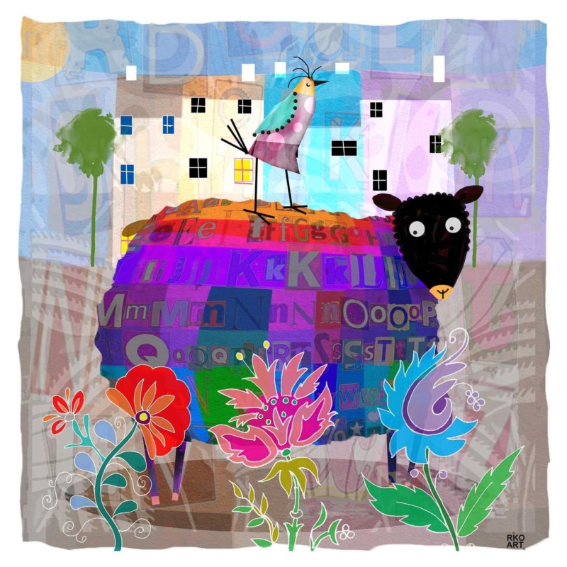
Sheep wall art for a cottage breakfast room can bring warmth and humour without requiring the rest of the space to follow a farmyard theme. Alphie Baa by Rikki O’Neill has a compact square format and a clear individual presence. It can greet the day beside a small table while leaving worktops and shelves visually uncluttered.
Keep sheep wall art for a cottage breakfast room fresh, not themed
Give the character one clear wall
Choose a position visible from the table, such as above a slim bench or on the return wall beside a window. The square proportion is useful where doorways, cabinets, or beams reduce the available width. Mark the full framed outline before deciding on height.
One characterful animal picture can feel personal; a room full of farm motifs can quickly feel staged.
Pair the print with honest materials already common in a cottage kitchen: painted timber, plain linen, stoneware, or a scrubbed wood table. Resist adding sheep ornaments and novelty wording. A small vase of seasonal stems is enough to soften the arrangement without repeating the subject.
- Check the seated sightline from every place at the table.
- Keep the lower edge safe from chair backs and passing shoulders.
- Test reflections during bright breakfast light.
- Use one restrained frame tone to connect with furniture or hardware.
Give a compact square print confident definition
Small artwork benefits from exact presentation because there is nowhere for weak detail to hide. Colour-managed Giclée printing maintains the image’s character, while bespoke framing creates a clean edge against plaster, panelling, or stone. The in-house hand finish makes the piece feel considered rather than merely decorative.
For a useful introduction to the variety behind the familiar subject, see the National Sheep Association’s guide to sheep breeds. Browse more work by Rikki O’Neill, or view the exact Alphie Baa framed print.
As sheep wall art for a cottage breakfast room, Alphie Baa adds an easy smile and a polished focal point while allowing the room to remain practical and grown-up.