Posted on

Sunflowers in Blue Vase: Wall Art for a Navy Kitchen

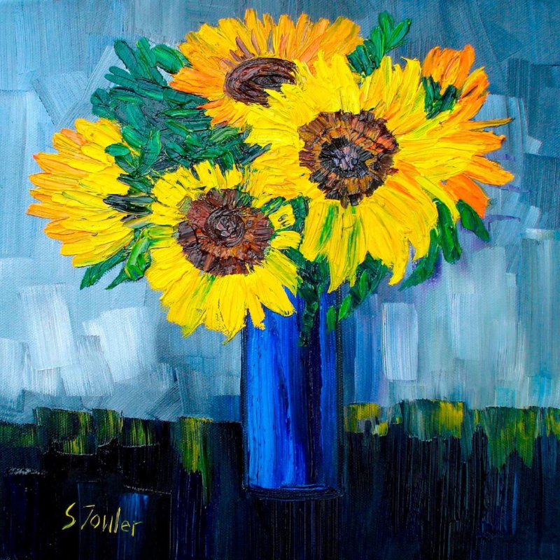
Image of Sunflowers in Blue Vase by Sheila Fowler

wall art for a navy kitchen has an important job. Deep blue cabinets already give the room confidence, so the picture should add warmth and life without turning every surface into another blue accent. Sunflowers in Blue Vase by Sheila Fowler offers a well-judged answer. Its vase relates to the cabinetry, while the sunflowers introduce light, movement, and a clear complementary colour.

wall art for a navy kitchen: Sunflowers in Blue Vase by Sheila Fowler

Why wall art for a navy kitchen needs warmth

Navy joinery can feel elegant and grounded, particularly with pale worktops or warm metal handles. Yet a large run of dark cabinets can also make the room appear cooler or heavier. Yellow sits opposite blue in the colour wheel, so even a modest amount creates energy and helps the darker finish feel intentional.

The floral subject matters as much as the palette. Kitchens contain many straight lines: doors, drawers, shelves, tiles, and appliance edges. Curving stems and irregular petals soften that geometry. The still life gives the eye a pause without asking the room to become rustic or overtly botanical.

Build a restrained palette from Sunflowers in Blue Vase

Colour noteWhere it can appearWhat it contributes
Deep blueCabinetry or islandStructure and visual calm
Warm yellowArtwork and one small accessoryBrightness and contrast
Soft whiteWalls, worktops, or ceramicsBreathing space
Natural timberStools, boards, or frameWarmth and texture

The useful rule is to let the artwork carry most of the yellow. One bowl, tea towel, or small ceramic can repeat it, but a full set of matching accessories may make the scheme feel staged. The blue vase already creates a direct connection to the kitchen.

Find a wall away from heat and visual clutter

A dining end, breakfast corner, or wall beside a pantry often works better than the space immediately above a hob or sink. The artwork will be easier to enjoy and less exposed to heat, steam, and splashes. It should also have enough clear wall around it to remain visible when counters are in everyday use.

Use nearby furniture to set the scale. Above a small table, the picture should relate to the table width rather than the full wall. On a narrow return wall, a compact frame with generous space around it can create a deliberate focal point. Avoid squeezing it between tall cabinets if the frame would appear trapped.

Choose a frame that connects the finishes

Light or mid-tone timber can link the floral warmth to oak shelves, flooring, or dining furniture. A slim dark frame gives a sharper finish and may suit contemporary handles or black lighting. A blue moulding is rarely necessary; the vase and cabinets already establish that colour relationship.

First 4 Frames uses colour-managed Giclée production and completes bespoke framing in-house in Falkirk. This helps retain variation in both the yellow petals and the blue vessel, while a considered frame makes the print feel part of the room rather than an accessory chosen after the kitchen was finished.

Bring colour into the kitchen without over-coordinating

See more of the artist’s bright Scottish landscapes and floral paintings on Sheila Fowler’s official website, and browse the wider Sheila Fowler collection. If you need wall art for a navy kitchen that balances dark cabinetry with warmth and organic detail, view the framed Sunflowers in Blue Vase print.

Posted on

Woodland Bluebells: Wall Art for a Dark Green Sofa

Image of Woodland Bluebells by Sheila Fowler

wall art for a dark green sofa needs to do more than repeat the colour of the upholstery. A successful piece should connect that strong furniture choice to the rest of the room and stop the seating from feeling like a heavy block. Woodland Bluebells by Sheila Fowler offers a useful balance. Its woodland greens relate naturally to the sofa, while bluebells, light, and receding trees open the view beyond it.

wall art for a dark green sofa: Woodland Bluebells by Sheila Fowler

Why wall art for a dark green sofa should create contrast

Dark green upholstery can anchor a living room beautifully, but it already carries considerable visual weight. An artwork dominated by the same deep tone may make the wall and sofa merge into one dense area. At the other extreme, a very pale abstract can look disconnected from the furniture beneath it.

Woodland Bluebells bridges those two positions. The woodland subject shares the sofa’s natural colour family, yet the lighter path through the trees gives the composition space. Blue and violet notes add a second accent without fighting the green. The result feels coordinated, not matched by formula.

Build the room from three colour notes

  1. Keep the sofa as the deepest green in the scheme.
  2. Repeat one softer bluebell tone in a cushion, throw, or small ceramic.
  3. Use the pale woodland light as a guide for walls, curtains, or a rug.

This limited approach keeps the room calm. It also means the artwork can provide the detailed colour variation while larger furnishings remain simple. There is no need to introduce botanical patterns everywhere. One well-placed landscape can carry the natural reference on its own.

Use woodland depth to lighten the seating wall

A sofa creates a strong horizontal line, especially when it sits against a plain wall. Hanging a woodland image above it introduces vertical trunks and a route into the distance. Those opposing directions bring useful structure to the arrangement and make the wall feel taller.

Measure from the outside edges of the sofa rather than from the whole wall. The framed piece should feel connected to the seating, with enough clear space around it to preserve the sense of woodland air. If a lamp or tall plant already occupies one side, centre the picture over the visual seating area instead of following the room’s mathematical midpoint.

Choose a frame that links, rather than competes

Natural timber can connect the print to wooden floors, side tables, or woven textures. A slim dark moulding may suit a more tailored room and provide a clean boundary between the image and a pale wall. Avoid choosing a green frame simply because the sofa is green; the artwork already supplies that relationship.

First 4 Frames produces colour-managed Giclée prints and completes bespoke framing in-house at the Falkirk workshop. That process makes it possible to judge the woodland’s subtle colour against the moulding, so the finished piece supports both the image and the room rather than relying on a generic frame.

Explore more Scottish landscapes and floral colour on Sheila Fowler’s official website, or browse the Sheila Fowler collection at First 4 Frames. For wall art for a dark green sofa that brings harmony without making the scheme feel overly coordinated, view the framed Woodland Bluebells print.

Posted on

How to Create a Gallery Wall Around White Sands and Wildflowers, Iona

Image of White Sands and Wildflowers, Iona by Sheila Fowler

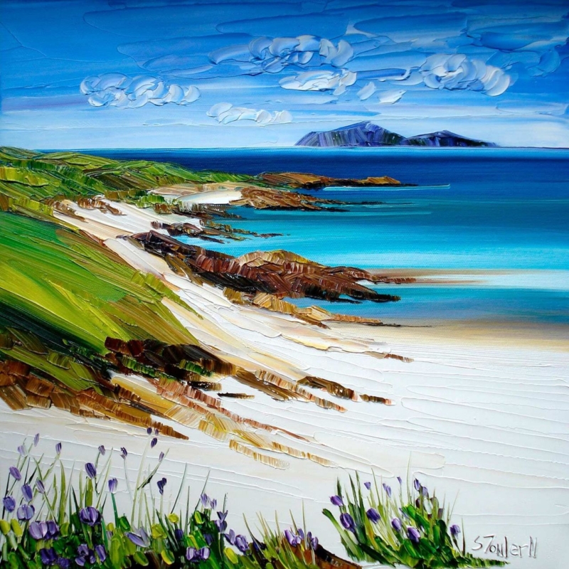
Learning how to create a gallery wall becomes easier when one picture sets the pace. White Sands and Wildflowers, Iona can act as that anchor. Its square shape creates stability, while the open beach, wildflowers, and distant water supply several colours and subjects that smaller companion pieces can develop.

how to create a gallery wall - White Sands and Wildflowers, Iona

How to create a gallery wall from one strong anchor

Begin by placing the anchor slightly off centre. A perfectly central arrangement can feel formal, while a random spread can look unsettled. Build out from the square with one portrait work, one landscape piece, and perhaps a smaller botanical or abstract image. Vary the shapes, but keep the gaps consistent.

  1. Trace each frame on paper and tape the templates to the wall.
  2. Keep a repeated gap between neighbouring edges.
  3. Choose two or three colours from the anchor instead of matching every shade.
  4. Mix coastal, floral, and abstract details so the group feels collected rather than themed.
  5. Photograph the layout and check it from the doorway before making holes.

Use frames to create family resemblance

Frames do not all need to be identical. They do need a shared logic. You might repeat one timber tone while changing widths, or use two related finishes across the group. White Sands and Wildflowers, Iona can carry the most substantial frame, giving the arrangement a visual centre of gravity.

Leave more empty wall around the whole collection than between individual pieces. This outer margin lets the arrangement read as one feature. It also stops a light, airy coastal anchor from losing its sense of openness.

First 4 Frames creates colour-managed Giclée prints and bespoke frames in-house in Falkirk. That one-to-one framing approach can help different artworks sit together with consistent craftsmanship, even when their formats and subjects vary.

Discover the setting through the National Trust for Scotland’s guide to Iona. Then explore more work by Sheila Fowler or start with White Sands and Wildflowers, Iona.

When deciding how to create a gallery wall, White Sands and Wildflowers, Iona provides a calm anchor with enough colour and variety to guide the whole arrangement.

Posted on

Art for a South-Facing Room Can Hold Its Colour With Purple Thistle

Image of Purple Thistle by Sheila Fowler

Choosing art for a south facing room means thinking about how colour behaves from morning to late afternoon. Purple Thistle offers a concentrated purple note and a clear botanical subject. It can stay visually present in generous daylight without making a bright room feel crowded.

art for a south facing room - Purple Thistle

Test art for a south facing room through the whole day

Strong natural light can make a pale picture look washed out at noon, while a very dark work may become dominant later in the day. Purple Thistle occupies a useful middle ground. Its colour creates definition, yet the botanical subject keeps the mood fresh and natural.

  1. Check the proposed wall in direct and indirect light.
  2. Position the frame away from a persistent reflection.
  3. Repeat one purple accent, not an entire matching palette.
  4. Leave clear wall around the square format.

The available 265 mm and 500 mm square print sizes suit different roles. The smaller size can brighten a narrow return wall or breakfast corner. The larger option has enough presence for a brighter sitting room without relying on an oversized composition.

Keep the framing crisp but not harsh

A pale timber frame can preserve an airy mood. A darker edge can give the purple stronger definition against a light wall. First 4 Frames handles the colour-managed Giclée production and hand-finished framing in-house, helping the artwork retain clean colour and a polished edge.

Learn about the plant through NatureScot’s introduction to Scotland’s thistles. Then explore Sheila Fowler’s collection or inspect Purple Thistle in its available sizes.

As art for a south facing room, Purple Thistle brings enough colour to meet strong daylight while keeping the scheme calm.

Posted on

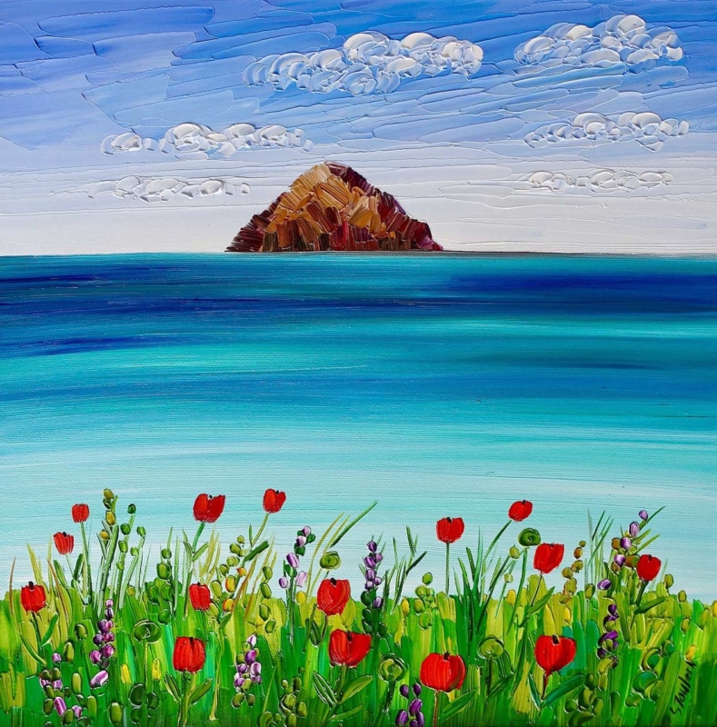
Ailsa Craig and Poppies: Scottish Coastal Floral Wall Art With Real Balance

Image of Ailsa Craig and Poppies by Sheila Fowler

Scottish coastal floral wall art offers something a pure seascape or flower study cannot always provide on its own. It can open up the room with distance, then bring the eye back through colour and texture. Ailsa Craig and Poppies by Sheila Fowler is a useful example. Ailsa Craig gives the composition a strong sense of place, while the poppies make the foreground feel immediate and alive.

Scottish coastal floral wall art: Ailsa Craig and Poppies by Sheila Fowler

What Scottish coastal floral wall art adds to a room

Coastal art often leans heavily on blue, grey, and empty sky. Floral work can move in the opposite direction, filling the frame with close detail and saturated colour. Combining both subjects creates a more flexible focal point. The distant view keeps the image spacious, while the flowers stop it from feeling cool or remote.

That balance makes Ailsa Craig and Poppies suitable for rooms that need colour but not visual noise. It can lift a calm living room, brighten a dining space, or connect a garden-facing room to the wider Scottish landscape. It also gives a neutral scheme one clear colour story without demanding several matching accessories.

Use the poppies as an accent, not a decorating instruction

There is no need to repeat red throughout the room. One or two quieter echoes are enough. A rust-coloured cushion, a warm ceramic, or a small detail in a rug can connect the artwork to the space. Keeping the rest restrained preserves the depth of the coastal view.

The square format is useful too. It can sit above a sideboard, between windows, or on a shorter section of wall where a wide panorama would feel cramped. Measure the available space with the furniture in place. A generous margin around the finished frame will help the sea, sky, and foreground breathe.

Presentation that protects both colour and detail

Strong colour makes print quality especially visible. First 4 Frames uses colour-managed Giclée production and hand-finished framing in-house in Falkirk. This careful presentation supports the subtler shifts in the sky and water as well as the brighter flower colour.

For more context on the artist’s use of Scottish landscapes, coastlines, and flowers, visit Sheila Fowler’s official website. You can also browse the wider Sheila Fowler collection before deciding whether this mix of landmark and wildflower colour is right for your room.

When you want Scottish coastal floral wall art with both openness and warmth, see Ailsa Craig and Poppies at First 4 Frames. It brings a recognisable west-coast subject into the home without becoming generic seaside decor.

Posted on

Botanical Wall Art Can Bring Woodland Calm Home With Woodland Bluebells

Image of Woodland Bluebells by Sheila Fowler

Botanical wall art need not depend on a formal flower study. Woodland Bluebells takes a wider view, setting bluebells within the rhythm and filtered light of woodland. That makes it particularly useful in a conservatory, breakfast area, or sitting room that already looks towards a garden.

botanical wall art - Woodland Bluebells

Let botanical wall art complement the view

Artwork beside a window should not try to imitate every colour outdoors. Instead, choose one connection. Here, the bluebell tones can pick up soft blue fabric, glazed ceramics, or cooler shadows in the garden. The tree forms then add structure, helping the room feel settled even when the outdoor view changes with the seasons.

Support the picture

  • Natural timber
  • Soft blue accents
  • Warm neutral walls

Keep it composed

  • Avoid dense floral patterns nearby
  • Control direct window glare
  • Leave space around the square frame

The available square format can create a calm pause among long windows or vertical furniture. First 4 Frames uses colour-managed Giclée production and bespoke framing in its Falkirk workshop. That in-house approach helps preserve subtle woodland colour while giving the finished piece clean definition.

Learn more about this protected native flower through the Woodland Trust’s bluebell guide. Then browse the Sheila Fowler collection or see Woodland Bluebells in detail.

For botanical wall art with atmosphere as well as colour, Woodland Bluebells offers a natural bridge between the interior and the landscape beyond it.

Posted on

Art for Tongue and Groove Walls Blooms Naturally With Ailsa Craig and Poppies

Image of Ailsa Craig and Poppies by Sheila Fowler

Choosing art for tongue and groove walls means working with a surface that already has a clear visual rhythm. The repeated boards can make a room feel crisp and architectural. Ailsa Craig and Poppies introduces a softer counterpoint through poppies, coast, and distant land, so the wall feels layered rather than lined.

art for tongue and groove walls - Ailsa Craig and Poppies

Hang art for tongue and groove walls with the boards in mind

First check that the hanging point is secure for the wall construction. Visually, position the frame so its edge looks deliberate against the grooves. A picture that is slightly too narrow can appear trapped between vertical lines. A more generous width interrupts that pattern and establishes a proper focal area.


Let the landscape open the wall

The distant shape of Ailsa Craig creates depth, while the poppies keep the foreground lively. That combination is especially effective on white, soft green, or pale blue panelling. The flowers add warmth, but the open view prevents the scheme from becoming overly cottage-like.

A carefully chosen mount can create breathing space between the busy board lines and the image. First 4 Frames produces and frames the work in-house, using colour-managed Giclée printing and bespoke craftsmanship to give the coastal colours a polished, lasting presentation.

For botanical background, visit the Royal Horticultural Society’s poppy guide. You can also see more work by Sheila Fowler and explore Ailsa Craig and Poppies in detail.

As art for tongue and groove walls, Ailsa Craig and Poppies softens the geometry while preserving the fresh, well-ordered character that makes painted timber appealing.

Posted on

Beach Cottages, Tiree and the Challenge of Wall Art for a Room With Picture Windows

Image of Beach Cottages, Tiree by Sheila Fowler

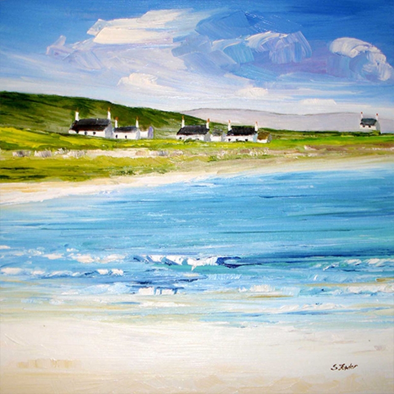
Choosing wall art for a room with picture windows can be harder than it sounds. The room already has a strong sense of openness, so the artwork needs to add character without fighting the daylight or the view. Beach Cottages, Tiree does that beautifully, bringing coastal colour and a sense of place while still feeling calm on the wall.

wall art for a room with picture windows - Beach Cottages, Tiree

Why Beach Cottages, Tiree suits wall art for a room with picture windows

Beach Cottages, Tiree works because it echoes the spaciousness many window-led rooms already have. Instead of closing the room down, the composition keeps the mood airy and lightly structured. That makes it a strong fit for a garden room, sitting area, or open-plan space where the glazing already does much of the visual work.

Artwork for a room with picture windows needs enough identity to hold the wall, but enough restraint to leave the room breathing space.

First 4 Frames finishes the piece in-house with bespoke framing and colour-managed Giclée quality, which helps the artwork keep its clarity under changing daylight. In a bright room, that level of craftsmanship is not a small detail. It is part of what makes the piece feel settled rather than washed out.

If the location itself appeals, the Isle of Tiree is worth exploring. You can also browse more work by Sheila Fowler and see the exact framed print here.

For anyone searching for wall art for a room with picture windows, Beach Cottages, Tiree is a strong example of how to complement a view without competing with it.

Posted on

Ready to Hang Artwork Feels More Settled With Autumn, Loch Lomond

Image of Autumn, Loch Lomond by Sheila Fowler

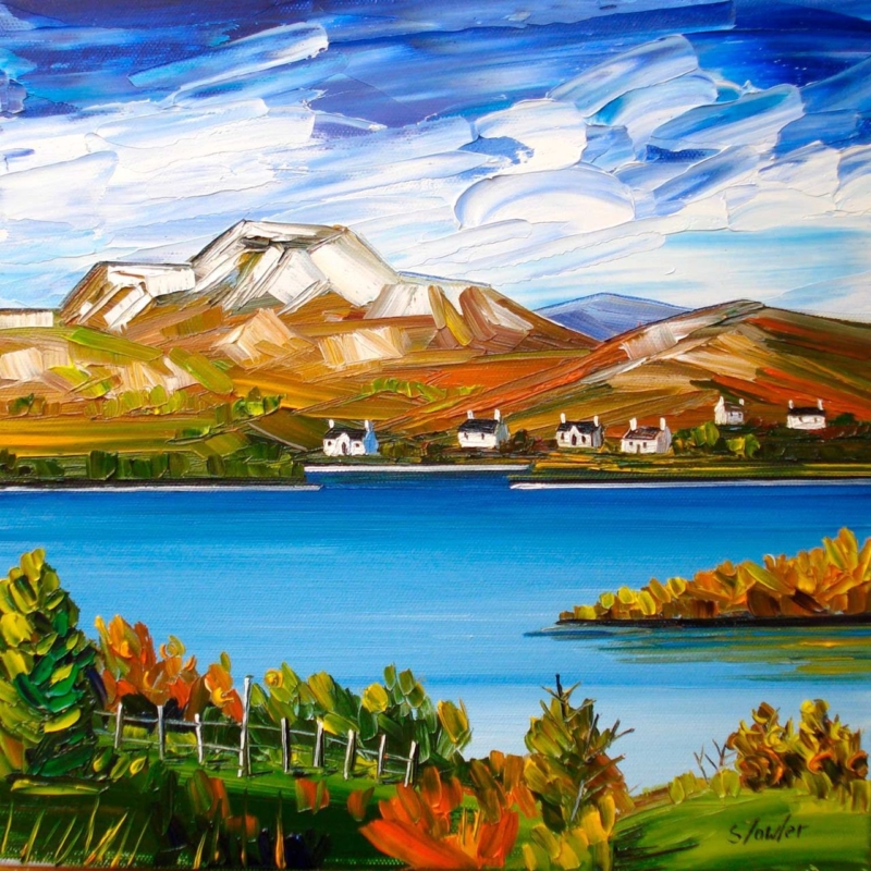
Good ready to hang artwork should not only be convenient. It should also feel complete from the first moment it reaches the wall. Autumn, Loch Lomond is a strong example because the scene already carries enough colour balance and atmosphere to make that all-in-one arrival feel satisfying rather than merely easy.

ready to hang artwork - Autumn, Loch Lomond

Why Autumn, Loch Lomond suits buyers looking for ready to hang artwork

Autumn, Loch Lomond works especially well when a room needs a quicker sense of completion without sacrificing quality. The autumn light gives the image warmth, while the loch keeps the composition open and calm. Together, those qualities help a living room, dining area, or hall feel more settled as soon as the piece is in place.

That is exactly why craftsmanship still matters. First 4 Frames completes every framed print in-house in Falkirk with bespoke finishing and colour-managed Giclée production, so convenience does not come at the expense of presentation, longevity, or room presence.

  • It helps a room feel finished quickly.
  • It keeps the mood warm rather than rushed or generic.
  • It arrives with the polish a main wall deserves.

If you want a closer look at the landscape behind the image, Loch Lomond and The Trossachs National Park is useful. You can also browse more work by Sheila Fowler and view the exact framed print here.

For customers who want ready to hang artwork that still feels calm, considered, and lasting, Autumn, Loch Lomond is a very good fit.

Posted on

Scottish Art Prints Feel More Spacious With Black Cuillins, Skye

Image of The Black Cuillins, Skye by Sheila Fowler

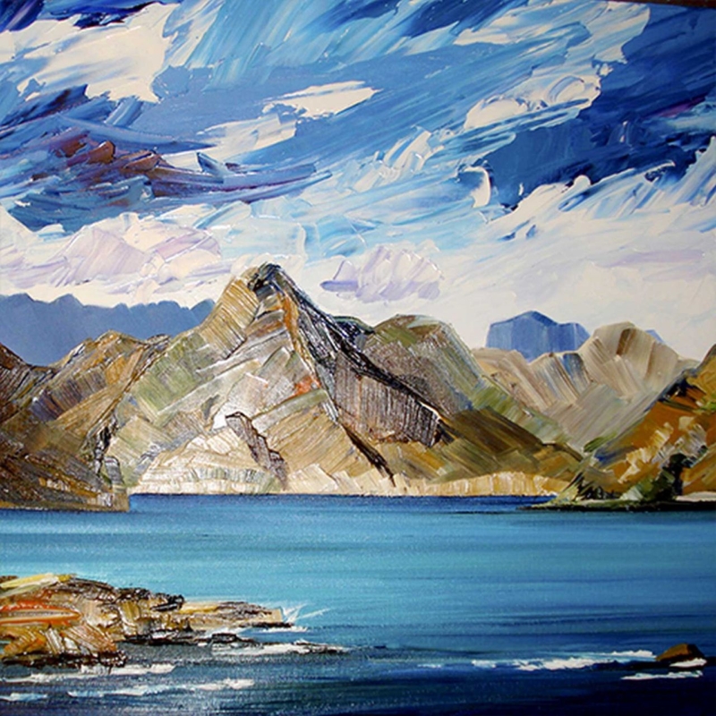
The most successful Scottish art prints often make a room feel larger in mood as well as richer in character. Black Cuillins, Skye does exactly that, using mountain form and open air to create a framed piece that feels rooted in Scotland while still remaining calm enough for everyday living.

Scottish art prints - Black Cuillins, Skye

Why Black Cuillins, Skye works so well for Scottish art prints

Black Cuillins, Skye has a useful kind of scale. It brings strong geography and recognisable place, but it does not crowd the wall. That makes it a particularly good option for a sitting room, guest room, or wider hallway where the artwork should open the space up rather than closing it down.

  • It adds a stronger sense of distance to the room.
  • It gives Scottish character without becoming overly touristy.
  • It pairs bold landscape form with a calm overall mood.

Because First 4 Frames handles the framing and Giclée production in-house, the finished piece keeps that balance of clarity and calm. The aim is not only to show the image well, but to give it a bespoke presentation that feels ready to live with for years.

If the mountain setting itself appeals, the Cuillin on Skye offers useful background. You can also browse more work by Sheila Fowler and see the exact framed print here.

For anyone comparing Scottish art prints and wanting something spacious, grounded, and highly displayable, Black Cuillins, Skye is a strong contender.