
Posted on

Bluebell Trail: Woodland Wall Art for a Care Home Lounge

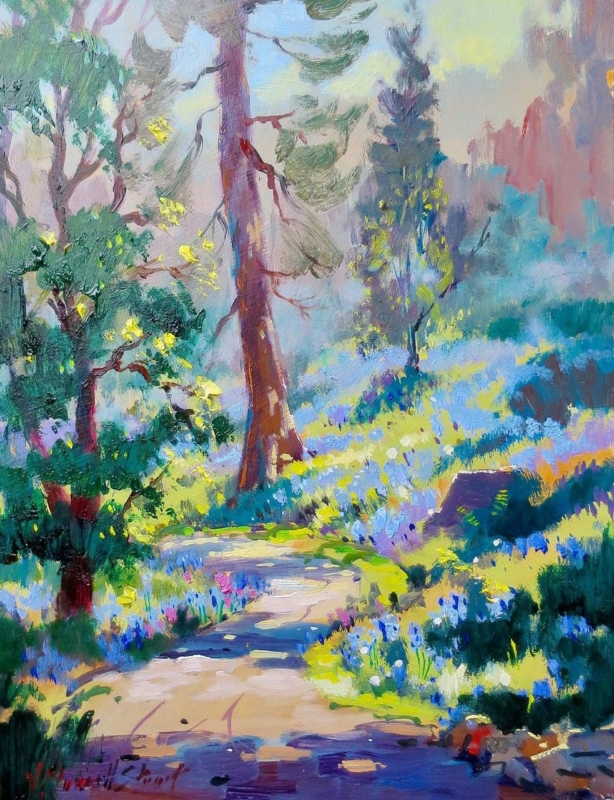
Image of Bluebell Trail by Josepth Maxwell Stuart

woodland wall art for a care home lounge should make a shared room feel more welcoming without asking residents to work hard to understand it. Bluebell Trail by Joseph Maxwell Stuart provides a recognisable path, trees, and bluebells in a clear upright composition. Its bright colour can lift a lounge, while the pathway creates a gentle sense of depth from a seated viewing position.

woodland wall art for a care home lounge: Bluebell Trail by Joseph Maxwell Stuart

What woodland wall art for a care home lounge needs to do

A care home lounge serves many people and several activities. Residents may chat, read, watch television, welcome visitors, or simply sit quietly. Artwork has to contribute warmth without dominating those uses. A familiar nature subject can offer a pleasant point of conversation, but its scale and position matter as much as the subject itself.

Bluebell Trail has an immediate visual route. The pale track begins near the bottom edge and leads through bluebells into the trees. Strong trunks hold the upright composition, while yellow-green highlights keep the scene lively. The image is expressive, yet its main elements remain easy to identify from across the room.

Assess the lounge from a resident’s seat

  1. Sit in the main chairs. Confirm that the path and trees remain legible at the usual viewing distance.
  2. Check the hanging height. Position the centre for seated enjoyment rather than defaulting to a standing gallery height.
  3. Watch daytime reflections. Windows and bright fittings should not turn the glazing into a mirror.
  4. Review evening light. Lamps need to reveal colour without creating a sharp hotspot.
  5. Keep routes clear. Place the frame away from doors, mobility-equipment storage, and areas where it could be knocked.

These checks are best made with staff and residents who use the room. A paper template can show the finished size before fixings are made. It also gives everyone a chance to judge the picture from different chairs and decide whether another wall offers a calmer view.

Use colour to support the room, not overwhelm it

The painting includes violet-blue flowers, fresh green, turquoise, warm cream, and touches of pink and yellow. A lounge does not need to repeat all of them. One blue cushion or a muted green chair can make a connection. Plain fabrics nearby will help residents see the artwork clearly and prevent several busy patterns from competing.

Contrast is useful around the frame. If the wall and moulding are almost identical, the picture can lose definition. A distinct but not harsh edge helps the artwork read as one complete object. A mount can provide a quieter transition between the energetic brushwork and the surrounding paint.

Select a size for the actual viewing distance

The print is available in 265 by 345 and 400 by 500 millimetre sizes before mounting and framing. The smaller option may suit a quiet seating area or a short wall between doors. The larger version will usually read more clearly across a substantial communal lounge. Finished frame dimensions should be marked out and checked before ordering.

One well-scaled image can be calmer than a grid of small pictures. If the lounge needs several artworks, give each one enough separation and use a consistent approach to frames. This creates visual order while still allowing different residents to enjoy different subjects.

Choose a subject with room for conversation

Bluebell woods can prompt thoughts about spring, local walks, gardens, and changing seasons without requiring a single correct interpretation. The Woodland Trust guide to native bluebells explains the native flower and its woodland habitat. That context can support an informal activity or conversation if residents are interested, while the picture still works simply as a colourful landscape.

Joseph Maxwell Stuart studied drawing at the Ruskin School and fine art at Edinburgh College of Art. His loose brushwork brings energy to the path and woodland floor without losing the scene’s structure. Explore the wider Joseph Maxwell Stuart collection at First 4 Frames to compare other Scottish landscapes and garden subjects.

Finish the piece for a busy shared setting

First 4 Frames produces colour-managed Giclée prints and completes bespoke framing in-house in Falkirk. A framing consultation can consider the moulding, mount, glazing, finished weight, and secure placement together. That practical care is valuable in a shared room where the artwork should remain easy to enjoy and straightforward to live with.

Thoughtful woodland wall art for a care home lounge can give residents a recognisable view, useful colour, and a gentle visual destination. View the framed Bluebell Trail print and compare both sizes for a care home lounge, quieter seating area, or visitor space.

Posted on

Woodland Bluebells: Wall Art for a Dark Green Sofa

Image of Woodland Bluebells by Sheila Fowler

wall art for a dark green sofa needs to do more than repeat the colour of the upholstery. A successful piece should connect that strong furniture choice to the rest of the room and stop the seating from feeling like a heavy block. Woodland Bluebells by Sheila Fowler offers a useful balance. Its woodland greens relate naturally to the sofa, while bluebells, light, and receding trees open the view beyond it.

wall art for a dark green sofa: Woodland Bluebells by Sheila Fowler

Why wall art for a dark green sofa should create contrast

Dark green upholstery can anchor a living room beautifully, but it already carries considerable visual weight. An artwork dominated by the same deep tone may make the wall and sofa merge into one dense area. At the other extreme, a very pale abstract can look disconnected from the furniture beneath it.

Woodland Bluebells bridges those two positions. The woodland subject shares the sofa’s natural colour family, yet the lighter path through the trees gives the composition space. Blue and violet notes add a second accent without fighting the green. The result feels coordinated, not matched by formula.

Build the room from three colour notes

  1. Keep the sofa as the deepest green in the scheme.
  2. Repeat one softer bluebell tone in a cushion, throw, or small ceramic.
  3. Use the pale woodland light as a guide for walls, curtains, or a rug.

This limited approach keeps the room calm. It also means the artwork can provide the detailed colour variation while larger furnishings remain simple. There is no need to introduce botanical patterns everywhere. One well-placed landscape can carry the natural reference on its own.

Use woodland depth to lighten the seating wall

A sofa creates a strong horizontal line, especially when it sits against a plain wall. Hanging a woodland image above it introduces vertical trunks and a route into the distance. Those opposing directions bring useful structure to the arrangement and make the wall feel taller.

Measure from the outside edges of the sofa rather than from the whole wall. The framed piece should feel connected to the seating, with enough clear space around it to preserve the sense of woodland air. If a lamp or tall plant already occupies one side, centre the picture over the visual seating area instead of following the room’s mathematical midpoint.

Choose a frame that links, rather than competes

Natural timber can connect the print to wooden floors, side tables, or woven textures. A slim dark moulding may suit a more tailored room and provide a clean boundary between the image and a pale wall. Avoid choosing a green frame simply because the sofa is green; the artwork already supplies that relationship.

First 4 Frames produces colour-managed Giclée prints and completes bespoke framing in-house at the Falkirk workshop. That process makes it possible to judge the woodland’s subtle colour against the moulding, so the finished piece supports both the image and the room rather than relying on a generic frame.

Explore more Scottish landscapes and floral colour on Sheila Fowler’s official website, or browse the Sheila Fowler collection at First 4 Frames. For wall art for a dark green sofa that brings harmony without making the scheme feel overly coordinated, view the framed Woodland Bluebells print.

Posted on

Why Bluebells Is Useful When You Want to Preview Artwork Before Buying

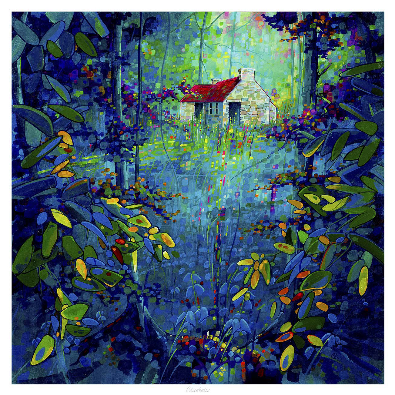
Bluebells: An impressionist artwork featuring a small stone cottage with a red roof, surrounded by a colorful forest and blooming bluebells in lush blue and green foliage, illuminated by streaming light.

Being able to preview artwork before buying is often what stops a good choice becoming an uncertain one. Customers may like the image itself, but still wonder whether the colour, scale, or framed weight will actually suit the room. Bluebells is a useful example because softer floral landscape work can look very different depending on the wall, the light, and the framing around it.

Why previewing matters with gentler colour palettes

Artwork with softer blues, greens, and woodland tones often succeeds through balance rather than sheer impact. That means the customer usually needs to judge more carefully how the piece will sit with daylight, paint colour, and nearby furnishings. Bluebells makes that easy to understand because it can either feel beautifully calming or slightly too quiet depending on where it goes.

  • Previewing helps you judge whether the colours will lift the room enough.
  • It shows whether the framed piece has the right visual weight for the wall.
  • It reduces the risk of choosing something lovely that still feels undersized or too gentle once hung.

This is particularly valuable in bedrooms, garden rooms, and lighter living spaces where daylight changes the artwork throughout the day. Seeing the likely effect in advance helps the final choice feel more assured.

Why framing is part of the preview, not an afterthought

First 4 Frames completes each piece in-house in Falkirk with bespoke framing, colour-managed Giclee printing, and hand-finished craftsmanship. That matters because previewing the artwork properly is not only about the image. The frame changes the visual weight and often decides whether the piece feels just decorative or properly finished.

You can explore more from Chris Sharp and view the exact framed print here.

If you want to preview artwork before buying with more confidence, Bluebells is a strong example of why colour, scale, and framing should all be judged together.