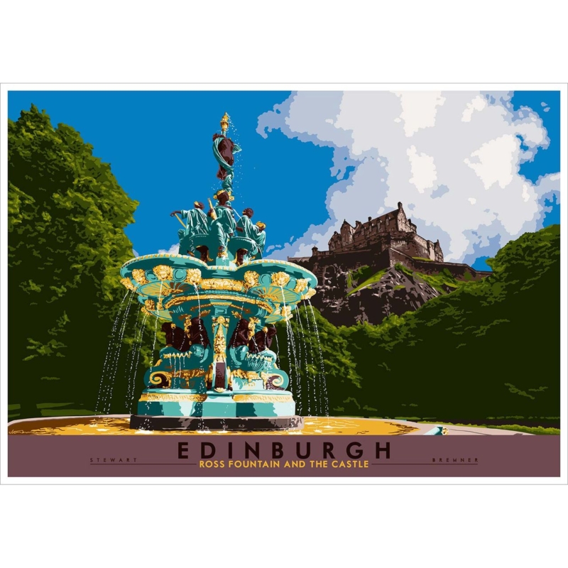
Edinburgh wall art for a marble entrance hall needs to respond to the room as well as the subject. Edinburgh: Ross Fountain and the Castle offers a useful starting point because Stewart Bremner’s graphic Edinburgh view brings colour and human-scale detail beside a hard, polished material without asking the stone itself to disappear.
Balance Edinburgh wall art for a marble entrance hall against shine
Room question
Practical response
Is the marble polished?
Check reflections from the main seat and doorway.
Is it a console?
Measure the complete frame above it and leave a calm gap.
Is the floor veined?
Keep nearby textiles plain so lines do not compete.
Which print size?
Mark both 594 × 420 and 840 × 594 mm options with the frame added.
Marble can make an entrance or living room feel crisp, but too many hard edges may also feel distant. The fountain, trees and Edinburgh skyline provide a more approachable layer. A rug or timber detail can support that softness without concealing the stone.
Let the picture warm the architecture; it does not need to imitate the marble’s veining.
Avoid defaulting to an ornate frame because the subject includes a historic fountain and castle. Compare clean and traditional mouldings against the print, stone and adjoining metalwork.
Frame wall art for marble surfaces without adding glare
Graphic shapes and layered colour need accurate separation beside a reflective surface. Colour-managed Giclée production keeps the Edinburgh detail clear, while bespoke framing allows the moulding, mount and glazing to be considered against the actual marble.
Wall art for marble surfaces works when it introduces warmth without disguising the architecture. Ross Fountain and the Castle adds place and colour, while measured framing keeps artwork and stone distinct.
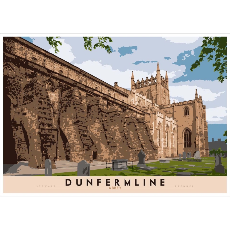
Scottish architecture wall art for a heritage home should connect subject, room and finished scale rather than fill an arbitrary gap. Dunfermline Abbey offers a specific starting point because Stewart Bremner’s treatment of a real historic landmark can acknowledge architectural character without asking every furnishing, fabric and object to reproduce the past.
Place Scottish architecture wall art for a heritage home beside period detail
Identify the room’s strongest fixed feature first. A cornice, fireplace, panelled door or deep window reveal already carries architectural weight. Place the print where it can be seen alongside that feature rather than squeezed into decorative moulding.
Respect the building
Use existing picture rails and sound fixing points where appropriate. Seek suitable advice before drilling into fragile fabric.
Keep the image current
A clean mount and confident frame can connect the old landmark with contemporary daily life.
Compare the 594 × 420 and 840 × 594 mm print options against the usable wall. The larger work needs space from cornices and furniture; the smaller version should relate to a definite cabinet, bay or panel.
Does a heritage home require an ornate frame?
No. Compare samples against the artwork, wall and timberwork. A quieter moulding may allow both architecture and image to remain clear.
Complete Scottish architecture wall art for a heritage home in context
Graphic treatment of historic stonework needs accurate shape and colour, not artificial ageing. Colour-managed Giclée production keeps the image clean, while one-to-one bespoke framing can respond to real timber, paint and architectural details.
Scottish architecture wall art for a heritage home should build a thoughtful connection rather than reproduce a period scheme. Dunfermline Abbey supplies place and history; the frame keeps that story liveable.
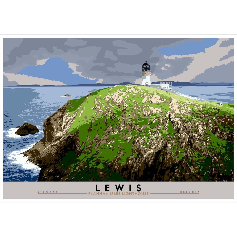
Scottish lighthouse wall art for a coastal hallway should connect subject, room and finished scale rather than fill an arbitrary gap. Isle of Lewis: Flannan Isles Lighthouse offers a specific starting point because the lighthouse gives a route a natural point of orientation, while Stewart Bremner’s landscape format avoids the need for a procession of small coastal pictures.
Set Scottish lighthouse wall art for a coastal hallway on the arrival line
Stand at the front door and identify the first uninterrupted wall.
Mark the complete frame around the 594 × 420 or 840 × 594 mm print.
Open every nearby door and cupboard.
Walk past the outline while carrying a bag or coat.
Test reflections from entrance glazing and evening lights.
Keep the coast specific
The Flannan Isles location already supplies history and atmosphere. Rope, anchors, striped signs and shell ornaments would turn a real place into broad nautical decoration.
A hallway picture is often seen in motion. Leave clear wall around it and avoid placing hooks through the sightline. The larger size can work on a long route, but only after the outer frame is tested at shoulder height.
Frame Scottish lighthouse wall art for a coastal hallway as one destination
A bold illustrated landmark benefits from controlled edges and consistent colour. In-house colour-managed Giclée production supports that clarity, while bespoke framing makes the mount, moulding and projection part of a safe hallway decision.
Scottish lighthouse wall art for a coastal hallway should guide the eye without filling the route with seaside props. Flannan Isles Lighthouse provides one destination and a genuine island story.
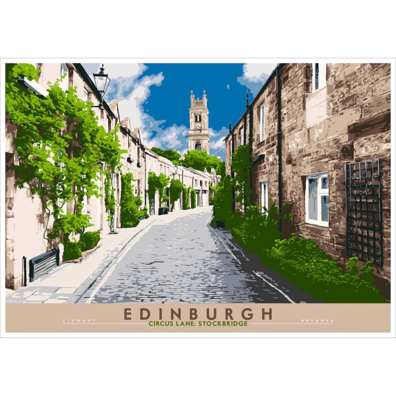
framed Edinburgh street art for a home office should connect subject, room and finished scale rather than fill an arbitrary gap. Edinburgh: Circus Lane, Stockbridge offers a specific starting point because Stewart Bremner’s view brings recognisable residential architecture into a work setting, while two print sizes can suit a cabinet wall or the area beyond a desk.
Measure framed Edinburgh street art for a home office from the desk
Decision
Useful test
594 × 420 mm print
Mark the full frame above a compact cabinet or on a side wall.
840 × 594 mm print
View it from the doorway and seated desk position.
Screen relationship
Keep architectural detail clear of monitors and video-call backgrounds.
Lighting
Check window and task-light reflections through a working day.
A local scene can make an office personal without motivational wording. Let Circus Lane carry the Edinburgh reference. Souvenirs, several skyline prints and tartan accessories would weaken its specificity.
Choose the wall from the working chair, not only from the empty doorway.
If the desk faces the wall, place the art beyond the monitor rather than directly behind it. On a side wall, align the finished frame with furniture instead of centring it on the entire room.
Finish framed Edinburgh street art for a home office with quiet authority
Graphic architecture and street detail need crisp colour relationships at both sizes. Colour-managed Giclée production preserves that definition, while a bespoke hand-finished frame gives the composition a professional boundary without making the office corporate.
Framed Edinburgh street art for a home office can establish identity without demanding attention all day. Circus Lane works when scale, screen relationship and lighting are treated as part of the workspace plan.
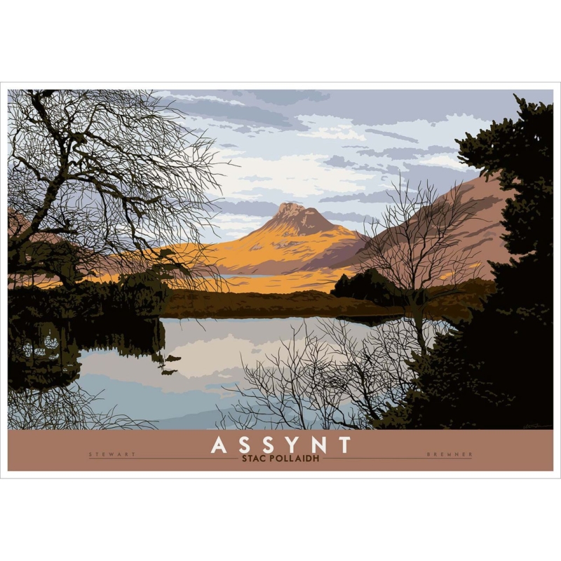
Scottish mountain art for a mid-century room can connect clean-lined furniture to a real landscape without making the home feel like a themed period display. Assynt: Stac Pollaidh by Stewart Bremner reduces mountain, water, trees and cloud to clear graphic shapes. Warm ochre light on Stac Pollaidh contrasts with the darker foreground and pale reflected sky. The composition feels structured, but the view still has space and atmosphere.
What Scottish mountain art for a mid-century room should contribute
Mid-century-influenced rooms often rely on clear silhouettes, useful proportions and a limited material palette. Artwork can support that order, but it should also stop the room from becoming too controlled. This print does both. Its travel-poster character relates to graphic design, while the branches and reflected shoreline introduce finer natural detail.
The mountain provides a single readable focal point from across the room. Closer up, the layered cloud, bare trees and dark woodland hold attention. That change in scale makes the picture suitable for everyday living rather than a purely decorative reference to one design era.
Start with shape rather than trying to match a decade
Look at the furniture already in the room. A low sideboard, tapered legs and a simple lounge chair create strong horizontal and diagonal lines. The artwork’s broad waterline can settle above those pieces, while the sloping mountain introduces a less rigid counterpoint. This relationship matters more than finding accessories that look historically exact.
Above a sideboard: keep the print centred and leave the surface below relatively clear.
Near a lounge chair: allow the mountain to remain visible above the chair back.
Between tall storage: check that dark trees do not merge into the furniture on both sides.
On an open wall: use a paper template to judge whether the framed size has enough presence.
The product is available in two substantial landscape print sizes. Include the frame and any mount when testing dimensions. A presentation that is too small can look like a poster sample, while one that crowds the furniture loses the quiet space that makes the landscape effective.
Borrow the palette in measured amounts
The ochre mountain and muted brown title band work naturally with walnut, teak and other warm timbers. Pale blue-grey sky can connect with upholstery or painted walls, while the black-green foreground adds definition. Use those relationships selectively. Repeating every shade would make the room feel overly coordinated.
Existing room feature
Connection in the artwork
Useful restraint
Walnut or teak furniture
Ochre mountain and muted brown border
Avoid adding several more orange accessories
Blue-grey upholstery
Layered sky and water reflection
Keep the wall warmer than a cold pure grey
Black metal legs
Dark woodland and branch silhouettes
Do not choose an unnecessarily heavy frame
Cream or oatmeal textile
Pale open areas in the sky
Let texture supply interest instead of pattern
Let the poster influence stop at the artwork
The title panel and simplified colour give the piece a confident travel-poster quality. That does not mean the rest of the room needs vintage signs, old suitcases or multiple destination prints. One graphic landscape is often enough. Contemporary ceramics, books and natural textiles can sit beside it without reinforcing a theme.
This restraint also keeps the sense of place genuine. Stac Pollaidh is not a generic mountain silhouette. Its distinctive ridge, Assynt setting and reflection carry the subject. Giving the print clear wall space lets those features remain more important than any retro reference.
Choose a frame that links old and new
A dark narrow moulding can echo the foreground and sharpen the graphic edge. A warm timber can create a softer link to furniture. Avoid choosing solely from an online swatch if the room contains several wood tones. Viewing samples beside a photograph or finish reference helps prevent an accidental near-match.
First 4 Frames completes colour-managed Giclée production and bespoke framing in-house at its Falkirk workshop. The careful finish preserves the separation between ochre hillside, dark trees, pale cloud and reflected water. It also gives the print the substantial, ready-to-hang presence needed above low furniture.
Thoughtful Scottish mountain art for a mid-century room can support a room’s clean lines while bringing in wild landscape, reflection and a specific Scottish place. View the framed Assynt: Stac Pollaidh print for a structured focal point that feels graphic without losing its natural atmosphere.
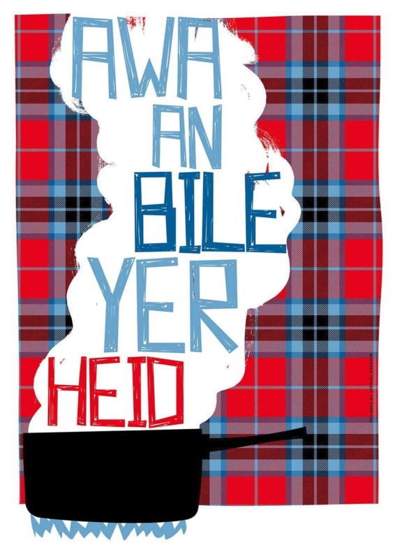
Scottish typography wall art for a kitchen should do more than fill a convenient gap. Awa An Bile Yer Heid offers a specific starting point because Stewart Bremner’s bold Scots phrase brings humour and regional character to the place where family and friends naturally talk.
Plan Scottish typography wall art for a kitchen sightline
Choose the wall from the conversation, not from an empty-space photograph. The phrase should be readable from the table, breakfast bar or main entrance without sitting behind steam, grease or an opening cupboard door. A dry dining-side wall is more practical than the splashback area.
Print option
Useful test
420 × 594 mm
Template it above a compact bench or on a wall return near the table.
594 × 840 mm
Check the complete framed outline against a broad dining wall and pendant lights.
Both sizes
Read the phrase from seated and standing positions before ordering.
The wording already supplies the personality. Avoid adding several more sayings, tartan plaques or novelty utensils around it. One painted cabinet colour or timber frame can connect the picture to the room while leaving enough quiet wall for the letters to register.
One well-placed phrase can become part of family conversation; a wall full of phrases becomes background noise.
Frame Scottish typography wall art for a kitchen cleanly
Graphic lettering exposes weak alignment and uneven borders quickly. Colour-managed Giclée printing keeps the design crisp, while accurate mounting and bespoke in-house framing give the portrait format a confident edge away from food preparation zones.
Scottish typography wall art for a kitchen feels most personal when the phrase suits the household and the placement supports daily use. Awa An Bile Yer Heid can prompt a smile without turning a practical room into a novelty display.
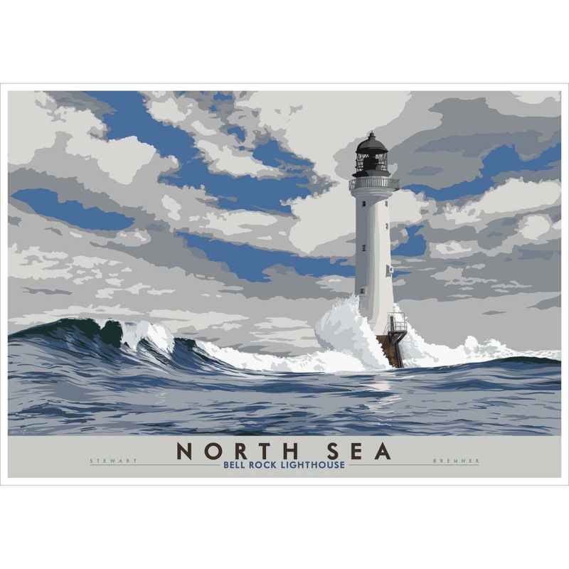
lighthouse wall art for a windowless hallway can give an enclosed passage a view-like sense of distance without pretending that a picture is a window. North Sea: Bell Rock Lighthouse by Stewart Bremner offers a strong horizon and a clear architectural subject. The lighthouse provides a vertical point of focus, while the sea and sky extend across the image. Together, they can make a hallway feel more composed and less visually closed.
What lighthouse wall art for a windowless hallway can do
A hallway without natural light often lacks a visual destination. Every surface may appear equally close, particularly when doors, coat storage and corners interrupt the route. A coastal image introduces depth through a recognisable foreground, horizon and sky. A lighthouse then gives the eye one stable landmark toward which the composition can move.
Bell Rock is a particularly purposeful subject. The tower stands offshore in the North Sea, so the artwork combines human engineering with open water. That tension gives the picture more substance than generic beach decoration. It can add a sense of place and resilience while remaining visually clean enough for a narrow route.
Place the horizon where it supports the route
Hang the picture where it can be seen from the approach, ideally at the end of a sightline or on the longest uninterrupted wall. Avoid a position where an open door hides half the image. The horizontal composition should reinforce the direction of travel rather than being squeezed between several tall objects.
At the end wall, centre the complete frame on the passage rather than on a nearby door.
Along a side wall, keep enough clearance for shoulders, bags and moving furniture.
Above a console, choose shallow furniture so the walkway stays comfortable.
Near coat storage, leave distance from wet fabric and swinging hangers.
Beside several doors, use the largest calm section of wall instead of filling every gap.
Build a simple lighting plan
Good artificial light matters more here than colour matching. One ceiling fitting may create a bright floor and leave the picture in shadow. A wall light or carefully aimed ceiling spot can reveal the whole print. The beam should be broad enough to avoid a theatrical circle and angled so it does not bounce directly from the glazing into the main viewpoint.
Lighting problem
Practical response
The image looks dull from the entrance
Add light from the opposite side of the walking line
A bulb reflects over the lighthouse
Change the angle or move the source laterally
The corridor feels flat
Layer a wall source with lower ambient light
The sea colour shifts too warm
Use a balanced lamp rather than an amber decorative bulb
Test the lighting after dark with the doors in their normal positions. Reflections change as people approach the frame, so check from both ends of the hallway. The aim is comfortable visibility, not gallery-level brightness in a domestic route.
Keep coastal references restrained
The lighthouse already establishes the North Sea setting. Rope, shells, signs and striped accessories would make the hallway feel themed and may add clutter. Instead, connect through material. A pale wall can support the open sky. Warm timber can soften the harder architecture. A dark handrail or frame can echo the tower’s graphic outline.
Limit additional pictures on the same wall. Negative space helps the horizon register and makes the route feel wider. If practical storage is needed, use closed or low-profile pieces in a finish that recedes. The artwork should provide the interest, while the hallway continues to function efficiently.
Choose a frame for a busy passage
A hallway frame must look proportionate without projecting unnecessarily into the walkway. A simple dark moulding can sharpen the poster-like architecture. A light timber can give the coastal scene a warmer domestic edge. Compare both options against the wall, doors and floor so the complete presentation belongs to the space.
Use secure fixings appropriate to the wall and keep the lower edge above contact from bags or furniture. The print is available in horizontal size options, so mark the finished dimensions before ordering. A paper template will show whether the larger version adds welcome presence or reduces the clear wall that gives the picture its effect.
Present Scottish graphic art with precision
Stewart Bremner is an Edinburgh-based illustrator and graphic designer known for bold Scottish imagery influenced by travel posters and mid-century design. That clear visual language suits Bell Rock’s remarkable offshore structure. Explore more work at Stewart Bremner’s official website, or browse the Stewart Bremner collection at First 4 Frames.
First 4 Frames uses colour-managed Giclé production and completes bespoke framing in-house at its Falkirk workshop. This process preserves crisp graphic boundaries and controlled coastal colour. The hand-finished frame gives the work a durable presentation for a route used many times each day.
Effective lighthouse wall art for a windowless hallway should create direction and breathing room while respecting the practical demands of the passage. View the framed North Sea: Bell Rock Lighthouse print for a distinctive Scottish coastal landmark with the structure to hold an enclosed hallway together.
Scots humour wall art for an understairs workspace can give a small working area character without taking up any useful surface. Help Ma Boab by Stewart Bremner is especially well suited to that job. Its familiar Scots exclamation introduces wit, while the bold graphic treatment creates a clear visual stop above a desk. That combination can make an improvised space feel deliberate rather than squeezed into a leftover corner.
Why Scots humour wall art for an understairs workspace works
An understairs desk often has an awkward outline, limited daylight and little room for decoration. Adding objects to the desk can reduce working space. Several small pictures may make the sloping wall look busier. One confident typographic print uses the vertical surface instead, giving the eye a focal point while leaving the practical area clear.
Help Ma Boab also brings a human note to a functional corner. The phrase is expressive and conversational, so it can lift routine tasks without turning the space into a novelty display. The artwork still needs enough clear wall around it for the lettering and colour blocks to read as design.
Fit the print to a sloping wall
Begin with the lowest point of the ceiling rather than the full width of the alcove. Mark the finished framed size on paper and tape it above the desk. Sit in the working chair, then stand at the entrance to the room. The whole phrase should be visible from both positions, with a comfortable gap below the slope.
Measure the frame, not only the print. Allow for the complete hand-finished presentation.
Protect headroom. Keep the lower edge clear of the area used when sitting down or standing up.
Centre on the desk zone. The alcove may be wider than the furniture, so use the working area as the reference.
Check the chair position. Make sure a high-backed chair does not hide the key words.
Test the doorway view. A slight horizontal adjustment can make the compact area look more intentional.
Control the rest of the visual noise
Typography already supplies pattern and rhythm. Keep nearby storage simple so letters on boxes, book spines and stationery do not compete with the print. Closed drawers, one pen pot and a clear section of desk will allow the artwork to lead. If a noticeboard is essential, place it on a side wall rather than directly beside the frame.
Workspace element
Useful choice
Reason
Desk surface
Plain timber or a quiet painted finish
It gives the graphic print a calm base
Storage
Mostly closed units
They reduce competing labels and small objects
Task lamp
Compact adjustable design
It directs light without blocking the artwork
Accessories
One repeated accent colour
It connects the print without copying every colour
Light the wall as well as the keyboard
Understairs areas can feel dim even during the day. A task lamp aimed only at the desk may leave the wall above it dull. Add a soft source that reaches the complete frame, but position it so the glazing does not reflect a bright bulb into the chair. Light from one side is often easier to control than a spotlight directly overhead.
Check the print during a real working evening. The words should remain legible without forcing the screen brightness or room lighting too high. A warm lamp can make the corner feel welcoming, while a neutral task light preserves concentration on documents and colour on the monitor.
Give a familiar phrase a lasting finish
Stewart Bremner is an Edinburgh-based artist, illustrator and graphic designer whose work draws on Scottish language, places and visual culture. His bold style has roots in twentieth-century travel posters and mid-century graphic design. See more at Stewart Bremner’s official website, or browse the Stewart Bremner collection at First 4 Frames.
First 4 Frames uses colour-managed Giclé production and completes bespoke framing in-house at its Falkirk workshop. That precise finish helps a humorous phrase feel like considered artwork rather than a temporary sign. It also gives the print a protected, ready-to-hang presentation for a hard-working part of the home.
Well-chosen Scots humour wall art for an understairs workspace can turn a difficult alcove into a workspace with confidence and local personality. View the framed Help Ma Boab print for a bold focal point that uses the wall while preserving the desk below.
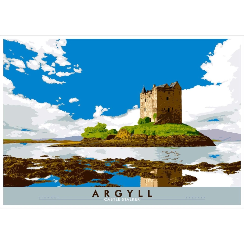
framed artwork UK works best when the picture answers a practical question about the room. Argyll: Castle Stalker is useful because Stewart Bremner’s view turns a recognisable castle into a concise landscape that can hold attention during a short passing view.
Plan framed artwork UK buyers can enjoy in passing
A hallway gives artwork only a few seconds at first, so silhouette and proportion matter. Castle Stalker supplies a clear landmark, water and surrounding land without needing explanatory objects. Place a paper template where it can be seen on arrival, then open every nearby door to check the route.
Decision
Hallway check
594 × 420 mm print
Test above a compact console or on a shorter landing wall.
840 × 594 mm print
Use the full framed outline to confirm shoulder and door clearance.
Lighting
Check glare from the front door and evening wall lights.
Let the architecture provide the history. Tartan signs, model castles and several maps would reduce a strong place-led print to a theme. One timber tone or painted frame can connect with the house while preserving a cleaner entrance.
Give framed artwork UK craftsmanship a clear role
Crisp edges, open water and architectural detail need accurate output. Colour-managed Giclée production keeps them distinct, while bespoke in-house framing gives the landscape a stable boundary suited to a busy route.
Framed artwork UK customers choose for a hallway should communicate quickly and wear well visually. Castle Stalker brings place and structure, while measured scale keeps the entrance open.
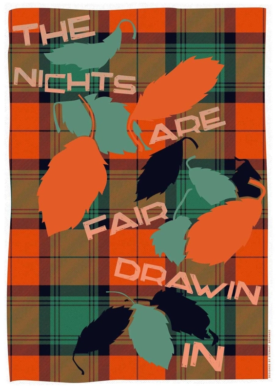
Scottish saying wall art should earn its place through a clear connection to the room, recipient or daily routine. The Nichts are Fair Drawin In provides a specific starting point because its familiar Scots title turns the seasonal arrival of darker evenings into a warm, conversational focal point.
Let Scottish saying wall art start one good conversation
A phrase-led print works best where people naturally pause. A dining nook, kitchen table or compact sitting area gives the words time to be noticed and discussed. It is less effective in a route where coats, notices and household reminders already compete for attention.
Choose scale from the furniture
The product offers 420 x 594 mm and 594 x 840 mm print sizes. Template the complete framed outline above the table or sideboard before deciding.
Plan for evening viewing
Use a warm nearby lamp that reveals the print without reflecting in the glazing. Check the result from every regular seat after sunset.
The title already provides plenty of regional character. Avoid surrounding it with tartan signs, souvenir objects and several more sayings. Timber, wool and one well-chosen colour can make the corner comfortable without turning Scottish identity into a theme.
Words gain more presence when the wall around them is quiet enough to let people read and respond.
Frame Scottish saying wall art for long winter use
Crisp lettering and balanced spacing depend on accurate printing and mounting. Colour-managed Giclée production supports Stewart Bremner’s graphic design, while bespoke in-house framing gives the larger paper formats a clean, stable boundary through many seasons.
Scottish saying wall art can feel personal without becoming novelty décor. The Nichts are Fair Drawin In suits the moment when lights come on and people gather, making placement and evening illumination part of the choice.