Posted on

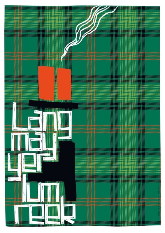
Lang May Yer Lum Reek: Scottish New Home Blessing Wall Art

Image of Lang May Yer Lum Reek by Stewart Bremner

Scottish new home blessing wall art can say more than a card that disappears after the move. The traditional phrase wishes a household lasting warmth, life and prosperity. In Lang May Yer Lum Reek, Stewart Bremner gives that generous sentiment a bold graphic form. A black chimney, curling white smoke and hand-drawn lettering sit against green tartan. The result feels rooted in Scotland, but it is confident enough for a contemporary home.

Scottish new home blessing wall art: Lang May Yer Lum Reek by Stewart Bremner

Why Scottish new home blessing wall art carries real meaning

“Lang may yer lum reek” is a wish that the chimney may smoke for a long time. Behind the humour is a practical image of a home that remains occupied, warm and well provided for. That makes the phrase especially fitting for a first home, a move back to Scotland or a household beginning a new chapter.

The artwork makes the meaning easy to live with. It does not spell out a formal blessing or attach itself to one date. Instead, the chimney and smoke turn the words into an image. The owners can enjoy the graphic design every day, while the story behind the phrase remains part of the gift.

Match the gift to the household, not only the occasion

A successful new-home gift should suit the people after the boxes are unpacked. This print is particularly appropriate for someone who uses Scots, values Scottish culture or enjoys graphic artwork. It can also mark a move abroad, where a familiar phrase brings a warm connection to home without relying on a conventional landscape.

  • For first-time buyers, the phrase recognises the achievement without being overly formal.
  • For newlyweds moving home, it offers a shared wish that is not tied only to the wedding day.
  • For a Scottish family overseas, it brings language and identity into an everyday room.
  • For hosts in a new house, it works as a thoughtful alternative to wine, flowers or another kitchen accessory.

Before ordering, check that the recipient enjoys typography and the assertive green, black, orange and white palette. A personal gift does not need to match every cushion, but it should belong comfortably with the owner’s taste.

Give the tall composition a useful wall

The portrait format makes the print useful on walls that cannot take a wide landscape. It can sit beside a kitchen doorway, above a narrow console, at the end of a hall or on a chimney breast. The artwork is available in substantial portrait print sizes, so it should be measured as a finished framed piece rather than treated like a small sign.

Use paper to mark the proposed outer dimensions. View the template from the main entrance and from the nearest seating area. The words should be readable without the frame crowding a door architrave, light switch or mantel. If the picture is intended as a surprise, a photograph and measurements of the likely wall can help First 4 Frames advise on presentation.

Let tartan act as pattern, not a decorating theme

The green tartan background gives the print energy and Scottish identity. It does not require tartan upholstery, antlers or a room full of heritage references. In fact, the artwork is often stronger against a plain wall where the crossing lines can be seen clearly.

Nearby finishConnection to the printKeep restrained
Warm timberThe orange chimney pots and fine warm linesExtra tartan accessories
Black metalThe chimney silhouette and dark gridHeavy black furniture on every side
Off-white wallsThe smoke and hand-drawn letteringSmall competing word signs
Deep green paintThe dominant tartan fieldA frame that disappears into the wall

The lettering is deliberately irregular, while the tartan provides structure. That contrast lets the piece work with simple modern furniture as well as older architectural details. One nearby orange or rust accent can acknowledge the chimney pots, but repeating every colour would weaken the main image.

Choose framing that makes the blessing last

A framed print has a different presence from a paper card or unmounted poster. First 4 Frames uses colour-managed Giclée production and completes bespoke framing in-house at its Falkirk workshop. Careful presentation keeps the fine tartan lines crisp, protects the pale lettering and gives the strong graphic design a clean boundary.

A dark moulding can connect with the chimney, while a lighter timber can make the piece feel more relaxed. The correct option depends on the wall and nearby furniture. If the gift is being ordered before the recipient has decorated, choose a versatile frame rather than trying to predict a precise future colour scheme.

Include the story with the present

Write the meaning of the phrase in the card and explain why it made you think of the household. That small note turns an eye-catching design into a considered blessing. It also helps anyone unfamiliar with Scots understand that the smoke represents continuity, warmth and a home in active use.

Stewart Bremner is an Edinburgh-based artist, illustrator and graphic designer whose work celebrates Scottish language, culture and place through bold compositions. See more of his approach at Stewart Bremner’s official website, or browse the Stewart Bremner collection at First 4 Frames.

Thoughtful Scottish new home blessing wall art combines a generous traditional wish with something the household can keep and display. View the framed Lang May Yer Lum Reek print for a colourful way to wish warmth, happiness and a long life to a new home.
Posted on

Office Wall Art for an Engineering Team: Read the Three Bridges

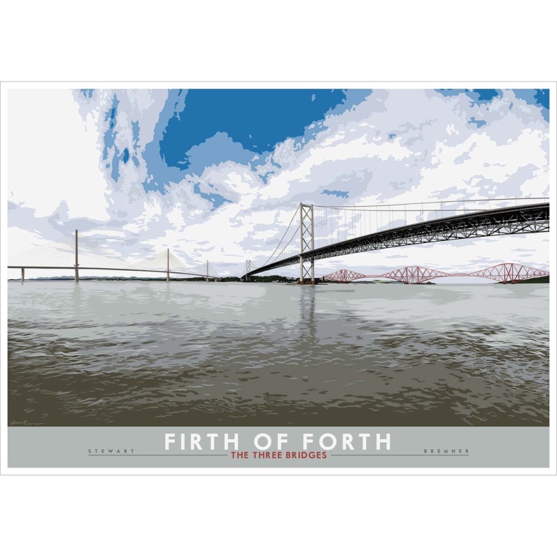
Image of Firth of Forth: the Three Bridges by Stewart Bremner

office wall art works best when it responds to the room rather than filling a convenient gap. Firth of Forth: the Three Bridges gives this decision a specific starting point because the three Forth crossings show different structural eras in one landscape-format Scottish view.

office wall art - Firth of Forth: the Three Bridges

Choose office wall art that rewards technical curiosity

An engineering workplace does not need motivational typography to express what its people value. The rail bridge, road bridge and Queensferry Crossing let viewers compare cantilevers, suspension and cable-stayed forms. That gives the image relevance without turning the reception or meeting room into a corporate display.

PlacementUseful test
Meeting roomKeep the bridges visible from occupied seats, not only from the doorway.
ReceptionAllow enough clear wall for the long structural lines to read at first glance.
594 x 420 mm printTry it over a compact console or within a smaller project room.
840 x 594 mm printTemplate the full framed outline on a broad wall before ordering.

Coordinate the frame with one existing finish, such as dark metal, pale timber or a restrained painted edge. Avoid adding models, technical diagrams and several bridge photographs around it. One composed view leaves room for the real projects and people in the space.

Frame office wall art for changing workplace light

Glazing and overhead light can create reflections across a detailed landscape. Check the sightline from desks and meeting chairs. Colour-managed Giclée output keeps Stewart Bremner’s printed detail clear, while in-house mounting and a hand-finished frame give the two substantial sizes a stable professional edge.

For engineering and heritage context behind the best-known crossing, read UNESCO’s account of the Forth Bridge. Browse the Stewart Bremner collection, or inspect the exact framed product and its available options.

Office wall art feels credible when it relates to the work without explaining it too loudly. The Three Bridges offers structure, Scottish identity and a useful conversation across generations of design.

Posted on

Edinburgh University McEwan Hall: Alumni Office Wall Art With a Sense of Place

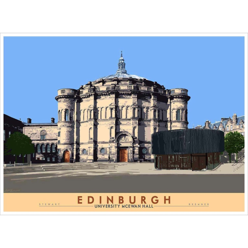
Image of Edinburgh: University McEwan Hall by Stewart Bremner

Edinburgh university alumni office wall art can carry a personal history into a professional room without making the workspace feel nostalgic. Edinburgh: University McEwan Hall by Stewart Bremner centres one of the university’s most recognisable ceremonial buildings. Its strong circular facade, pale stone and open blue sky make a confident architectural image. For someone who studied, graduated or worked in Edinburgh, the connection is specific. For colleagues and visitors, it remains a clear, accomplished piece of city art.

Edinburgh university alumni office wall art: Edinburgh: University McEwan Hall by Stewart Bremner

Why Edinburgh university alumni office wall art can feel professional

Alumni pieces often rely on crests, dates or novelty slogans. Those details may be meaningful, but they can look more like memorabilia than lasting office art. Architecture offers a quieter connection. McEwan Hall has an immediate link to university life and graduation, yet the building also stands on its own as a substantial Edinburgh subject.

The image is structured rather than sentimental. The domed roof, rounded towers and deep window shadows give it visual authority. A low modern entrance balances the ornate stonework, while the broad sky keeps the square composition open. That combination works well in a study, consulting room, professional practice or home office where the owner wants one personal reference without filling the room with academic symbols.

Let the building tell the story

A useful alumni display does not need to explain every connection on the wall. The printed Edinburgh caption and the recognisable building provide enough context. Keep certificates, graduation photographs and smaller keepsakes on a different surface or in a more private part of the office. Giving the artwork its own clear area makes the connection feel assured rather than over-stated.

  • For a client-facing office, use the print as the main personal element and keep signs functional.
  • For a home office, position it where it can be enjoyed from the desk, not only used as a video-call backdrop.
  • For a shared practice, choose a wall connected to the alumnus rather than implying a link for the whole organisation.
  • For a graduation gift, confirm that the recipient has room for the finished framed size before choosing the larger option.

Use the architecture to organise the office

The hall is almost symmetrical, so it can bring order to a workspace containing screens, shelves and paperwork. Its central dome creates a natural axis. Centre that axis over a desk, credenza or meeting table rather than automatically using the middle of the entire wall. The relationship to the furniture will matter more during everyday use.

The artwork is available in landscape print sizes, although the product image includes a generous poster border within its square presentation. Make a paper template for the full framed dimensions. Check it from the doorway, from the main chair and from the opposite side of any meeting table. The word Edinburgh should remain readable, but the frame should not compete with a monitor or presentation screen.

Office featureDetail to connectWhat to avoid
Warm timber deskThe sandstone and brown poster letteringA frame that almost, but not quite, matches the desk
Blue seatingThe broad clear skyRepeating blue across every accessory
Dark shelvingThe deep architectural shadows and entranceA heavy moulding that closes in the image
Pale neutral wallsThe light facade and printed borderHanging the work without enough edge definition

Balance heritage and modern working life

McEwan Hall combines historic stone architecture with a dark, contemporary entrance structure. That contrast is useful in offices where traditional professional furniture sits beside modern technology. The print can connect both without forcing the room into a period style. Its travel-poster influence simplifies the building, so ornate details remain legible without becoming fussy.

Keep surrounding objects selective. One small stack of books or a ceramic piece can support the scholarly association. A collection of university mugs, scarves and branded stationery would turn the wall into a display of affiliation. The framed picture is stronger when it suggests experience and memory through place rather than repeating a logo.

Check light, reflections and viewing distance

Office windows and overhead panels can create strong reflections. Test the wall through a full working day before fixing the frame. A position at right angles to the main glazing often gives a clearer view than the wall directly opposite it. Also check the seated sightline. Fine architectural details and the small lower caption should be visible without placing the picture uncomfortably low.

First 4 Frames uses colour-managed Giclée production and completes bespoke framing in-house at its Falkirk workshop. This process helps retain the difference between cream stone, grey paving, dark shadow and the flat blue sky. A well-judged mount and moulding give the poster-style border a professional finish suited to a working environment.

Stewart Bremner is an Edinburgh-based artist, illustrator and graphic designer whose work draws on travel-poster and mid-century design. Explore his wider approach at Stewart Bremner’s official website, or browse the Stewart Bremner collection at First 4 Frames.

Thoughtful Edinburgh university alumni office wall art can mark an important connection while still serving the room as accomplished architectural art. View the framed Edinburgh: University McEwan Hall print for a distinctive Edinburgh landmark that brings memory, structure and a confident sense of place into the working day.

Posted on

Meaningful Gift Wall Art for a Graduate: Edinburgh University Old College

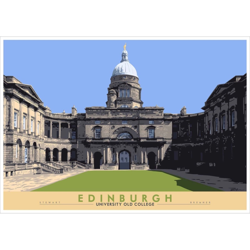
Image of Edinburgh: University Old College by Stewart Bremner

meaningful gift wall art should answer a specific need in the room or for the buyer. Edinburgh: University Old College is a useful example because Old College can mark years of study and a specific Edinburgh connection without relying on dates, slogans or short-lived graduation merchandise.

meaningful gift wall art - Edinburgh: University Old College

Choose meaningful gift wall art from a true connection

Begin with the recipient, not the occasion. Did they study in or regularly pass Old College? Does Edinburgh represent independence, friendships or a change in direction? A recognisable place becomes a stronger gift when it carries one of those personal stories.

Gift questionWhy it matters
Where might it hang?The 594 x 420 mm and 840 x 594 mm print options both need realistic wall space after framing.
Will they move soon?A versatile frame and clear landscape format can transfer more easily between homes.
Which memory matters?A short handwritten note can explain the location without adding wording to the artwork.
Is the subject personal?Choose it for a genuine university or Edinburgh link, not simply because graduation is Scottish.

Do not guess at the largest option. If possible, ask a partner or family member for a wall photograph and furniture width. Include the mount and moulding in the planned outline. Good scale makes the gift easier to enjoy immediately rather than creating a storage problem.

A graduation picture should carry the memory after the cards and ceremony have passed.

Make the presentation worthy of the milestone

Stewart Bremner’s place-led illustration gives the recipient a recognisable Edinburgh subject. Colour-managed Giclée production and hand-finished framing turn that connection into a substantial, ready-to-hang gift, with the work completed in-house in Falkirk.

For practical information about visiting the university and its city-centre sites, use the University of Edinburgh’s official visitor information. You can also browse the Stewart Bremner collection or see the exact framed product.

Meaningful gift wall art succeeds when the picture belongs to the recipient’s story. Edinburgh University Old College can honour achievement, place and memory in a form designed to remain part of the home for years.

Posted on

Edinburgh: Scottish Parliament: Civic Office Wall Art With Modern Architecture

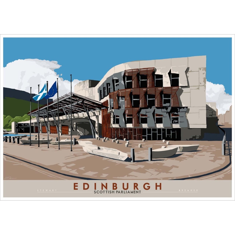
Image of Edinburgh: Scottish Parliament by Stewart Bremner

civic office wall art should tell visitors something about a workplace before a meeting begins. Edinburgh: Scottish Parliament by Stewart Bremner uses the Scottish Parliament’s recognisable forms, flags and open forecourt to create that immediate connection. The building is modern, public and unmistakably Edinburgh. Its clean graphic treatment can give a reception, consultation room or shared office a strong sense of place without falling back on a generic city skyline.

civic office wall art: Edinburgh: Scottish Parliament by Stewart Bremner

Why civic office wall art needs a clear purpose

Artwork in a civic setting is seen by many audiences. Staff pass it every day. Visitors may see it while waiting, asking for help or preparing for an appointment. A picture therefore needs to be interesting without becoming distracting, locally relevant without looking like a souvenir, and professional without feeling impersonal.

This print answers that brief through architecture. The Parliament’s pale stone, dark window openings and warm timber details create a disciplined palette. Strong shadows give the building depth, while the open blue sky stops the scene from feeling severe. The Saltire and European flag add movement near the entrance, but they do not dominate the composition.

Start with the visitor journey

Choose the wall by following the route a visitor actually takes. Begin at the entrance, pause at the reception point and then sit in the waiting area. The best position is often the first uninterrupted wall seen from two of those places. It lets the picture act as an orientation point rather than a decoration added after the furniture plan was finished.

  1. Check the entrance view. The building and the Edinburgh caption should remain legible from the doorway.
  2. Check the seated view. Avoid placing the centre of the image so high that waiting visitors look up sharply.
  3. Check the service point. Screens, leaflet holders and signs should not cut across the lower part of the frame.
  4. Check circulation. Keep the finished frame clear of door swings, queue barriers and the busiest shoulder-height route.

The available print proportions suit a wall above low seating, a credenza or a bank of visitor chairs. Mark the full framed dimensions with paper or low-tack tape. This test reveals whether the artwork is large enough to hold the wall without making a public area feel crowded.

Use modern architecture to signal local confidence

A traditional landmark can communicate heritage. The Scottish Parliament says something different. Its asymmetric windows, projecting timber elements and broad canopy speak about contemporary public life and ambitious design. That makes the image relevant to organisations working in policy, community services, planning, education or the built environment.

There is no need to turn the whole office into an Edinburgh theme. One specific architectural subject is more confident than a collection of unrelated postcards. Keep nearby signage functional and give the artwork a defined area of wall. Local identity then feels deliberate rather than promotional.

Build a calm workplace palette around the print

Existing office finishConnection in the artworkPractical approach
Blue seatingThe clear sky and flags provide a natural linkKeep other blue accessories limited
Pale wallsThe stone facade keeps the picture lightUse a mount edge if the print needs more separation
Timber reception deskWarm brown louvres repeat the material gentlyAvoid forcing the frame to match the desk exactly
Dark metal detailsWindow shadows add crisp contrastChoose a slim moulding rather than a heavy black border

The graphic style is especially useful where an office already contains screens, wayfinding and printed information. Large, simplified shapes remain readable among those practical elements. They also keep the building clear from a distance, while smaller details reward a closer look.

Plan lighting and presentation for daily use

Public offices often combine ceiling panels, window light and task lighting. Check the proposed wall at different times of day. A bright reflection across the Parliament caption or the dark windows can interrupt the design. Moving the frame slightly, adjusting a spotlight or choosing a wall at right angles to glazing may improve visibility.

First 4 Frames uses colour-managed Giclée production and completes bespoke framing in-house at its Falkirk workshop. That process helps preserve the flat blue sky, pale masonry, fine flag details and deep architectural shadows. A well-chosen frame also protects the print in a busy shared environment and gives it a suitably finished edge.

Stewart Bremner is an Edinburgh-based artist, illustrator and graphic designer whose work draws on travel-poster and mid-century influences. See more of his approach at Stewart Bremner’s official website, or browse the wider Stewart Bremner collection at First 4 Frames.

Purposeful civic office wall art can make a workplace feel rooted, approachable and contemporary before a conversation starts. View the framed Edinburgh: Scottish Parliament print for a strong architectural image that connects public space with a distinctive part of modern Edinburgh.

Posted on

Art for Hotels With a Sense of Place: Welcome Guests to Inveraray

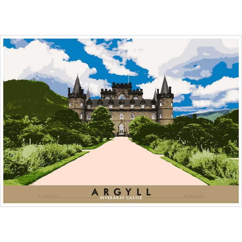
Image of Argyll: Inverary Castle by Stewart Bremner

art for hotels should answer a real question about the room or recipient. Argyll: Inverary Castle is useful here because its recognisable Argyll landmark gives guests a destination and local context rather than an anonymous landscape or corporate pattern.

art for hotels - Argyll: Inverary Castle

Specify art for hotels from the guest journey

Walk the route from entrance to reception, lift, corridor and bedroom. The castle can work as an arrival statement, a wayfinding pause or a quieter view above low furniture. Decide its role before choosing between the 594 x 420 mm and 840 x 594 mm print sizes.

Hotel zonePractical response
ReceptionGive the larger landscape clear space beyond the desk and check reflections.
Corridor endUse the landmark as a destination without placing signs across it.
BedroomMeasure from the headboard or console and test the doorway view.
LoungeRelate the frame to fixed timber rather than adding tartan motifs.

A recognisable place supplies its own story. Keep accessories restrained. Across several rooms, consistent outer dimensions and hanging heights can create order without repeating the same image everywhere.

Balance local character with commercial consistency

Colour-managed Giclée production supports dependable reproduction, while in-house bespoke framing can coordinate a single statement piece or a wider hospitality scheme. The result is ready to hang but still specific to Argyll.

For visitor information and history connected with the landmark, see the official Inveraray Castle website. Browse the Stewart Bremner collection, or view the exact product and framing choices.

Art for hotels should help guests understand where they have arrived. Argyll: Inverary Castle brings a clear destination to the wall while disciplined framing keeps the interior professional rather than themed.

Posted on

Scottish Art Gifts for a New Baby: Let Ally Bally Tell the Story

Image of Ally Bally, Ally Bally, Bee by Stewart Bremner

Scottish art gifts should answer a real question about the room or recipient. Ally Bally Ally Bally Bee is useful here because the familiar rhyme can connect a child with family voices and Scottish language while remaining a proper framed artwork.

Scottish art gifts - Ally Bally Ally Bally Bee

Choose Scottish art gifts that can outlast the nursery

Begin with the family connection. If parents or grandparents know the song, the words carry a memory that generic baby motifs cannot supply. A note can explain who sang it and why it was chosen, without adding names or dates permanently to the print.

For the first room

Hang the portrait print away from the cot, direct sun and reachable furniture. Leave clear wall so the words are easy to read.

For later years

The 420 x 594 mm and 594 x 840 mm sizes can move to a landing, reading corner or family room as the child grows.

Avoid surrounding it with several sayings. One familiar line has more presence when shelving, bunting and patterned textiles leave it visual space. Measure the complete framed outline before selecting either size.

Give a remembered rhyme a durable finish

Accurate mounting and hand-finished framing turn familiar words into a resolved gift. First 4 Frames completes the work in-house in Falkirk, so the presentation feels substantial while the typography remains warm and immediate.

For more of the illustrator’s Scotland-led work, visit Stewart Bremner’s official website. Browse the Stewart Bremner collection, or view the exact product and framing choices.

Scottish art gifts feel personal when they carry a real connection. Ally Bally Ally Bally Bee can mark a new arrival through language and family memory, then follow the child into later rooms.

Posted on

Scottish Typography Wall Art for a Landing: A Braw Bricht Welcome

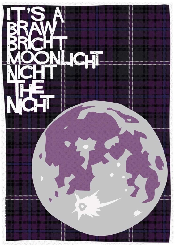
Image of It's a Braw Bricht Moonlicht Nicht the Nicht by Stewart Bremner

Scottish typography wall art for a landing can give a passing space a reason to pause. It’s a Braw Bricht Moonlicht Nicht the Nicht brings a familiar Scots phrase into that role. Its musical wording feels welcoming, while the portrait proportions suit a wall that may be taller than it is wide.

Scottish typography wall art for a landing - It's a Braw Bricht Moonlicht Nicht the Nicht

Give Scottish typography wall art for a landing time to be read

A landing is viewed from several directions. Walk upstairs, come out of each doorway and look back towards the proposed wall. The complete line should appear before a door leaf, banister or tall light fitting interrupts it. A paper template at the finished framed size makes that test more reliable than judging the print dimensions alone.

Use the smaller size

The 420 x 594 mm print can suit a compact return wall where the phrase is read at close range. Keep its centre connected to normal eye level.

Consider the larger size

The 594 x 840 mm option can hold a taller stair landing, provided switches, alarms and opening doors remain clear of the full frame.

Typography already supplies pattern and personality. Avoid surrounding it with several other sayings. One runner, a simple wall colour and warm, even light are enough. If the landing is dim after sunset, position a fitting so it reveals the words without throwing a hard reflection across the glazing.

Frame a familiar phrase as lasting artwork

Precise mounting and a hand-finished frame help bold lettering feel deliberate rather than temporary. First 4 Frames completes the work in-house in Falkirk, so the final proportions and finish can be judged for a narrow circulation space.

See more of the illustrator’s Scots-led work at Stewart Bremner’s printmaking website. You can also explore the Stewart Bremner collection or view the exact print and framing choices.

Scottish typography wall art for a landing works when people can read it naturally as they move. Give this braw bricht line one clear position and it can make the route feel personal without filling every wall.

Posted on

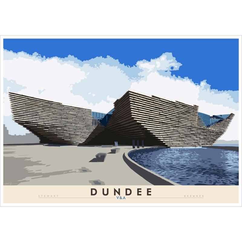
Dundee V&A: A Scottish Gift for an Architecture Graduate

Image of Dundee: V&A by Stewart Bremner

A Scottish gift for an architecture graduate can mark years of study without defaulting to drawing tools, novelty plans, or another object for a crowded desk. Dundee: V&A by Stewart Bremner connects the occasion to a distinctive piece of Scottish architecture. Its bold graphic treatment also reflects the graduate’s trained eye for silhouette, proportion, and the relationship between a building and its setting.

Scottish gift for an architecture graduate: Dundee: V&A by Stewart Bremner

Why a Scottish gift for an architecture graduate should feel specific

Graduation presents are most memorable when they acknowledge what the recipient has learned. An image of a recognised contemporary building does this without turning their degree into a slogan. The V&A Dundee provides a strong subject because the structure is immediately defined by its form and riverside position.

The Scottish setting adds another layer. It may connect with a graduate who studied in Dundee, grew up nearby, visited the museum during their course, or simply values ambitious public architecture. Those personal links make the gift easier to remember than a broadly architectural poster chosen without reference to place.

Match the gift to the graduate, not only the degree

  • For a Dundee connection: the landmark can hold memories of study, work placements, exhibitions, or the waterfront.
  • For a design-led home: the travel-poster influence sits naturally with clean furniture and strong colour.
  • For a first professional office: the subject signals architectural interest without looking like course material.
  • For a move after graduation: a framed image provides a portable connection to Scotland and a familiar city.

Think about the recipient’s taste before selecting a size or frame. Someone who prefers minimal rooms may want a restrained moulding and plenty of wall space. A graduate with a more colourful interior may enjoy a stronger frame edge. The aim is to support the graphic image rather than compete with it.

Choose a size for where life goes next

The available print sizes are 594 by 420 and 840 by 594 millimetres before framing. The smaller option is easier to place in a rented flat, study, or compact office. The larger version can become a substantial focal point in a living room or studio. If you do not know the graduate’s future wall space, the more adaptable size is often the considerate choice.

A ready-to-hang framed print also reduces practical work during a busy transition. First 4 Frames uses colour-managed Giclée production and completes bespoke framing by hand at its Falkirk workshop. The result feels properly finished for a milestone while remaining useful long after the ceremony.

Add a message without marking the artwork

Write a separate card that records the qualification, date, and why you chose the building. This keeps the print versatile if it later moves from a home to a workplace. It also gives the recipient a personal note to keep without adding a plaque or inscription that may not suit every future room.

Stewart Bremner is an Edinburgh-based artist, illustrator, and graphic designer whose Scottish work draws on travel posters and mid-century graphic design. See the wider range on Stewart Bremner’s official website, or compare more subjects in the Stewart Bremner collection at First 4 Frames.

As a Scottish gift for an architecture graduate, this image recognises both achievement and an enduring interest in the built environment. View the framed Dundee: V&A print for a landmark-led present with bold design and lasting craftsmanship.

Posted on

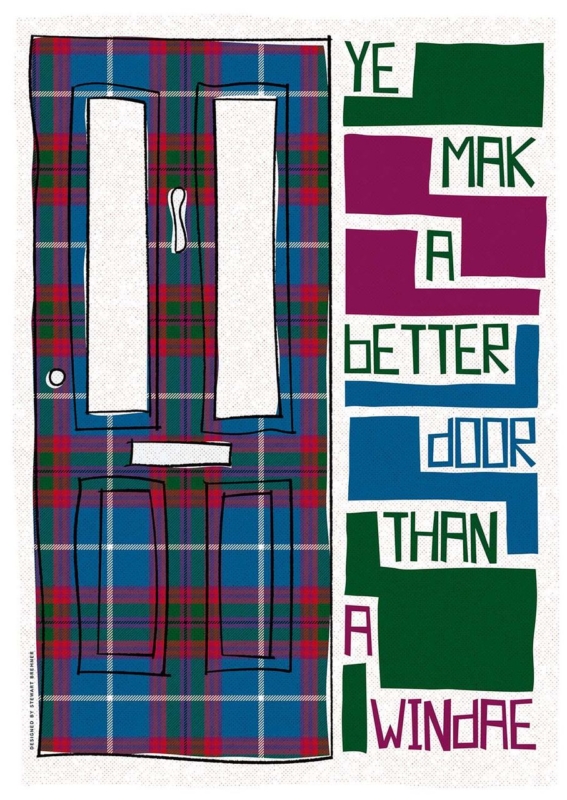
Ye Mak a Better Door Than a Windae: Scottish Wall Art for a Flatshare

Image of Ye Mak a Better Door Than a Windae by Stewart Bremner

Scottish wall art for a flatshare has to do more than suit one person’s taste. A shared living room may contain inherited chairs, temporary shelving, several colour preferences, and housemates who change over time. Ye Mak a Better Door Than a Windae by Stewart Bremner meets that challenge with a familiar joke, a strong graphic layout, and tartan-inspired colour. It gives everyone a talking point without pretending the room has one perfectly coordinated style.

Scottish wall art for a flatshare: Ye Mak a Better Door Than a Windae by Stewart Bremner

What Scottish wall art for a flatshare should contribute

Communal artwork works best when it creates recognition rather than claiming ownership of the whole room. This phrase is likely to raise a smile for anyone who has blocked a television, window, or kitchen cupboard without noticing. The humour comes from ordinary shared life, so it feels more inclusive than a personal slogan or a highly specific hobby print.

The design has enough visual substance even before the words are read. A tall tartan-covered door occupies one side. Blocks of green, magenta, blue, and white turn the phrase into a lively vertical rhythm on the other. That balance allows the print to work as graphic art from across the room and reveal the joke at closer range.

Agree on a position before debating every colour

A shared decision becomes easier when housemates start with the wall rather than the frame finish. Look for a place seen by everyone: above a low sideboard, beside the dining table, or on the main route between kitchen and sitting area. Avoid the narrow strip behind an actual open door, where both the artwork and the joke would spend much of the day hidden.

  • Use the common sightline. Check the view from the sofa, dining seats, and doorway.
  • Keep notices separate. Do not crowd the frame with calendars, keys, or a household chore board.
  • Allow for changing furniture. A strong wall position should still work if a borrowed bookcase or table is replaced.
  • Choose one colour connection. Repeat a green, blue, or magenta note if it already exists, but do not force the entire room to match.

Use the generous format as a shared focal point

The available print sizes are 420 by 594 millimetres and 594 by 840 millimetres before framing. Both are substantial enough to avoid looking like a temporary sign. The larger size can anchor a broad communal wall, while the smaller option may suit a dining corner or the end of a galley-style living space.

Measure the complete framed dimensions rather than the print alone. A mount and moulding add presence. Use paper templates to compare the two options, then make sure doors, cupboard fronts, and tall lamps have clear movement around the proposed position.

Can bold Scots language art still look polished?

Yes, provided the presentation treats it as artwork rather than a poster pinned up for a season. A simple dark moulding can echo the black outlines and sharpen the blocks of colour. A quiet natural timber may soften the graphic quality in a room with older furniture. In either case, the frame should contain the energy rather than compete with it.

First 4 Frames uses colour-managed Giclée production and hand-finishes its bespoke framing in-house in Falkirk. That level of craftsmanship supports the fine tartan pattern, clean lettering, and saturated colour. It also gives a shared home one properly finished piece that can move with its owner later, instead of becoming disposable flat decor.

A familiar phrase with confident graphic design

Stewart Bremner is an Edinburgh-based artist, illustrator, and graphic designer whose work celebrates Scottish language, landscape, and culture. His bold shapes and poster-like compositions make familiar subjects feel contemporary. See the wider range on Stewart Bremner’s official website, or browse the Stewart Bremner collection at First 4 Frames.

The best Scottish wall art for a flatshare gives several people a reason to enjoy the same wall. View the framed Ye Mak a Better Door Than a Windae print for a colourful piece whose humour, scale, and distinctly Scottish voice can hold together an otherwise mixed communal room.