Posted on

Fall and the Appeal of Wall Art for Smoked Glass Accents

Image of Fall by Stuart Roy

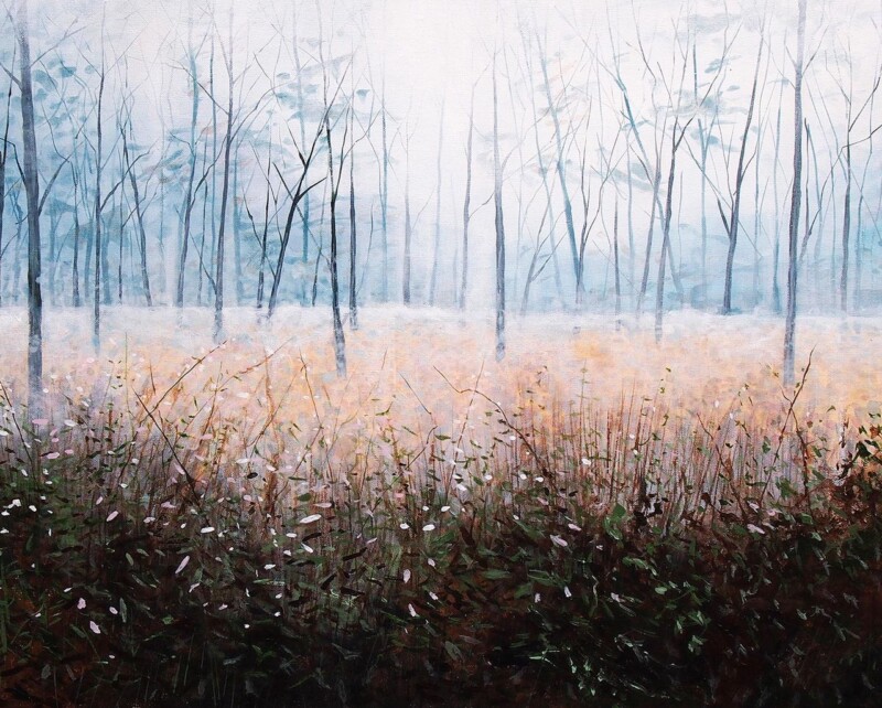
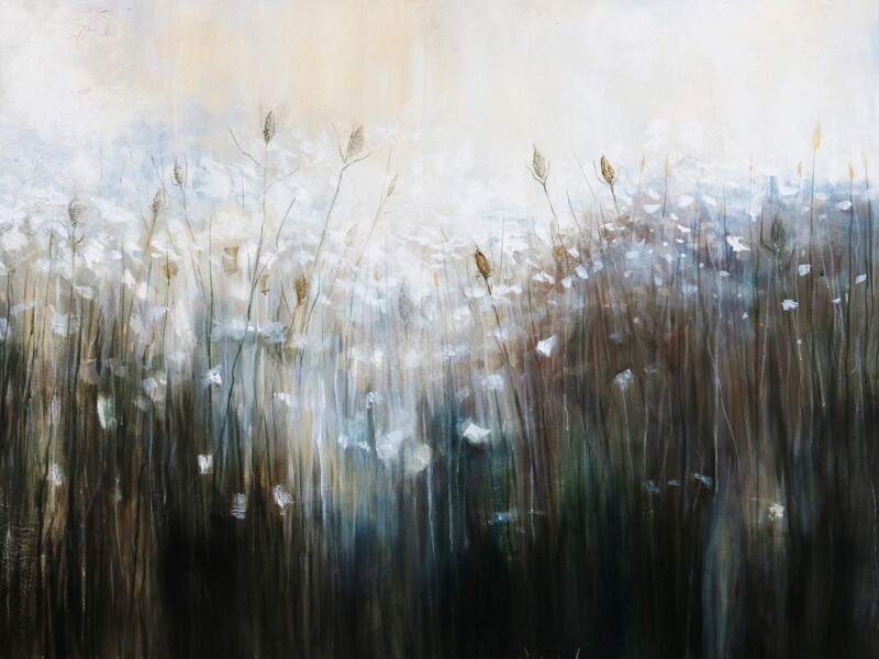
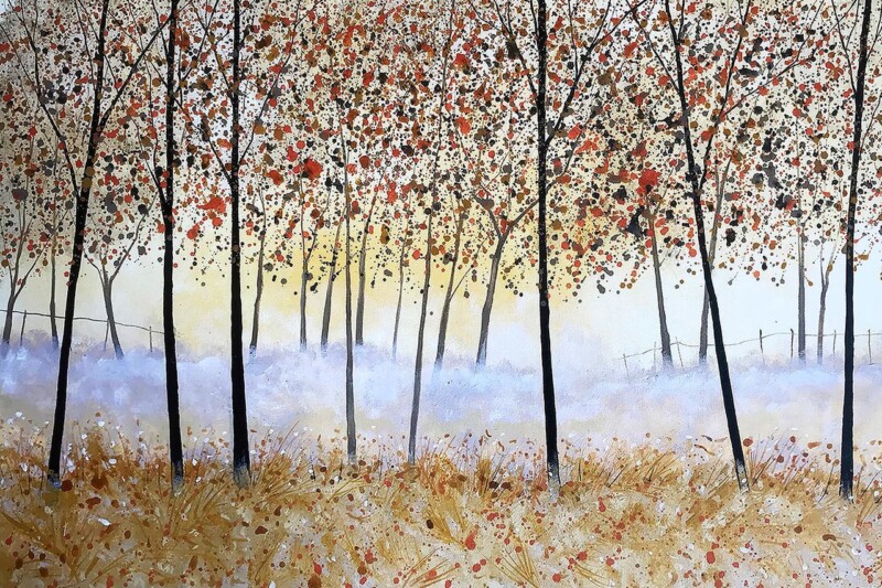
Choosing wall art for smoked glass accents is usually about getting the mood right. Smoked glass can make a room feel rich, contemporary, and beautifully layered, but it can also turn slightly heavy if the artwork does not bring enough warmth or movement. Fall works especially well because it deepens the atmosphere without making the space feel closed in.

Why richer interiors still need softness

Rooms with darker reflective details often benefit from artwork that has mood but also a little lift. This piece gives you that middle ground. It feels dramatic enough to belong in the room, yet it still stops the scheme from becoming too sharp or too cold.

  • It suits contemporary living rooms and dining rooms.
  • It works well near darker sideboards or drinks cabinets.
  • It helps reflective finishes feel more grounded.

Why this pairing feels more balanced than obvious

The point is not to match every surface exactly. It is to create a room where the materials speak to each other. Fall does that by echoing depth and atmosphere while still adding a natural softness that glass alone cannot provide.

Why framing quality stands out in this kind of room

First 4 Frames completes every piece in-house with bespoke framing, colour-managed Giclée printing, and hand-finished craftsmanship. In a more design-led room, those finer details are easier to notice, which makes superior presentation especially worthwhile.

This artwork is by Stuart Roy, and you can view the exact framed product here.

If you need wall art for smoked glass accents that feels warm, composed, and beautifully finished, Fall is an excellent option.

Posted on

Haunted, Still and the Case for Wall Art in a Room With Statement Lighting

Image of Haunted, Still by Stuart Roy

Finding the right wall art for a room with statement lighting is often about restraint. If a chandelier, oversized pendant, or sculptural wall light already sets the tone, the artwork needs enough confidence to belong there without turning the room into a contest. Haunted, Still works especially well because it brings atmosphere and depth while staying composed.

Why dramatic rooms still need one quieter anchor

Statement lighting often draws the eye upward first. That makes the wall art even more important, because it has to steady the room rather than merely fill space underneath. This piece introduces a softer kind of drama. It gives the room mood, but it does so in a more grounded way.

That balance can be especially useful in dining rooms, hallways, and darker sitting rooms where lighting is part of the design identity.

Why this artwork pairs so well with stronger fittings

  • It has presence without looking flashy.
  • It complements evening atmosphere beautifully.
  • It helps decorative lighting feel integrated rather than isolated.

The room keeps its character, but the overall effect becomes more layered and less dependent on one standout fitting.

Why craftsmanship makes a difference here

At First 4 Frames, every piece is completed in-house in Falkirk using bespoke framing, colour-managed Giclée printing, and hand-finished craftsmanship. In a more design-led room, that superior finish matters because the details around the frame and print quality are far easier to notice.

This artwork is by Stuart Roy, and you can view the exact framed product here.

If you need wall art for a room with statement lighting that feels atmospheric, balanced, and professionally finished, Haunted, Still is a strong choice.

Posted on

How Moody Blues Can Work Beautifully as Wall Art for a Room With Wall Lights

Image of Moody Blues by Stuart Roy

Choosing wall art for a room with wall lights is often less about daylight and more about how the space feels in the evening. When the room relies on side lighting, the artwork needs enough depth and character to hold attention without disappearing after dark. Moody Blues is especially effective because it comes alive in a softer, more atmospheric setting.

Why evening rooms need artwork with depth

Wall lights create warmth and intimacy, but they also flatten weaker pieces or make them feel secondary to the lighting itself. This artwork has enough tonal interest to stay present as the light levels change, which helps the room feel layered rather than simply dim.

  • It suits sitting rooms, bedrooms, and snug spaces used more in the evening.
  • It works well where lighting is softer and more directional.
  • It helps an intimate room feel richer without adding clutter.

Why the mood of the piece matters

Some artwork only really reads in bright natural light. Moody Blues is different. Its atmosphere means it still feels expressive when lit by wall sconces or lamps, which makes it a very practical as well as attractive choice for rooms that come into their own later in the day.

It can work beautifully between two wall lights, above a sideboard with ambient lighting nearby, or on the wall opposite a sofa where the room needs a quieter but still memorable focal point.

Why the framed finish helps after dark

First 4 Frames completes each piece in-house with bespoke framing, colour-managed Giclée printing, and hand-finished craftsmanship. In evening rooms, those details matter because the quality of the presentation helps the artwork keep its presence even under softer light.

This artwork is by Stuart Roy, and you can view the exact framed product here.

If you need wall art for a room with wall lights that feels atmospheric, polished, and easy to live with, Moody Blues is an excellent option.

Posted on

Why Avocet Works So Well as Wall Art for Linen Curtains

Image of Avocet by Stuart Roy

Choosing wall art for linen curtains is usually about protecting the softness of the room while making sure it does not drift into looking too vague. Linen window dressings bring lovely texture, filtered light, and an easy sense of calm, but they also benefit from artwork that gives the room a little more definition. Avocet does that beautifully.

Why soft textiles still need a focal point

Linen curtains often appear in rooms designed to feel restful and natural. That softness is part of their charm, but without one clearer visual anchor the room can look slightly unfinished. This piece brings enough structure and interest to settle the space while keeping the lighter mood intact.

  • It suits bedrooms, sitting rooms, and quieter guest spaces.
  • It adds definition without making the room feel formal.
  • It works well where daylight is filtered and gentle rather than harsh.

Why this subject feels right beside linen

There is a natural restraint to Avocet that pairs well with softer fabrics. The piece has presence, but it does not feel loud. That makes it easy to place in rooms where the appeal comes from texture, calm colour, and a slower pace rather than high contrast decoration.

It can work especially well above a bed, beside a window seat, or on the wall opposite the curtains where the framed print can help complete the whole composition of the room.

Why the framed finish matters

First 4 Frames completes every piece in-house with bespoke framing, colour-managed Giclée printing, and hand-finished craftsmanship. That superior presentation suits linen-led interiors especially well because the room already relies on texture and quality rather than flashier decoration.

This artwork is by Stuart Roy, and you can view the exact framed product here.

If you want wall art for linen curtains that feels calm, elegant, and professionally finished, Avocet is an excellent choice.

Posted on

Choosing Wall Art for Limewashed Walls, Why Morning Rises Feels So Balanced

Image of Morning Rises by Stuart Roy

Choosing wall art for limewashed walls takes a little more thought than standard decorating. Limewash already gives a surface movement, softness, and tonal variation, so the artwork has to complement that texture rather than flatten it. Morning Rises works very well because it adds atmosphere and focus while still respecting the wall behind it.

Why gentle texture still needs contrast

Limewashed rooms often feel calm and tactile, but they can drift into looking slightly underfurnished if every element remains too close in tone. This piece introduces enough variation to shape the room, yet it does not break the softer mood that limewash creates so well.

  • It adds depth without overwhelming a quieter wall finish.
  • It suits bedrooms, sitting rooms, and more considered entrance spaces.
  • It helps a textured room feel complete rather than simply minimal.

Why the balance matters more than boldness

The best pairing here is usually not the loudest artwork. It is the piece that can hold its place while leaving the wall texture visible and meaningful. Morning Rises does exactly that. It feels present, but it does not turn the room into a contest between surface and picture.

That makes it especially useful above a bed, behind a sofa, or on the wall that first catches the light as the room brightens through the day.

Why quality framing helps

At First 4 Frames, each piece is produced in-house in Falkirk with bespoke framing, colour-managed Giclée printing, and hand-finished craftsmanship. On a finish as characterful as limewash, that higher standard is important because cheaper presentation tends to show immediately.

This artwork is by Stuart Roy, and you can view the exact framed product here.

If you need wall art for limewashed walls that feels measured, atmospheric, and professionally finished, Morning Rises is an excellent fit.

Posted on

Why Mirror Glaze Is Such a Good Wall Art Choice for Polished Plaster Walls

Image of Mirror Glaze by Stuart Roy

Finding the right wall art for polished plaster walls can be more important than it first seems. Those softly textured finishes already bring depth and sophistication to a room, so the artwork needs to complement that richness without looking busy. Mirror Glaze works especially well because it adds atmosphere and contrast while still feeling calm.

Why smoother texture still needs a focal point

Polished plaster can make a room feel beautifully finished, but large uninterrupted walls sometimes need one stronger element to stop the space feeling too evenly toned. This piece introduces movement and colour in a way that still respects the room’s quieter surface detail.

  • It adds depth without making the wall feel cluttered.
  • It suits schemes built around softer neutrals and layered finishes.
  • It works well in living rooms, bedrooms, and calm reception spaces.

Why the balance feels right

Artwork for this kind of room usually needs presence rather than fuss. Mirror Glaze has enough atmosphere to hold the wall, but it does not overpower the subtle texture already in the scheme. That makes it easier to place and easier to live with over time.

It can work especially well above a sofa, opposite a bed, or on the main wall of a room where the finish itself already signals a quality-led interior.

Why the framing standard matters

At First 4 Frames, every piece is produced in-house in Falkirk with bespoke framing, colour-managed Giclée printing, and hand-finished craftsmanship. That superior presentation sits naturally in a room where material quality is already part of the design story.

This artwork is by Stuart Roy, and you can view the exact framed product here.

If you want wall art for polished plaster walls that feels atmospheric, balanced, and professionally finished, Mirror Glaze is an excellent fit.

Posted on

Scorched Earth as Wall Art for Concrete Floors, Why It Works

Image of Scorched Earth by Stuart Roy

Finding the right wall art for concrete floors is often about adding warmth without softening the room too much. Concrete can look crisp, contemporary, and beautifully understated, but it can also make a space feel a little severe if nothing counterbalances it. Scorched Earth works especially well because it brings atmosphere and texture while still feeling right at home in a modern interior.

Why cooler surfaces need more depth on the wall

Concrete tends to flatten the mood of a room unless other elements bring movement and visual warmth. This piece does that without relying on overly sweet colour or decorative fuss. It feels strong, but not harsh.

  • It softens a cooler scheme without making it look traditional.
  • It adds texture that complements polished or matte concrete alike.
  • It works well in loft spaces, dining areas, and contemporary hallways.

Why this kind of artwork sits well in design-led rooms

Some modern interiors need art that can hold its own against stronger materials. Scorched Earth has enough presence to do that, but it still leaves room for the architecture. That balance makes it easier to live with over time.

It can be especially effective where the floor already carries a lot of visual weight and the walls need something equally considered.

Why superior framing helps the result

At First 4 Frames, every piece is completed in-house in Falkirk with bespoke framing, colour-managed Giclée printing, and hand-finished craftsmanship. That superior quality matters in a pared-back room where cheaper finishes tend to show very quickly.

This artwork is by Stuart Roy, and you can view the exact framed product here.

If you want wall art for concrete floors that feels atmospheric, grounded, and professionally finished, Scorched Earth is a very smart choice.

Posted on

Why Nightswimming Is Such a Strong Choice for Art in a Room With Curved Furniture

Image of Nightswimming by Stuart Roy

Choosing art for a room with curved furniture is often about echo rather than contrast. Softer silhouettes in sofas, armchairs, and tables give a room a gentler feel, so the artwork needs to support that movement without turning the whole space vague. Nightswimming gets that balance right.

Why shape matters as much as colour

When a room uses more rounded forms, harsh or overly rigid artwork can feel slightly disconnected. The better choice is usually a piece that carries flow and atmosphere while still giving the room a proper point of focus. That is what makes this artwork so useful.

  • It supports softer furniture lines without becoming too blurred.
  • It suits calmer interiors that rely on shape and mood.
  • It helps a room feel cohesive rather than stage-managed.

Why Nightswimming works particularly well

The atmosphere feels settled and fluid, which makes it a natural partner for rounded silhouettes and more tactile upholstery. It can work especially well in a sitting room, bedroom, or snug where the aim is comfort with a cleaner, more deliberate edge.

Why a superior framed finish completes the look

First 4 Frames produces each piece in-house with bespoke framing, colour-managed Giclée printing, and hand-finished craftsmanship. In a room where the furniture has been chosen carefully for shape and feel, the framed finish matters. A superior quality presentation helps the artwork feel like part of the scheme rather than an afterthought.

This artwork is by Stuart Roy, and you can view the exact framed product here.

If you need art for a room with curved furniture that feels calm, cohesive, and beautifully presented, Nightswimming is a very strong option.

Posted on

Choosing Art for a Green Velvet Sofa, Why Oyster Catcher Feels So Balanced

Image of Oyster Catcher by Stuart Roy

Finding the right art for a green velvet sofa is often harder than it looks. Rich upholstery can give a room instant depth, but it can also make the scheme feel a little too weighty if the wall art does not bring contrast and clarity. Oyster Catcher handles that balance beautifully.

Why contrast matters with deeper upholstery

Velvet naturally brings softness and saturation. The best artwork alongside it usually has enough shape and tonal definition to stop the room from feeling overly dense. This piece gives you that sharper edge while still keeping a calm, design-led feel.

  • It works well when the sofa is the strongest colour in the room.
  • It helps richer fabrics feel elegant rather than heavy.
  • It adds personality without cluttering a more polished scheme.

Why Oyster Catcher works particularly well

The subject has real character, but the overall look still feels composed. That makes it a strong option for sitting rooms, snugs, or reading corners where the aim is warmth and individuality rather than a loud statement. It gives the room something memorable without forcing the scheme in an obvious coastal direction.

Why framing quality changes the result

At First 4 Frames, every print is produced in-house with bespoke framing, colour-managed Giclée printing, and hand-finished craftsmanship. Against a luxurious fabric like velvet, finishing details matter even more. A superior quality frame helps the artwork hold its own and keeps the whole room looking intentional.

This artwork is by Stuart Roy, and you can view the exact framed product here.

If you want art for a green velvet sofa that feels balanced, characterful, and properly resolved, Oyster Catcher is a very smart choice.

Posted on

Choosing Art for Tartan Accents, Why Pheasant Feels So Well Judged

Image of Pheasant by Stuart Roy

Choosing art for tartan accents is often about restraint. Tartan brings warmth, heritage, and texture, but it can also make a room feel visually heavy if the artwork adds too much competition. Pheasant is a strong answer because it supports that country character while still keeping the scheme balanced.

Why tartan rooms need thoughtful contrast

In interiors with tartan cushions, upholstery, or throws, the artwork should not try to out-pattern the textiles. It needs to bring a different kind of interest. This piece does that by introducing subject, tone, and presence rather than more visual noise.

  • It suits rooms with tartan details, wool textures, and darker timber.
  • It adds country character without forcing the room into cliché.
  • It helps the whole scheme feel collected rather than overly busy.

Where it can work especially well

Pheasant can sit comfortably in a snug, study, dining room, or hall where tartan already appears in smaller amounts. It gives the room a clearer focal point, which helps patterned fabrics feel better supported and less scattered across the space.

That is often the difference between a room that feels richly layered and one that simply feels busy.

Why superior framing helps the scheme land

First 4 Frames completes every piece in-house in Falkirk with bespoke framing, colour-managed Giclée printing, and hand-finished craftsmanship. In a more characterful interior, that polished finish matters because it gives the artwork the definition needed to sit confidently with heavier textures and stronger fabrics.

This artwork is by Stuart Roy, and you can view the exact framed product here.

If you need art for tartan accents that feels warm, balanced, and beautifully finished, Pheasant is an excellent choice.