What if a Scottish housewarming gift could feel personal without requiring you to guess every detail of someone’s décor? A framed print can bring a connection to Scotland into a new home, while its subject and colours help you choose with care. It’s understandable to hesitate between meaningful art and a generic home accessory, especially when you’re unsure what will suit their walls.
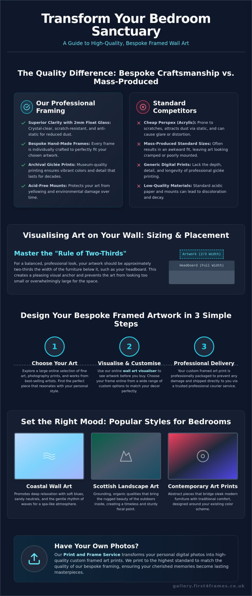
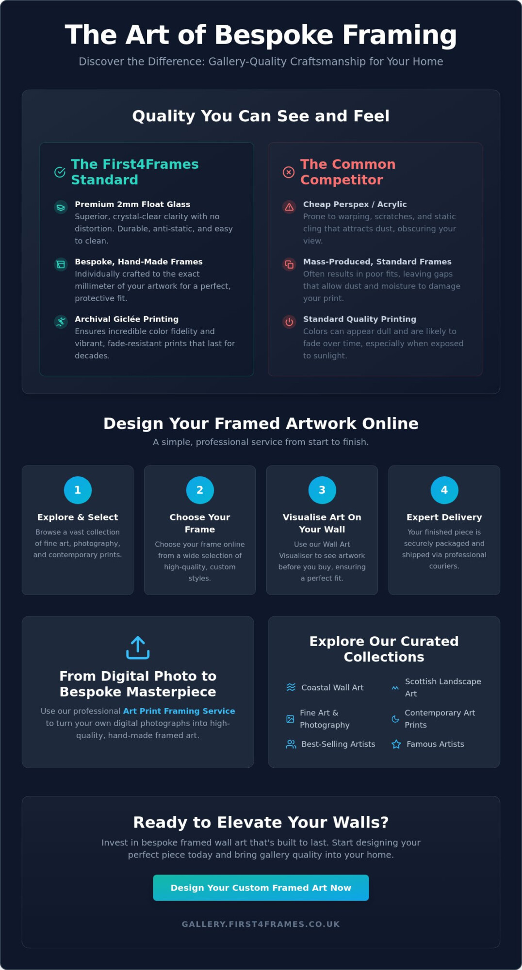
This guide will help you choose Scottish landscape art or coastal wall art that celebrates a sense of home, then turn it into a finished gift. Explore how to visualise art on your wall, see artwork before you buy, and choose your frame online. At First4Frames Gallery, bespoke frames are handmade for each order, with professional mounting and 2 mm float glass. Your framed artwork arrives ready to hang, making it a thoughtful choice without extra work for the recipient.
Key Takeaways
- Choose Scottish housewarming gifts with a meaningful connection to home, then narrow the subject to suit the recipient’s taste.
- Compare an unframed print, bespoke framed art and a framed personal photo to find a presentation that feels right.
- Learn what Giclée printing means and why the paper is described as not fading or discolouring.
- Follow a simple browse, select, frame and order path, with general orders delivered ready to hang within two weeks.
Why Scottish Housewarming Gifts Feel at Home in a New Space
Choosing a housewarming gift can feel tricky when someone is still settling into an unfamiliar home. You want it to feel personal, but guessing their colour scheme, furniture or available wall space can add pressure. Scottish housewarming gifts offer a thoughtful alternative: choose a subject with a connection to the recipient, then let the artwork bring its own story to the room.
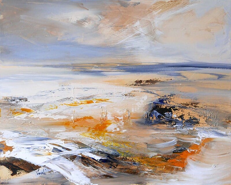
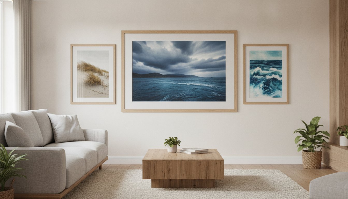
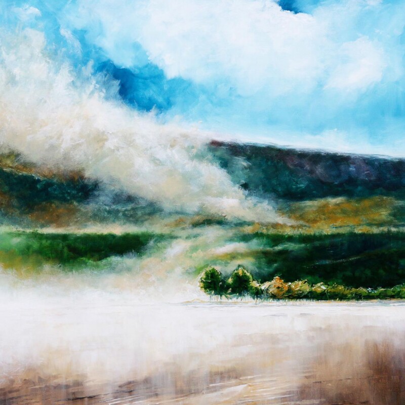
A Scottish landscape, coastline or other place-inspired image can suggest a sense of belonging without dictating how the rest of the room should look. Scotland’s artistic heritage is broad, and exploring Scottish art history and movements can introduce you to the stories and visual traditions behind different subjects. Browse Scottish artwork at First4Frames Gallery to find a print that resonates with the person, not just the occasion.
What makes framed wall art a thoughtful new-home gift?
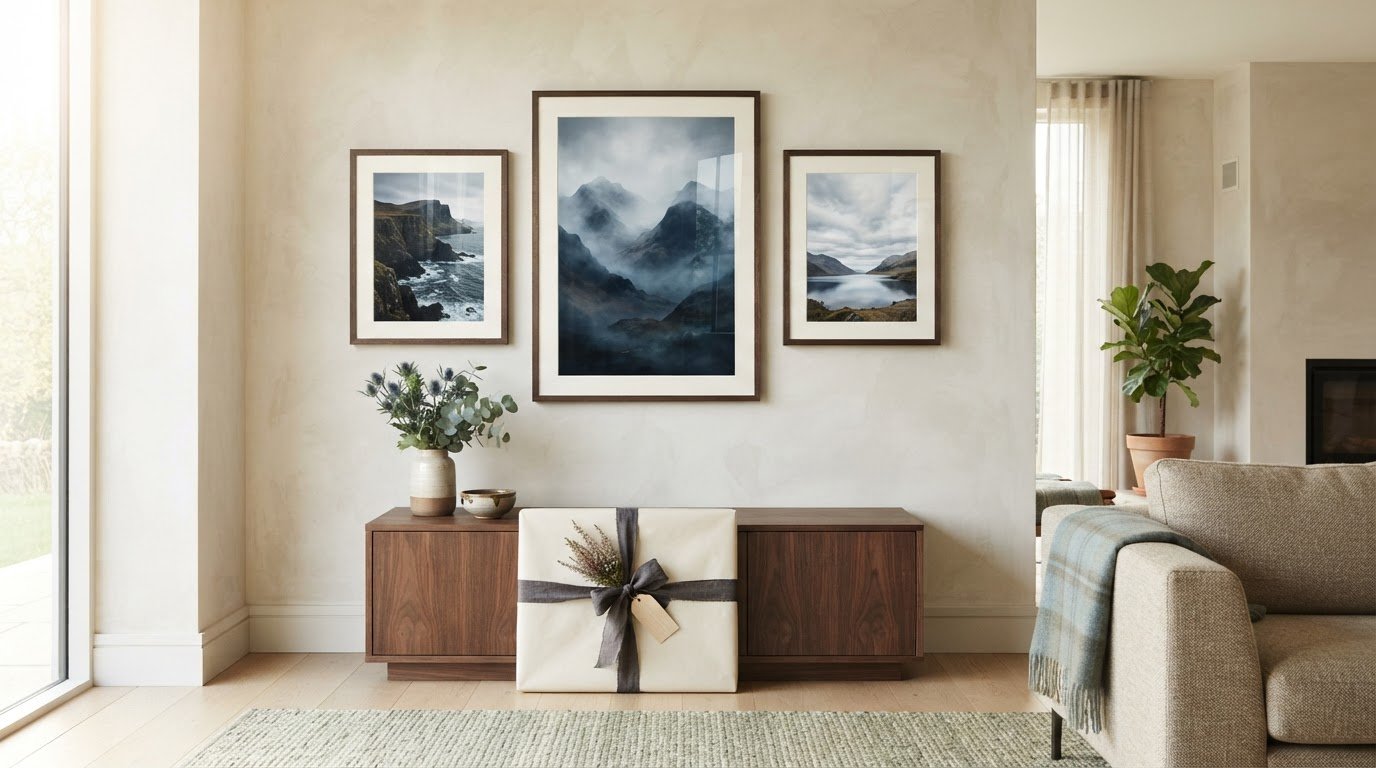
A carefully chosen print can mark the start of a new chapter and give the recipient something to enjoy every day. Unlike a generic accessory chosen mainly for practical use, framed wall art can hold personal meaning and become part of a home’s character. A finished, ready-to-hang piece is also considerate during a move: it arrives prepared for display, without leaving the recipient to source a frame or arrange the presentation.
Choosing meaning without overguessing their taste
Start with what you know about them, rather than trying to predict every detail of their interior. Do they have a connection to Scotland, enjoy open landscapes, or feel drawn to the coast? Then consider the atmosphere they might want at home: calm and spacious, bright and uplifting, or rich with a sense of place. A subject that reflects their interests gives the gift a personal anchor while leaving them room to make it their own.
How to Choose Scottish Art for Someone Else’s New Home
Choosing art for another person’s home doesn’t mean you need to know the exact wall colour or furniture style. Use a simple sequence: start with the recipient, choose a subject that suits them, then consider how the finished piece should look.
- Think about the person. Recall places they love, interests they talk about, or memories they associate with Scotland.
- Choose a subject. Scottish landscape art offers a sense of space and place, while contemporary art prints can bring a more modern interpretation. If they follow famous artists or enjoy discovering best-selling artists, use those interests as clues when selecting a subject.
- Decide on presentation. Consider the print’s scale and overall mood, then explore a frame and mount that complement the artwork.
If you haven’t seen the new home, familiar subjects and compositions with a clear focal point can be easier to imagine in different settings than a highly specific colour-led choice. For inspiration beyond the artwork itself, Contemporary Scottish craft and makers offers a window into the breadth of creative work connected with Scotland.
Match the artwork to the person, not every wall colour
Hobbies, memories and the atmosphere someone enjoys are often more useful clues than trying to predict their décor. Landscape wall art might suit a person who finds calm in open scenery; a Scottish saying could appeal to someone who enjoys words, humour or familiar expressions. These choices make a gift personal in different ways without relying on an exact match to the room.
See artwork before you buy
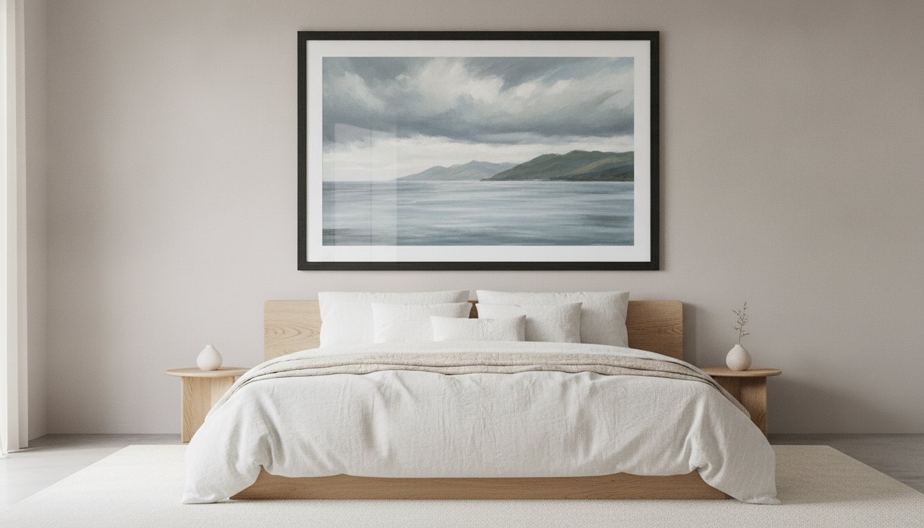
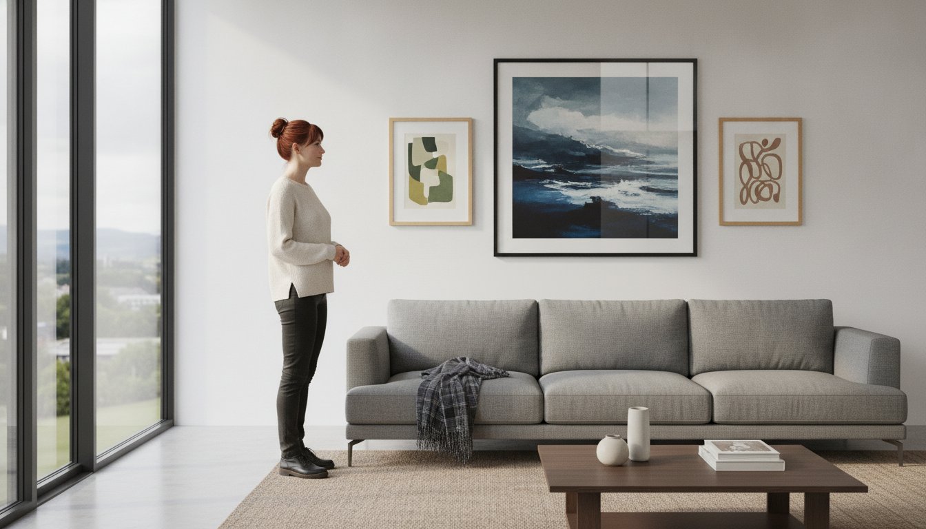
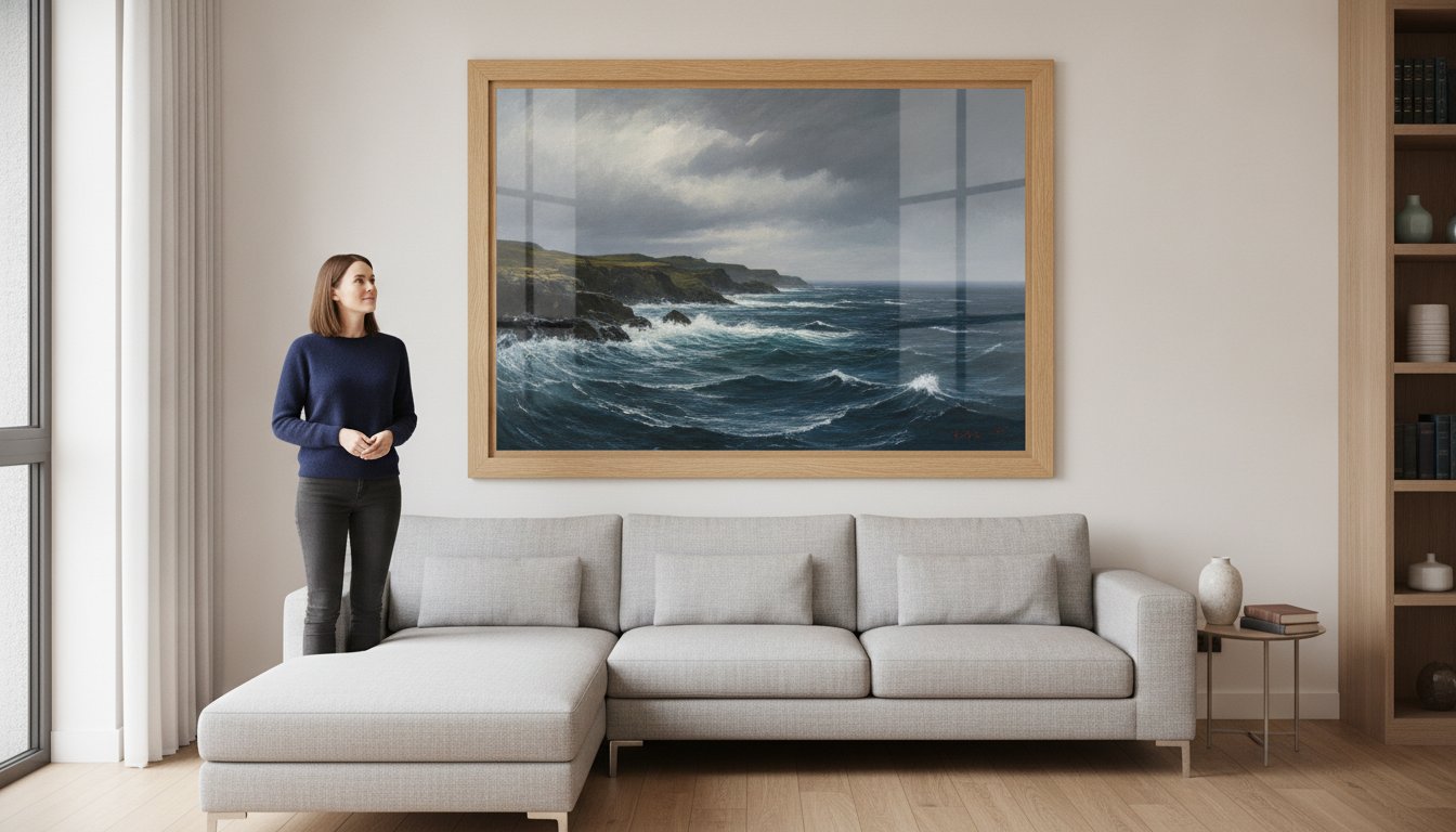
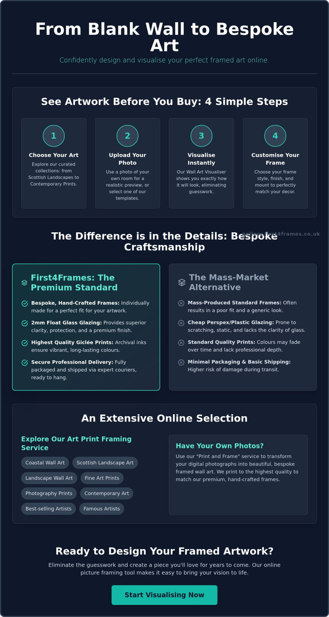
Visualise art on your wall by picturing its scale and mood in a room setting. A wall art visualiser, if you use one, can help you see artwork before you buy and compare how different framing choices change the overall impression. When you design your framed artwork, focus on whether the image feels balanced and suits the recipient, rather than trying to recreate a room you haven’t seen.
Once you have a subject in mind, explore framed Scottish art prints and see which pieces feel right for the person you’re celebrating.
What to Compare in Bespoke Framed Wall Art
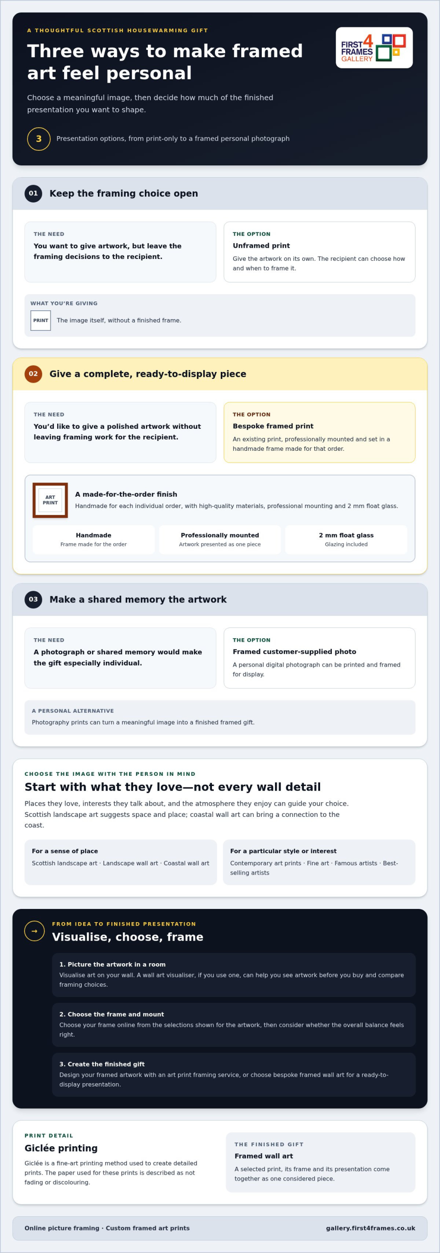
For Scottish housewarming gifts, presentation can make a meaningful image feel complete. Compare these three options by how much choice and personal input they offer.
| Option | What it offers | Consider it if |
|---|---|---|
| Unframed print | The artwork, without a finished frame. | You want to leave the framing decisions to the recipient. |
| Bespoke framed print | An existing print professionally mounted and set in a handmade frame made for that order. | You’d like to give a polished piece that’s ready to display. |
| Framed customer-supplied photo | A personal image printed and framed as a gift. | A shared memory or meaningful photograph would make the artwork especially individual. |
Giclée is a fine-art printing method used to create detailed prints. The paper used for these prints is described as not fading or discolouring, helping the image retain its appearance over time. For a personal alternative to a gallery image, First4Frames Gallery can also turn your own digital photograph into one of its photography prints, printed and framed for display.
Why bespoke framing changes the finished gift
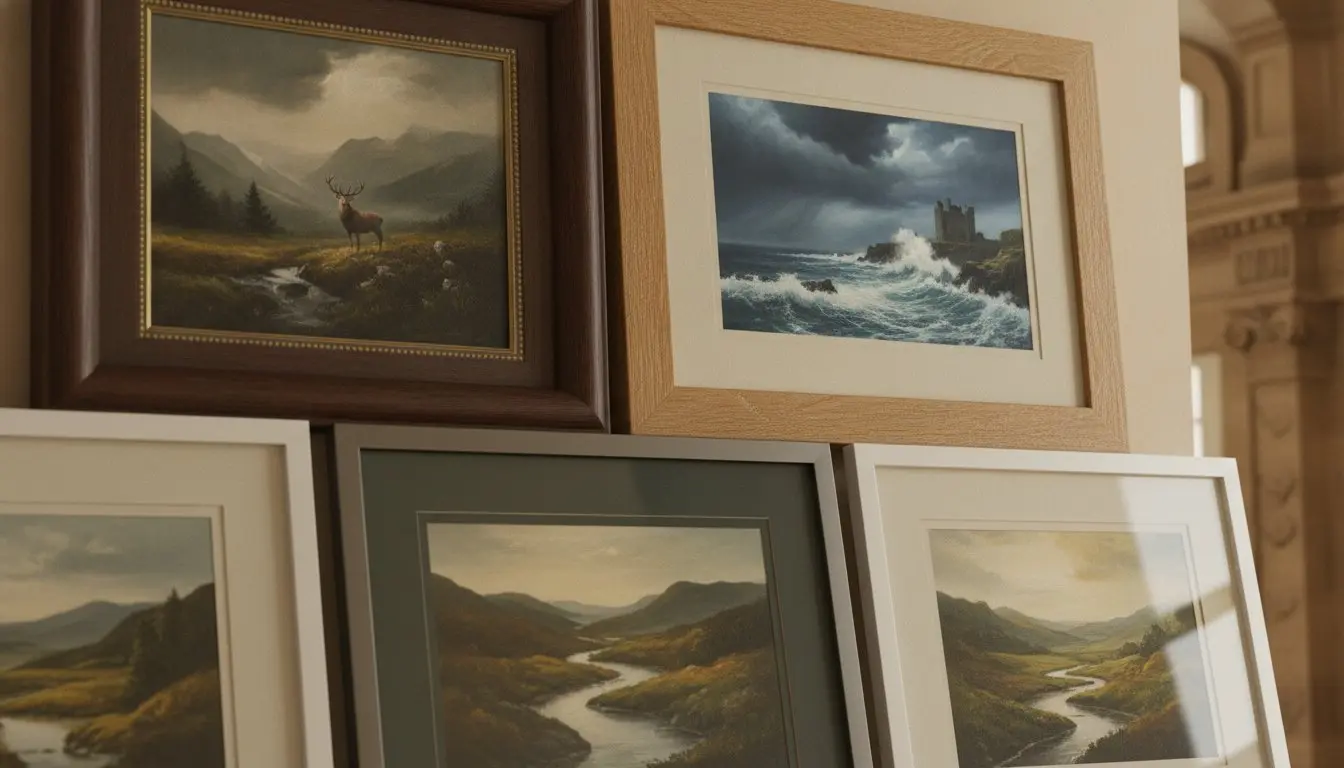
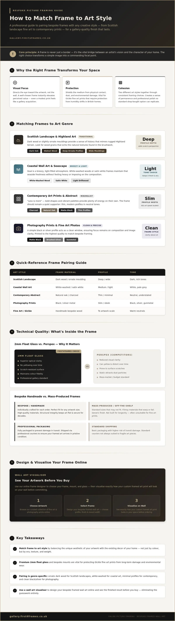
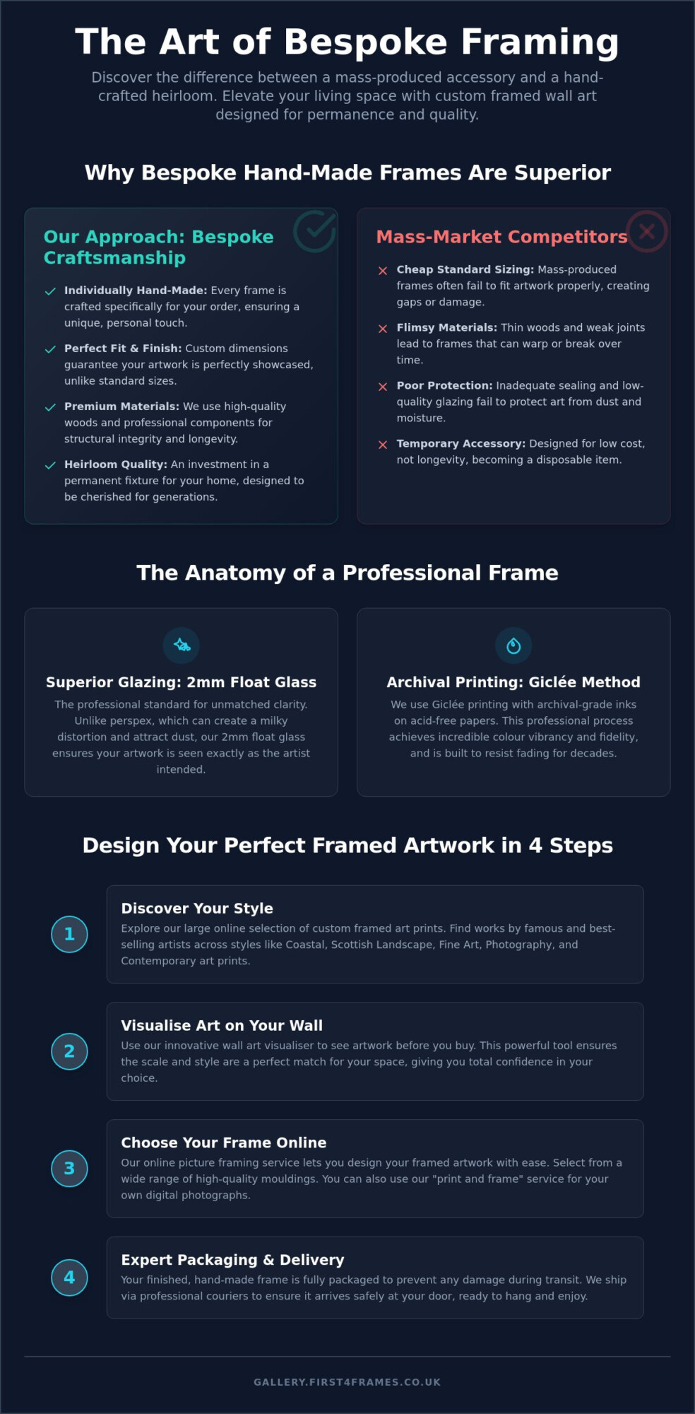
Each frame from First4Frames Gallery is handmade for the individual order, rather than selected as a standard size. High-quality materials, precise cutting and professional mounting help the artwork sit neatly within its frame, creating a considered finish. With online picture framing, you can choose from the frame and mount selections shown for the artwork. Frames are glazed with 2 mm float glass and include D-rings and high-quality framing wire to help the piece hang straight. This art print framing service brings the print and its presentation together as one finished piece.
A print, a framed artwork, or a personal photograph
An existing print makes it simpler to choose a subject you know the recipient will appreciate. A customer-supplied photo can carry a more specific memory, such as a favourite Scottish view or a moment shared with family. The photo printing and framing service lets you turn a digital image into a framed gift. Browse framed Scottish art prints to compare artwork and create custom framed art prints with a presentation that feels right.
Buying Scottish Housewarming Gifts That Arrive Ready to Hang
Once you’ve found artwork that feels right, ordering a framed gift is a straightforward process. For Scottish housewarming gifts that arrive prepared for display, follow these steps:
- Browse the gallery and select an artwork that suits the recipient.
- Choose the frame and mount from the options shown for that particular print.
- Place your order with the chosen presentation details.
Frames are handmade for individual orders, then carefully packaged and shipped by courier. General orders are delivered ready to hang within two weeks.
What the recipient receives
A framed print arrives with 2 mm float glass, D-rings and high-quality framing wire, so it’s ready to hang without the recipient needing to arrange separate framing. The frame and mount choices vary by artwork, so use the product page to compare the options for that piece. This lets you tailor your choice to the print rather than relying on a one-size-fits-all frame.
Make the final choice with confidence
Before ordering, review the image, framing choices and overall presentation together. If you’re weighing up artwork as a present, the guide to Scottish prints for gifts and advice on how to gift a framed picture can help you think through the details. The aim is a considered gift that feels personal and doesn’t create extra work during a busy move.
Ready to find a piece that will bring Scottish character to a new home? Browse the framed art gallery and choose a print to make your own.
Choose a gift that helps a new home feel personal
A new home takes shape through the things its owners choose to keep and display. A thoughtfully selected Scottish print can become part of that story, reflecting a treasured connection, a favourite kind of scenery or simply the atmosphere they want to create. That personal meaning is what can make Scottish housewarming gifts feel more memorable than a choice made only to fill a space.
For a gift with a carefully finished feel, First4Frames Gallery brings more than 20 years of professional framing experience to bespoke, handmade framing. Choose from a large range of artwork and frames, then bring the image and its presentation together as one considered piece for the person who’ll live with it. First4Frames also offers bespoke framed wall art and custom framing for customer-supplied images or artwork.
Take a moment to browse, trust the subject that feels most fitting, and imagine it becoming part of the recipient’s everyday surroundings. Browse Scottish framed art for a new home and find a piece to celebrate their next chapter.
Frequently Asked Questions
Can I have my own photograph printed and framed as a housewarming gift?
Yes, you can upload your own photo to be printed and framed. This can make a housewarming gift especially meaningful if the image captures a shared memory, a favourite view or a family moment. First4Frames Gallery frames customer-supplied photos as well as artwork, so you can create Scottish housewarming gifts with a personal story behind the image.
Can First4Frames source a print that is not shown in the gallery?
Yes, First4Frames Gallery can source prints that aren’t shown in the gallery on request via email. This may help if you have a particular artist or image in mind but haven’t found it among the displayed choices. Include the relevant details in your message so the team can understand what you’re looking for and assist with your request.
What does Giclée printing mean for a framed art gift?
Giclée is a fine-art printing technique used to produce a reproduction of an artwork on paper. It gives you a way to gift an artist’s image as a print rather than an original artwork. First4Frames Gallery’s Giclée prints use paper that won’t fade or discolour, making the print a considered choice for a new home.
How are framed housewarming gifts delivered in the UK?
Finished framed orders are carefully packaged and sent by courier anywhere in the UK. Your professionally framed, premium quality print will be delivered ready to hang within two weeks. That gives you a clear general delivery timeframe to consider when planning a housewarming present. The recipient receives a finished artwork, rather than a print that still needs framing before display.