
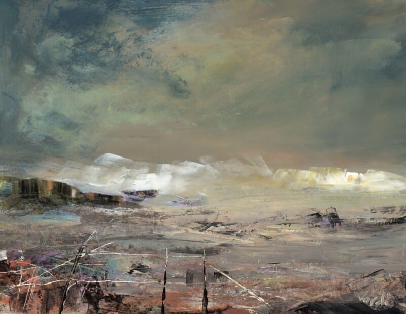
Choosing art for pale blue walls is often about making sure the room keeps its freshness without tipping into feeling chilly or visually thin. White Horses, Lewis is a particularly good answer because it brings movement and coastal atmosphere while still holding enough warmth to stop the scheme feeling washed out.
Why pale blue needs the right kind of contrast
Soft blue walls can look calm and elegant, but they often need artwork with a little more life in it. Too close a colour match and the whole room can drift into one flat note. This piece helps avoid that by adding texture, rhythm, and a stronger focal point.
- It keeps a cool room feeling airy rather than cold.
- It suits bedrooms, sitting rooms, and quieter hallways.
- It adds energy without making the scheme feel louder.
Where it tends to work best
This kind of piece sits especially well above a sofa, chest of drawers, or bed where the room needs one clearer anchor. It also works well in spaces with daylight from more than one side, where pale wall colour can otherwise feel a little diffuse.
Why the finish matters in a lighter scheme
First 4 Frames completes every piece in-house in Falkirk using bespoke framing, colour-managed Giclée printing, and hand-finished craftsmanship. In a pale room, those details matter because cleaner print quality and a well-judged frame help the artwork feel deliberate rather than faint.
This artwork is by Arie Vardi, and you can view the exact framed product here.
If you need art for pale blue walls that feels fresh, balanced, and easy to live with, White Horses, Lewis is an excellent choice.