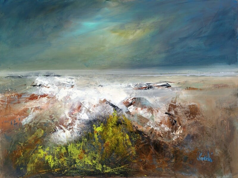
The right spa treatment room wall art should do more than simply fill a blank wall. In a treatment room, the artwork helps shape how calm, private, and well cared for the space feels from the moment someone walks in. Walk on the Waves is especially effective because it brings movement and atmosphere while still keeping the room settled and easy to relax in.
Why treatment spaces benefit from artwork with a quieter presence
A good spa or therapy room should feel polished without seeming staged. The atmosphere needs to support rest, trust, and a sense of being properly looked after. Artwork plays a part in that. Walk on the Waves works beautifully because it introduces coastal calm and a sense of flow without turning the room into predictable wellness decor.
That matters in smaller treatment rooms especially, where every detail is more noticeable. A hand-finished framed print can help the room feel more considered, more complete, and more in keeping with a premium client experience.
- It helps a treatment room feel calm without becoming bland.
- It adds atmosphere and movement without asking too much of the eye.
- It supports a more polished, quality-led impression for clients.
Why hand-finished quality matters in a client-facing room
First 4 Frames completes each piece in-house in Falkirk using bespoke framing, colour-managed Giclee printing, and hand-finished craftsmanship. That level of presentation suits spaces where customers expect care and quality in every detail, not only in the service itself but in the setting around them.
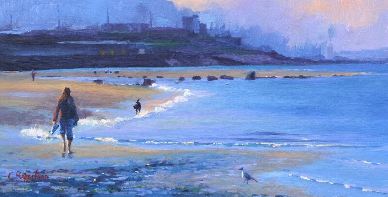
You can explore more work by Colin Robertson and view the exact framed print here.
If you are looking for spa treatment room wall art that feels calm, professional, and genuinely well judged, Walk on the Waves is well worth considering.