Posted on

Art for Pale Blue Walls, Why Winter Feels So Calm and Well Balanced

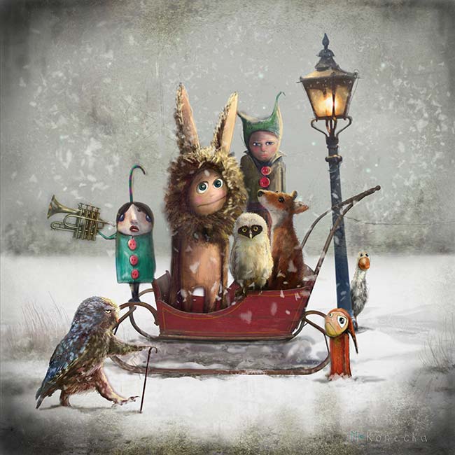
Winter": Doll-like children, including one in a bunny costume, sit on a red sleigh in the snow surrounded by quirky animals and birds near an old-fashioned streetlamp—a magical, surreal scene.

Choosing the right art for pale blue walls is often about adding enough contrast and character without making the room feel heavier. Winter works especially well because it brings story, shape, and mood while still keeping the overall atmosphere calm.

That balance matters in rooms with cooler paint tones. Pale blue can feel restful and elegant, but it also benefits from artwork that stops the scheme becoming too slight or overly airy.

Why This Piece Works With Cooler Wall Colour

A room with pale blue walls usually needs artwork that can deepen the palette gently rather than jar against it. This piece does that with a more imaginative mood that feels composed rather than decorative for its own sake.

  • It adds visual depth without making a lighter room feel darker.
  • It keeps cooler wall colour feeling intentional rather than a little flat.
  • It introduces personality in a way that still feels calm enough for everyday living.

Where It Can Sit Most Naturally

Winter would work beautifully above a sofa, at the end of a bedroom wall, or in a sitting room corner that needs a stronger focal point. It is especially effective where pale blue paint is paired with softer neutrals, painted timber, or layered fabrics that need one more confident element.

Why The Framed Finish Matters

First 4 Frames completes bespoke framing and colour-managed Giclee production in-house in Falkirk, giving the finished piece the polish needed for a carefully balanced colour scheme. That hand-finished presentation helps the artwork feel resolved within the room, rather than simply added to it.

You can view the exact framed product here, and browse more from Matylda Konecka if you enjoy imaginative work with the same calm, story-led presence.

For anyone looking for art for pale blue walls that adds warmth, atmosphere, and a more collected finish, Winter is a very strong choice.

Posted on

Choosing Art for Pale Blue Walls, Why White Horses, Lewis Works So Well

Image of White Horses, Lewis by Arie Vardi

Choosing art for pale blue walls is often about making sure the room keeps its freshness without tipping into feeling chilly or visually thin. White Horses, Lewis is a particularly good answer because it brings movement and coastal atmosphere while still holding enough warmth to stop the scheme feeling washed out.

Why pale blue needs the right kind of contrast

Soft blue walls can look calm and elegant, but they often need artwork with a little more life in it. Too close a colour match and the whole room can drift into one flat note. This piece helps avoid that by adding texture, rhythm, and a stronger focal point.

  • It keeps a cool room feeling airy rather than cold.
  • It suits bedrooms, sitting rooms, and quieter hallways.
  • It adds energy without making the scheme feel louder.

Where it tends to work best

This kind of piece sits especially well above a sofa, chest of drawers, or bed where the room needs one clearer anchor. It also works well in spaces with daylight from more than one side, where pale wall colour can otherwise feel a little diffuse.

Why the finish matters in a lighter scheme

First 4 Frames completes every piece in-house in Falkirk using bespoke framing, colour-managed Giclée printing, and hand-finished craftsmanship. In a pale room, those details matter because cleaner print quality and a well-judged frame help the artwork feel deliberate rather than faint.

This artwork is by Arie Vardi, and you can view the exact framed product here.

If you need art for pale blue walls that feels fresh, balanced, and easy to live with, White Horses, Lewis is an excellent choice.