
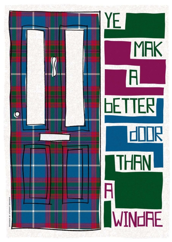
Scottish wall art for a flatshare has to do more than suit one person’s taste. A shared living room may contain inherited chairs, temporary shelving, several colour preferences, and housemates who change over time. Ye Mak a Better Door Than a Windae by Stewart Bremner meets that challenge with a familiar joke, a strong graphic layout, and tartan-inspired colour. It gives everyone a talking point without pretending the room has one perfectly coordinated style.
What Scottish wall art for a flatshare should contribute
Communal artwork works best when it creates recognition rather than claiming ownership of the whole room. This phrase is likely to raise a smile for anyone who has blocked a television, window, or kitchen cupboard without noticing. The humour comes from ordinary shared life, so it feels more inclusive than a personal slogan or a highly specific hobby print.
The design has enough visual substance even before the words are read. A tall tartan-covered door occupies one side. Blocks of green, magenta, blue, and white turn the phrase into a lively vertical rhythm on the other. That balance allows the print to work as graphic art from across the room and reveal the joke at closer range.
Agree on a position before debating every colour
A shared decision becomes easier when housemates start with the wall rather than the frame finish. Look for a place seen by everyone: above a low sideboard, beside the dining table, or on the main route between kitchen and sitting area. Avoid the narrow strip behind an actual open door, where both the artwork and the joke would spend much of the day hidden.
- Use the common sightline. Check the view from the sofa, dining seats, and doorway.
- Keep notices separate. Do not crowd the frame with calendars, keys, or a household chore board.
- Allow for changing furniture. A strong wall position should still work if a borrowed bookcase or table is replaced.
- Choose one colour connection. Repeat a green, blue, or magenta note if it already exists, but do not force the entire room to match.
Use the generous format as a shared focal point
The available print sizes are 420 by 594 millimetres and 594 by 840 millimetres before framing. Both are substantial enough to avoid looking like a temporary sign. The larger size can anchor a broad communal wall, while the smaller option may suit a dining corner or the end of a galley-style living space.
Measure the complete framed dimensions rather than the print alone. A mount and moulding add presence. Use paper templates to compare the two options, then make sure doors, cupboard fronts, and tall lamps have clear movement around the proposed position.
Can bold Scots language art still look polished?
Yes, provided the presentation treats it as artwork rather than a poster pinned up for a season. A simple dark moulding can echo the black outlines and sharpen the blocks of colour. A quiet natural timber may soften the graphic quality in a room with older furniture. In either case, the frame should contain the energy rather than compete with it.
First 4 Frames uses colour-managed Giclée production and hand-finishes its bespoke framing in-house in Falkirk. That level of craftsmanship supports the fine tartan pattern, clean lettering, and saturated colour. It also gives a shared home one properly finished piece that can move with its owner later, instead of becoming disposable flat decor.
A familiar phrase with confident graphic design
Stewart Bremner is an Edinburgh-based artist, illustrator, and graphic designer whose work celebrates Scottish language, landscape, and culture. His bold shapes and poster-like compositions make familiar subjects feel contemporary. See the wider range on Stewart Bremner’s official website, or browse the Stewart Bremner collection at First 4 Frames.
The best Scottish wall art for a flatshare gives several people a reason to enjoy the same wall. View the framed Ye Mak a Better Door Than a Windae print for a colourful piece whose humour, scale, and distinctly Scottish voice can hold together an otherwise mixed communal room.