
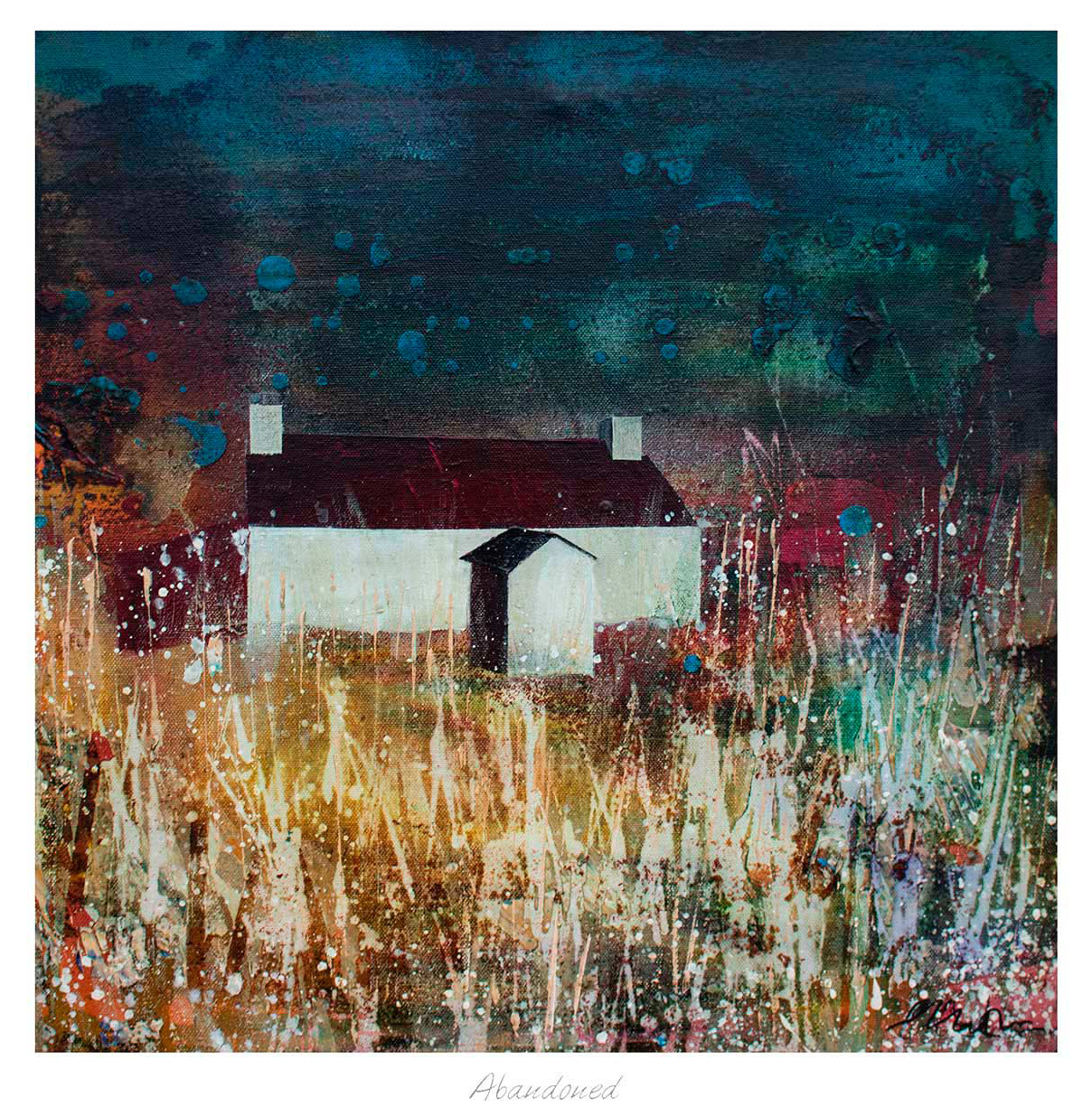
The best art for limestone flooring brings life to the room without covering up the stone’s quiet beauty. Limestone often creates a pale, softly varied base. Abandoned can add the contrasting sense of age, texture, and story that stops such a scheme feeling too pristine.
Balance art for limestone flooring through texture
Start by identifying whether the floor reads warm cream, cool grey, or sandy beige in daylight. Do not force the artwork to match it exactly. A small tonal connection is enough. More important is contrast in surface character: where stone feels smooth and architectural, a layered image can make the wall feel tactile and inhabited.
Keep
- Natural tonal links
- Visible wall space
- A frame with definition
Avoid
- Matching every beige note
- Cold glare opposite windows
- Frames that disappear completely
A darker or mid-tone frame can outline the work against pale plaster. In a larger room, generous scale prevents the print from looking detached from the visual weight of the floor. First 4 Frames can resolve those choices through bespoke, hand-finished framing and colour-managed Giclée production at its Falkirk workshop.
You can read more about the material through the Natural Stone Institute’s limestone guide, browse art by Fiona Matheson, and view the exact Abandoned print.
When selecting art for limestone flooring, Abandoned is a useful reminder that warmth often comes from contrast and character, not closer colour matching.