Posted on

Modern Framed Wall Art: Let Sea Breeze Keep Texture Calm

Sea Breeze is a vibrant abstract painting of a dynamic coastal landscape, featuring a stormy sky, swirling blue water, sandy shore, and textured grasses that evoke the refreshing energy of the sea with bold brushstrokes and vivid colors.

modern framed wall art does not need hard geometry or a cold palette; an expressive landscape can feel current when its placement and surrounding materials are disciplined. Sea Breeze gives the decision a specific artwork, proportion and palette to test.

modern framed wall art - Sea Breeze

Balance modern framed wall art with quieter surfaces

Sea Breeze carries the boldness, vibrancy and atmosphere associated with Fiona Matheson’s textural landscape work. Let those marks provide movement. A plain sofa, low cabinet and generous patch of wall will support the picture more effectively than repeated wave patterns or several heavily textured cushions.

Separate the image from the wall

On white or pale neutral paint, compare a frame with enough edge definition to stop the landscape floating. On a deeper wall, test a lighter mount or inner boundary so the atmosphere remains legible.

Keep furniture low

A lower horizontal line gives the landscape visual air and prevents tall accessories from interrupting the marks.

Repeat colour selectively

Choose one restrained textile connection. Copying every blue or coastal note can turn atmosphere into a decorating formula.

Does modern mean choosing the thinnest frame?

No. The moulding must suit the artwork’s scale, the wall and the viewing distance. A narrow frame can look underweight, while a broad one can compress expressive marks. Judge the finished outline as one object.

Check daylight from the main seat and switch on every lamp used after dark. Glazing reflections can be more disruptive than frame colour, particularly opposite broad windows. Move the marked outline before committing to the brightest wall.

Finish modern framed wall art without flattening the marks

Expressive landscape texture includes small tonal shifts as well as bold passages. Colour-managed Giclée production preserves that range, while in-house bespoke framing creates a stable edge that organises the energy without making it feel mechanical.

For broader context on the many ways artists interpret place rather than simply record it, read the Tate guide to landscape art. Browse the Fiona Matheson collection, then view the exact product and framing choices.

Modern framed wall art can feel atmospheric and tactile while the room stays composed. Sea Breeze brings the movement; measured framing and edited materials give it space to settle.

Posted on

Cottage Wall Art for Tongue and Groove Walls: Keep Old Times Fresh

Old Times" depicts a white cottage with a red roof in an abstract field of tall grass and red flowers beneath a pink sky with blue splatters, painted in a textured, expressive style.

cottage wall art for tongue and groove walls can feel naturally connected to the room, but too many rustic references flatten that connection into a theme. Old Times provides a specific starting point rather than a generic decorating formula.

cottage wall art for tongue and groove walls - Old Times

Plan cottage wall art for tongue and groove walls around the boards

Wall conditionUseful response
Vertical boardsLet the frame interrupt the lines cleanly.
Horizontal boardsAvoid a strong joint appearing to cut through the focal area.
Painted finishCompare samples against the real sheen and undertone.
Unknown substrateConfirm sound fixing points before drilling.

Old Times shows a white cottage with a red roof among tall grasses and flowers beneath a pink-blue sky. Mark the complete frame and view it from the doorway. The boards already add rhythm, so the picture needs enough clear wall to remain legible.

Let the wall provide texture and the picture provide the cottage story.

Avoid distressed signs, miniature cottages and several checked fabrics. Plain wool, a useful timber table and one colour repeated from the sky support Fiona Matheson’s expressive scene without turning the room into a stage set.

Frame expressive cottage art without artificial ageing

Textured marks, red flowers and the coloured sky require accurate reproduction. Colour-managed Giclée production keeps them clear, while bespoke framing can respond to the boards without pretending to be old.

For practical background on traditional building fabric, explore the Historic Environment Scotland Engine Shed. Browse the Fiona Matheson collection, then view the exact product.

Cottage wall art for tongue and groove walls should look considered, not costume-led. Old Times brings colour and place; careful fixing and edited materials keep it current.

Posted on

Art for Terrazzo Floors: Balance Pattern With Blue Washing

Blue Washing captures a rural coastal landscape with white cottages, red roofs among green hills beside a blue sea and swirling sky, evoking the serene effect of blue washing across the scene.

Art for terrazzo floors needs enough character to hold its own beside a patterned surface, yet it should not compete chip for mark. Fiona Matheson’s Blue Washing brings expressive northern landscape and a materials-led sensibility shaped by her textile background. Its cool blue presence can steady a room where the flooring already supplies lively detail.

art for terrazzo floors - Blue Washing

Choose art for terrazzo floors by contrast, not imitation

Read the floor from standing height

Terrazzo often appears calmer across a whole room than it does in a close sample. Judge its dominant temperature first: cool grey, warm cream or something more colourful.

Give the wall one contained area of texture

The artwork can be expressive because a clean frame provides a pause. Avoid adding patterned wallpaper and several textured accessories to the same sightline.

Connect with one colour only

If the floor contains a blue-grey chip, let that be the subtle bridge. There is no need to match every colour in either surface.

Two patterned elements can share a room when scale, colour and the space between them are deliberately different.

Hang the work where it can be seen from the doorway as well as from a seat. The composition should draw the eye upward and give the hard floor a visual counterweight. A rug may soften acoustics, but it should not be asked to repeat the picture.

Use the frame as a quiet boundary

Matheson’s experimental marks need clarity without becoming harsh. Colour-managed Giclée production supports the changes in blue, atmosphere and surface. A bespoke hand-finished frame can separate that movement from the wall and floor, creating a controlled edge that allows the materials to speak without merging into one busy field.

Matheson’s materials-led approach has roots in textile design; the V&A guide to textile techniques offers wider context on textile processes and surface-making. Browse the Fiona Matheson collection, or view the exact Blue Washing product.

The best art for terrazzo floors does not try to out-pattern the room. Blue Washing adds a distinct scale of mark, a cooler visual horizon and a crafted boundary, so the floor and wall remain interesting for different reasons.

Posted on

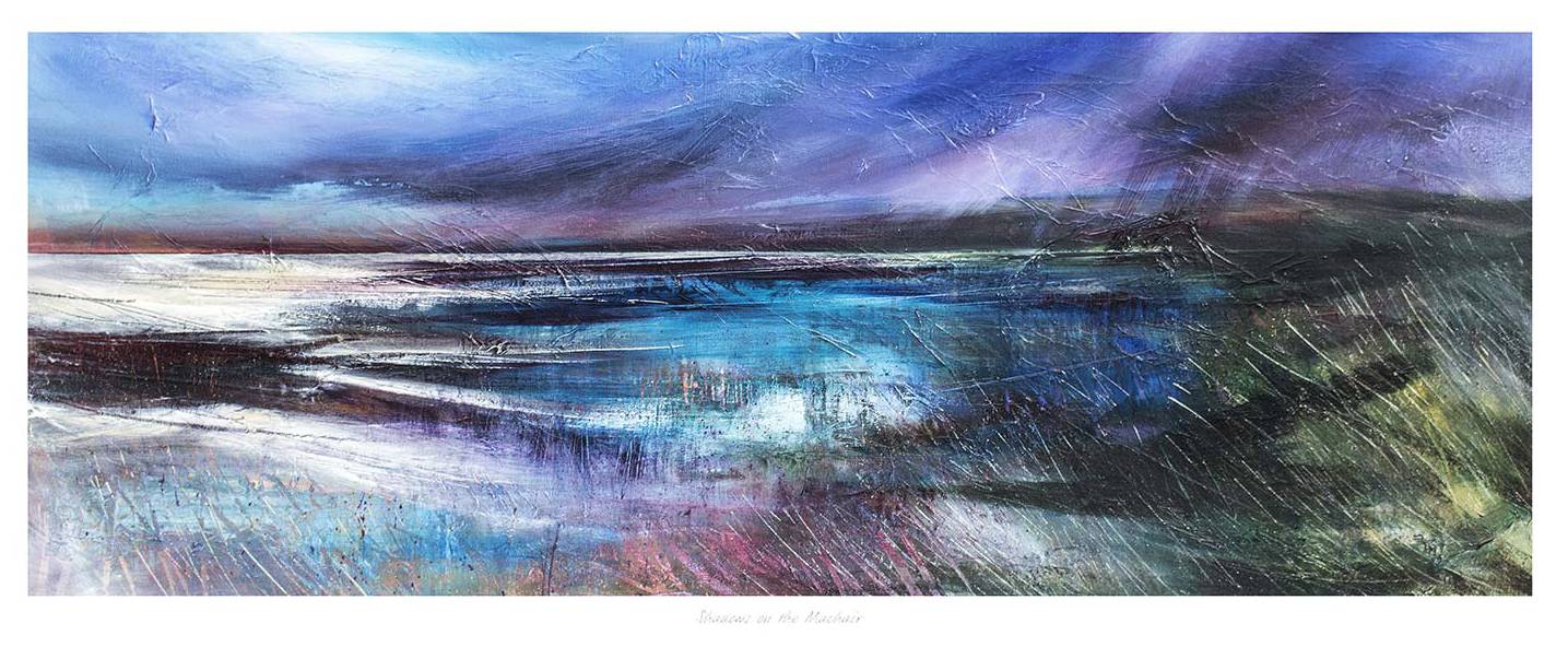
Art for Pebble Grey Walls Gains Warmth From Shadows on the Machair

Shadows on the Machair is an abstract seascape painting featuring swirling blue, purple, and white hues that evoke dynamic waves and a dramatic sky, capturing a sense of movement and atmosphere.

Choosing art for pebble grey walls is an opportunity to add warmth without abandoning a calm neutral scheme. Shadows on the Machair brings earthy marks, shifting coastal light, and textured movement. Those qualities stop grey walls feeling flat while preserving the room’s quieter foundation.

art for pebble grey walls - Shadows on the Machair

Build art for pebble grey walls around tonal contrast

Room elementUseful connection
Wall colourLet the cooler grey act as breathing space around the warmer landscape.
Soft furnishingsRepeat one muted ochre, sand, or rust note rather than every colour.
FrameUse timber for warmth or a darker edge for sharper separation.

The expressive surface is important. A very smooth neutral interior can look impersonal when every finish is equally controlled. Shadows on the Machair introduces irregular marks and natural variation. This creates a useful counterpoint to plain upholstery, neat cabinetry, and simple painted walls.

Avoid matching the grey too closely

A frame chosen only to copy the wall may cause the picture to disappear. Instead, judge the darkest and warmest notes in the image. Even a slim contrasting edge can hold the composition clearly. Place the work where side light reveals its tonal range, but avoid direct glare across the glazing.

First 4 Frames completes its colour-managed Giclée production and bespoke framing in-house in Falkirk. That careful process matters for a work built on subtle shifts. It helps the printed texture retain depth and allows the frame to support the palette rather than flatten it.

Read about the coastal habitat through an introduction to the machair landscape. Then browse more work by Fiona Matheson or view Shadows on the Machair.

For art for pebble grey walls, Shadows on the Machair offers enough warmth and movement to enrich the room while respecting its restrained character.

Posted on

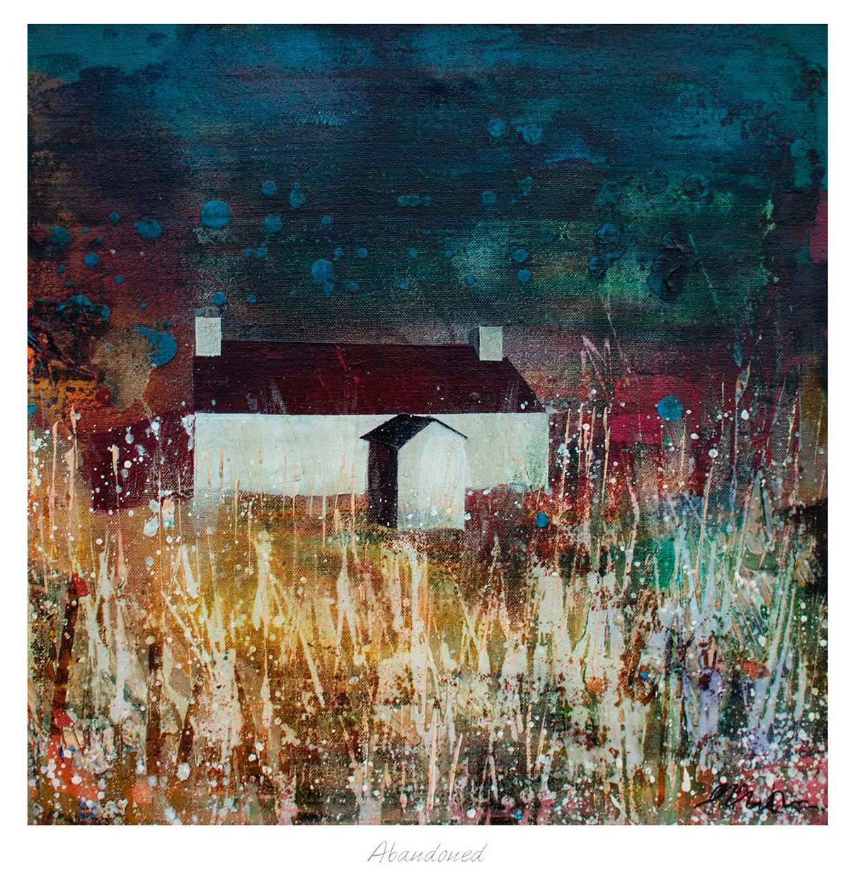
Art for Limestone Flooring Can Feel Warmer With the Texture of Abandoned

Abandoned features a white house with a red roof in a field of tall grass and wildflowers under a dramatic, color-splattered sky.

The best art for limestone flooring brings life to the room without covering up the stone’s quiet beauty. Limestone often creates a pale, softly varied base. Abandoned can add the contrasting sense of age, texture, and story that stops such a scheme feeling too pristine.

art for limestone flooring - Abandoned

Balance art for limestone flooring through texture

Start by identifying whether the floor reads warm cream, cool grey, or sandy beige in daylight. Do not force the artwork to match it exactly. A small tonal connection is enough. More important is contrast in surface character: where stone feels smooth and architectural, a layered image can make the wall feel tactile and inhabited.

Keep

  • Natural tonal links
  • Visible wall space
  • A frame with definition

Avoid

  • Matching every beige note
  • Cold glare opposite windows
  • Frames that disappear completely

A darker or mid-tone frame can outline the work against pale plaster. In a larger room, generous scale prevents the print from looking detached from the visual weight of the floor. First 4 Frames can resolve those choices through bespoke, hand-finished framing and colour-managed Giclée production at its Falkirk workshop.

You can read more about the material through the Natural Stone Institute’s limestone guide, browse art by Fiona Matheson, and view the exact Abandoned print.

When selecting art for limestone flooring, Abandoned is a useful reminder that warmth often comes from contrast and character, not closer colour matching.

Posted on

Why Blue Washing Works Beautifully as Powder Room Wall Art

Blue Washing captures a rural coastal landscape with white cottages, red roofs among green hills beside a blue sea and swirling sky, evoking the serene effect of blue washing across the scene.

Good powder room wall art should give a smaller space presence without making it feel cluttered. Blue Washing works especially well for that balance because it brings colour, movement, and a clear focal point while still feeling easy to live with every day.

powder room wall art featuring Blue Washing

Why powder room wall art needs confidence without clutter

A powder room often has less wall space than a bathroom, hallway, or dressing area, so every visual choice carries more weight. Artwork can make that compact space feel considered and complete, but only if the piece has enough character to hold attention without turning the room into a collection of competing details.

Blue Washing suits that job beautifully. Its expressive composition gives the wall energy, yet the colour still feels composed rather than noisy. That matters in a smaller room where pattern, paint, fittings, and mirrors are already working hard.

Why Blue Washing suits powder room wall art so naturally

  • It adds personality without making a compact room feel crowded.
  • It brings colour movement that helps a smaller space feel more intentional.
  • It feels distinctive enough to be memorable, yet calm enough for everyday use.

First 4 Frames completes each piece in-house in Falkirk using bespoke framing, colour-managed Giclee printing, and hand-finished craftsmanship. That superior finish is especially valuable in smaller rooms because details are seen up close and presentation matters more, not less.

You can browse more work by Fiona Matheson, visit the Fiona Matheson website, and view the exact framed print here.

If you are comparing powder room wall art and want something polished, distinctive, and easy to place, Blue Washing is a very strong option.

Posted on

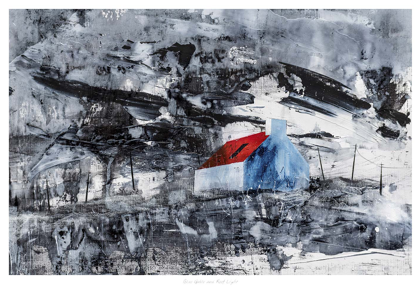
Why Blue Gable and Roof Light Works Beautifully as Wall Art for Checkerboard Floors

Blue Gable and Roof Light features a small white house with a red roof and blue gable, standing alone in a misty black-and-gray landscape. Bold brushstrokes and subtle roof light create an isolated, dynamic atmosphere.

The best wall art for checkerboard floors needs to calm a room as much as complete it. Checkerboard flooring already brings strong rhythm and contrast, so the artwork above it has to add shape and personality without turning the whole scheme into a contest. Blue Gable and Roof Light works especially well because it carries clear structure, soft colour shifts, and a sense of light that helps the room breathe.

wall art for checkerboard floors featuring Blue Gable and Roof Light

Why wall art for checkerboard floors needs balance more than more pattern

Checkerboard floors can look brilliant, but they are already doing a lot of visual work. If the art is too busy, the room can feel over-styled. If it is too faint, the wall can feel disconnected from the floor below. The strongest choice usually adds a sense of order and lift without repeating the same geometry too bluntly.

Blue Gable and Roof Light strikes that balance nicely. The roof light, gable form, and open composition give the print enough shape to stand up to the flooring, while the colour and looser handling stop the room feeling rigid. It suits kitchens, hallways, breakfast rooms, and transitional spaces where bold flooring needs a calmer visual partner.

Why Blue Gable and Roof Light is a strong fit for wall art for checkerboard floors

  1. It brings structure that relates to the floor without simply echoing it.
  2. It introduces lightness and colour so a stronger scheme feels more open.
  3. It helps a patterned room feel deliberate and resolved rather than slightly overdone.

First 4 Frames completes each piece in-house in Falkirk with bespoke framing, colour-managed Giclee printing, and hand-finished craftsmanship. In a room with bold flooring, that superior quality matters because every part of the finish contributes to whether the space feels considered or merely busy.

You can discover more about the artist at Fiona Matheson Studio, browse more work by Fiona Matheson, and view the exact framed print here.

If you are looking for wall art for checkerboard floors that keeps a stronger interior feeling airy, composed, and properly finished, Blue Gable and Roof Light is a very strong option.

Posted on

Commercial Framing Services Need More Than Neatness, Why Blue Gable and Roof Light Works

Blue Gable and Roof Light features a small white house with a red roof and blue gable, standing alone in a misty black-and-gray landscape. Bold brushstrokes and subtle roof light create an isolated, dynamic atmosphere.

The best commercial framing services do more than produce a tidy finish. Blue Gable and Roof Light is a useful example of why, because it shows how one well-framed piece can bring structure and personality to a project at the same time.

commercial framing services - Blue Gable and Roof Light

That matters in professional spaces where artwork needs to feel deliberate and polished, but should not drift into generic filler. A room can still feel human while remaining presentation led.

Why Commercial Framing Services Need Artwork With Character

A strong framing service only reaches its full value when the artwork itself gives something back to the room. This piece has enough line, shape, and colour to feel designed into the space rather than added late in the process.

  • It feels polished without becoming bland.
  • It adds structure to a reception, meeting area, or client-facing wall.
  • It helps a commercial interior feel chosen rather than simply equipped.

Where A Piece Like This Can Be Especially Useful

Blue Gable and Roof Light would work particularly well in a reception area, studio, hospitality corridor, or meeting space where one piece needs to add professionalism and warmth together. It suits interiors with clean walls, timber finishes, stone surfaces, and dark metal details.

Why First 4 Frames Is Well Suited To This Work

First 4 Frames supports both home and commercial clients with bespoke framing, colour-managed Giclee printing, and in-house finishing from the Falkirk workshop. You can view the exact framed product here, and browse more from Fiona Matheson if you enjoy expressive architectural work with the same balance of polish and personality.

For anyone assessing commercial framing services and the kind of artwork that makes those services worthwhile, Blue Gable and Roof Light is a strong reference point.

Posted on

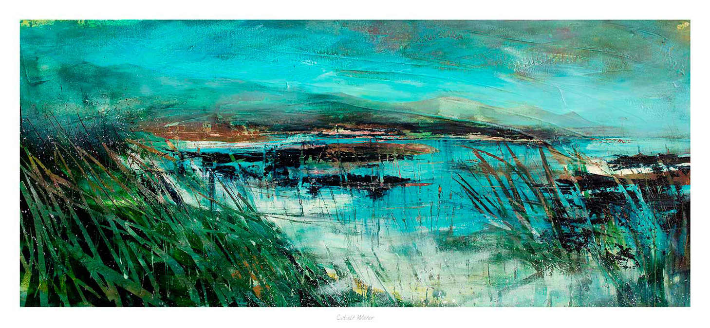
Cobalt Water and the Calm Appeal of Blue Wall Art

Cobalt Water" features an abstract landscape with vibrant cobalt water, green reeds in the foreground, and distant mountains beneath a turquoise sky. Energetic brushstrokes evoke movement and life throughout the scene.

Well-chosen blue wall art can cool a room gently without making it feel distant. That balance matters because blue is often used to create calm, yet the wrong piece can leave the wall looking flatter than before. Cobalt Water works beautifully because it brings freshness and depth while still keeping the overall mood relaxed.

Why calmer colour still needs contrast

Rooms built around softer palettes often rely on subtle changes in tone. Artwork has to support that rather than break it. Cobalt Water does this especially well, giving the wall more shape and movement while keeping the palette airy and easy to live with.

  • It suits bedrooms, sitting rooms, and calmer corners that need a little more visual depth.
  • It adds blue in a way that feels refined rather than overly decorative.
  • It helps neutral walls feel more composed and less empty.

This is particularly useful where the room already includes pale paint, washed wood, or lighter upholstery. The artwork introduces clearer colour, but it still leaves the space feeling open and restful.

Why better presentation keeps the effect polished

First 4 Frames completes each piece in-house in Falkirk with bespoke framing, colour-managed Giclee printing, and hand-finished craftsmanship. That superior quality helps the colour stay purposeful on the wall, rather than feeling thin or easily lost within a quieter scheme.

You can explore more from Fiona Matheson and see the exact framed print here.

If you are comparing blue wall art and want something calm, fresh, and easy to place, Cobalt Water is a very appealing choice.

Posted on

Why Blue Grass Works So Well as Cloakroom Wall Art

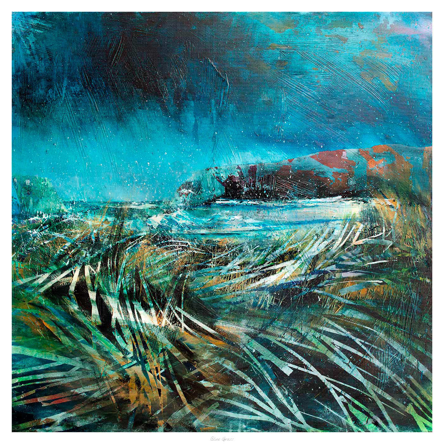
Blue Grass is an abstract landscape painting with sweeping blue, green, and white brushstrokes, depicting wild blue grass in the foreground under a moody sky.

Choosing cloakroom wall art is often about adding just enough character to a smaller space. Blue Grass is a strong choice when you want a guest bathroom or downstairs WC to feel more welcoming and less overlooked.

Why compact rooms respond well to one good piece

Small rooms benefit from details that feel considered. Blue Grass brings personality and colour into the space without asking for too much wall area, which makes it especially useful in compact layouts where every decision is more visible.

  1. It helps a practical room feel less purely functional.
  2. It adds warmth to spaces that can otherwise feel plain or hard surfaced.
  3. It suits homes where even smaller rooms are styled with care.

This kind of piece can work above a towel rail, beside a mirror, or on the wall facing the door. The aim is not to overcrowd the space. It is to make the room feel more polished and more in keeping with the rest of the home.

Why a framed finish feels more deliberate

Because First 4 Frames completes the work in-house in Falkirk, the final piece benefits from bespoke framing, colour-managed Giclee quality, and hand-finished craftsmanship. That stronger finish gives a small room a more resolved look straight away.

The artwork is by Fiona Matheson, and you can view the exact framed product here.

For anyone choosing cloakroom wall art that feels polished, individual, and easy to place, Blue Grass is well worth a look.