Posted on

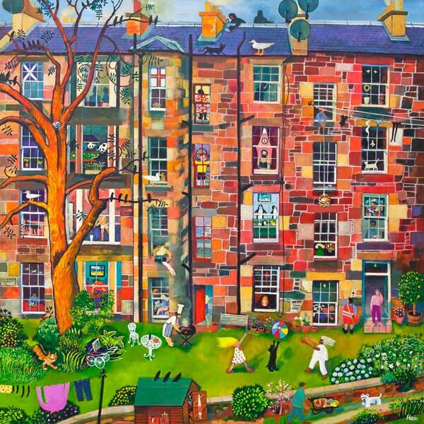
Why Royal Circus Is Such a Natural Georgian Townhouse Wall Art Choice

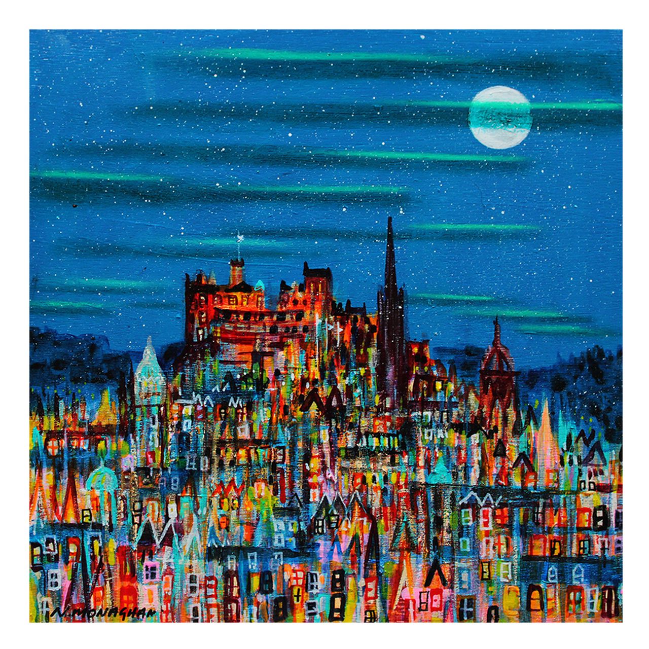
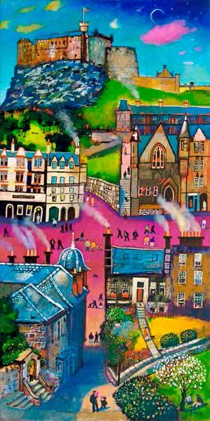
Image of Royal Circus by Nikki Monaghan

Choosing Georgian townhouse wall art is often about getting the tone right. Period homes have built-in character, proportion, and detail, so the artwork needs to complement that setting without becoming too stiff or overly formal. Royal Circus is a particularly good fit because it reflects architectural elegance while still feeling warm and liveable.

Why period interiors respond well to local architecture

In homes with original features, artwork that shares a sense of place often feels more settled on the wall. It helps the room feel curated rather than decorated in a hurry. This piece brings that architectural connection while still offering enough softness and individuality to avoid a museum-like effect.

That balance matters in sitting rooms, stair halls, and dining spaces where the fabric of the room already has a lot to say.

Why Royal Circus works so well

  • It reflects period character without becoming overly grand.
  • It suits homes where local identity matters as much as decoration.
  • It can sit comfortably alongside antique pieces and cleaner modern additions.

That flexibility makes it easier to place than artwork that feels too decorative or too rigidly traditional.

Why the First 4 Frames finish supports the setting

At First 4 Frames, every print is completed in-house with bespoke framing, colour-managed Giclée printing, and hand-finished craftsmanship. In a period home, those details count. A superior quality frame helps the artwork feel at home among original cornicing, fireplaces, timber, and other lasting features.

This artwork is by Nikki Monaghan, and you can view the exact framed product here.

If you are looking for Georgian townhouse wall art that feels elegant, grounded, and properly finished, Royal Circus is a very strong choice.

Posted on

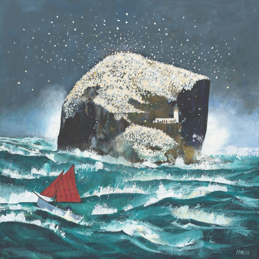
Sentinal and the Appeal of Lighthouse Wall Art That Still Feels Calm

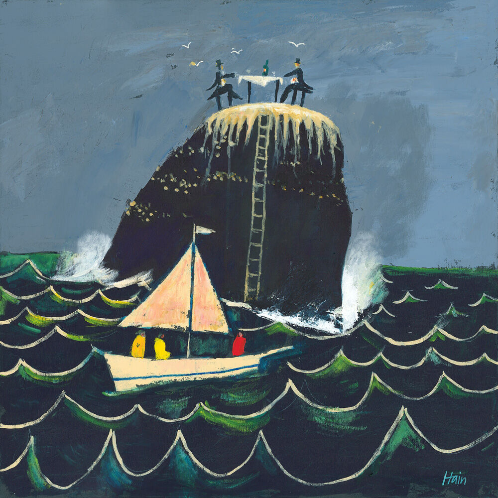
Image of Sentinal by Esther Cohen

Good lighthouse wall art should bring a sense of place without pushing a room into an obvious seaside theme. Sentinal gets that balance right. It carries coastal character and visual direction, but the overall effect remains calm and easy to live with.

Why this subject stays popular

Lighthouses naturally suggest reassurance, outlook, and distance. That gives them a broad appeal in the home. The challenge is finding a piece that feels thoughtful rather than decorative in a generic way. This one has enough atmosphere and composure to feel more grounded.

  • It works in homes that want a coastal reference without a full coastal scheme.
  • It can lift a neutral room with story as well as colour.
  • It suits spaces where one framed piece needs to provide calm focus.

Where it can fit naturally

Sentinal can work beautifully in a sitting room, hall, study, or guest room where the aim is atmosphere rather than obvious theming. It is especially useful when a room already has natural textures, soft blues, or weathered timber tones and simply needs one stronger visual anchor.

That restraint is what helps the piece feel lasting rather than trend-driven.

Why a bespoke framed finish helps

First 4 Frames completes each artwork in-house in Falkirk with bespoke framing, colour-managed Giclée printing, and hand-finished craftsmanship. A superior quality finish helps coastal subjects feel more substantial and keeps the overall result polished rather than casual.

This artwork is by Esther Cohen, and you can view the exact framed product here.

If you want lighthouse wall art that feels calm, characterful, and beautifully presented, Sentinal is an excellent option.

Posted on

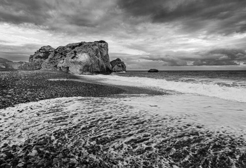
Why Winterlands Works So Well as Wall Art for a Monochrome Room

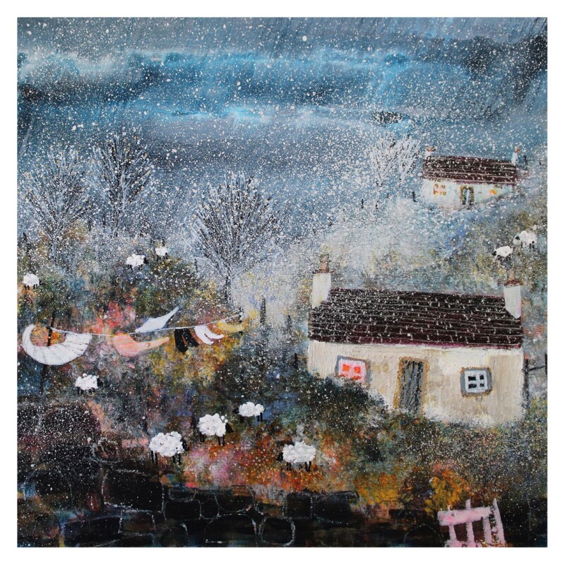
Image of Winterlands by Stuart Roy

Choosing wall art for a monochrome room can be more subtle than people expect. A black, white, and grey scheme often looks smart and controlled, but it still needs enough variation to avoid feeling flat. Winterlands is a particularly good answer because it adds texture, atmosphere, and a clear focal point while keeping the palette disciplined.

Why a monochrome scheme still needs depth

When a room relies on a tighter palette, the success of the scheme often comes down to contrast, surface interest, and layering. Artwork plays a major role there. This piece offers enough tonal movement to keep the wall from looking static, but it still feels consistent with a more edited interior.

That is useful in homes where you want clarity and calm, but not at the expense of warmth.

Where this approach works best

  • In a modern sitting room with black accents and pale upholstery.
  • In a bedroom where a simpler palette is part of the calming effect.
  • In a hallway or office where one framed piece can stop the scheme feeling too hard.

Because the artwork brings quiet variation rather than a jolt of colour, it helps the room feel more complete without changing its overall character.

Why print and framing quality matter here

At First 4 Frames, every piece is produced in-house with bespoke framing, colour-managed Giclée printing, and hand-finished craftsmanship. In a monochrome interior, those cleaner details are easy to notice. A superior quality finish helps the artwork feel sharp, intentional, and well judged.

This artwork is by Stuart Roy, and you can view the exact framed product here.

If you need wall art for a monochrome room that feels considered, textural, and properly finished, Winterlands is a very strong fit.

Posted on

What Makes Unstoppable Approach Such a Refined Dressage Wall Art Choice

Image of Unstoppable Approach by Diana Hand

The best dressage wall art usually has a sense of discipline as well as movement. It should reflect the grace of the subject without becoming visually crowded. Unstoppable Approach does that beautifully, giving the room equestrian character in a calmer and more refined way.

Why restraint matters with equestrian artwork

People who love horses often want artwork that feels true to that world, but still easy to live with day to day. That is where this piece stands out. It has poise and energy, yet the overall effect remains composed. It does not need to be loud to have presence.

  • It suits homes where elegance matters more than novelty.
  • It works well in studies, bedrooms, and quieter sitting rooms.
  • It can complement both contemporary and more traditional interiors.

Who this sort of piece tends to appeal to

It is a natural fit for riders, horse owners, dressage followers, and anyone who values equestrian subjects presented with real sensitivity. It can also work as a thoughtful gift when you want something more lasting and personal than standard horse-themed décor.

That quieter confidence is often what makes a piece feel more useful in the home over time.

Why superior framing helps

First 4 Frames finishes every piece in-house in Falkirk with bespoke framing, colour-managed Giclée printing, and hand-finished craftsmanship. That careful presentation adds polish and helps the artwork feel settled, substantial, and worthy of its wall space.

This artwork is by Diana Hand, and you can view the exact framed product here.

If you want dressage wall art that feels graceful, polished, and genuinely easy to live with, Unstoppable Approach is a lovely choice.

Posted on

Above the Castle (And The Tattoo Too) and the Appeal of Edinburgh Festival Wall Art

A surreal scene from "Above the Castle (And The Tattoo Too)" depicts a stadium of performers and spectators, two giant umbrellas floating in cloudy skies—one with a small dog—and a grand castle in the background.

Well-chosen Edinburgh Festival wall art should do more than simply show a recognisable skyline. It should capture some of the energy, theatre, and layered atmosphere that make the city so memorable at festival time. Above the Castle (And The Tattoo Too) does that in a way that feels imaginative rather than obvious.

Why this subject has real staying power

Festival-inspired artwork can sometimes lean too hard on nostalgia or become overly literal. This piece avoids that by keeping a sense of spectacle while still feeling like a proper artwork for the home. It has movement, wit, and a strong sense of place, but it does not rely on cliché.

That is what makes it useful beyond a short seasonal moment. It still works long after the performances and crowds have gone.

Where it can feel especially at home

  • In a city flat where local character matters.
  • In a hall or sitting room that benefits from one more conversational piece.
  • In a home office where art with imagination helps the room feel less predictable.

Because the image carries so much story, it gives the room personality without needing a whole themed scheme around it.

Why the framed finish is important

At First 4 Frames, each print is completed in-house with bespoke framing, colour-managed Giclée printing, and hand-finished craftsmanship. That level of presentation gives a more playful piece the structure it needs to feel polished and lasting on the wall.

This artwork is by Matylda Konecka, and you can view the exact framed product here.

If you are looking for Edinburgh Festival wall art that feels imaginative, local, and beautifully presented, Above the Castle (And The Tattoo Too) is a superb option.

Posted on

Why Ardbeg Distillery Isle of Islay Makes Such a Good Scottish Whisky Gift

A vibrant painting of Ardbeg Distillery Isle of Islay shows turquoise waters, a rocky shore, grassy foreground, and white distillery buildings across the bay, set against mountains and a cloudy sky.

A good Scottish whisky gift should feel considered from the start. For someone who loves distilleries, island character, and the ritual around whisky, a framed print can offer something more lasting than the usual short-lived present. Ardbeg Distillery Isle of Islay is a particularly strong example.

Why this subject works as a gift

Part of the appeal is that it connects with a real interest rather than just a broad theme. It speaks to place, memory, and taste all at once. That makes it feel more personal, especially for someone with a genuine affection for Islay, Scottish distilling, or collecting meaningful pieces for the home.

  • It feels more lasting than a novelty whisky present.
  • It is easy to display in a study, snug, or entertaining space.
  • It carries Scottish character without feeling overplayed.

Who it is likely to suit best

This kind of gift works well for birthdays, retirements, thank-yous, and milestone celebrations where you want something with genuine staying power. It can suit whisky enthusiasts, collectors of Scottish art, or anyone who has a personal connection to Islay and its distilleries.

Because it is ready to hang and easy to live with, it feels generous without becoming difficult to place.

Why the First 4 Frames approach adds value

First 4 Frames produces each piece in-house in Falkirk with bespoke framing, colour-managed Giclée printing, and hand-finished craftsmanship. That superior quality matters when the gift is meant to last. It gives the finished print the polish and substance that make it feel worth giving.

This artwork is by Jean Feeney, and you can view the exact framed product here.

If you want a Scottish whisky gift that feels thoughtful, distinctive, and properly finished, Ardbeg Distillery Isle of Islay is a very good choice.

Posted on

What Makes Drift into Dusk, Loch Awe Such a Good Choice for Linen Interiors

Image of Drift into Dusk, Loch Awe by Colin Robertson

When people choose wall art for linen interiors, they are usually trying to protect a sense of softness. Natural fabrics, pale neutrals, and relaxed textures can make a room feel beautifully calm, but they can also leave it slightly undefined if the artwork is too faint. Drift into Dusk, Loch Awe solves that problem in a very well-judged way.

Why softness still needs structure

Linen-heavy interiors often rely on texture more than colour. That means the artwork has an important job to do. It needs to give the eye somewhere to settle while still respecting the quieter palette of the room. This piece does that by adding tonal depth and atmosphere instead of hard contrast.

The result feels composed rather than stark. It helps the room hold together without spoiling the natural ease that makes linen-led schemes so appealing.

Why this piece fits so naturally

  • It sits well with soft neutrals, oatmeals, and stone shades.
  • It adds depth without making the room feel heavier.
  • It works in bedrooms, sitting rooms, and quieter guest spaces.

Because the composition feels calm rather than busy, it suits rooms where tactile materials are already doing a lot of the work.

Why a hand-finished presentation makes a difference

At First 4 Frames, every piece is completed in-house with bespoke framing, colour-managed Giclée printing, and superior quality craftsmanship. In a softer interior, those details matter. A clean, thoughtful finish helps the artwork feel part of the room rather than simply added to it.

This artwork is by Colin Robertson, and you can view the exact framed product here.

If you want wall art for linen interiors that feels calm, textural, and properly finished, Drift into Dusk, Loch Awe is an excellent choice.

Posted on

Choosing Art for Navy Walls, Why On Route To Oban Works So Well

Image of On Route To Oban by Arie Vardi

Choosing art for navy walls is often a question of balance. Deep blue can look elegant and cocooning, but it can also make the wrong artwork disappear into the background. On Route To Oban works especially well because it brings movement, light, and a gentle lift without breaking the mood of the room.

Why navy walls need contrast with warmth

Very pale artwork can feel too sharp against a darker wall, while something equally heavy can make the whole scheme feel flat. This piece sits in a more useful middle ground. It has enough brightness to stand clear of the wall colour, but it still feels calm and collected rather than stark.

  • It helps a navy room feel layered rather than one-note.
  • It adds a clearer focal point without making the wall feel busier.
  • It suits both modern furniture and more classic timber pieces.

Where it can work particularly well

This is the kind of framed print that can sit comfortably in a sitting room, bedroom, or study where navy has been used to add depth. Because the scene carries a sense of distance and atmosphere, it stops the darker wall from feeling closed in.

That makes it especially helpful when you want a deeper colour scheme to feel polished and settled, but still welcoming enough for everyday living.

Why the finish matters with stronger wall colours

First 4 Frames completes each piece in-house in Falkirk with bespoke framing, colour-managed Giclée printing, and hand-finished craftsmanship. Against a darker wall, those details matter even more. A superior quality frame gives the artwork enough definition to feel deliberate and properly resolved.

This artwork is by Arie Vardi, and you can view the exact framed product here.

If you are looking for art for navy walls that feels balanced, atmospheric, and beautifully finished, On Route To Oban is a very strong option.

Posted on

Why The Balloonist Works Brilliantly as Art for a Gallery Wall

The Balloonist features a whimsical owl in an orange hat, seated in a wicker hot air balloon basket over water. Colorful balloons, lanterns, cages, and feathers surround the owl, creating a dreamy and surreal scene.

When people plan art for a gallery wall, the biggest challenge is often cohesion. The Balloonist works brilliantly because it has enough personality to anchor a mixed display without overwhelming everything around it.

A gallery wall can look collected and expressive, but only if at least one piece helps set the tone. The Balloonist does that job well. It brings imagination, movement, and a clear focal point, which makes surrounding smaller pieces feel more deliberate.

  • It helps a gallery wall feel curated rather than scattered.
  • It works well with a mix of landscapes, typography, and smaller prints.
  • It adds story and character without relying on loud colour alone.

How to place it

This piece works especially well slightly off-centre in a salon-style arrangement, above a console or sideboard, or as the print that gives the rest of the display its starting point. Once one framed piece has enough presence, the whole wall usually feels easier to build around.

Why a better framed finish helps

Because First 4 Frames completes the work in-house in Falkirk, the finished piece has the crisp presentation, bespoke framing, and colour-managed quality needed for a display where details are seen up close.

The artwork is by Matylda Konecka, and you can view the exact framed product here.

If you want art for a gallery wall that adds focus, wit, and a more resolved overall look, The Balloonist is an excellent choice.

Posted on

Choosing Wall Art for Walnut Furniture, Why Low Cloud at Melvich beach Sutherland Works

Image of Low Cloud at Melvich beach Sutherland by Arie Vardi

Finding the right wall art for walnut furniture is often about preventing a room from feeling too visually heavy. Low Cloud at Melvich beach Sutherland works beautifully because it brings air, movement, and coastal light into a scheme shaped by richer timber tones.

Walnut furniture has depth and warmth, but it can dominate if everything around it is equally dark or dense. This piece helps counter that. The landscape feel introduces breathing space, while the framed presentation still has enough presence to sit comfortably alongside more substantial furniture.

  • It softens deeper wood tones without making the room feel washed out.
  • It works well with walnut sideboards, dining furniture, shelving, and occasional tables.
  • It helps a scheme feel layered and intentional rather than simply brown-on-brown.

Where it works best

This kind of piece suits a dining room, living room, or study where walnut furniture already gives the space structure. It is especially effective when the room also uses neutral upholstery, stone, or soft blue-grey accents that benefit from one connecting focal point.

Why the print quality matters

At First 4 Frames, the artwork is completed in-house with colour-managed Giclée printing and bespoke hand-finished framing. That superior quality matters when the piece is sitting near better furniture, because the presentation needs to hold its own.

The artwork is by Arie Vardi, and you can view the exact framed product here.

If you are choosing wall art for walnut furniture and want the room to feel lighter, richer, and more resolved, Low Cloud at Melvich beach Sutherland is a very good option.