Posted on

Beach Wall Art Feels More Grounded With Cottage on the shore, Balnakeil

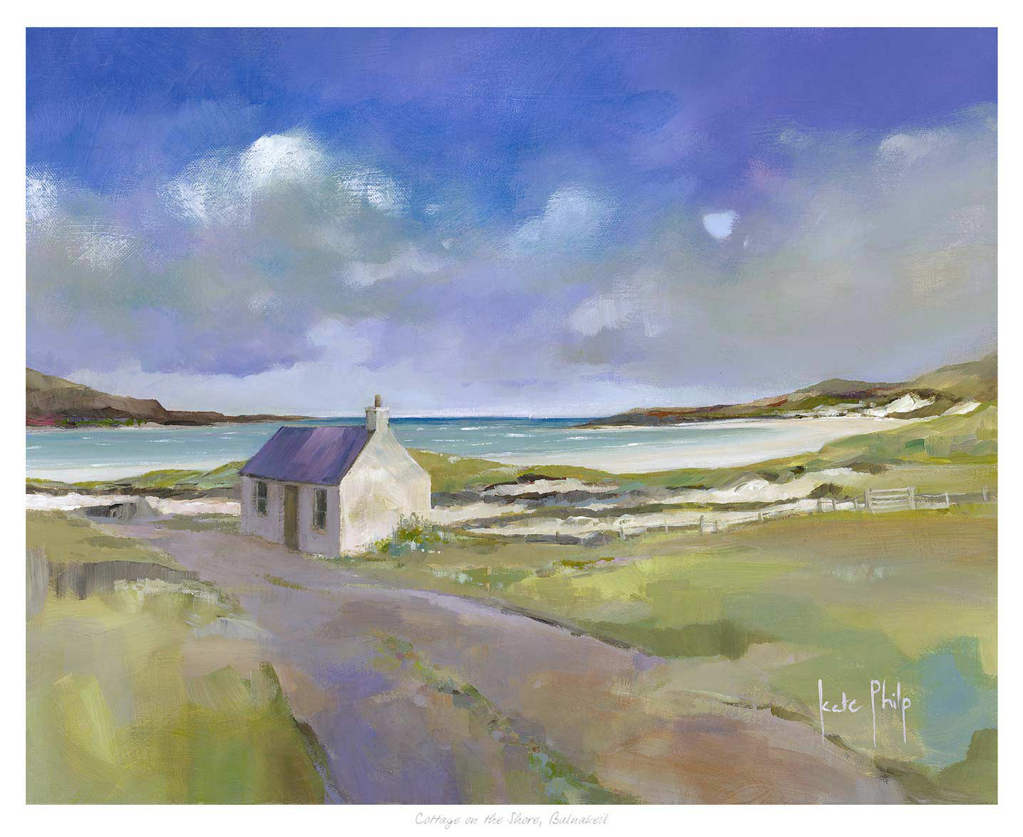
Cottage on the shore, Balnakeil sits near a sandy beach among grassy fields and hills, with a calm sea and blue sky with scattered clouds, creating a peaceful and serene setting.

Good beach wall art should bring calm and openness, but it should still feel like part of a real home. Cottage on the shore, Balnakeil gets that balance right by combining shoreline light with a cottage subject that feels warm, settled, and easy to live with.

beach wall art - Cottage on the shore, Balnakeil

Why Cottage on the shore, Balnakeil works as beach wall art with more depth

Some coastal pieces lean too heavily on obvious seaside cues and can make a room feel themed rather than thoughtfully styled. Cottage on the shore, Balnakeil feels more grounded than that. The cottage gives the image a lived-in note, while the surrounding coast keeps the overall mood light, open, and restorative for bedrooms, guest rooms, or quieter sitting spaces.

  • It softens neutral interiors without drifting into blandness.
  • It suits homes that want a coastal note without overt nautical styling.
  • It feels especially convincing in rooms with natural wood, linen, or pale painted walls.

At First 4 Frames, the print and framing are completed in-house with bespoke craftsmanship and colour-managed Giclee quality. That superior finish helps the softer coastal tones hold their clarity and gives the final piece the room-ready presence customers expect.

For more on the wider landscape around Balnakeil, VisitScotland on Durness and the north coast is worth a look. You can also browse more work by Kate Philp and see the exact framed product here.

If you want beach wall art that feel calm, homely, and more substantial than a simple seaside accent, Cottage on the shore, Balnakeil is a beautiful fit.

Posted on

Why Bluebells, Eigg Works Beautifully as Botanical Wall Art for a Guest Room

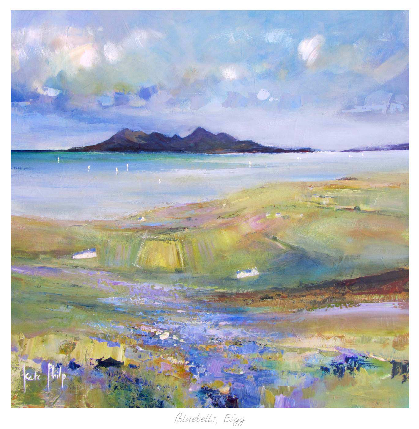
Bluebells, Eigg" is a vibrant painting showing grassy fields and bluebells in the foreground, calm water in the middle, and the distant island of Eigg with dark hills beneath a cloudy sky.

The most useful botanical wall art brings natural ease into a room without making it feel over-decorated. Bluebells, Eigg does that especially well, giving a space colour and freshness while still keeping the overall mood calm enough for everyday rest.

botanical wall art - Bluebells, Eigg

Why botanical wall art suits a guest room so well

A guest room often benefits from artwork that feels thoughtful and warm without becoming too personal or too dramatic. Bluebells, Eigg strikes that balance nicely. The subject brings life and natural texture, but the piece still feels grown-up and composed, which helps occasional visitors feel properly looked after.

It also works well in a reading nook or spare room where floral or garden references need to feel airy rather than busy. That is where a framed finish and a more considered composition make a real difference.

Why Bluebells, Eigg feels fresh rather than fussy

First 4 Frames produces and frames every piece in-house with bespoke craftsmanship and colour-managed Giclee quality. That finish helps the softer blues and greens stay clear, giving the artwork the superior quality presence it needs to lift the room rather than disappear into it.

For more on the island behind the scene, The Isle of Eigg is a lovely starting point. You can also browse more work by Kate Philp and view the exact framed product here.

If you are choosing botanical wall art for a room that should feel easy, welcoming, and quietly polished, Bluebells, Eigg is an excellent fit.

Posted on

Art for Sandy Beige Walls Feels Lighter With Portnalong, Isle of Skye

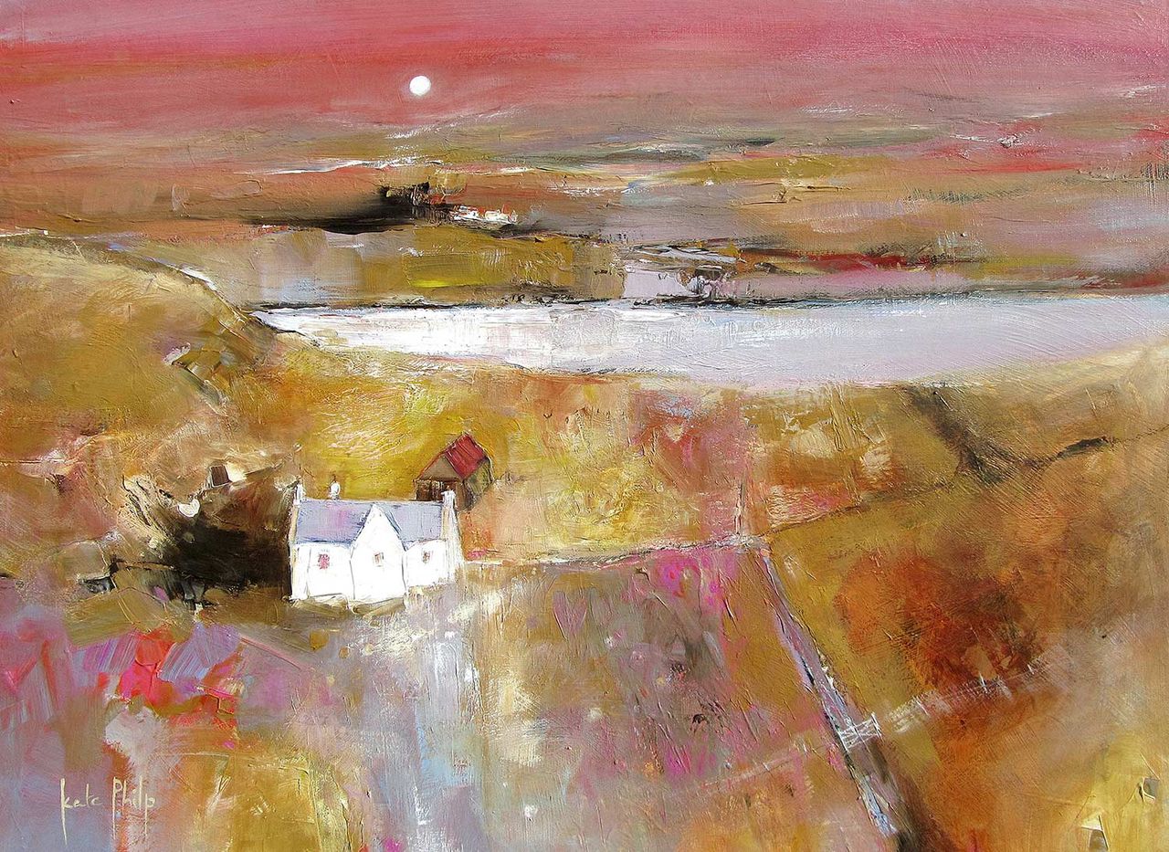
Portnalong, Isle of Skye: Impressionist painting depicting a rural sunset landscape with a red-roofed white house in the foreground, earthy-toned fields, a river, and a pink sky glowing with the setting sun.

The most effective art for sandy beige walls should keep a warm neutral room feeling alive. Portnalong, Isle of Skye does that beautifully because the coast, sky, and open light introduce freshness without fighting the quieter warmth of beige walls.

art for sandy beige walls - Portnalong, Isle of Skye

Why art for sandy beige walls needs lift as well as warmth

Sandy beige is easy to live with, but it can leave a space feeling a little sleepy if every finish stays on the same wavelength. Portnalong, Isle of Skye helps by introducing cooler light, open water, and more distance, which makes the room feel brighter and more resolved rather than simply pale.

That balance works especially well in living rooms, guest bedrooms, and hallways where warm neutrals are doing most of the quiet background work and the artwork needs to bring shape without disturbing the calm.

Why Portnalong, Isle of Skye keeps beige schemes feeling fresh

First 4 Frames completes the print and framing in-house with bespoke craftsmanship and colour-managed Giclee production. That finish helps the lighter tones stay clean, which is important when the surrounding paintwork is already warm and understated.

For more on the island setting behind the scene, VisitScotland on the Isle of Skye is worth exploring. You can also browse more work by Kate Philp and view the exact framed product here.

If you are choosing art for sandy beige walls and want a room to feel warm yet lighter on its feet, Portnalong, Isle of Skye is a very strong option.

Posted on

Why Bluebells, Eigg Works Beautifully as Therapy Room Wall Art

Bluebells, Eigg" is a vibrant painting showing grassy fields and bluebells in the foreground, calm water in the middle, and the distant island of Eigg with dark hills beneath a cloudy sky.

The best therapy room wall art should help the room feel settled from the moment someone walks in. In a therapy space, artwork needs to support calm and trust without turning the room into something generic or overly staged. Bluebells, Eigg works especially well because its soft colour, natural rhythm, and sense of open air bring reassurance without demanding attention.

therapy room wall art featuring Bluebells, Eigg

Why therapy room wall art should feel calm but never empty

Rooms used for conversation need a gentler kind of focus. If the walls are too bare, the space can feel colder or less considered than intended. If the artwork is too bold, it can pull attention in the wrong direction. The right framed print gives the room warmth, a little visual softness, and a sense that every detail has been chosen with care.

Bluebells, Eigg suits that balance naturally. The bluebell landscape feels restorative without becoming sugary, and the composition has enough structure to help the room feel grounded. It is especially well suited to therapy rooms, consulting spaces, quieter practices, and private studios where people benefit from an atmosphere that feels calm, respectful, and easy to settle into.

What makes Bluebells, Eigg such a strong therapy room wall art choice

  • It adds colour and life without making the space feel visually busy.
  • It supports a calmer emotional tone while still feeling personal and well chosen.
  • It helps a client room feel softer and more welcoming without slipping into bland wellness decor.

First 4 Frames completes each piece in-house in Falkirk with bespoke framing, colour-managed Giclee printing, and hand-finished craftsmanship. That superior presentation matters in professional spaces, where quieter details often shape how thoughtful and trustworthy the whole room feels.

You can discover more about the artist at Kate Philp, browse more work by Kate Philp, and view the exact framed print here.

If you are comparing therapy room wall art and want something calm, natural, and easy to live with every day, Bluebells, Eigg is very well judged.

Posted on

Premium Wall Art Needs Restraint Too, Why Torridon Works

Impressionist painting titled "Torridon" depicts a white cottage with a red roof by a reflective lake, surrounded by fields and hills under a blue sky with scattered clouds in a rural landscape.

Good premium wall art does not always announce itself loudly. Torridon is a useful reminder that a more spacious image can feel every bit as considered and luxurious as something with greater visual drama, provided the print and framing are handled properly.

premium wall art - Torridon

Why premium wall art often relies on restraint rather than noise

One of the clearest signs of a quality-led piece is that it does not need to over-explain itself. Torridon gives the room air, scale, and steadiness. That can be far more valuable than a louder picture when you want a living room, bedroom, or landing to feel settled, elevated, and easy to return to every day.

  • It creates space without looking empty.
  • It supports neutral and natural palettes especially well.
  • It gives a room depth without making it feel heavier.

Why Torridon suits a superior quality presentation

First 4 Frames finishes the work in-house in Falkirk using bespoke framing, colour-managed Giclee printing, and hand-finished craftsmanship. That level of care helps the final piece keep its subtle atmosphere and makes the artwork feel complete from the moment it is on the wall.

You can explore more from Kate Philp, visit Kate Philp, and view the exact framed product here.

If your idea of premium wall art is about calm confidence rather than excess, Torridon is a particularly good fit.

Posted on

Why The Waterlily Lochan Shows What Good Fine Art Prints Can Do

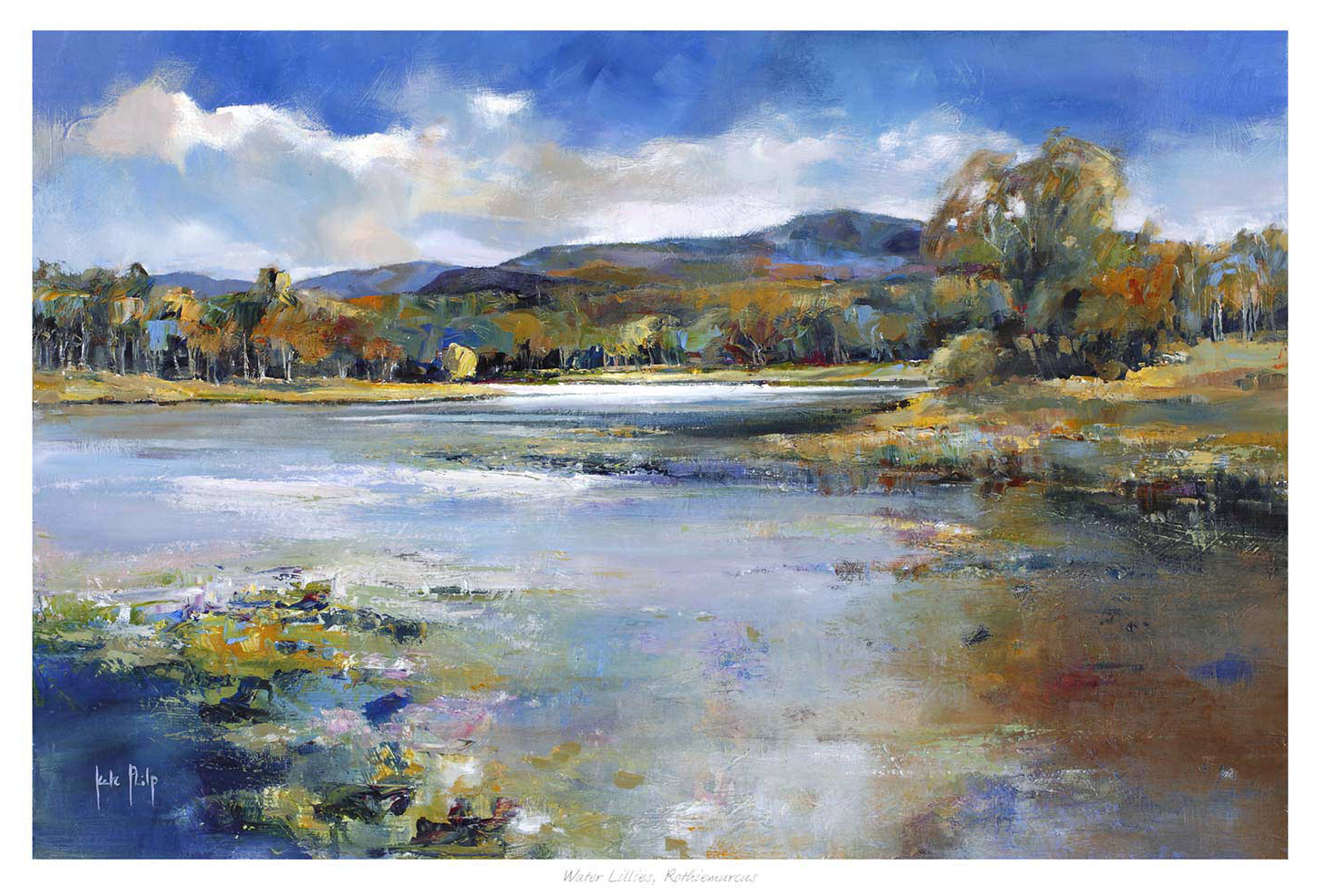
The Waterlily Lochan is a colorful impressionist painting featuring bold brushstrokes that blend blues, purples, and greens in a vivid lakeside scene with water reflections, green hills, and a dramatic cloudy sky.

The real appeal of fine art prints is often easiest to see in calmer work. The Waterlily Lochan is a strong example because the image relies on stillness, tonal control, and a quieter kind of beauty that needs proper production to remain convincing once framed.

fine art prints - The Waterlily Lochan

Why fine art prints matter most when the image is subtle

Some pictures can survive rougher treatment because their impact is loud from the start. The Waterlily Lochan is different. Its strength comes from quietness, light reflection, and softer shifts of colour. That means the finished print has to retain delicacy rather than turning muddy, flat, or overly harsh.

This is exactly where better materials and colour-managed production make the difference between an image that merely resembles the original and one that still feels resolved on the wall.

Why The Waterlily Lochan rewards a careful framed presentation

First 4 Frames handles the work in-house with bespoke framing and colour-managed Giclee printing, helping the finished piece keep its calm authority. The result feels less like a decorative afterthought and more like a properly collected artwork for a bedroom, sitting room, or quiet landing.

You can browse more work by Kate Philp, visit Kate Philp, and view the exact framed product here.

If you are weighing up fine art prints and want a piece that shows the value of quality printing clearly, The Waterlily Lochan is a persuasive place to start.

Posted on

A Picture Framing Service Shows Its Value With Ardnamurchan Reflections

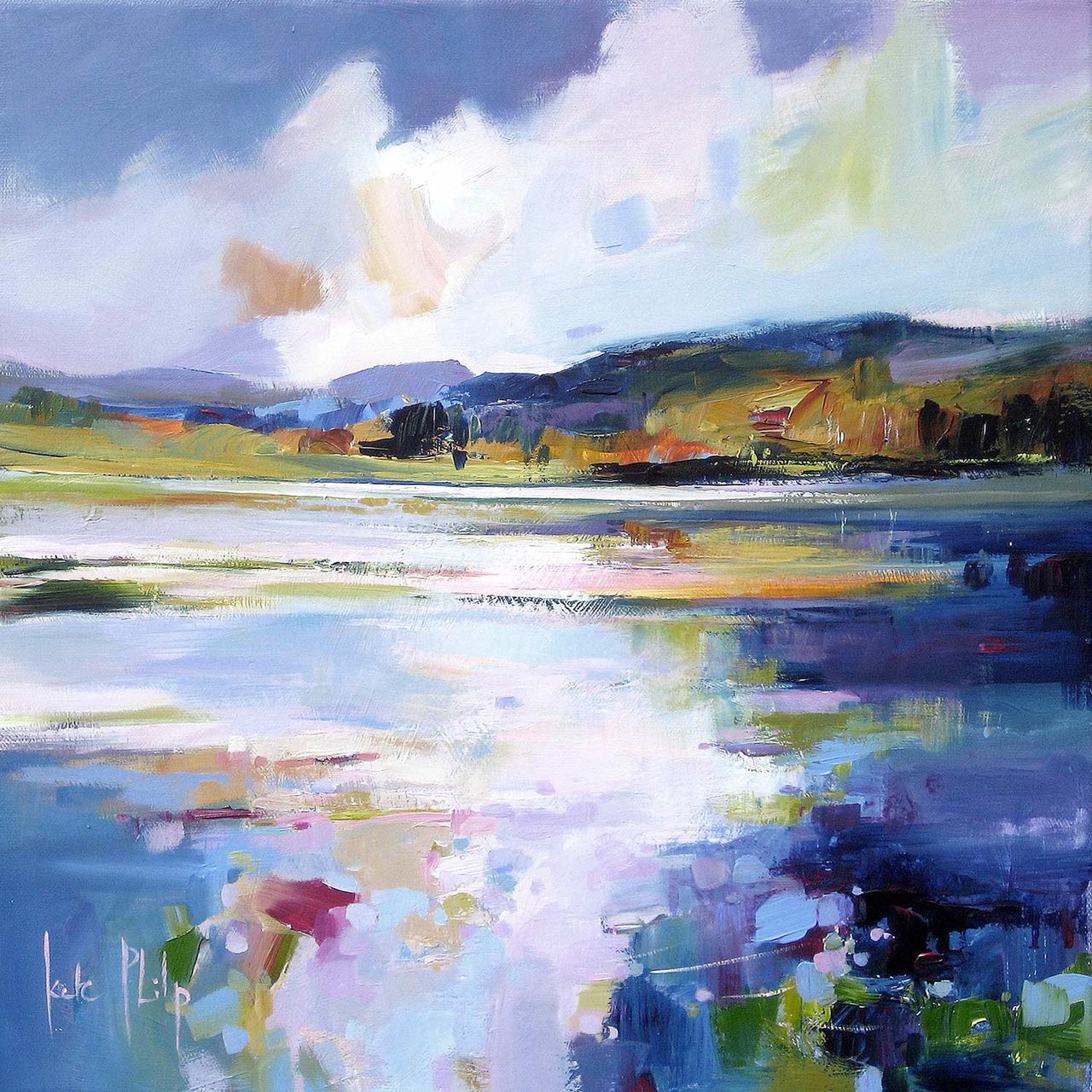
Ardnamurchan Reflections depicts a serene lake mirroring a bright, cloudy sky and distant hills, in calming blues with touches of white, green, and gold—capturing tranquility on canvas.

A good picture framing service should do more than put a border around a print. Ardnamurchan Reflections shows why that matters. The image depends on reflection, horizon, and quiet shifts of light, so the framed result needs enough care to preserve the mood that makes the artwork worth choosing.

picture framing service - Ardnamurchan Reflections

Why a picture framing service changes how quieter art is experienced

With calmer coastal work, the presentation affects how spacious or compressed the print feels once it reaches the wall. The wrong finish can make a subtle image disappear. The right one helps the composition breathe and gives the piece enough presence to hold its own in the room.

That is especially useful in bedrooms, hallways, sitting rooms, and studies where quieter art often needs craftsmanship behind it to feel intentional rather than faint.

Why Ardnamurchan Reflections rewards that extra care

Ardnamurchan Reflections already has softness and balance built into the image, so the framing needs to support that rather than interrupt it. First 4 Frames handles the work in-house with bespoke framing and colour-managed fine art printing, helping the final piece feel hand-finished, superior quality, and genuinely room-ready.

You can browse more work by Kate Philp, learn more about the artist at Kate Philp, and view the exact framed product here.

If you are weighing up a picture framing service and want a piece that shows the benefit clearly, Ardnamurchan Reflections makes a persuasive case.

Posted on

Why St Andrews Works Beautifully as Wall Art for a Room With Window Seats

St Andrews features a coastal landscape painting with a wide, reflective beach, gentle waves, distant shoreline, and a dramatic blue, white, and green sky. Signed by Kate Philp in the corner.

Choosing wall art for a room with window seats is often about balance. A seat by the window already gives the room a natural place to pause, so the artwork nearby needs to add atmosphere without making that brighter corner feel busy. St Andrews works especially well because it brings openness, coastal calm, and enough colour to anchor the view indoors.

wall art for a room with window seats featuring St Andrews

Why wall art for a room with window seats needs calm structure

Window seats tend to become quiet everyday spaces for reading, morning coffee, or simply taking in the light. That means the wall art has to do more than fill a blank area. St Andrews helps the seat feel connected to the wider room, rather than like a separate corner that never quite settles into the scheme.

  • It keeps a bright seating area feeling grounded rather than washed out.
  • It suits interiors where natural light already does a lot of the visual work.
  • It gives a built-in seat or alcove a more considered focal point.

Where it works best

This piece is particularly effective beside a painted window bench, above a lower side table, or on the return wall that frames the seating area. Because the scene has space and movement, it complements the openness that makes a window seat appealing in the first place.

Why the framed finish matters

At First 4 Frames, St Andrews is produced in-house with bespoke framing, colour-managed Giclee printing, and hand-finished craftsmanship. In a room where daylight catches every detail, that superior quality helps the finished piece feel polished and intentional rather than like an afterthought.

The artwork is by Kate Philp, and you can view the exact framed product here.

If you are choosing wall art for a room with window seats and want something calm, coastal, and easy to live with, St Andrews is a very strong option.

Posted on

Choosing Art for Oatmeal Walls, Why By the Tweed Feels So Settled

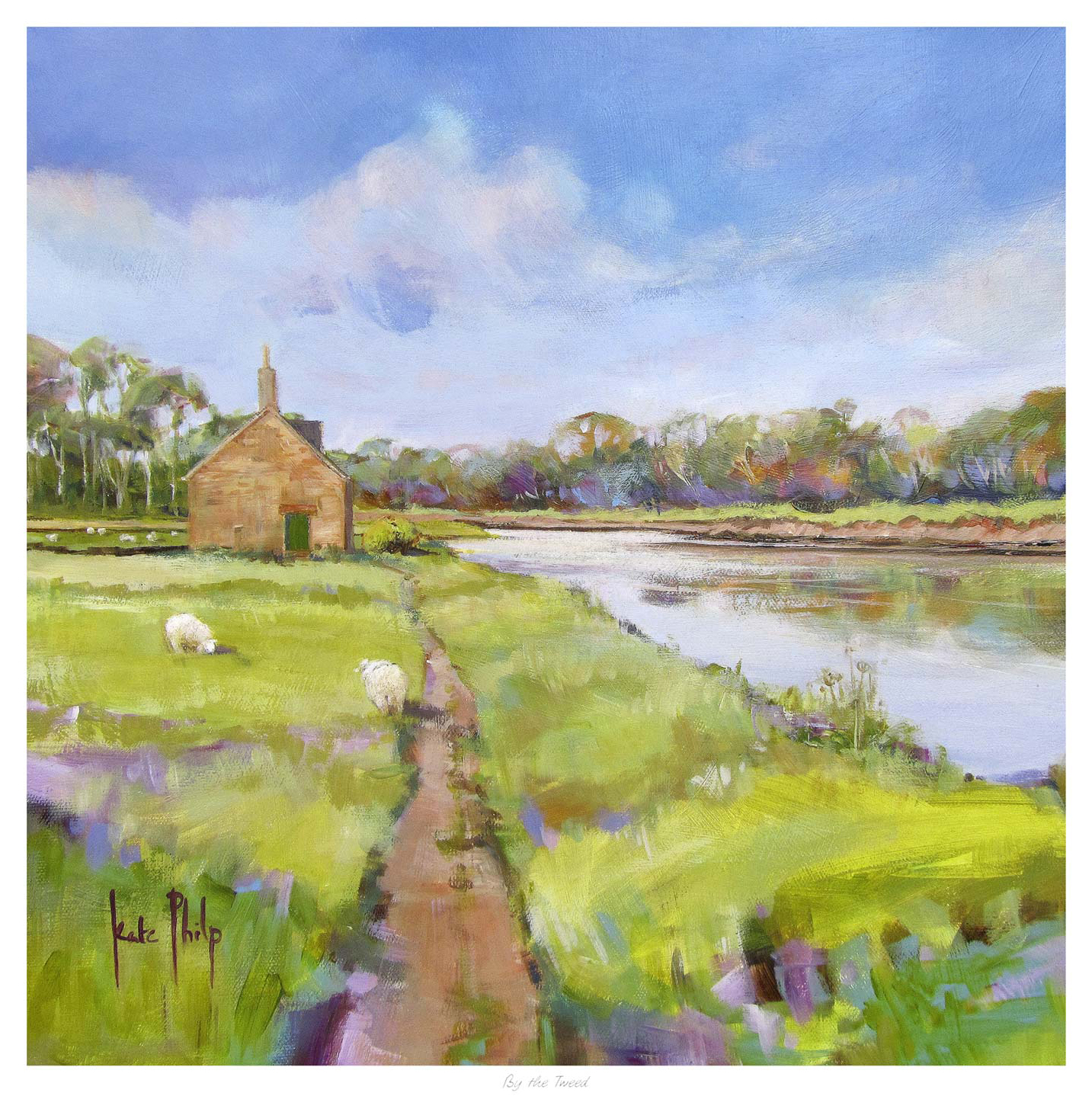
By the Tweed" depicts a small stone house beside the river, reached by a grassy path. Two sheep graze on a green field under a blue sky with clouds, while trees line the distant horizon.

Finding the right art for oatmeal walls is often about keeping a room warm and calm while still giving it enough definition. Oatmeal tones are wonderfully easy to live with, but they can leave a space feeling slightly flat if the artwork does not bring enough movement or atmosphere. By the Tweed works especially well because it adds depth and flow without breaking the softer mood of the room.

art for oatmeal walls featuring By the Tweed

Why art for oatmeal walls needs atmosphere as well as softness

Oatmeal is a useful neutral because it feels warmer than cooler greys and less stark than off-white. The challenge is that a room built around it can drift toward looking too safe unless the wall art introduces more shape, tonal variation, and a stronger sense of place. The best pieces keep the room restful while making the whole scheme feel more complete.

That is where By the Tweed stands out. Kate Philp’s landscape handling brings a gentle rhythm to the wall, which helps a neutral room feel more layered rather than merely coordinated. It suits living rooms, bedrooms, and quieter corners where warm paint colours and natural textures already do most of the work.

  • It keeps a neutral room calm while adding more visual depth.
  • It works with warm paint tones without feeling too matched.
  • It gives a softer interior a clearer hand-finished focal point.

A river landscape that feels grounded and easy to live with

The character of the River Tweed helps explain why the image feels so grounded and flowing at the same time. If this quieter landscape style appeals, you can also explore more work by Kate Philp. It is decorative in a useful way, adding beauty while also helping the room feel more joined up.

First 4 Frames completes each piece in-house in Falkirk using bespoke framing, colour-managed Giclee printing, and hand-finished craftsmanship. In a warm neutral room, that superior quality matters. The print feels properly made and properly considered, not like an afterthought added once the decorating is finished.

You can view the exact framed print here. If you are looking for art for oatmeal walls that keeps a room soft but gives it more atmosphere and finish, By the Tweed is well worth considering.

Posted on

Why Dunes at Dusk Works Beautifully as Art for Bedroom Spaces

Dunes at Dusk" is a vibrant painting featuring sand dunes, beach grass, and a calm sea under a dramatic sky with blue, pink, and orange tones.

The best art for restful bedrooms spaces should help the room slow down rather than compete for attention. Dunes at Dusk does that beautifully, using a softer coastal palette and a gentler horizon to make the wall feel calmer from the moment you walk in.

That matters in a bedroom because the artwork is part of the room’s rhythm. A piece with too much visual pressure can keep the space feeling active when it should feel settled.

Why Art for Restful Bedrooms Styling Benefits From Restraint

This print has enough colour and movement to keep the wall interesting, but the overall mood stays composed. That balance is what makes it easy to live with over time.

  • It softens the room without making it feel bland.
  • It adds atmosphere without turning the bedroom into a theme.
  • It works especially well where rest matters more than statement.

Where This Piece Can Sit Best

Dunes at Dusk would work especially well above a chest, opposite the bed, or on the quieter wall of a main bedroom or guest room. It pairs naturally with pale neutrals, sandy tones, textured bedding, and timber furniture because the image already carries that same easy warmth.

Why The Finish Makes The Mood More Convincing

First 4 Frames completes bespoke framing and colour-managed Giclee production in-house, which helps quieter tones stay clean and believable rather than flat. You can view the exact framed product here, and see more from Kate Philp if you enjoy coastal work with the same calm sense of space.

If you are comparing art for restful bedrooms spaces that feels restful, polished, and genuinely easy to live with, Dunes at Dusk is a lovely option.

Art for restful bedrooms should help the room unwind rather than push it into a louder decorative mood. This extra sense of ease is what makes the piece a good fit for spaces built around sleep, comfort, and slower evening light.