Posted on

Custom Framed Art Prints Gain Atmosphere From Morning Light, Venice

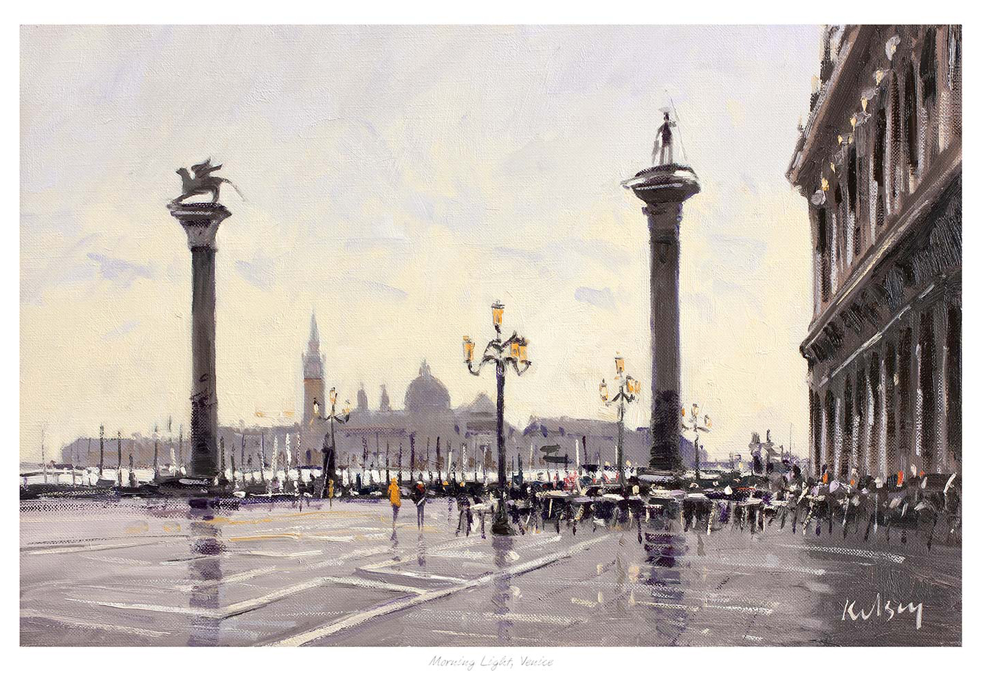
Morning Light, Venice" captures St. Mark’s Square at dawn with two tall columns, classic lamps, distant domes, and crowds reflected on wet pavement in warm, soft hues.

Custom framed art prints are most convincing when the presentation responds to the picture itself. Morning Light, Venice combines tall architecture, wet reflections, and gentle dawn light. Those elements need enough breathing room to retain their atmosphere, but they also benefit from a defined edge that helps the long perspective hold the wall.

custom framed art prints - Morning Light, Venice

Let custom framed art prints respond to light and perspective

The eye travels through Morning Light, Venice towards the distant domes. A generous mount can preserve that sense of visual approach. A frame that is too heavy may shorten the view, while one that is too pale can let the softer edges disappear against a bright wall.

DecisionWhat to consider
Frame toneUse a darker edge for architectural definition or a warmer timber to support the dawn colour.
Mount spaceGive the reflected pavement and skyline room to breathe.
PositionAvoid direct reflections from windows opposite the glass.

The composition can work in a dining room, a quieter hallway, or a sitting room with warm neutral finishes. Its location-led character creates interest, yet the early light keeps the scene calmer than a crowded daytime city view. That makes it easy to live with beyond the first impression.

Make the frame part of the room

Look at nearby furniture, door hardware, and lighting before choosing the final moulding. The aim is not to match every finish. It is to give the artwork a clear relationship with the room. First 4 Frames offers one-to-one guidance and completes the colour-managed Giclée printing and bespoke framing in-house at its Falkirk workshop.

For cultural context, visit UNESCO’s overview of Venice and its lagoon. Browse Robert Kelsey’s collection or inspect Morning Light, Venice before considering the wall and frame together.

Among custom framed art prints, Morning Light, Venice clearly shows how proportion, tonal restraint, and craftsmanship can preserve a scene’s quiet depth.
Posted on

Wall Art for a Narrow Wall Between Windows Can Still Feel Generous

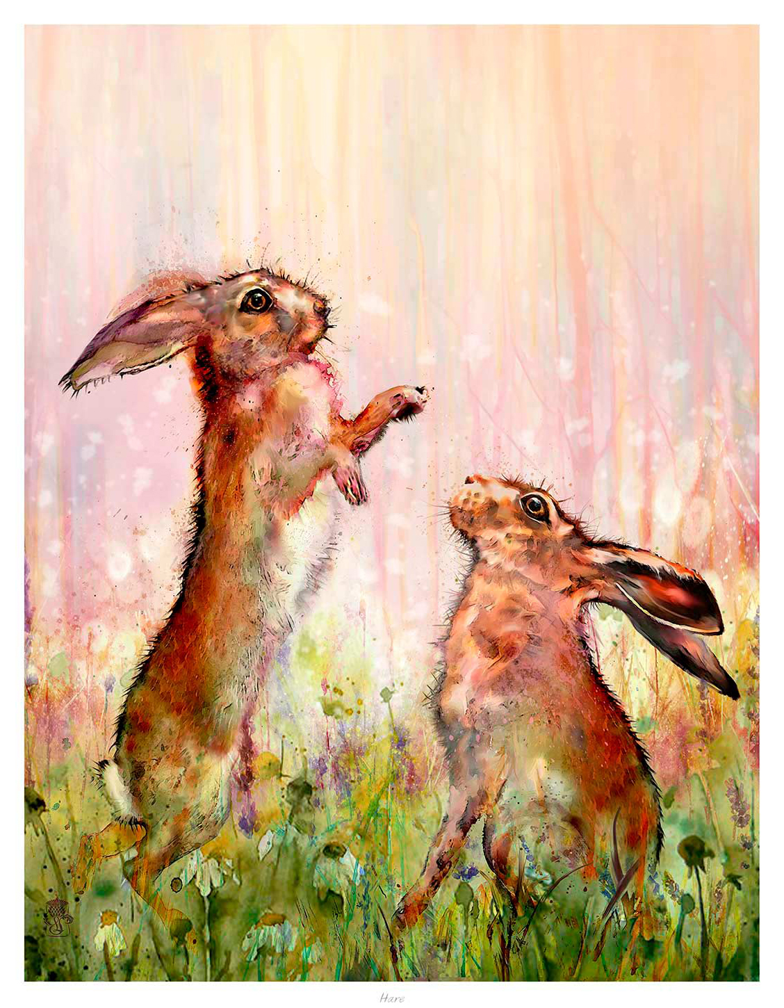
Hare features two brown hares standing on their hind legs, facing each other in a colorful abstract meadow with tall grass and flowers against a pastel background, captured in a whimsical, painterly style.

Choosing wall art for a narrow wall between windows is mainly a question of proportion. Hare uses a portrait format and an upward-moving subject, so it can give a slim section of wall purpose without making the windows feel hemmed in. The two alert hares also add energy while the meadow colours keep the effect soft.

wall art for a narrow wall between windows - Hare

Measure wall art for a narrow wall between windows carefully

Measure the solid wall rather than the distance from one curtain edge to the other. Then leave a visible margin on both sides of the frame. That breathing room prevents the artwork from looking trapped between architraves, blinds, or curtain folds. It also lets the vertical composition read clearly from across the room.

Check the width

A frame that uses roughly half to two-thirds of the solid wall often feels balanced. Mark its outline with removable tape before deciding.

Check the height

Align the picture with the room, not necessarily the window tops. Keep the visual centre comfortable at normal standing or seated eye level.

Hare is more useful here than a busy panoramic scene. Its vertical rhythm follows the shape of the available wall, while the paired animals create a clear focal point. Repeat one meadow colour in a cushion or nearby accessory if you want a connection, but avoid filling the sill with competing ornaments.

First 4 Frames produces the colour-managed Giclée print and bespoke frame in-house in Falkirk. A carefully judged frame can give the narrow space definition without adding unnecessary visual weight. The hand-finished presentation also means the solution feels deliberate rather than improvised.

Learn more about the subject through The Wildlife Trusts’ guide to the brown hare. You can also explore more work by Lee Scammacca or view the exact Hare print.

As wall art for a narrow wall between windows, Hare turns a difficult gap into a light, characterful pause between views.

Posted on

Home Office Wall Art Can Add Humour Without Distracting From Work

Image of Cup of Ambition, 9 to 5 by David Short

Home office wall art should make a workspace feel personal without pulling attention away from the task. Cup of Ambition, 9 to 5 introduces humour through a familiar working-day reference. Its square composition can also create a clear, polished point of interest behind a desk.

home office wall art - Cup of Ambition, 9 to 5

Plan home office wall art for the room and the camera

First decide whether you want to enjoy the picture from the desk or use it as part of a video-call backdrop. If it sits behind you, check the camera crop before fixing the frame. Leave enough clear wall around the image so it reads as intentional rather than squeezed between shelves.

Which size suits the workspace?

The 265 mm square option can brighten a compact study. The 500 mm size offers more presence behind a desk, while the 800 mm option can anchor a broader wall in a larger office. Measure the visible wall area, not only the room itself.

Keep cables, stacked paperwork, and small accessories away from the frame’s immediate sightline. One confident piece usually looks calmer on camera than several unrelated objects. A frame tone linked to the desk or shelving can help the background feel coherent.

Make personality feel professional

Humour works best when the design still has visual discipline. First 4 Frames completes the colour-managed Giclée print and bespoke framing in-house in Falkirk. That craftsmanship gives a playful subject a resolved finish suitable for a serious working space.

For practical workspace guidance, consult the HSE’s display screen equipment guidance. You can also browse David Short’s other work and see Cup of Ambition, 9 to 5.

As home office wall art, Cup of Ambition, 9 to 5 adds warmth and wit while preserving the order a productive room needs.

Posted on

Art for Terrazzo Floors Gains Warmth and Texture With Industrial Reverie

Image of Industrial Reverie by Emily Little

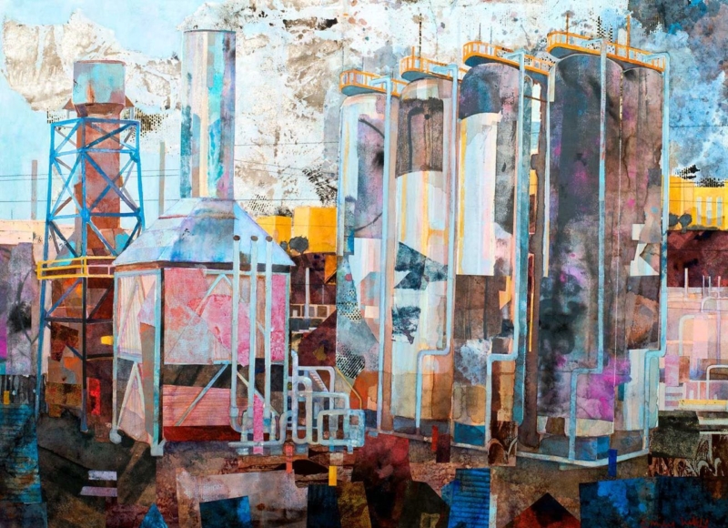
The right art for terrazzo floors should respond to the material’s texture without making the whole room feel harder. Industrial Reverie introduces atmosphere and a more reflective visual layer. It can echo the floor’s mineral character while giving the eye a warmer place to rest.

art for terrazzo floors - Industrial Reverie

Balance art for terrazzo floors with softer layers

Terrazzo often contains several small colour notes. Select one quieter chip colour to repeat in the artwork or frame, rather than trying to match the entire floor. This creates a relationship without turning the room into a strict palette exercise.

  • Add softness: use wool, linen, or timber between picture and floor.
  • Control reflection: check the glazed frame under overhead lighting.
  • Create an edge: let the frame separate atmospheric imagery from a busy surface pattern.

Use industrial character without creating a theme

A title such as Industrial Reverie can tempt a room towards exposed bulbs and repeated metal details. Restraint is more effective. Let the picture supply the industrial note, then balance it with comfortable seating, warm wood, or tactile curtains.

The 345 by 250 mm landscape format is suitable above a compact console or within a quieter seating zone. First 4 Frames produces the Giclée print and bespoke frame in-house. Colour management protects tonal relationships, while the hand-finished frame adds clean definition against patterned flooring.

Discover the material’s history through the background and history of terrazzo. Then see more work by Emily Little or view Industrial Reverie in detail.

As art for terrazzo floors, Industrial Reverie offers texture, atmosphere, and the softness needed to balance a durable polished surface.

Posted on

Wall Art for a Room With Garden Views Can Still Create Its Own Scene

Image of Garden Party by Fred Carson

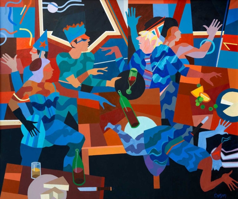
Wall art for a room with garden views does not need to reproduce the same foliage seen through the glass. Garden Party takes a more interesting route. Its garden-led setting adds human narrative and sociable energy, giving the interior a distinct scene of its own.

wall art for a room with garden views - Garden Party

Choose wall art for a room with garden views by contrast

A changing outdoor view already supplies movement, weather, and seasonal colour. The artwork can therefore offer something different: a stable composition and a story that remains present after dark. Garden Party can connect to the outlook without becoming a visual imitation of it.

Room conditionUseful response
Dense green outlookPick up one accent colour rather than every shade of foliage.
Wide glazingPlace the picture on a solid side wall where it can hold its own.
Evening useTest nearby lamps for glare before fixing the height.

The landscape-oriented 360 by 300 mm print can suit a side wall, a reading corner, or the space above a small cabinet. Its modest proportion also makes it easier to maintain breathing room beside windows and doors.

First 4 Frames uses colour-managed Giclée production and bespoke framing at its Falkirk workshop. A carefully selected frame can connect the picture to timber furniture or painted joinery while keeping it visually separate from the view beyond.

Explore the RHS guide to designing with plants for practical garden colour ideas. You can also browse art by Fred Carson and view Garden Party itself.

For wall art for a room with garden views, Garden Party creates connection through mood while preserving a separate interior identity.

Posted on

A Thank You Gift for a Riding Instructor With Poise: Jockey

Image of Jockey by Rikki O'Neill

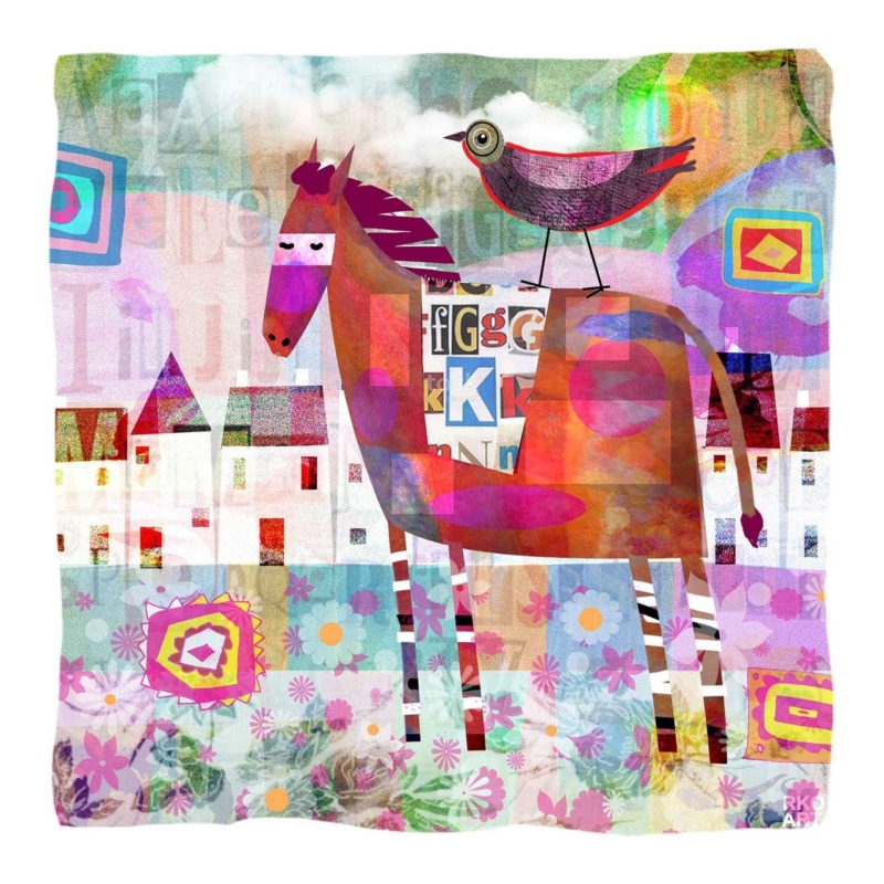
A thoughtful thank you gift for a riding instructor should recognise patience, knowledge, and a shared love of horses. Jockey does that through the artwork itself. It feels personal to equestrian life without depending on a printed message or a short-lived novelty.

thank you gift for a riding instructor - Jockey

Why framed art makes a lasting thank you gift for a riding instructor

Consumable gifts are welcome, but artwork can remain part of a home, tack-room office, or teaching space for years. Jockey’s 265 mm square print format is especially practical. It can fit a compact wall or sit within an existing group of pictures without demanding a complete room rearrangement.

The most successful thank-you gift reflects what the recipient has given their time and skill to.

Think about presentation as part of the gift. A clean dark frame can add crisp definition. A softer timber finish may suit a relaxed country interior. If several pupils are contributing, add a private card with their names rather than writing on the artwork or frame.

When should the gift be given?

It can mark the end of a season, a rider’s progression, a competition milestone, or simply sustained support. The reason should be specific to the relationship rather than attached to a generic calendar occasion.

First 4 Frames completes the colour-managed Giclée print and bespoke framing in-house at its Falkirk workshop. That hand-finished result helps the gesture feel considered and ready to display from the moment it is opened.

For wider equestrian information, visit the British Horse Society. You can also discover more by Rikki O’Neill or view the Jockey print.

As a thank you gift for a riding instructor, Jockey combines relevance, craftsmanship, and lasting wall presence.

Posted on

Art for a South-Facing Room Can Hold Its Colour With Purple Thistle

Image of Purple Thistle by Sheila Fowler

Choosing art for a south facing room means thinking about how colour behaves from morning to late afternoon. Purple Thistle offers a concentrated purple note and a clear botanical subject. It can stay visually present in generous daylight without making a bright room feel crowded.

art for a south facing room - Purple Thistle

Test art for a south facing room through the whole day

Strong natural light can make a pale picture look washed out at noon, while a very dark work may become dominant later in the day. Purple Thistle occupies a useful middle ground. Its colour creates definition, yet the botanical subject keeps the mood fresh and natural.

  1. Check the proposed wall in direct and indirect light.
  2. Position the frame away from a persistent reflection.
  3. Repeat one purple accent, not an entire matching palette.
  4. Leave clear wall around the square format.

The available 265 mm and 500 mm square print sizes suit different roles. The smaller size can brighten a narrow return wall or breakfast corner. The larger option has enough presence for a brighter sitting room without relying on an oversized composition.

Keep the framing crisp but not harsh

A pale timber frame can preserve an airy mood. A darker edge can give the purple stronger definition against a light wall. First 4 Frames handles the colour-managed Giclée production and hand-finished framing in-house, helping the artwork retain clean colour and a polished edge.

Learn about the plant through NatureScot’s introduction to Scotland’s thistles. Then explore Sheila Fowler’s collection or inspect Purple Thistle in its available sizes.

As art for a south facing room, Purple Thistle brings enough colour to meet strong daylight while keeping the scheme calm.

Posted on

Scottish Coastal Art Finds a Story-Rich Focal Point in Kisimul Castle

Image of Isle of Barra: Kisimul Castle by Stewart Bremner

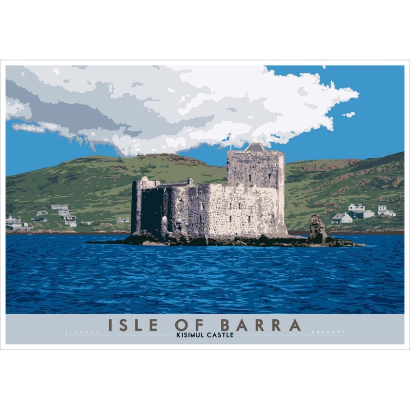
Scottish coastal art can offer more than a broad horizon. Isle of Barra: Kisimul Castle brings stone architecture, island history, and surrounding water into one composed image. That combination makes the print a useful focal point for a room that needs character as well as a feeling of space.

Scottish coastal art - Isle of Barra: Kisimul Castle

Let Scottish coastal art carry a sense of history

Kisimul Castle sits on a rocky islet in Castlebay, so the subject naturally balances shelter and exposure. In an interior, the strong silhouette gives the eye a clear stopping point. The water and sky then prevent that architecture from making the composition feel too formal or heavy.

Where it can work

  • Above a hallway console
  • On a dining-room feature wall
  • In a study with natural materials

What to pair with it

  • Wool and weathered timber
  • Stone, slate, or soft blue-grey
  • Simple lighting that limits glare

The available square format can create a self-contained focal point, while the larger option gives the island setting more breathing room. Avoid adding nautical ornaments around it. The specific place and architecture already provide enough coastal identity.

First 4 Frames produces the colour-managed Giclée print and bespoke frame in-house in Falkirk. Careful framing can echo the castle’s definition while preserving the lighter atmosphere around it.

Read Historic Environment Scotland’s Kisimul Castle guide for the site’s history. You can also browse more work by Stewart Bremner or view the exact Kisimul Castle print.

For Scottish coastal art with narrative depth, Isle of Barra: Kisimul Castle offers a memorable balance of place, structure, and open water.

Posted on

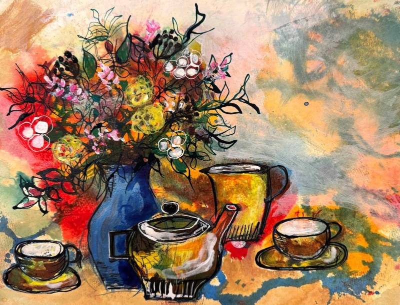
Art for a Dining Room Should Feel Sociable: Tea With Friends Shows How

Image of Tea with Friends by David Short

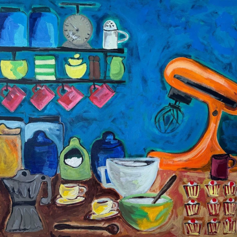
Good art for a dining room should help the space feel sociable even when nobody is sitting at the table. Tea with Friends has that convivial quality built into its subject. Familiar tableware and lively colour suggest shared time, making the room feel ready for conversation rather than reserved for formal occasions.

art for a dining room - Tea with Friends

Connect art for a dining room to the table

Do not match the picture to a full dinner service. Instead, borrow one or two colours for everyday objects: a small vase, napkins, or a bowl. This creates a gentle relationship between wall and table. It also allows the artwork to remain relevant when seasonal settings change.

Dining-room featureUseful artwork response
Long tableChoose the wider available print size for better visual balance.
Strong pendant lightKeep enough space above the frame and check evening reflections.
Mixed tablewareRepeat one colour, not every pattern.

Keep it welcoming, not themed

A food or table subject can become too literal if surrounded by signs and matching accessories. Give Tea with Friends clear wall space and let its colour do the work. A bespoke frame can then connect it to timber furniture or provide sharper definition in a contemporary scheme.

First 4 Frames completes its colour-managed Giclée production and framing in-house in Falkirk. This craftsmanship is especially valuable in a dining room, where daylight and evening lighting can reveal colour and finish in very different ways.

For cultural and design context, explore the UK Tea and Infusions Association’s history of tea. You can also browse more by David Short or view the exact Tea with Friends print.

When choosing art for a dining room, Tea with Friends offers warmth, colour, and a subject naturally connected to time spent together.

Posted on

Abstract Wall Art Can Give an Open-Plan Room a Visual Pause

Image of Echo of the Unseen by Fred Carson

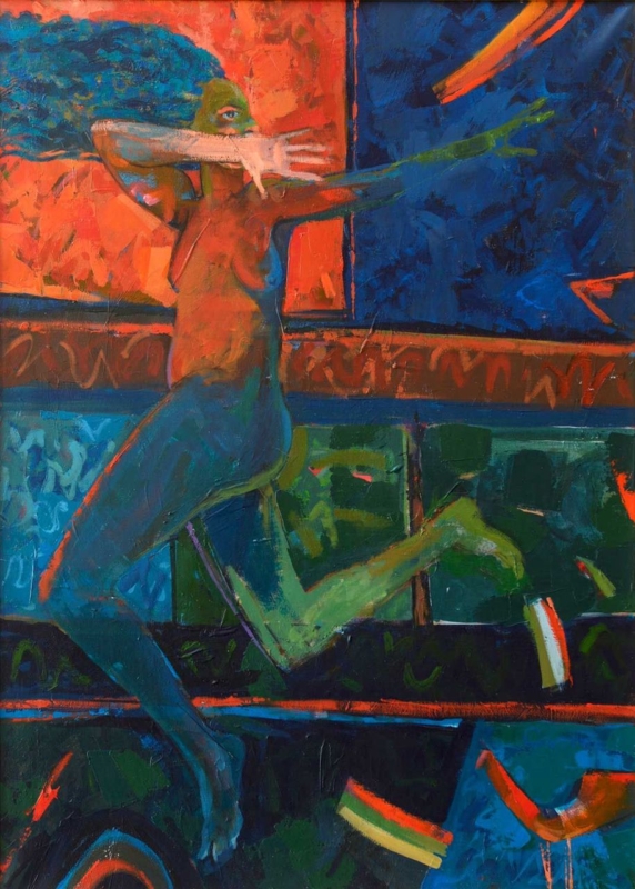
Well-placed abstract wall art can organise an open-plan room without adding a screen or changing the layout. Echo of the Unseen can mark a reading chair, dining area, or quiet end of a larger living space through colour and form. The artwork becomes a visual pause between activities.

abstract wall art - Echo of the Unseen

Use abstract wall art to define one zone

Begin with function. Decide which part of the room needs identity, then centre the work on that furniture group rather than on the entire wall. This small change can make a dining table or reading chair feel intentional, even when it shares one uninterrupted space with the kitchen and sitting area.

  1. Choose the zone that currently feels least anchored.
  2. Repeat one colour from the artwork within that area only.
  3. Use the frame edge to give the composition a clear boundary.
  4. Leave enough wall around the piece to create a pause.

Echo of the Unseen has a portrait-oriented format, which can add height above a compact console or beside a lower chair. Avoid scattering several equally assertive objects around it. One lamp, textile, or ceramic note is often enough to connect the art to its zone.

First 4 Frames produces the Giclée print and bespoke frame in-house at its Falkirk workshop. Colour-managed production preserves the intended relationships between colours, while hand-finished framing helps the work create a precise edge in a visually busy room.

Read Tate’s introduction to abstract art for wider context. Then discover the work of Fred Carson or look at Echo of the Unseen itself.

As abstract wall art for open-plan living, Echo of the Unseen can create definition and breathing room without sacrificing flow.