
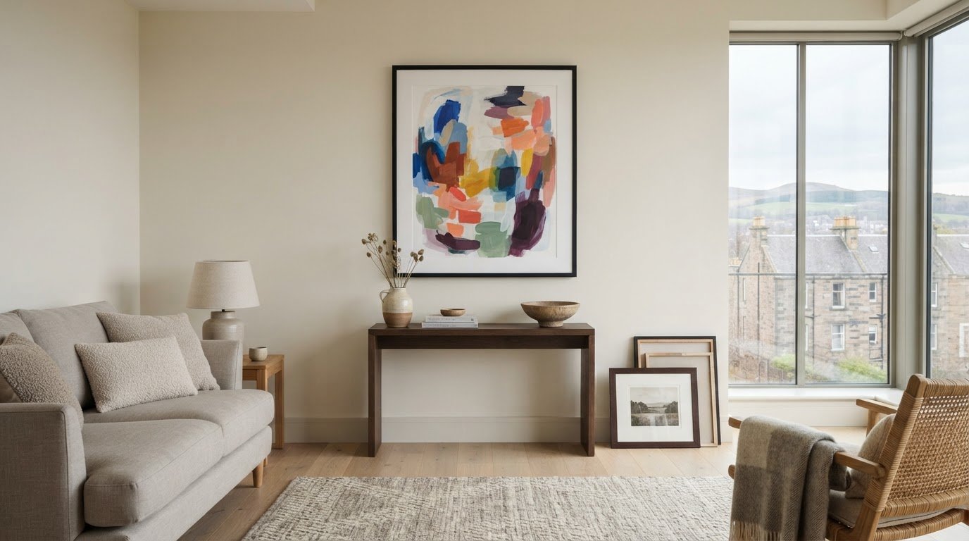
What if colourful abstract art could make a neutral room feel more considered, not less calm? The right piece adds warmth and personality to pared-back surroundings, but bold colour can feel risky if it clashes with warm or cool finishes, dominates the space or looks different once framed. Colourful abstract art for neutral decor works best when you consider colour, scale and framing together.
This guide explains how to connect artwork with existing accents, judge its size and compare framing choices. First4Frames Gallery offers a wide selection of framed wall art, including Contemporary art prints, with bespoke frames individually crafted for each order. Unlike cheap standard frames that may not fit the artwork properly, a custom frame is made to suit the piece. Artwork is finished with 2mm float glass, chosen for its superior clarity compared with the perspex used by many competitors. Use the Wall art visualiser to visualise art on your wall and see artwork before you buy, so you can assess your choice in context.
Key Takeaways
- Use colourful abstract art for neutral decor as a deliberate accent that adds energy while preserving the room’s calm foundation.
- Match artwork to warm, cool or mixed neutrals. Complementary or neighbouring shades on the colour wheel can guide your choice, but they are not rules.
- Measure the wall, consider nearby furniture and compare proportions to find artwork that suits the space.
- Compare Giclée prints, Fine art, Photography prints and framed artwork by palette, print style, dimensions and frame choices.
Why colourful abstract art works in neutral decor
Colourful abstract art creates a deliberate focal point against restrained walls, floors or furnishings. It can bring energy to a room without asking you to change its neutral foundation. Contrast makes a neutral interior feel more personal by giving the eye a vivid detail to return to, while the surrounding calm keeps the artwork in balance.
Start by identifying the room’s undertones. Cream, beige and warm stone tend to feel softer and more sunlit; grey and many off-whites tend to feel cooler. This distinction can guide your palette. Warm neutrals often sit comfortably with earthy reds, ochres or greens, while cooler ones can complement blues and cleaner, sharper accents. Treat these as starting points, not strict rules.
What makes abstract art a natural fit for neutral rooms?
Non-representational shapes and colour bring character without tying the room to a specific subject or decor theme. A flowing composition can add movement, while blocks of colour create a more structured focal point. If you’re curious about the history and forms of abstract art, exploring its variety can help you identify the kinds of compositions you’re drawn to.
Abstract prints are one option among other styles, including Coastal wall art, Landscape wall art and Scottish landscape art. Choose based on the mood you want, rather than assuming a neutral room needs artwork that blends in.
Choose a colour mood before choosing the print
Look around the room first. Echo a shade already present in a cushion, rug or vase to connect the artwork with its surroundings. Or introduce one purposeful accent colour and let the print become the room’s main point of contrast. Repeating a small detail of that colour elsewhere can make the choice feel deliberate.
For a quieter effect, choose tonal artwork with colours close to the room’s existing palette. Higher-contrast Contemporary art prints make a bolder statement, particularly against plain walls. Neither approach is inherently better. Consider how much visual energy you want, then choose a print that complements the room rather than competing with it.
How to match colourful abstract art to your neutral palette
Before choosing a print, look at the undertones in the room’s largest surfaces, such as the sofa, flooring and walls. Undertones influence how artwork colours appear: a shade can look warmer or cooler depending on the neutral colours and light around it. Use the guide below to narrow your palette, then treat it as inspiration rather than a formula.
Warm neutrals: Cream, beige and warm stone pair naturally with related warm accents. A measured cool contrast can add definition.
Cool neutrals: Grey and cool off-white can support vivid colour, gentle tonal combinations or a mix of warm and cool shades.
Mixed palettes: If warm and cool finishes sit together, look for artwork with a colour note that connects both sides.
The colour wheel can help refine your choice. Complementary colours sit opposite each other and create stronger contrast; analogous colours sit beside each other and tend to feel more harmonious. Neither approach is a rule. For more on how colour shapes interiors, explore this overview of color theory in interior design. Look for one or two colours already present in the room to create a visual link. Exact matches aren’t necessary: a similar tone can help the composition feel at home without repeating every accessory.
Compare colour intensity before committing
A print with one vivid focal colour makes a clear statement, while several softer colours spread interest across the composition. Consider which effect suits the room’s existing visual activity. Daylight and artificial lighting can change how colours appear, so compare artwork in the space where it will hang, at different times if possible.
Use the Wall art visualiser to Visualise art on your wall and See artwork before you buy. Previewing the work in context can help you judge its palette more practically than viewing it on a screen alone. For more ideas on selecting artwork and its presentation, browse this gallery of framed art as you consider colourful abstract art for neutral decor.
How to choose the right size and frame for colourful abstract art
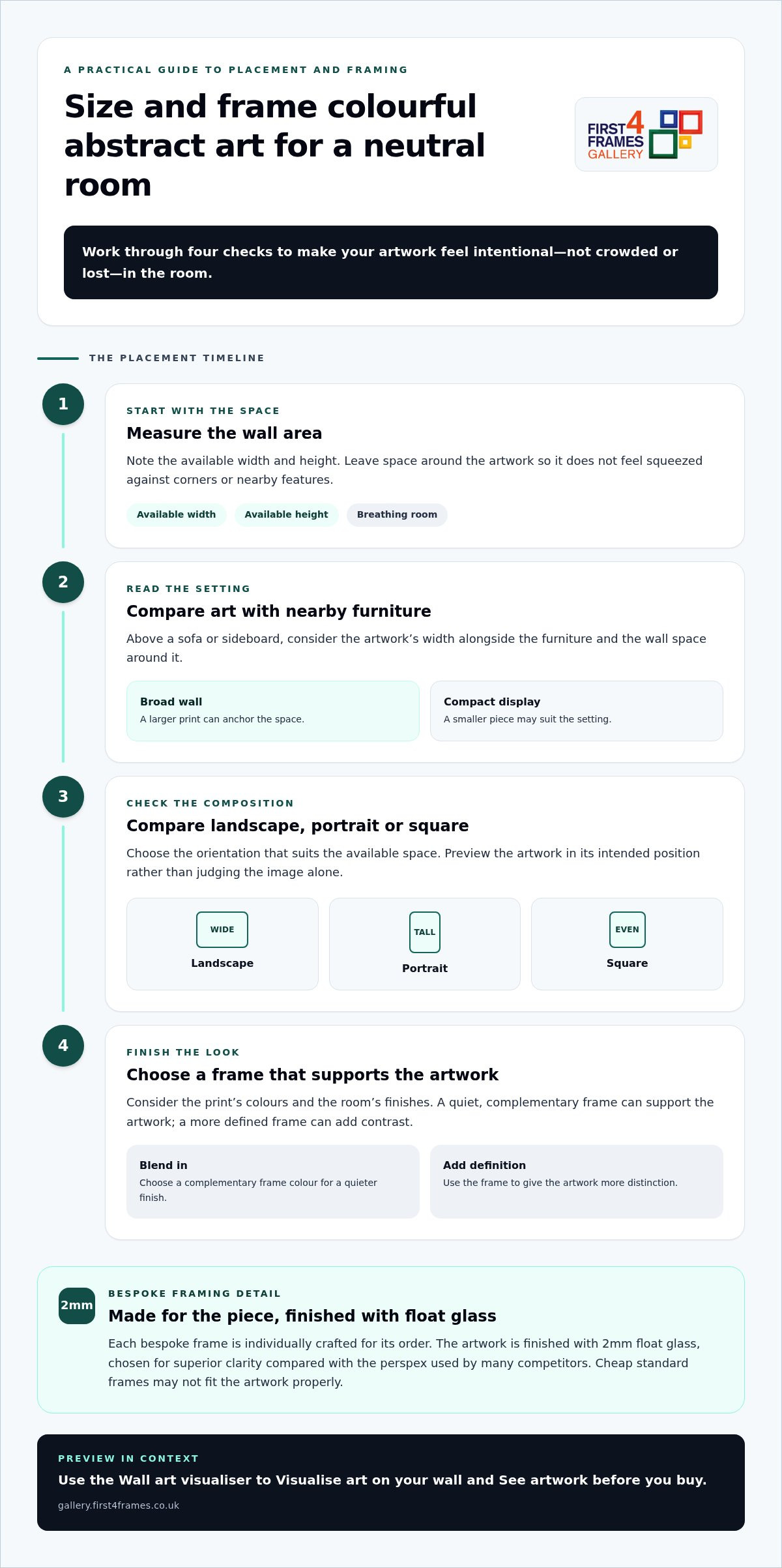
Good proportions help colourful abstract art feel intentional rather than crowded or lost. Work through these steps before settling on a print:
- Measure the wall area. Note the available width and height, leaving space around the artwork so it doesn’t feel squeezed against corners or nearby features.
- Consider nearby furniture. Above a sofa or sideboard, compare the artwork’s width with the furniture and the wall space around it. A larger print can anchor a broad wall; a smaller piece may suit a compact display.
- Compare proportions. Check whether a landscape, portrait or square composition suits the space. Preview it in its intended position rather than judging the image alone.
- Choose a frame. Consider the print’s colours, the room’s finishes and whether the frame should blend in or add definition.
Make artwork scale feel balanced above furniture
Stand back and assess the whole arrangement, including the furniture beneath it and any surrounding objects. A print can look generous on screen but feel undersized above a wide sofa, or overwhelm a narrow wall. The picture frames guide offers further help with display choices. A Wall art visualiser can also help you preview the work in its intended position and judge the overall balance.
Use framing to connect art with the room
A frame in a quiet, complementary colour can support the artwork without competing for attention. A darker or more defined profile can sharpen its contrast against pale walls. With Online picture framing, you can Design your framed artwork by comparing frame choices. Every First4Frames frame is individually crafted for the order using high-quality materials, unlike cheap standard frames that may not fit the artwork properly. The framed work uses 2mm float glass for superior clarity compared with the perspex used by many competitors. For a tailored finish, explore framed art and bespoke options, including Bespoke framed wall art.
Where to find colourful abstract art for neutral decor
Compare artwork by more than its dominant colour. Consider palette, print style, dimensions and frame choices together, since each affects how the finished piece will sit in your room. The selection includes Giclée prints, Fine art, Photography prints and Contemporary art prints, as well as work by Best-selling artists and Famous artists. Custom framed art prints bring your chosen image and frame together as one considered piece.
Browse and visualise framed abstract artwork
Online picture framing makes it easier to compare print and frame combinations. As you browse, consider how the artwork’s colours and dimensions work with different frame options. Choose your frame online and use the Wall art visualiser to picture the combination in your room. Explore colourful framed wall art to compare abstract prints and other styles in context.
An Art print framing service brings a selected print and frame together. First4Frames also offers a print-and-frame option for digital photographs, with high-quality printing chosen to complement the bespoke framing.
Turn a considered choice into framed art
The gallery brings together work from its artist selection, Giclée fine art prints, ready-to-hang framed art and bespoke framing. This joined-up approach lets you explore artwork and consider its finished presentation as part of the same decision. Finished frames are fully packaged to help prevent damage and shipped via professional couriers.
A considered print, a well-fitted frame and protective delivery bring colour to your room with care from selection to arrival. Explore the gallery’s framed art and prints to find a piece that feels right for your space.
Let your artwork make the room your own
A neutral room can be a living backdrop, ready to evolve as your taste changes. Rather than aiming for a perfectly coordinated finish, choose a piece you’ll enjoy seeing each day. The most lasting choice may be the one that makes you pause, sparks a memory or brings a little of your personality into the space.
Give yourself room to explore before deciding. Compare different compositions and colour moods, then picture how each might feel in your home over time. The right colourful abstract art for neutral decor doesn’t simply fill an empty wall; it can become part of how you experience the room, whether you’re settling in for a quiet evening or welcoming friends.
Explore colourful abstract prints and framed art to find a piece that speaks to you. Trust your eye, compare the options and choose the artwork you’ll love living with.
Frequently Asked Questions
Can colourful abstract art work in a small neutral room?
Yes, colourful abstract art can suit a small neutral room. Consider the clear wall area and how much visual activity already comes from furniture, rugs and fittings. A compact print can provide a focused accent, while a larger statement piece may become the room’s main feature. Compare both at the intended height and position, leaving enough surrounding wall space for the artwork to breathe.
How do I choose abstract art for a beige or grey room?
For colourful abstract art for neutral decor, first check whether the beige or grey feels warm, cool or balanced in your room. Then choose colours that harmonise with that undertone or create a deliberate contrast. Pick out one existing shade, perhaps from a cushion or rug, as a visual bridge. View the print under your room’s lighting. Exact colour matches aren’t needed for a cohesive effect.
Will colourful abstract art go out of style?
Art doesn’t have to follow a trend to feel current. Its staying power depends more on whether you enjoy looking at it and whether it sits comfortably with the room. Consider how you might feel about the piece if you changed cushions, throws or other accessories. Choosing artwork for a colour combination you genuinely love gives you more freedom than buying solely to keep pace with a passing style.
Should the frame match the colours in abstract artwork?
No. A frame can pick up one colour in the artwork, recede into the room’s finishes or create a crisp outline that strengthens contrast. Rather than matching every shade, compare the complete framed piece with the wall and nearby furniture. Use the visualiser to test how the frame’s tone and profile affect the composition in place, especially if the artwork has several competing colours.
Can I have a digital photograph printed and framed to suit neutral decor?
Yes. A personal digital photograph can be printed and framed as wall art, with its colours considered alongside your neutral decor. First4Frames’ print-and-frame service pairs high-quality printing with bespoke framing, so the image and its presentation are considered together. For example, a photograph with a small accent of colour can tie in with cushions or ceramics. Choose a frame that supports both the image and its surroundings.