Posted on

Colourful Abstract Art for Neutral Decor: Buying Guide

Colourful Abstract Art for Neutral Decor: Buying Guide

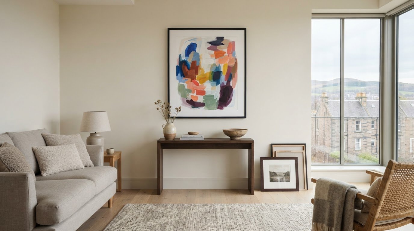
What if colourful abstract art could make a neutral room feel more considered, not less calm? The right piece adds warmth and personality to pared-back surroundings, but bold colour can feel risky if it clashes with warm or cool finishes, dominates the space or looks different once framed. Colourful abstract art for neutral decor works best when you consider colour, scale and framing together.

This guide explains how to connect artwork with existing accents, judge its size and compare framing choices. First4Frames Gallery offers a wide selection of framed wall art, including Contemporary art prints, with bespoke frames individually crafted for each order. Unlike cheap standard frames that may not fit the artwork properly, a custom frame is made to suit the piece. Artwork is finished with 2mm float glass, chosen for its superior clarity compared with the perspex used by many competitors. Use the Wall art visualiser to visualise art on your wall and see artwork before you buy, so you can assess your choice in context.

Key Takeaways

  • Use colourful abstract art for neutral decor as a deliberate accent that adds energy while preserving the room’s calm foundation.
  • Match artwork to warm, cool or mixed neutrals. Complementary or neighbouring shades on the colour wheel can guide your choice, but they are not rules.
  • Measure the wall, consider nearby furniture and compare proportions to find artwork that suits the space.
  • Compare Giclée prints, Fine art, Photography prints and framed artwork by palette, print style, dimensions and frame choices.

Why colourful abstract art works in neutral decor

Colourful abstract art creates a deliberate focal point against restrained walls, floors or furnishings. It can bring energy to a room without asking you to change its neutral foundation. Contrast makes a neutral interior feel more personal by giving the eye a vivid detail to return to, while the surrounding calm keeps the artwork in balance.

Start by identifying the room’s undertones. Cream, beige and warm stone tend to feel softer and more sunlit; grey and many off-whites tend to feel cooler. This distinction can guide your palette. Warm neutrals often sit comfortably with earthy reds, ochres or greens, while cooler ones can complement blues and cleaner, sharper accents. Treat these as starting points, not strict rules.

What makes abstract art a natural fit for neutral rooms?

Non-representational shapes and colour bring character without tying the room to a specific subject or decor theme. A flowing composition can add movement, while blocks of colour create a more structured focal point. If you’re curious about the history and forms of abstract art, exploring its variety can help you identify the kinds of compositions you’re drawn to.

Abstract prints are one option among other styles, including Coastal wall art, Landscape wall art and Scottish landscape art. Choose based on the mood you want, rather than assuming a neutral room needs artwork that blends in.

Choose a colour mood before choosing the print

Look around the room first. Echo a shade already present in a cushion, rug or vase to connect the artwork with its surroundings. Or introduce one purposeful accent colour and let the print become the room’s main point of contrast. Repeating a small detail of that colour elsewhere can make the choice feel deliberate.

For a quieter effect, choose tonal artwork with colours close to the room’s existing palette. Higher-contrast Contemporary art prints make a bolder statement, particularly against plain walls. Neither approach is inherently better. Consider how much visual energy you want, then choose a print that complements the room rather than competing with it.

How to match colourful abstract art to your neutral palette

Before choosing a print, look at the undertones in the room’s largest surfaces, such as the sofa, flooring and walls. Undertones influence how artwork colours appear: a shade can look warmer or cooler depending on the neutral colours and light around it. Use the guide below to narrow your palette, then treat it as inspiration rather than a formula.

Warm neutrals: Cream, beige and warm stone pair naturally with related warm accents. A measured cool contrast can add definition.

Cool neutrals: Grey and cool off-white can support vivid colour, gentle tonal combinations or a mix of warm and cool shades.

Mixed palettes: If warm and cool finishes sit together, look for artwork with a colour note that connects both sides.

The colour wheel can help refine your choice. Complementary colours sit opposite each other and create stronger contrast; analogous colours sit beside each other and tend to feel more harmonious. Neither approach is a rule. For more on how colour shapes interiors, explore this overview of color theory in interior design. Look for one or two colours already present in the room to create a visual link. Exact matches aren’t necessary: a similar tone can help the composition feel at home without repeating every accessory.

Compare colour intensity before committing

A print with one vivid focal colour makes a clear statement, while several softer colours spread interest across the composition. Consider which effect suits the room’s existing visual activity. Daylight and artificial lighting can change how colours appear, so compare artwork in the space where it will hang, at different times if possible.

Use the Wall art visualiser to Visualise art on your wall and See artwork before you buy. Previewing the work in context can help you judge its palette more practically than viewing it on a screen alone. For more ideas on selecting artwork and its presentation, browse this gallery of framed art as you consider colourful abstract art for neutral decor.
Colourful Abstract Art for Neutral Decor: Buying Guide

How to choose the right size and frame for colourful abstract art

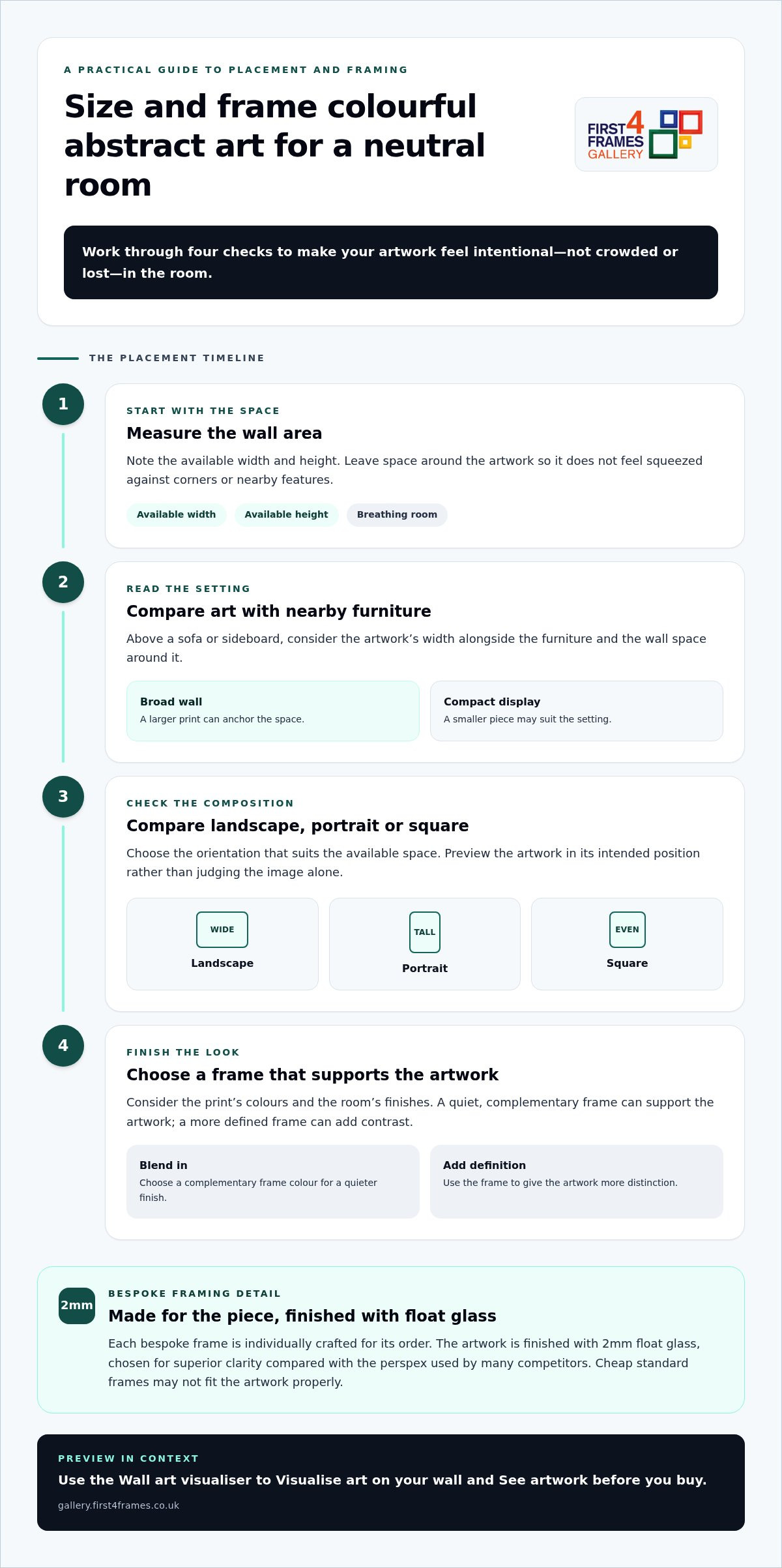
Good proportions help colourful abstract art feel intentional rather than crowded or lost. Work through these steps before settling on a print:

  1. Measure the wall area. Note the available width and height, leaving space around the artwork so it doesn’t feel squeezed against corners or nearby features.
  2. Consider nearby furniture. Above a sofa or sideboard, compare the artwork’s width with the furniture and the wall space around it. A larger print can anchor a broad wall; a smaller piece may suit a compact display.
  3. Compare proportions. Check whether a landscape, portrait or square composition suits the space. Preview it in its intended position rather than judging the image alone.
  4. Choose a frame. Consider the print’s colours, the room’s finishes and whether the frame should blend in or add definition.

Make artwork scale feel balanced above furniture

Stand back and assess the whole arrangement, including the furniture beneath it and any surrounding objects. A print can look generous on screen but feel undersized above a wide sofa, or overwhelm a narrow wall. The picture frames guide offers further help with display choices. A Wall art visualiser can also help you preview the work in its intended position and judge the overall balance.

Use framing to connect art with the room

A frame in a quiet, complementary colour can support the artwork without competing for attention. A darker or more defined profile can sharpen its contrast against pale walls. With Online picture framing, you can Design your framed artwork by comparing frame choices. Every First4Frames frame is individually crafted for the order using high-quality materials, unlike cheap standard frames that may not fit the artwork properly. The framed work uses 2mm float glass for superior clarity compared with the perspex used by many competitors. For a tailored finish, explore framed art and bespoke options, including Bespoke framed wall art.

Where to find colourful abstract art for neutral decor

Compare artwork by more than its dominant colour. Consider palette, print style, dimensions and frame choices together, since each affects how the finished piece will sit in your room. The selection includes Giclée prints, Fine art, Photography prints and Contemporary art prints, as well as work by Best-selling artists and Famous artists. Custom framed art prints bring your chosen image and frame together as one considered piece.

Browse and visualise framed abstract artwork

Online picture framing makes it easier to compare print and frame combinations. As you browse, consider how the artwork’s colours and dimensions work with different frame options. Choose your frame online and use the Wall art visualiser to picture the combination in your room. Explore colourful framed wall art to compare abstract prints and other styles in context.

An Art print framing service brings a selected print and frame together. First4Frames also offers a print-and-frame option for digital photographs, with high-quality printing chosen to complement the bespoke framing.

Turn a considered choice into framed art

The gallery brings together work from its artist selection, Giclée fine art prints, ready-to-hang framed art and bespoke framing. This joined-up approach lets you explore artwork and consider its finished presentation as part of the same decision. Finished frames are fully packaged to help prevent damage and shipped via professional couriers.

A considered print, a well-fitted frame and protective delivery bring colour to your room with care from selection to arrival. Explore the gallery’s framed art and prints to find a piece that feels right for your space.

Let your artwork make the room your own

A neutral room can be a living backdrop, ready to evolve as your taste changes. Rather than aiming for a perfectly coordinated finish, choose a piece you’ll enjoy seeing each day. The most lasting choice may be the one that makes you pause, sparks a memory or brings a little of your personality into the space.

Give yourself room to explore before deciding. Compare different compositions and colour moods, then picture how each might feel in your home over time. The right colourful abstract art for neutral decor doesn’t simply fill an empty wall; it can become part of how you experience the room, whether you’re settling in for a quiet evening or welcoming friends.

Explore colourful abstract prints and framed art to find a piece that speaks to you. Trust your eye, compare the options and choose the artwork you’ll love living with.

Frequently Asked Questions

Can colourful abstract art work in a small neutral room?

Yes, colourful abstract art can suit a small neutral room. Consider the clear wall area and how much visual activity already comes from furniture, rugs and fittings. A compact print can provide a focused accent, while a larger statement piece may become the room’s main feature. Compare both at the intended height and position, leaving enough surrounding wall space for the artwork to breathe.

How do I choose abstract art for a beige or grey room?

For colourful abstract art for neutral decor, first check whether the beige or grey feels warm, cool or balanced in your room. Then choose colours that harmonise with that undertone or create a deliberate contrast. Pick out one existing shade, perhaps from a cushion or rug, as a visual bridge. View the print under your room’s lighting. Exact colour matches aren’t needed for a cohesive effect.

Will colourful abstract art go out of style?

Art doesn’t have to follow a trend to feel current. Its staying power depends more on whether you enjoy looking at it and whether it sits comfortably with the room. Consider how you might feel about the piece if you changed cushions, throws or other accessories. Choosing artwork for a colour combination you genuinely love gives you more freedom than buying solely to keep pace with a passing style.

Should the frame match the colours in abstract artwork?

No. A frame can pick up one colour in the artwork, recede into the room’s finishes or create a crisp outline that strengthens contrast. Rather than matching every shade, compare the complete framed piece with the wall and nearby furniture. Use the visualiser to test how the frame’s tone and profile affect the composition in place, especially if the artwork has several competing colours.

Can I have a digital photograph printed and framed to suit neutral decor?

Yes. A personal digital photograph can be printed and framed as wall art, with its colours considered alongside your neutral decor. First4Frames’ print-and-frame service pairs high-quality printing with bespoke framing, so the image and its presentation are considered together. For example, a photograph with a small accent of colour can tie in with cushions or ceramics. Choose a frame that supports both the image and its surroundings.
Posted on

Architectural Prints of Glasgow and Edinburgh: A Guide to Choosing Art

Architectural Prints of Glasgow and Edinburgh: A Guide to Choosing Art

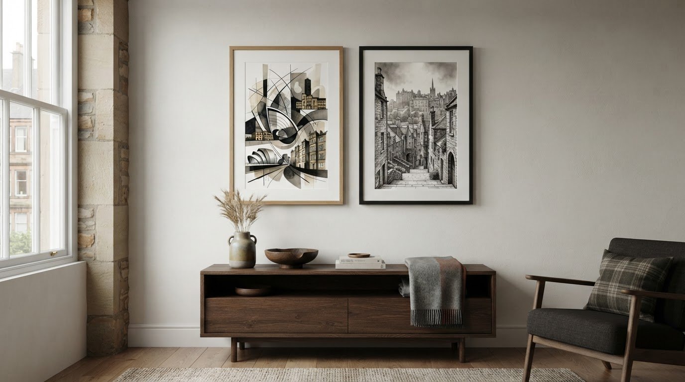
What if the print that feels most like your favourite city isn’t the one with its best-known landmark? Choosing architectural prints of Glasgow and Edinburgh means weighing two distinct moods: Glasgow’s expressive Mackintosh lines and Edinburgh’s close-packed stone streets, stairways and closes. Both make compelling wall art, but it can be difficult to judge online how a particular image or artistic treatment will look in your room.

A detailed monochrome drawing can feel calm and timeless, while a colourful or graphic interpretation makes a stronger contemporary statement. The right choice depends on the architecture you love, the atmosphere you want and the colours already in your space.

In this guide, compare the cities’ visual character, consider how artistic style changes a print’s impact, and use practical checks to choose a size and frame. You’ll also find ways to visualise art on your wall and see how individually crafted framing, made with high-quality materials, brings your chosen architectural print together as ready-to-display framed wall art.

Key Takeaways

  • Choose between architectural prints of glasgow and edinburgh by the city and streetscape you feel most connected to, not by a “right” answer.
  • Compare illustration, photography and contemporary treatments to find the colour, contrast and level of detail you enjoy.
  • Start with the wall, then consider the print’s subject, scale and visual weight alongside your room’s colours and furniture.
  • Pair your chosen print with a considered frame through online picture framing. Each First4Frames Gallery frame is individually crafted for its order using high-quality materials.

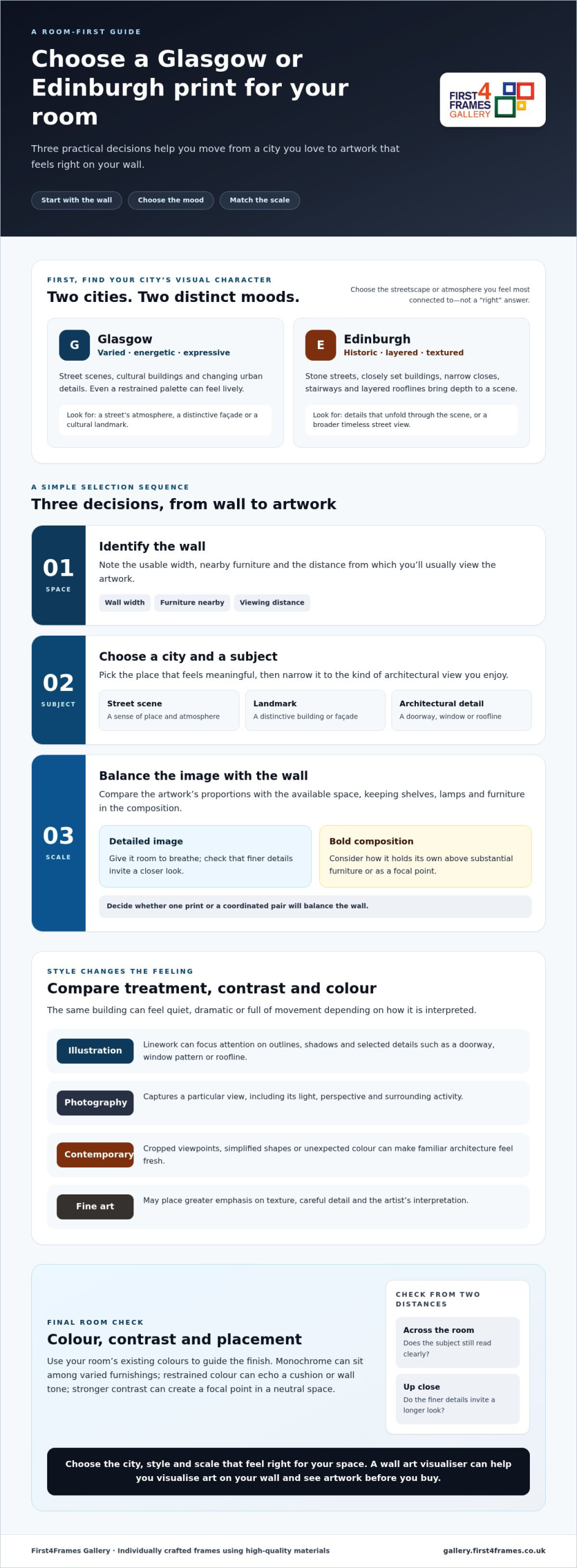
What Makes Glasgow and Edinburgh Architectural Prints Feel Different?

Choosing between two much-loved Scottish cities isn’t a test with one right answer. The appeal of architectural prints of glasgow and edinburgh often comes down to personal connection: a familiar street, a building you admire or the atmosphere you want to bring into a room.

Architectural art turns the shape of a street or the character of a façade into a daily reminder of a place.

City Possible mood and subjects May suit
Glasgow Varied, energetic; street scenes, cultural buildings and changing urban details Rooms that welcome expressive, characterful imagery
Edinburgh Historic and layered; stone streets, closes and rooflines Spaces that call for depth, texture or a sense of history

Which Glasgow architectural details might draw your eye?

Glasgow city prints can bring together contrasting façades, busy streets and cultural buildings, so even a restrained palette may feel lively. The Architecture of Glasgow offers context on the city’s Victorian buildings and Glasgow Style. Ashton Lane, Oran Mor and Glasgow Film Theatre are examples of subjects that could focus a print on a street’s atmosphere, a distinctive façade or a cultural landmark. As you browse, notice which details connect with your own experience of the city.

What gives Edinburgh architecture prints their distinctive appeal?

Edinburgh’s historic streetscape has a different visual rhythm. Closely set stone buildings, layered rooflines, narrow closes and stairways can create depth, with details unfolding as your eye moves through the scene. A familiar setting might bring back a visit or favourite walk; a broader street view can convey a quieter, timeless mood. Choose the image for the memory or atmosphere it holds for you, rather than to declare one city better than the other.

How Artistic Style Changes the Look of Glasgow and Edinburgh Prints

The same building can feel quiet, dramatic or full of movement depending on how an artist interprets it. In architectural prints of glasgow and edinburgh, the medium and composition shape the mood as much as the subject. Artistic treatment transforms a building’s lines, light and surroundings into the atmosphere a print brings to a room.

Illustration or photography: which architectural treatment suits you?

Illustrative linework can reduce a scene to outlines, shadows and selected details, directing attention to a doorway, window pattern or roofline. Photography prints capture a particular view, including its light, perspective and surrounding activity. Compare how clearly you can see the details, whether darker tones feel rich or heavy, and how the image is composed. Fine lines and open space often feel measured; strong tonal contrast can make the same subject more striking.

How do contemporary and fine art prints differ in feel?

Contemporary art prints may use cropped viewpoints, simplified shapes or unexpected colour to make familiar architecture feel fresh. Fine art prints can place more emphasis on texture, careful detail and the artist’s interpretation. When comparing them, notice how colour guides your eye, how much of the setting is included, and whether the composition feels balanced or deliberately energetic.

Scottish landscape art can include architectural elements, but for this choice, look for buildings that remain central to the image. Browsing works by best-selling artists and famous artists can introduce you to different approaches to fine art, photography prints and contemporary art prints.

As you compare, picture each print’s contrast and colour alongside your room’s existing palette. To explore possible subjects and treatments, browse architectural and city-inspired prints.

Architectural Prints of Glasgow and Edinburgh: A Guide to Choosing Art

How to Choose Architectural Prints for Your Room

Choosing architectural prints of glasgow and edinburgh for a particular room is easier when you work from the space outward. Use this sequence to narrow your options:

  • 1. Identify the wall. Note its usable width, nearby furniture and the distance from which you’ll usually view the artwork.
  • 2. Choose a city and subject. Pick the place that feels meaningful, then decide whether you prefer a street scene, landmark or architectural detail.
  • 3. Consider scale and visual weight. A detailed image needs room to breathe, while a bold composition can hold its own above substantial furniture. Decide whether one print or a coordinated pair will balance the wall.

Use your room’s existing colours to guide the finish. Monochrome can work well among varied furnishings; restrained colour can echo a cushion or wall tone, while stronger contrast can create a focal point in a neutral space. If you’re also browsing Coastal wall art or Landscape wall art, look for a clear architectural feature to keep the city’s buildings at the heart of your choice. A wall art visualiser can help you visualise art on your wall and see artwork before you buy. For broader display planning, consult Picture Frames: The Ultimate Guide to Choosing, Hanging, and Displaying Art.

How can print size and placement shape the result?

Compare the artwork’s proportions with the available wall space, allowing nearby shelves, lamps and furniture to remain part of the composition. From across the room, check whether the subject still reads clearly. Up close, consider whether the finer details invite a longer look. For practical UK size context, see Standard Photo & Picture Sizes: The Complete UK Guide for Framing.

How should the frame and glazing complement architecture prints?

A simple profile can define the print’s edges without competing with windows, masonry or fine linework. Each First4Frames frame is individually crafted for its order using high-quality materials, unlike cheap, standard frames that may not fit the artwork properly. First4Frames uses 2mm float glass for glazing, offering superior clarity to the perspex used by many competitors. For more bespoke framing guidance, explore Mastering Custom Picture Framing: The Expert Guide to Bespoke Art Display.

Ready to compare artwork for your space? Explore architectural and city-inspired prints.

From City Print to Bespoke Framed Wall Art

A city print becomes part of your room when its presentation feels as considered as the image. Online picture framing lets you pair a chosen architectural print with a frame that suits its lines and tones. With architectural prints of glasgow and edinburgh, a subtle frame can let fine details speak, while a stronger profile gives the artwork more presence.

What does the print-and-frame experience involve?

Browse a large online selection of artwork and frames, choose a print, then Choose your frame online to complement it. Design your framed artwork as bespoke framed wall art, with custom framed art prints individually framed for your order. This bespoke approach avoids the compromises of a standard frame that may not fit the artwork properly. Every frame is crafted using high-quality materials, so its proportions and finish are considered for the piece it holds.

An art print framing service brings the presentation choices together in one place. Select a finish that supports the artwork without overwhelming its architectural features, and consider how the completed piece will sit with your room. The print and frame work together as ready-to-hang framed art.

Can a digital photograph become a framed architectural keepsake?

Yes. The print-and-frame service can turn your own digital photograph of a Glasgow or Edinburgh building into a finished piece. Your photograph is printed to a high quality suited to bespoke framing, then paired with a frame you choose. It’s a way to keep a personal architectural view on display, whether it captures a memorable visit or a detail you pass every day.

Finished frames are fully packaged to help prevent damage and shipped via professional couriers. Explore framed architectural and city prints and find a piece that feels at home on your wall.

Make a Favourite City Part of Your Everyday

A well-chosen architectural print can do more than fill an empty wall. It can bring a place you love into your daily surroundings, whether that connection comes from a memorable visit, a familiar street or an appreciation of the buildings themselves. Let that personal response guide your choice. The most successful architectural prints of glasgow and edinburgh are the ones you’ll enjoy living with, not simply the ones that make the strongest first impression.

Before deciding, picture where your eye will meet the artwork during an ordinary day. A quiet corner might suit a detailed view; a prominent wall may welcome a composition with greater presence. Trust your sense of what belongs in the room, and give the print space to become part of its character.

Browse the gallery and find architectural prints for your space. Your chosen view of Glasgow or Edinburgh could be the detail that makes a room feel unmistakably yours.

Frequently Asked Questions

Can Glasgow and Edinburgh architectural prints work together on one wall?

Yes, prints from both cities can make a cohesive display when they share a visual point of connection. For example, align their centres and use the same frame finish, while choosing one broad street view and one closer façade. Before hanging, arrange the pieces on the floor to test their order and spacing against the wall.

What should I look for in an architectural print?

Choose a subject that matters to you, then check how clearly the image conveys its sense of place. Notice whether the viewpoint includes enough of the building to make it recognisable, and whether surrounding details add context or distract. For architectural prints of Glasgow and Edinburgh, a familiar doorway, roofline or street corner can make the artwork personal without requiring a panoramic city view.

Is float glass clearer than perspex for framed prints?

First4Frames uses 2mm float glass for glazing, which offers superior clarity to the perspex used by many competitors. Its clear presentation lets you appreciate the print’s fine lines, tonal changes and surface detail. The frame, artwork and surrounding light all contribute to how the finished piece looks on your wall.

How can I see artwork on my wall before buying?

Use a wall art visualiser to preview a chosen print in your room before making a decision. Compare its apparent size with nearby furniture, then check whether the image feels balanced beside shelves, windows or other wall features. If possible, view the preview in the room’s usual lighting as well as in daylight, so you can judge how the artwork fits your everyday space.

Posted on

Scottish Castles Art: A Guide to Sourcing and Framing Iconic Highland Landscapes

Scottish Castles Art: A Guide to Sourcing and Framing Iconic Highland Landscapes

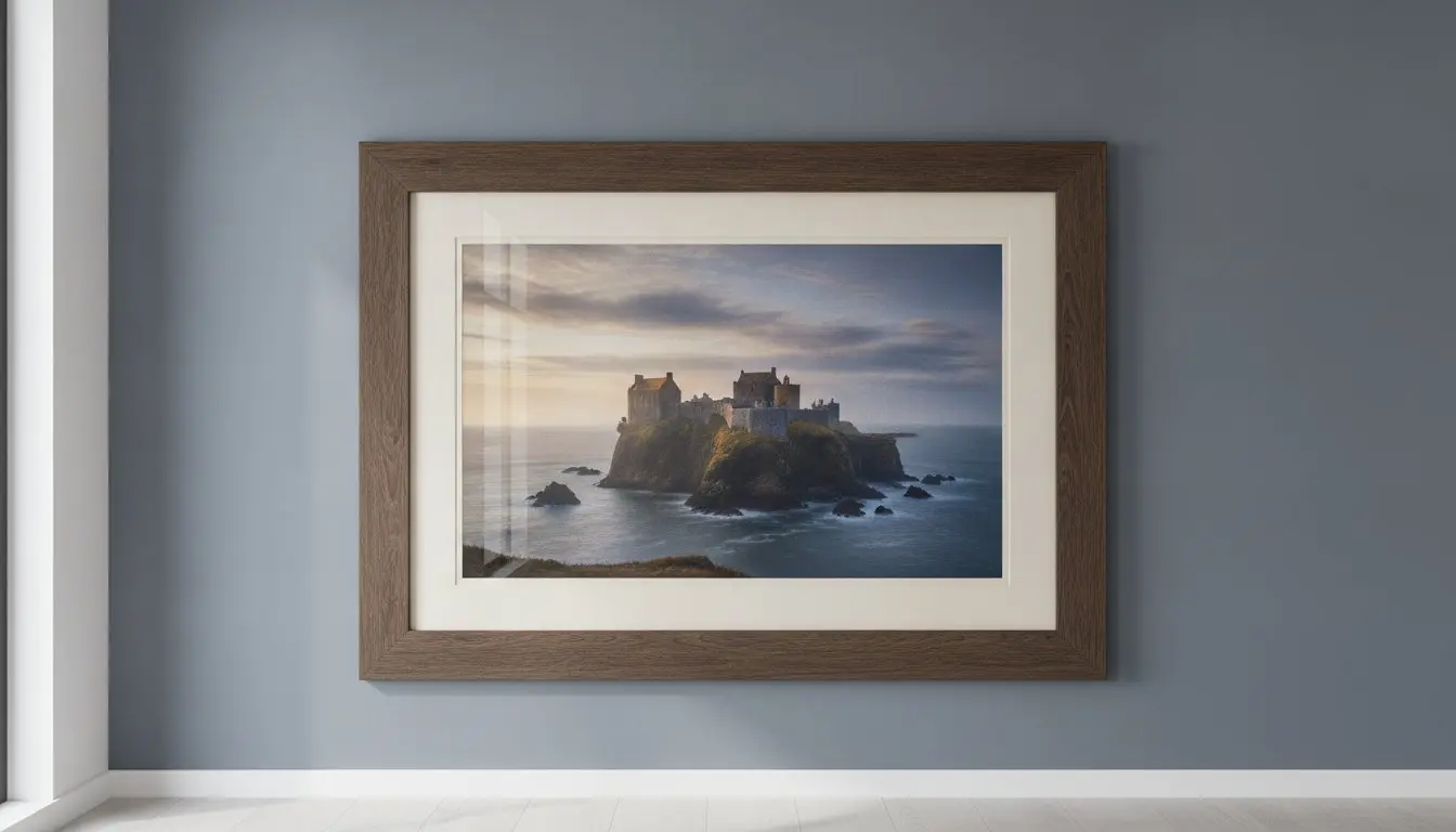
A Scottish castle is far more than just stone and mortar; it is a silent witness to centuries of history that deserves much more than a mass-produced plastic frame. You likely want to capture that raw, Highland spirit in your home, yet it’s frustrating to find that many retail options rely on cheap Perspex glazing that reflects every light in the room. This plastic-like finish often obscures the very heritage you’re trying to celebrate. Finding the right Scottish castles art should be an inspiring journey, not a compromise on quality or a worry about shipping damage.

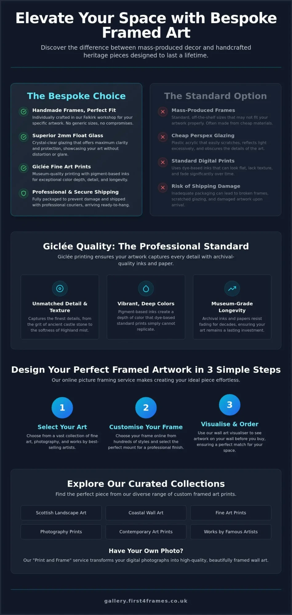
We understand that a true work of art requires a dedicated partner to bring it to life. This guide will show you how to choose and bespoke frame the finest Scottish castle art to bring the rugged majesty of the Highlands into your home. You’ll learn how to move beyond generic proportions and embrace superior clarity with real 2mm float glass. We will walk through the process of selecting Giclée fine art prints and matching them with handmade frames that turn a simple wall into a storied focal point.

Key Takeaways

  • Learn why Giclée fine art prints are the professional standard for capturing the intricate textures of ancient stone and rugged Highland landscapes.
  • Understand the vital difference between bespoke handmade frames and cheap, mass-produced alternatives that use light-reflecting Perspex.
  • Discover how to use online visualisation tools to see exactly how your chosen Scottish castles art will look in your room before you place an order.
  • Follow a simple three-step guide to selecting your favourite castle scene, customising your frame, and picking the perfect mount for a professional finish.
  • Explore the benefits of sourcing from a dedicated Falkirk workshop where every piece is individually crafted to create a ready-to-hang heritage focal point.

The Majesty of Scottish Castles Art: More Than Just a Landscape

Scottish castles art serves as a bridge between the raw power of nature and the enduring strength of human history. These pieces aren’t mere depictions of buildings; they capture the unique harmony where jagged rock meets meticulously carved stone. To understand why these subjects remain so popular, one only needs to look at the history of Scottish castles, which spans from early fortifications to the romantic baronial revivals that define the Highland silhouette today. This blend of architectural precision and dramatic natural scenery creates a visual narrative that few other subjects can match.

For many, these artworks evoke a deep sense of heritage and romance. Whether it’s the silhouette of Edinburgh Castle guarding the capital or the lonely ruins of Urquhart on the banks of Loch Ness, these structures symbolise a resilience that resonates with collectors. In 2026, as the Royal Scottish Academy celebrates its 200th anniversary, there is a renewed focus on how contemporary artists reinterpret these historic icons. Choosing Scottish landscape art for your home creates a timeless aesthetic that anchors a room with a sense of place and permanence. High-quality Scottish castles art ensures that this connection to the past remains a vibrant, beautiful part of your daily environment.

Iconic Strongholds: From Eilean Donan to Urquhart

The visual appeal of these fortresses often depends on their dramatic placement. Island castles like Eilean Donan offer a sense of peaceful isolation, while cliff-top ruins like Dunnottar project a defiant strength against the North Sea. These compositions successfully bottle the untamed Scottish spirit by placing ancient architecture in direct conversation with the wild elements of the Highlands.

The Aesthetic of Ruins vs. Restored Castles

There is a distinct atmospheric difference between a crumbling ruin and a restored stronghold. Ruins offer a rugged, melancholic beauty that works well in rooms with a moody or rustic palette. In contrast, restored or preserved castles provide a sense of stately elegance and architectural precision. The mood shifts entirely based on the artist’s use of light; a castle bathed in the golden Highland sun feels welcoming and warm, while the same stone under a pale moonlight can feel haunting and deeply mysterious.

Giclée Quality: Capturing the Soul of Historic Stone

Giclée printing is the professional standard for reproducing Scottish castles art. Unlike standard digital printing, this method uses pigment-based inks rather than dyes. This results in a depth of colour and a level of detail that standard prints simply can’t match. When you look at a print of Scotland’s most picturesque castles, you want to see the moss between the stones and the subtle shifts in the Highland sky. This high-fidelity process ensures every brushstroke or photographic detail is preserved with absolute precision.

These prints serve as the essential foundation for high-quality bespoke framed wall art. A beautiful frame can’t hide a pixelated or flat-looking image. By choosing contemporary art prints produced to Giclée standards, you ensure the artwork retains the character and texture of the original piece. The result is a vibrant, lifelike image that serves as a commanding focal point in your home.

Texture and Fidelity in Castle Art

Professional artists prefer this medium because it handles complex textures like ancient masonry and heather-clad hills with ease. Giclée ink allows for the vibrant, deep tones found in coastal wall art, where the sea meets the dark basalt of the islands. It captures the heavy atmosphere of a rainy day at Stirling or the sharp clarity of a winter morning at Braemar. This fidelity allows you to feel the grit of the stone and the softness of the mist through the paper itself.

Longevity: Art That Lasts a Lifetime

Standard photo prints often fade within a few years when exposed to direct sunlight. In contrast, the archival papers and pigment inks used at First4Frames Gallery are designed to resist fading for decades. Giclée is the preferred choice for collectors of Scottish castles art because it offers museum-grade longevity. It ensures your investment remains as striking as the day it was first hung. You can browse our curated gallery to see how these professional standards elevate every historic scene.

Scottish Castles Art: A Guide to Sourcing and Framing Iconic Highland Landscapes

How to Choose Your Frame Online and Visualise Art on Your Wall

Selecting the perfect piece of Scottish castles art shouldn’t feel like a leap of faith. Our interactive tools allow you to visualise art on your wall before you make a commitment. This digital preview ensures the colours of the Highlands harmonise with your existing decor, turning your screen into a virtual gallery. By seeing the artwork in a room context, you can confidently judge how the scale and frame style will impact your space.

We’ve simplified the journey from inspiration to a finished product. Follow this three-step guide to create your custom masterpiece:

  • Select your castle scene: Browse our curated collection of iconic landmarks and hidden gems.
  • Choose your frame online: Experiment with different materials, colours, and finishes in real-time.
  • Pick your mount: Customise the border to provide the perfect visual transition between the art and the frame.

The style of the architecture often dictates the best framing choice. A medieval ruin like Dunnottar might call for an ornate or textured frame that mirrors its historic weight. In contrast, a more symmetrical, stately home may suit a minimalist profile. The ‘Wall art visualiser’ allows you to swap these styles instantly. This takes the guesswork out of the creative process and ensures the final result feels like a natural extension of your home. Start using our visualiser tool to find your perfect combination.

Matching the Frame to the Highland Aesthetic

A rustic wood frame with a visible grain can enhance the rugged, organic feel of a coastal ruin. If your home features a more modern aesthetic, a sleek black or white frame provides a clean, sharp contrast to the wild shapes of the Scottish landscape. Use our bespoke photo frames guide to understand how different proportions and widths can change the visual weight of your art on the wall.

The Impact of the Mount

The mount provides essential breathing room for the image. A double mount is particularly effective for dramatic castle landscapes because it adds physical depth and draws the eye inward. Neutral mounts like off-white or light grey are timeless choices that let the stone textures lead the narrative. However, choosing a bold mount colour that picks up a subtle hue in the heather or the sea can make a Scottish castles art print truly pop in a contemporary setting.

The First4Frames Advantage: Bespoke Craftsmanship in Falkirk

Many high-street retailers offer standard-sized frames that rarely do justice to the unique proportions of a historic landscape. At First4Frames Gallery, we take a different approach. Every frame is individually crafted for the specific order in our Falkirk workshop. This bespoke process ensures that your Scottish castles art isn’t just squeezed into a generic box but is instead cradled by a frame designed to enhance its specific character and scale. Handmade quality means your art won’t just look better; it will last longer, providing a durable home for your investment.

We understand that shipping art can feel like a gamble. To give you complete peace of mind, we use secure, professional packaging and trusted couriers to prevent any risk of damage during transit. Your artwork arrives ready to hang, exactly as it left our hands. If you have a specific vision or a non-standard space that requires a unique solution, don’t hesitate to contact us to discuss your custom framing requirements. We’re here to act as your dedicated partner in the creative process.

Why 2mm Float Glass Beats Perspex

Clarity is the silent partner of fine art. While many mass-produced alternatives use Perspex to save on cost, this material often creates a distracting plastic-like glare that flattens the image. We use 2mm float glass as our standard at First4Frames Gallery because it provides superior clarity. This real glass doesn’t just protect the print; it enhances the visual depth of the ink, making the textures of the stone and the Highland mist feel almost tangible. It’s a small detail that makes a massive difference when your Scottish castles art serves as the room’s main focal point.

Print and Frame: Your Own Castle Photography

Perhaps you’ve captured your own iconic moment while exploring the ruins of the West Coast. Our photo printing and framing service allows you to turn those personal holiday photos into professional-grade wall art. We treat your digital files with the same respect as our gallery pieces, printing them to high Giclée standards on archival paper. It’s the simplest way to transform a digital memory into a tangible piece of heritage that’s ready to hang the moment it reaches your door.

Preserve Your Piece of Scottish History

Your home deserves more than a generic print; it deserves a ready-to-hang piece of heritage that captures the true essence of the Highlands. By prioritising Giclée quality and professional 2mm float glass, you ensure that every detail of your chosen Scottish castles art remains clear and vibrant for decades. We take pride in our role as your dedicated partner, hand-crafting each frame in our Central Scotland gallery to meet your exact specifications. This bespoke approach eliminates the compromises of mass production, giving you a focal point that is as sturdy as the stone fortresses it depicts.

With our professional courier shipping across the UK, you can feel confident that your artwork will arrive in perfect condition. Whether you’re selecting a classic landscape from our curated gallery or framing your own holiday memories, we’re here to help you move from inspiration to action with total confidence. Browse our Scottish Castles Collection and design your bespoke framed art today. It’s time to bring the rugged majesty of Scotland into your living space with the quality it deserves.

Frequently Asked Questions

What is the best type of glass for a framed castle print?

Real 2mm float glass is the superior choice for any high-quality framed castle print. Unlike standard Perspex, which often creates a distracting plastic-like glare, float glass provides the exceptional clarity needed to appreciate fine architectural details. This allows the rugged textures of the Highlands to shine through without distortion. At First4Frames Gallery, we provide this as standard to ensure your artwork remains a professional and beautiful focal point.

Can I choose my frame online for a Scottish castle print?

Yes, our interactive gallery tools allow you to fully customise and choose your frame online for any piece of Scottish castles art. You can experiment with different timber finishes and mount colours in real-time to see how they complement the specific castle scene. This streamlined process allows you to design a bespoke piece of wall art that perfectly matches your home’s unique interior style and proportions.

What is a Giclée print, and why is it better for landscape art?

A Giclée print is a professional reproduction using pigment-based inks that offer exceptional depth and lightfastness. For landscape art, this ensures that the subtle gradients of a Highland sky and the gritty textures of ancient stone are captured with museum-grade fidelity. Collectors prefer this medium at First4Frames Gallery because it provides a level of longevity and visual impact that standard digital prints simply cannot match.

How do I visualise how a castle print will look on my wall?

You can use our integrated ‘Visualise art on your wall’ feature to see a digital preview of the artwork in a realistic room context. This tool helps you judge the scale of the piece against your furniture and ensure the frame style harmonises with your decor. It removes the uncertainty from the buying process, giving you the confidence that your new Scottish castles art will look exactly as intended.

How is my framed artwork protected during shipping?

We ensure every order is protected with secure, bespoke packaging and shipped via professional couriers across the UK. Each frame is individually wrapped and reinforced at our Falkirk workshop to prevent damage during transit. Unlike standard postal services, our professional couriers are experienced in handling fragile art, ensuring your piece arrives in pristine condition and is ready to hang the moment it reaches your door.