Posted on

Square Art Prints for UK Walls: Sizes, Prices and Ordering

Square Art Prints for UK Walls: Sizes, Prices and Ordering

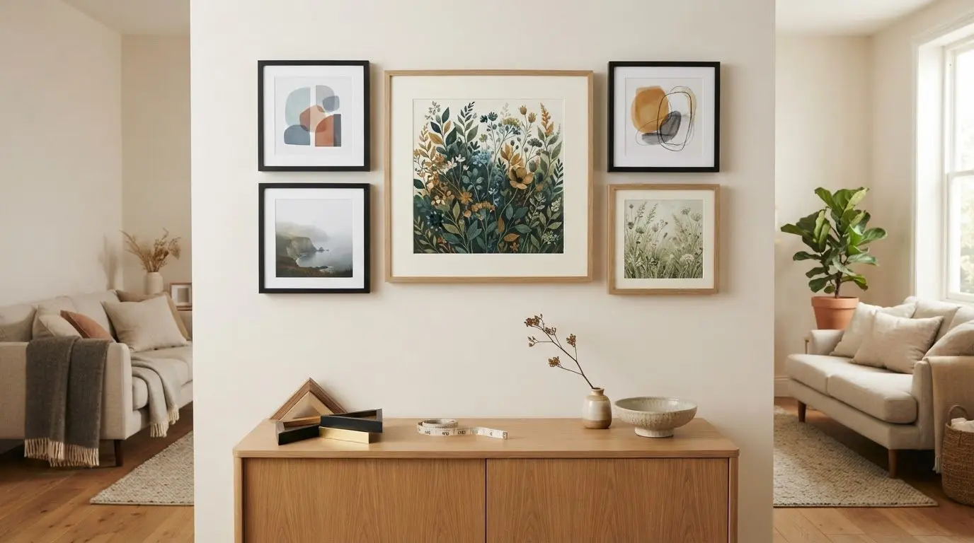
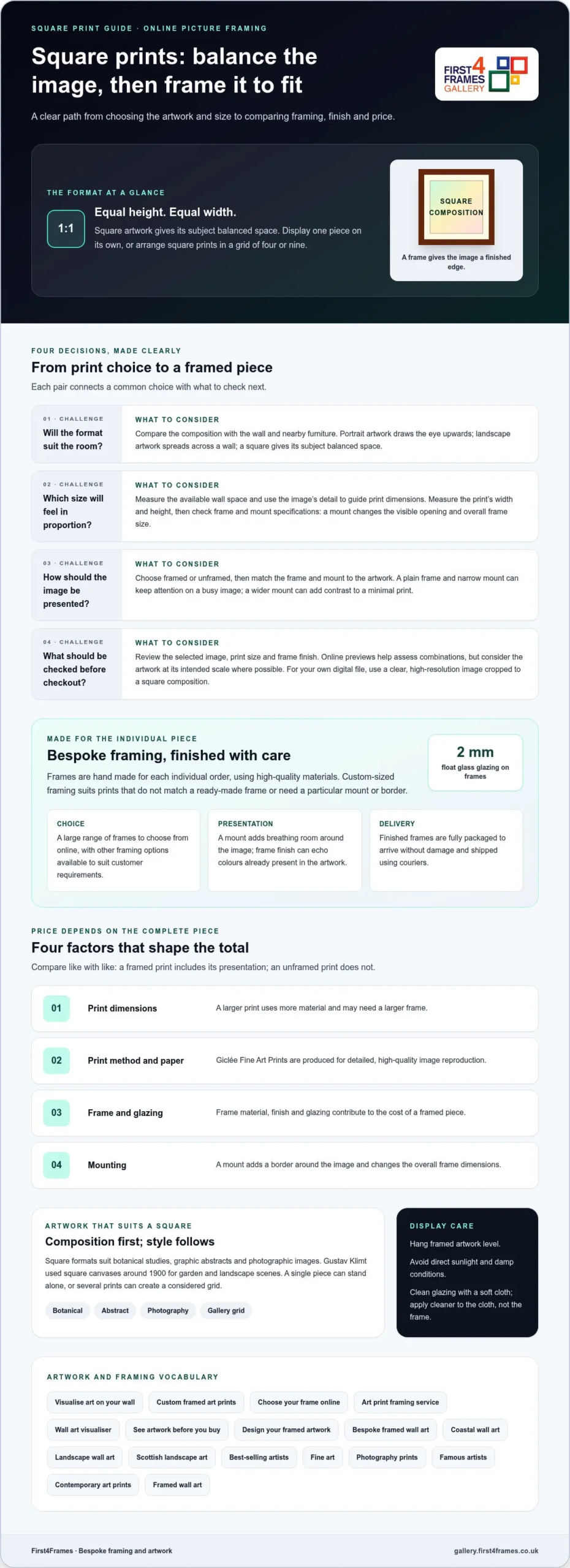
A square print can feel balanced on its own or as part of a group: its height and width are equal, creating a 1:1 ratio. Portrait prints draw the eye upwards, while landscape prints spread across a wall. Framing a square art print lets its composition take centre stage, whether it’s displayed alone or arranged with three or eight others in a grid.

Portrait and landscape formats may feel familiar, but a square can bring a calm, contemporary rhythm to a room. Choosing frames for square art prints starts with matching the print and frame to your wall and the artwork. This guide explains how square prints compare with other formats, how to choose a size and order online, and what affects the price of a framed print. You’ll also find ideas for making one piece a focal point or creating a considered gallery wall.

Key Takeaways

  • Compare the artwork’s composition with your wall space to decide whether a square format will suit the room.
  • Choose a print size and frame finish that work together, then follow the online ordering steps to create your framed piece.
  • Understand how print choice, framing and presentation affect the overall price before you decide what to buy.
  • Use placement, scale and surrounding décor to give square artwork a clear focal point, with bespoke framing available to complete the look.

Square prints compared with portrait and landscape formats

A square print has equal height and width, creating a 1:1 format. Portrait artwork is taller than it is wide, while landscape artwork is wider than it is tall. That difference changes how each image uses wall space: a portrait can emphasise a person or tall building, while a landscape suits a broad coastline. A square composition, such as a close-up botanical study, gives its subject balanced space.

Square wall art can be printed on paper or canvas, then displayed unframed or in a frame. A mount, the border between image and frame, adds breathing room and can make a small print feel more considered. For a contemporary finish, choose a simple frame that supports the artwork; a natural or dark finish can also echo colours already present in the image. A square format works alone or in a grid of four or nine prints.

Square-format poster styles range from graphic abstracts to botanical illustrations and photographic images. Gustav Klimt turned to square canvases around 1900 for garden and landscape scenes, showing how the shape can suit subjects beyond geometric designs. A square poster of a single flower, for example, places the bloom centrally, while a bold abstract can use the equal sides to create a beautiful, orderly composition.

Choose a frame and mount to suit the print’s colours, detail and visual weight. For a busy image, a plain frame and narrow mount keep attention on the artwork. For a minimal print, a wider mount can add contrast.

For a square print, measure its width and height, then choose a frame that fits. A mount changes the visible opening and increases the frame’s overall dimensions, so check the frame and mount specifications against the print measurements.

Yes, custom-sized framing can be made for square art prints in the UK. It suits prints whose measurements don’t match a ready-made frame, or artwork that needs a particular mount or border.

Hang framed artwork level and avoid placing it in direct sunlight or damp conditions, which can affect artwork over time. Clean the glazing with a soft cloth, applying cleaner to the cloth rather than spraying the frame.

Creating and ordering square wall art online

Ordering square wall art online begins with the image, then moves to size, finish and framing. Square prints are available framed or unframed, so decide whether you want a ready-to-display piece or prefer to arrange framing separately. An abstract design, botanical study or photograph each has different details to consider before choosing its final presentation.

Consider the image’s colours and subject alongside the room where it will hang. A botanical print with fine leaf detail may suit a quiet frame, while a high-contrast abstract can carry a stronger finish. Measure the available wall space and consider nearby furniture so the print feels in proportion, rather than choosing based on how it looks on screen alone.

  1. Select the artwork. Compare the composition and colour palette with the wall and furnishings.
  2. Choose a size. Use the available space and the image’s detail to guide the print dimensions.
  3. Decide on framing. A framed print can arrive professionally finished in a choice of frame finishes and ready to hang.
  4. Review the order. Check the selected image, size and finish before completing checkout.

Online previews help you assess how options work together, but consider the artwork at its intended scale where possible. A small screen can make a delicate botanical image appear bolder or hide fine details. If you’re ordering a print from your own digital file, use a clear, high-resolution image and crop it to a square composition before selecting the print size.

Keep the key choices together when ordering: the image, print dimensions, frame finish and delivery address. For a gallery wall, repeating a frame finish across several square pieces creates a connected arrangement. For a single focal print, let the image’s colours or subject guide your frame choice.

Explore the online artwork gallery to compare subjects and styles before settling on a square print.
Square Art Prints for UK Walls: Sizes, Prices and Ordering

The price of a square print depends on what you’re buying: the print alone, a canvas, or a framed piece. Framing, print size, materials and the selected artwork all shape the total. A gallery listing may show an unframed print separately from a ready-to-hang option, so compare like with like before choosing.

Start by separating the artwork cost from its presentation. An unframed paper print doesn’t include a frame or glazing; a framed version brings those choices into the purchase. Canvas is another format, with its own presentation and finish. For example, compare the same abstract image as paper and canvas, then check whether either option includes framing.

Next, look at the factors that change the final price:

  • Print dimensions: a larger print uses more material and may need a larger frame.
  • Print method and paper: Giclée Fine Art Prints are produced for detailed, high-quality image reproduction.
  • Frame and glazing: the frame material, finish and glazing contribute to a framed piece’s cost.
  • Mounting: a mount adds a border around the image and changes the overall frame dimensions.

For a useful comparison, note the artwork, print size, frame and mount options in each listing. Compare like with like: a framed print includes its presentation, while an unframed print does not. Check the product details so you know what the selected option includes before ordering.

For a personal budget, decide which elements matter most. Choose the image first, then weigh paper or canvas against framing and mount options. A minimal print may need little visual framing, while detailed artwork can benefit from a mount that separates the image from its frame. These choices explain price differences without assuming that square prints share one fixed rate.

Compare the complete item rather than the headline figure. Check what arrives, whether the print is framed, and which finish you selected. That makes it easier to choose a square artwork that suits both your wall and your budget.

Square artwork as a focal point

Choose a square print as the room’s visual anchor, then arrange nearby objects around its colours or subject. A vivid abstract can draw attention above a console, while a calm botanical print can bring focus to a quiet corner. Because the square has equal sides, a centred composition can feel balanced rather than directional.

Identify the artwork’s strongest feature and give it room to stand out. For a close-up flower, keep surrounding décor simple so the petals remain prominent. For a detailed city scene, leave clear wall around the frame to distinguish its smaller elements. This breathing space helps the print stand apart from shelves, lamps and other framed pieces.

The frame also shapes the focal point. A simple finish keeps attention on a colourful image, while a darker frame can define a pale print against a light wall. A mount creates a border between the artwork and frame, helping separate a busy composition from nearby décor. Choose a finish that relates to the room without matching every object exactly.

Use these steps to plan the display:

  • Pick the wall: choose a spot that’s visible from the room’s main seating or entrance.
  • Check the surroundings: consider furniture edges, shelves and nearby wall art.
  • Balance the composition: use the print’s dominant colours to guide cushions, ceramics or other accents.
  • Review the framing: make sure the frame supports the artwork instead of competing with it.

A polished look comes from thoughtful coordination, not extra decoration. Pair a framed coastal print with restrained blue accents, for example, or let a bold geometric image provide the room’s main colour statement. Keep neighbouring pieces visually lighter so the square artwork remains the first thing the eye notices.

Browse square artwork and print styles to find an image that can anchor your wall arrangement.

First4Frames Gallery brings square artwork and its frame together through Ready-to-Hang Framed Art and Custom Picture Framing. Choose from Giclée Fine Art Prints, or have a print framed to suit your chosen image and space. Each frame is handmade to order from high-quality materials, with 2 mm float glass glazing.

This is a practical next step when a standard frame doesn’t fit your print, or when you want the finished piece ready to display. Select a frame that complements the artwork, then consider how its finish will work with your room. Commercial clients can also explore Commercial Artwork Curation for artwork suited to their spaces.

For help choosing a framing option, contact First4Frames Gallery or visit the online gallery.

Choose the piece that makes your wall feel complete

The best artwork is the piece you’ll enjoy living with every day. Before choosing a square print, picture the mood you want in the room: a quiet landscape can soften a reading corner, while a vivid abstract can bring energy to a plain wall. Let that feeling guide your choice of image and presentation.

Thoughtful framing of square art prints means treating the frame as part of the artwork, not an afterthought. If you’re framing square art prints, consider how the frame’s finish will complement the image and room. First4Frames Gallery offers Ready-to-Hang Framed Art, Custom Picture Framing and Giclée Fine Art Prints, giving you options for a finished piece or a presentation tailored to your chosen image.

Take the next step by browsing artwork and considering which image belongs in your space. Explore the gallery and find your square artwork. A well-chosen print can give your room a personal focal point and make the wall feel distinctly yours.

Frequently Asked Questions

What makes square art prints different from portrait or landscape prints?

A square print has equal width and height, unlike a portrait print, which is taller, or a landscape print, which is wider. This balanced shape suits centred subjects, such as a single flower or a close-up still life. Before choosing a square crop, check the image’s edges: a tight crop may remove details that make the subject feel complete.

Where can I buy framed square art prints in the UK?

You can buy framed square art prints from UK galleries that sell artwork with framing. First4Frames Gallery offers framed art and Giclée Fine Art Prints, with professional in-house framing. For framing square art prints you already own, Custom Picture Framing can help create a presentation around the print. Compare the artwork and framing details on the product page before placing an order.

What sizes are square art prints commonly available in?

Square print sizes vary between artworks and sellers, so check the dimensions shown for each piece. Confirm that the width and height are equal, then measure your intended wall area to see how the print will sit alongside furniture or other artwork. If you’re planning a group display, map each print’s dimensions on paper before deciding on spacing.

How much do square art prints and framing cost in the UK?

The cost of framing square art prints depends on the selected artwork, print dimensions and framing details. Check whether the listed product is framed and review its frame and mount options before comparing prices. First4Frames Gallery includes framing in the price of its framed prints, with float glass as standard. The current product listing gives the relevant price for that artwork and selection.

What are the differences between framed and unframed square art prints?

A framed print arrives presented within a frame, while an unframed print leaves you to arrange its display separately. First4Frames Gallery’s ready-to-hang framed prints include float glass, D-rings and high-quality framing wire. An unframed print may suit someone who already has a frame or wants to plan a different display. Check the listing to see which presentation is included.
Posted on

Artist’s Proof Prints: How They Differ and What Affects Value

Artist's Proof Prints: How They Differ and What Affects Value

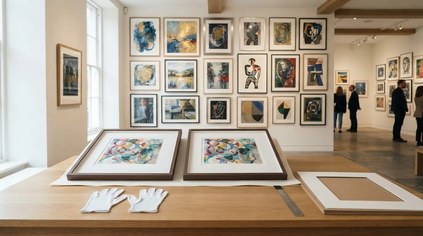
An artist’s proof isn’t automatically more valuable than a signed, numbered print. If you’re asking what an artist’s proof print is, it’s a copy set apart from the main numbered edition, traditionally kept by the artist and often marked AP or A/P. The label signals its place in the edition, not a guarantee of greater quality or value.

It’s easy to assume that a rarer-sounding label means a better investment, but collectibility depends on more than the proof mark. This guide explains what an artist’s proof print is, how it differs from a limited edition, and how factors such as rarity, condition and the artist’s reputation can influence value. You’ll also see why a proof and a signed, numbered print may appeal to collectors for different reasons, helping you assess the artwork as well as the notation on its margin.

Key Takeaways

  • Compare an artist’s proof with the main edition by its numbering and how it was issued, not by the label alone.
  • Learn to distinguish AP or A/P marks from printer’s proofs, hors commerce proofs and a bon à tirer proof.
  • Look beyond rarity when assessing collectibility: condition, edition size and the artist’s work all matter.
  • Weigh a proof against signed, numbered prints on its own merits; neither the proof status nor a low edition number guarantees higher value.

What is the difference between a Limited Edition Print and an Artist’s Proof?

A limited edition print belongs to a fixed quantity, while an artist’s proof sits outside its numbered edition. For UK buyers and sellers, clear descriptions should distinguish AP or A/P marks from edition numbering and match any certificate or edition record to the print.

Differences from Limited-Edition Prints

A limited edition print is one of a set quantity, while an artist’s proof is a separate copy associated with that edition. An edition print marked 25/150 is number 25 in a 150-print edition; an artist’s proof is not counted as one of those 150. Proofs were traditionally retained by artists to assess colour and quality, but modern proofs are generally produced alongside the main edition. The distinction matters because the proof mark describes its status, not a different image.

Choosing Between Proofs and Editions

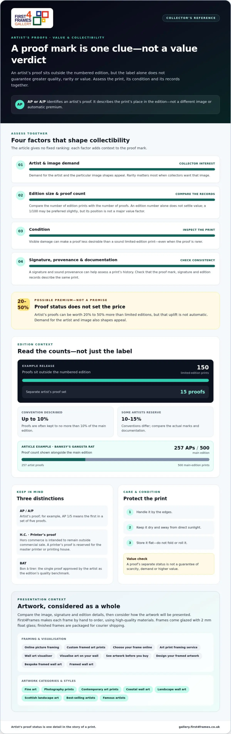
Choose by considering the artwork, the edition information and what you value as a collector, rather than assuming a proof is automatically superior. For example, a release could have 150 limited-edition prints and 15 artist’s proofs, with the proofs remaining outside the numbered edition. Conventions differ: proofs are often kept to no more than 10% of the main edition, while some artists reserve 10-15%. Compare the actual marks and documentation, then decide whether the proof’s separate status matters to you.

Print Quality and Edition Documentation

An artist’s proof is not necessarily higher in image or print quality than other impressions. Digital printing can produce proofs identical to other impressions, while traditional techniques may involve proofs used to assess colour before approval. Check that the label, signature and edition records describe the same print. A certificate of authenticity may accompany a proof, depending on when and how it was published, so treat it as supporting documentation rather than evidence of higher quality or value.

Factors affecting print value and collectibility

An artist’s proof can be sold or resold; its proof status alone neither prevents a sale nor sets a price. To care for one, handle it by the edges, keep it dry and away from direct sunlight, and store it flat rather than folding or rolling it.

Proof Value and Collector Demand

An artist’s proof may attract a premium, but demand for the artist and particular image also shapes its appeal. Proofs can be worth 20% to 50% more than limited editions, though that isn’t an automatic uplift. A signature and sound provenance can help collectors assess the print’s history.

Rarity and Collectibility

Rarity matters when collectors want a particular image, but an edition number alone doesn’t settle value. A numbered 1/100 may be preferred slightly, yet its position isn’t a major value factor. Compare the edition size and proof count: an edition of 30 prints may hold higher value than one of 200. A French term such as hors commerce describes a proof intended to remain outside commercial sale, not a guarantee of scarcity or demand.

Check for visible damage before judging collectibility. A damaged artist’s proof may be less desirable than a sound limited edition print, even if the proof is rarer. Also consider whether the image was reissued after an edition sold out; some artists have marked later prints as proofs, such as “Artist’s Proof no.8 of 50.” Banksy’s Gangsta Rat has 257 artist proofs against a main edition of 500, showing why proof counts matter alongside condition and edition records.

Compare the image, signature and edition details before choosing a print to live with. Explore fine art prints to consider how the artwork itself speaks to you.

Artist proof definitions and abbreviations

Proof marks identify a print’s role in an edition, but similar abbreviations can describe different roles. Read the letters alongside the artwork, signature and edition information.

Meaning of an Artist’s Proof

An artist’s proof is an impression set aside from an edition, traditionally for the artist’s personal use. It sits outside the numbered edition total, although it may show the same artwork as the edition prints. The label describes the print’s status, not a different image or an automatic change in quality.

A proof can be used to assess a print’s colour and quality before the main edition is approved. Today, they’re generally produced alongside it. Some are altered or hand-finished, but that isn’t true of every proof. Look closely at the print and its accompanying records to establish whether it’s identical to the edition or has a distinct finish.

Artist’s Proof Abbreviations

AP and A/P are common marks for an artist’s proof. Numbering may clarify the proof’s position: AP 1/5 means the first print in a set of five proofs. Some artists use Roman numerals to distinguish proof numbering from the main edition’s numbering, so read the notation as a whole.

Other marks point to different roles. A printer’s proof is reserved for the master printer or printing house. H.C., short for hors commerce, identifies a proof intended to remain outside commercial sale. A BAT, or bon à tirer, is the single proof approved by the artist as the edition’s quality benchmark. These distinctions matter: an AP is not interchangeable with a printer’s proof, H.C. print or BAT.

When reading a label, separate its letters from its numbers, then compare both with the signature and edition record. For instance, AP 1/5 describes a proof within a group of five, not the first print in the main edition. That small distinction helps collectors interpret what was produced and how the proof relates to the artwork.

Artist's Proof Prints: How They Differ and What Affects Value

Artist’s proofs compared with signed and numbered prints

A signature and an edition number describe different details from an artist’s proof mark. Limited-edition prints may be individually signed and numbered, while an artist’s proof is identified separately from the main edition. A proof may also be signed, so the artist’s signature alone doesn’t establish whether a print is an edition copy or a proof.

Consider two separate details when buying: what the number records and what the proof label identifies. A print marked 1/99 is the first print in an edition of 99; one marked 99/99 is the last. Neither position is inherently more valuable. By comparison, an AP mark identifies an artist’s proof, and some artists number proofs separately, such as AP 1/5.

Price and collectibility aren’t determined by proof status alone. Artist’s proofs may be more expensive than signed and numbered counterparts, but they’re not inherently more valuable. The artwork, condition, artist’s reputation and collector demand all contribute. For example, a damaged proof may be less desirable than a well-kept edition print. A low edition number can appeal to a buyer, yet it doesn’t automatically make that print more valuable.

Before choosing, compare the signature, edition number, proof notation and any accompanying documentation. Check that the description matches the marks on the print, then weigh the artwork’s condition and your own interest in the image. If you value a clearly defined place within the edition, a signed, numbered print may suit you. If a separately marked impression appeals more, consider its records and condition alongside the proof label.

Explore fine art prints and compare the images that speak to your collection.

First4Frames Gallery offers Ready-to-Hang Framed Art, Custom Picture Framing and Giclée Fine Art Prints for artwork you’re ready to display. With online picture framing, you can choose your frame online from a wide selection and design framed artwork to suit your space. Frames are handmade for each individual order from high-quality materials, and come glazed with 2 mm float glass.

Choose bespoke framed wall art to complement fine art, coastal wall art, landscape wall art or Scottish landscape art. The gallery’s artwork range also includes contemporary art prints and photography prints. As you browse work from famous and best-selling artists, consider how to visualise art on your wall and see artwork before you buy. A wall art visualiser can help you picture the finished display; the art print framing service lets your chosen print take shape in a frame selected for it.

Finished frames are carefully packaged and shipped by courier. Browse fine art prints to explore artwork and framing choices.

Choose a Print That Belongs in Your Space

Understanding what an artist’s proof print represents can inform your choice, but the artwork’s connection to your space matters too. Think about the mood you want to create, the colours already in the room and the image you’ll enjoy seeing each day. A thoughtful choice can make a wall feel more personal and give your collection a natural next chapter.

Take time to explore images that hold your attention rather than choosing by a label alone. Notice which subjects you return to and how each print might sit within the room. That personal response can guide you towards a piece that feels at home in your space.

As you consider what belongs on your walls, browse the gallery’s fine art prints and let a favourite image shape your next step. The right print is one you’ll be glad to live with.

Frequently Asked Questions

How do I know how many versions of S/N’s or A/P’s there are?

Use the edition details and supporting records to distinguish the numbered run from artist’s proofs. The denominator in a mark such as 12/80 indicates an edition of 80 prints, while proof notation may show a separate proof count. Compare the print’s margin marks with its certificate, catalogue entry or publisher’s documentation. If records describe different totals, treat that mismatch as a reason to examine the print’s history more closely.

What Does This Mean When You’re Buying Art?

It means you can assess the print’s status separately from its appearance and personal appeal. Before buying, read the description alongside the marks on the print, then consider its condition, signature and accompanying paperwork. If you’re choosing between two impressions of the same artwork, for example, a proof label may matter to your collecting interests, but it doesn’t by itself establish better quality or greater desirability.

Which is Rarer?

Neither an artist’s proof nor a signed, numbered print is automatically rarer; compare the documented quantities for that specific artwork. Proof totals vary between artists and editions, and some artists produce only one proof. A small proof group can be scarcer than the main run, but rarity alone doesn’t establish collector demand. Consider how many were produced, whether the edition was reissued, and the condition of the individual print.

Will my Artist’s Proof be signed and numbered too?

An artist’s proof may be signed, but its numbering is usually separate from the main edition’s sequence. Look for a signature and a distinct proof mark rather than expecting a standard edition fraction beside it. For instance, an artist may identify a proof with Roman numerals while numbering edition prints with Arabic numerals. The exact format depends on the artist’s practice, so read the notation alongside its documentation.

What is an artist’s proof print?

An artist’s proof print is an impression set aside from the main numbered edition, often for the artist’s personal use. The term describes its relationship to the edition, not necessarily a change to the image. For a collector, the key is to interpret the proof mark alongside the artwork’s signature and records. That helps distinguish an artist’s proof from other specially marked prints.

How is an artist’s proof marked and numbered?

An artist’s proof is commonly marked AP or A/P, sometimes with its own proof sequence. A notation such as AP 1/5 indicates a position within a group of proofs, not the main edition. Some artists use Roman numerals instead. Check the front and margins for marks, then compare them with the accompanying paperwork, since abbreviations can identify different print roles.

Posted on

How to Choose a Mount Width That Fits Your Artwork

How to Choose a Mount Width That Fits Your Artwork

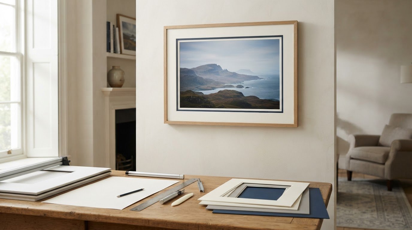
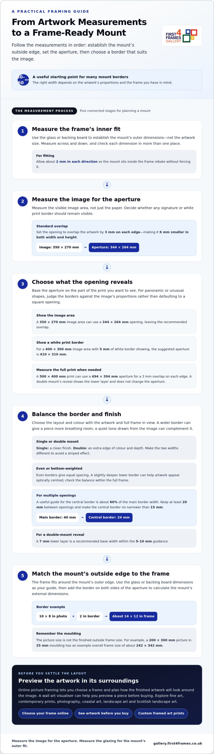
A mount border of 30-60 mm is a useful starting point for many pictures. Choose a single mount for a clean finish or a double mount for extra depth and colour. The right width depends on the artwork’s proportions and the frame you have in mind.

With online picture framing, you can choose a frame and plan how the finished artwork will look around the image. Custom framing gives art prints and other pictures a considered finish. Explore fine art, contemporary prints and photography, including coastal, landscape and Scottish landscape art. A wall art visualiser can help you preview a piece before buying and imagine how it might look at home. Browsing artists and their work can also help you find a style that suits your space.

Next, learn which dimensions to measure, how to position the aperture around the artwork, and how to size the mount’s outer edge to fit the frame. These steps make it easier to plan a framed print or choose framed wall art with confidence.

Key Takeaways

  • Use the glass or backing board dimensions to establish the mount’s outer size, and measure the artwork itself carefully before setting the aperture.
  • Choose a single mount for a simple finish or a double mount when an extra edge of colour and depth will suit the artwork.
  • Balance the border against the image and frame; a wider border can give a piece more presence, while a weighted bottom can help it look centred.
  • Plan the finished mount’s external dimensions to fit the frame, rather than assuming the artwork size determines the frame size.

Should I Measure the Internal Frame or the Glass?

For a secure fit, measure the glass or hardboard inside the frame, not just its internal dimensions. A practical guide to how to decide on a mount width starts with this outer measurement and the artwork’s visible image size. Set the aperture to overlap the artwork by 3 mm on each edge, making it 6 mm smaller in both width and height.

For panoramic or unusually shaped artwork, judge the borders against the image’s proportions rather than defaulting to a square opening. Keep the mount balanced around the image, then check that its outer dimensions suit the frame.

Watch this framing guide for a visual explanation of how to choose a mount:

  1. Measure the glazing and frame rebate. Remove the glass and backing board, then measure across and down. Check each dimension in more than one place because paper may not be perfectly square. The rebate usually overlaps the picture by about 5 mm on each side and is typically 3 mm larger than the glass size.
  2. Set the aperture using the image, not the paper. To understand how to decide on a mount width for a particular print, measure the image area and account for any signature below it. For a 350 mm × 270 mm image, a suitable opening is 344 mm × 264 mm. A 10 × 8 inch photo typically has a 9.75 × 7.75 inch window.
  3. Choose what the opening should reveal. For larger prints, subtract 10 mm from each image dimension to create 5 mm overlap on each side. To show a print’s white border, measure the full print: a 500 mm × 400 mm print needs a 494 mm × 394 mm aperture. A double mount’s reveal shows the lower layer and doesn’t change the aperture.
  4. Select a complementary finish. A wider mount gives artwork more breathing room, while a quiet colour drawn from the image can complement it. For valuable or sentimental prints, acid-free mount board and backing help reduce the risk of yellowing or acid damage over time.

How Do I Choose the Border Width?

Set the border after considering the image shape, frame and number of openings. Then choose an even or weighted layout and check that the aperture reveals the intended part of the artwork.

  1. Balance Even and Bottom-Weighted Borders

    Choose an even border for equal spacing around the image. For a bottom-weighted mount, make the lower border slightly deeper than the top and sides; this can help the artwork appear optically centred. Compare both layouts within the full frame, not just around the aperture, and avoid extra weight if it makes the picture feel too low.

  2. Select Mount Width and Colour

    Choose a border that gives the artwork breathing room without overwhelming it. Wider borders can create a gallery-style finish and add presence, particularly around a larger frame. A mount colour drawn from a quiet tone in the image, such as soft off-white or cream, can work with many styles of artwork. Compare it beside the print, because surrounding colours can affect how the mount appears.

  3. Set the central border for multiple openings. In a multiframe mount, keep the central border narrower than the main borders to avoid a striped effect. A useful guide is about 60% of the main mount width, with at least 20 mm between openings. For example, a 40 mm main border pairs proportionately with a 24 mm central border. Keep it no narrower than 15 mm.
  4. Check the aperture and reveal. Base the opening on the image area you want visible, then consider whether any white print border should remain in view. For a 400 mm × 300 mm image area with 5 mm of white border showing, the suggested aperture is 410 mm × 310 mm. For a double mount, make the two widths different to avoid striping; a 7 mm lower layer is a recommended base width, within the 5-10 mm guidance. Browse framed artwork in the gallery to compare how border proportions frame different images.

How to Choose a Mount Width That Fits Your Artwork

How Do I Measure the External Mount Size?

Measure the glass or backing board to establish the mount’s outer dimensions. The frame fits around that outer edge, not just the picture.

  1. Measure the Picture and Frame

    Start by measuring the picture’s visible image, then measure the glass or backing board across and down. These measurements serve different purposes: the image guides the aperture, while the glass or board helps establish the mount’s outer dimensions. Use millimetres for precision and note the width before the height. Measure the paper in more than one place, as it may not be perfectly square.

  2. Account for Frame Moulding and Overall Dimensions

    Measure the frame’s visible opening separately from its outside edges. Moulding adds to the overall frame dimensions, so don’t treat the picture size as the finished frame size. For example, a 200 × 300 mm picture in 25 mm moulding has an example overall frame size of about 242 × 342 mm. A 25 mm moulding overlapping the picture by 5 mm extends 20 mm beyond it on each side.

  3. Match the External Mount to the Frame

    Use the glass or backing board dimensions as the guide for the mount’s outside edge, then allow about 2 mm in each direction for fitting. Check that the mount sits inside the frame rebate without forcing it. An A4 frame, for instance, can hold a mount with an aperture sized for a 7 × 5-inch photo, showing why frame size and picture size aren’t interchangeable.

  4. Check How the Mount Affects Frame and Picture Size

    Add the border on both sides of the aperture to calculate the mount’s external dimensions. A 10 × 8-inch photo with a 2-inch border needs a frame of about 14 × 12 inches. A double mount or acid-free backing adds thickness, so ensure the frame rebate can accommodate the complete stack. Ready-made frames suit standard sizes; made-to-measure frames can follow a chosen mount’s outer dimensions.

Standard picture mount border widths

Use standard widths only as a starting point. Judge the mount against the image and frame: the border should give the artwork space without making the opening feel cramped.

  1. Start with the common range. Mount border widths vary, so choose one that suits the image and frame. For many pieces, 2-3 inches is a useful starting range. These are guides, not fixed rules: compare the border with the visible image and the frame’s proportions before settling on a width.
  2. Scale the border to the picture. A small photo can sit comfortably within a 5-8 cm border, while a larger print may need more space to feel balanced. Consider the image’s visual weight too. A busy composition often benefits from a quieter margin, while a simple image can carry a broader border without losing focus.
  3. Check the full framing proportions. Picture the mount and frame together rather than judging the opening alone. A narrow border inside a broad frame can feel crowded; a wider mount can create a gallery-style finish and give the artwork more presence. Compare the proposed border on all four sides, then consider how the finished piece will look on the wall.
  4. Adapt standard widths to the image shape. A square photograph and a panoramic print may need different border proportions. Centre the opening on the visible image, then adjust the border to create a balanced overall shape. For a panoramic picture, an even border can keep the presentation clean, while a wider mount may help the long image hold its own within the frame.
  5. Choose by looking at real examples. Compare mount widths around different prints before deciding. Notice whether the border supports the image or draws attention away from it. Explore framed artwork in the gallery to see how artwork and framing proportions work together, then use the standard ranges as a practical starting point for your own picture.

First4Frames Gallery offers Ready-to-Hang Framed Art with frames handmade to order from high-quality materials. Each frame is made for its individual order, with 2 mm float glass and expert mounting for a considered finish. If you have a particular picture, Custom Picture Framing lets you choose a frame to suit it; Giclée Fine Art Prints can be paired with a frame from the available range.

Explore the framing and artwork options to find a combination that feels right for your image and space. Browse the First4Frames Gallery to see framed art and choose a direction for your own piece.

When you’re ready, contact First4Frames Gallery to discuss your framing needs.

Give Your Artwork Room to Belong

A mount shapes the space around the image and influences how the artwork sits in a room. Knowing how to decide on a mount width gives you a practical starting point, but the final choice should feel in harmony with both the picture and its intended setting.

Before choosing a finish, picture the framed piece in its intended setting. Consider nearby colours, available wall space and whether you want the artwork to blend in or become a focal point. A paper outline at the intended outer dimensions can help you judge its presence before you decide.

When you’re ready to explore artwork and framing options, browse the First4Frames Gallery. Let your chosen image guide the details, and create a presentation that feels right at home on your wall.

Frequently Asked Questions

Single or double mount?

Choose a single mount when you want the image to remain the main focus, especially with detailed artwork. A double mount can add a second tone that picks up a small accent in the image. For a coordinated display of several pictures, use the same mount treatment throughout so the frames feel connected, even when the artwork differs.

How wide should a mount be?

Let the image’s composition guide the visible margin. A portrait with a small signature beneath the image may need enough space to keep that detail visible, while a full-bleed print has no paper border to preserve. Sketch the proposed opening over a copy or outline of the artwork, then check that important details remain clear.

How wide should the border be?

Consider where the framed picture will hang before choosing its border. A piece displayed alongside other frames may look more cohesive with a similar treatment, while a standalone work can have a more individual presence. For a pair of prints, test the same border design around both images and adjust only if their compositions need different breathing room.

How do you choose the right mount width for a picture frame?

Start with the frame’s available space and the picture’s visible image, then make a paper template of the proposed mount. Place it over the artwork and view it from the distance where the picture will usually be seen. This helps show whether the opening cuts into an important feature or leaves an awkward sliver of the image.

What is the standard mount border width in the UK?

No single border width suits every picture. Common framing guidance provides a starting point, but the image’s shape, composition and display setting all affect the choice. For a group of photographs, consistent borders may matter more than finding a separate ideal width for each picture.

How wide should a picture mount be for different print sizes?

Choose the border based on the visible image and intended presentation, not the paper size alone. For a print with a white margin, decide whether to leave it visible or cover it with the mount. With a collection of different print sizes, matching the visual treatment can create unity while preserving each picture’s proportions.

Posted on

4 Ways to Choose Art for Above a Sofa

4 Ways to Choose Art for Above a Sofa

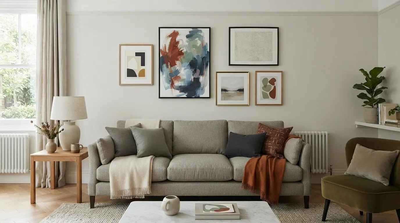
The artwork above your sofa shouldn’t feel like an afterthought. Knowing how to choose art for above a sofa starts with scale: aim for a piece or arrangement around two-thirds to three-quarters of the sofa’s width, then leave roughly 15 to 25 cm between the sofa back and the frame’s bottom edge. These proportions help the art feel connected to the furniture without overwhelming it.

It’s easy to focus on a favourite image and overlook how it will sit on the wall. When considering how to choose art for above a sofa, think about the room’s focal point, the sofa’s shape and the balance you want to create.

This guide covers four practical decisions: measuring the available space, setting a comfortable hanging height, choosing a single print or a group, and selecting a focal point that brings the room together. You’ll also find simple ways to preview the arrangement before committing, so the art feels considered and at home above your sofa.

Key Takeaways

  • Aim for artwork or an arrangement around two-thirds to three-quarters of your sofa’s width, and centre it over the seating.
  • Leave roughly 15 to 25 cm between the sofa back and the frame’s bottom edge, adjusting the layout to suit nearby windows and the room.
  • Choose a statement print, a coordinated set or a gallery wall to suit the wall’s proportions and the look you want.
  • Build the display around a piece you love, then use its colours and framing to create a focal point that feels at home in the room.

1. Artwork placement for sectionals and window-adjacent sofas

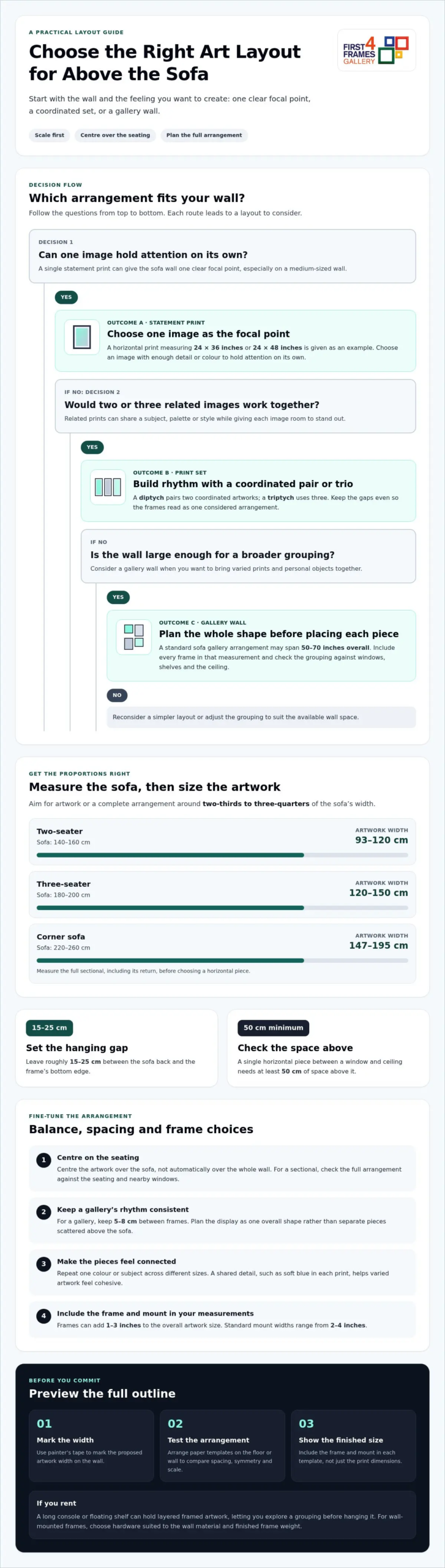
For balanced proportion, choose artwork or a complete arrangement around two-thirds to three-quarters of your sofa’s width. A 140-160 cm two-seater suits artwork 93-120 cm wide; a 180-200 cm three-seater suits 120-150 cm. For a 220-260 cm corner sofa, aim for 147-195 cm. Measure the full sectional, including its return, before choosing a horizontal piece.

Above a sofa, position the frame’s bottom edge 15-25 cm above the back. Centre the artwork over the seating, not automatically over the whole wall. If a window sits beside the sofa, keep the artwork visually balanced with the window rather than squeezing it into a narrow strip. A single horizontal piece between a window and ceiling needs at least 50 cm of space above it.

For a visual guide to scale and balance, watch this short video:

Artwork costs in the UK vary by image, size and framing. Decide on your preferred format and the space available first, then compare pieces that suit both your room and budget.

Coordinate the artwork with your sofa without matching every colour exactly. A neutral sofa can anchor a vivid abstract print, while a patterned sofa may work better with art that picks up one subtle shade. Consider visual weight too: a dark, detailed image can feel heavier than a pale landscape of the same size.

Common mistakes include choosing a print that looks too small, hanging it too close to the sofa, or letting its colours compete with the room. Use painter’s tape to mark the proposed artwork’s width on the wall. For a sectional sofa, outline the full arrangement and check how its horizontal shape relates to the seating and nearby windows.

Using symmetry, frames and cohesive themes

Symmetry gives a sofa wall a composed feel, especially when the room already has strong patterns. Try a pair of prints with matching outer dimensions, or arrange four pieces in a 2-by-2 grid. For a more relaxed gallery, repeat one colour or subject across different sizes. A shared detail, such as soft blue in each print, helps varied artwork feel connected.

Plan the gallery as one visual shape, rather than separate frames scattered above the sofa. Keep 5-8 cm between frames for a consistent rhythm, then check the arrangement’s full outline against the seating. A 2-by-3 grid creates a clear rectangular layout, while a looser cluster can suit an informal living interior. Leave enough space between the arrangement and the ceiling.

Choose frames that echo the room’s existing materials. A slim, simple frame can complement a contemporary interior; a more decorative profile can suit traditional furnishings. Matching every frame creates order, while mixing profiles works best when another detail, such as colour or finish, ties them together. Remember that frames can add 1-3 inches to the overall artwork size.

Framed prints and canvas create different visual effects. A framed print gives the image a defined edge, and a mount can add breathing space around the artwork. Standard mount widths range from 2-4 inches. Canvas presents the image without a separate frame, creating a more continuous surface. Choose the format that supports the image and the balance you want above the sofa.

Before committing, arrange paper templates on the floor or wall to compare spacing, symmetry and overall scale. Include the frame and mount in each template, not just the print dimensions. This makes it easier to see whether a balanced grid or varied gallery suits the room. Explore framed artwork and print options for ideas that could bring your chosen theme together.

4 Ways to Choose Art for Above a Sofa

A single statement print gives the sofa wall one clear focal point. It suits a medium-sized wall, especially when the image has enough detail or colour to hold attention on its own. Examples include a horizontal print measuring 24 × 36 inches or 24 × 48 inches. Part of how to choose art for above a sofa is deciding whether one image can carry the room’s visual story.

A set of prints creates rhythm across the wall. Two or three related pieces can share a subject, palette or style while giving each image room to stand out. A diptych pairs two coordinated artworks; a triptych uses three. Keep the gaps even so the frames read as one considered arrangement rather than competing pieces.

For a larger wall, a gallery wall can bring together varied prints and personal objects. Plan the full outline first: arrange templates on the floor, then test the shape above the sofa. A standard sofa gallery arrangement may span 50-70 inches overall. Include each frame in that measurement, and consider how the grouping relates to nearby windows, shelves and the ceiling.

Renters can lean framed artwork on a long console or floating shelf, layering smaller pieces in front of a larger print. If you’re weighing how to choose art for above a sofa, this flexible approach lets you explore a grouping before hanging it. For wall-mounted frames, choose hardware suited to the wall material and finished frame weight. Plasterboard and masonry need different fixings. Adhesive strips offer another option for lightweight artwork, with heavy-duty strips described as supporting prints up to around 3 kg. Follow the strip maker’s stated limits for the surface and load.

Compare the visual impact of one large image with several smaller frames. A bold abstract can anchor a simple interior, while a gallery wall adds personality. Choose the arrangement that gives the sofa a focal point without crowding the wall.

4. Choosing a focal point above the sofa

Abstract art, landscapes and photographic prints can all work above a sofa. Choose a style that suits your living room, then let one artwork lead the arrangement. A vivid abstract, a calm coastal scene or a diptych can each create a focal point, in a different way.

First decide what should catch the eye. If your sofa has a distinctive shape or colour, choose art that complements it without copying every detail. In a neutral room, a clear subject or rich colour can become the anchor. In a patterned room, a quieter image may keep the wall from feeling crowded.

Think about how the image connects with the rest of the room. Pick one or two colours from a rug, cushion or nearby wall, then look for artwork that repeats them naturally. A blue landscape, for example, can link a pale sofa with a patterned rug. This creates a visual connection without making the art feel like a matching accessory.

Scale affects whether the focal point feels connected to the sofa. A single framed print measuring 70 × 100 cm can suit a standard three-seater; a panoramic artwork measuring 150 cm wide offers another option. Artwork that feels too small can look detached, so consider the full composition and its frame against the furniture before choosing.

Choose the image because you want to live with it, not simply because it matches the sofa. Then decide whether surrounding objects support its role or distract from it. A clear focal point gives the room a visual centre, while carefully chosen colours and subject matter help the artwork feel beautifully connected to its setting. Explore artwork for your living room and find a piece that could anchor your space.

First4Frames Gallery offers Ready-to-Hang Framed Art, Custom Picture Framing and Giclée Fine Art Prints. Its artwork can inspire choices from coastal wall art and landscape wall art to Scottish landscape art, contemporary art prints and fine art by best-selling artists or famous artists. For a personal image, photography prints can be paired with framing to create custom framed art prints and bespoke framed wall art.

With online picture framing, you can choose your frame online and design your framed artwork to suit your room. Before deciding, visualise art on your wall or use a wall art visualiser to see artwork before you buy. Consider the art print framing service when selecting a finished piece of framed wall art for above your sofa.

Choose a piece you’ll love living with

Before settling on a design, imagine seeing it every day. When deciding how to choose art for above a sofa, look beyond matching colours and ask whether the image means something to you. It might recall a favourite landscape, bring energy to a quiet room or simply make you pause and look again.

Give yourself time to compare subjects and moods. Notice which artwork feels right alongside your furniture and suits the atmosphere you want to create. The strongest choice isn’t necessarily the most dramatic; it’s the one that feels at home and continues to speak to you.

Let your preferred image guide the next decision, then explore the available styles and subjects at First4Frames Gallery. Browse artwork and find your favourite, and take the next step towards a wall that feels distinctly yours.

Frequently Asked Questions

How big should wall art be above a sofa?

A useful starting point is artwork around two-thirds to three-quarters of the sofa’s width. Measure the complete framed piece or arrangement, not just the image, so its visual footprint feels proportionate. For instance, a 200 cm sofa can suit a composition around 130-150 cm wide. The room’s layout and the artwork’s visual weight can help you refine that starting size.

Single Painting or Diptych?

Choose a single painting for an uninterrupted image and a clear, simple focal point. A diptych, or pair of coordinated artworks, can suit a wide landscape or abstract composition. Consider the wall’s shape and the image itself: splitting a scene can create rhythm, while one piece keeps the subject visually whole.

What Size Art Should I Get for My Wall?

Start with the wall’s usable area, then consider nearby furniture, doors and windows. A large, open wall can take artwork measuring 36 × 48 inches or larger, while a small nook may call for a more modest scale. In rooms with ceilings under 2.4 m, horizontal artwork can preserve a sense of space. Include the frame in your measurements.

What size should art be above a sofa?

For a 200 cm sofa, a composition about 130-150 cm wide is a practical reference. That composition could be one piece or several arranged together, with gaps included in its total width. Check the artwork’s height as well as its width: a tall image can feel imposing above low seating, while a very shallow one may seem visually slight.

How wide should artwork be compared with the sofa?

Aim for artwork or a grouped display roughly two-thirds to three-quarters as wide as the sofa. Measure from the outside edge of the leftmost frame to the outside edge of the rightmost. This is more accurate than adding print dimensions alone, especially when the arrangement includes several pieces and gaps.

Should you choose one large artwork or a gallery wall above a sofa?

Choose one large artwork for a clean, simple display or when a single image deserves attention. A gallery wall suits a broader space or a collection of personally meaningful images. Consider how much detail is already in the room: a quieter interior can support a varied collection, while patterned furnishings may work better with one focused image.

Posted on

Scottish wedding gifts for the bride and groom

Scottish wedding gifts for the bride and groom

Memorable Scottish wedding gifts bring a touch of home and heritage into a couple’s life together. Lucky heather is a traditional token of good fortune, while a framed Scottish landscape print or thoughtfully chosen homeware can become part of their home.

It’s natural to want a personal present the couple will also use or enjoy. Start with what suits them: a small keepsake, artwork showing a place they love, or a practical item that fits their everyday life.

Explore gift ideas for the couple, from symbolic tokens to framed prints and homeware. This guide explains the meaning behind popular Scottish touches, how to choose something that suits their taste, and how artwork can bring a lasting sense of place into their home.

Key Takeaways

  • Match the gift to the couple’s tastes, home and connection to Scotland to make it feel personal.
  • Consider lucky heather as a meaningful keepsake, and explore how its symbolism can add a thoughtful touch.
  • Balance decorative appeal with everyday usefulness when choosing homeware, artwork or a wedding-day memento.
  • For a lasting artwork gift, bespoke framing can help a Scottish print feel at home in the couple’s space.

Scottish wedding gifts for the bride and groom

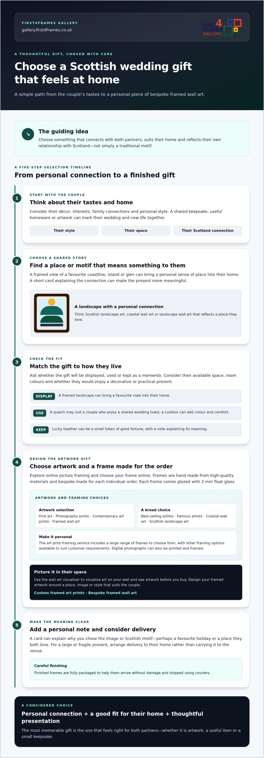
Choose a present that celebrates Scotland and reflects both partners’ tastes. A shared keepsake, useful homeware or artwork can mark their wedding and new life together.

Gifts for the Couple

For a joint present, look for something the bride and groom can enjoy together. A Scottish landscape print, a decorative cushion or a chess set can suit a shared home. The Lewis chessmen that inspired a dark brown chess set date to the 12th century, giving the design a connection to Scotland’s past. Consider the couple’s décor and interests before choosing.

Personal details make a familiar gift feel more meaningful. Choose a print of a place they love, or homeware in colours already used in their living space. A framed image gives them something to display, while a practical item can become part of their daily routine.

Gift Customs and Etiquette

A thoughtful gift doesn’t need to be elaborate. Consider the couple’s preferences, their wedding setting and whether they have room for a decorative item. A short card explaining why you chose a Scottish motif can make the present more personal.

For a wedding in Scotland, choose a present for both partners unless you know they’d prefer otherwise. Don’t assume tartan, heather or other Scottish symbols suit every couple. Their family connections and personal style matter more than choosing a motif just because it looks traditional.

Small details can also bring Scottish character to a present. For homeware, the Tree of Life with Birds Tapestry Cushion Cover in red is square and measures 50cm, so its size and colour are worth considering alongside the couple’s room.

To narrow your options, ask yourself whether the gift will be displayed, used or kept as a memento. A framed landscape can bring a favourite Scottish view into their home. A cushion may add colour and comfort, while a chess set can inspire shared evenings. Look for something that connects with both partners, not just the wedding theme.

Lucky Scottish heather

Lucky heather is a small, symbolic gift for a couple, representing good fortune and offering a thoughtful wish for their life together. Scottish wedding gifts can include traditional tokens, but their meaning feels most personal when it resonates with the couple.

Consider how they might display or keep it. A small sprig of heather can accompany a simple card, while a decorative arrangement may suit a shelf or mantelpiece. Choose a presentation that fits their home and style rather than assuming they prefer traditional decoration.

A handwritten note can explain your choice. For example, say the heather represents your wish for good luck in their marriage. This makes the symbolism clear, especially if they haven’t encountered the custom before. Keep the message warm and specific to the couple.

Heather can also accompany another present, such as a Scottish landscape print, keepsake box or useful homeware. The sprig carries a symbolic message, while the other gift gives the couple something to display or use. Scottish wedding gifts feel more considered when each part suits their interests and home.

If you choose a living heather plant, include a care note specific to it. A dried or decorative sprig makes a keepsake without asking the couple to care for a plant. Make clear which form you’ve chosen so they know how to enjoy the gift.

For a complementary visual present, explore Scottish landscape artwork that reflects a place meaningful to the couple. A view of a favourite coastline, island or glen can sit alongside heather’s symbolism and bring a personal connection to Scotland into their home.

Scottish wedding gifts for the bride and groom

Wedding gifts and homeware

Homeware can give the couple a useful reminder of their wedding day. A Scottish wedding quaich, for example, can be used to toast the occasion. It’s a thoughtful choice for couples who enjoy hosting or value ceremonial keepsakes. Choose a design that suits their taste and complements their tableware.

These compact gifts can accompany a card or become the main present if the couple prefers keepsakes to larger household items.

Decorative homeware works best when its colours and scale suit the couple’s rooms. Before choosing a vase, consider whether they display flowers, prefer clear glass or have space for a statement piece.

Use this simple selection process to connect the gift to their home:

  • Choose a quaich if a shared wedding toast feels meaningful to them.
  • Pick a sixpence or keepsake set if they value small, symbolic mementoes.
  • Select a vase when their décor and available display space suit it.

For a personal touch, add a short note explaining why you chose the item. Mention a wedding toast for a quaich or the Scottish theme behind a keepsake. This helps the couple connect the object to the day, rather than seeing it as just another household purchase. Usefulness, symbolism and suitability for their home can guide your final choice.

Are there Scottish wedding gift customs or etiquette to follow?

There’s no single Scottish rule requiring a particular wedding present. A gift doesn’t need tartan, heather or another national motif to feel thoughtful. Start with the couple’s preferences, then choose something that suits their relationship and home. Their invitation or wedding website may say whether they have a gift list or prefer contributions.

If the couple has shared a gift list, use it to guide your choice. It helps avoid duplicate household items and shows what fits their plans. Without a list, consider a joint gift rather than choosing something for just one partner. A framed print, for example, can show a place they both love. Add a card explaining the connection.

Thoughtful timing and presentation make giving easier for the couple. If you’re attending the ceremony, bring a card and follow their instructions for gifts. Arrange delivery to their home for a large or fragile present rather than carrying it to the venue. A framed print needs care in transit, as the glass and frame corners can be damaged.

Keep your message personal, not prescriptive. A note about a favourite Scottish holiday or shared memory gives the present context. Avoid assuming the couple wants traditional symbols or decorative objects. For a modern home, consider contemporary artwork; for a minimal interior, a quieter print may be a better fit.

For artwork, consider the room where the couple might display it, along with the colours and subject they enjoy. A Scottish coastline or familiar landscape can make the image feel personal without dictating their décor. Browse Scottish artwork and prints for ideas, then choose a subject that reflects their shared story.

First4Frames Gallery can help make Scottish landscape art a thoughtful wedding present. Choose Ready-to-Hang Framed Art, or use Custom Picture Framing to create bespoke framed wall art, with each frame made for its individual order. You can choose your frame online to complement the artwork and the couple’s home.

Giclée fine art prints offer another option, and you can have your own digital photographs printed and framed. Whether you choose a coastal view or a shared travel memory, select an image that feels personal to both partners.

Explore the gallery of Scottish art and prints to find artwork that could become part of their home.

Choose a gift that becomes part of their home

A wedding present can mark the start of a shared story, especially when it reflects a place or image the couple treasures. Before choosing, imagine where they might display it and how it would suit their home. That simple step can help turn a thoughtful idea into something they’ll enjoy living with.

For Scottish wedding gifts with an artistic touch, First4Frames Gallery offers Ready-to-Hang Framed Art, Custom Picture Framing and Giclée Fine Art Prints. These options let you select a finished piece or create a framed artwork around a print that feels meaningful to the couple.

Let their interests guide your choice, whether that means a view of Scotland, a favourite colour palette or artwork suited to a new home. Explore the gallery and find a print that feels personal to both partners. Browse framed art and prints to begin choosing a wedding gift with lasting character.

Frequently Asked Questions

What are traditional Scottish wedding gifts?

Traditional Scottish wedding gifts can include a quaich, lucky heather or a sixpence keepsake. These carry symbolic meaning, but couples don’t all share the same tastes or customs. For a personal gift, pair a traditional token with a note explaining its significance, or choose a Scottish-inspired design that suits the couple’s home and interests.

What Scottish-made gifts are suitable for a wedding?

Artwork by a Scottish artist can make a distinctive present, especially when it reflects a place the couple values. First4Frames Gallery works with numerous artists, primarily from Scotland, and offers Giclée fine art prints. Choose an image that connects with the couple’s story, such as a familiar landscape or a view from a meaningful trip. A framed print can then become a lasting feature in their home.

What are popular modern wedding gifts in Scotland?

Consider a Scottish landscape print, useful homeware, a quaich for a shared toast, or a small keepsake such as lucky heather or a sixpence. Choose something that suits both partners’ tastes and home.

Posted on

Contract Framing for New Developments: A Buying Guide

Contract Framing for New Developments: A Buying Guide

A development’s artwork can bring its interiors together or leave each space feeling disconnected. Contract framing for new property developments starts with a cohesive art scheme, then gives every piece a frame suited to its artwork and setting. The aim is not to make every room identical, but to create a considered visual thread throughout the property.

Coordinating choices across rooms or multiple properties takes planning. You need a clear picture of the finished scheme and confidence in the framing quality. First4Frames combines commercial artwork curation with bespoke picture framing, bringing together artwork selection and made-to-order frames. Each frame is individually crafted for its order using high-quality materials. The 2mm float glass offers clarity compared with the perspex used by many competitors.

This guide explains how to create a consistent scheme while choosing artwork and frame details that work in each space. It also covers practical ways to plan specifications and coordinate decisions, from selecting artwork to receiving professionally finished, carefully packaged pieces.

Key Takeaways

  • Contract framing for new property developments means planning and supplying framed artwork for a commercial project, not building contracts or public procurement.
  • Map room functions, wall areas and interior finishes first to shape an art scheme that feels cohesive and suits each space.
  • Choose artwork before specifying frames, so each frame complements the individual piece and the development’s visual direction.
  • Commercial artwork curation and a broad online selection of artwork and frames can help bring a project from initial choices to a finished scheme.

What Contract Framing for New Property Developments Involves

Contract framing for new property developments means planning and supplying framed artwork for a commercial project. It brings art selection and presentation into the wider interior design, helping entrances, show homes and shared spaces feel considered and welcoming. In this context, “contract framing” is about presenting artwork, not building contracts or public procurement.

The distinction matters because “framing” can describe different kinds of work. Framing (construction) concerns a building’s structural framework; artwork framing is about presenting pictures for interior spaces. A well-planned art scheme considers where each piece will hang, how it relates to the room and the impression it creates.

Where framed artwork can shape a development

Begin with the spaces people encounter and use. An entrance may need a clear visual welcome, while artwork in a show home can complement the furnishings and help visitors imagine the space as lived in. In shared areas, consider the room’s purpose and character before selecting pieces. Check usable wall area, sightlines, finishes and the scale of the artwork. These details help each piece feel purposeful rather than added as an afterthought.

A cohesive scheme without a one-size-fits-all look

Consistency does not mean hanging the same picture in every room or property. Carry a few visual cues through the scheme, such as a related palette, subject matter or framing approach, then vary the artwork to suit each interior. A quieter room might suit fine art, while a more expressive space could feature photography prints or contemporary art prints. Explore a broad choice of framed wall art to find pieces that support the overall direction while allowing individual rooms to retain their character.

How Bespoke Framing Builds a Consistent Art Specification

A useful art specification covers the picture and its presentation together. Each frame is individually crafted for its order using high-quality materials, with proportions and finishes selected to suit the artwork. Cheap, standard frames may not fit a piece properly, leaving an awkward border or an unbalanced result. Bespoke framed wall art gives each piece a considered finish while helping maintain a consistent scheme across the development.

Consideration Bespoke framing Standard framing
Fit Individually made to suit the order and artwork Set sizes may not fit the artwork properly
Finish Chosen to complement the piece and interior Less tailored to the artwork or room
Glazing clarity 2mm float glass, selected for its clarity Perspex used by many competitors can appear less clear

Choose artwork and finishes as one specification

Coordinate frame finishes with the artwork, room palette and development’s interior direction. Coastal wall art may suit a light, relaxed setting, while Landscape wall art or Scottish landscape art can bring a stronger sense of place. Photography prints offer another route to a personal or contemporary feel. Keep a simple schedule listing each artwork, its frame finish and its intended room. This makes it easier to review the scheme as a whole without making every piece identical.

From online selection to visualising the finished piece

Choose your frame online and Design your framed artwork with the picture’s colours and proportions in mind. A Wall art visualiser can help you Visualise art on your wall and See artwork before you buy, making it easier to assess scale and placement within the wider scheme. For further inspiration, browse the gallery’s framed artwork selection and compare options for each space.

Contract Framing for New Developments: A Buying Guide

How to Plan Contract Framing for a New Development

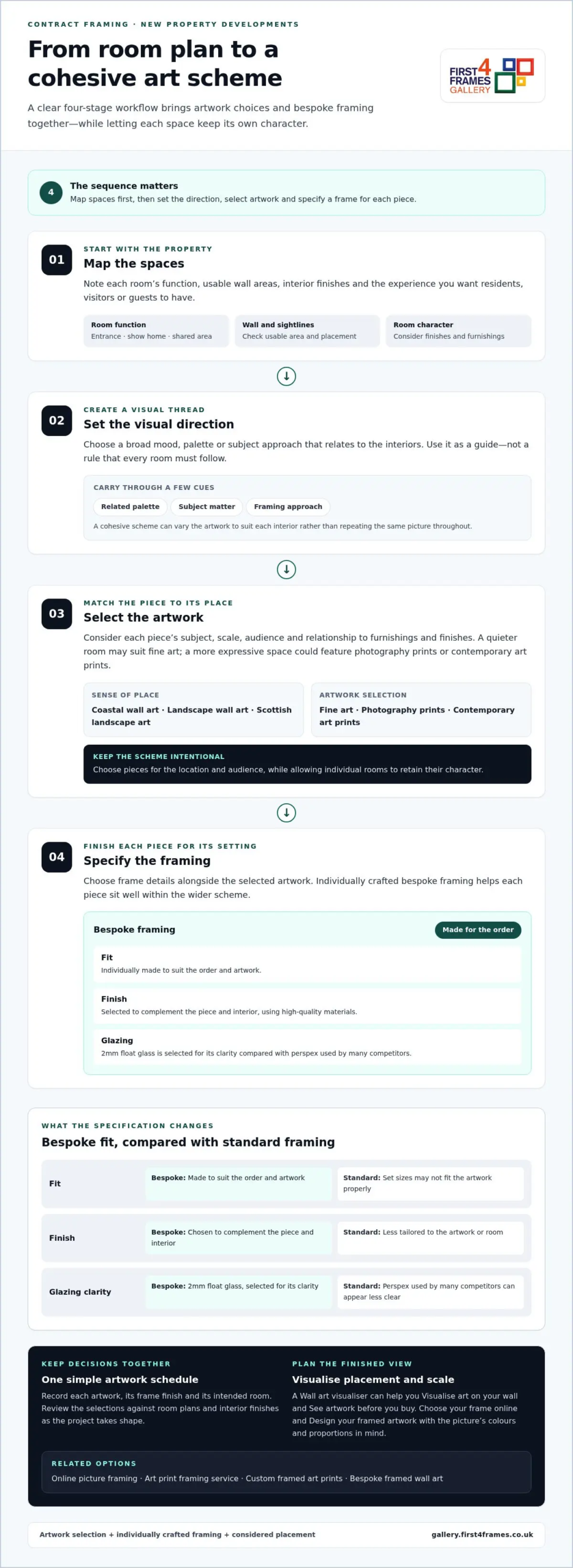
A clear workflow makes decisions easier to manage and helps the finished artwork feel intentional throughout the property. For contract framing for new property developments, record choices as the project takes shape. Keep the artwork and framing details together so the team can review selections against room plans and interior finishes.

  1. Map the spaces. Note each room’s function, usable wall areas, interior finishes and the experience you want residents, visitors or guests to have. This gives you a practical starting point for selecting artwork.
  2. Set the visual direction. Choose a broad mood, palette or subject approach that relates to the interiors. Treat it as a guide, not a rule that every space must follow.
  3. Select the artwork. Match each piece to its location and audience. Consider its subject, scale and relationship to furnishings and finishes.
  4. Specify the framing. Choose frame details alongside the selected artwork, so the presentation suits each piece and contributes to the overall scheme.

Selecting art that suits the property and its audience

A coordinated scheme can include framed wall art, fine art and works by best-selling or famous artists while still giving each room its own character. Consider whether a shared space needs a calm focal point or whether a show home would benefit from a more personal touch. A guide to choosing picture frames can help you assess how a frame supports the artwork and its display.

Preparing digital photographs for a framed scheme

Digital photographs can become finished display pieces through a print-and-frame service. High-quality printing helps the image sit well with its bespoke frame, making personal or place-related photographs a considered part of the interior rather than an afterthought. Custom framed art prints can form part of the scheme, with an art print framing service or online picture framing bringing selection and presentation together.

Start exploring artwork options for your project in the online art gallery.

Bring a New Development’s Art Scheme Together with First4Frames

Commercial artwork curation and bespoke framing work best as connected parts of a project. First4Frames Gallery brings artwork selection and made-to-order framing together, with a broad online choice of artwork and frames to help shape a scheme for development interiors. This joined-up service supports contract framing for new property developments, from discussing the spaces and selecting artwork to creating finished framed pieces.

What to bring to an initial art-scheme discussion

Start with a clear picture of the development and the experience you want its interiors to create. Share the interior direction, room uses, artwork preferences and project information. Plans, room lists or notes on finishes can help focus the discussion. You do not need every decision settled: a clear sense of priorities gives the curation and framing process a practical foundation and helps guide the next choices.

Choosing framed artwork for the finished spaces

Explore framed wall art across landscape, coastal and contemporary styles, considering how each piece relates to its intended room and the broader interior. A striking landscape might provide a focal point, while coastal imagery could reinforce a lighter atmosphere. For more guidance on selecting artwork and its presentation, explore this fine art sourcing and framing guide.

Once selected, finished frames are fully packaged to help prevent damage and shipped via professional couriers. This supports a straightforward handover from framing to project coordination. Explore framed artwork and prints to begin shaping an art scheme for your development.

Give Your Development a Distinctive Art Direction

A new development’s art scheme can do more than fill walls. It can give each interior a sense of place and make the whole project feel thoughtfully considered. Start with a clear idea of how you want residents and visitors to experience the property. Let artwork express that character, with enough variety for each room to feel individual. That balance is at the heart of contract framing for new property developments: creating a distinctive identity through considered choices rather than repetition. Keep a shortlist of artwork and styles that suit the project to make later decisions easier and more focused.

Explore the gallery at your own pace, noting which subjects and moods feel right for the development. A well-chosen piece can become a memorable detail, welcoming people into a space and giving its interior personality. Explore framed artwork and prints to start shaping an art direction for your project.

Frequently Asked Questions

What does contract framing mean for a new property development?

It means including framed artwork in the planning of a commercial development’s interiors. Treat it as part of the interior-finish process by connecting art decisions to room schedules, design intent and handover priorities. This keeps artwork visible alongside other interior selections instead of leaving it until rooms are otherwise complete. The scope is artwork presentation, not construction work or public procurement.

Can framed artwork be coordinated across multiple properties or rooms?

Yes. For a multi-property project, create a simple reference system that identifies each location and its artwork decisions. This makes it easier to compare selections across the development and see where a shared visual cue is working, while still allowing local variations. Keep the references with the project’s interior documentation so the team can follow the scheme as decisions progress.

What is the difference between bespoke framing and a standard frame?

Bespoke framing allows the frame specification to be tailored to an individual artwork, while standard frames follow set formats. Before approving a piece, compare its overall framed dimensions with the available wall area and nearby furnishings. Record the selected finish alongside the artwork reference so project notes show which framing choice is intended for each location.

Can digital photographs be printed and framed for a development?

Yes. Digital photographs can be considered alongside other artwork in a development’s scheme. Select images that support the property’s character, then review their orientation, colours and intended placement before deciding how to present them. For instance, a place-focused image might help tell a local story, while a more abstract photograph could complement a contemporary interior without dominating it.

How are framed artworks protected during delivery?

Finished frames are fully packaged to help prevent damage and shipped via professional couriers. For site handling, plan a designated receiving point and identify who will log each piece on arrival. Match artwork references to room or location labels, then store the frames appropriately until they are needed. This gives the project team a clear handover process and makes it easier to locate each work.

Posted on

Colourful Abstract Art for Neutral Decor: Buying Guide

Colourful Abstract Art for Neutral Decor: Buying Guide

What if colourful abstract art could make a neutral room feel more considered, not less calm? The right piece adds warmth and personality to pared-back surroundings, but bold colour can feel risky if it clashes with warm or cool finishes, dominates the space or looks different once framed. Colourful abstract art for neutral decor works best when you consider colour, scale and framing together.

This guide explains how to connect artwork with existing accents, judge its size and compare framing choices. First4Frames Gallery offers a wide selection of framed wall art, including Contemporary art prints, with bespoke frames individually crafted for each order. Unlike cheap standard frames that may not fit the artwork properly, a custom frame is made to suit the piece. Artwork is finished with 2mm float glass, chosen for its superior clarity compared with the perspex used by many competitors. Use the Wall art visualiser to visualise art on your wall and see artwork before you buy, so you can assess your choice in context.

Key Takeaways

  • Use colourful abstract art for neutral decor as a deliberate accent that adds energy while preserving the room’s calm foundation.
  • Match artwork to warm, cool or mixed neutrals. Complementary or neighbouring shades on the colour wheel can guide your choice, but they are not rules.
  • Measure the wall, consider nearby furniture and compare proportions to find artwork that suits the space.
  • Compare Giclée prints, Fine art, Photography prints and framed artwork by palette, print style, dimensions and frame choices.

Why colourful abstract art works in neutral decor

Colourful abstract art creates a deliberate focal point against restrained walls, floors or furnishings. It can bring energy to a room without asking you to change its neutral foundation. Contrast makes a neutral interior feel more personal by giving the eye a vivid detail to return to, while the surrounding calm keeps the artwork in balance.

Start by identifying the room’s undertones. Cream, beige and warm stone tend to feel softer and more sunlit; grey and many off-whites tend to feel cooler. This distinction can guide your palette. Warm neutrals often sit comfortably with earthy reds, ochres or greens, while cooler ones can complement blues and cleaner, sharper accents. Treat these as starting points, not strict rules.

What makes abstract art a natural fit for neutral rooms?

Non-representational shapes and colour bring character without tying the room to a specific subject or decor theme. A flowing composition can add movement, while blocks of colour create a more structured focal point. If you’re curious about the history and forms of abstract art, exploring its variety can help you identify the kinds of compositions you’re drawn to.

Abstract prints are one option among other styles, including Coastal wall art, Landscape wall art and Scottish landscape art. Choose based on the mood you want, rather than assuming a neutral room needs artwork that blends in.

Choose a colour mood before choosing the print

Look around the room first. Echo a shade already present in a cushion, rug or vase to connect the artwork with its surroundings. Or introduce one purposeful accent colour and let the print become the room’s main point of contrast. Repeating a small detail of that colour elsewhere can make the choice feel deliberate.

For a quieter effect, choose tonal artwork with colours close to the room’s existing palette. Higher-contrast Contemporary art prints make a bolder statement, particularly against plain walls. Neither approach is inherently better. Consider how much visual energy you want, then choose a print that complements the room rather than competing with it.

How to match colourful abstract art to your neutral palette

Before choosing a print, look at the undertones in the room’s largest surfaces, such as the sofa, flooring and walls. Undertones influence how artwork colours appear: a shade can look warmer or cooler depending on the neutral colours and light around it. Use the guide below to narrow your palette, then treat it as inspiration rather than a formula.

Warm neutrals: Cream, beige and warm stone pair naturally with related warm accents. A measured cool contrast can add definition.

Cool neutrals: Grey and cool off-white can support vivid colour, gentle tonal combinations or a mix of warm and cool shades.

Mixed palettes: If warm and cool finishes sit together, look for artwork with a colour note that connects both sides.

The colour wheel can help refine your choice. Complementary colours sit opposite each other and create stronger contrast; analogous colours sit beside each other and tend to feel more harmonious. Neither approach is a rule. For more on how colour shapes interiors, explore this overview of color theory in interior design. Look for one or two colours already present in the room to create a visual link. Exact matches aren’t necessary: a similar tone can help the composition feel at home without repeating every accessory.

Compare colour intensity before committing

A print with one vivid focal colour makes a clear statement, while several softer colours spread interest across the composition. Consider which effect suits the room’s existing visual activity. Daylight and artificial lighting can change how colours appear, so compare artwork in the space where it will hang, at different times if possible.

Use the Wall art visualiser to Visualise art on your wall and See artwork before you buy. Previewing the work in context can help you judge its palette more practically than viewing it on a screen alone. For more ideas on selecting artwork and its presentation, browse this gallery of framed art as you consider colourful abstract art for neutral decor.

Colourful Abstract Art for Neutral Decor: Buying Guide

How to choose the right size and frame for colourful abstract art

Good proportions help colourful abstract art feel intentional rather than crowded or lost. Work through these steps before settling on a print:

  1. Measure the wall area. Note the available width and height, leaving space around the artwork so it doesn’t feel squeezed against corners or nearby features.
  2. Consider nearby furniture. Above a sofa or sideboard, compare the artwork’s width with the furniture and the wall space around it. A larger print can anchor a broad wall; a smaller piece may suit a compact display.
  3. Compare proportions. Check whether a landscape, portrait or square composition suits the space. Preview it in its intended position rather than judging the image alone.
  4. Choose a frame. Consider the print’s colours, the room’s finishes and whether the frame should blend in or add definition.

Make artwork scale feel balanced above furniture

Stand back and assess the whole arrangement, including the furniture beneath it and any surrounding objects. A print can look generous on screen but feel undersized above a wide sofa, or overwhelm a narrow wall. The picture frames guide offers further help with display choices. A Wall art visualiser can also help you preview the work in its intended position and judge the overall balance.

Use framing to connect art with the room

A frame in a quiet, complementary colour can support the artwork without competing for attention. A darker or more defined profile can sharpen its contrast against pale walls. With Online picture framing, you can Design your framed artwork by comparing frame choices. Every First4Frames frame is individually crafted for the order using high-quality materials, unlike cheap standard frames that may not fit the artwork properly. The framed work uses 2mm float glass for superior clarity compared with the perspex used by many competitors. For a tailored finish, explore framed art and bespoke options, including Bespoke framed wall art.

Where to find colourful abstract art for neutral decor

Compare artwork by more than its dominant colour. Consider palette, print style, dimensions and frame choices together, since each affects how the finished piece will sit in your room. The selection includes Giclée prints, Fine art, Photography prints and Contemporary art prints, as well as work by Best-selling artists and Famous artists. Custom framed art prints bring your chosen image and frame together as one considered piece.

Browse and visualise framed abstract artwork

Online picture framing makes it easier to compare print and frame combinations. As you browse, consider how the artwork’s colours and dimensions work with different frame options. Choose your frame online and use the Wall art visualiser to picture the combination in your room. Explore colourful framed wall art to compare abstract prints and other styles in context.

An Art print framing service brings a selected print and frame together. First4Frames also offers a print-and-frame option for digital photographs, with high-quality printing chosen to complement the bespoke framing.

Turn a considered choice into framed art

The gallery brings together work from its artist selection, Giclée fine art prints, ready-to-hang framed art and bespoke framing. This joined-up approach lets you explore artwork and consider its finished presentation as part of the same decision. Finished frames are fully packaged to help prevent damage and shipped via professional couriers.

A considered print, a well-fitted frame and protective delivery bring colour to your room with care from selection to arrival. Explore the gallery’s framed art and prints to find a piece that feels right for your space.

Let your artwork make the room your own

A neutral room can be a living backdrop, ready to evolve as your taste changes. Rather than aiming for a perfectly coordinated finish, choose a piece you’ll enjoy seeing each day. The most lasting choice may be the one that makes you pause, sparks a memory or brings a little of your personality into the space.

Give yourself room to explore before deciding. Compare different compositions and colour moods, then picture how each might feel in your home over time. The right colourful abstract art for neutral decor doesn’t simply fill an empty wall; it can become part of how you experience the room, whether you’re settling in for a quiet evening or welcoming friends.

Explore colourful abstract prints and framed art to find a piece that speaks to you. Trust your eye, compare the options and choose the artwork you’ll love living with.

Frequently Asked Questions

Can colourful abstract art work in a small neutral room?

Yes, colourful abstract art can suit a small neutral room. Consider the clear wall area and how much visual activity already comes from furniture, rugs and fittings. A compact print can provide a focused accent, while a larger statement piece may become the room’s main feature. Compare both at the intended height and position, leaving enough surrounding wall space for the artwork to breathe.

How do I choose abstract art for a beige or grey room?

For colourful abstract art for neutral decor, first check whether the beige or grey feels warm, cool or balanced in your room. Then choose colours that harmonise with that undertone or create a deliberate contrast. Pick out one existing shade, perhaps from a cushion or rug, as a visual bridge. View the print under your room’s lighting. Exact colour matches aren’t needed for a cohesive effect.

Will colourful abstract art go out of style?

Art doesn’t have to follow a trend to feel current. Its staying power depends more on whether you enjoy looking at it and whether it sits comfortably with the room. Consider how you might feel about the piece if you changed cushions, throws or other accessories. Choosing artwork for a colour combination you genuinely love gives you more freedom than buying solely to keep pace with a passing style.

Should the frame match the colours in abstract artwork?

No. A frame can pick up one colour in the artwork, recede into the room’s finishes or create a crisp outline that strengthens contrast. Rather than matching every shade, compare the complete framed piece with the wall and nearby furniture. Use the visualiser to test how the frame’s tone and profile affect the composition in place, especially if the artwork has several competing colours.

Can I have a digital photograph printed and framed to suit neutral decor?

Yes. A personal digital photograph can be printed and framed as wall art, with its colours considered alongside your neutral decor. First4Frames’ print-and-frame service pairs high-quality printing with bespoke framing, so the image and its presentation are considered together. For example, a photograph with a small accent of colour can tie in with cushions or ceramics. Choose a frame that supports both the image and its surroundings.

Posted on

Modern Botanical Prints UK: Find Art That Feels at Home

Modern Botanical Prints UK: Find Art That Feels at Home

The right botanical print can make a room feel more like yours, rather than simply following a trend. Choosing among modern botanical prints for sale uk homes can feel tricky when style, scale and colour all need to work together, and an online image doesn’t always show how a piece will look on your wall.

Start with the room: consider its colours, the available wall space and whether you’re drawn to delicate leaves, bold forms or atmospheric florals. This guide will help you choose botanical wall art that feels personal, compare print and frame options, and preview the artwork at home with a wall art visualiser. First4Frames Gallery offers a large online selection of artwork and frames, bespoke framing, and Giclée prints that can be ordered ready to hang. Each frame is individually crafted for the order using high-quality materials, with 2mm float glass for a clear view of the artwork.

Key Takeaways

  • Explore modern botanical prints for sale uk and compare contemporary interpretations with traditional botanical illustration to find a style that suits your home.
  • Use your room’s palette and available wall space to narrow down artwork and choose a print size that feels balanced.
  • Giclée printing reproduces artwork with attention to colour and detail, while a frame crafted for your order completes its presentation.
  • Preview your selection with the wall art visualiser, then use the online process to create framed art ready to display.

Modern botanical prints for sale in the UK: choose a style that suits your space

Botanical art brings natural forms, colour and a sense of life into everyday spaces. Modern prints range from carefully observed leaves to simplified shapes and expressive compositions. Traditional botanical illustration often records plants in precise detail, while contemporary work may interpret them more freely. Both approaches have their own appeal: choose according to the room and the atmosphere you want to create. For background, explore the history and purpose of Botanical illustration.

When looking at modern botanical prints for sale uk, begin with the room rather than a passing trend. A delicate plant study can bring quiet detail to a bedroom, while graphic foliage can turn a plain living-room wall into a focal point. Think about how much visual activity the room already has. A detailed print may stand out in a simple setting, while a restrained design can balance patterned furnishings.

For creative inspiration, watch this watercolour and linework demonstration.

Which botanical print style works in your room?

Delicate plant studies and soft greens work well with an existing restful palette. Bold foliage or saturated colours make a more deliberate focal point, especially against simpler décor. Contemporary compositions may use unusual cropping or open space to keep the image feeling light. Botanical prints can also complement modern framed wall art, including works by best-selling artists and famous artists, alongside Coastal wall art or Landscape wall art.

How can you judge scale and colour before buying?

Measure the available wall width and consider the distance from which you’ll usually view the print. Compare its proportions with nearby furniture: a small piece above a broad sofa may feel lost, while a large image can overwhelm a narrow wall. Notice whether the artwork’s colours echo or contrast with cushions, paint and other nearby pieces. Use the wall art visualiser to visualise art on your wall and see artwork before you buy.

For a cohesive display, match the botanical subject to the room, the palette to its surroundings and the print size to the wall.

What makes a quality modern botanical print and frame?

A botanical image’s fine lines, layered greens and subtle changes in tone deserve a print that reproduces the artwork faithfully. Giclée is a fine-art printing method that captures the original image with careful attention to colour and detail. It offers a considered way to enjoy botanical work alongside other gallery categories, including Fine art, Contemporary art prints and Photography prints.

When comparing modern botanical prints for sale uk, look beyond the image alone. With online picture framing, you can consider how a frame will sit with the print. A slim profile can keep a small, delicate study feeling light, while a bolder frame may give a larger composition a stronger presence. Colour matters too: a frame that picks up a tone in the leaves or provides a quiet contrast can help the print feel at home in its setting.

How does bespoke framing change the finished print?

Each frame is individually crafted for its order using high-quality materials, rather than relying on a cheap, standard frame that may not fit the artwork properly. This bespoke approach lets the frame complement the print’s scale, palette and presentation. For an overview of available framed artwork, explore the online art gallery and its custom framed art prints.

Framed artwork uses 2mm float glass, selected for its clarity. Compared with the perspex used by many competitors, float glass offers a clearer view of the image, so fine details and colours are easy to appreciate. The glazing is an important part of the finished presentation, not just a final detail.

The print carries the image, the frame shapes its presentation, and the glazing provides a clear view. Together, these choices turn a botanical print into a finished piece of framed art, thoughtfully suited to its subject and setting.

Modern Botanical Prints UK: Find Art That Feels at Home

How to choose modern botanical wall art for your home

A thoughtful choice starts with the room, not the frame. Decide where the artwork will hang, then note the wall colour, textiles and nearby furniture. A print that picks up a quiet green in your cushions can bring the room together; a contrasting leaf or flower colour can add a purposeful accent.

How do you match botanical art to colour and interior style?

Compare the artwork’s dominant colours with the tones already around it. Soft botanical hues can sit easily in calm, traditional rooms, while graphic foliage can bring energy to a modern interior. In a mixed space, use one shared colour to connect different styles. Botanical subjects can also sit alongside Scottish landscape art or Coastal wall art, creating a varied display without making every piece match.

How should you plan the frame and wall placement?

Measure the available display area and consider how the artwork will relate to a sofa, sideboard or other nearby furniture. Check the space from your usual viewing position, not just up close. Then choose your frame online: a frame that echoes a furnishing can create harmony, while a gentle contrast can help the print stand out. Use the option to design your framed artwork and consider the complete presentation. If you’re comparing modern botanical prints for sale uk, a wall art visualiser can help you preview the artwork in your room and visualise art on your wall before deciding.

Keep the process simple: choose the room, compare colours, measure the wall, then select the artwork and frame. Explore framed art in the gallery to find a piece that suits your space.

Buy framed modern botanical prints online with confidence

Buying framed art online can feel uncertain if you can’t picture the finished piece in your room. A straightforward process helps: browse the artwork, use the wall art visualiser to preview your choice, select a frame and complete your framed-art design. Seeing the print and frame together makes it easier to judge the whole composition, rather than choosing a print and hoping the frame suits it later.

What should you expect from online picture framing?

With a wide online selection of artwork and frames, you can choose your frame online and design your framed artwork around the print’s subject, colour and scale. Bespoke framed wall art comes from these choices working together. Each frame is individually crafted for its order using high-quality materials, giving the artwork a considered fit and finish instead of a cheap, standard frame that may not suit it. Custom framing options let the presentation be tailored to the piece.

An art print framing service brings the print and frame together as one considered order. Finished frames are fully packaged to help prevent damage and shipped via professional couriers, so your artwork is prepared for its journey to your home.

Can you frame your own digital botanical photograph?

Yes. A print-and-frame service for digital photographs offers a straightforward route from your own image to finished wall art. The photograph is printed to a high quality to match its bespoke framing. Explore online photo printing and framing to turn a botanical image of your own into a framed piece.

Whether you’re choosing a gallery print or framing a personal photograph, the process brings artwork, presentation and practical delivery together. Browse modern botanical and framed wall art to find a piece that feels right for your home.

Bring botanical art home with confidence

The right botanical print is more than a pleasing image. Consider how its subject, colours and scale will sit in your room, then use the wall art visualiser to preview the finished look before choosing your frame. As you explore modern botanical prints for sale uk, remember that thoughtful framing is part of the artwork’s overall character.

Each frame is individually crafted for its order using high-quality materials. The 2mm float glass provides a clear view compared with the perspex used by many competitors, while finished frames are fully packaged to help prevent damage and shipped via professional couriers. Together, these details carry your choice from screen to wall with care.

Ready to find a piece that feels at home in your space? Browse the gallery and design your framed artwork, choosing artwork and framing that work beautifully together.

Frequently Asked Questions

How do I choose a modern botanical print for my living room?

Start with the room’s colour palette and the wall space available. Compare the print’s dominant tones with your walls, textiles and nearby furniture, then consider how its size will look above a sofa or sideboard. Delicate plant studies can add quiet detail, while bold foliage can create a focal point. A wall art visualiser can help you preview the effect before choosing a frame.

Are botanical prints still in style in 2026?

Botanical prints remain a versatile choice because natural forms can suit many interior styles. Choose soft colours for a calmer feel, or expressive foliage to bring colour and energy to a wall. The key is finding a print that feels right in your room rather than following a trend. Modern botanical prints for sale uk range from delicate studies to contemporary, graphic interpretations.

What is the difference between a Giclée print and a standard art print?

Giclée is a fine-art printing method used to reproduce artwork with attention to its original detail and colour. “Standard art print” is a broader term and doesn’t describe one specific printing method, so production and finish can vary. First4Frames Gallery offers Giclée fine art prints from a range of artists, primarily from Scotland, which can be paired with a selected frame.

Can I choose a frame online for a botanical print?

Yes, you can browse artwork and frames online, then choose a frame to suit your print and room. A wall art visualiser lets you preview the artwork in your space, helping you consider the overall presentation before completing your framed design. Each frame is individually crafted for its order using high-quality materials, bringing a considered fit and finish to the artwork.

How are framed art prints packaged and delivered in the UK?

Finished frames are fully packaged to help prevent damage during their journey and shipped via professional couriers. Framed artwork uses 2mm float glass for clarity, rather than the perspex used by many competitors. These practical details support a carefully finished piece from framing through delivery.

Posted on

Art for Dental Waiting Rooms: A Practical Buying Guide

Art for Dental Waiting Rooms: A Practical Buying Guide

What if the artwork on your waiting-room walls could make the whole practice feel more considered? Selecting art for a dental practice waiting room isn’t simply about filling a blank space. The right subjects, colours and proportions can create a welcoming first impression and reflect your practice’s identity without making the room feel overly personal or visually busy.

This guide explains how to choose artwork for the room and its visitors, assess size and placement, and finish each piece with a suitable frame. Compare options such as coastal wall art, Scottish landscape art, photography prints and contemporary art prints, then consider how the frame relates to the image and the rest of the room. First4Frames Gallery offers Giclée fine art prints, bespoke framing and commercial artwork curation. Use the steps below to plan a cohesive display and make confident choices for your practice.

Key Takeaways

  • Start selecting art for a dental practice waiting room by deciding what impression the space should create, such as warm, professional or locally connected.
  • Compare landscapes, coastal scenes, photography and contemporary art by subject, colour and visual contrast to find a style that fits the room.
  • Measure usable wall space, consider viewing distance and test the layout before choosing a focal piece or a coordinated group.
  • Choose ready-to-hang framed art or bespoke framing, and check that the frame suits the artwork for a cohesive finish.

What Should Art for a Dental Practice Waiting Room Achieve?

Waiting-room art is a design choice, not a substitute for clinical care. It helps shape a practice’s first impression. You might want the room to feel calm, professional, warm, contemporary or connected to its local setting. Selecting art for a dental practice waiting room means considering that intended impression alongside the space, rather than choosing a picture in isolation.

Evidence-based design (EBD) is a broader approach to planning environments with research in mind. It can inform thoughtful decisions about a healthcare setting, but artwork is one part of the room’s design. It is not a guarantee of changes to health or treatment outcomes.

Start with the people and the room

Consider who uses the waiting room, how long they may wait and what the space already communicates. Children, adults and other visitors may have different tastes, so avoid assuming that one theme will suit everyone. Look for artwork that feels welcoming and considered for a varied audience. Comfort is a design aim, not a promised clinical result.

Define the atmosphere before browsing

Write down a few words that describe the atmosphere you want, such as composed, welcoming or contemporary. Then note the wall colours, furniture finishes, lighting and practice branding. These details give you a practical basis for comparing artwork: a print might repeat a colour already in the room, complement its overall mood or provide a deliberate focal point. Explore art in the frame and compare how different prints and frames work together.

Decision rule: Consider the room, its audience and the atmosphere you want to create before choosing a subject. This keeps your shortlist connected to the practice’s identity and gives you a clear basis for comparing style, colour and scale.

Which Art Styles and Subjects Suit a Dental Waiting Room?

There’s no single style that suits every practice. Choose artwork that fits the room’s character and the impression you want to create, while remaining easy to view from the seats where patients spend their time. A consistent visual direction usually feels more considered than a group of unrelated pictures.

Compare landscapes, photography and contemporary art

Landscape wall art can bring a broad, open view to a wall. Coastal wall art offers a more specific sense of place through shorelines, sea and sky. For a practice with a Scottish connection, Scottish landscape art can express local identity without relying on overt branding. Photography prints offer realistic detail, fine art prints foreground an artist’s interpretation, and contemporary art prints can introduce a more graphic or modern note.

Choose landscape art for a spacious, natural feel, coastal imagery for a place-led palette, photography for recognisable detail, or contemporary prints for a modern character. Treat these as starting points, not fixed rules. When selecting art for a dental practice waiting room, choose a clear visual direction, such as nature-led, locally connected or contemporary, rather than mixing subjects without a reason.

Use colour and subject with intention

Compare each print’s colours with the wall paint, seating and other finishes. A piece that picks up an existing colour can help the scheme feel connected; a strong contrast can make the artwork stand out. Neither approach is automatically better. Consider the image’s level of detail, too. Ask whether its main subject is easy to make out from the usual seating positions, not just when viewed close up.

Before deciding, compare your shortlist with the room’s actual palette and layout. The gallery’s selection of framed artwork can help you explore different visual directions. Choose pieces whose mood, palette and scale feel at home in your practice.

Art for Dental Waiting Rooms: A Practical Buying Guide

How Do You Choose the Right Size, Layout and Frame?

Good proportions help artwork feel intentional rather than lost on a wall or crowded by its surroundings. Before selecting art for a dental practice waiting room, map the usable space and account for how people move through and use the room.

Plan artwork scale and placement

Use this sequence to make a considered choice:

  1. Measure the usable wall space. Record its width and height, noting doors, furniture, signage and other features that may compete with the artwork or limit where it can go.
  2. Consider viewing distance. Check what patients can see from the main seating positions. A detailed image may need to be larger or placed where its subject is easier to distinguish.
  3. Test the layout. Mark the proposed dimensions on the wall with removable tape, then step back and assess the balance. Sketch a single focal piece and, if the wall allows, a coordinated group. Keep spacing and alignment consistent so a group reads as one arrangement.
  4. Select the frame and glazing. Compare the frame’s profile and colour with the artwork and the room’s finishes. Consider how the framed piece will look from the seating area, including whether reflections affect the view.

Assess frame finish and glazing

A frame should be made to fit the artwork, not simply approximate its dimensions. First4Frames frames are individually crafted for each order using high-quality materials. When comparing framed options, look at the frame’s proportions and finish alongside the print, then check the glazing choices for the piece. The aim is to keep the image clear and create a finish that suits the room.

Once you’ve settled on the size, layout and finish, browse framed artwork and print options to compare pieces for your planned space.

How Can a Practice Source and Finish Waiting-Room Art?

Once you’ve settled on the room’s style and layout, choose the sourcing route that suits your project. Ready-to-hang framed art offers a straightforward way to select a finished piece. Bespoke framing lets you bring a particular print, artwork or photograph and choose a frame to suit its dimensions and the room.

Choose an online, bespoke or print-and-frame route

Online picture framing lets you compare artwork and frame options. As you choose a frame and design your framed artwork, check the finished dimensions and how the frame relates to the image. Custom framed art prints can be a useful route when you have a specific wall or brief in mind. First4Frames Gallery offers fine art prints that customers can pair with a selected frame, as well as bespoke framing for prints, paintings and photographs.

If you’re looking for a wall art visualiser to preview artwork on your wall, confirm whether a preview tool is available before relying on it. A mock-up made to the artwork’s intended dimensions can also help you judge scale and placement. First4Frames frames are individually crafted for each order using high-quality materials, so compare the available frame options with the size and style of the piece you have chosen.

Make the next step straightforward

First4Frames Gallery offers Giclée prints from a range of artists, primarily from Scotland, alongside a selection of frames. Check the current artwork and framing choices before selecting particular pieces. If you’re furnishing several areas, consider whether a shared palette or subject will help the rooms feel connected. First4Frames also provides commercial artwork curation and custom framing for businesses.

Explore the framed art gallery to compare artwork and frame options, or contact First4Frames Gallery about commercial artwork curation and custom framing for a more tailored approach.

Make Your Waiting Room Feel Considered

Thoughtful artwork can help your practice make a polished first impression. Choose subjects and colours that suit the room, its visitors and the atmosphere you want to create, then check the scale and layout before ordering. Selecting art for a dental practice waiting room is a practical design decision: each piece should feel at home in the space and contribute to a cohesive whole.

Finishing matters, too. A frame made to fit the artwork can bring the print and its surroundings together. First4Frames Gallery offers bespoke framing and ready-to-hang framed art, so you can compare a finished piece with options tailored to your chosen print or photograph.

Start with a clear plan, then compare artwork and frames against the room itself. Browse framed artwork for your practice and contact First4Frames Gallery to discuss commercial artwork curation or custom framing.

Frequently Asked Questions

What art is suitable for a dental practice waiting room?

Suitable art reflects the room, its audience and the atmosphere the practice wants to create. Landscapes and coastal imagery can offer a natural or place-led direction, while photography prints and contemporary art create different visual characters. When selecting art for a dental practice waiting room, compare each piece with the wall colours, furniture and available space. No single subject or style will suit every practice or visitor.

How do I choose the right size artwork for a waiting room?

Measure the usable wall area before choosing a piece, and note nearby furniture, doors and signage that affect placement. Consider how the artwork will appear from the main seating positions as well as up close. A paper template or simple layout mock-up helps you compare dimensions and arrangements on the actual wall before ordering framed art.

Can framed art help make a dental waiting room feel more welcoming?

Artwork can contribute to a room’s appearance and support the impression created by its colours, furnishings and practice identity. It is one part of the overall design, not a guarantee of how patients will feel or a clinical outcome. Review the complete room, including how the art relates to seating and other finishes, rather than selecting a piece in isolation.

What should I look for in a frame for dental practice artwork?

Choose a frame that suits the artwork and room, and check that it is made to fit the piece properly. First4Frames Gallery individually crafts frames for each order using high-quality materials. Compare the available frame and glazing options with the artwork and the way it will be viewed in the room.

Can I order custom framed art prints for a dental practice online?

You can compare artwork and framing options online, then check that your chosen dimensions and frame suit the intended wall. First4Frames Gallery offers ready-to-hang framed art, bespoke picture framing and Giclée fine art prints that customers can pair with a frame. Review the current artwork selection and framing options before placing an order for your practice.

Posted on

How to Source Local Scottish Artists for Commercial Projects

How to Source Local Scottish Artists for Commercial Projects

What if the artwork in a commercial space could tell a story about its Scottish setting before a guest or customer reads a single word? Finding local scottish artists for commercial projects is about more than choosing attractive images. The collection should suit the place, purpose and feel of the space, while meeting practical needs such as quantity, framing and fulfilment.

It can be hard to know where to begin when you’re weighing original works against framed prints or commissioned murals. A clear plan helps you compare options and bring the collection together without losing sight of the project’s requirements.

This guide explains how to match Scottish artwork to a commercial interior, assess sourcing options and coordinate artwork choices with professional framing. You’ll also learn how First4Frames Gallery, based in Falkirk and featuring a selection of artists primarily from Scotland, can support commercial artwork curation and provide bespoke, ready-to-hang framed prints. Frames are individually crafted for each order, bringing the artwork and its presentation together with care.

Key Takeaways

  • Match artwork to the space, audience and brand, while recognising the range of styles within Scottish art.
  • Assess local scottish artists for commercial projects against the brief, including whether prints, original works or a mural best suit the space.
  • Record quantities, dimensions, room locations and project constraints before shortlisting artwork and confirming formats.
  • Plan framing and fulfilment as part of the selection process so the finished collection feels cohesive and meets the space’s practical needs.

Why Source Local Scottish Artists for Commercial Projects?

Artwork for a commercial space has to do more than fill a wall. It should suit the room, audience and brand, while meeting practical requirements such as viewing distance and the project brief. Choosing local scottish artists for commercial projects can give a space a meaningful sense of place, provided you select the artwork for the setting as well as its regional connection.

Scottish art isn’t one look. It can draw on landscapes, communities, history or contemporary life, with artists exploring these subjects in very different ways. Commercial art curation is the considered selection and coordination of artwork to suit a space, its users and its purpose.

For a visual example of artwork in a commercial setting, watch this video:

Start with the space, audience and project brief

For each room, note its function, how far away people will view the artwork, the existing finishes and the atmosphere you want to create. A hotel reception might need a welcoming focal point, while an office may call for a consistent visual identity across several rooms. For property staging, artwork should complete the interior without competing with its features. Decide which matters most for each space: cohesion, local character or a polished finish.

What does local mean when sourcing Scottish artists?

Decide whether “local” means Scottish subject matter, artists based in Scotland, or both. These criteria aren’t interchangeable: an artist based elsewhere can create a Scottish landscape, while a Scotland-based artist may explore subjects beyond Scotland. A gallery’s location also doesn’t mean every artist it represents lives nearby. For context, explore this overview of the history of Scottish art, then define what regional connection matters to your project. First4Frames Gallery is based in Falkirk and offers a selection of artists primarily from Scotland.

Being specific about what you mean by local helps you choose art that connects with its setting without reducing Scottish creativity to a single subject or style.

How to Choose Scottish Artwork and the Right Commercial Sourcing Route

Choose a format to suit the brief, not simply the wall. Framed Giclée prints can create a coordinated look across guest rooms or offices. Original works bring individual character to a focal space, while bespoke murals are designed for a particular wall and need their own site and installation planning. When sourcing local scottish artists for commercial projects, compare each work’s subject, scale and finish with how the room will be used.

Choose artwork that works across the commercial space

A reception may benefit from a strong focal image, while a staged property may need artwork that complements its finishes without dominating them. Scottish landscape art, coastal wall art and contemporary art prints offer different ways to set a mood. Browse framed wall art categories such as fine art and photography prints, including best-selling or famous artists, as starting points rather than guarantees of availability. Ask the supplier to confirm what suits your brief.

Format Suitable project needs Questions to confirm
Framed Giclée print Coordinated artwork across multiple rooms, with a consistent finished presentation. What sizes and framing options suit the walls? Are the selected works available in the required quantities?
Original work A distinctive focal point or a collection where individual character is central. What are the dimensions, display requirements and permitted uses?
Bespoke mural A site-specific feature integrated with the wall and architecture. Who handles design, surface preparation, installation and usage permissions?

Prints and murals serve different purposes: a print is framed artwork, while a mural is made for a particular wall. For framed prints, ask about materials and finish. First4Frames Gallery frames are individually crafted for each order using high-quality materials, with 2mm float glass. This offers a made-to-fit alternative to standard frames that may not suit the artwork. For a commissioned work, consult the Scottish Contemporary Art Network’s commissioning best practices, and confirm rights, specifications and suitability directly with the artist or supplier. To explore print options, browse the Scottish artwork gallery.

How to Source Local Scottish Artists for Commercial Projects

How to Brief, Frame, and Coordinate a Scottish Commercial Art Project

A clear schedule connects artwork decisions with room requirements and fulfilment planning. Keep the brief, approvals and framing details together so your team and supplier can review the project scope before ordering.

Specify artwork and framing before placing an order

Work through this five-step process:

  1. Define the brief: Record visual priorities, project constraints and the atmosphere each space should convey.
  2. Shortlist artwork: Note the selected artist, image and intended room for every piece.
  3. Confirm formats: Check the artwork dimensions and whether each selection is a print or original work.
  4. Specify framing: Confirm the frame choice, glazing and any project-specific custom options with the supplier. Ask how the frame will fit the artwork and suit the planned display.
  5. Coordinate fulfilment: Consolidate quantities, room allocations and delivery details, then confirm arrangements with the supplier.

For framed work, First4Frames uses 2mm float glass, which provides superior clarity compared with the perspex used by many competitors. Ask for custom picture framing guidance to discuss project-specific options.

Plan a simple approval and delivery process

Use one schedule to track each artwork’s dimensions, quantity, room location, framing specification and approval status. This gives the project team a shared reference before fulfilment. Confirm delivery arrangements directly with the supplier, especially if pieces are allocated across multiple locations. First4Frames finished frames are packaged for protection and shipped via professional couriers.

Review bespoke framed wall art for your project, or use the commercial artwork enquiry page to discuss requirements.

A Practical Scottish Commercial Art Solution with First4Frames

Choosing artwork for a commercial space means balancing project fit, artist and subject, format, framing and fulfilment. First4Frames Gallery, based in Falkirk, offers commercial artwork curation and a wide online selection of frames and artwork, including prints by artists primarily from Scotland. Project teams can review the options against the character and practical needs of their space.

From choosing artwork to finished framed art

Explore the selection, then Choose your frame online or ask about custom options suited to your artwork. The Art print framing service brings artwork and presentation together as Custom framed art prints. Customers supplying digital photographs can ask about the print-and-frame service: their images are printed to the highest quality to match the bespoke framing. Share the intended size and finish so framing can be considered alongside the image.

Make the next step easy for your project team

Shortlist choices by room, then Design your framed artwork around the brief. Note any questions about dimensions or framing before purchase. Reviewing options this way helps your team compare artwork consistently and see how each choice contributes to the space.

Browse framed artwork for your commercial project and start shaping a collection that feels right for your setting.

Bring a Considered Scottish Art Collection Together

The strongest commercial collections begin with the space and its purpose. Define what the artwork should contribute, choose a format that suits each room, and keep quantities, framing choices and fulfilment details together in a clear brief. This makes sourcing local scottish artists for commercial projects more manageable and helps the finished collection feel connected rather than incidental.

First4Frames Gallery supports property developers, hoteliers and estate agents with commercial artwork curation and fine art prints by artists primarily from Scotland. Frames are individually crafted using high-quality materials, finished with 2mm float glass and packaged for protection before shipment via professional couriers. This brings your selected artwork from choice to presentation with care.

Ready to explore possibilities for your space? Browse framed artwork for your commercial project and begin shaping a collection that gives the setting its own character.

Frequently Asked Questions

How do I find local Scottish artists for a commercial project?

Start by defining the space, audience, desired atmosphere and practical requirements. Then review galleries and artist portfolios, deciding whether you prioritise artists based in Scotland, Scottish subject matter, or both. These are different criteria, so make them clear in your shortlist. Ask potential suppliers about commercial artwork curation, available formats, framing choices and fulfilment arrangements before deciding what suits the project.

What type of Scottish art works best in hotels or offices?

There’s no single subject or format that works best in every commercial interior. Consider how the room is used, its finishes, viewing distance and the impression you want to create. Scottish landscape art might complement a place-focused brief, while coastal wall art, photography prints, fine art or contemporary art prints may suit other visual directions. Compare each option with the specific room and project aims.

Can I use framed prints instead of commissioning a mural?

Yes, framed prints are an alternative to a bespoke mural, but the two formats serve different needs. Prints can be selected from a gallery and paired with a frame, while a mural is designed for a particular wall. Consider the visual effect, site requirements and installation needs before choosing. Confirm artwork specifications and any intended commercial use directly with the relevant artist or supplier.

How should I brief a commercial art supplier?

Give the supplier a concise record of the property type, room list, intended audience, approximate artwork dimensions, visual direction and project constraints. Include useful references, such as existing finishes or interior details. Before ordering, ask them to confirm artwork formats, frame choices, glazing, custom requirements, protective packaging and courier arrangements. A shared schedule of selections and room allocations can help your team review the proposed scope.

Can First4Frames help source and frame artwork for a business?

Yes. First4Frames Gallery offers commercial artwork curation for property developers, hoteliers and estate agents, alongside Giclée fine art prints by artists primarily from Scotland and bespoke framing. Its frames are individually crafted for each order using high-quality materials, with 2mm float glass. Finished frames are packaged for protection and shipped via professional couriers. Browse the gallery or contact the team to discuss your project requirements.