Posted on

Colourful Abstract Art for Neutral Decor: Buying Guide

Colourful Abstract Art for Neutral Decor: Buying Guide

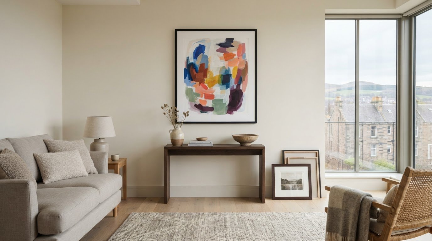
What if colourful abstract art could make a neutral room feel more considered, not less calm? The right piece adds warmth and personality to pared-back surroundings, but bold colour can feel risky if it clashes with warm or cool finishes, dominates the space or looks different once framed. Colourful abstract art for neutral decor works best when you consider colour, scale and framing together.

This guide explains how to connect artwork with existing accents, judge its size and compare framing choices. First4Frames Gallery offers a wide selection of framed wall art, including Contemporary art prints, with bespoke frames individually crafted for each order. Unlike cheap standard frames that may not fit the artwork properly, a custom frame is made to suit the piece. Artwork is finished with 2mm float glass, chosen for its superior clarity compared with the perspex used by many competitors. Use the Wall art visualiser to visualise art on your wall and see artwork before you buy, so you can assess your choice in context.

Key Takeaways

  • Use colourful abstract art for neutral decor as a deliberate accent that adds energy while preserving the room’s calm foundation.
  • Match artwork to warm, cool or mixed neutrals. Complementary or neighbouring shades on the colour wheel can guide your choice, but they are not rules.
  • Measure the wall, consider nearby furniture and compare proportions to find artwork that suits the space.
  • Compare Giclée prints, Fine art, Photography prints and framed artwork by palette, print style, dimensions and frame choices.

Why colourful abstract art works in neutral decor

Colourful abstract art creates a deliberate focal point against restrained walls, floors or furnishings. It can bring energy to a room without asking you to change its neutral foundation. Contrast makes a neutral interior feel more personal by giving the eye a vivid detail to return to, while the surrounding calm keeps the artwork in balance.

Start by identifying the room’s undertones. Cream, beige and warm stone tend to feel softer and more sunlit; grey and many off-whites tend to feel cooler. This distinction can guide your palette. Warm neutrals often sit comfortably with earthy reds, ochres or greens, while cooler ones can complement blues and cleaner, sharper accents. Treat these as starting points, not strict rules.

What makes abstract art a natural fit for neutral rooms?

Non-representational shapes and colour bring character without tying the room to a specific subject or decor theme. A flowing composition can add movement, while blocks of colour create a more structured focal point. If you’re curious about the history and forms of abstract art, exploring its variety can help you identify the kinds of compositions you’re drawn to.

Abstract prints are one option among other styles, including Coastal wall art, Landscape wall art and Scottish landscape art. Choose based on the mood you want, rather than assuming a neutral room needs artwork that blends in.

Choose a colour mood before choosing the print

Look around the room first. Echo a shade already present in a cushion, rug or vase to connect the artwork with its surroundings. Or introduce one purposeful accent colour and let the print become the room’s main point of contrast. Repeating a small detail of that colour elsewhere can make the choice feel deliberate.

For a quieter effect, choose tonal artwork with colours close to the room’s existing palette. Higher-contrast Contemporary art prints make a bolder statement, particularly against plain walls. Neither approach is inherently better. Consider how much visual energy you want, then choose a print that complements the room rather than competing with it.

How to match colourful abstract art to your neutral palette

Before choosing a print, look at the undertones in the room’s largest surfaces, such as the sofa, flooring and walls. Undertones influence how artwork colours appear: a shade can look warmer or cooler depending on the neutral colours and light around it. Use the guide below to narrow your palette, then treat it as inspiration rather than a formula.

Warm neutrals: Cream, beige and warm stone pair naturally with related warm accents. A measured cool contrast can add definition.

Cool neutrals: Grey and cool off-white can support vivid colour, gentle tonal combinations or a mix of warm and cool shades.

Mixed palettes: If warm and cool finishes sit together, look for artwork with a colour note that connects both sides.

The colour wheel can help refine your choice. Complementary colours sit opposite each other and create stronger contrast; analogous colours sit beside each other and tend to feel more harmonious. Neither approach is a rule. For more on how colour shapes interiors, explore this overview of color theory in interior design. Look for one or two colours already present in the room to create a visual link. Exact matches aren’t necessary: a similar tone can help the composition feel at home without repeating every accessory.

Compare colour intensity before committing

A print with one vivid focal colour makes a clear statement, while several softer colours spread interest across the composition. Consider which effect suits the room’s existing visual activity. Daylight and artificial lighting can change how colours appear, so compare artwork in the space where it will hang, at different times if possible.

Use the Wall art visualiser to Visualise art on your wall and See artwork before you buy. Previewing the work in context can help you judge its palette more practically than viewing it on a screen alone. For more ideas on selecting artwork and its presentation, browse this gallery of framed art as you consider colourful abstract art for neutral decor.
Colourful Abstract Art for Neutral Decor: Buying Guide

How to choose the right size and frame for colourful abstract art

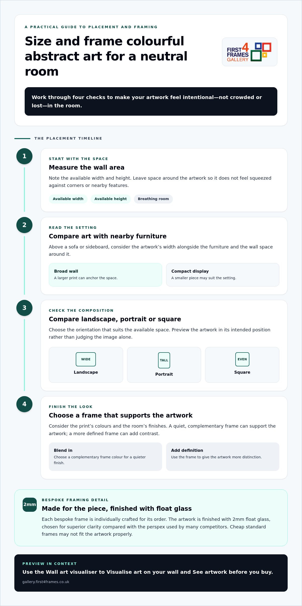
Good proportions help colourful abstract art feel intentional rather than crowded or lost. Work through these steps before settling on a print:

  1. Measure the wall area. Note the available width and height, leaving space around the artwork so it doesn’t feel squeezed against corners or nearby features.
  2. Consider nearby furniture. Above a sofa or sideboard, compare the artwork’s width with the furniture and the wall space around it. A larger print can anchor a broad wall; a smaller piece may suit a compact display.
  3. Compare proportions. Check whether a landscape, portrait or square composition suits the space. Preview it in its intended position rather than judging the image alone.
  4. Choose a frame. Consider the print’s colours, the room’s finishes and whether the frame should blend in or add definition.

Make artwork scale feel balanced above furniture

Stand back and assess the whole arrangement, including the furniture beneath it and any surrounding objects. A print can look generous on screen but feel undersized above a wide sofa, or overwhelm a narrow wall. The picture frames guide offers further help with display choices. A Wall art visualiser can also help you preview the work in its intended position and judge the overall balance.

Use framing to connect art with the room

A frame in a quiet, complementary colour can support the artwork without competing for attention. A darker or more defined profile can sharpen its contrast against pale walls. With Online picture framing, you can Design your framed artwork by comparing frame choices. Every First4Frames frame is individually crafted for the order using high-quality materials, unlike cheap standard frames that may not fit the artwork properly. The framed work uses 2mm float glass for superior clarity compared with the perspex used by many competitors. For a tailored finish, explore framed art and bespoke options, including Bespoke framed wall art.

Where to find colourful abstract art for neutral decor

Compare artwork by more than its dominant colour. Consider palette, print style, dimensions and frame choices together, since each affects how the finished piece will sit in your room. The selection includes Giclée prints, Fine art, Photography prints and Contemporary art prints, as well as work by Best-selling artists and Famous artists. Custom framed art prints bring your chosen image and frame together as one considered piece.

Browse and visualise framed abstract artwork

Online picture framing makes it easier to compare print and frame combinations. As you browse, consider how the artwork’s colours and dimensions work with different frame options. Choose your frame online and use the Wall art visualiser to picture the combination in your room. Explore colourful framed wall art to compare abstract prints and other styles in context.

An Art print framing service brings a selected print and frame together. First4Frames also offers a print-and-frame option for digital photographs, with high-quality printing chosen to complement the bespoke framing.

Turn a considered choice into framed art

The gallery brings together work from its artist selection, Giclée fine art prints, ready-to-hang framed art and bespoke framing. This joined-up approach lets you explore artwork and consider its finished presentation as part of the same decision. Finished frames are fully packaged to help prevent damage and shipped via professional couriers.

A considered print, a well-fitted frame and protective delivery bring colour to your room with care from selection to arrival. Explore the gallery’s framed art and prints to find a piece that feels right for your space.

Let your artwork make the room your own

A neutral room can be a living backdrop, ready to evolve as your taste changes. Rather than aiming for a perfectly coordinated finish, choose a piece you’ll enjoy seeing each day. The most lasting choice may be the one that makes you pause, sparks a memory or brings a little of your personality into the space.

Give yourself room to explore before deciding. Compare different compositions and colour moods, then picture how each might feel in your home over time. The right colourful abstract art for neutral decor doesn’t simply fill an empty wall; it can become part of how you experience the room, whether you’re settling in for a quiet evening or welcoming friends.

Explore colourful abstract prints and framed art to find a piece that speaks to you. Trust your eye, compare the options and choose the artwork you’ll love living with.

Frequently Asked Questions

Can colourful abstract art work in a small neutral room?

Yes, colourful abstract art can suit a small neutral room. Consider the clear wall area and how much visual activity already comes from furniture, rugs and fittings. A compact print can provide a focused accent, while a larger statement piece may become the room’s main feature. Compare both at the intended height and position, leaving enough surrounding wall space for the artwork to breathe.

How do I choose abstract art for a beige or grey room?

For colourful abstract art for neutral decor, first check whether the beige or grey feels warm, cool or balanced in your room. Then choose colours that harmonise with that undertone or create a deliberate contrast. Pick out one existing shade, perhaps from a cushion or rug, as a visual bridge. View the print under your room’s lighting. Exact colour matches aren’t needed for a cohesive effect.

Will colourful abstract art go out of style?

Art doesn’t have to follow a trend to feel current. Its staying power depends more on whether you enjoy looking at it and whether it sits comfortably with the room. Consider how you might feel about the piece if you changed cushions, throws or other accessories. Choosing artwork for a colour combination you genuinely love gives you more freedom than buying solely to keep pace with a passing style.

Should the frame match the colours in abstract artwork?

No. A frame can pick up one colour in the artwork, recede into the room’s finishes or create a crisp outline that strengthens contrast. Rather than matching every shade, compare the complete framed piece with the wall and nearby furniture. Use the visualiser to test how the frame’s tone and profile affect the composition in place, especially if the artwork has several competing colours.

Can I have a digital photograph printed and framed to suit neutral decor?

Yes. A personal digital photograph can be printed and framed as wall art, with its colours considered alongside your neutral decor. First4Frames’ print-and-frame service pairs high-quality printing with bespoke framing, so the image and its presentation are considered together. For example, a photograph with a small accent of colour can tie in with cushions or ceramics. Choose a frame that supports both the image and its surroundings.
Posted on

Understanding Art Print Edition Numbers: A Clear, Practical Guide

Understanding Art Print Edition Numbers: A Clear, Practical Guide

A lower number on an art print doesn’t automatically make it better or more valuable. If you’ve looked at a mark such as 7/50 and wondered what the two numbers mean, you’re not alone. Understanding art print edition numbers starts with separating what the mark records from what it can’t tell you: the first number usually identifies the print’s place in the edition, while the second gives the edition’s stated size. Practices vary, so the surrounding artwork information matters too.

This guide explains how to read the numerator and denominator, what edition size tells you, and how limited editions differ from open editions. You’ll also learn why a number alone can’t establish a print’s quality or value, and which other details to consider when choosing artwork. With a clearer picture of the edition, you can explore fine art prints with more confidence and plan how the artwork will look in your home.

Key Takeaways

  • Understanding art print edition numbers helps you interpret edition details, but the number isn’t a measure of quality or value.
  • Distinguish limited editions from open editions, and remember that different sizes or print processes may have separate edition counts.
  • Read edition numbers alongside other artwork details. Signatures and proof marks provide different information, and conventions can vary.
  • Choose artwork that speaks to you, then use edition details as context while exploring themes such as Scottish landscape art, coastal wall art and contemporary art prints.

What Do Art Print Edition Numbers Mean? Read the Mark at a Glance

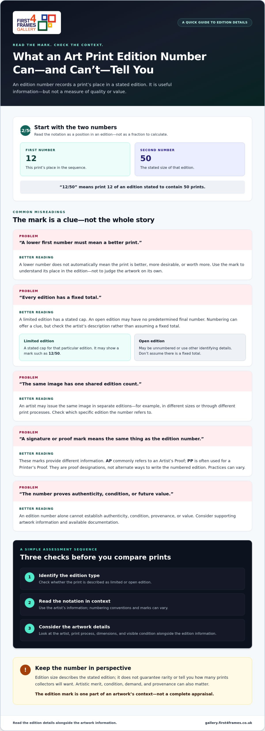
Edition numbers identify a print’s position within a stated edition. A mark such as 12/50 commonly means that the print is number 12 in an edition of 50. The first number identifies its place in the sequence; the second gives the stated edition size.

Edition size is the total number of prints stated as belonging to a particular edition. It describes the edition, but doesn’t guarantee rarity or tell you how many prints collectors will want. A lower first number doesn’t automatically mean the print is better, more desirable or worth more. Understanding art print edition numbers helps you read the notation, not judge the artwork by the mark alone.

How to read a number such as 12/50

If a print is numbered 12/50, read it as “print 12 of an edition stated to contain 50 prints”, not as a fraction to calculate. The artist’s information provides the best context for interpreting the number. If the mark is unclear or uses a different format, look for the accompanying artwork details rather than assuming the usual convention applies.

Where edition details may appear

Numbering is often written in the print’s margin, the unprinted border around the image. Edition information may also appear on an accompanying label, certificate or artwork description. Signatures and other marks are separate details. For example, an Artist’s Proof is a distinct printmaking designation, not another way of writing the edition fraction.

Artists and printmaking practices vary, so the placement, wording and marks aren’t universal. Read the number alongside the artist’s description to understand what the stated edition covers. This provides useful context, while print quality and personal appeal should be considered on their own merits.

Limited Edition vs Open Edition Prints: What the Number Tells You

A limited edition has a stated cap for that particular edition. An open edition may have no predetermined final number, so it can be produced without the same declared limit. Numbering can offer a clue, but the artist’s description is important because practices and ways of presenting edition details vary.

Edition type
Numbering clue
Sensible interpretation
Limited edition
May show a fraction such as 12/50
The stated edition has a defined cap
Open edition
May be unnumbered, or use other identifying details
Don’t assume there’s a fixed total

Does a smaller edition mean a more valuable print?

Not by itself. A smaller edition may mean fewer prints were made in that particular run, but scarcity is only one part of a print’s context. Artistic merit, condition, demand and provenance can all matter. No edition number guarantees authenticity or future resale value. Christie’s collecting guide offers further context on prints and multiples, including the idea of an original print. Treat the edition mark as useful information, not a promise of price.

Can one artwork have more than one edition?

Yes. An artist may issue the same image in separate editions, for example in different sizes or through different print processes. Don’t assume that the numbers belong to one shared count. Check the details for the specific print to see which edition its number refers to.

Once you understand what an edition label can tell you, explore artwork that suits your space and taste in the online art print gallery.

Understanding Art Print Edition Numbers: A Clear, Practical Guide

How to Assess Art Print Edition Details Before You Choose

Use this sequence to assess edition information without reading too much into the number:

  • Identify the edition type. Check whether the print is described as limited or open edition.
  • Read the notation. Interpret the number using the artist’s information, rather than assuming every mark follows the same convention.
  • Check the artwork details. Consider the artist, print process, dimensions and visible condition alongside the edition information.

Signatures, proof marks and edition numbers are different details. A signature may identify or be attributed to the artist, while a proof mark describes a print’s relationship to the edition or production process. Their use can vary between artists and printmaking practices. Christie’s collecting guide offers further background on limited editions and how prints are made.

What do AP, PP or other proof marks mean?

AP commonly refers to an Artist’s Proof, while PP is often used for a Printer’s Proof. These are proof designations, not alternative ways of writing the numbered edition. Interpret them alongside the specific artwork information. Their meanings, use and numbering practices can differ, so don’t assume a universal quantity or significance from the letters alone.

What edition numbers cannot prove on their own

An edition number by itself doesn’t establish authenticity, condition, provenance or value. It tells you something about a print’s place in a stated edition, but it can’t provide a complete account of the artwork. Look for supporting information that identifies the artist, process and edition, and consider any available documentation. This broader context makes understanding art print edition numbers more useful when comparing prints.

An edition number is one part of an artwork’s context, not a complete appraisal. Keep that in mind as you browse the art print and framed art gallery, weighing the edition details alongside the image that feels right for your space.

Choose and Display an Art Print with Confidence

Choose a print because you enjoy looking at it, then use its edition details as context. Understanding the number can inform your decision, but it needn’t outweigh the image or how it will look in your home. Explore fine art, Scottish landscape art, coastal wall art, photography prints and contemporary art prints. A wall art visualiser can help you visualise art on your wall and see artwork before you buy.

Pair a print with a considered frame

A well-chosen frame completes an artwork’s presentation without changing what its edition number means. First4Frames Gallery creates bespoke framed wall art, with each frame individually crafted to order from high-quality materials. Unlike cheap, standard frames that may not fit artwork properly, a bespoke frame is made for the individual order. With Online picture framing, you can Choose your frame online and Design your framed artwork to suit the print and your space. The Art print framing service uses 2mm float glass, offering superior clarity to the perspex used by many competitors.

Explore artwork and plan the finished display

Browse an extensive online selection of artwork and frames, including framed wall art featuring works by best-selling artists and famous artists. Find Custom framed art prints and consider how the frame will complement the image. For digital photographs, the online photo printing and framing service combines high-quality printing with bespoke framing. Finished framed orders are fully packaged to help prevent damage and shipped via professional couriers.

Explore the framed art and print gallery to find an image that feels right for your space.

Choose a Print That Feels Right for Your Space

Understanding art print edition numbers gives you a useful starting point: the first figure commonly shows a print’s position, while the second indicates the stated edition size. The mark alone doesn’t prove a print’s quality, authenticity or future value. Read it alongside the artwork information, and remember that edition practices can vary.

Use those details as context, then let the image, artist and the way it will look in your home guide your choice. First4Frames Gallery offers Giclée fine art prints from a range of artists, primarily from Scotland, with bespoke frames individually crafted for each order using high-quality materials. Thoughtful framing helps the chosen artwork feel at home on your wall.

Ready to find an image that speaks to you? Explore framed art prints in the gallery and discover artwork you’ll be glad to display.

Frequently Asked Questions

What does 12/50 mean on an art print?

12/50 commonly means print number 12 in a stated edition of 50. The first number identifies the print’s place in the edition, and the second gives the edition size. Read the notation alongside the artist’s description because numbering practices can vary. The mark provides edition context, but it doesn’t by itself tell you about the print’s quality or value.

Is a lower-numbered art print more valuable?

No. A lower number doesn’t automatically make a print more valuable. A number such as 2/50 records its position in the edition, not its quality or desirability compared with 28/50. Value can depend on factors such as the artist, demand, condition and provenance. Treat the number as one piece of information, not a guarantee of a particular price or future resale value.

What is the difference between a limited edition and an open edition print?

A limited edition has a stated cap for that particular edition. An open edition may not have a predetermined total, so it can be produced without the same declared limit. The artwork’s description should clarify which type it is. Artists may also issue separate editions for different sizes or print processes, so don’t assume all versions share one edition count.

Do all art prints have edition numbers?

No, not all art prints are numbered. Open editions may be unnumbered, and artists or printmaking practices can use different ways to identify a work. You may find information in an artwork description or accompanying documentation instead. If a print has no edition number, that alone doesn’t establish its quality, authenticity or value. Consider the artwork details as a whole.

What does AP mean beside an art print edition number?

AP commonly stands for Artist’s Proof, a proof designation associated with the artist and distinct from the numbered edition. It may appear beside a print rather than as a fraction such as 12/50. Proof practices and meanings can vary by artist and print process, so interpret the mark using the accompanying artwork information. An AP mark alone doesn’t prove greater quality or value.

Posted on

Elevate Your Space with Framed Photography Wall Art

Elevate Your Space with Framed Photography Wall Art

The most breathtaking landscape photograph in the world can look like a cheap supermarket poster if it’s trapped behind scuffed plastic and a flimsy, warping frame. You’ve likely felt the disappointment of buying a piece of photography wall art only to watch the colours fade or the glazing cloud over within a year. It’s frustrating when an investment meant to inspire your home ends up feeling like a temporary fixture. You deserve a piece that looks as vibrant on your wall as it did in the artist’s eye.

This guide will show you how to move beyond mass-produced alternatives and secure a gallery-standard finish that lasts a lifetime. We’ll explore the science of archival Giclée prints, the unmatched clarity of 2mm float glass, and the secrets to choosing bespoke framing that truly honours the artist’s vision. From Scottish landscapes to contemporary fine art, you’ll learn how to transform your space with professional quality that supports specialised artists and preserves your investment for decades.

Key Takeaways

  • Learn the technical differences between temporary posters and investment-grade photography wall art, focusing on archival Giclée inks and fine art papers.
  • Discover the benefits of bespoke, hand-made framing and why 2mm float glass provides superior clarity and protection over standard plastic glazing.
  • Master the use of a wall art visualiser to accurately preview Scottish landscapes or contemporary styles in your home before making a purchase.
  • Explore how to transform your personal digital files into professional, ready-to-hang art through a high-quality print and frame service.

Beyond the Poster: Defining High-Quality Photography Wall Art

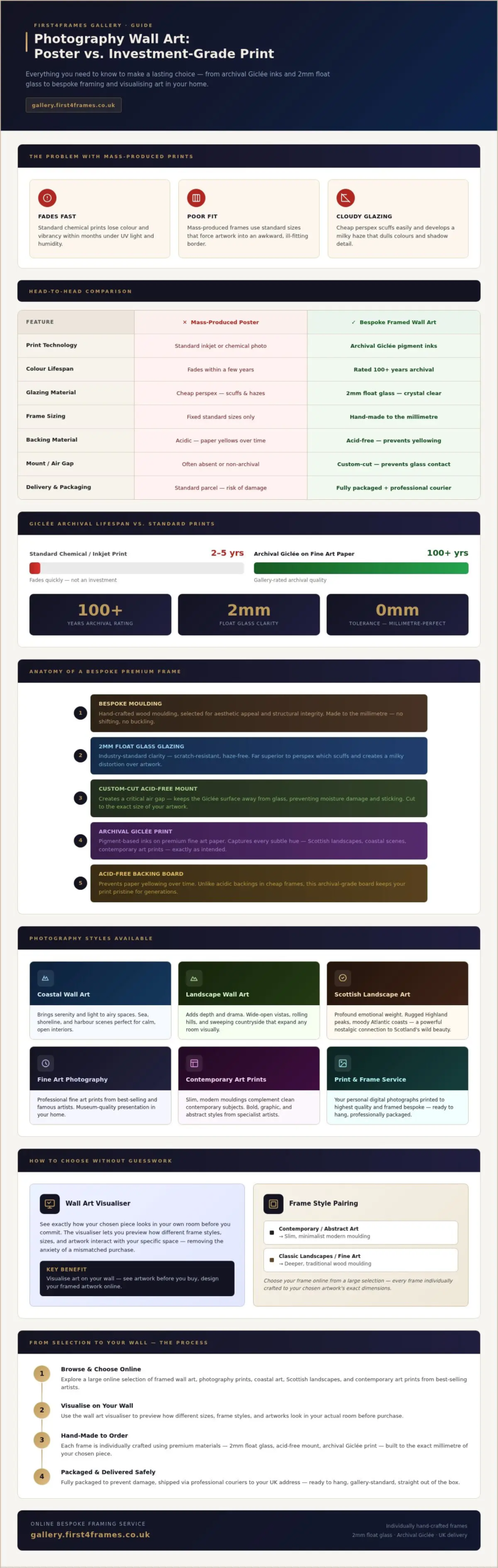
Moving from temporary posters to professional photography wall art is a shift from disposable decor to a lasting home legacy. While a standard high-street poster might look acceptable initially, it often succumbs to UV light and humidity within months. True fine art photography relies on three pillars: archival materials, professional intent, and precision craftsmanship. It isn’t just a picture on a page; it’s a carefully curated object designed to remain vibrant for decades.

Many homeowners assume all framed prints are essentially the same. This is a common misconception. A high-quality frame isn’t just a border; it acts as a protective micro-environment. It shields the delicate print surface from dust, pollutants, and rapid temperature changes. We ensure this protection by using 2mm float glass rather than the cheap perspex found in budget frames. This provides superior clarity and prevents the scuffing that often ruins the view of your artwork. Unlike mass-produced alternatives that use acidic backings, bespoke framing uses acid-free materials to prevent the paper from yellowing over time.

The Longevity of Giclée Fine Art Prints

The real difference lies in longevity and fidelity. While standard prints might lose their punch and start to fade within a few years, Giclée prints on archival paper are rated to last upwards of 100 years under normal gallery conditions. This ensures your investment in photography wall art remains a stunning focal point in your home for generations. Choosing these standards ensures the artist’s vision is preserved exactly as intended, without the colour shifts common in cheaper alternatives.

The Anatomy of Premium Bespoke Framed Wall Art

A professional frame is more than just four pieces of wood; it’s a precision-engineered system. When you invest in Photography wall art, every component must work in harmony to protect and present the image. This begins with the moulding, selected for both its aesthetic appeal and structural integrity. Unlike mass-produced frames found in big-box stores, our bespoke frames at First4Frames Gallery are individually hand-made to the millimetre. This ensures a perfect fit, preventing the artwork from shifting or buckling as the environment changes.

The mount is another critical element. It isn’t just for visual breathing room; it creates a vital air gap. This custom-cut barrier prevents the print from touching the glass, protecting the delicate Giclée surface from moisture and potential sticking. While competitors use standard sizes that often force your art into an awkward fit, bespoke framed wall art is tailored by First4Frames Gallery to the specific dimensions of your chosen piece. This artisanal approach reflects a deep pride in workmanship that standard retail options simply can’t match.

The Clarity Advantage: 2mm Float Glass vs. Perspex

2mm float glass is the industry standard for superior clarity and scratch resistance. Many online competitors opt for perspex because it’s cheaper and lighter to ship, but it fails the user long-term. Perspex scuffs easily and often develops a distracting “milky” haze that dulls the vibrant colours and deep shadows of your photography prints. In contrast, 2mm float glass enhances depth and fidelity for your Photography wall art, ensuring your view remains crystal clear for a lifetime. To protect this investment, we fully package each finished frame and use professional couriers to ensure it arrives safely at your UK address.

Elevate Your Space with Framed Photography Wall Art

Choosing and Visualising Your Photography Style

Selecting the right Photography wall art involves more than just picking a pretty picture. It’s about finding a piece that speaks to your personal journey and matches your home’s atmosphere. Coastal wall art brings a sense of serenity and light to airy spaces, while Landscape wall art adds depth and drama. Scottish landscape art carries a profound emotional weight; it often serves as a nostalgic connection to the rugged beauty of the Highlands or the moody Atlantic coast, making it a powerful choice for both personal decor and professional home staging. If you are looking to elevate your property marketing with bespoke visual content, you can check out Framework Creative for professional media services.

To remove the guesswork, use our wall art visualiser to see artwork before you buy. This tool lets you see how different dimensions and frame styles interact with your specific room layout. It reduces the anxiety of a mismatched purchase and helps you determine the right scale for your furniture. When choosing a frame, consider the subject. A minimalist contemporary print often pairs best with a slim, modern moulding, whereas a classic landscape might benefit from a slightly more substantial, traditional profile that adds a sense of history and gravitas.

Designing Your Framed Artwork Online

Our online picture framing service at First4Frames Gallery makes it simple to customise every detail. You can choose your frame online, selecting from a vast library of high-quality mouldings that we hand-craft in our Falkirk workshop. This bespoke framed wall art approach ensures that your chosen piece isn’t just another mass-produced item; it’s a unique addition to your home crafted to your exact specifications.

Our art print framing service allows you to create custom framed art prints that fit your exact wall space. First4Frames Gallery collaborations with best-selling artists provide exclusive access to unique photography prints that you won’t find in high-street shops. Whether you’re looking for contemporary art prints or works by famous artists, our system allows you to design your framed artwork with precision. Browse our full collection and visualise art on your wall today to find the perfect match for your interior.

From Digital File to Wall: The Art Print Framing Service

Your digital memories deserve better than a basic gloss print from a high-street kiosk. Our professional art print framing service transforms your personal files into gallery-standard Photography wall art. We use the same pigment-based Giclée process for your family portraits or holiday snapshots that we use for our professional Scottish landscape collections. This ensures that your personal memories don’t fade or lose their vibrancy as the years pass. It’s about turning a fleeting digital moment into a permanent fixture of your home.

The journey from file to wall is straightforward and transparent. You start by uploading your image to our secure platform. Next, you select a frame that complements your interior. Our system allows you to visualise the final result before we begin the physical build. Once you’re happy, our artisans at First4Frames Gallery hand-craft your frame to the exact millimetre. We don’t use stock sizes or flimsy materials. Every piece is finished with 2mm float glass for unmatched clarity, ensuring your photos look sharp from every angle.

We take the stress out of the logistical side. Each finished frame is meticulously packaged with protective corners and robust outer layers to prevent transit damage. We ship across the UK using professional couriers who understand how to handle delicate, glass-fronted artwork. This ensures your order arrives ready to hang and in perfect condition.

Bespoke Photo Frames for Your Own Memories

Professional framing elevates a simple family photo into a sophisticated piece of bespoke framed wall art. It adds a layer of permanence and style that mass-produced retail frames simply can’t match. To get started, visit our Photo Printing and Framing Online page. Before you upload, ensure your digital file is high-resolution to achieve the best results for your chosen print size.

Transform Your Home with Professional Artistry

Investing in professional Photography wall art is about more than just filling a gap on a wall. It’s a commitment to preserving a visual story with the highest standards of craftsmanship. By choosing archival Giclée prints and bespoke frames, you ensure your chosen landscape or family memory remains vivid for decades. We take pride in every piece being hand-made in our Falkirk workshop; specifically using premium 2mm float glass to offer the clarity your art deserves. You don’t have to settle for the scuffs and haze of plastic alternatives when gallery-standard quality is so accessible. This level of care guarantees that your investment is protected from the moment it leaves our hands.

Ready to find your perfect piece? Browse our Gallery of Bespoke Framed Photography Wall Art and discover how our secure UK-wide courier delivery brings artisan excellence straight to your door. Our team is dedicated to helping you create a space that feels both inspired and uniquely yours. Your home is a canvas; let’s fill it with something truly extraordinary.

Frequently Asked Questions

What is the difference between Giclée prints and standard photo prints?

Giclée prints offer a sophisticated matte or satin finish on heavy-weight archival paper, whereas standard photo prints are often glossy and highly reflective. This technical choice prevents distracting glares when your Photography wall art is placed near windows or bright indoor lighting. The pigment inks provide a wider colour gamut, capturing subtle textures and tonal transitions that standard chemical prints often miss.

Why does First4Frames Gallery use float glass instead of perspex for photography wall art?

Beyond superior clarity, 2mm float glass provides essential structural rigidity that prevents the frame from bowing over time. Perspex is a flexible plastic that can warp with temperature fluctuations, which often causes the mount to ripple or the print to touch the glazing. Glass remains perfectly flat, maintaining the protective air gap required for the long-term preservation of bespoke art.

Can I see how the art will look on my wall before I buy it?

Our visualiser tool allows you to upload a photo of your actual room to see how different frames complement your existing furniture and wall colour. This ensures the scale of your chosen Photography wall art is perfectly proportionate to your space. You can swap between different mouldings and mount colours instantly to find the perfect aesthetic balance before we begin the build.

How are large framed photography prints shipped safely to prevent glass breakage?

We use custom-made, heavy-duty double-walled boxes and internal shock-absorbing materials specifically designed for protecting fragile glass. Our courier partners are vetted for their expertise in handling high-value artwork across the UK. In the unlikely event of transit damage, our professional service includes full support to ensure a replacement is crafted and dispatched to you as a priority.

Do you offer custom framing for my own digital photography?

Our “print and frame” service is designed to handle high-resolution files, including JPEGs and TIFFs from professional cameras. During the upload process, our system automatically checks your file’s resolution to ensure it meets our quality standards for your requested dimensions. This allows you to turn personal milestones into gallery-grade art using the same artisanal materials we provide for professional artists.

Posted on

Gateway to the Mile Feels Fresh Among Contemporary Art Prints

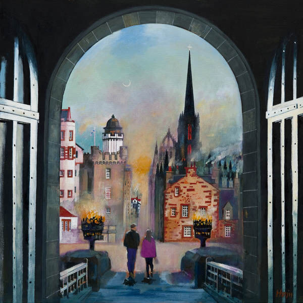
Gateway to the Mile": A painting of two people walking a dog beneath the iconic archway, with historic buildings and a church spire silhouetted against a twilight sky filled with warm lights and hints of mist.

The most convincing contemporary art prints tend to feel current without trying too hard. Gateway to the Mile does that very well. The image carries movement and city character, yet it still feels welcoming enough for a real home rather than like a design gesture that might date too quickly.

contemporary art prints - Gateway to the Mile

Why contemporary art prints work when they combine movement with place

Contemporary does not have to mean detached. Gateway to the Mile feels lively because it captures a recognisable route and a real urban rhythm. That gives the room energy, but it also gives the piece staying power because the image has more behind it than trend value alone.

This makes it a strong option for hallways, dining spaces, home offices, or sitting rooms that need a little more momentum without becoming visually hard.

Why Gateway to the Mile benefits from a careful final presentation

First 4 Frames handles the piece in-house with bespoke framing, colour-managed Giclee printing, and superior craftsmanship. That presentation helps the image feel polished and lasting, which is important when a more contemporary picture needs to look composed rather than merely busy.

You can browse more work by Rob Hain, visit Rob Hain, and view the exact framed product here.

If you are looking through contemporary art prints and want something lively, current, and easy to place, Gateway to the Mile stands out for the right reasons.

Posted on

Contemporary Art Prints, Why Going Up Feels So Architectural

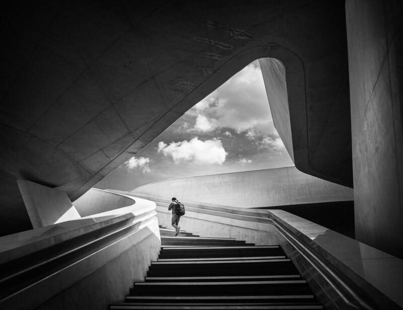
Image of Going Up by Noel Fenech Photography

Some contemporary art prints rely on colour to feel current. Going Up takes a different route. Its strength comes from architectural rhythm, black and white contrast, and the subtle presence of one ascending figure, which gives the image movement without turning it into visual noise.

That makes it a strong option for rooms that want a clearer edge and a more design-led focal point.

Why Architecture Works In Cleaner Schemes

In a pared-back interior, contemporary artwork often needs to add shape rather than decoration. The sweeping lines in Going Up do exactly that, giving the wall direction and energy while still feeling controlled.

  • It sharpens a room without adding extra colour clutter.
  • It creates momentum, which helps static spaces feel more alive.
  • It suits buyers who prefer contemporary work with real structure.

Rooms That Benefit Most

This piece would work especially well in a home office, hallway, stair landing, or study where a more architectural image can support focus and polish. It also makes sense in interiors with black metal, pale walls, glass, or cleaner-lined furniture because it speaks the same visual language without feeling too severe.

The human figure keeps the image from becoming purely abstract, which helps it feel more approachable in everyday spaces.

A Good Finish Stops It Feeling Cold

Monochrome work depends on tonal precision. If the printing and framing are weak, the contrast can either flatten or feel harsh. First 4 Frames handles the Giclee production and bespoke framing in-house, helping the finished piece keep its depth and authority.

You can view the framed product here, and see more by Noel Fenech Photography if you want photography with the same architectural clarity.

For buyers exploring contemporary art prints that feel disciplined, modern, and visually confident, Going Up is a strong place to start.