You’ve found the perfect piece of art, a spectacular print that speaks to you. Now comes the final, crucial decision: the frame. The thought of choosing a colour can feel overwhelming. Will it clash with your decor? Will a bold choice look dated in a few years? It’s a common fear that can stand between you and a truly stunning display. This is where the transformative power of custom colour picture frames comes in. A bespoke frame is more than just a border; it’s the bridge between your artwork and your living space, the final touch that ties everything together with professional flair.
In this ultimate guide, we demystify the world of colour. Forget the guesswork and anxiety; we’ll walk you through simple principles to help you select a hue that makes your artwork sing, complements your existing decor, and expresses your personal style. By the end, you’ll have the confidence to choose the perfect coloured frame with the ease of a seasoned professional and create a display that is uniquely and beautifully you.
Key Takeaways
- Learn how the right frame colour can dramatically alter the mood of your artwork and act as a beautiful bridge to your room’s decor.
- Discover a simple method using the colour wheel to confidently choose hues that either complement or contrast with your art.
- Find specific colour recommendations tailored to your home’s interior style, whether it’s modern, traditional, or eclectic.
- Follow our step-by-step process to confidently select bespoke custom colour picture frames that perfectly reflect your personal taste.
Why Go Beyond Black and White? The Power of a Coloured Frame
A picture frame is far more than a simple border; it’s a crucial design element that acts as a bridge between your artwork and your room’s decor. While classic black, white, or natural wood frames are timeless choices, they often play a supporting role. A coloured frame, however, does some of the heavy lifting. It has the power to dramatically alter the mood of a piece, draw the eye to specific details, and create a truly bespoke finish that is uniquely yours.
Choosing a custom colour is a professional interior design trick used to achieve a cohesive, polished look that feels intentional and thoughtfully curated. It’s an opportunity to transform the entire dynamic of your art-making a traditional piece feel excitingly modern or lending a classic, timeless quality to a contemporary print. To see how the right frame can transform a piece, take a look at this helpful video:
Make Your Artwork Pop
The right colour choice can elevate your art from beautiful to spectacular. By applying some basic color theory principles, you can create stunning visual effects. Consider these professional techniques:
- Create contrast: Use a complementary colour-opposite on the colour wheel-to make the artwork stand out. A deep orange frame around a blue-toned seascape creates a dynamic, energetic feel.
- Build harmony: Choose an analogous colour-one that sits next to the main colour in the art-for a unified, serene aesthetic. A soft green frame can beautifully complement a print dominated by blues and yellows.
- Pull an accent: Select a subtle, minor colour from within the artwork and use it for the frame. This expert touch draws attention to finer details and creates a sophisticated, cohesive look.
Create a Cohesive Room Aesthetic
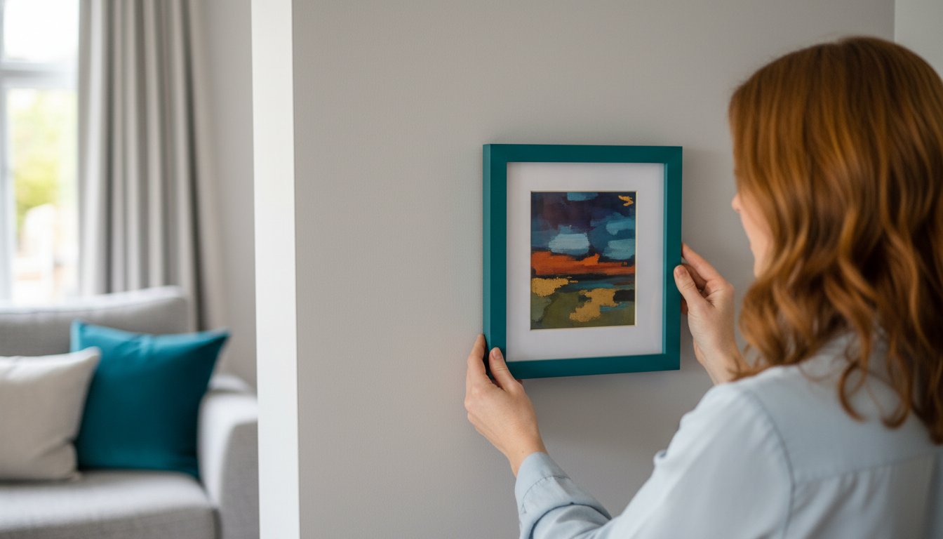
Custom colour picture frames are a powerful tool for unifying your interior design. Instead of treating the art as a separate entity, a coloured frame integrates it seamlessly into your space. You can match the frame to other accents in the room, such as cushions, a rug, or a statement vase, to tie the entire scheme together. In a neutral room, a bold, brightly coloured frame can become a stunning focal point. For a gallery wall, using a single, consistent custom colour across all frames creates a powerful, unified display, even with a diverse collection of art.
Express Your Unique Personality
Colour is deeply connected to emotion, and your choice of frame is a wonderful way to express your personal style. Moving beyond standard options allows you to create something truly bespoke that reflects you. A vibrant yellow frame can inject a sense of energy and optimism into a kitchen, while a deep, calming navy can add a touch of sophistication and tranquillity to a study or bedroom. Your home is your story, and a custom-coloured frame is the perfect finishing touch to help you tell it.
A Simple Guide to Colour Theory for Picture Framing
Choosing the perfect colour for your picture frame can feel daunting, but you don’t need an art degree to make a spectacular choice. Think of colour theory as a simple set of tools, not a rigid rulebook. The most important rule? Trust your own taste. A frame is the bridge between your art and your room, and selecting the right shade is a beautiful final touch to your piece. Let’s demystify the process with a few foundational concepts.
Understanding the Colour Wheel
The colour wheel is your best friend in this journey. It’s a visual map that shows the relationships between colours, making it easy to create beautiful pairings. Here are the key combinations to know:
- Complementary Colours: These are opposites on the colour wheel (like blue and orange, or red and green). A complementary frame creates high contrast, making the artwork pop with energy and impact. It’s a bold choice that draws the eye.
- Analogous Colours: These colours sit next to each other on the wheel (like blue, green, and teal). An analogous frame colour creates a serene and harmonious effect, blending beautifully with the artwork for a calm, cohesive look.
Warm vs. Cool Tones: Setting the Mood
Colours have a temperature that influences the mood of both the artwork and the room. Warm colours like reds, oranges, and yellows feel energetic, cosy, and intimate. Cool colours such as blues, greens, and purples create a sense of calm and spaciousness. A professional touch is to match the frame’s tone to the dominant temperature of the artwork. This is where bespoke custom colour picture frames truly shine, allowing you to find the perfect shade. This principle also extends to your home; a deeper understanding of matching frame to your interior design helps create a perfectly curated space.
The Versatility of ‘Coloured’ Neutrals
When you think of a neutral frame, you might picture only black or white. But the world of neutrals is far richer. Consider the soft sophistication of a charcoal grey, a warm off-white, or a gentle beige. These ‘coloured’ neutrals offer a more subtle and deliberate alternative to stark basics. A warm cream frame can soften a piece without disappearing, while a deep grey provides grounding and depth. These are the perfect choices when you want your custom colour picture frames to support the art with quiet confidence rather than competing for attention.

Matching Frame Colour to Your Interior Design Style
A beautifully chosen frame does more than just protect your artwork; it acts as a crucial bridge between the piece itself and your room’s decor. Choosing from a range of custom colour picture frames allows you to harmonise your space, create a stunning focal point, or add a subtle layer of personality. Before you decide, consider the overall feeling you want to achieve. Are you aiming for calm and serene, or vibrant and energetic? Let’s explore how to select the perfect frame colour for your interior design style.
For Minimalist & Scandinavian Homes
In a space defined by simplicity and light, a frame should enhance, not overwhelm. Soft, muted tones like sage green, dusty blue, or a pale, warm grey add a subtle point of interest without disrupting the calm. A thin frame profile in a custom colour adds a delicate touch, while a natural wood frame with a light colour wash can introduce texture and warmth, perfectly aligning with the Scandi love for natural materials.
For Bold, Maximalist & Eclectic Spaces
This is where you can truly have fun with colour! Maximalist and eclectic interiors thrive on personality and contrast. Don’t be shy-embrace vibrant, saturated hues like emerald green, deep teal, or a striking mustard yellow to make your art pop. This style is the perfect canvas for high-contrast, complementary colour choices. Consider mixing and matching different bold colours on a gallery wall to create a dynamic and truly personal display.
For Traditional & Farmhouse Interiors
These styles call for colours with depth and a sense of history. Rich, classic shades such as navy blue, deep burgundy, or a timeless forest green lend an air of sophistication and cosiness. Remember that stained wood absolutely counts as colour; warm cherry or deep walnut tones add elegance. For a more rustic farmhouse feel, a frame with a distressed or antiqued colour finish can provide that perfect touch of lived-in charm.
Ultimately, the goal is to create a cohesive look that feels uniquely yours. Our bespoke framing service ensures you can achieve that perfect balance, making your art feel completely at home. See how our beautiful framed prints can be tailored to suit any style and bring your vision to life.
Step-by-Step: How to Choose Your Custom Frame Colour
Choosing the perfect hue for your frame can feel daunting, but it doesn’t have to be. This simple, step-by-step guide transforms theory into a clear action plan, removing the guesswork and ensuring you select a colour with confidence. By following this structured approach, you can create a beautiful, cohesive look that you’ll love for years to come.
Step 1: Analyse the Colours in Your Artwork
Your artwork is the star of the show, so begin by looking at it closely. Take a photo in good, natural light to use as a reference. Identify the main, dominant colour and then pick out two or three secondary or accent colours. Now, decide on your goal:
- To blend: Choose a neutral shade from the artwork, like a soft grey, cream, or off-white.
- To stand out: Pull out a bold accent colour from the piece to create a dynamic, eye-catching effect.
Step 2: Consider the Room’s Colour Palette
A frame acts as a bridge between your art and your decor. Look at your wall colour, furniture, and key accessories like cushions or rugs. A frame that matches a secondary colour in the room creates a wonderfully unified feel. For a more dramatic, gallery-style look, choose a frame that contrasts with the wall. A frame painted the same colour as the wall can create a stunning ‘floating’ effect, making the artwork itself the sole focus.
Step 3: Factor in Material and Finish
The same colour can appear dramatically different depending on its finish. The texture and sheen of your frame play a huge role in the final look of your custom colour picture frames. Consider what best suits your art and your space:
- Matte Finish: Offers a contemporary, non-reflective surface that minimises glare and feels understated.
- Satin Finish: Provides a subtle, soft sheen that adds a touch of elegance without being overpowering.
- Gloss Finish: Creates a bold, high-impact statement, reflecting light for a formal and polished look.
Step 4: Order a Sample (If Possible)
Colours on a screen can vary significantly from their real-life appearance. We always recommend seeing a physical sample of the frame colour in your home. This allows you to check it against your artwork and wall, observing how it looks in your home’s unique lighting throughout the day. If you’re unsure, our experts are here to help guide you to the perfect choice. Contact us for a framing consultation.
Bring Your Vision to Life with the Perfect Hue
Choosing a frame is no longer a simple choice between black and white. As we’ve explored, the right colour acts as a bridge between your artwork and your space, elevating both in perfect harmony. By understanding colour theory and your own interior style, you can select the perfect hue for your custom colour picture frames, turning a cherished image into a spectacular focal point for any room.
At First4Frames Gallery, our passion is helping you find that perfect match. With over 20 years of expert framing experience and a commitment to using only premium, high-quality materials, we ensure a lasting, beautiful finish for your pieces. Based in Falkirk, our team of skilled artisans is proud to serve art lovers across Scotland and the entire UK.
Ready to create your perfect piece? Explore our custom framing options. Embark on your journey to a beautifully framed home today.
Frequently Asked Questions
Should a picture frame be lighter or darker than the artwork?
There is no strict rule, but the goal is to enhance the artwork, not overpower it. A frame darker than the art can create a rich, defined border that draws your eye inward. Conversely, a lighter frame can give the piece a more open, airy feel. For a beautifully balanced approach, consider choosing a mid-tone colour found within the artwork itself. This creates a harmonious bridge between the art and its surroundings.
What is the most popular colour for picture frames besides black and white?
Beyond the classics, natural wood finishes like oak remain exceptionally popular for the warmth and texture they bring to a room. Metallic frames, especially in soft gold, champagne, or silver, are also a timeless choice for adding a touch of elegance. We’re also seeing a wonderful trend towards deep, sophisticated hues like navy blue and forest green, which provide a spectacular pop of colour while still feeling classic and refined.
Should the picture frame match the wall colour?
We generally advise against a perfect match, as this can cause your artwork to blend into the wall. Instead, create a subtle and sophisticated contrast. Choose a frame that is a few shades lighter or darker than your wall colour to give the artwork definition. Another excellent strategy is to select a frame colour that picks up an accent shade from your room’s decor, such as from a cushion or rug, to create a cohesive, professionally styled look.
Is it okay to use different coloured frames in the same room?
Absolutely! Mixing different coloured frames is a fantastic way to create a dynamic and personal gallery wall that reflects your unique style. The key to a cohesive look is to maintain a unifying element. This could be a consistent mount colour, the same frame profile in various colours, or a shared colour palette that runs through the artwork itself. This approach adds wonderful visual interest and turns your wall into a bespoke feature.
How do I choose a frame colour for a black and white photograph?
For a timeless, gallery-style look, you can’t go wrong with a simple black, white, or charcoal grey frame to complement the tones in a monochrome photograph. However, this is also a perfect opportunity to be bold. Choosing one of our vibrant custom colour picture frames can create a stunning modern statement and connect the photograph to your room’s decor. A bright yellow or deep red frame can make your black and white art truly pop.
Can you paint an existing picture frame a different colour?
Yes, you can paint an old frame, but achieving a flawless, professional finish requires careful preparation, including thorough sanding and priming. For a truly durable result that honours your art, we recommend a bespoke solution. Ordering a new frame from our workshop ensures premium materials and expert craftsmanship, giving you the perfect, lasting finish without the time and effort of a DIY project, guaranteeing a perfect match every time.
The same logic applies to other custom color projects in your home. For example, professionally refinishing kitchen cabinets can completely transform a space, and just like with picture frames, an expert finish makes all the difference. For inspiration on how custom color can revitalize cabinetry, see the project galleries at cabinetrefinishing.info.