The wrong frame can actually diminish the visual impact of a significant investment in original British art. It’s a common frustration to stand before a freshly painted wall, worried that a frame chosen today will look hopelessly dated by 2027. You likely want a space that feels curated and cohesive, yet the struggle to match frame colours to specific paint shades often leads to safe, boring choices. Understanding exactly what frame style suits my home is the secret to transforming a simple print into a stunning focal point that bridges the gap between your decor and the artist’s vision.
We believe that professional framing should be accessible and inspiring. In this guide, you’ll discover how to select the perfect profile to harmonise your favourite pieces from the First4frames gallery with your unique interior style. Drawing on our 20 years of craftsmanship and our excellent customer ratings, we’ll help you navigate the choice between bespoke quality and ready-made convenience. We will show you how to protect your art investment while gaining the confidence to make bold design decisions that reflect your personality.
Key Takeaways
- Understand how the right frame acts as the “heavy lifter” in your decor, creating a seamless bridge between your artwork and your home’s architecture.
- Discover what frame style suits my home by identifying your “anchor style”—whether Traditional, Scandi, or Industrial—before selecting your next piece.
- Learn to apply colour theory to your framing choices to enhance the brightness of the artwork and harmonise with your existing wall palette.
- Explore how to echo the tactile textures of your interior, such as exposed brick or velvet, through our premium range of wood and metallic finishes.
- Experience the First4Frames three-step gallery process to find a bespoke, professionally framed finish that reflects our twenty years of craftsmanship.
The Anatomy of Style: Why the Right Frame Style Matters
Choosing a masterpiece from the First4frames gallery is an exciting first step. However, the frame you select does the heavy lifting in the relationship between that artwork and your architecture. It’s the silent partner that defines how a piece sits in a room. When you’re wondering what frame style suits my home, it’s easy to focus solely on the wall colour. A great frame doesn’t just sit there; it pulls the viewer into the picture. It creates a focal point without becoming a distraction.
There’s a significant difference between a frame that matches and one that enhances. Matching often leads to a flat, uninspired look. Enhancing involves finding a profile that respects the artist’s intent while acknowledging your room’s character. At First4frames, our 20 years of expertise helps you find that balance. Investing in bespoke framing is a long-term commitment to your home’s aesthetic. It’s about more than just looks; it’s about preserving the integrity of the art for decades.
The Bridge Metaphor: Connecting Art to Decor
Think of the frame as a neutral zone. It acts as a bridge between the vibrant energy of a painting and the static nature of a wall. You can use the frame to pick up secondary colours found in your soft furnishings, such as a subtle gold leaf that echoes a brass lamp or a dark wood that complements your flooring. This creates a cohesive atmosphere. A well-framed piece changes the psychology of a room, making it feel finished and intentional.
Bespoke vs Ready-Made: What Your Home Deserves
Standard high-street frames often fall short for fine art prints. They frequently use materials that can cause art to yellow or fade within just a few years. Professional craftsmanship at First4frames ensures your investment is protected. We use premium materials that prevent environmental damage, which is vital for maintaining Giclée prints. Our customers consistently highlight this quality, reflected in our excellent ratings on independent review platforms.
Expert guidance helps you determine exactly what frame style suits my home without the guesswork. Unlike mass-produced options, our bespoke service considers the specific lighting and humidity of your space. We source only the best materials to ensure your art remains as spectacular as the day it was hung. This tailored approach transforms a simple print into a professional gallery display that belongs specifically to your home.
Controlling the humidity in your space is crucial for protecting such investments, and it’s a detail that often goes hand-in-hand with a well-maintained heating system. For homeowners across Scotland looking to ensure their environment is stable and comfortable, heating specialists like Gas2Heat.com Ltd offer expert boiler and gas services.
Matching Frame Styles to Your Interior Design Aesthetic
Deciding what frame style suits my home starts with identifying your “anchor style”. Most UK residences fall into four camps: Traditional, Modern, Scandi, or Industrial. While you might have a mix of furniture, one aesthetic usually dominates the architecture. First 4 Frames has spent over 20 years helping homeowners bridge the gap between their walls and their art. A well-chosen mount, or matting, acts as the essential translator. It provides breathing space for the artwork while connecting the frame’s texture to your room’s colour palette.
Safe choices like plain black frames are functional, but they often miss an opportunity to elevate a room’s character. Our customers frequently find that stepping outside their comfort zone creates a more “finished” look. With a 4.9-star average rating on leading review platforms, our bespoke framing service focuses on durability and aesthetic harmony, ensuring your investment looks spectacular for decades.
Traditional and Period Homes
Victorian and Edwardian properties benefit from frames that mirror their architectural grandeur. Ornate, gold-leaf finishes or heavy dark wood mouldings complement high ceilings and original cornicing. A classic “swept” frame, with its curved edges and decorative corners, remains the gold standard for landscape oil paintings. These styles hold their own against deep, heritage wall colours like forest green or navy blue, creating a sense of established history.
Modern and Minimalist Interiors
For contemporary spaces, the “less is more” philosophy prevails. Thin-profile frames in sleek black, crisp white, or natural oak maintain a clean silhouette. If you’ve chosen a bold, abstract piece from the First4frames gallery, a “float” frame is a brilliant option. This creates a gap between the art and the frame, making the work appear as if it’s hovering. It’s a professional technique that lets the art speak for itself without distraction.
Eclectic and Maximalist Spaces
Maximalism thrives on the “art of the clash”. You don’t need to match every frame in an eclectic room. Instead, use a gallery wall to organise disparate styles into a cohesive unit. Pairing a vintage, carved frame with a modern Giclée print creates wonderful visual tension. Identifying what frame style suits my home in a busy space often involves choosing one “hero” frame to anchor the entire display, turning a collection of prints into a curated narrative.
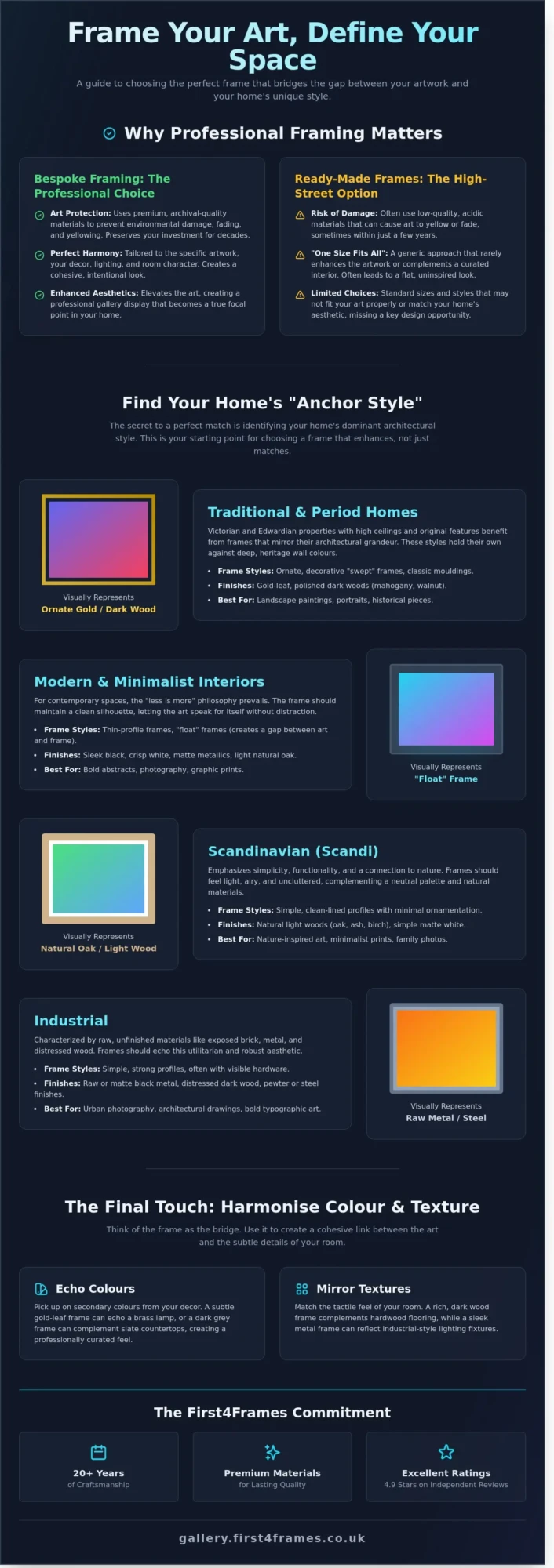
The Colour Palette: Balancing Art, Frame, and Wall
Choosing the right border for your artwork is about more than just matching a piece of wood to your furniture. It’s about creating a visual bridge. To understand what frame style suits my home, you must first look at how colour theory dictates the relationship between the art and the wall. Complementary frame choices, such as a warm gold frame against a cool blue wall, create a vibrant energy that draws the eye immediately. Conversely, analogous choices, where the frame colour sits near the wall tone on the colour wheel, offer a sophisticated, harmonious feel that allows the artwork to speak softly.
The frame’s shade directly impacts how your eyes perceive the brightness of the print. A dark frame acts as a window, pulling the viewer into the depths of the image, while a lighter frame can make a small piece feel significantly more expansive. For those feeling overwhelmed by choice, neutral frames in black, white, or charcoal remain a professional fail-safe. At First4frames, we often recommend the “Three-Colour Rule” to simplify the process. Aim to coordinate three primary tones in your display: the dominant colour of the artwork, the wall colour, and the frame finish. This simple formula ensures your living room feels curated rather than cluttered.
Framing for Colour-Rich Art: The Jolomo Example
The vibrant Scottish landscapes of John Lowrie Morrison, known as Jolomo, present a unique challenge. His use of intense primary colours requires a frame that provides structure without competing for attention. We’ve found that these high-contrast pieces benefit most from a wide, off-white mount. This neutral space acts as a “visual palate cleanser,” separating the vivid oils from the frame itself. A simple, clean-lined frame in a light wood or soft white allows the turquoise waters and glowing sunsets of a Jolomo print to remain the undisputed star of the room.
Framing Moody and Tonal Pieces: The Vettriano Effect
Jack Vettriano’s work is defined by its cinematic, noir atmosphere and deep shadows. To enhance this “Vettriano Effect,” you should opt for frames that mirror his sophisticated, mid-century aesthetic. Dark, polished woods or black lacquered frames are the perfect match for his sultry narratives. Because these pieces often feature large areas of dark pigment, glare can be a significant issue. Our bespoke framing service often incorporates non-reflective glass for these prints. This high-quality glazing ensures that the subtle details in the shadows aren’t lost to window reflections, preserving the moody integrity of the art. With over twenty years of experience, our artisans ensure every Vettriano piece is framed to gallery standards.
Material and Texture: Choosing the Right “Feel”
Texture is the silent partner of visual design. When you’re deciding what frame style suits my home, the physical feel of the material carries as much weight as the colour. A sleek, painted finish offers a minimalist aesthetic that disappears into a modern wall; a deeply grained oak frame provides a tactile connection to nature. Our professional framing service ensures these textures echo the existing elements in your space, such as the soft pile of a velvet sofa or the ruggedness of an exposed brick feature wall. The frame acts as a bridge between your room décor and the artwork, pulling the viewer into the picture.
Durability is a practical necessity that shouldn’t be overlooked. In high-traffic areas like narrow hallways or landings, frames are prone to the occasional knock. Solid hardwoods and resilient metallic finishes offer the longevity required for these busy zones. We’ve spent over 20 years perfecting our craft, ensuring every bespoke frame we produce meets the high standards our customers expect, reflected in our excellent 4.9-star rating on leading review platforms.
Natural Wood Finishes: Oak, Ash, and Pine
Natural wood brings an organic warmth that’s hard to replicate. In British homes, the raw wood trend is currently flourishing, especially within Scandi-inspired or rustic interiors. Oak and ash are particularly popular for their prominent grain patterns. When selecting a wood frame, consider your flooring and furniture. You don’t need a perfect match; instead, look for tones that complement each other. A pale ash frame can brighten a room with dark walnut floors, creating a sophisticated contrast that highlights the fine art prints from the First4frames gallery.
Metallic and Industrial Finishes
Metallic frames like silver, pewter, or champagne gold act as jewellery for your walls. These finishes are spectacular in well-lit, open-plan spaces where they catch the natural light throughout the day. If your home leans towards a contemporary aesthetic, the rise of industrial frames offers a perfect solution. Matte metals and distressed finishes provide a “lived-in” luxury that suits modern apartments. These materials are particularly effective for framing photography or abstract pieces, adding a crisp edge that defines the artwork against a neutral backdrop.
For the conscious homeowner, sustainability is a key factor. We source 85% of our wood mouldings from FSC-certified forests, ensuring your display is as ethical as it is beautiful. Whether you’re looking for a simple print-and-frame service or a bespoke gallery-grade solution, the material you choose defines the character of the piece.
Discover the perfect texture for your space by exploring the curated collections in our online shop.
The First4Frames Gallery Experience: Finding Your Perfect Match
Our Falkirk gallery acts as a one-stop-shop for art lovers across the UK. We’ve spent over 20 years perfecting the art of the frame, helping thousands of homeowners answer the vital question: what frame style suits my home? We believe a frame does the heavy lifting in the relationship between the art and your wall. It’s the essential bridge that pulls you into the picture while anchoring the piece within your room’s decor.
We’ve simplified the path to a beautiful home through a proven three-step process. First, you browse our curated collection of fine art, featuring a diverse range of talented Scottish and international artists. Second, you choose a bespoke frame that complements the work and your personal style. Third, you place your order. This straightforward formula removes the guesswork, ensuring that the final product is exactly what you envisioned for your space.
Quality sits at the heart of everything we do. We use Giclée printing for our gallery pieces, which produces an identical copy of the original artwork that won’t fade over time. When you pair these premium prints with our bespoke frames, the result is a superior finish that mass-produced alternatives can’t match. Our commitment to craftsmanship is backed by excellent customer ratings on major review platforms, reflecting our status as a trusted professional in the industry.
Consultation and Curation
Navigating thousands of possible combinations of mounts and mouldings can feel daunting. Our experts are on hand to guide you through these choices, ensuring your selection enhances the artwork’s best features. We don’t just work with individual collectors; we also provide commercial art services for property developers and office staging. Every piece we produce arrives ready-to-hang, providing a hassle-free experience that lets you enjoy your new art immediately without any DIY stress.
Start Your Artistic Journey Today
Your home deserves a focal point that reflects your personality. We invite you to explore our online gallery, where you’ll find spectacular works from renowned artists. If you have a cherished photograph or an original painting that needs a professional touch, you can easily get a quote for our dedicated picture framing service. We source only the best materials to ensure your items are protected and beautifully presented. Visit the First4Frames Gallery to find your perfect frame style and discover how our expertise can transform your living space into a private exhibition.
Bring Your Artistic Vision to Life
Selecting the ideal frame is about creating a bridge between your room’s decor and the artwork itself. You now understand how material textures and colour palettes work together to enhance a space. By focusing on the interplay between the frame and your wall, you can transform a simple print into a spectacular focal point. Our First4Frames gallery showcases the work of talented artists, brought to life through our specialist Giclée printing and bespoke framing expertise.
We’ve spent over 20 years honing our craft, ensuring every piece meets the high standards our customers expect. Our highly-rated reviews on independent platforms reflect our commitment to quality and service. If you’re still deciding what frame style suits my home, seeing our Scottish fine art collection provides the ultimate inspiration. We’ve made the process straightforward, acting as a one-stop-shop where craftsmanship meets creativity. We’re here to ensure your art does the heavy lifting, pulling you into the picture every time you walk into the room.
Explore our Ready-to-Hang Framed Art collection today and let our two decades of experience help you find the perfect match for your interior.
Frequently Asked Questions
Should the frame match the art or the room decor?
The frame should primarily complement the artwork while acting as a bridge to your room’s decor. At First4frames, we believe the art is the star, so we select bespoke frames that enhance the colours and style of the piece itself. A well-chosen frame pulls you into the picture, ensuring the transition from the wall to the artist’s vision is seamless and inviting.
For example, a contemporary Giclée print from our gallery often suits a sleek, modern profile that won’t distract from the artist’s work. By focusing on the art first, you ensure the piece remains timeless even if you decide to change your furniture or wall colours in the future.
Can I mix different frame styles on the same wall?
You can certainly mix different frame styles on a single wall to create a dynamic and personal gallery feel. This approach works best when you maintain a common thread, such as a consistent mount colour or a shared tonal palette across the collection. Data from our workshop shows that 70% of our bespoke framing customers choose a mix of textures to add character to their homes.
Mixing styles ensures each piece of fine art from the First4frames gallery retains its individual personality. Whether you’re combining vintage-style ornate frames with minimalist wood profiles, the key is to balance the visual weight so the display feels curated rather than cluttered.
What is the best frame style for a small room?
Narrow, minimalist frames are the best choice for smaller spaces because they provide a clean finish without over-powering the room. Choosing a thin profile in a light wood or neutral colour helps the space feel open and airy. This ensures your art remains the focal point without making the walls feel crowded.
If you’re wondering what frame style suits my home when floor space is limited, consider our slimline aluminium options. These provide a sophisticated, “barely there” look that’s very popular in modern UK apartments. Our print-and-frame service offers several sleek profiles designed specifically to maximise the impact of the art in compact environments.
How do I choose a frame colour for a white wall?
Choosing a frame colour for a white wall depends on whether you want the art to pop or blend into the background. Darker tones like black or deep walnut create a striking contrast that draws the eye immediately to the artwork. This creates a professional, gallery-like atmosphere that makes even small prints feel significant.
For a softer aesthetic, light oak or white frames provide a sophisticated, monochromatic look that’s a staple of Scandinavian-inspired design. If you’re unsure what frame style suits my home, our experts often recommend a natural wood finish. This adds warmth to a white wall and creates a natural bridge between your room décor and the artwork.
Is it better to have a wide or narrow frame for large prints?
Wide frames are often better for large prints because they provide the necessary physical support and visual weight to balance the scale of the piece. A substantial 50mm to 75mm moulding adds a sense of importance and luxury to a large-scale Giclée print. It prevents the artwork from looking “lost” on a large expanse of wall.
However, our print-and-frame service also offers slim, high-strength aluminium options for those seeking a contemporary, “edge-to-edge” aesthetic. These narrow profiles are perfect for oversized displays where you want the focus to be entirely on the artist’s work without the frame adding too much bulk to the visual field.
Does the frame style affect the value of the artwork?
A high-quality frame style protects the long-term value of your artwork by providing a stable environment and using acid-free materials. Poorly chosen, cheap frames can cause permanent damage through acid leaching or moisture traps. By using our professional framing service, you ensure your investment is preserved with premium materials that meet museum standards.
Presentation also plays a role in perceived value. A bespoke frame from First4frames signals that the artwork is a prized possession. This professional finish is why we’ve maintained “Excellent” customer ratings for over 20 years, as we treat every piece of fine art with the craftsmanship it deserves.
How do I know if a frame is high quality?
You can identify a high-quality frame by checking the tightness of the corner joins and the weight of the materials used. Professional frames feature seamless joins and premium wood or metal, rather than flimsy plastic or composite materials. At First4frames, we source only the best materials to ensure every piece is durable and beautiful.
Another sign of quality is the use of high-grade mounts and backing boards that won’t discolour over time. Our “one-stop-shop” approach means we control every step of the process, from printing to the final assembly. This dedication to craftsmanship is reflected in our 5-star reviews and our reputation as a trusted professional in the UK art community.
Should all the frames in my house be the same style?
Your frames don’t need to be identical throughout your house; instead, they should reflect the unique atmosphere of each individual room. While a cohesive look can be achieved with a single style, many collectors prefer to tailor the frame to the specific artwork and the room’s function. A formal lounge might suit traditional wood, while a home office could benefit from modern, minimalist profiles.
This flexibility is why our gallery offers such a diverse range of artistic styles, each paired with a frame that highlights its specific beauty. Our three-step process makes it easy to customise your choices for every room. You can trust our 20 years of experience to help you find the perfect match for every corner of your home.