
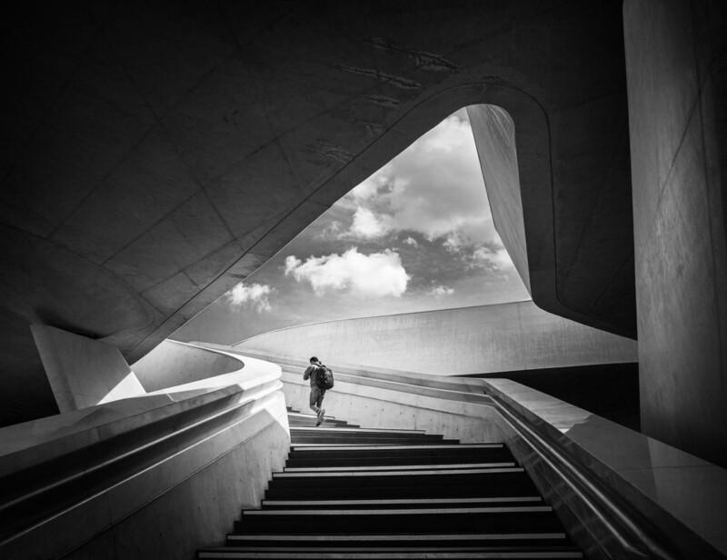
Some contemporary art prints rely on colour to feel current. Going Up takes a different route. Its strength comes from architectural rhythm, black and white contrast, and the subtle presence of one ascending figure, which gives the image movement without turning it into visual noise.
That makes it a strong option for rooms that want a clearer edge and a more design-led focal point.
Why Architecture Works In Cleaner Schemes
In a pared-back interior, contemporary artwork often needs to add shape rather than decoration. The sweeping lines in Going Up do exactly that, giving the wall direction and energy while still feeling controlled.
- It sharpens a room without adding extra colour clutter.
- It creates momentum, which helps static spaces feel more alive.
- It suits buyers who prefer contemporary work with real structure.
Rooms That Benefit Most
This piece would work especially well in a home office, hallway, stair landing, or study where a more architectural image can support focus and polish. It also makes sense in interiors with black metal, pale walls, glass, or cleaner-lined furniture because it speaks the same visual language without feeling too severe.
The human figure keeps the image from becoming purely abstract, which helps it feel more approachable in everyday spaces.
A Good Finish Stops It Feeling Cold
Monochrome work depends on tonal precision. If the printing and framing are weak, the contrast can either flatten or feel harsh. First 4 Frames handles the Giclee production and bespoke framing in-house, helping the finished piece keep its depth and authority.
You can view the framed product here, and see more by Noel Fenech Photography if you want photography with the same architectural clarity.
For buyers exploring contemporary art prints that feel disciplined, modern, and visually confident, Going Up is a strong place to start.