Posted on

What Makes Earth Wind and Tide Such a Good Choice for a Room With Large Windows

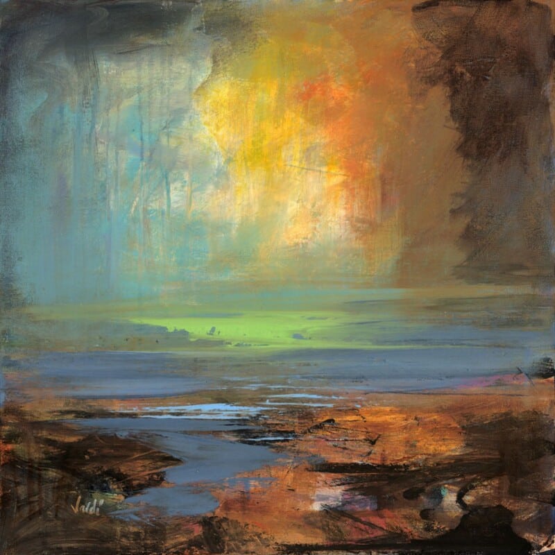
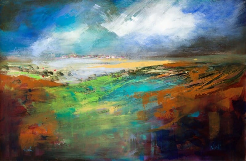
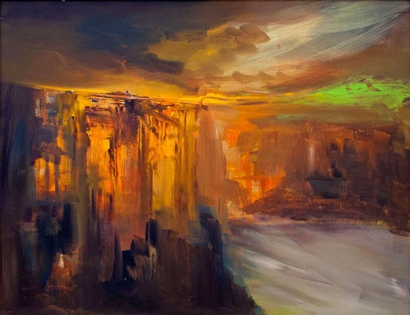
Image of Earth Wind and Tide by Arie Vardi

Choosing art for a room with large windows can be harder than it sounds. Natural light is a gift, but it can also make artwork feel visually thin if the piece does not have enough presence. Earth Wind and Tide works especially well because it brings movement, colour, and structure without making the room feel weighed down.

Why bright rooms need a little visual weight

In a room with generous glazing, the eye is constantly drawn outward. That often means the artwork needs enough depth to hold its own. Earth Wind and Tide has exactly that quality. It feels open and atmospheric, but it still gives the wall a clear focal point.

  • It works well in spaces with full-height windows or wide patio doors.
  • It adds energy without fighting the natural calm of the light.
  • It helps a brighter room feel finished rather than slightly underdressed.

Where this kind of piece earns its place

This sort of artwork suits a main sitting room, a garden-facing family room, or a dining area with strong daylight. Because the subject has both horizon and movement, it helps connect the inside of the room with the sense of openness beyond the glass.

That balance matters. In brighter rooms, the best artwork usually does not shout. It simply has enough confidence to stay present throughout the day as the light changes.

Why the framed finish matters here

At First 4 Frames, each piece is completed in-house in Falkirk with bespoke framing, colour-managed Giclée printing, and hand-finished craftsmanship. In a bright room, those cleaner details really show. A superior quality finish helps the artwork feel deliberate and well judged rather than temporary.

This artwork is by Arie Vardi, and you can view the exact framed product here.

If you are looking for art for a room with large windows that feels expansive, balanced, and properly finished, Earth Wind and Tide is a very strong option.

Posted on

Why Blushing Heather Works Beautifully as Art for Blush Pink Walls

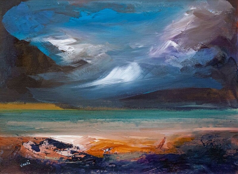
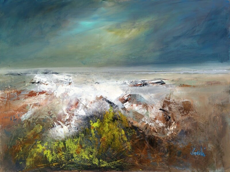
Image of Blushing Heather by Arie Vardi

Finding the right art for blush pink walls is often about control. Soft pink can feel warm and flattering, but it needs artwork that keeps the room grounded. Blushing Heather is a very good fit because it echoes that warmth while still adding enough contrast and structure to stop the scheme from drifting into something too sugary.

Why this colour pairing feels balanced

Pink walls work best when the artwork supports the softness but also introduces a little depth. Blushing Heather does that naturally. The palette feels sympathetic, yet the landscape mood gives the room more maturity and calm.

  • It suits blush, dusty rose, and warmer neutral pinks.
  • It stops a soft colour scheme from feeling flat.
  • It adds interest without turning the room too pretty or over-styled.

Rooms where it earns its place

This kind of framed print works especially well in a bedroom, dressing area, or sitting room where pink is being used with restraint. Because the artwork feels airy but not insubstantial, it helps the room stay elegant and settled.

That makes it a strong option for people who like soft colour, but still want the room to feel polished rather than theme-led.

Why the First 4 Frames finish helps

At First 4 Frames, each piece is completed in-house with bespoke framing, colour-managed Giclée printing, and hand-finished craftsmanship. In a softer room, those details matter. A cleaner finish gives the artwork definition and helps the whole scheme feel more deliberate.

This artwork is by Arie Vardi, and you can view the exact framed product here.

If you want art for blush pink walls that feels calm, refined, and easy to place, Blushing Heather is an excellent choice.

Posted on

Choosing Art for Terracotta Walls, Why Low Tide Morar Feels So Balanced

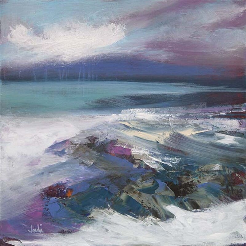
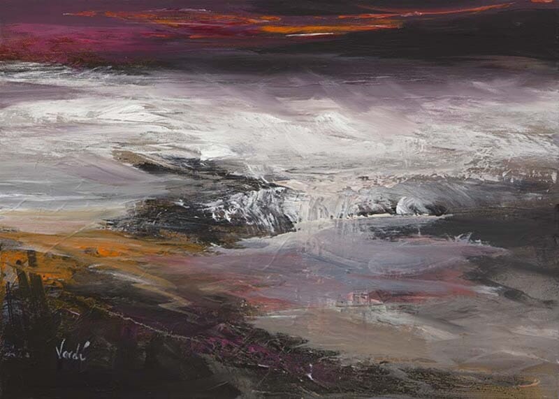
Image of Low Tide Morar by Arie Vardi

Finding the right art for terracotta walls is often about balance. Warm wall colours can feel rich and inviting, but they need artwork that keeps the room from becoming too visually dense. Low Tide Morar does that beautifully, bringing in coastal light and softer tonal contrast while still sitting comfortably with a warm scheme.

Why this pairing works

Terracotta has a natural grounded warmth, so it often benefits from artwork that introduces air, horizon, and a little visual breathing room. Low Tide Morar has that quality. It complements warmth rather than repeating it too heavily, which helps the room feel layered instead of overloaded.

  • It suits earthy interiors with clay, rust, or burnt orange accents.
  • It can stop a warm room from feeling visually closed in.
  • It works well with timber, linen, and natural textures.

How to use it in the room

This kind of piece works especially well above a sofa, over a sideboard, or on the main wall of a dining space where the décor already carries warmth. Because the image brings a softer coastal mood, it helps create contrast without making the scheme feel disconnected.

It is also a useful reminder that warm interiors do not always need more red or orange in the artwork. Sometimes the best result comes from choosing a piece that steadies the palette and lets the wall colour do its work.

Why the finish matters

First 4 Frames produces every piece in-house with bespoke framing, colour-managed Giclée printing, and hand-finished craftsmanship. That superior quality helps the artwork hold its own against stronger wall colour and makes the finished room feel far more considered.

This artwork is by Arie Vardi, and you can view the exact framed product here.

For anyone choosing art for terracotta walls that feels calm, polished, and easy to place, Low Tide Morar is an excellent fit.

Posted on

Choosing Art for Exposed Brick Walls, Why Lost in Time Feels So Balanced

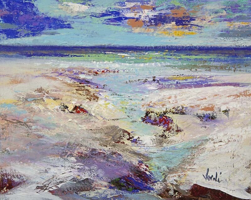
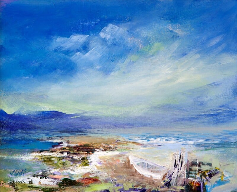
Image of Lost in Time by Arie Vardi

Choosing art for exposed brick walls is often a question of balance. Brick already brings texture, pattern, and a certain amount of visual weight, so the artwork needs to soften the effect rather than add more noise. Lost in Time does this particularly well, offering atmosphere and colour in a calm, measured way.

Why calmer artwork often works better on brick

A heavily textured wall can make busy art feel crowded. This piece succeeds because it introduces mood and depth without fighting for attention. The room still keeps its character, but it feels less hard-edged and more complete.

It would suit dining spaces, garden rooms, studios, or open-plan corners where exposed brick is part of the architecture. Instead of trying to dominate the wall, the artwork works with it, which is usually the more lasting choice.

A useful way to bring polish to a more rugged backdrop

There is a real difference between preserving character and letting a room feel unfinished. One well-framed print can bridge that gap. This artwork adds a sense of intention, helping the wall feel styled while still allowing the brick to do its job.

  • It softens texture without making the scheme bland.
  • It suits interiors that mix older materials with cleaner furniture.
  • It brings calm colour to a wall that already has a lot going on.

Why the frame makes a difference

First 4 Frames completes the work in-house in Falkirk with colour-managed Giclée printing and hand-finished bespoke framing. That superior quality finish matters on exposed brick because the presentation needs enough clarity and structure to stand confidently against a textured backdrop.

The artwork is by Arie Vardi, and you can view the exact framed product here.

If you want art for exposed brick walls that feels calm, polished, and naturally well judged, Lost in Time is a strong choice.

Posted on

Why In Time With A Moment Is a Strong Choice for Art in a Room With Sea Views

Image of In Time With A Moment by Arie Vardi

Finding the right art for a room with sea views can be harder than it sounds. If the artwork is too loud, it competes with the window. If it is too bland, it disappears entirely. In Time With A Moment sits in that valuable middle ground.

Why this kind of room needs restraint

Rooms with a coastal outlook already have movement, light, and changing colour built into them. The artwork should echo that atmosphere rather than trying to overpower it. This piece works because it feels contemplative and spacious, with enough depth to hold attention when the blinds are closed and enough calm to live alongside a real view.

When it is especially effective

It is a particularly good choice for bedrooms, upstairs sitting rooms, and quieter corners where the view matters. The darker tones and shoreline mood can help tie the inside and outside together, especially when the room includes muted textiles, weathered timber, or cooler painted walls.

  • It supports a sea-facing room without turning the décor into a theme.
  • It brings atmosphere for evenings, when the view outside is less visible.
  • It suits people who prefer coastal art with depth and quiet drama.

Why the framed result matters

First 4 Frames produces the piece in-house in Falkirk using colour-managed Giclée printing and bespoke hand-finished framing. In a room with a strong natural outlook, the finish needs to feel every bit as considered as the architecture around it. That craftsmanship helps the print hold its own in a subtle, confident way.

The artwork is by Arie Vardi, and you can view the exact framed product here.

If you want art for a room with sea views that feels calm, atmospheric, and intelligently chosen, In Time With A Moment is a very strong fit.

Posted on

What Makes Carista Bay Lewis a Strong Choice for Wall Art in a Low-Ceiling Room

Image of Carista Bay Lewis by Arie Vardi

When you are choosing wall art for a low ceiling room, scale and subject matter matter more than people often realise. A cramped room does not usually benefit from artwork that feels busy or boxed in. Carista Bay Lewis is a strong option because its expansive landscape character helps the eye travel outward rather than stopping abruptly.

Why wider, calmer artwork can help

Lower ceilings can make a room feel slightly compressed, especially if the furniture is substantial or the walls are close in tone. This piece introduces visual space. The sense of horizon and distance can make the room feel easier to breathe in, which is exactly what many compact or older rooms need.

  • It suits smaller living rooms, spare bedrooms, and upstairs rooms with awkward proportions.
  • It helps compact spaces feel calmer without depending on pale décor alone.
  • It works especially well when you want one quiet focal point instead of several smaller pieces.

A practical way to avoid visual clutter

In a room with lower ceilings, clutter builds quickly. One well-chosen framed print can often do more than a cluster of smaller pieces. This artwork gives you depth and atmosphere without adding fuss, which makes it useful for rooms that need to stay visually simple.

Why the finish still needs presence

First 4 Frames produces the work in-house in Falkirk with colour-managed Giclée printing and hand-finished bespoke framing. That quality-led approach matters because a compact room still benefits from artwork with proper presence and craftsmanship, not something that feels flat or insubstantial.

The artwork is by Arie Vardi, and you can view the exact framed product here.

If you want wall art for a low ceiling room that helps the space feel more open, more restful, and better resolved, Carista Bay Lewis is an excellent choice.

Posted on

Choosing Art for Sage Green Walls, Why Off the Beaten Path Skye Works

Image of Off the Beaten Path Skye by Arie Vardi

Finding the right art for sage green walls can be trickier than it first appears. A soft green room already has character, so the artwork needs to add depth without clashing or fading away. Off the Beaten Path Skye by Arie Vardi is a strong solution because it feels atmospheric, layered, and confident enough to hold its place.

Why sage green benefits from contrast and depth

Sage green often works because it feels restful and natural, but that same softness can leave a room looking slightly flat if the wall art is too timid. This piece introduces stronger tonal variation and a more dramatic landscape mood, which gives the room shape and movement without breaking the calm.

It is especially useful when you want the décor to feel thoughtful rather than overly matched. Instead of repeating the wall colour, the artwork complements it while adding another layer of atmosphere.

Where it works especially well

  • Above a sofa in a green-toned living room.
  • In a bedroom with sage paint, darker timber, and natural fabrics.
  • In a dining space where muted wall colour needs one stronger focal point.

Why the framed presentation matters

First 4 Frames completes the work in-house in Falkirk with bespoke framing, hand-finished craftsmanship, and colour-managed Giclée printing. In a carefully coloured room, that quality matters. A strong frame and a superior print finish help the artwork feel fully integrated into the design rather than simply added afterwards.

The artwork is by Arie Vardi, and you can view the exact framed product here.

For anyone choosing art for sage green walls and wanting a room to feel richer, calmer, and more complete, Off the Beaten Path Skye is a very smart option.

Posted on

How Kyles of Bute II Can Elevate Show Home Wall Art

Image of Kyles of Bute II by Arie Vardi

The right show home wall art should help a property feel aspirational without becoming distracting. In a staged interior, every piece has a job to do, and the artwork often helps buyers imagine how the room could feel once it is properly lived in. Kyles of Bute II is especially effective in that role.

Why artwork matters in staged interiors

Show homes and dressed properties often rely on calm furniture, clean lines, and broad appeal. That can make the rooms look neat, but sometimes slightly anonymous. One strong framed print can introduce atmosphere and identity without narrowing the appeal of the space.

  • It helps a room feel warmer and more complete in photographs and viewings.
  • It adds a focal point without competing with the layout of the space.
  • It supports a premium presentation that feels thoughtful rather than generic.

A useful choice for lounges, principal bedrooms, and entrance spaces

Because the piece feels polished and easy to place, it works across several settings within a staged property. It can help a lounge feel more resolved, a bedroom feel calmer, or an entrance area make a stronger first impression.

Why a bespoke framed finish supports the overall impression

First 4 Frames produces the work in-house in Falkirk with colour-managed Giclée printing and hand-finished bespoke framing. That craftsmanship is important in presentation-led spaces, where buyers and clients tend to notice whether the finishing details feel convincing.

The artwork is by Arie Vardi, and you can view the exact framed print here.

For anyone choosing show home wall art that adds polish and memorability without overcomplicating the room, Kyles of Bute II is a very smart option.

Posted on

Why Sound of Jura Works So Well When You Need Art for a Beige Room

Image of Sound of Jura by Arie Vardi

Choosing art for a beige room is often about adding depth without losing calm. Beige interiors can feel warm and versatile, but they still need a focal point that stops the scheme from looking too safe or washed out. Sound of Jura does that beautifully.

Why beige rooms benefit from artwork with movement

When walls, flooring, and upholstery sit in softer neutral tones, the artwork has to bring shape, contrast, and atmosphere rather than simply more beige. This piece introduces that extra layer, helping the room feel more complete while still staying restful.

  • It gives a neutral room more visual depth without becoming heavy.
  • It adds interest while still working comfortably with natural textures and timber.
  • It helps a calm palette feel finished instead of under-decorated.

A useful fit for sitting rooms, bedrooms, and quieter corners

Because the colour feels balanced rather than sharp, Sound of Jura can sit comfortably in spaces where you want the room to stay relaxed. It works especially well where linen, stone, oak, or painted neutrals already shape the scheme.

Why the framed presentation matters

First 4 Frames completes the piece in-house in Falkirk using colour-managed Giclée printing and bespoke hand-finished framing. That superior quality finish matters in a neutral room, where careful craftsmanship tends to show more clearly.

The artwork is by Arie Vardi, and you can view the exact framed piece here.

If you are looking for art for a beige room that brings warmth, movement, and a more resolved feel, Sound of Jura is a very strong option.

Posted on

Why Big Sky, Loch Gilp Works So Well on a Long Wall

Image of Big Sky, Loch Gilp by Arie Vardi

Finding the right long wall art is often less straightforward than it should be. A wide wall can quickly feel bare or disconnected, especially in open spaces, hallways, or larger sitting rooms. Big Sky, Loch Gilp is a strong solution because its sense of breadth suits that format naturally.

Why wide walls need more than a token picture

Long walls tend to exaggerate whatever is missing. If the artwork is too small, the wall still feels unfinished. If the piece is too fussy, it can make the space feel busy rather than composed. A wide landscape gives the eye something generous to settle on, which helps the whole room feel more deliberate.

  • It helps a broad wall feel anchored rather than underdressed.
  • It brings calm and openness instead of cluttering the space.
  • It works especially well where the wall risks feeling corridor-like or purely functional.

Useful in both modern and more traditional interiors

This kind of piece can sit comfortably above a sofa, sideboard, or dining bench, but it also works well in wider hallways and upstairs landings with more wall span than visual interest. The landscape subject keeps it easy to live with while still giving the room a stronger sense of finish.

Why the framed finish matters on a bigger wall

First 4 Frames produces the piece in-house in Falkirk with colour-managed Giclée printing and bespoke framing. On a long wall, that cleaner hand-finished presentation matters because the artwork has to carry more of the visual structure of the room.

The artwork is by Arie Vardi, and you can view the exact framed piece here.

If you need long wall art that gives a wide space more presence without making it feel crowded, Big Sky, Loch Gilp is a very smart choice.