Posted on

Choosing Art for Pale Blue Walls, Why White Horses, Lewis Works So Well

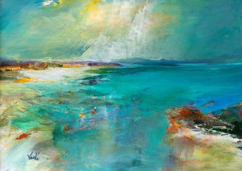
Image of White Horses, Lewis by Arie Vardi

Choosing art for pale blue walls is often about making sure the room keeps its freshness without tipping into feeling chilly or visually thin. White Horses, Lewis is a particularly good answer because it brings movement and coastal atmosphere while still holding enough warmth to stop the scheme feeling washed out.

Why pale blue needs the right kind of contrast

Soft blue walls can look calm and elegant, but they often need artwork with a little more life in it. Too close a colour match and the whole room can drift into one flat note. This piece helps avoid that by adding texture, rhythm, and a stronger focal point.

  • It keeps a cool room feeling airy rather than cold.
  • It suits bedrooms, sitting rooms, and quieter hallways.
  • It adds energy without making the scheme feel louder.

Where it tends to work best

This kind of piece sits especially well above a sofa, chest of drawers, or bed where the room needs one clearer anchor. It also works well in spaces with daylight from more than one side, where pale wall colour can otherwise feel a little diffuse.

Why the finish matters in a lighter scheme

First 4 Frames completes every piece in-house in Falkirk using bespoke framing, colour-managed Giclée printing, and hand-finished craftsmanship. In a pale room, those details matter because cleaner print quality and a well-judged frame help the artwork feel deliberate rather than faint.

This artwork is by Arie Vardi, and you can view the exact framed product here.

If you need art for pale blue walls that feels fresh, balanced, and easy to live with, White Horses, Lewis is an excellent choice.


Posted on

Why Mist on Loch Assynt Works Beautifully as Art for a South Facing Room

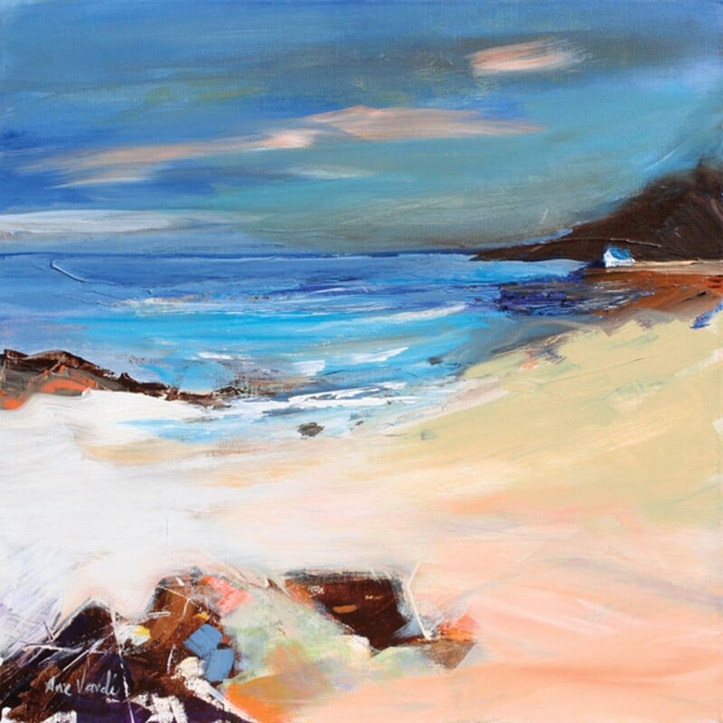
Image of Mist on Loch Assynt by Arie Vardi

Choosing art for a south facing room is often less straightforward than people expect. The room may already feel bright and welcoming, but strong daylight can flatten weaker artwork and leave the whole wall looking slightly bleached by midday. Mist on Loch Assynt works beautifully in that setting because it keeps its atmosphere while still feeling light and easy to live with.

Why bright rooms still need visual calm

South facing spaces usually have plenty of natural energy already. That means the artwork does not have to shout. It is often better when it introduces softness, depth, and a little restraint. This piece does exactly that, helping a sunny room feel settled rather than overexposed.

  • It works well in bright sitting rooms and bedrooms.
  • It keeps a sunlit wall feeling composed rather than bare.
  • It adds presence without making the room feel heavier.

Where this kind of piece can help most

It suits the wall opposite a window especially well, where glare and changing light can expose poor print quality very quickly. It can also work above a sofa, sideboard, or bed where the room needs one calmer focal point to balance all that daylight.

Why the finish matters in strong natural light

First 4 Frames produces each piece in-house in Falkirk with bespoke framing, colour-managed Giclée printing, and hand-finished craftsmanship. In a south facing room, that superior quality matters because cleaner printing and a well judged frame help the artwork hold its character from morning through late afternoon.

This artwork is by Arie Vardi, and you can view the exact framed product here.

If you want art for a south facing room that feels calm, polished, and genuinely suited to brighter light, Mist on Loch Assynt is an excellent option.

Posted on

Why Coastal Path web Works So Well as Wall Art for Sliding Patio Doors

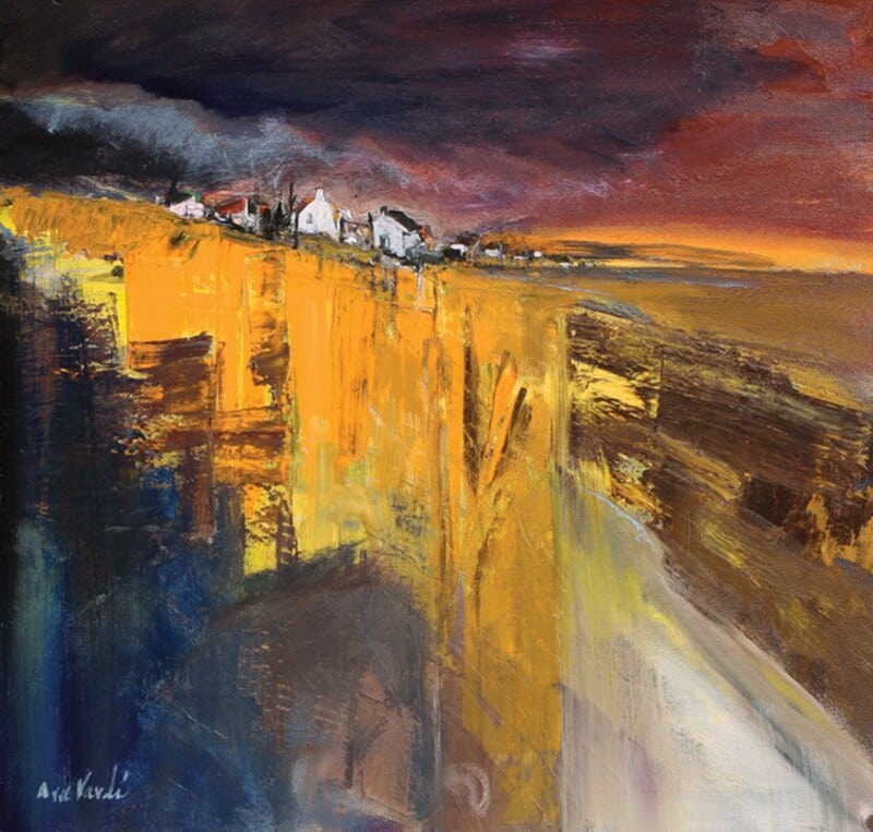
Image of Coastal Path web by Arie Vardi

Choosing wall art for sliding patio doors is often about restoring balance. Large panes of glass bring in wonderful light and a strong garden connection, but they can also leave the interior feeling visually light on one side. Coastal Path web works especially well because it gives the room a calm focal point without making it feel heavier or more enclosed.

Why wide glazing needs something steady nearby

Patio doors naturally pull the eye outward. That is part of their appeal, but it means the walls around them need a little more intention. A well-chosen framed print helps the room feel finished even when the view outside changes with the weather and the time of day.

  • It suits sitting rooms, dining spaces, and garden rooms with broad glazing.
  • It adds structure without competing with the outdoor view.
  • It helps the room feel styled indoors rather than defined only by the doors.

Why this piece feels right in a brighter room

Coastal Path web has enough movement and colour to hold its place, yet it still keeps the room relaxed. That matters in spaces with large glass openings, where artwork needs presence but should not feel too dense. The result is a more settled room that still feels open and easy to live with.

Why the finish matters

First 4 Frames completes each piece in-house in Falkirk with bespoke framing, colour-managed Giclée printing, and hand-finished craftsmanship. In a light-filled room, that superior presentation makes a real difference because better framing and print quality stop the artwork from looking washed out beside the glass.

This artwork is by Arie Vardi, and you can view the exact framed product here.

If you want wall art for sliding patio doors that feels calm, balanced, and professionally finished, Coastal Path web is an excellent choice.

Posted on

Colours of Argyll and the Appeal of Wall Art for Fluted Wood Panels

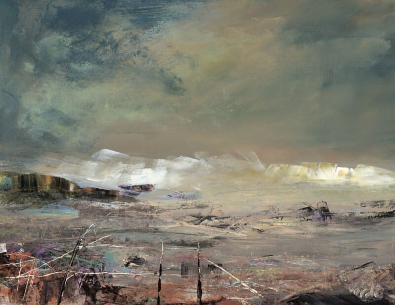
Image of Colours of Argyll by Arie Vardi

The right wall art for fluted wood panels needs to soften texture rather than compete with it. Fluted panelling already creates a strong rhythm on the wall, which can look striking but also slightly rigid if the surrounding elements are not handled carefully. Colours of Argyll works particularly well because it introduces movement and colour that loosen the look without losing the room’s refinement.

Why vertically textured walls need a different kind of artwork

With fluted wood, the backdrop already has direction and repetition. The art does not need more stiffness. It is often better when it offers a broader sweep of colour and a more relaxed sense of form. That gives the room balance and stops the panelling from becoming the only thing you notice.

  • It works well with oak, walnut, or painted fluted joinery.
  • It helps a more architectural scheme feel warmer and easier to live with.
  • It suits dining areas, hallways, and sitting rooms that rely on texture.

Why this pairing feels sophisticated

Colours of Argyll brings visual flow, which is exactly what fluted surfaces benefit from. The room keeps its structure, but it gains a softer centre. That makes the design feel more complete and less dependent on the panelling alone.

This sort of piece can work beautifully above a bench, over a sideboard, or on a main wall where joinery and finish already play a big part in the room’s character.

Why a bespoke framed finish completes the look

First 4 Frames produces every piece in-house in Falkirk with bespoke framing, colour-managed Giclée printing, and hand-finished craftsmanship. That level of finish matters in a room where materials and joinery have already been chosen with intention.

This artwork is by Arie Vardi, and you can view the exact framed product here.

If you are looking for wall art for fluted wood panels that feels warm, composed, and professionally finished, Colours of Argyll is a very smart option.

Posted on

Why Heres looking at you Isle of Bute Works So Well as Wall Art for a Room With French Doors

Image of Heres looking at you Isle of Bute by Arie Vardi

Choosing wall art for a room with French doors is often about balance. The doors bring welcome light, movement, and a strong connection to the garden, but that same openness can leave the room feeling a little visually loose unless the walls carry enough weight. Heres looking at you Isle of Bute works especially well because it keeps the room airy while still giving it a clear focal point.

Why garden-facing rooms need something steady on the wall

French doors naturally pull the eye outward. That is part of their appeal, but it also means the interior can feel underplayed if every surface is too pale or too quiet. This piece helps pull the room back together. It adds colour, shape, and enough presence to stop the space feeling unfinished once the daylight starts shifting.

  • It suits sitting rooms and dining rooms that open directly onto the garden.
  • It adds atmosphere without fighting with the view.
  • It helps the room feel styled in its own right rather than only defined by the doors.

Where it can make the biggest difference

This kind of framed piece works well on the wall perpendicular to the doors, above a sideboard, or anywhere the room needs a little more visual structure. The subject keeps things relaxed, but the framed presentation gives the space a more settled and deliberate feel.

Why the finish matters in a bright room

First 4 Frames completes each piece in-house in Falkirk with bespoke framing, colour-managed Giclée printing, and hand-finished craftsmanship. In a light-filled room, that standard matters. Cleaner framing and better print quality help the artwork hold its own rather than washing out beside the glass.

This artwork is by Arie Vardi, and you can view the exact framed product here.

If you want wall art for a room with French doors that feels light, balanced, and professionally finished, Heres looking at you Isle of Bute is an excellent option.

Posted on

Why Sound Of Taransay Works Beautifully as Wall Art for Rattan Furniture

Image of Sound Of Taransay by Arie Vardi

Choosing wall art for rattan furniture is often about getting the balance right. Natural textures already bring warmth and character into a room, but they can start to feel a little expected if the artwork leans too heavily into a beach-house cliché. Sound Of Taransay works beautifully because it keeps the room light and relaxed while still giving it a more considered focal point.

Why it suits natural textures so well

Rattan, cane, and woven finishes tend to look best with artwork that has movement and atmosphere rather than something too rigid or overworked. This piece has that easy sense of flow, which helps a room feel collected rather than themed.

  • It adds colour without fighting the room’s lighter materials.
  • It keeps a natural scheme feeling airy rather than rustic.
  • It suits sitting rooms, sunrooms, and relaxed bedrooms especially well.

Where it can make the biggest difference

This kind of framed print works especially well above a woven bench, near occasional chairs, or on the main wall of a room where timber and natural fibres already do much of the talking. It gives the eye somewhere to settle while still keeping the overall mood easy to live with.

Why the framed finish matters

At First 4 Frames, each piece is completed in-house in Falkirk with bespoke framing, colour-managed Giclée printing, and hand-finished craftsmanship. That superior quality helps the artwork feel polished enough for a room built around quieter materials and better textures.

This artwork is by Arie Vardi, and you can view the exact framed product here.

If you are looking for wall art for rattan furniture that feels refined, restful, and professionally finished, Sound Of Taransay is an excellent option.

Posted on

Welcome to Harris and the Challenge of Art for a Room With Skylights

Image of Welcome to Harris by Arie Vardi

Choosing art for a room with skylights can be surprisingly difficult. Overhead daylight gives a room wonderful openness, but it can also leave walls feeling visually thin if the artwork does not carry enough shape and colour. Welcome to Harris works beautifully in that setting because it brings clarity and calm without feeling heavy.

Why skylit rooms still need a clear focal point

Rooms with roof windows often change character across the day. Morning light can feel crisp, while afternoon light can flatten softer tones. This piece holds its presence through those shifts and helps the room stay visually grounded.

  • It gives a brighter room structure without darkening it.
  • It keeps a light scheme feeling calm rather than empty.
  • It suits bedrooms, loft rooms, and upper-floor living spaces especially well.

Why the colour balance matters

In a room where light arrives from above, balanced colour usually works better than anything too faint or too sharp. Welcome to Harris brings enough movement to be noticed, but it still feels easy to live with in a restful space.

That makes it useful above a bed, opposite a window wall, or in the section of the room that needs one stronger visual anchor.

Why a hand-finished framed print helps

At First 4 Frames, each piece is completed in-house in Falkirk with bespoke framing, colour-managed Giclée printing, and hand-finished craftsmanship. In a skylit room, that superior finish helps the artwork hold its own against stronger natural light.

This artwork is by Arie Vardi, and you can view the exact framed product here.

If you are looking for art for a room with skylights that feels settled, luminous, and professionally finished, Welcome to Harris is a very strong option.

Posted on

How Rock Pools Can Make Window Seat Wall Art Feel More Considered

Image of Rock Pools by Arie Vardi

The best wall art for a window seat should support the feeling that draws people to that spot in the first place. A window seat is usually about pause, light, and a little retreat within the room. Rock Pools works beautifully there because it feels reflective and textured without becoming sleepy or flat.

Why these smaller corners matter

A window seat can easily become an almost-finished part of a room. The cushions are there, the light is lovely, but the wall can still feel underused. One framed piece nearby often does more than people expect. It turns the seat into a destination rather than just a practical ledge or tucked-away perch.

  • It helps the corner feel properly styled.
  • It supports a calmer, slower mood without looking empty.
  • It works well in reading nooks, bedrooms, and garden-facing sitting rooms.

Why Rock Pools is a strong fit

The sense of texture and reflection feels very natural beside changing daylight. That makes it especially suitable for spaces where the view and the light already do part of the work. It brings enough interest to hold the wall, but it still leaves the corner feeling restful.

Why the framed finish matters

At First 4 Frames, every artwork is completed in-house with bespoke framing, colour-managed Giclée printing, and hand-finished craftsmanship. In a smaller corner, quality becomes even more noticeable. A superior framed finish helps the whole seating area feel more intentional and more refined.

This artwork is by Arie Vardi, and you can view the exact framed product here.

If you are searching for wall art for a window seat that feels calm, textural, and properly finished, Rock Pools is well worth considering.

Posted on

Why Light Breeze Works So Well as Wall Art for a Room With Sheer Curtains

Image of Light Breeze by Arie Vardi

Choosing wall art for a room with sheer curtains is often about balance. Soft window treatments let in beautiful light, but they can also leave a room feeling slightly insubstantial if the artwork does not have enough presence. Light Breeze solves that problem with a calm sense of movement and just enough structure to hold the wall properly.

Why this pairing works

Sheer curtains soften edges, blur stronger daylight, and make a room feel relaxed. The artwork beside them needs to support that gentler atmosphere without disappearing into it. Light Breeze does that well because it feels airy, but not vague. It keeps the room feeling open while still giving the eye a clear focal point.

  • It suits rooms where daylight is an important part of the mood.
  • It helps softer textiles feel intentional rather than unfinished.
  • It adds calm colour without making the space feel visually heavy.

Where it can sit naturally

This kind of piece works especially well in a sitting room, bedroom, or guest space where curtains, voiles, and lighter fabrics already shape the atmosphere. If the room feels bright but slightly loose, one well-chosen framed print can give it far more definition.

Why the finish matters

At First 4 Frames, each piece is completed in-house with bespoke framing, colour-managed Giclée printing, and hand-finished craftsmanship. In a light-filled room, those details matter. A superior quality finish helps the artwork feel settled and considered rather than temporary.

This artwork is by Arie Vardi, and you can view the exact framed product here.

If you want wall art for a room with sheer curtains that feels calm, polished, and easy to live with, Light Breeze is a very good fit.

Posted on

Why Northern Light Works Beautifully as Wall Art for a West Facing Room

Image of Northern Light by Arie Vardi

Choosing wall art for a west facing room is often about understanding what late-day light actually does to a space. Afternoon sun can make some prints feel washed out, while evening light can turn others too heavy. Northern Light sits in a very helpful middle ground, bringing atmosphere and clarity without fighting the changing light.

Why west facing rooms need balance

Rooms with this aspect often feel different hour by hour. That means the artwork needs enough presence to hold up in brighter light, but enough softness to stay comfortable later in the day. This piece manages that balance beautifully, which is one reason it is so easy to live with.

  • It helps warm evening light feel intentional rather than overpowering.
  • It adds a focal point without making the room feel darker.
  • It works well in living spaces, bedrooms, and dining rooms that catch the setting sun.

Where it tends to work best

Northern Light would sit well above a sofa, opposite a window, or on the wall that catches the richest late-day glow. Because the composition feels expansive rather than busy, it helps the room feel calmer as the light shifts across the evening.

That makes it especially useful when you want a brighter room to feel grounded instead of visually unsettled.

Why the framed finish matters

At First 4 Frames, each piece is completed in-house in Falkirk with bespoke framing, colour-managed Giclée printing, and hand-finished craftsmanship. In a room where light changes so much, that superior quality really helps the artwork keep its presence throughout the day.

This artwork is by Arie Vardi, and you can view the exact framed product here.

If you want wall art for a west facing room that feels calm, balanced, and beautifully finished, Northern Light is a very strong choice.