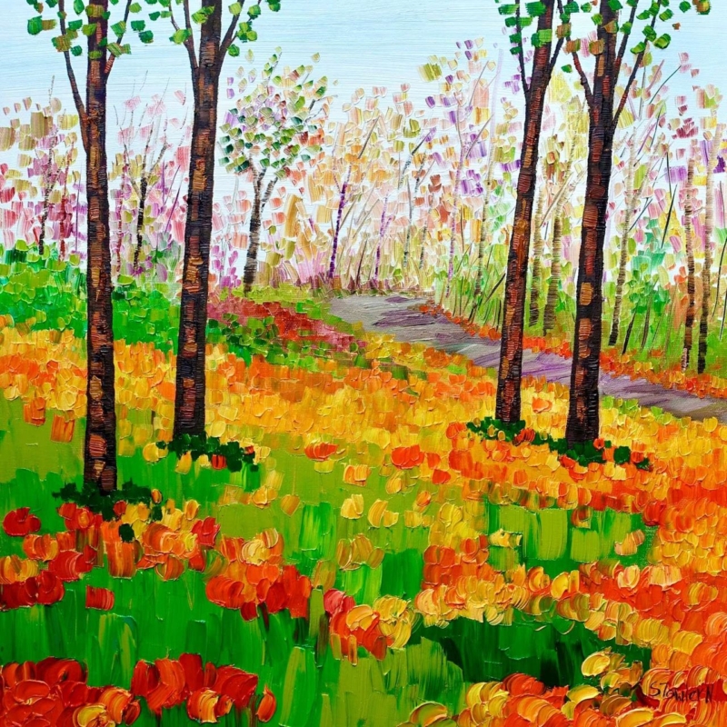
Art for maple furniture should give pale timber enough definition without making its clean, natural character feel heavy. Sheila Fowler’s Autumn Colours concentrates seasonal colour inside a square composition. It can bring warmth to a breakfast area, bedroom or light living space while the furniture continues to provide visual calm.
Pair art for maple furniture through tonal difference
- Keep the brightest autumn colour inside the artwork rather than repeating orange across every accessory.
- Use off-white, oatmeal or soft grey textiles to preserve the lightness of maple.
- Choose a frame that separates warm picture colour from warm timber furniture.
- Leave clear wall between the framed square and the furniture below it.
The 265 × 265 mm print can complete a narrow wall, bedside area or compact dining corner. The 500 × 500 mm option has enough presence above a chest or two-seat table. In both cases, the square format is useful because it creates a stable focal point beside furniture with long horizontal lines.
Do not assume a natural timber frame is the only answer. If its tone is too close to the maple, the whole arrangement may blur together. A soft white, muted dark or deliberately contrasting wood can give the image a clearer edge. Compare samples under both daylight and evening lamps.
Keep seasonal colour rich rather than overpowering
Autumn colour works through differences between brighter leaves, quieter passages and the underlying structure of the scene. Colour-managed Giclée production helps preserve those relationships. A bespoke frame, hand-finished in-house, supplies enough separation from pale furniture to make the picture feel intentional rather than simply warm on warm.
For ideas about when and where seasonal woodland colour appears across Scotland, explore the Forestry and Land Scotland autumn colour guide. Browse the Sheila Fowler collection, or view the exact Autumn Colours product.
As art for maple furniture, Autumn Colours works best through concentration and restraint. One square field of strong autumn colour can deepen a pale room while the timber, textiles and surrounding wall remain fresh and uncluttered.