Posted on

Choosing Art for Terracotta Walls, Why South Uist, Cloud Burst Works So Well

Image of South Uist, Cloud Burst by Nikki Monaghan

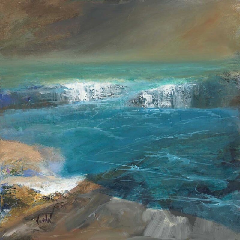
The best art for terracotta walls should work with warmth while still giving the room some lift. Terracotta is rich, earthy, and inviting, but it can also make a scheme feel visually dense unless the artwork introduces enough contrast and openness. South Uist, Cloud Burst does that beautifully.

Why terracotta interiors need balance

Earth-toned walls bring depth from the start, which means the art has to be carefully chosen. Pieces that are too similar can make the room feel flat, while artwork with the right tonal contrast can keep the scheme warm but much more refined.

  • It suits sitting rooms, dining rooms, and bedrooms with terracotta or clay-toned walls.
  • It adds atmosphere without making the room feel too enclosed.
  • It helps a stronger colour choice feel more polished and grown up.

Why South Uist, Cloud Burst feels so well judged

The image has enough weather, movement, and tonal variation to stand up to a warmer wall colour. At the same time, it still feels calm enough to live with every day, which is what makes it so versatile in a richer interior.

Why First 4 Frames presentation helps

First 4 Frames produces each piece in-house in Falkirk using bespoke framing, colour-managed Giclee printing, and hand-finished craftsmanship. That superior finish gives the artwork the confidence it needs beside a strong decorative backdrop.

You can explore more work by Nikki Monaghan and view the exact framed product here.

If you are looking for art for terracotta walls that feels balanced, atmospheric, and properly finished, South Uist, Cloud Burst is an excellent fit.

Posted on

Choosing Art for Terracotta Walls, Why Low Tide Morar Feels So Balanced

Image of Low Tide Morar by Arie Vardi

Finding the right art for terracotta walls is often about balance. Warm wall colours can feel rich and inviting, but they need artwork that keeps the room from becoming too visually dense. Low Tide Morar does that beautifully, bringing in coastal light and softer tonal contrast while still sitting comfortably with a warm scheme.

Why this pairing works

Terracotta has a natural grounded warmth, so it often benefits from artwork that introduces air, horizon, and a little visual breathing room. Low Tide Morar has that quality. It complements warmth rather than repeating it too heavily, which helps the room feel layered instead of overloaded.

  • It suits earthy interiors with clay, rust, or burnt orange accents.
  • It can stop a warm room from feeling visually closed in.
  • It works well with timber, linen, and natural textures.

How to use it in the room

This kind of piece works especially well above a sofa, over a sideboard, or on the main wall of a dining space where the décor already carries warmth. Because the image brings a softer coastal mood, it helps create contrast without making the scheme feel disconnected.

It is also a useful reminder that warm interiors do not always need more red or orange in the artwork. Sometimes the best result comes from choosing a piece that steadies the palette and lets the wall colour do its work.

Why the finish matters

First 4 Frames produces every piece in-house with bespoke framing, colour-managed Giclée printing, and hand-finished craftsmanship. That superior quality helps the artwork hold its own against stronger wall colour and makes the finished room feel far more considered.

This artwork is by Arie Vardi, and you can view the exact framed product here.

For anyone choosing art for terracotta walls that feels calm, polished, and easy to place, Low Tide Morar is an excellent fit.