
Posted on

Black and White Wall Art Feels More Architectural With The Final Beacon

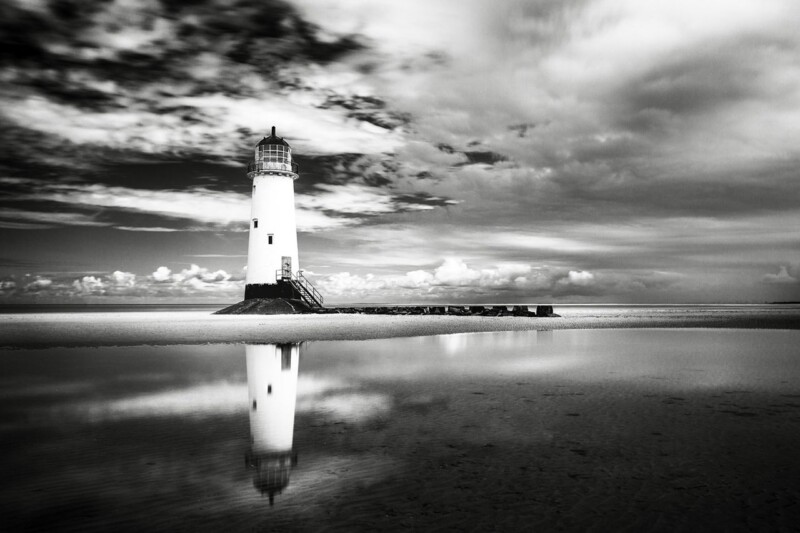
Image of The Final Beacon by Noel Fenech Photography

The strongest black and white wall art should do more than provide contrast. It should also shape the room. The Final Beacon manages that well, using a solitary lighthouse, open sky, and mirrored shoreline to create a calmer, more architectural kind of impact.

black and white wall art - The Final Beacon

Why The Final Beacon gives black and white wall art more presence

Black and white pieces can sometimes feel harsh if there is not enough openness in the image. The Final Beacon avoids that. The lighthouse gives the composition direction and authority, while the surrounding water and cloud bring enough softness to keep the overall effect balanced in hallways, living rooms, bedrooms, or cleaner-lined offices.

  • It works well where a room needs stronger visual structure rather than more colour.
  • It suits contemporary interiors but does not feel cold or severe.
  • It gives a wall a more finished focal point than a generic monochrome print.

First 4 Frames completes the framing and production in-house, which is especially important for monochrome work. Bespoke presentation, careful tonal control, and a hand-finished result help black and white imagery keep its depth instead of flattening out once it reaches the wall.

For more on the photographer, visit Noel Fenech. You can also browse more work by Noel Fenech Photography and see the exact framed product here.

If you want black and white wall art that feel composed, atmospheric, and quietly authoritative, The Final Beacon is a very strong option.
Posted on

Zebra Glass and the Lasting Appeal of Black and White Wall Art

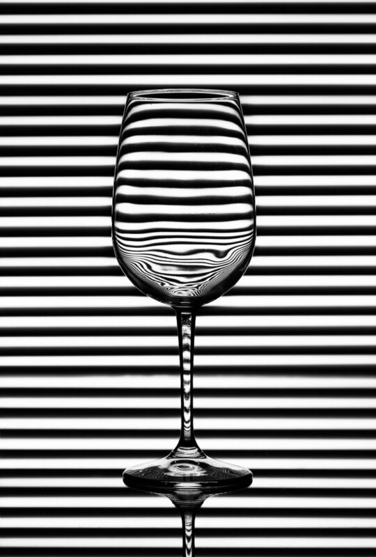
Image of Zebra Glass by Noel Fenech Photography

Strong black and white wall art can do something colour-led pieces sometimes cannot. It can make a room feel sharper, calmer, and more deliberate all at once. Zebra Glass is a good example because its monochrome character brings clarity and contrast without asking the rest of the room to compete.

Why monochrome artwork can feel more architectural

In interiors with cleaner lines, quieter palettes, or stronger materials, colour is not always what the wall needs. Sometimes the better choice is definition. Zebra Glass works well because the black and white treatment encourages the eye to focus on form, light, and pattern rather than distraction.

  • It adds contrast without complicating the palette.
  • It suits rooms that already rely on texture, line, or material detail.
  • It can make a simpler scheme feel more intentional very quickly.

This is often useful in bedrooms, offices, or living rooms where the furniture is restrained and the room needs a focal point that feels crisp rather than decorative for its own sake.

Black and white artwork often succeeds because it edits a room rather than adding to its noise.

First 4 Frames completes each piece in-house in Falkirk with bespoke framing, colour-managed Giclee printing, and hand-finished craftsmanship. With monochrome work especially, that controlled finish helps keep the result clean and confident on the wall.

You can browse more from Noel Fenech Photography and view the exact framed product here.

If you are looking for black and white wall art that feels graphic, balanced, and easy to place in a modern room, Zebra Glass is a smart choice.