
Posted on

Why The Final Beacon Works So Well as Black and White Framed Prints

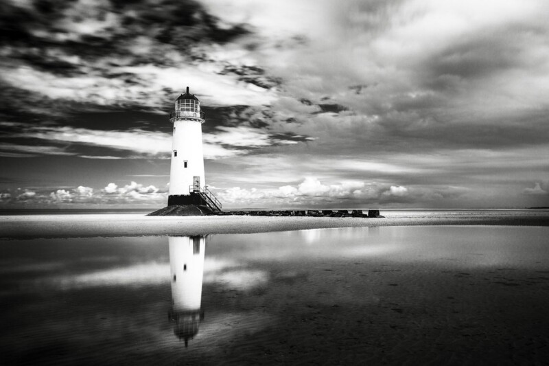
Image of The Final Beacon by Noel Fenech Photography

The best black and white framed prints do more than strip colour away. They create a clearer sense of structure, contrast, and mood. The Final Beacon is a particularly strong example because the lighthouse subject feels crisp and architectural, while the wider scene still carries atmosphere and movement.

black and white framed prints - The Final Beacon

Why black and white framed prints often feel more composed

Monochrome artwork can be a very practical choice when a room already has plenty of texture, pattern, or mixed materials. Instead of competing for attention, it brings direction. That is one reason The Final Beacon works so well in a hallway, home office, sitting room, or stair wall where the room wants focus rather than more colour.

  • It gives the eye a strong focal point without visual clutter.
  • It sits easily with timber, stone, metal, and neutral upholstery.
  • It feels atmospheric rather than flat because the subject has depth and weather in it.

Why The Final Beacon feels easier to live with than many monochrome pieces

Some black and white work can feel severe if the image only offers contrast. The Final Beacon avoids that because the composition still carries reflection, sky, and distance. First 4 Frames completes the piece in-house with bespoke framing and colour-managed fine art printing, so the final result feels polished and substantial rather than merely graphic.

For wider background on lighthouse heritage, the Northern Lighthouse Board is useful. You can also explore more work by Noel Fenech Photography and view the exact framed product here.

If you want black and white framed prints that feel calm, dramatic, and well finished, The Final Beacon is an excellent option.

Posted on

Why The Final Beacon Works Beautifully as Black and White Office Wall Art

Image of The Final Beacon by Noel Fenech Photography

A workspace does not need loud colour to feel considered. Often, the best black and white office wall art does something quieter. It gives the room structure, presence, and a stronger visual centre without becoming distracting. The Final Beacon does that especially well, using dramatic light, reflection, and monochrome contrast to create interest while still keeping the mood composed.

Why monochrome photography suits a working space

Black and white imagery can help an office feel more settled because it works with almost any palette. It sits comfortably with timber desks, darker shelving, glass partitions, and neutral walls, and it can make a room feel more deliberate rather than simply furnished. That is useful in a home office, private study, or client-facing room where you want the space to look polished without losing warmth.

  • It adds atmosphere without fighting with paperwork, screens, or shelving.
  • It suits both modern and traditional office interiors.
  • It gives the wall more presence while keeping the room calm enough for concentration.

A stronger focal point without visual noise

The Final Beacon is particularly effective when an office feels a little plain or too functional. The lighthouse subject gives the print identity, while the dramatic sky and reflected light stop it from feeling generic. That combination can help a meeting corner, desk wall, or reception-facing office feel more established and memorable.

Because the composition is photographic and not overly busy, it still leaves room for the practical side of the space to do its job. You get character and depth without turning the room into a gallery at the expense of usability.

Hand-finished quality makes the difference

At First 4 Frames, each piece is completed in-house in Falkirk using bespoke framing, colour-managed Giclee printing, and superior craftsmanship. That matters in an office setting because a hand-finished framed print looks intentional and lasting in a way a loose poster rarely does.

You can explore more work by Noel Fenech Photography and view the exact framed print here.

If you want black and white office wall art that feels calm, professional, and visually strong, The Final Beacon is well worth considering.

Posted on

Best Frame Colours for Black and White Photography, Starting With The Final Beacon

Image of The Final Beacon by Noel Fenech Photography

Choosing best frame colours for black and white photography is often less obvious than it sounds. A monochrome image can feel sharper, softer, more dramatic, or more architectural depending on the frame that surrounds it. The Final Beacon is a particularly useful example because its lighthouse subject and strong tonal contrast respond clearly to different framing choices.

How frame colour changes the feel of monochrome work

Black and white photography already relies on contrast, shape, and atmosphere rather than colour. That means the frame has even more influence than people often expect. With The Final Beacon, a darker frame can heighten drama and definition, while a lighter or softer finish can make the image feel calmer and more understated.

  • Darker frame tones can make the lighthouse feel bolder and more contemporary.
  • Softer finishes can keep the photograph elegant and less severe.
  • The right choice depends on the room as much as the print itself.

A good frame should guide the mood of black and white photography without stealing attention from the image.

This matters most in rooms with cleaner palettes, metal accents, or quieter furnishings where monochrome art is expected to carry more visual weight. The wrong frame can make the piece feel either too stark or slightly lost.

First 4 Frames completes each piece in-house in Falkirk with bespoke framing, colour-managed Giclee printing, and hand-finished craftsmanship. That personal framing approach is exactly what helps a photograph like this feel fully resolved on the wall.

You can browse more from Noel Fenech Photography and view the exact framed product here.

If you are comparing the best frame colours for black and white photography, The Final Beacon shows clearly why the finish around the image matters almost as much as the photograph itself.