
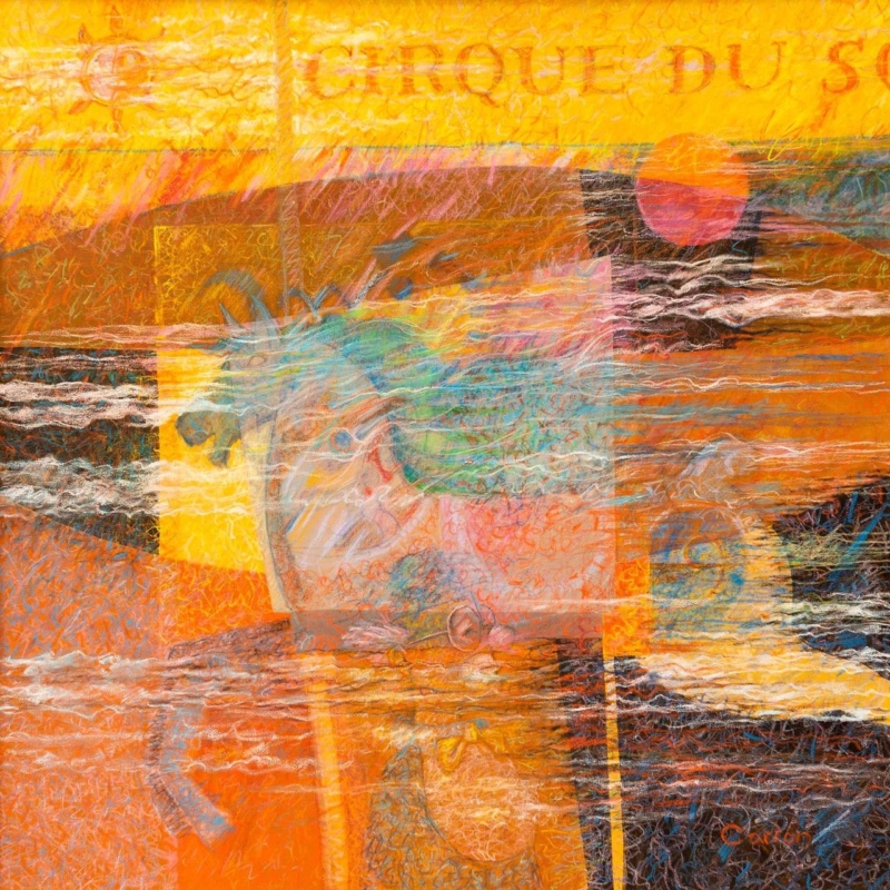
abstract art for a room with burnt orange furniture needs to do more than repeat the upholstery. A successful piece should carry the warmth into the wall, introduce contrast, and give the room a clear visual destination. Breton Circus by Fred Carson offers that balance through glowing yellow and orange, dark linear passages, sea-like blues, and overlapping translucent forms.
Why abstract art for a room with burnt orange furniture benefits from contrast
Burnt orange already has presence. It can make a velvet chair, painted cabinet, or generous sofa feel warm and grounded. If every nearby object repeats the same note, however, the room may become dense. Artwork can keep the warmth while adding the cooler and lighter areas needed to restore depth.
Breton Circus does not treat orange as a flat block. Rust, coral, ochre, and clear yellow move across the surface at different strengths. Turquoise and blue-green interrupt that heat, while charcoal and off-white marks create definition. The result connects with warm furniture without disappearing into it.
Decide whether the furniture or the picture should lead
Start by standing at the room entrance. If a large orange sofa already dominates the first view, the artwork should provide variation rather than trying to become even louder. Place it on a wall with enough breathing room and keep surrounding accessories restrained. If the orange appears only on one small chair, the print can become the main source of colour and help that chair feel intentional.
| Existing feature | Useful response in the room |
|---|---|
| Large burnt orange sofa | Use the blues in the print as the secondary accent |
| Single orange armchair | Let the picture extend the warm palette across the wall |
| Dark timber furniture | Keep some pale wall visible around the finished frame |
| Brass or copper details | Avoid adding more metallic decoration beside the artwork |
This hierarchy prevents colour matching from becoming a collecting exercise. Two or three clear relationships are enough. A blue ceramic, a cream rug, or a charcoal lamp can connect with the quieter parts of the print while allowing the orange furniture to retain its character.
Use the layered surface without adding more clutter
The image has the energy of pasted fragments, drawing, and rubbed-back colour. That layered quality suits an interior with tactile upholstery and collected objects, but it does not require a busy gallery wall. In many rooms, one compact framed piece will feel stronger than several small pictures competing around it.
The artwork’s overlapping forms relate to the language of collage, where separate materials or visual elements build a new whole. Tate’s introduction to collage gives useful context for that approach. Here, the effect creates movement and memory without asking the viewer to identify a single literal scene.
Make the compact square format feel deliberate
The available print size is 265 by 265 millimetres before mounting and framing. It can suit a short wall beside a bookcase, the space above a side table, or a quiet corner near the orange chair. It should not be expected to fill a wide wall over a long sofa by itself.
Mark out the finished frame size with low-tack tape. Then check it from the doorway and the main seat. A mount can increase the overall dimensions and create a calm transition around the active image. Clear wall on every side will make the square composition look chosen for the position rather than squeezed into a leftover gap.
Frame for separation, not an exact furniture match
A slim dark moulding can pick up the deepest marks and sharpen the edge against a pale wall. A light neutral mount can stop the orange areas from running directly into warm paint. Timber may also work, but an almost-match to nearby furniture can look accidental. Compare physical samples beside the upholstery in both daylight and evening light.
First 4 Frames produces colour-managed Giclée prints and completes bespoke framing in-house in Falkirk. That careful process helps the subtle transparent layers, bright passages, and dark lines remain distinct. It also allows the presentation to respond to the real room rather than a colour viewed only on a screen.
A layered composition by Fred Carson
Fred Carson is an Edinburgh-based artist whose practice has included painting, ceramics, murals, wood, glass, and silver. That broad interest in material and form is visible in this densely worked image. Browse the Fred Carson collection at First 4 Frames to compare his abstract and figurative compositions.
Well-chosen abstract art for a room with burnt orange furniture can amplify warmth while still giving the eye somewhere cooler to rest. View the framed Breton Circus print for a compact, energetic focal point with hand-finished presentation.