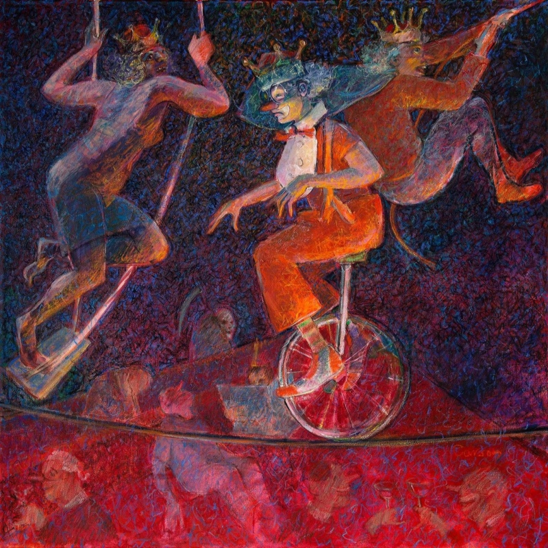
contemporary art prints work well in a sociable corner when they invite different readings instead of supplying one decorative answer. In the Court of Clowns gives that decision a real subject, proportion and finish to assess.
Let contemporary art prints invite interpretation
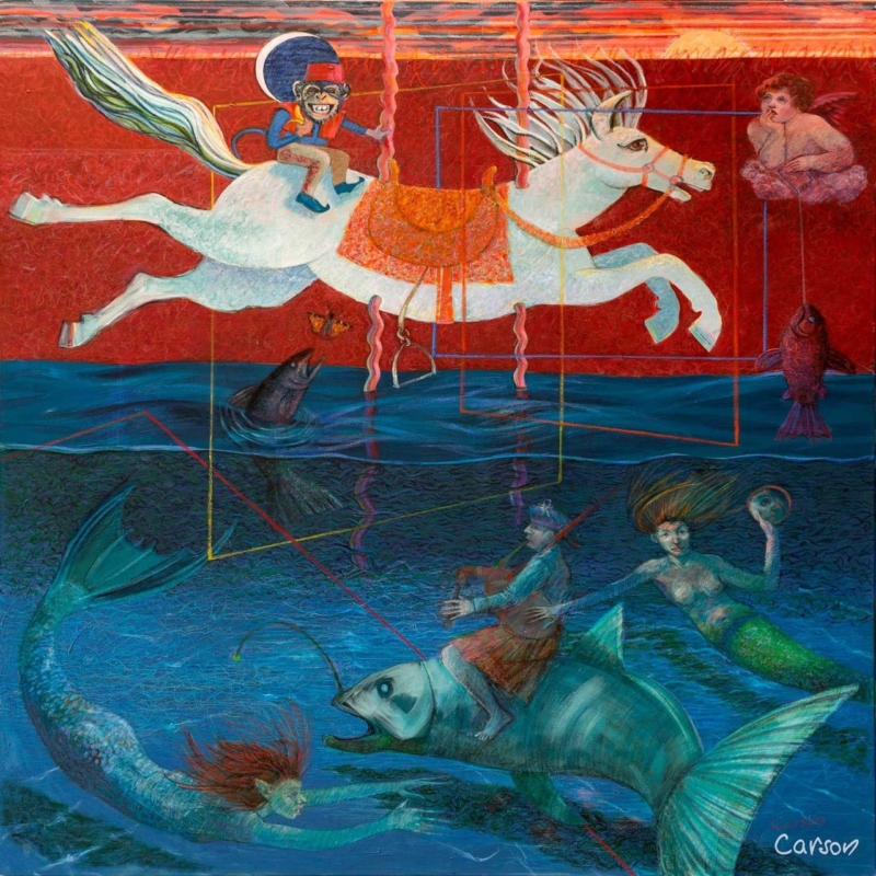
In the Court of Clowns suggests characters, performance and hierarchy without requiring a circus palette. Place it where two chairs or a small sofa encourage people to pause. The picture can begin a conversation while the furniture does its practical job.
Keep the supporting scene quiet
A patterned rug, bright cushions and theatrical ornaments may compete with the work. Choose one subtle colour connection and leave the remaining surfaces calm.
Decision
Useful test
265 mm square
Try it in a close corner with one chair and a focused lamp.
500 mm square
Mark the full frame above a wider pair of seats.
Viewing height
Sit down before setting the centre.
Lighting
Check evening glare from every lamp.
Must the frame look overtly modern?
No. A very thin frame can feel underweight, while an elaborate moulding can turn ambiguity into theatre. Compare finishes against the complete room.
Finish contemporary art prints without explaining them away
An open-ended image depends on tonal and colour detail that remains available for close looking. Colour-managed Giclée printing supports that detail. Hand-finished bespoke framing gives the square work presence without prescribing its meaning.
Contemporary art prints can make a small conversation area memorable. In the Court of Clowns supplies the question; restrained surroundings leave room for different answers.
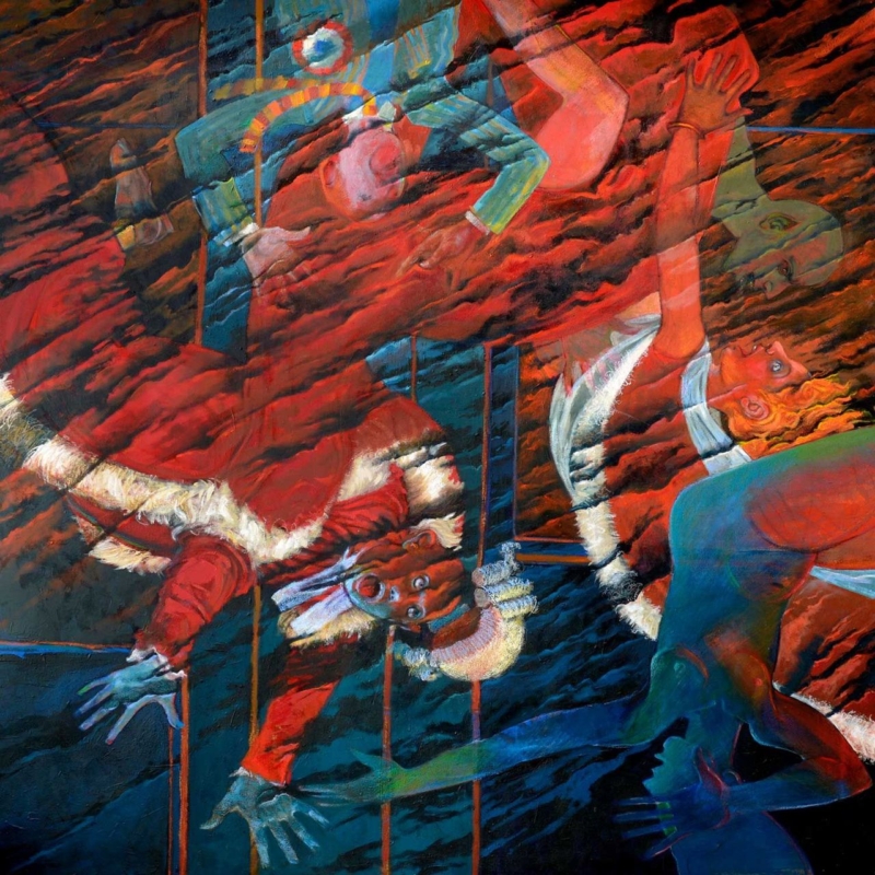
extra large framed wall art must connect the architecture with the people using it; sheer size alone will not resolve a tall wall. Fallen Angel I provides a specific subject, scale and mood to test in the room.
Scale extra large framed wall art from real viewpoints
Mark the outer frame around the 265, 500 and 800 mm square print choices.
View each outline from the main sofa and the room entrance.
Check it again from any upper landing or mezzanine.
Add the furniture, lamps and plants that normally occupy the wall.
Photograph the options at eye level before selecting a scale.
Fallen Angel I has an ambiguous title and square format that reward a slower look. The 800 × 800 mm print may suit a broad wall, but its finished frame will be larger. A 500 × 500 mm version can feel more deliberate if the wall includes a console, stair line or architectural opening.
Do not hang only for the upper void
A picture centred in the full wall height can feel disconnected from the seating below. Relate its lower edge to the occupied part of the room, then confirm that the composition still reads from upstairs.
Leave enough negative space for the square outline to register. Several small objects beneath an already expressive piece can weaken its impact. One low furniture line or a clear wall often provides the stronger relationship.
Specify extra large framed wall art as one object
At larger scale, tonal transitions and edge detail become more visible. Colour-managed Giclée production keeps the image coherent, while in-house bespoke framing allows the moulding, mount and final weight to be considered as part of the artwork rather than an afterthought.
Extra large framed wall art succeeds when it feels connected to the room at human height. Fallen Angel I offers scale choices; measured outlines and several viewpoints reveal which one truly belongs.
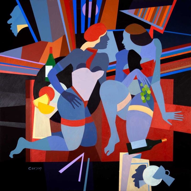
contemporary framed art prints can make a compact eating area feel intentional when the subject offers conversation rather than simply repeating plates, cups or menu typography. Le Déjeuner sur l’herbe gives the decision a real artwork, scale and setting to work from.
Use contemporary framed art prints to define a dining nook
Fred Carson’s title invites an art-historical association, but the work should be judged as its own contemporary image. Begin with the table position. A square artwork can define a small dining zone when its centre relates to seated eye level and its outer frame has room beyond chair backs.
Dining-nook question
Practical response
Is the table round?
Use the square picture as a calm geometric counterpoint.
Is the wall compact?
Mark both available print sizes with the frame added.
Is there a pendant?
Check that it does not cross the artwork from the doorway.
Are fabrics patterned?
Repeat one colour and let the artwork carry the figure and geometry.
Avoid blackboard menus, cutlery motifs and several other food pictures. The title already makes a subtle connection with eating together. Leaving that connection open gives guests more to discuss and keeps the dining area from resembling a themed café.
View the marked outline while every chair is occupied. The artwork should remain visible, yet it should not feel perched too high above seated people. Check evening reflections because dining rooms are often used under concentrated pendant light.
Frame a contemporary dining-room focal point with restraint
Stylised figures, bold colour and geometry need clean edges. Colour-managed Giclée production supports those relationships, while bespoke mounting and framing give the square composition enough authority without overwhelming a compact table.
Contemporary framed art prints can make a dining nook social without being literal. Le Déjeuner sur l’herbe brings a layered reference, while measured placement keeps the room relaxed.
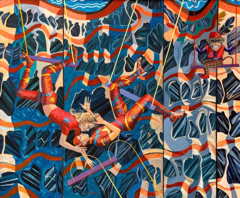
modern framed wall art for a conversation corner works best when the artwork answers a practical need rather than merely filling a gap. Suspended Desire offers a useful example because its landscape proportions and evocative title can hold the space between two seats while leaving room for different interpretations.
Measure modern framed wall art for a conversation corner
Arrange the chairs for comfortable conversation before measuring. Include the gap between them, any permanent side table and the reach of a reading lamp. The artwork should belong to that complete group rather than being centred mechanically on the wall.
Print option
Useful test
400 x 330 mm
Try it where the chairs are compact or another architectural detail already has presence.
560 x 460 mm
Use a paper template to judge whether the broader option connects both seats.
Finished frame
Add the mount and moulding before comparing either outline with furniture.
Lighting
Check lamp and window reflections from both chairs after dark.
The title invites conversation without prescribing a single story. Keep the table surface simple and avoid placing figurines directly below the image. One artwork can create more cohesion than several small objects competing for attention between the chairs.
Use the frame to hold visual tension
Fred Carson’s contemporary practice draws on colour, figure and geometric form. Controlled Giclée output and a precise bespoke frame provide a stable boundary, allowing the composition to remain expressive without making the seating area restless.
Modern framed wall art for a conversation corner should connect the seats and invite looking. Suspended Desire can give a small social zone identity while preserving enough clear wall for the composition to breathe.
custom framed prints should answer a real question about the room or recipient. Weightless is useful here because three landscape sizes allow careful proportion testing rather than assuming a broad piece of furniture always needs the largest option.
Measure custom framed prints from the furniture zone
Clear the sideboard to its normal state, then measure the occupied furniture width. Include any lamp that always remains, but ignore seasonal objects. Make templates for the 400 x 300 mm, 560 x 418 mm and 750 x 560 mm prints with an allowance for mount and frame.
Check
What to look for
Width
Relate the frame to the sideboard without copying its full span.
Height
Leave a deliberate gap above furniture and below the ceiling.
Lamps
Keep shades outside key image areas and test reflections.
Distance
Step back to the doorway as well as standing directly in front.
The middle size may add authority while preserving wall around the frame. The largest can anchor a broad wall only when there is enough viewing distance. Scale should make the title’s sense of lightness convincing, not crowd it out.
Use frame choice to support visual lightness
Custom presentation lets mount, moulding and finished size be judged together. First 4 Frames handles colour-managed output and hand finishing in-house, defining the artwork without making a light composition feel boxed in.
Custom framed prints succeed above long furniture when finished proportions are tested first. Weightless offers enough choice to create a focal point while leaving the sideboard and wall room to breathe.
Abstract wall art for a south facing room must work through very different light levels. When the Sky Breaks has an atmospheric title and confident square format that can hold attention as sunshine moves, but its position still needs to be chosen with care.
Plan abstract wall art for a south facing room over one full day
Mark the full framed square on the proposed wall.
Check it in morning, midday and late-afternoon light.
Exclude any position reached by persistent direct sun.
Sit in the main chairs and look for glazing reflections.
Repeat the test with lamps switched on after dusk.
A pale picture is not automatically best for a bright room. It can lose definition at the strongest point of the day. An expressive work can provide a firmer visual pause, especially when nearby upholstery and window treatments are quiet. Let the artwork carry the movement rather than adding several competing patterns.
Choose scale from furniture, not sunlight
The 265 x 265 mm print can suit an intimate corner. The 500 x 500 mm option can anchor a broader wall above low furniture. Measure both as finished frames, then choose the proportion that belongs to the furniture zone. Brightness should affect placement and protection, not tempt you to oversize the piece.
Keep changing atmosphere intact
Controlled Giclée production gives colour and tonal shifts a reliable starting point. A hand-finished frame then provides a stable boundary as daylight changes around it. Blinds can soften glare, but normal conservation care still means avoiding sustained direct sunlight.
Abstract wall art for a south facing room should remain engaging from breakfast to evening. When the Sky Breaks can supply that focal energy when the wall, light and framing are considered together.
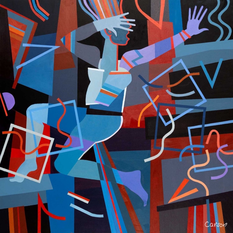
statement wall art for an entrance works best when the artwork solves a particular visual problem instead of merely filling an empty wall. Fallen Angel II is a useful example because Fred Carson combines a stylised figure with bold colour and geometric control in a compact 265 mm square print.
Plan statement wall art for an entrance around the first sightline
Stand outside the room and open the door fully. The best wall is the one that appears naturally during arrival but stays clear of the door swing. Mark the complete framed outline there. A strong image does not need to sit at the architectural centre if that position is hidden by coats or moving people.
Remove temporary clutter before judging the available wall.
Open cupboards and doors to expose their full movement.
Mark the finished frame, not only the 265 mm print.
Check the view from outside and from the adjoining room.
Keep keys, post and charging cables below a separate practical zone.
The compact square can carry more visual weight than its measurements suggest because the figure and geometry are concentrated. Avoid surrounding it with several miniature prints. One mirror may still be useful, but place it on another plane so reflections do not fracture the composition.
Should a small entrance use quiet artwork?
Not necessarily. A controlled square composition can be bold without becoming untidy. Clear wall around it matters more than choosing a timid image.
Use framing to turn visual energy into a welcome
Fred Carson’s work draws on painting, ceramics and sculptural form. Accurate colour-managed reproduction protects those deliberate relationships, while a hand-finished frame creates the firm outer line needed in a busy circulation space.
Statement wall art for an entrance should make the first view intentional. Fallen Angel II supplies personality in a modest footprint, leaving the rest of the arrival area free to work properly.
abstract wall art for ash wood furniture should earn its place by answering a real question about the room or recipient. Dreamtime is a useful starting point because Fred Carson’s square abstract work gives pale timber a concentrated visual counterpoint while allowing the grain, clean lines and open feeling of the furniture to remain visible.
Balance abstract wall art for ash wood furniture by visual weight
Ash furniture usually brings a pale, linear presence to a room. Centre the finished frame on the furniture it belongs with, not automatically on the whole wall. Above a compact sideboard or desk, leave enough clear wall for the square image to read as a deliberate counterweight.
Room element
Useful response
Pale ash grain
Let the artwork provide the stronger colour.
Clean furniture edges
Use a measured frame with an equally clear outline.
Neutral upholstery
Repeat only one quieter tone from the image.
Open shelving
Leave breathing space instead of filling every level.
Abstract work does not need to match the room colour by colour. Its value is often the tension between organic marks and disciplined furniture. Test the arrangement from the doorway, then from the chair or desk where the image will be seen at closer range.
Let pale timber organise the room and let one abstract picture introduce the surprise.
Use the frame to connect free form with clean joinery
Abstract colour relies on accurate transitions rather than recognisable detail alone. Colour-managed production protects those relationships, while a hand-finished frame supplies a dependable outer line that sits naturally with carefully made ash furniture.
Abstract wall art for ash wood furniture works when contrast feels intentional. Dreamtime can bring personality to a pale scheme while measured spacing keeps the room light and composed.
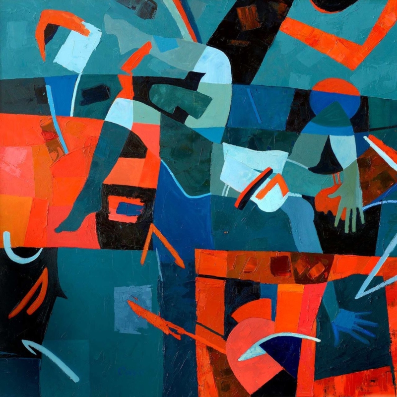
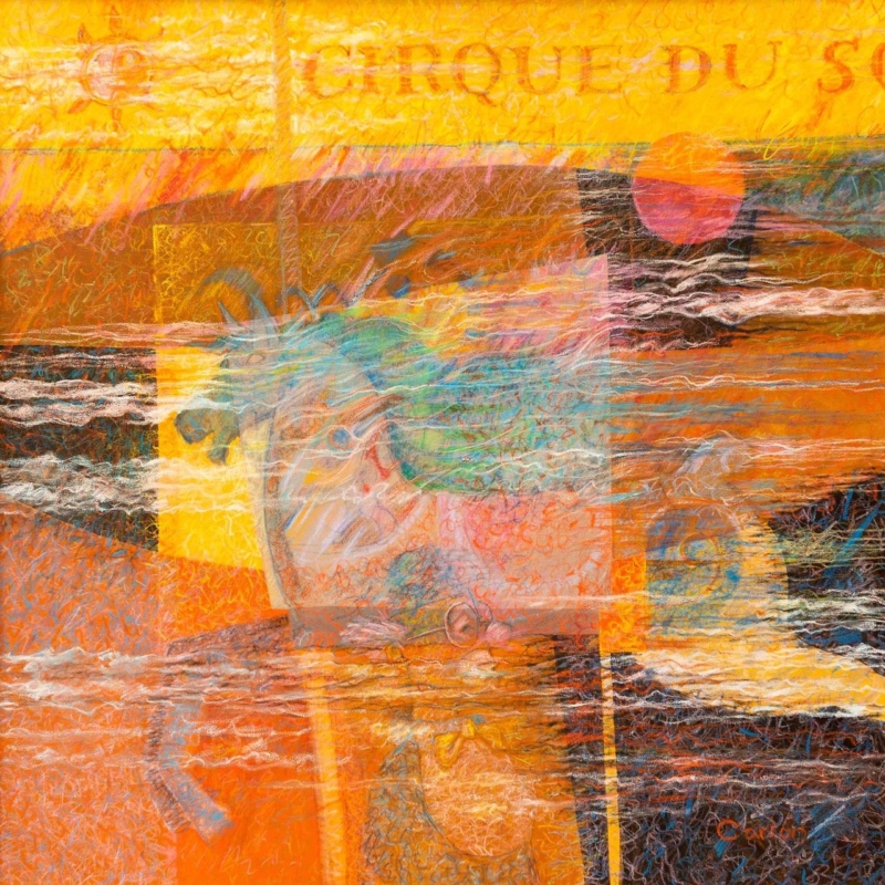
abstract art for a room with burnt orange furniture needs to do more than repeat the upholstery. A successful piece should carry the warmth into the wall, introduce contrast, and give the room a clear visual destination. Breton Circus by Fred Carson offers that balance through glowing yellow and orange, dark linear passages, sea-like blues, and overlapping translucent forms.
Why abstract art for a room with burnt orange furniture benefits from contrast
Burnt orange already has presence. It can make a velvet chair, painted cabinet, or generous sofa feel warm and grounded. If every nearby object repeats the same note, however, the room may become dense. Artwork can keep the warmth while adding the cooler and lighter areas needed to restore depth.
Breton Circus does not treat orange as a flat block. Rust, coral, ochre, and clear yellow move across the surface at different strengths. Turquoise and blue-green interrupt that heat, while charcoal and off-white marks create definition. The result connects with warm furniture without disappearing into it.
Decide whether the furniture or the picture should lead
Start by standing at the room entrance. If a large orange sofa already dominates the first view, the artwork should provide variation rather than trying to become even louder. Place it on a wall with enough breathing room and keep surrounding accessories restrained. If the orange appears only on one small chair, the print can become the main source of colour and help that chair feel intentional.
Existing feature
Useful response in the room
Large burnt orange sofa
Use the blues in the print as the secondary accent
Single orange armchair
Let the picture extend the warm palette across the wall
Dark timber furniture
Keep some pale wall visible around the finished frame
Brass or copper details
Avoid adding more metallic decoration beside the artwork
This hierarchy prevents colour matching from becoming a collecting exercise. Two or three clear relationships are enough. A blue ceramic, a cream rug, or a charcoal lamp can connect with the quieter parts of the print while allowing the orange furniture to retain its character.
Use the layered surface without adding more clutter
The image has the energy of pasted fragments, drawing, and rubbed-back colour. That layered quality suits an interior with tactile upholstery and collected objects, but it does not require a busy gallery wall. In many rooms, one compact framed piece will feel stronger than several small pictures competing around it.
The artwork’s overlapping forms relate to the language of collage, where separate materials or visual elements build a new whole. Tate’s introduction to collage gives useful context for that approach. Here, the effect creates movement and memory without asking the viewer to identify a single literal scene.
Make the compact square format feel deliberate
The available print size is 265 by 265 millimetres before mounting and framing. It can suit a short wall beside a bookcase, the space above a side table, or a quiet corner near the orange chair. It should not be expected to fill a wide wall over a long sofa by itself.
Mark out the finished frame size with low-tack tape. Then check it from the doorway and the main seat. A mount can increase the overall dimensions and create a calm transition around the active image. Clear wall on every side will make the square composition look chosen for the position rather than squeezed into a leftover gap.
Frame for separation, not an exact furniture match
A slim dark moulding can pick up the deepest marks and sharpen the edge against a pale wall. A light neutral mount can stop the orange areas from running directly into warm paint. Timber may also work, but an almost-match to nearby furniture can look accidental. Compare physical samples beside the upholstery in both daylight and evening light.
First 4 Frames produces colour-managed Giclée prints and completes bespoke framing in-house in Falkirk. That careful process helps the subtle transparent layers, bright passages, and dark lines remain distinct. It also allows the presentation to respond to the real room rather than a colour viewed only on a screen.
A layered composition by Fred Carson
Fred Carson is an Edinburgh-based artist whose practice has included painting, ceramics, murals, wood, glass, and silver. That broad interest in material and form is visible in this densely worked image. Browse the Fred Carson collection at First 4 Frames to compare his abstract and figurative compositions.
Well-chosen abstract art for a room with burnt orange furniture can amplify warmth while still giving the eye somewhere cooler to rest. View the framed Breton Circus print for a compact, energetic focal point with hand-finished presentation.
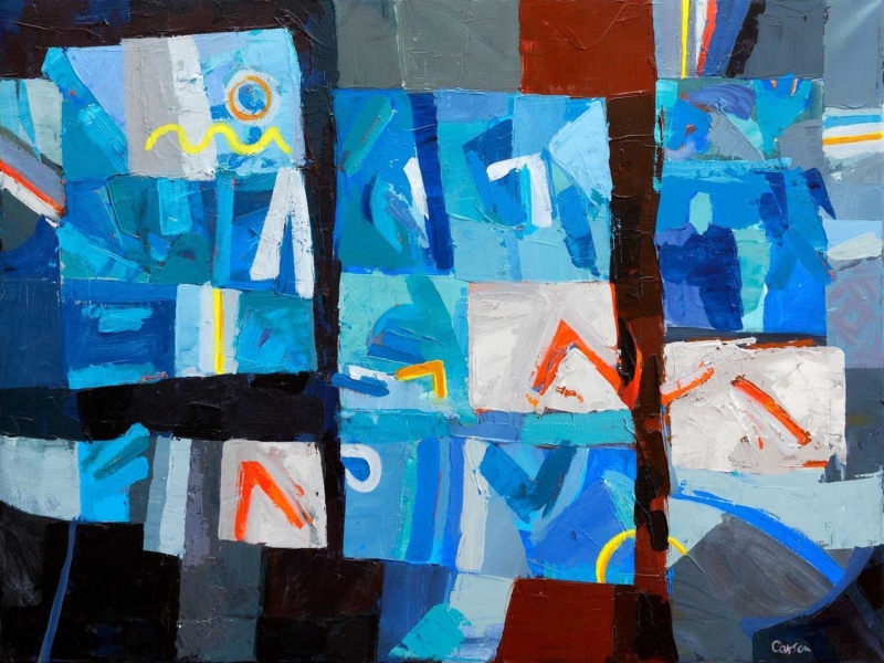
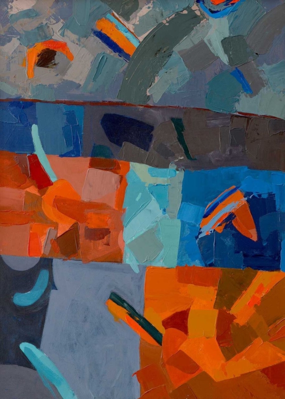
abstract wall art for a narrow hallway should earn its place by answering a real question about the room or recipient. Echoes of Form is a useful starting point because its 400 × 560 mm portrait format, bold colour and geometric character can make one controlled pause without narrowing the route with a long run of small frames.
Position abstract wall art for a narrow hallway from the approach
Stand in the room that leads into the hall. The best wall is often the one revealed gradually as you approach, not the surface nearest the front door. A portrait composition can occupy that view while leaving useful wall space around its frame.
Check the route before marking the wall
Open every nearby door to its full arc.
Allow for coats, bags and passing shoulders.
Mark the complete frame, not only the 400 × 560 mm print.
Walk towards the paper outline from both directions.
View it under the lamps normally used after dark.
Echoes of Form already supplies visual activity. Keep the runner, paint and storage disciplined, and avoid answering every shape with another patterned object. One repeated colour in a small practical detail is enough to connect the picture with the space.
A passage feels larger when the eye has one destination and the walking line remains physically clear.
Use the frame to contain energy rather than add more pattern
Fred Carson’s practice spans painting, ceramics and architectural work, so form and colour are central to the image. Colour-managed Giclée production and a precisely mounted, hand-finished frame give that energy a dependable edge in a busy route through the home.
Abstract wall art for a narrow hallway works when it creates a deliberate stop without becoming an obstacle. Echoes of Form brings colour and structure, while measured placement preserves the hall’s practical flow.