Posted on

Why Softly the River Flows Works Beautifully as Wall Art for Travertine Accents

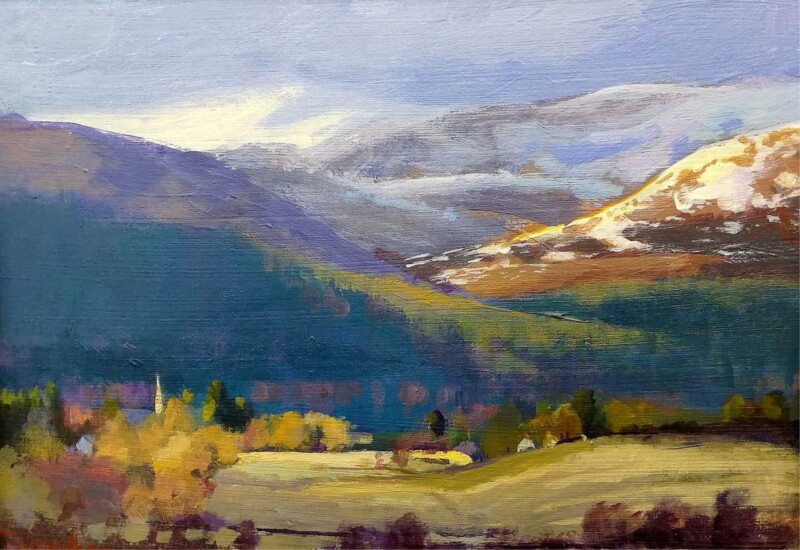
Image of Softly the River Flows by Colin Robertson

Finding the right wall art for travertine accents is often about introducing movement. Travertine gives a room lovely natural character, but stone surfaces can sometimes read as still or slightly cool unless the artwork adds a softer rhythm. Softly the River Flows is a particularly good match because it brings warmth and flow without fighting the room’s quieter materials.

Why stone textures need something more fluid nearby

Travertine often appears in schemes that value restraint and natural materials. That can look beautiful, but the space still benefits from a piece that stops everything becoming too block-like or architectural. This artwork does that by bringing a sense of movement and distance into the room.

  • It works well with travertine tables, hearths, lamps, or side pieces.
  • It softens a room without making it feel fussy.
  • It suits calm living rooms, bedrooms, and polished reception areas.

Why this pairing feels refined rather than obvious

The strongest art in a stone-led room usually adds atmosphere instead of more weight. Softly the River Flows has enough presence to shape the wall, but it still keeps the scheme relaxed. That makes the room feel more layered, not busier.

It can work especially well above a sofa, on the wall facing a stone coffee table, or close to a fireplace where the materials need a little more visual softness around them.

Why the First 4 Frames finish belongs in this setting

First 4 Frames completes every piece in-house in Falkirk with bespoke framing, colour-managed Giclée printing, and hand-finished craftsmanship. In a room where the material palette already suggests quality, that superior finish makes a real difference.

This artwork is by Colin Robertson, and you can view the exact framed product here.

If you want wall art for travertine accents that feels calm, elegant, and professionally finished, Softly the River Flows is a very strong option.

Posted on

Why Tranquility, Plockton Works So Well as Wall Art for Jute Rugs

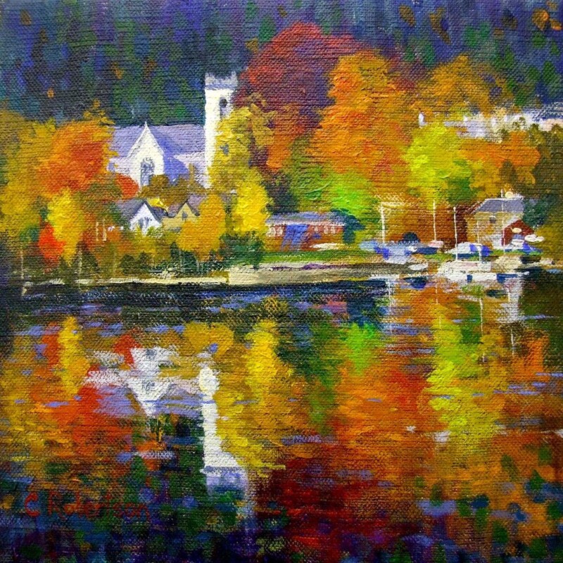
Image of Tranquility, Plockton by Colin Robertson

Finding the right wall art for jute rugs is often less straightforward than it sounds. Jute brings welcome texture and softness underfoot, but it can also leave a room feeling a little unfinished unless the walls carry enough visual interest. Tranquility, Plockton works especially well because it keeps that natural ease while giving the room a stronger focal point.

Why natural flooring needs balance above it

Jute often appears in rooms that aim for a relaxed, pared-back look. That can be beautiful, but the scheme still needs a little colour and shape on the walls if it is going to feel fully considered. This piece brings exactly that without disturbing the calm.

  • It adds atmosphere without making the room feel busier.
  • It works well with timber, linen, and woven textures.
  • It suits sitting rooms, bedrooms, and casual dining spaces particularly well.

Why this pairing feels easy to live with

The room still keeps its natural softness, but the artwork stops it from drifting into looking incomplete. Tranquility, Plockton has enough colour and distance to help the whole space breathe while still feeling anchored.

It can work beautifully above a sofa, near a favourite chair, or on the wall that frames the seating area in a more relaxed scheme.

Why the First 4 Frames finish matters

First 4 Frames completes every piece in-house with bespoke framing, colour-managed Giclée printing, and hand-finished craftsmanship. That superior finish helps the artwork feel properly at home in a room built around better materials and a quieter style of decorating.

This artwork is by Colin Robertson, and you can view the exact framed product here.

If you need wall art for jute rugs that feels calm, layered, and professionally finished, Tranquility, Plockton is an excellent choice.

Posted on

What Makes Embers of the Cuillins, Elgol Such a Good Wall Art Choice for Leather Furniture

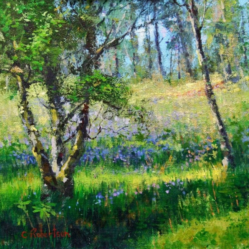
Image of Embers of the Cuillins, Elgol by Colin Robertson

The right wall art for leather furniture should lighten the mood of a room without disconnecting from its richer materials. Leather brings depth, comfort, and presence, but too many heavy notes together can leave the space feeling overly dense. Embers of the Cuillins, Elgol works very well because it adds colour and atmosphere while still suiting a room with substance.

Why richer materials benefit from lift on the wall

Brown, tan, or darker leather often looks best when the walls carry something with movement and tonal variation. This piece does not fight the furniture. Instead, it gives the room a little more air and rhythm.

  • It complements leather without repeating its heaviness.
  • It helps a room feel layered rather than weighed down.
  • It works beautifully in sitting rooms, studies, and snug spaces.

Why landscape colour helps the room breathe

A landscape with warmth and distance can make a richer interior feel more open. Embers of the Cuillins, Elgol has that effect. It carries enough strength for a room with character, but it also gives the eye somewhere lighter to travel.

That makes it especially useful above a leather sofa, near a favourite chair, or on the wall that sets the tone for the whole room.

Why superior presentation matters

At First 4 Frames, each piece is completed in-house in Falkirk with bespoke framing, colour-managed Giclée printing, and hand-finished craftsmanship. That superior finish helps the artwork sit confidently with better furniture and a more settled, quality-led interior.

This artwork is by Colin Robertson, and you can view the exact framed product here.

If you want wall art for leather furniture that feels balanced, atmospheric, and beautifully finished, Embers of the Cuillins, Elgol is a very strong option.

Posted on

Why Whispered Shore Works Beautifully as Art for Boucle Furniture

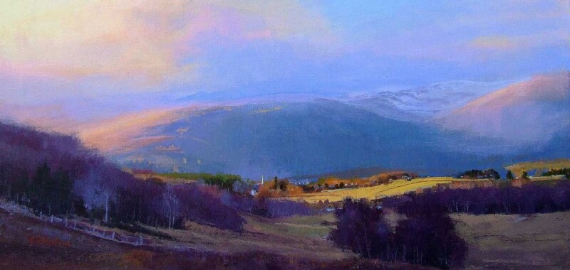
Image of Whispered Shore by Colin Robertson

Choosing art for boucle furniture is often about texture as much as colour. Boucle brings softness and comfort into a room, but without the right artwork nearby the whole scheme can start to feel a little too muted. Whispered Shore is a strong answer because it adds movement and clarity while keeping that softer overall mood intact.

Why texture-led rooms need visual contrast

Rooms built around tactile fabrics benefit from artwork that brings definition without becoming harsh. The better pieces usually echo the softness of the room in spirit, but still introduce enough shape, colour, and direction to stop everything blending together. That is exactly where this artwork works well.

  • It suits softer interiors without feeling overly pale.
  • It gives a textured room more visual depth.
  • It helps neutral upholstery feel finished rather than unfinished.

Why Whispered Shore fits the setting

The coastal atmosphere brings ease and light, while the composition gives the room something more definite to gather around. It can work beautifully in sitting rooms, bedrooms, or relaxed guest spaces where boucle chairs, benches, or cushions need a companion piece that keeps the scheme elevated.

Why the First 4 Frames finish helps

First 4 Frames produces every piece in-house with bespoke framing, colour-managed Giclée printing, and hand-finished craftsmanship. In a texture-led interior, those finishing details stand out. A superior quality frame helps the artwork feel considered and keeps the softer room scheme looking polished rather than vague.

This artwork is by Colin Robertson, and you can view the exact framed product here.

If you need art for boucle furniture that feels soft, balanced, and beautifully finished, Whispered Shore is a very appealing choice.

Posted on

Silent Blue, Castle Stalker and the Case for Better Meeting Room Wall Art

Image of Silent Blue, Castle Stalker by Colin Robertson

Good meeting room wall art should help a space feel professional without making it feel cold. In rooms used for discussion, planning, and decision-making, the artwork needs to add calm focus rather than distraction. Silent Blue, Castle Stalker is a very strong choice for exactly that reason.

Why calm artwork suits working spaces

A meeting room does not usually need loud colour or obvious messaging on the wall. It needs something that creates a composed atmosphere and helps the room feel cared for. This piece brings presence, but it does so with restraint. That makes it easier to live with through long conversations and everyday use.

  • It gives the room a more settled, professional tone.
  • It brings character without pulling attention away from the table.
  • It works well in spaces that need Scottish identity without cliché.

Why Silent Blue, Castle Stalker fits the brief

The quieter palette helps the piece feel credible in a working environment, while the landscape subject keeps it more welcoming than corporate graphics or generic prints. That balance is useful in offices, boardrooms, client meeting rooms, and smaller professional studios where presentation matters.

Why a superior framed finish matters here

First 4 Frames completes each artwork in-house in Falkirk with bespoke framing, colour-managed Giclée printing, and hand-finished craftsmanship. In a business setting, finish matters. A properly framed piece helps the room feel more established, more confident, and better considered overall.

This artwork is by Colin Robertson, and you can view the exact framed product here.

If you are looking for meeting room wall art that feels calm, capable, and properly finished, Silent Blue, Castle Stalker is an excellent option.

Posted on

Why Carved by Wind and Water, Glen Lyon Suits Wall Art for Vaulted Ceilings

Image of Carved by Wind and Water, Glen Lyon by Colin Robertson

Choosing wall art for vaulted ceilings is usually about proportion as much as taste. Taller rooms can feel impressive, but they can also seem underfurnished or slightly echoey when the walls are left too bare. Carved by Wind and Water, Glen Lyon is a strong option because it has the presence needed to anchor a room with more vertical space.

Why height needs visual grounding

In a room with a vaulted or cathedral-style ceiling, the eye naturally travels upward. Good artwork helps guide that movement without leaving the lower part of the room feeling disconnected. This piece brings enough scale and calm to make the space feel more resolved.

  • It helps a taller room feel less empty.
  • It adds structure without making the wall feel crowded.
  • It suits living rooms, entrance halls, and open-plan spaces with extra height.

Why landscape imagery works especially well

An expansive landscape can be very useful in a taller room because it introduces width, distance, and calm. That stops the wall from feeling too narrow or top-heavy. This piece would work particularly well above a sofa, on a feature wall, or where a double-height area needs a stronger visual centre.

The effect is more welcoming and more balanced, which is exactly what many lofty interiors need.

Why quality framing matters at this scale

At First 4 Frames, every piece is completed in-house in Falkirk with bespoke framing, colour-managed Giclée printing, and hand-finished craftsmanship. In a room with added height, a superior quality frame helps the artwork hold its own and feel properly integrated into the architecture.

This artwork is by Colin Robertson, and you can view the exact framed product here.

If you need wall art for vaulted ceilings that feels balanced, atmospheric, and professionally finished, Carved by Wind and Water, Glen Lyon is an excellent fit.

Posted on

Kelvingrove, Glasgow and the Appeal of a Graduation Gift With Real Sense of Place

Image of Kelvingrove, Glasgow by Colin Robertson

A thoughtful Glasgow graduation gift should feel like more than a token. It should mark a real milestone and, ideally, connect to the city that shaped that chapter of life. Kelvingrove, Glasgow does that beautifully, offering a stronger sense of place than a generic present ever could.

Why location matters with graduation gifts

Graduation is often tied to memory, independence, and a particular city or campus rhythm. A piece linked to Glasgow feels more lasting because it reflects that lived experience. It is not just something nice for the wall. It becomes part of the story of that time.

  • It feels more personal than a standard celebratory gift.
  • It is easy to display in a first flat, study, or future home.
  • It offers a grown-up keepsake rather than a short-lived gesture.

Why this piece works after the occasion too

The strongest graduation gifts still feel right years later. This artwork has enough character and calm to live easily in different rooms and different stages of life. That makes it especially suitable for someone moving on, starting work, or setting up a new home.

It carries the memory of Glasgow without needing to shout about it.

Why First 4 Frames makes it more gift-worthy

First 4 Frames produces each piece in-house with bespoke framing, colour-managed Giclée printing, and hand-finished craftsmanship. That superior quality matters when the artwork is meant to mark an achievement and last well beyond the day itself.

This artwork is by Colin Robertson, and you can view the exact framed product here.

If you want a Glasgow graduation gift that feels lasting, personal, and beautifully presented, Kelvingrove, Glasgow is a superb option.

Posted on

What Makes Drift into Dusk, Loch Awe Such a Good Choice for Linen Interiors

Image of Drift into Dusk, Loch Awe by Colin Robertson

When people choose wall art for linen interiors, they are usually trying to protect a sense of softness. Natural fabrics, pale neutrals, and relaxed textures can make a room feel beautifully calm, but they can also leave it slightly undefined if the artwork is too faint. Drift into Dusk, Loch Awe solves that problem in a very well-judged way.

Why softness still needs structure

Linen-heavy interiors often rely on texture more than colour. That means the artwork has an important job to do. It needs to give the eye somewhere to settle while still respecting the quieter palette of the room. This piece does that by adding tonal depth and atmosphere instead of hard contrast.

The result feels composed rather than stark. It helps the room hold together without spoiling the natural ease that makes linen-led schemes so appealing.

Why this piece fits so naturally

  • It sits well with soft neutrals, oatmeals, and stone shades.
  • It adds depth without making the room feel heavier.
  • It works in bedrooms, sitting rooms, and quieter guest spaces.

Because the composition feels calm rather than busy, it suits rooms where tactile materials are already doing a lot of the work.

Why a hand-finished presentation makes a difference

At First 4 Frames, every piece is completed in-house with bespoke framing, colour-managed Giclée printing, and superior quality craftsmanship. In a softer interior, those details matter. A clean, thoughtful finish helps the artwork feel part of the room rather than simply added to it.

This artwork is by Colin Robertson, and you can view the exact framed product here.

If you want wall art for linen interiors that feels calm, textural, and properly finished, Drift into Dusk, Loch Awe is an excellent choice.

Posted on

What Makes Fields of Quiet, Edinburgh a Calm Waiting Room Wall Art Choice

Image of Fields of Quiet, Edinburgh by Colin Robertson

Good waiting room wall art should do more than fill a blank wall. Fields of Quiet, Edinburgh is a strong choice when you want a waiting area to feel calmer, more welcoming, and more reassuring from the moment someone sits down.

Reception and waiting spaces often set the emotional tone for the rest of an appointment or visit. Artwork with too much visual noise can make the room feel unsettled, while something too bland can make it feel neglected. Fields of Quiet, Edinburgh sits in a better middle ground, giving the room presence without strain.

  • It helps a professional space feel cared for rather than purely functional.
  • It introduces colour in a steady, reassuring way.
  • It suits healthcare, studio, consultancy, and client-facing environments where calm matters.

Why this kind of piece works

In a waiting room, the most effective artwork usually supports trust and comfort. This piece does that well, especially in spaces with neutral seating, timber details, or soft painted walls that need one clearer focal point.

Why framing quality matters in commercial spaces

First 4 Frames produces each piece in-house with bespoke framing and colour-managed Giclée printing. That hand-finished quality gives a waiting room a more professional impression, which can influence how clients or visitors feel about the service around them.

This artwork is by Colin Robertson, and you can view the exact framed product here.

For anyone choosing waiting room wall art that feels calm, credible, and well judged, Fields of Quiet, Edinburgh is well worth considering.

Posted on

What Makes The Old Mill Such a Good Wall Art Choice for Exposed Beams

Image of The Old Mill by Colin Robertson

The best wall art for exposed beams needs to respect what is already in the room. Beams bring structure, texture, and history, so the artwork should support that character rather than fight for attention. The Old Mill works especially well because it feels grounded, settled, and naturally in tune with a room that already has architectural presence.

Why this kind of room needs the right balance

Rooms with exposed beams can look wonderful, but they already carry plenty of line and texture. That often means the artwork needs a steadier visual rhythm. The Old Mill has enough depth and character to belong in the space, yet it still feels calm enough to stop the room becoming too busy.

  • It suits cottages, converted outbuildings, and older homes with visible timber detail.
  • It adds warmth without competing with the room’s structure.
  • It helps a characterful interior feel curated rather than pieced together.

Where it can work particularly well

This type of piece sits comfortably above a mantel, on a main sitting room wall, or in a dining area where timber detail is already a feature. Because the subject feels established and rooted, it complements a room with age and texture rather than pulling away from it.

That makes it especially useful for homes where you want to keep the original character, but still bring in a framed focal point that feels intentional and polished.

Why the finish matters in a characterful room

First 4 Frames produces each piece in-house in Falkirk with bespoke framing, colour-managed Giclée printing, and hand-finished craftsmanship. In a room with exposed beams, those details matter. A cleaner, higher-quality finish helps the artwork sit confidently alongside older materials and stronger textures.

This artwork is by Colin Robertson, and you can view the exact framed product here.

If you want wall art for exposed beams that feels grounded, thoughtful, and properly finished, The Old Mill is a very good choice.