
Posted on

Art for Pebble Grey Walls Gains Warmth From Shadows on the Machair

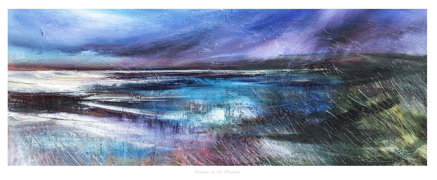
Shadows on the Machair is an abstract seascape painting featuring swirling blue, purple, and white hues that evoke dynamic waves and a dramatic sky, capturing a sense of movement and atmosphere.

Choosing art for pebble grey walls is an opportunity to add warmth without abandoning a calm neutral scheme. Shadows on the Machair brings earthy marks, shifting coastal light, and textured movement. Those qualities stop grey walls feeling flat while preserving the room’s quieter foundation.

art for pebble grey walls - Shadows on the Machair

Build art for pebble grey walls around tonal contrast

Room elementUseful connection
Wall colourLet the cooler grey act as breathing space around the warmer landscape.
Soft furnishingsRepeat one muted ochre, sand, or rust note rather than every colour.
FrameUse timber for warmth or a darker edge for sharper separation.

The expressive surface is important. A very smooth neutral interior can look impersonal when every finish is equally controlled. Shadows on the Machair introduces irregular marks and natural variation. This creates a useful counterpoint to plain upholstery, neat cabinetry, and simple painted walls.

Avoid matching the grey too closely

A frame chosen only to copy the wall may cause the picture to disappear. Instead, judge the darkest and warmest notes in the image. Even a slim contrasting edge can hold the composition clearly. Place the work where side light reveals its tonal range, but avoid direct glare across the glazing.

First 4 Frames completes its colour-managed Giclée production and bespoke framing in-house in Falkirk. That careful process matters for a work built on subtle shifts. It helps the printed texture retain depth and allows the frame to support the palette rather than flatten it.

Read about the coastal habitat through an introduction to the machair landscape. Then browse more work by Fiona Matheson or view Shadows on the Machair.

For art for pebble grey walls, Shadows on the Machair offers enough warmth and movement to enrich the room while respecting its restrained character.
Posted on

Choosing Art for Pebble Grey Walls, Why The Lairig Ghru, Cairngorms Feels So Balanced

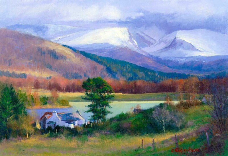
Image of The Lairig Ghru, Cairngorms by Colin Robertson

Finding the right art for pebble grey walls is usually about stopping a neutral room from feeling too flat. Pebble grey is versatile and easy to live with, but it needs artwork with enough depth to build atmosphere without dragging the whole scheme darker. The Lairig Ghru, Cairngorms gets that balance right very naturally.

Why grey rooms need contrast with restraint

Grey can create a calm and elegant backdrop, but it often works best when the artwork introduces shape, distance, and tonal variation. The aim is not to shock the scheme into life. It is to give it more range and visual substance. The Lairig Ghru, Cairngorms brings that sense of depth while still keeping the room composed.

  • It adds atmosphere without making the room feel heavy.
  • It helps quieter paint colours feel more layered and intentional.
  • It works well in bedrooms, sitting rooms, and calmer shared spaces.

This is especially valuable if the room already includes soft neutrals, stone tones, or brushed finishes. The piece adds a clearer focal point while still respecting the gentler palette around it.

First 4 Frames produces each piece in-house in Falkirk with bespoke framing, colour-managed Giclee printing, and hand-finished craftsmanship. That superior presentation helps the artwork hold its own against a cooler, cleaner wall colour.

You can browse more from Colin Robertson and view the exact framed product here.

If you are weighing up art for pebble grey walls, The Lairig Ghru, Cairngorms is a very good example of how to add mood and depth without losing calm.

Posted on

Afternoon Waves, The Bass Rock and the Challenge of Art for Pebble Grey Walls

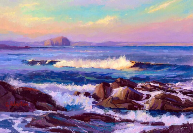
Image of Afternoon Waves, The Bass Rock by Colin Robertson

Finding the right art for pebble grey walls is often about giving the room enough contrast without breaking its calmer mood. Pebble grey is a useful, elegant wall colour, but it can also make the wrong artwork disappear. Afternoon Waves, The Bass Rock works beautifully because it adds movement and depth while still feeling completely at ease in a softer neutral scheme.

Why softer greys still need a clear focal point

Grey often appeals because it feels easy to live with. The risk is that a whole room can become a little too quiet if the art does not bring enough structure. This piece avoids that problem by introducing a stronger horizon and a little more energy without losing the room’s calm.

It is especially useful in living rooms, bedrooms, and hallways where the wall colour is doing a lot of the background work already.

Why this piece pairs so naturally with pebble grey

  • It keeps the scheme soft but not flat.
  • It adds movement without looking busy.
  • It suits both modern and more traditional interiors.

Why the print quality matters

First 4 Frames completes every piece in-house with bespoke framing, colour-managed Giclée printing, and hand-finished craftsmanship. In a neutral room, subtle differences in print quality and finish become easier to notice, so superior presentation really counts.

This artwork is by Colin Robertson, and you can view the exact framed product here.

If you need art for pebble grey walls that feels calm, layered, and properly finished, Afternoon Waves, The Bass Rock is a very strong option.