Posted on

Between Earth and Sky: Calming Wall Art for a Meditation Room

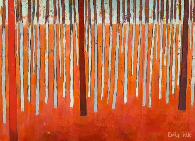
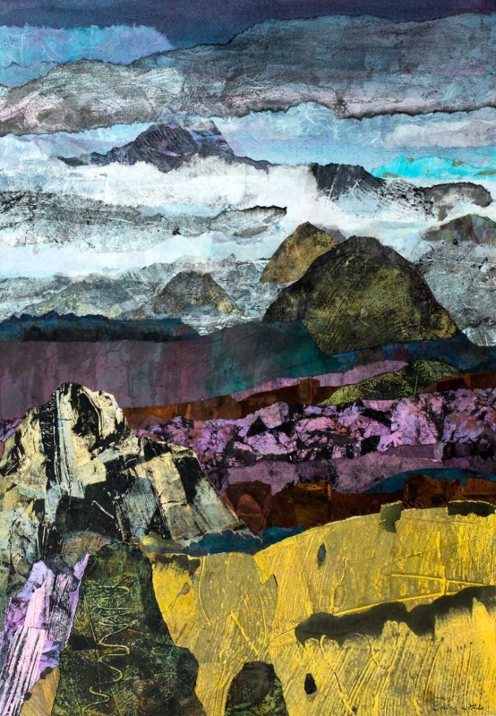
Image of Between Earth and Sky by Emily Little

calming wall art for a meditation room should support attention rather than demand it. A quiet space does not need a literal lotus, slogan, or prescribed spiritual symbol. Between Earth and Sky by Emily Little offers a subtler alternative. Its atmospheric composition suggests landscape and distance while leaving enough ambiguity for the viewer to settle into their own response.

calming wall art for a meditation room: Between Earth and Sky by Emily Little

What calming wall art for a meditation room should do

The artwork is not there to fill every blank surface. Its role is to provide one stable point for the eye before practice begins or when attention wanders. Soft transitions, an open composition, and a title that connects ground with air can help establish that sense of steadiness without dictating how anyone should feel.

Between Earth and Sky works because it sits between recognisable landscape and abstraction. There is enough structure to hold the gaze, yet not so much detail that the mind starts cataloguing objects. This balance can suit a dedicated meditation room, a yoga corner, or a quiet section of a bedroom used for reflection.

Begin with the practice position

Arrange the room from the seated position outward. Sit on the cushion, chair, or bench you actually use and notice where the eyes rest naturally. The artwork should be visible without lifting the chin or twisting the body. If practice usually happens with closed eyes, the picture can still shape the transition into and out of the session.

Avoid placing the print directly above the practitioner’s head. That position removes it from view and may make the wall feel top-heavy. A wall opposite or slightly to one side often creates a more useful anchor. Keep enough clear space around the frame for the composition to feel open.

Build the room in three quiet layers

  • The visual layer: one considered artwork and uncluttered wall space.
  • The tactile layer: a supportive mat, cushion, natural textile, or simple chair chosen for comfort.
  • The practical layer: soft controllable light, ventilation, and storage that removes everyday clutter from view.

Keeping these roles clear prevents the room from becoming a collection of wellness accessories. The picture supplies atmosphere. The furniture supports the body. Storage and lighting make the routine easy to repeat. Nothing needs to perform several jobs or compete for attention.

Let colour remain atmospheric

Instead of matching every tone, choose a wall colour and textile that allow the artwork’s quieter shifts to register. Warm off-white, mineral grey, muted clay, or a restrained natural green can all work, depending on the print in person and the room’s daylight. Test samples at the hours when the space is normally used.

Lighting should be gentle but sufficient to see the image clearly. A shaded lamp or dimmable wall light is often more comfortable than a bright ceiling fitting. Position the light so it does not throw a distracting reflection across the glazing from the usual seated viewpoint.

Frame for calm rather than disappearance

A frame does not have to vanish to feel calm. A restrained dark moulding can give an atmospheric work definition, while a pale timber may connect it to natural textures in the room. A measured mount creates a pause between image and frame. The best combination depends on the actual print, wall, light, and nearby materials.

First 4 Frames uses colour-managed Giclée production and completes bespoke framing in-house in Falkirk. The hand-finished presentation supports the artwork’s tonal detail and gives the piece a settled, lasting presence beyond a short-term room trend.

Atmosphere without a prescribed meaning

Emily Little creates atmospheric paintings in which memory, interior space, and landscape can overlap. Explore more of her work on Emily Little’s official website, or browse the Emily Little collection at First 4 Frames.

The most useful calming wall art for a meditation room leaves room for a personal practice. View the framed Between Earth and Sky print for an artwork that can steady the room through atmosphere, proportion, and thoughtful craftsmanship rather than obvious symbolism.

Posted on

How to Create a Gallery Wall Around The Collector’s Room

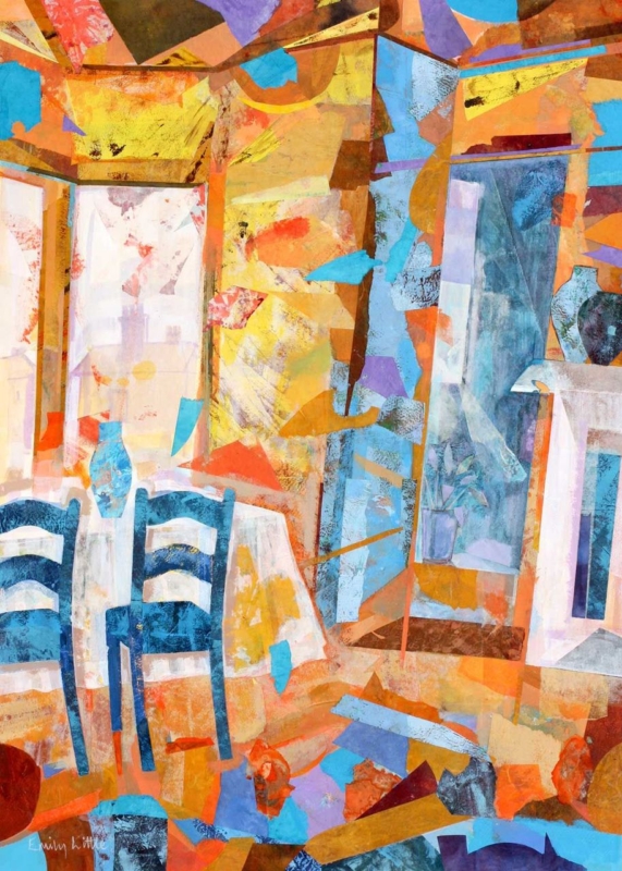
Image of The Collector's Room by Emily Little

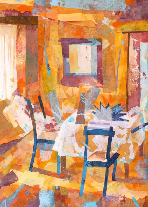
Learning how to create a gallery wall is easier when one work sets the tone. The Collector’s Room by Emily Little is a natural anchor because its portrait proportions, interior subject, and semi-abstract character already suggest a collected world. Begin with it, then make every additional piece justify its place.

how to create a gallery wall - The Collector's Room

How to create a gallery wall from one clear anchor

1. Choose the anchor position

Place the main work slightly off centre if the arrangement will grow to one side. The 360 × 500 mm option can lead a broader composition, while the 230 × 322 mm version suits a tighter group above a desk or console.

2. Build with paper first

Cut paper templates to the finished frame sizes and tape them to the wall. Keep a consistent gap, usually somewhere around 50 to 80 mm, and check the outer silhouette from across the room.

3. Control the relationship

Connect the pieces through one element only: frame tone, a repeated colour, subject, or drawing style. Repeating everything creates a showroom grid; repeating nothing creates visual noise.

How many pieces are enough?

Stop when the arrangement holds the furniture below it and the negative space feels deliberate. An odd number can help, but balance matters more than a fixed total. Leave room to add a genuinely meaningful work later.

Photograph the paper layout before making holes. The camera often reveals a heavy corner or an awkward gap that is less obvious when standing close to the wall.

Use framing to make variety feel intentional

Emily Little’s use of colour, memory, and suggested space rewards nuanced reproduction. Colour-managed Giclée production keeps the transitions alive. Bespoke framing can then coordinate the anchor with neighbouring works without forcing every frame to be identical.

For inspiration from objects and artworks gathered across periods and cultures, explore the V&A collections. Browse more work by Emily Little, or view the exact The Collector’s Room framed print.

The practical answer to how to create a gallery wall is to begin with conviction, measure carefully, and edit firmly. The Collector’s Room offers a characterful centre from which a personal collection can grow.

Posted on

Abstract Wall Art for a Shallow Alcove: Why The Gloaming Fits

Image of The Gloaming by Emily Little

Abstract wall art can give a shallow alcove more depth without filling it with ornaments that collect dust and reduce usable space. The Gloaming by Emily Little is available in unusually slim vertical proportions. Its evening mood can make a narrow recess feel deliberate and quietly atmospheric.

abstract wall art - The Gloaming

Size abstract wall art to the alcove’s internal rhythm

Measure the opening at several heights because older alcoves are rarely perfectly square. Allow a clear margin on both sides of the finished frame. The 120 × 280 mm print can suit a very narrow recess, while the 240 × 560 mm option gives more presence where the wall allows it.

  • Keep the sill or shelf beneath it mostly clear.
  • Use one soft light source from outside the recess.
  • Avoid glazing reflections from a window directly opposite.
  • Choose the frame only after checking the surrounding trim and wall colour.

An alcove already creates a frame within the architecture, so the artwork needs space inside it.

A dusk-like palette can add visual depth to a pale wall. On a darker wall, a clear mount or lighter frame edge may stop the image disappearing. The aim is a measured pause, not a shadow box packed with accessories.

Keep subtle evening colour from closing in

Semi-abstract work depends on small transitions between colour, memory, and suggested form. Colour-managed Giclée production keeps those relationships nuanced rather than muddy. Precise in-house framing helps the slender composition remain straight and visually calm within an architectural recess.

For a concise explanation of the wider art form, read Tate’s guide to abstract art. Browse more work by Emily Little, or view the exact The Gloaming framed print.

As abstract wall art for an awkward alcove, The Gloaming uses proportion and atmosphere to add depth while leaving the space itself clean and purposeful.

Posted on

Industrial Reverie: Art for a Converted Warehouse Apartment

Image of Industrial Reverie by Emily Little

Choosing art for a converted warehouse apartment means working with architecture that already has a strong voice. Brick, steel, tall windows, deep reveals, and open spans can make a memorable home, but they can also leave smaller walls feeling unresolved. Industrial Reverie by Emily Little offers a compact, atmospheric counterpoint. Its semi-abstract character can acknowledge the setting without simply repeating industrial motifs.

art for a converted warehouse apartment: Industrial Reverie by Emily Little

Let the building remain part of the composition

A warehouse conversion rarely needs artwork to supply more visual scale. The structure has already done that. What it often needs is a point of human focus: something that rewards a closer view and makes a particular corner feel inhabited. A modest landscape-format print can create that pause without trying to dominate a double-height wall.

The title Industrial Reverie suggests a useful tension between harder surroundings and a more reflective mood. That makes the work suitable for an interior where original fabric meets domestic life. It can connect with the building’s history while preventing brick, metal, and concrete from becoming the only story in the room.

Where art for a converted warehouse apartment can work hardest

PositionWhat the artwork can doUseful check
Above a compact consoleGive an entrance zone a clear identityRelate the frame to the furniture width
Beside an exposed-brick pierSoften a hard architectural junctionLeave visible brick around the frame
Near a reading chairCreate a more intimate visual scaleCheck the view from the seat
Along an open-plan transitionMark the change between living and dining areasAvoid a busy route where the frame may be brushed

Do not assume that the largest blank wall is automatically the right location. A compact piece may look stranded there. Shorter returns, structural bays, and walls near furniture often provide better proportion. Use a paper template that includes the expected frame, not only the 345 x 250 millimetre print size.

Build contrast instead of matching every material

An industrial apartment can become heavy if every choice repeats black metal, dark leather, and reclaimed timber. Artwork provides an opportunity to introduce ambiguity, movement, and a different kind of surface. Semi-abstract work is especially helpful because it can sit between the building’s geometry and the softer objects of everyday life.

Keep nearby accessories selective. One ceramic, a stack of books, or a soft pool of lamplight may be enough. Avoid arranging vintage factory signs and mechanical objects around the frame. Those additions can make the room feel staged, whereas a little clear space allows the picture and original architecture to hold a more natural conversation.

Choose a frame that defines rather than imitates

A black frame may suit steel window lines, but it is not the only answer. A fine dark moulding can provide definition on pale plaster. Natural timber can bring warmth to exposed brick or concrete. If the wall itself is highly textured, a mount and a clean outer edge can give the image visual breathing room.

First 4 Frames produces colour-managed Giclée prints and completes bespoke framing in-house at its Falkirk workshop. That careful presentation matters in a detail-rich apartment. It makes a smaller artwork feel deliberate and gives it enough finish to stand alongside strong architectural materials.

A quieter focal point within a large interior

Emily Little explores colour, memory, emotion, and the world around us through expressive semi-abstract painting. Visit Emily Little’s official website for more of her practice, or compare the wider Emily Little collection at First 4 Frames.

Successful art for a converted warehouse apartment does not have to fill the biggest wall or mirror every exposed beam. It can make one part of the home feel more personal and complete. View the framed Industrial Reverie print for an atmospheric piece that respects the architecture while bringing the interior back to a human scale.

Posted on

Interior Scene Wall Art Can Add Mystery to a Quiet Landing

Image of The Other Room by Emily Little

Interior scene wall art for a quiet landing can give an in-between space a purpose beyond circulation. The Other Room by Emily Little is especially apt because its title already suggests a place just beyond immediate view. On a landing, that implied space can create depth and a small moment of discovery between bedrooms or floors.

interior scene wall art for a quiet landing - The Other Room

Let interior scene wall art for a quiet landing slow the journey

Find the natural pause

Stand where someone finishes climbing the stairs or turns toward the next room. That is often a stronger position than the middle of a long wall. The artwork can meet the eye at the point where movement already slows.

Protect the route

Keep the frame away from tight corners and doors that open toward it. The portrait format can use a narrower section of wall, but it still needs physical clearance and enough distance to be understood as a complete scene.

Use evening light as part of the experience

Landings are often seen under artificial light. A lamp or wall light placed to one side can reveal the image without placing a hard reflection over it. Test the view from both the stairs and the nearest doorway.

Retain the quieter transitions within the image

Atmospheric interior work depends on controlled tonal separation. Colour-managed Giclée printing keeps quieter passages visible, while a bespoke frame defines the image against the surrounding wall. The in-house, hand-finished process gives the piece presence without making a calm landing feel overdecorated.

For ideas on looking closely at narrative and composition, use the National Gallery’s resources for looking at art. Browse more work by Emily Little, or view the exact The Other Room framed print.

As interior scene wall art for a quiet landing, The Other Room gives an overlooked transition depth, story, and a reason to pause.

Posted on

The Attic Room: How to Choose Wall Art for a Loft Study

Image of The Attic Room by Emily Little

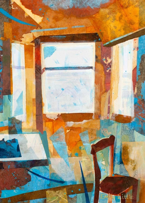
wall art for a loft study has to work with a room that may offer excellent character but very little straightforward hanging space. Sloping ceilings, dormer windows, desks, and built-in storage quickly divide the walls. The Attic Room by Emily Little provides a thoughtful answer. Its upright proportions fit a narrower vertical section, while the painted windows and warm interior colours create an extra sense of light and depth.

wall art for a loft study: The Attic Room by Emily Little

Map the usable walls before furnishing the loft

Begin with the full height sections. A gable wall, chimney return, or strip beside a dormer may be more valuable for art than the long walls beneath the eaves. Reserve low areas for cupboards, files, and surfaces. This prevents the picture from being squeezed into a space where the roof line cuts across it or where furniture hides the lower half.

Next, sit at the desk and note the walls in your natural sightline. Artwork directly behind a monitor is often obscured. A piece on the return wall, opposite the desk, or beside the approach to the workspace can be easier to enjoy. It can also improve the view during breaks without becoming a distraction during focused work.

Why upright wall art for a loft study is so useful

The Attic Room is available in 230 x 322 and 360 x 500 millimetre print sizes before framing. Its vertical format uses height rather than width, which is helpful when a broad wall is interrupted by windows or storage. Mark the intended finished frame with low-tack tape and check that the top has comfortable clearance from the changing roof angle.

The composition reinforces that vertical movement. Bright window shapes draw the eye upward, while the chair and fragments of table keep the image connected to a working interior. The subject therefore relates to the room without literally repeating a desk, keyboard, or office slogan.

Balance daylight and screen light

  1. Watch the room for a full working day. Rooflights and dormers can send strong light across different walls as the sun moves.
  2. Avoid direct glare. Choose a position where bright reflections will not make the image difficult to see.
  3. Keep it out of the screen’s background when needed. If video calls matter, decide whether a calm artwork backdrop helps or whether another wall gives better daily enjoyment.
  4. Add controlled task lighting. A desk lamp should support work without throwing a hard hotspot across the glazing.

The painted windows in the artwork bring a suggestion of brightness even on overcast days. Orange and rust tones add warmth, while turquoise and pale blue details keep the image from feeling enclosed. This colour balance can help a loft study feel welcoming in winter as well as airy in summer.

Let the artwork soften practical office furniture

Loft studies often rely on efficient furniture because every section of floor and wall has a job. White cupboards, metal desk legs, and filing boxes can make the result feel temporary. The layered, semi-abstract surface of The Attic Room introduces marks, irregular edges, and human warmth without requiring extra objects on the desk.

A simple natural-timber frame can connect the orange tones to exposed beams or a wooden worktop. A narrow dark frame gives the fragmented forms a crisp boundary and may relate better to contemporary lighting or black furniture. Avoid an excessively wide moulding if the hanging section is already narrow.

Make a converted room feel permanent

A loft office can sometimes feel like spare space claimed in a hurry. One properly scaled and hand-finished piece signals that the room has a settled purpose. First 4 Frames completes colour-managed Giclée production and bespoke framing in-house in Falkirk, helping the subtler paper textures, painted colour, and pale window forms remain clear.

See how the artist uses colour, memory, and semi-abstract interiors on Emily Little’s official website, then browse the wider Emily Little collection. If you need wall art for a loft study that uses a narrow wall well and gives the room greater depth, view the framed The Attic Room print.

Posted on

Narrative Wall Art for a Guest Room Gives Visitors Something to Discover

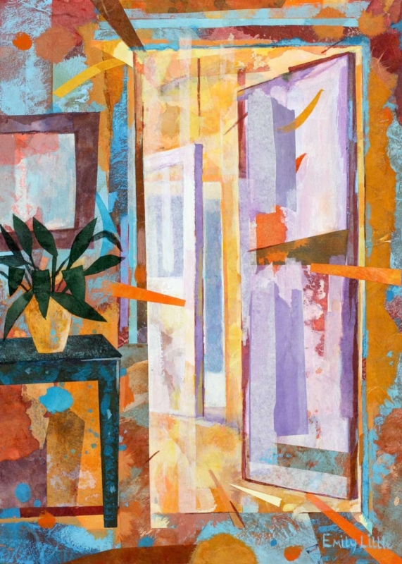
Image of The Unexpected Visit by Emily Little

Narrative wall art for a guest room gives visitors something to discover without filling the space with the homeowner’s personal photographs. The Unexpected Visit by Emily Little has a suggestive title that opens a story. That possibility can make an occasional bedroom feel thoughtful and memorable.

narrative wall art for a guest room - The Unexpected Visit

Let narrative wall art for a guest room invite interpretation

A guest room feels personal when it offers character, but comfortable when the story remains open enough for visitors to make their own.

Hang the work where it can be noticed after someone enters, rather than directly above a tall headboard where details are hard to see. A wall opposite the bed, beside a compact desk, or above a low chest usually gives the image a better viewing distance.

Build comfort around the artwork

Use bedding and curtains as a quiet background. Pick one secondary colour from the print, then repeat it once in a throw or bedside object. Avoid several other figurative works, which may turn intrigue into noise.

Guest-room hanging check

Check the frame from the doorway and pillow, keep it clear of luggage racks and opening doors, and make sure bedside lighting does not reflect across the image.

Narrative work depends on legible detail and balanced tone. First 4 Frames uses colour-managed Giclée production and completes the bespoke frame in-house for a considered finish.

For a concise explanation of storytelling in visual art, read Tate’s introduction to narrative art. Explore more work by Emily Little, or view the exact The Unexpected Visit framed print.

As narrative wall art for a guest room, The Unexpected Visit brings intrigue and individuality to a simple scheme while allowing each visitor to read the story differently.

Posted on

Alberi II: Panoramic Wall Art Above a Bed

Image of Alberi II by Emily Little

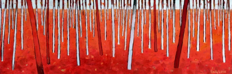
panoramic wall art above a bed can solve a familiar proportion problem. A bed creates a broad visual base, yet a standard upright picture may seem detached above it. Alberi II by Emily Little takes the opposite approach. Its very wide, shallow format follows the line of the headboard, while the repeated trunks and intense woodland floor create rhythm without requiring a group of separate frames.

panoramic wall art above a bed: Alberi II by Emily Little

Why panoramic wall art above a bed feels settled

The strongest bedroom arrangements connect the furniture and wall instead of treating them as separate layers. A horizontal image extends across the headboard area and gives the eye a clear line to follow. Because Alberi II is only 310 millimetres high at its largest print size, it adds presence without pushing too close to the ceiling.

The woodland subject supports that geometry. Slim vertical trunks rise through the composition, but their repeated spacing reads as one continuous band. That balance of horizontal format and vertical detail prevents the piece from looking like a decorative stripe. It remains an artwork with depth and movement.

Set the width in relation to the headboard

Begin with the bed, not the full wall. The framed picture should be clearly narrower than the headboard so the arrangement keeps a stable visual base. At the same time, it needs enough width to avoid floating as a small object over the pillows. Use masking tape to mark the proposed outer frame, then view it from the doorway and from the foot of the bed.

  1. Measure the headboard. Record its full visible width after bedside furniture is in place.
  2. Mark the frame outline. Include the moulding and any mount, not only the 900 x 310 or 560 x 180 millimetre print.
  3. Check the gap below. Leave comfortable breathing space above the headboard rather than allowing the frame to appear perched on it.
  4. Test the doorway view. Make sure the artwork centres on the bed, even if the bed is not centred on the whole wall.

The narrower print option can suit a single or double bed, depending on the finished frame. The larger version has the reach for a broader headboard. Exact proportions will vary with the mount and moulding, so a paper template gives a more dependable answer than a general percentage rule.

Use the red woodland without making the room restless

The red and orange ground gives the print real energy, but the pale trunks and disciplined repetition keep it controlled. Let that band of colour be the room’s main expressive feature. Bedding can stay quieter in stone, soft white, charcoal, or muted green. One rust or berry-coloured cushion is enough to connect the palette.

This restraint is particularly useful in a bedroom. Repeating every colour across curtains, lamps, throws, and rugs would make the scheme feel busy. A concentrated area of warm colour above the bed can create focus while the rest of the room remains restful.

Choose the frame and fixings as part of the plan

A dark, slim moulding can sharpen the tree trunks and suit black bedside lights or metal details. Pale timber may connect the woodland subject to oak furniture and soften the stronger red. Avoid an unnecessarily deep or ornate profile; the elongated format already provides a distinctive architectural line.

Anything positioned over a bed must be securely fixed for the wall type and finished frame weight. Use appropriate hardware and avoid relying on a loose picture ledge. First 4 Frames can advise on presentation and practical hanging considerations when the frame is specified.

A confident focal point with an in-house finish

First 4 Frames produces colour-managed Giclée prints and completes bespoke framing in-house at its Falkirk workshop. Careful production helps preserve the fine pale trunks, dark lines, and variation across the red woodland floor. The finished frame turns the unusual shape into a deliberate part of the bedroom architecture.

See how the artist explores colour, memory, and semi-abstract landscape on Emily Little’s official website, then compare more work in the Emily Little collection. If you need panoramic wall art above a bed with a strong sense of proportion and an original colour story, view the framed Alberi II print.

Posted on

Birch Forest: Wall Art for a Windowless Hallway

Image of Birch Forest by Emily Little

wall art for a windowless hallway can do more than fill an empty stretch between rooms. The right image can create a visual destination, suggest natural light, and make a narrow route feel less enclosed. Birch Forest by Emily Little offers that kind of lift. Its pale trunks and layered woodland space give the eye somewhere to travel, even when the hallway itself has no outside view.

wall art for a windowless hallway: Birch Forest by Emily Little

What should wall art for a windowless hallway achieve?

A hall without daylight often feels flatter than the rooms around it. Painting every surface brilliant white does not always solve the problem. With no changing light to animate it, a pale corridor can still appear blank. Artwork introduces contrast and depth, giving the wall a point of interest that remains effective throughout the day.

A woodland subject is especially useful because paths, overlapping trunks, and changing tones imply distance. Birch Forest creates an opening rather than a hard visual stop. The effect is subtle, but it can make the walk from an entrance to the main rooms feel calmer and more intentional.

Place the image where it draws people forward

Start by standing at the entrance and noting the wall seen first. An artwork at the far end can act as a destination. On a longer side wall, the print can mark the midpoint and break up an uninterrupted run. Avoid squeezing it between several doors if a quieter section is available.

  1. Check the main sightline from the front door or staircase.
  2. Measure the clear wall after allowing for switches and door swings.
  3. Set the centre at a comfortable viewing height, rather than aligning it with door tops.
  4. Use one nearby light fitting to illuminate the picture evenly and avoid glare.

Let colour create light without looking washed out

Pale artwork needs enough tonal variation to remain visible in artificial light. The darker woodland notes in Birch Forest give the composition definition, while softer areas keep it open. This is more effective than choosing an image that is almost entirely white, which may disappear into the wall after sunset.

Warm bulbs can make cream, stone, and natural timber finishes feel welcoming. Cooler lighting can suit a crisp grey or blue scheme, but test it in the evening. The aim is to preserve the artwork’s quieter shifts rather than flood the glass with a bright hotspot.

Choose a frame that defines the view

A slim dark moulding can outline the woodland scene and give a pale hall useful contrast. A natural timber finish may connect it to flooring, a console, or stair details. In a narrow passage, a restrained profile is usually practical as well as visually tidy.

First 4 Frames produces colour-managed Giclée prints and completes framing in-house at the Falkirk workshop. This personal process helps customers compare moulding tones and finished scale, both of which matter when the viewing distance is short.

Explore the artist’s wider atmospheric work on Emily Little’s official website, or compare pieces in the Emily Little collection. For wall art for a windowless hallway that brings depth and a suggestion of daylight, view the framed Birch Forest print.

Posted on

Interior Design Wall Art Can Add Organic Rhythm With Alberi II

Image of Alberi II by Emily Little

Effective interior design wall art should solve a room problem as well as reward close looking. Alberi II introduces organic rhythm where furniture and architecture feel straight. Its tree-led forms soften cabinetry, echo windows, and bring movement to a contemporary scheme.

interior design wall art - Alberi II

Use interior design wall art to repeat rhythm

Three details to coordinate

  • Repeat one quiet colour in a cushion, ceramic, or book spine.
  • Relate the frame to nearby timber without matching every grain.
  • Leave blank wall so the branching forms remain clear across the room.

Look for vertical elements before choosing a position. Tall glazing, shelving uprights, floor lamps, and fluted surfaces create a repeated beat. Alberi II can join that rhythm while loosening it, so an orderly room does not become rigid.

The upward movement is useful above low furniture. It balances a long sofa or sideboard and draws attention through the wall’s height without requiring an oversized frame.

At First 4 Frames, colour-managed Giclée printing and bespoke framing are completed in-house in Falkirk. Fine marks remain clear, and the moulding can be judged as part of the room solution.

For useful background, visit the V&A’s exploration of nature in design. You can also browse more work by Emily Little or view the exact Alberi II print.

As interior design wall art, Alberi II earns its place by joining structure with softness and giving a clean room a natural pace.