Posted on

Garden Party: Wall Art for an Event Planner’s Studio

Image of Garden Party by Fred Carson

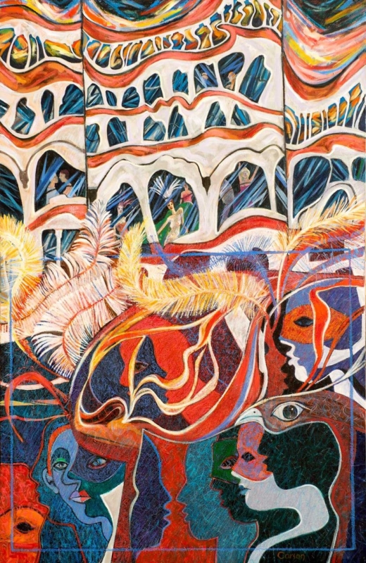
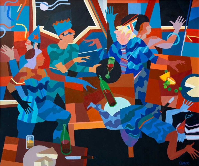
wall art for an event planner’s studio should express the energy of bringing people together without making a professional workspace resemble a permanent party set. Garden Party by Fred Carson offers a lively but structured alternative. Stylised figures talk, gesture, carry glasses, and move through a bold arrangement of blue, red, terracotta, black, and cream. The scene feels social, yet its strong geometry keeps the image composed.

wall art for an event planner's studio: Garden Party by Fred Carson

What wall art for an event planner’s studio needs to communicate

Clients visit an event professional to imagine an experience that does not yet exist. The studio therefore needs to feel organised and dependable, but also alert to atmosphere, colour, and human behaviour. Generic office prints can make the room feel cautious. Literal balloons, champagne labels, or wedding slogans can narrow the business to one type of brief.

Garden Party focuses on people rather than decorations. Hands, faces, drinks, chairs, and tables overlap in a scene full of conversation. The painting suggests arrival, connection, and movement without defining whether the gathering is a wedding, launch, dinner, or private celebration. That openness makes it relevant to a varied events practice.

Use the picture to anchor a client conversation

The strongest position is one clients can see without turning away from the discussion. Behind a consultation table, beside a materials library, or on the first clear wall inside the studio may work well. Avoid placing it among mood boards that change every week. The artwork should supply continuity while project samples come and go.

Studio zoneWhat the artwork contributesPractical check
Consultation areaA relaxed social cue before the meeting beginsCheck that chairs do not hide the lower edge
Entrance wallAn immediate statement about people and atmosphereKeep reception signs and notices separate
Sample libraryA stable focal point beside changing colours and materialsLeave enough clear wall to prevent visual competition
Team workspaceEnergy and character beyond schedules and screensTest glare from task lighting and monitors

The print measures 360 by 300 millimetres before framing. Its near-square landscape shape has enough width for the group to read as a social scene while remaining suitable for a smaller client studio. Mark the full framed size above furniture and view it from both seated and standing positions.

Let the composition demonstrate visual coordination

Event work often involves many simultaneous details. In this image, different figures, gestures, colours, and table forms remain connected through repetition. Blue moves across clothing and background shapes. Warm red and orange passages establish rhythm. Pale curved lines travel through the darker upper area, while black sections hold the brighter elements together.

That balance can support a studio filled with swatches, stationery, flowers, floor plans, and screens. Keep active project material grouped in trays, drawers, or defined boards. Giving the framed picture a clean boundary shows that abundance can still be edited and controlled, which is a useful message for clients trusting someone with a complex occasion.

Choose colours that belong to the business all year

  • Neutral studio: allow the blue and terracotta to provide the main colour rather than adding several bright accessories.
  • Dark joinery: use the image’s black structure to connect with shelving or a consultation table.
  • Warm timber: let rust, brown, and cream bridge the furniture with the cooler blue figures.
  • Existing brand colour: echo one compatible tone in a folder or chair, but do not force the whole painting into the brand palette.

Because the scene is not tied to one season, it can remain in place while spring weddings, autumn dinners, corporate launches, and winter celebrations move through the calendar. The studio gains personality without needing to redecorate for each campaign.

Keep creative atmosphere separate from operational information

An attractive studio still needs clear working systems. Risk planning, supplier details, access notes, and production schedules should remain legible and current. the HSE event safety guidance provides practical background on responsibilities and planning. Place essential documents where the team can use them, while letting the artwork perform a different role: expressing why people gather in the first place.

This separation also helps during client meetings. The picture can establish mood without competing with the exact plan under discussion. When the team turns to timings, budgets, or logistics, the room remains visually engaging but does not blur decoration with instruction.

Frame bold figurative art for a professional setting

A slim dark moulding can reinforce the image’s graphic structure. A restrained warm timber may soften the scene and relate to tables or sample storage. A coloured frame is possible, but it should be compared against the full composition; choosing one bright tone in isolation could make the result look promotional rather than collected.

First 4 Frames produces colour-managed Giclée prints and completes bespoke framing by hand at its Falkirk workshop. That careful in-house process helps the closely related blues, reds, creams, and dark shapes remain separate. It also gives a creative business a polished, ready-to-hang piece suited to repeated client use.

A social scene by Edinburgh artist Fred Carson

Fred Carson is an Edinburgh-based artist whose contemporary work combines stylised figures, bold colour, and geometric form. His background spans painting, ceramics, sculpture, and architectural commissions. Browse the wider Fred Carson collection at First 4 Frames to compare how other compositions handle movement and groups.

Effective wall art for an event planner’s studio should make creativity visible while leaving the studio calm enough for decisions. View the framed Garden Party print for a sociable, carefully structured image finished with lasting in-house craftsmanship.
Posted on

A Romantic Framed Art Gift That Avoids the Usual Anniversary Clichés

Image of Breton Lovers by Fred Carson

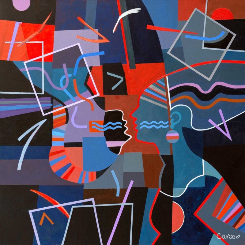
romantic framed art gift should earn its place by answering a real question about the room or recipient. Breton Lovers is a useful starting point because its title and paired subject suggest intimacy, while the compact square composition remains artwork first and an occasion marker second.

romantic framed art gift - Breton Lovers

How to choose a romantic framed art gift personally

Begin with the couple’s home, not the anniversary number. Notice whether they use bold colour, graphic forms or small focal artworks. Breton Lovers is most convincing for someone who responds to contemporary figures and a clear emotional idea, rather than literal hearts or written declarations.

QuestionWhy it matters
Do they choose art together?A shared visual taste is more useful than a generic romantic message.
Where could a square piece live?A bedside wall, reading corner or sitting-room return can offer an intimate scale.
Would bold colour suit their home?The gift should belong there after the occasion has passed.
Do they value craftsmanship?A finished frame makes it ready to keep and display.

Resist adding a plaque, printed date or matching ornament unless the recipients genuinely enjoy personalised objects. A handwritten card can explain why you chose the image. The artwork itself can then remain flexible if they move it to another room later.

Make the lasting part of the gift visible

A romantic gift should arrive as a resolved object, not another job for the recipients. First 4 Frames combines colour-managed printing with bespoke, hand-finished framing in Falkirk, giving the compact image enough presence to hang immediately.

For more context on the artist’s bold figures, colour and varied practice, visit Fred Carson’s official website. You can also browse the Fred Carson collection or see the exact framed product.

A romantic framed art gift becomes meaningful through recognition rather than wording. Breton Lovers can mark a shared story quietly, while its colour and form remain enjoyable long after the anniversary.

Posted on

Warrior Princess: Empowering Wall Art for a Home Gym

Image of Warrior Princess by Fred Carson

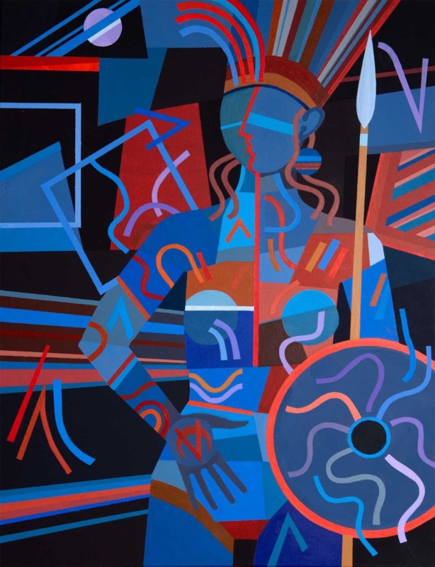
empowering wall art for a home gym can give an exercise space identity without covering it in instructions or slogans. Warrior Princess by Fred Carson centres a poised female figure holding a spear and shield. Red, blue, rust, violet, and black shapes interlock around her, creating strength through posture, rhythm, and composition rather than a printed command to work harder.

empowering wall art for a home gym: Warrior Princess by Fred Carson

Why empowering wall art for a home gym need not use words

Home gyms often accumulate visual messages: app screens, exercise charts, equipment labels, timers, and personal targets. Adding another block of bold lettering can make the room feel like a noticeboard. Figurative art provides a different kind of motivation. It can suggest focus and capability while leaving the person training free to define those qualities for themselves.

The figure in Warrior Princess is still, yet the image is not static. Curved bands rise from the headdress. Diagonal lines cross behind the body. Circular forms in the shield, bracelets, and surrounding geometry establish a repeated beat. The upright spear gives the portrait a clear vertical axis, making the composition feel controlled amid all that movement.

Start with the activity zones, not an empty wall

A home gym must remain safe and functional. Identify the full movement area around each piece of equipment before choosing a position. Include space for raised arms, resistance bands, skipping ropes, benches, and doors. Artwork should never sit where a dropped weight, moving bar, or swinging attachment can reach it.

Possible positionPractical check
Beyond a cardio machineConfirm the frame remains outside the equipment’s moving parts and ventilation path
Opposite a training matView it from floor level and standing height without placing it behind a swing zone
Beside storageOpen racks, cupboards, and doors fully before marking the frame
Near a mirrorKeep enough separation for both elements to read clearly and check doubled reflections

The print size is 265 by 345 millimetres before framing. Its portrait format suits a narrower wall between functional areas, but the final mount and moulding will increase both width and height. Mark those complete dimensions. A compact piece can still have presence when the surrounding wall is kept clear.

Let the palette organise a practical room

Gym equipment can introduce unrelated colours through mats, bands, handles, screens, and storage. The artwork already combines several strong tones, so it can act as a visual anchor rather than another item that needs matching. Choose one dominant relationship and allow the smaller colours to remain within the picture.

  • Black equipment: the dark ground creates continuity while blue and red stop the room feeling severe.
  • Blue or grey walls: cooler shapes connect naturally, with rust and coral adding warmth.
  • White walls: the portrait becomes a concentrated focal point instead of requiring several accessories.
  • Timber details: brown and terracotta passages can link shelves or flooring to the cooler training equipment.

Avoid repeating every hue through colour-coded kit. The goal is a coherent space, not a complete theme. Closed storage for smaller items will also let the figure and shield remain readable when the room is at rest.

Choose an image that belongs to the person using the room

Motivation is personal. Some people respond to competition; others value consistency, recovery, confidence, or a few quiet minutes away from daily demands. A composed warrior figure can represent resolve without dictating a specific sport or body type. That openness makes the artwork suitable for strength work, mobility, yoga, indoor cycling, or mixed training.

It is also worth thinking beyond decoration. Research and practical guidance on sportscotland’s women and girls research discusses participation, barriers, and inclusion in physical activity. A well-designed personal space cannot solve those wider issues, but it can feel welcoming, individual, and free from the narrow imagery often used in fitness advertising.

Account for changing light and working conditions

Check the proposed wall with overhead lights on and off. Strong downlights may create glare in glazing, while coloured smart bulbs can distort the distinction between red, violet, and blue. Daylight from a nearby window can also reflect a bright rectangle across the darker background. A small change in height or angle may improve visibility.

Keep framed paper away from recurring condensation, direct heat, and damp external walls. Good ventilation matters in any exercise area. Wipe equipment with care so cleaning spray does not travel towards the frame, and do not hang the picture where towels or clothing will be placed over it.

Frame the graphic figure with a decisive edge

A slim black moulding can continue the dark background and keep attention on the figure. A deep blue frame may support the cooler geometry, while a restrained warm timber can soften a room dominated by metal and rubber. The moulding should clarify the portrait rather than compete with the shield and patterned bands.

First 4 Frames produces colour-managed Giclée prints and completes bespoke framing in-house at its Falkirk workshop. Careful production helps the closely related blues, reds, violets, and dark shapes remain distinct. Hand-finished presentation also gives a practical exercise room one crafted element designed to last beyond a passing fitness trend.

Bold geometry from an Edinburgh artist

Fred Carson is an Edinburgh-based artist whose work uses stylised figures, strong geometry, and vivid colour. Browse the wider Fred Carson collection at First 4 Frames to compare related compositions and formats. In this portrait, the quiet stance and energetic surface create a useful balance between focus and momentum.

The best empowering wall art for a home gym should support the room without trying to shout over every session. View the framed Warrior Princess print for a poised, colourful figure that brings strength, character, and hand-finished craftsmanship to a personal training space.

Posted on

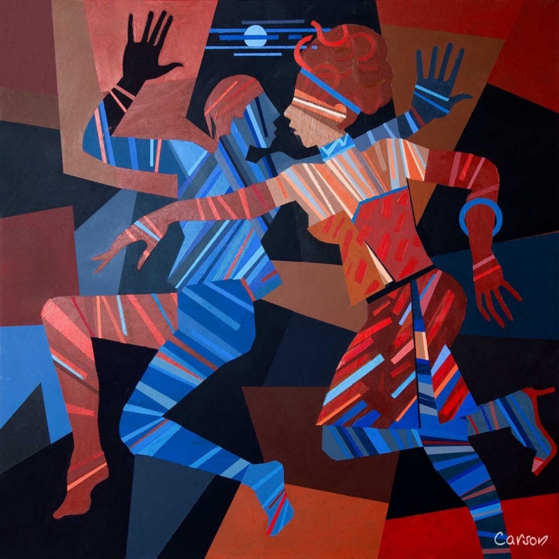
Dance Till Dawn: A Distinctive Gift for a Contemporary Dancer

Image of Dance Till Dawn by Fred Carson

A meaningful gift for a contemporary dancer should recognise more than costume or performance night. It can celebrate discipline, physical conversation, creative risk, and the joy of moving with another person. Dance Till Dawn by Fred Carson captures those ideas through two interlocking figures, strong geometric shapes, and lines that behave almost like beats. It feels connected to dance without resorting to a slogan or a literal studio scene.

gift for a contemporary dancer: Dance Till Dawn by Fred Carson

Why this works as a gift for a contemporary dancer

Dancers spend a great deal of time with objects chosen for function: shoes, warm layers, tape, bottles, and bags. Those things matter, but they rarely mark the imaginative side of the work. Framed art offers a different kind of recognition. It can live at home, remain useful after a production ends, and reflect the recipient’s creative identity without pretending to choose specialist equipment for them.

In Dance Till Dawn, the figures do not hold a fixed classical pose. Bent knees, open hands, crossed arms, and opposing diagonals imply motion between moments. Blue and red stripes travel across bodies and clothing, while the dark ground makes each gesture clearer. The pair feels coordinated but not symmetrical, which gives the composition the tension and responsiveness associated with contemporary performance.

Match the occasion to the message

The title makes the print celebratory, yet the image is not limited to one milestone. It can suit a dancer completing professional training, joining a company, returning after injury, making a first independent work, or finishing a demanding run. It may also be a thoughtful thank-you for someone who has created a duet or supported a partner through rehearsals.

  • For graduation: focus the card on persistence, growth, and the start of a creative career.
  • For a première: mention the courage required to bring new movement in front of an audience.
  • For a partnership: connect the two figures to trust, listening, and shared timing.
  • For a personal milestone: let the artwork carry the dance reference while the written message stays specific to the person.

A short personal note will do more than extra themed wrapping. Name the performance, teacher, company, or moment that prompted the gift. That detail makes the choice feel observed rather than selected simply because it contains dancers.

Look for movement, not a perfect likeness

Contemporary dance covers many practices and body languages. A picture does not need to reproduce the recipient’s exact technique or costume to feel relevant. Often, rhythm, weight, counterbalance, and spatial relationship are the stronger connection. The stylised figures here leave room for interpretation, so the artwork can suggest rehearsal, performance, social energy, or an improvised exchange.

The square shape reinforces that flexibility. It avoids the formal stage-like width of a theatre scene and keeps attention on the figures’ interaction. The moon and horizontal blue marks offer a small pause above them, while the angular background pushes the action forward.

Plan a home for the artwork before gifting

The available 265 by 265 millimetre print format can work in a bedroom, home practice corner, hallway, or living space without requiring a vast wall. Remember that mounting and framing will increase the finished dimensions. If possible, ask indirectly about the recipient’s wall colours and whether they prefer dark, light, or natural timber frames.

Possible settingWhy the print can work
Home practice areaStrong movement adds energy without giving technical instruction
Quiet bedroom wallThe compact square adds identity without dominating the room
Hall or landingBold colour reads clearly from a passing viewpoint
Living-room gallery groupThe geometric edges provide structure among looser pieces

Choose presentation that respects the strong colour

A slim black frame can sharpen the angular background and stage-like darkness. A deep blue moulding may connect to the cooler figure without copying every stripe. A warm wood can soften the graphic quality for a more relaxed home. The final choice should respond to the print in person and to the recipient’s interior, not to a generic idea of dance decor.

First 4 Frames uses colour-managed Giclée production and completes bespoke framing in-house in Falkirk. That care matters here because the red, rust, coral, and several blues need to remain distinct. A hand-finished frame also turns the gift into something ready to display rather than another task for the recipient after a busy performance period.

Contemporary energy from an Edinburgh artist

Fred Carson is an Edinburgh-based artist whose work combines bold colour, stylised figures, and geometric form. Explore the wider Fred Carson collection at First 4 Frames. For further connection to dance in Scotland, Scottish Ballet shares performances, films, classes, and insight into the art form.

The best gift for a contemporary dancer feels personal without becoming predictable. View the framed Dance Till Dawn print for an image that honours movement, partnership, and creative confidence through colour and lasting craftsmanship.

Posted on

Dance Wall Art That Gives a Social Room Its Rhythm

Image of Dance Till Dawn by Fred Carson

dance wall art becomes more useful when the artwork answers a real feature of the room. Dance Till Dawn offers a clear example because its title carries a clear sense of movement and shared energy, making it suitable for a space used for music, meals or conversation.

dance wall art - Dance Till Dawn

Place dance wall art where the room becomes social

Movement in an artwork is most effective when the room leaves it space to continue.

Choose a wall seen as people enter or gather, not one hidden behind a tall speaker or open door. The compact 265 × 265 mm print format can create a deliberate beat above a drinks cabinet, beside record shelving or within a dining corner.

  • Keep cables and audio equipment visually tidy beneath the picture.
  • Use warm ambient light, but avoid placing a bright fitting directly opposite the glazing.
  • Repeat one energetic line or colour in a small object rather than adding dance-themed signs.
  • Leave clear wall around the frame so the square shape reads confidently.

The artwork should support the atmosphere even when no music is playing. That is why a resolved framed presentation matters more than a collection of literal decorative references.

Give movement a disciplined frame

A hand-finished frame provides a still boundary around an energetic subject. Combined with colour-managed Giclée production, that clean edge helps Dance Till Dawn hold its own among furniture, lighting and the activity of a social room.

For a wider view of contemporary dance in Scotland, visit National Dance Company of Scotland. You can also browse the Fred Carson collection or view the exact framed product.

Dance wall art can suggest sound and movement without dictating the whole scheme. Dance Till Dawn gives a social space rhythm, while its compact framed form keeps the result controlled.

Posted on

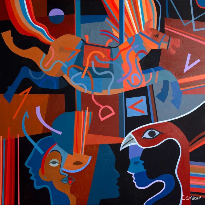
Modern Framed Wall Art That Brings Order to Bold Colour

Image of Breton Circus, Quatorze Juilliet by Fred Carson

Modern framed wall art can carry intense colour when its composition has a clear internal structure. Breton Circus, Quatorze Juilliet layers geometric horses, human profiles and rhythmic lines over deep black, red and blue. The image feels active, yet repeated curves and verticals stop it becoming random.

modern framed wall art - Breton Circus, Quatorze Juilliet

Give modern framed wall art one calm surrounding zone

In a pale room

Allow the black ground and saturated colour to act as the main visual weight. Plain upholstery and one dark lamp are enough support.

In a darker room

Use a mount or frame edge that separates the black passages from the wall. This preserves the silhouettes instead of letting them disappear.

Hang the picture where there is time to scan its details, such as above a low sideboard or opposite a seating area. Avoid surrounding it with several small, equally colourful works. The circus rhythm is strongest when it has a clear field around it.

Should every accent colour be repeated?

No. Select one red, blue or burnt orange note for a textile or object. Repeating all of them would flatten the artwork into a decorating palette rather than letting it remain the focal point.

Use the frame to contain energy, not suppress it

Sharp shapes, dark grounds and adjacent saturated colours require accurate reproduction. Colour-managed Giclée production keeps their boundaries and tonal differences clear. A hand-finished frame supplies a final visual pause, helping the energetic image sit confidently in a domestic room.

The title points to France’s national celebration; Britannica’s overview of Bastille Day provides useful context. Browse the Fred Carson collection, or view the exact Breton Circus, Quatorze Juilliet framed print.

For buyers considering modern framed wall art, Breton Circus, Quatorze Juilliet shows how bold subject matter can remain liveable when colour, placement and framing are handled with discipline.

Posted on

Contemporary Framed Art Prints Can Give a Stair Turn Real Purpose

Image of Warrior Princess by Fred Carson

Contemporary framed art prints can make the turn in a staircase feel like a moment of arrival rather than leftover wall space. Warrior Princess by Fred Carson has an upright format and a bold stylised figure. Its clear presence suits the short, changing view experienced while moving between floors.

contemporary framed art prints - Warrior Princess

Use contemporary framed art prints to reward a changing viewpoint

Approaching from below

Test whether the full figure remains visible above the handrail. A portrait-format work should guide the eye upward without being hung so high that it feels detached.

Returning from above

Check the frame from the top landing. Keep it beyond door swings and away from the narrowest shoulder line, especially where furniture sometimes moves between floors.

Let the figure provide the drama. Plain surrounding walls and a controlled light source will help the geometric forms read quickly. Repeating one colour elsewhere on the landing is enough; a second figurative piece nearby could weaken the focal point.

Frame bold form with clean visual control

Fred Carson’s background across painting, ceramics, and architectural work informs the strong form of this image. Accurate Giclée reproduction protects its colour relationships and edges. A bespoke frame gives the portrait authority while guarding it in a high-traffic part of the home.

For wider context on how artists approach the figure, see National Galleries of Scotland’s introduction to portraiture. Browse more work by Fred Carson, or view the exact Warrior Princess framed print.

Among contemporary framed art prints, Warrior Princess has the upright scale and visual confidence needed to make a staircase turn memorable without crowding the route.

Posted on

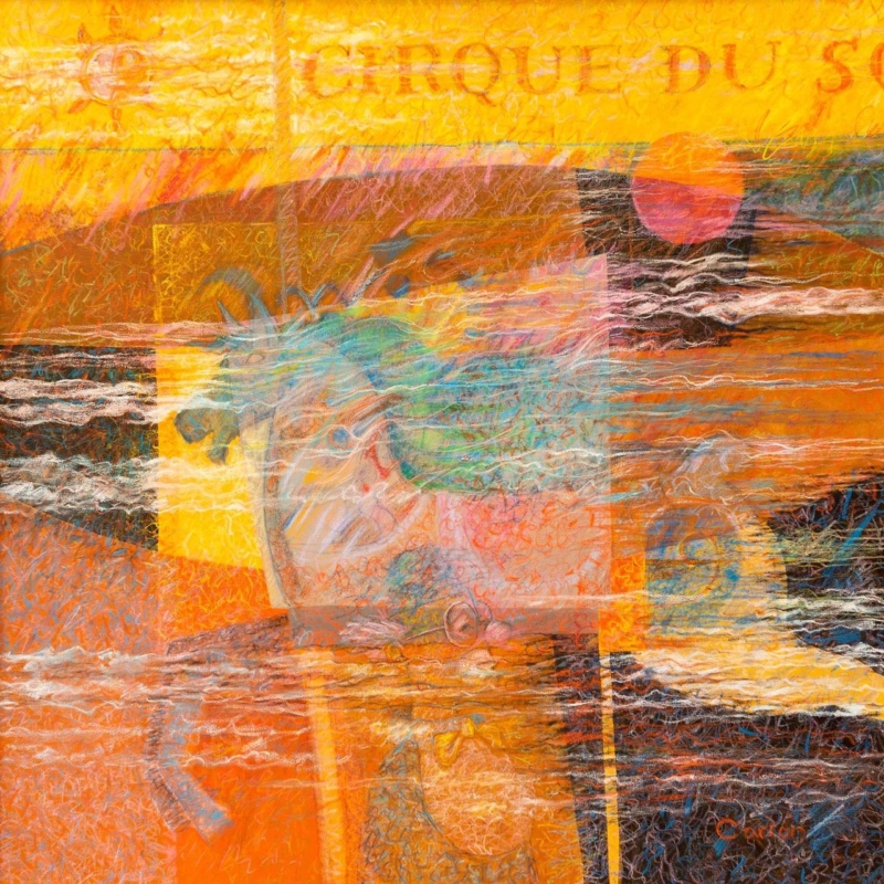
Small Square Wall Art Can Finish a Narrow Wall Between Shelves

Image of Breton Circus by Fred Carson

Small square wall art for a narrow wall between shelves can complete an awkward gap without pretending it is a full feature wall. Breton Circus by Fred Carson is available at a compact 265 mm square print size. Its self-contained proportion makes it easier to position where a broad landscape or tall poster would feel forced.

small square wall art for a narrow wall between shelves - Breton Circus

Measure small square wall art for a narrow wall between shelves precisely

MeasurementWhat it prevents
Finished frame widthAssuming the print size is the complete outside dimension.
Gap at each sideThe frame appearing trapped between shelf uprights.
Viewing heightHanging for the empty wall rather than for the seated or standing viewer.
Object projectionBooks and ornaments visually overlapping the framed edge.

Clear the adjacent shelves before testing the position. Put back only useful books and a few objects after the frame is placed. This lets the artwork establish the centre rather than becoming another item in an already busy display.

Why one square can be stronger than a mini gallery

A single complete composition creates a visual stop. Several tiny pieces introduce extra edges and uneven gaps, which can make a narrow section feel even more fragmented.

Use a frame finish that relates to the shelving without copying it exactly. A little contrast helps the piece remain visible, while a repeated timber or restrained dark tone can connect the two parts of the arrangement.

Let careful framing give a compact image authority

Small work needs precision because the eye sees every relationship at close range. Colour-managed Giclée production maintains the image’s atmosphere and detail. A bespoke frame, hand-finished in-house, supplies the visual weight needed to hold its own beside books and shelving.

For a concise explanation of how visual elements work together, see Tate’s introduction to composition. Browse more work by Fred Carson, or view the exact Breton Circus framed print.

As small square wall art for a narrow wall between shelves, Breton Circus turns an in-between strip into a purposeful pause without overfilling it.

Posted on

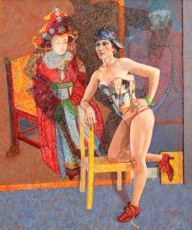
Portrait Wall Art Can Give a Reading Alcove Its Own Identity

Image of Eastern Princess by Fred Carson

Portrait wall art for a reading alcove can make a small corner feel intentional without taking useful space from books, lighting, or a comfortable chair. Eastern Princess by Fred Carson has a compact portrait format that suits a narrow wall. Its figurative presence gives the alcove a point of character beyond the shelves themselves.

portrait wall art for a reading alcove - Eastern Princess

Position portrait wall art for a reading alcove at seated eye level

Use the view from the chair

Sit down before marking the wall. The artwork should be comfortable to look at without craning upward. If it hangs beside the chair, keep enough distance from the lamp and shelving for its outline to stay clear.

A reading corner often collects objects quickly: stacked books, bookmarks, a side table, and a lamp all add visual information. One focused artwork is usually stronger than several small prints in this setting. It gives the eye somewhere to rest when a page is put down.

  • Keep the lower frame edge clear of the chair back.
  • Check that the reading lamp illuminates pages without reflecting in the glazing.
  • Use one nearby colour echo rather than matching the whole palette.
  • Leave the adjacent shelf arrangement simple.

The artwork should define the pause between chapters, not compete with every book on the shelf.

Give the compact portrait a precise outer edge

A smaller work relies on clarity. Colour-managed Giclée reproduction protects the relationship between figure, colour, and background, while bespoke framing supplies enough definition to hold the wall. First 4 Frames completes the presentation by hand in its Falkirk workshop.

For broader context on this kind of subject, explore Tate’s introduction to figurative art. Browse more work by Fred Carson, or view the exact Eastern Princess framed print.

As portrait wall art for a reading alcove, Eastern Princess adds human presence and a clear identity without sacrificing the corner’s calm.

Posted on

Seville Wall Art for a Home Office Can Keep Travel in the Working Day

Image of Lost in Seville by Fred Carson

Seville wall art for a home office can keep the imaginative energy of travel present during an ordinary working day. Lost in Seville by Fred Carson suggests experience and place without behaving like a literal souvenir. That makes it useful for a study used for creative or focused work.

Seville wall art for a home office - Lost in Seville

Choose the sightline for Seville wall art in a home office

Behind the desk

This position can create a distinctive video-call background. Leave blank wall around the frame so the composition remains readable on screen, and check that the camera does not crop it awkwardly.

Opposite the desk

Here the artwork becomes a place for the eye to rest between tasks. It can introduce a sense of distance that a screen, noticeboard, or shelf cannot provide.

Beside a reading chair

In a larger study, use the print to distinguish a thinking corner from the workstation. Repeat a single colour in a notebook or textile rather than collecting travel memorabilia around it.

Atmosphere and nuanced colour rely on accurate production. First 4 Frames uses colour-managed Giclée printing, then hand-finishes the bespoke frame in Falkirk for a confident professional presentation.

For context on the city behind the title, explore Seville’s official visitor guide. Explore more work by Fred Carson, or view the exact Lost in Seville framed print.

As Seville wall art for a home office, Lost in Seville keeps curiosity and travel close to the working day without allowing the room to become cluttered or themed.