
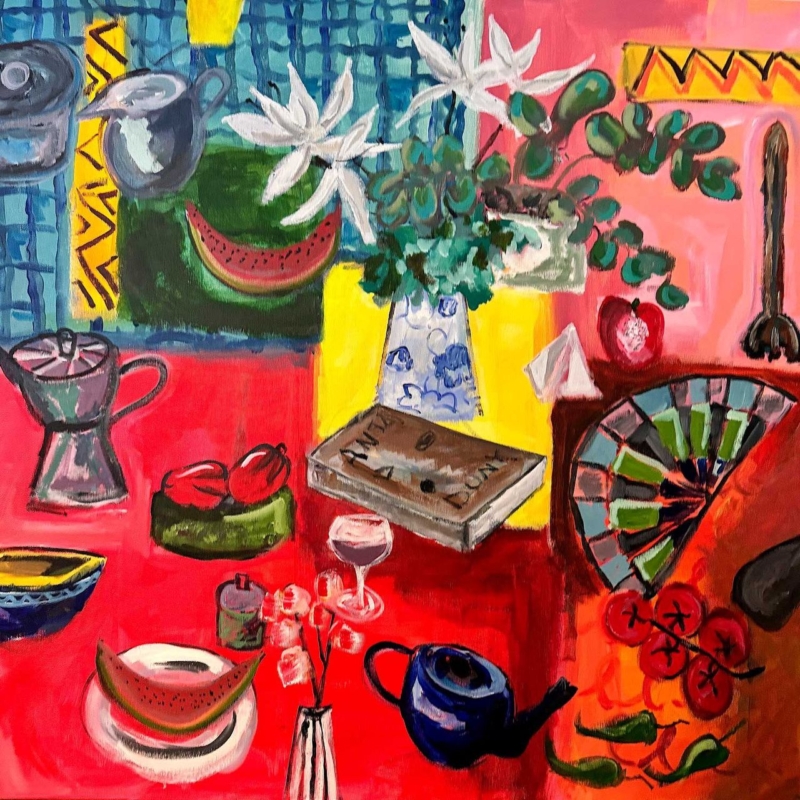
colourful wall art for a dining room with red accents should organise the room’s energy rather than add random colour to it. Here Comes the Sun by David Short brings a red table, pink ground, yellow panels and blue pattern into one square composition. Watermelon, tomatoes, flowers, a teapot and a coffee pot make the scene feel sociable. Because those objects are gathered within one clear frame, the artwork can unite existing red details without requiring every chair, cushion or plate to match.
Why colourful wall art for a dining room with red accents needs structure
Red is visually assertive. A pendant, chair seat or painted cabinet can command attention even when it occupies little space. Adding a picture with one isolated red patch may make the room feel as though several accents are competing. A more varied artwork can work better because it shows red as part of a complete palette.
Here Comes the Sun uses red across the lower table, the background and several pieces of fruit, but it breaks that warmth with cobalt, turquoise, leaf green, white and black. Repeated curves also hold the image together: cups, bowls, fruit, a fan and the rounded coffee maker. The eye discovers separate objects while the square format keeps them part of one lively whole.
Repeat red selectively, not everywhere
Start by identifying the dining room’s existing red. A deep oxblood chair behaves differently from a bright tomato-red cabinet or a rust-coloured rug. The artwork does not have to reproduce the exact shade. Its range of coral, scarlet and pink can bridge nearby warm colours, provided the rest of the room includes enough quiet space.
- Choose one main red feature. Let the artwork support a cabinet, pendant or group of chairs rather than all three.
- Add one small bridge. A vase, napkin or candle can repeat a warm tone without becoming a permanent colour commitment.
- Keep large surfaces calmer. Pale walls, timber and simple flooring give the composition room to breathe.
- Borrow a cooler colour. One blue or green detail can connect with the teapot, foliage or patterned upper section.
This selective approach makes the room feel collected rather than themed. It also allows table settings to change. The painting remains useful when seasonal flowers, serving dishes and textiles introduce temporary colours of their own.
Use the square format to anchor the dining zone
A square picture can create a stable focal point above a sideboard, a compact table or the end wall of an open-plan dining area. It does not pull strongly in one direction, so it can help define the zone without making a narrow room look longer or a low wall feel flatter. Centre it on the furniture beneath it rather than on the entire wall.
The product is offered in several print sizes, so use a paper template to judge the finished framed footprint. Above a sideboard, leave clear space for serving dishes and tall bottles. Beside the table, check that chair backs cannot reach the frame. From the room entrance, the red table in the painting should read as a broad colour field rather than a small, busy patch.
| Existing feature | Colour to borrow from the print | What to limit |
|---|---|---|
| Red dining chairs | Use blue or green tableware as a cooler counterpoint | More large red furniture |
| Warm timber table | Connect it with orange, yellow and the cardboard box | An orange-brown frame that nearly matches the wood |
| White walls | Let the white flowers and pale vessel create small pauses | Too many colourful prints on the same wall |
| Black metal lighting | Repeat the loose dark outlines with a slim frame edge | A broad black frame that overwhelms the colour |
Let the subject support conversation
The picture is full of recognisable objects but does not explain one fixed event. A watermelon slice, wine glass, flowers, fruit, vessels and a folded fan suggest a table assembled from travel, memory and ordinary pleasures. That openness suits a dining room, where the artwork can start conversation without turning the space into a literal food-themed interior.
Avoid surrounding it with slogan signs, menu typography or several smaller pictures of food. The composition already provides enough detail. A clear area around the frame will make the brushwork and unexpected combinations easier to appreciate from a seated position.
Preserve the differences between strong colours
Intense colour needs accurate reproduction. If reds merge into one flat tone, the cup, fruit and table lose their separation. First 4 Frames uses colour-managed Giclée production and completes bespoke framing in-house at its Falkirk workshop. This process supports the contrast between coral, scarlet, deep red, blue and green while retaining the loose painted marks.
A simple moulding gives the image a necessary boundary. Dark charcoal can echo the drawn outlines, while a pale frame can keep the overall result lighter against a saturated room feature. A mount is helpful when the wall itself is strongly coloured, as it creates a neutral pause before the composition begins.
David Short creates bold contemporary work shaped by colour, pattern, memory and familiar objects. Explore more of his work at David Short’s official website, or browse the David Short collection at First 4 Frames.
Well-chosen colourful wall art for a dining room with red accents can make a sociable room feel more coherent, not more crowded. View the framed Here Comes the Sun print for a vivid table scene that turns everyday objects into a confident focal point.