colourful wall art for a music room should earn its place by answering a real question about the room or recipient. Disco Inferno is a useful starting point because David Short’s playful contemporary image can supply rhythm and personality, leaving instruments and listening equipment to remain useful rather than turning them into decorative props.
Scale colourful wall art for a music room around the equipment
Start with the room in use. Open the piano lid, place guitars on their safe stands and sit in the normal listening position. The available wall may become smaller once cables, speakers and acoustic treatment are considered, so mark the finished artwork only after those essentials are settled.
Print size
Potential role
265 mm square
A compact beat above a record unit or narrow return.
500 mm square
A clear focal point visible across a modest practice room.
800 mm square
A room anchor where the wall and listening distance support it.
Repeat one colour in a chair, cable tidy or storage box, then allow the remaining equipment to stay visually quiet. The title already carries a musical association. It does not need a neon lyric, mirrored ball and a gallery of album covers beside it.
Rhythm in a room can come from spacing, scale and colour; it does not require every object to announce music.
Give joyful colour the discipline of a square frame
David Short’s work draws on colour, pattern and memory. At the larger square sizes, consistent reproduction and accurate mounting become especially important. Colour-managed Giclée output and bespoke framing completed in-house keep the lively image coherent.
Colourful wall art for a music room should contribute energy without distracting from playing or listening. Disco Inferno supplies a joyful visual rhythm, while deliberate sizing keeps the practical room organised.
colourful wall art for an open-plan kitchen should earn its place by answering a real question about the room or recipient. Cake by the Ocean is a useful starting point because its playful title and square composition can give the cooking and dining zone an identity without resorting to recipe typography, café signs or a wall full of themed objects.
Scale colourful wall art for an open-plan kitchen from the whole room
Open-plan walls are often judged from too close. Step into the adjoining sitting or dining zone and test the framed outline from there. The picture should remain legible across the shared space while relating to the kitchen furniture beneath it.
265 mm square
Useful for a breakfast ledge, short return or compact wall beyond the work surface.
500 mm square
A stronger option above a small dining table or clear bank of low storage.
800 mm square
Test this as the room anchor where the wall and viewing distance support it.
Keep art away from steam, grease and splashes. A dining-side wall gives the kitchen connection with fewer demands than the area above a hob or sink. Confirm that chairs cannot strike the frame when pulled back.
Repeat one image colour modestly.
Let cabinetry provide the quiet background.
Clear appliances from the main sightline.
Use the square frame to signal the zone.
Contain lively colour with a precise square frame
A larger colourful image needs consistent reproduction and a strong outline. Colour-managed Giclée production retains deliberate colour relationships, while bespoke framing completed in-house gives each square size enough structure for an open-plan wall.
Colourful wall art for an open-plan kitchen works when it defines the zone without taking over every finish. Cake by the Ocean contributes wit and energy, while practical placement and a measured frame keep the room coherent.
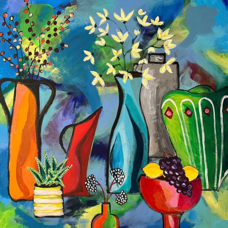
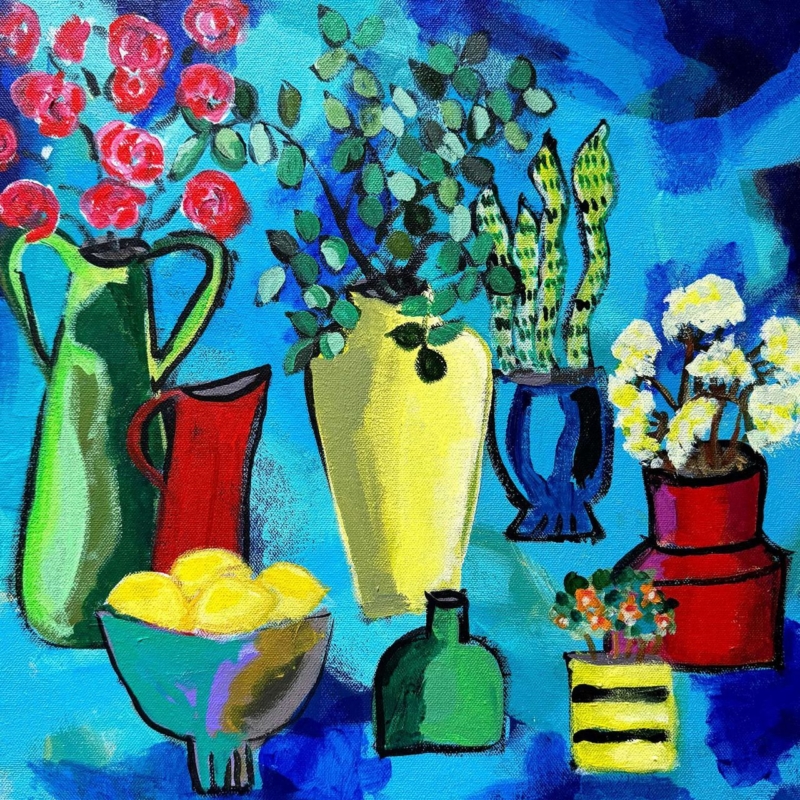
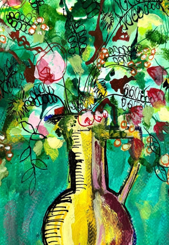
still life wall art for a handleless kitchen can give a sleek room the human irregularity it needs. Flat-front cabinets, integrated appliances, and uninterrupted worktops create welcome order, but the result may feel impersonal if every surface is equally controlled. Upside Down II by David Short introduces pitchers, plants, flowers, and lemons through loose black outlines and saturated colour. It brings everyday life into the scheme without weakening the architecture.
Why still life wall art for a handleless kitchen adds balance
Handleless cabinetry is effective because repeated doors read as calm planes rather than separate cupboards. The same discipline can make a kitchen feel spacious and easy to use. Yet a room built only from smooth rectangles may need one element with visible gesture, variation, and evidence of the hand.
Upside Down II provides that contrast. A tall green jug, red pitcher, yellow vessel, blue pot, lemons, and plants create a row of distinct silhouettes. Their outlines are intentionally lively rather than mechanically perfect. The square format keeps this abundance contained, so the image feels energetic without making the wider kitchen disorderly.
Use one strong colour relationship, not every colour
The picture includes intense blue, turquoise, red, green, yellow, and pink. Trying to repeat all of them around the kitchen would undermine the clarity of the cabinetry. Instead, identify one existing room colour and let the remaining hues belong to the artwork.
Dark blue or charcoal cabinets: the vivid blue ground feels related, while yellow and red add lift.
White or pale grey cabinets: the square becomes a clear block of colour against a quiet field.
Green cabinetry: the jugs and foliage make a connection without requiring an exact paint match.
Timber accents: warm red and yellow details stop natural wood from feeling detached from cooler surfaces.
A single bowl, tea towel, or pendant shade can repeat the chosen accent. Leave the worktop largely clear. The artwork already contains the visual equivalent of collected vessels and flowers, so it can supply personality without filling every shelf.
Find a safe wall away from heat, steam, and splashes
The obvious empty area is not always the correct place for framed art. Avoid the wall directly above a hob, kettle, sink, or high-steam appliance. Heat, grease, repeated moisture, and cleaning spray are poor conditions for paper and framing materials. A dining end, clear wall beside a pantry door, or seating area beyond the main work zone is usually more suitable.
The available square print sizes are 265, 500, and 800 millimetres before framing. This range allows the composition to work beside a compact table or across a more generous open-plan wall. Mark the complete intended dimensions, including mount and moulding, before ordering. Open every adjacent cupboard and door to check clearance.
Kitchen position
What to check
Dining end
Centre the frame on the table or bench rather than on the entire room
Beside tall cabinetry
Leave enough wall for the square to avoid looking wedged into a gap
Open-plan transition
Make sure the colours read well from both cooking and seating zones
Near a glazed door
Watch direct sun and reflections at different times of day
Frame expressive objects with a clean edge
A simple dark moulding can echo the black outlines and give the image a decisive boundary. A pale frame can sit quietly with lighter cabinets, while a restrained timber may connect the kitchen to an adjoining dining area. The frame should clarify the square composition rather than add a decorative flourish that competes with the objects.
First 4 Frames produces colour-managed Giclée prints and completes bespoke framing in-house in Falkirk. Careful production helps the blue field, green vessels, red accents, and smaller floral details remain distinct. The hand-finished presentation gives a modern kitchen a crafted counterpoint while retaining the precision the room already has.
Everyday objects made bold through colour
David Short makes contemporary work informed by familiar possessions, plants, pattern, and strong colour. His still lifes treat domestic objects as an expressive group rather than a formal inventory. See more on David Short’s official website, or explore the David Short collection at First 4 Frames.
Successful still life wall art for a handleless kitchen should complement clean cabinetry without making the room feel clinical or over-accessorised. View the framed Upside Down II print for a concentrated square of colour, plants, and useful objects brought together with confident hand-drawn energy.
abstract landscape art becomes more useful when the artwork answers a real feature of the room. Upside Down II offers a clear example because its 265 mm, 500 mm and 800 mm square print choices allow the same composition to move from an intimate accent to a substantial focal point.
Judge abstract landscape art by distance as well as dimensions
Print size
Likely role
Planning priority
265 × 265 mm
Close-view accent
Keep nearby objects sparse.
500 × 500 mm
Independent focal point
Align with a cabinet or chair grouping.
800 × 800 mm
Room anchor
Confirm viewing distance and finished frame size.
Square artwork creates a stable visual centre, but that does not mean it should be centred on every wall. Relate it to the furniture group used most often. An offset position above a sideboard may feel more balanced than the mathematical middle of a long open-plan wall.
At larger scale, remove small competing pictures from the immediate area. At compact scale, leave enough blank wall that the piece does not look like an afterthought among shelves and switches.
Use the frame to clarify an open composition
Abstract work benefits from accurate colour separation and a frame chosen for the whole composition, not one isolated tone. Colour-managed Giclée production and bespoke in-house framing give Upside Down II a precise square boundary at each available scale.
Abstract landscape art can shift role dramatically as it grows. Upside Down II makes that choice practical: decide whether the room needs a detail, a focal point or a true anchor before choosing the size.
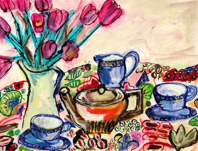
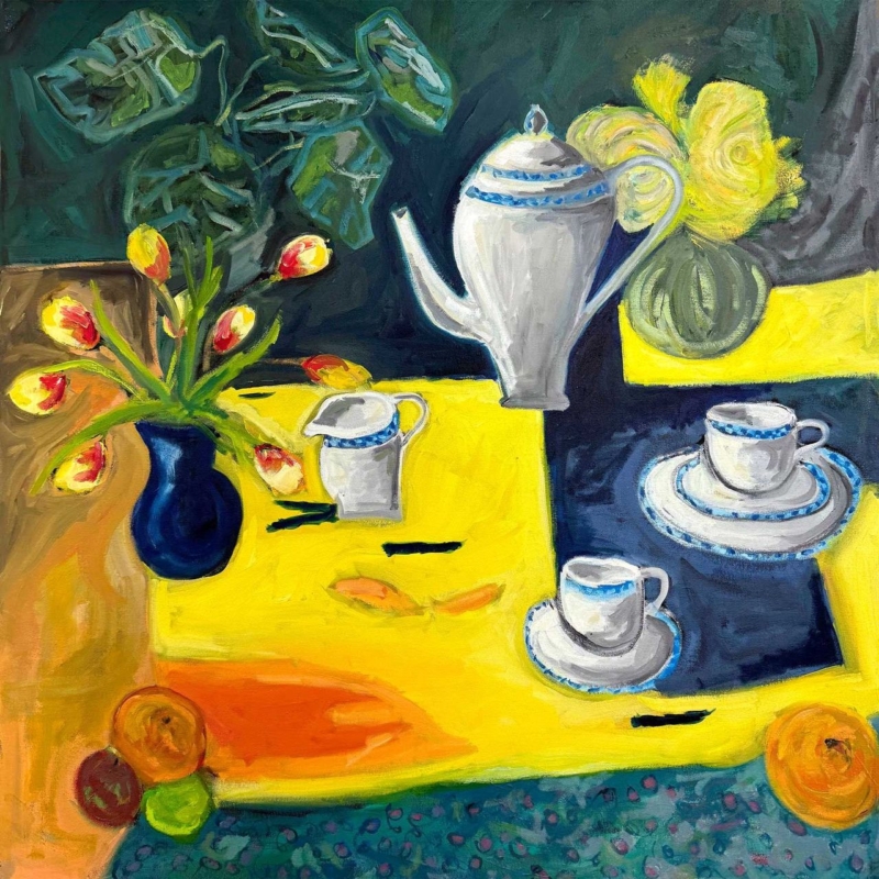
maximalist kitchen wall art can be exuberant without being chaotic. The strongest piece repeats colours and shapes already enjoyed in the room, then gathers them into one deliberate composition. Blue Tea Set by David Short does exactly that. Blue cups, a russet teapot, pink flowers, turquoise stems, and patterned fabric create plenty to discover, while the horizontal arrangement holds everything together.
Why maximalist kitchen wall art still needs visual order
A colourful kitchen may already contain glazed tiles, cookware, cookbooks, ceramics, and open storage. Adding a timid print can make the wall look incidental. Adding several unrelated pictures can make the room feel fragmented. One confident still life is often the better answer because it reflects the room’s abundance while establishing a clear centre.
In Blue Tea Set, the blue tea pieces recur across the image and give the eye a sequence to follow. The central pot provides weight. Flowers rise on the left, balancing the lower row of cups without creating a rigid mirror image. Black outlines keep individual objects legible, while repeated pink, red, green, and turquoise marks connect the patterned areas.
Let the artwork organise the kitchen palette
Colour from the print
Useful room connection
Keep it controlled by
Deep and powder blue
Cabinetry, crockery, or a small appliance
Choosing one main blue rather than matching every shade
Pink and red
Flowers, a blind, or seat fabric
Repeating it in one or two compact accents
Turquoise and leaf green
Painted chair, plant pot, or glassware
Leaving larger worktops and walls quieter
Rust and ochre
Timber, terracotta, or warm metal
Using natural texture instead of more printed pattern
The aim is relationship, not exact matching. Pulling one blue and one warm accent from the picture is enough. The remaining colours can stay within the artwork, where they add richness without requiring a new purchase for every shelf.
Give the horizontal composition room to spread
The landscape format can work above a low dresser, a dining bench, or a clear stretch of wall near the table. It can also bridge the visual gap between tall cabinets and a doorway. Avoid hanging it directly above a hob, kettle, or sink, where heat, steam, and splashes make the location unsuitable for framed work.
Measure the usable wall after doors and cupboards are open. A paper template helps confirm that the frame will not be crowded by shelves or pendant lights. From a distance, the flowers and tea set should read as one broad arrangement. At closer range, the patterned cloth and energetic drawn marks provide the detail that maximalist interiors thrive on.
Pair pattern with areas of calm
Maximalism works through editing as much as collecting. If the wall art sits near patterned tiles, keep the space between them uncluttered. If open shelves hold many ceramics, group them by colour or scale rather than spreading every piece evenly. A clear edge around the frame allows the composition to feel intentional instead of absorbed into the background.
The pale ground within the picture is useful here. It gives the flowers, cups, and tablecloth breathing space and can connect to a light wall without making the whole scheme quiet. A slim blue or dark frame could reinforce the drawn outlines, while a lighter moulding may give a busier wall a cleaner boundary.
Everyday objects treated with colour and humour
David Short creates contemporary work informed by colour, pattern, memory, and familiar possessions. That viewpoint makes a tea set feel less like formal still life and more like a lively record of hospitality. Visit David Short’s official website for more of the artist’s practice, or explore the David Short collection at First 4 Frames.
First 4 Frames produces colour-managed Giclée prints and completes bespoke framing in-house in Falkirk. That careful finish is especially important for maximalist kitchen wall art, where crisp colour relationships and a considered frame distinguish joyful layering from visual muddle. View the framed Blue Tea Set print and use its palette as a confident starting point.
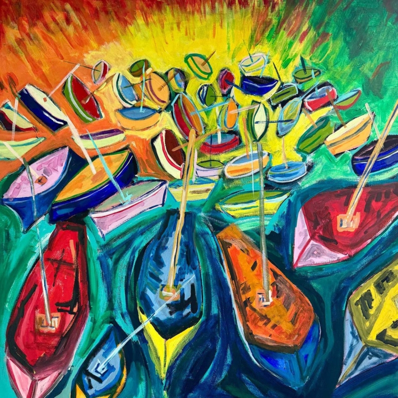
Art for a room with blue walls does not need to repeat blue as its dominant note. View from the Harbour places orange, yellow, red, green and violet boats across lively turquoise water. Those warm hulls create contrast, while the harbour subject still connects naturally with the wall colour.
Choose art for a room with blue walls by temperature
Start by identifying the paint. A cool navy will make the yellow and orange boats appear especially bright. A softer petrol or teal wall will connect more closely to the water. In both cases, the frame needs to create a clear edge so turquoise passages do not merge into the background.
Echo one warm hull colour in a cushion, vase or chair fabric.
Use natural timber if the room needs warmth beyond the artwork.
Keep other coastal objects minimal; the boats already tell the story.
Test the square outline above the furniture before choosing the largest size.
The dense cluster of boats rewards a position with comfortable viewing distance. Above a dining bench, sideboard or broad sofa, the square composition can anchor the furniture while its energetic marks prevent a dark blue scheme from feeling static.
Can this work in a small blue room?
Yes, if the frame has breathing room and the remaining accessories stay edited. Select a size related to the furniture below rather than trying to fill the entire wall.
Keep every boat distinct against lively water
Closely placed complementary colours can turn muddy if reproduction is poorly controlled. Colour-managed Giclée production preserves the separation between hulls, masts and water. Bespoke framing gives the busy harbour a calm perimeter and a polished, ready-to-hang finish.
As art for a room with blue walls, View from the Harbour adds the warmth and motion the paint may lack, creating contrast without breaking the room’s coastal connection.
wall art for a vinyl listening room needs to contribute something different from the records, sleeves, and equipment already in the space. Take Five by David Short offers a lively visual rhythm without turning the room into a display of familiar music logos. Its colourful square composition can hold attention between listening sessions and give the practical elements of a record setup a more considered setting.
What wall art for a vinyl listening room should add
A listening room often has a strong visual centre before any artwork arrives. The turntable, speakers, amplifier, and rows of records create repeated rectangles, dark surfaces, and small details. A successful picture should soften that technical arrangement while still feeling connected to the reason the room exists.
Take Five brings colour, movement, and a musical title into that setting. The connection is clear, yet the work remains an artwork in its own right. That distinction matters. It means the picture can suit a dedicated music room, a living-room listening corner, or a study where records share space with books and furniture.
Plan the wall around listening, not just looking
Start with the speakers. Keep the area directly around them visually calm so the setup still feels balanced.
Check the seated view. Position the artwork where it can be enjoyed from the main chair without asking the listener to turn or look upwards.
Leave access to records. A frame above storage should not interfere with lids, doors, or the comfortable removal of an LP.
Watch direct light. Avoid strong glare from a nearby window or lamp, especially on a wall viewed during evening listening.
The square format is particularly useful above a compact record cabinet or on a section of wall beside the equipment. Available print sizes include 265, 500, and 800 millimetres square. Measure the finished wall area and the furniture below it rather than choosing by print dimensions alone. The frame and the clear margin around it are part of the final proportion.
Balance colour with record storage and equipment
Existing feature
Useful response
What to avoid
Black equipment
A restrained dark frame with a lighter mount
Making every surface black
Timber record unit
A frame tone that relates to, rather than copies, the wood
Mixing several unrelated timber finishes
Colourful record sleeves
Clear wall space around the artwork
Displaying too many sleeves beside the print
Low evening light
A nearby lamp aimed away from the glazing
Direct reflections across the image
There is no need to pick out every colour in the picture. One echo in a chair, cushion, or small object is enough. The artwork should organise the room, not issue a list of colours that must be repeated. This restraint also allows favourite album covers to change without upsetting the wider scheme.
Frame a musical image for the long term
A listening room rewards details that feel good over time. First 4 Frames produces colour-managed Giclée prints and completes bespoke framing in-house at its Falkirk workshop. Careful print production supports the work’s colour and pattern, while a hand-finished frame gives it enough presence beside substantial speakers and record furniture.
Good wall art for a vinyl listening room should enrich the atmosphere without competing with the act of listening. View the framed Take Five print for a colourful musical focal point that can make a record space feel finished, personal, and ready for the next side.
Dining room wall art should give the space energy even when the table is not in use. Pink Jazz by David Short brings rhythm, pattern, and an optimistic colour note. It can make the room feel ready for conversation without resorting to menu boards, wine slogans, or restaurant styling.
Use dining room wall art to set a sociable tempo
Dining setting
Useful approach
Compact table for two
Use the 189 × 275 mm print as a focused portrait accent.
Four- to six-seat table
Test the 350 × 500 mm size against the table width.
Broad sideboard wall
Let the 560 × 780 mm option stand alone with clear space around it.
Open-plan room
Repeat one pink or dark note in the dining zone to define it gently.
Hang the centre where seated and standing views can both enjoy it. Artwork placed too high may relate to the ceiling rather than the table. If a pendant light is present, check that the frame does not sit directly behind the brightest bulb or catch distracting reflections at dinner.
Rhythm can come from colour and spacing; the room does not need musical props to explain the title.
Keep tableware flexible by echoing only one colour from the print. Neutral crockery, timber, or plain linen will let the artwork carry the livelier pattern. That balance keeps the dining room useful for quiet breakfasts as well as larger gatherings.
Preserve lively colour with a composed frame
David Short’s playful approach relies on confident colour and pattern. Colour-managed Giclée production keeps those relationships energetic rather than harsh. A hand-finished frame gives the portrait composition enough order to work beside furniture, lighting, and a frequently changing table.
As dining room wall art, Pink Jazz can make the space feel sociable and complete between meals, with enough scale choice to suit anything from a small table to a broad sideboard wall.
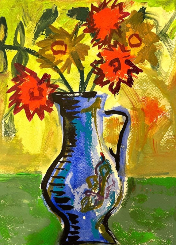
A thoughtful gift for a ceramicist should recognise how closely they look at shape, surface, and colour. Buying pottery can be difficult when the recipient already has strong preferences about clay bodies, glazes, and firing methods. Blue Jug with Flowers by David Short offers another route. It celebrates a familiar vessel and a generous arrangement of flowers, yet leaves the maker free to enjoy it as art rather than judge it as a tool or material.
Why this gift for a ceramicist feels relevant
Ceramicists spend time considering the relationship between a vessel’s outline, its opening, its handle, and the space around it. A still life built around a blue jug speaks naturally to that visual awareness. The subject is connected to their craft, but it does not rely on a slogan, a novelty mug, or specialist equipment that may not suit the way they work.
The flowers add another layer. Their softer, irregular shapes contrast with the solid jug, while the colour gives the whole arrangement energy. That conversation between a made object and natural forms is part of what makes the image rewarding. It can appeal to someone who throws functional ware, builds sculptural pieces, or simply loves good studio pottery.
Choose art instead of guessing at studio supplies
Clay, tools, brushes, and glazes are personal choices. Even an experienced buyer can choose the wrong specification. Artwork avoids that practical uncertainty while still showing that the recipient’s creative life has shaped the gift. It is also something they can enjoy away from the bench, wheel, and kiln.
For a new studio: mark the move with a finished piece that makes the workspace feel established.
For an exhibition milestone: celebrate the work involved without trying to select more materials.
For a birthday or retirement: choose something lasting that reflects a lifelong interest in objects and making.
For a tutor or mentor: acknowledge their creative influence with a subject that feels considered.
Find the right scale and place
The available print sizes are 189 x 275, 350 x 500, and 560 x 780 millimetres before framing. The smallest can suit a quiet wall beside a desk or a compact creative corner. The middle size has enough presence for a kitchen or dining room. The largest can become a confident focal point in a studio reception, living room, or open-plan space.
In a working studio, keep framed art away from clay dust, splash zones, and direct heat from a kiln. A clean office wall, customer consultation area, or home display space will make care easier. In a domestic setting, relate the finished dimensions to the furniture below it and leave enough clear wall for the jug’s outline to read properly.
Let the colour complement handmade objects
A blue vessel can sit comfortably with many ceramic collections. It can sharpen pale stoneware, cool down warm terracotta, or connect with blue-and-white tableware. Avoid arranging every blue object directly beneath the picture. A smaller echo in a bowl, cushion, or book cover is enough to make the relationship feel intentional.
A simple frame is usually the most respectful partner for a colourful still life. Light timber can connect to studio shelving and natural materials. A slim dark moulding can add definition in a brighter room. First 4 Frames can guide that decision and completes bespoke framing in-house at its Falkirk workshop.
The print is produced with colour-managed Giclée methods and presented with hand-finished framing. That combination gives the vivid subject a polished, lasting form. If you need a gift for a ceramicist that feels observant, creative, and easy to display, view the framed Blue Jug with Flowers print.
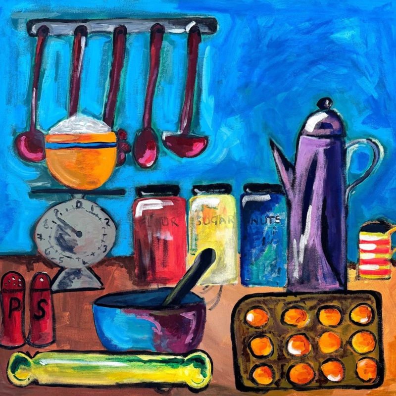
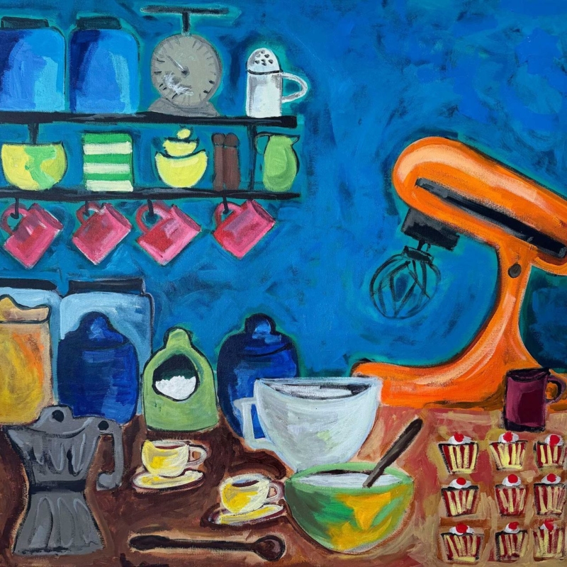
wall art for a home baking corner should make the space feel more enjoyable without adding to the visual clutter of mixers, scales, jars, and everyday mugs. Cup of Ambition, 9 to 5 by David Short is especially well suited to that job. Its shelves, baking tools, bright cups, and row of finished cakes celebrate the activity itself, while the square composition gathers many small details into one clear focal point.
Why wall art for a home baking corner needs a little structure
A baking area naturally contains many shapes and materials. There may be glass storage jars, metal utensils, paper cases, recipe books, and a stand mixer on show. Adding several small signs or decorative objects can make the corner feel busier. One confident artwork gives the eye a place to settle and helps the practical collection read as part of an intentional room.
Cup of Ambition, 9 to 5 reflects the same objects without trying to imitate a perfectly styled kitchen. The energetic paintwork and uneven forms make the scene feel used and sociable. That quality suits a real baking space, where flour appears on the worktop and favourite tools earn their place through regular use.
Choose the safest useful wall
Keep framed art away from direct heat, steam, and repeated splashes. The wall beside a pantry, above a freestanding sideboard, or near a kitchen table will usually be more suitable than the area immediately over a hob, kettle, or sink. A nearby position can still define the baking zone without exposing the frame and glazing to unnecessary kitchen residue.
Check how cupboard doors and appliances open before marking the hanging point. The image should remain visible when the mixer is in use, but it should not sit where a raised appliance head or open cabinet could meet the frame. A comfortable gap above the work surface also makes wiping and moving equipment easier.
Use the square shape to anchor a compact baking station
The available print sizes are 265 x 265, 500 x 500, and 800 x 800 millimetres before framing. The smallest can suit a narrow pantry wall or a modest coffee-and-baking corner. The middle size can hold its own above a sideboard. The largest needs generous clear wall and is better suited to an open-plan kitchen where it will be viewed from across the room.
What is already in the corner
Useful artwork response
What to avoid
Bright stand mixer
Repeat one of its colours lightly in the print or frame
Matching every accessory to the appliance
Open shelves and jars
Leave clear wall around one square focal piece
A cluster of many small kitchen signs
Plain fitted cabinetry
Use the painting’s strong colour to add personality
Choosing art so pale that it disappears
Patterned tiles
Frame the image simply and keep nearby extras restrained
Adding another competing decorative pattern
Borrow colour without turning the kitchen into a theme
The deep blue ground gives the image enough weight to work with navy cabinetry, dark shelves, or black hardware. Orange, pink, green, and yellow details prevent that blue from feeling cool. Pick up just one accent in a tea towel, bowl, or storage tin. The artwork should lead the palette rather than become an instruction to buy a complete matching set.
A slim dark moulding can sharpen the shelves and utensils in the composition. Natural timber can make the result feel warmer and connect it to chopping boards, a table, or open shelving. The right choice depends on the finishes already in the room, so consider the complete framed dimensions rather than the print alone.
A hand-finished focal point for an everyday ritual
First 4 Frames produces colour-managed Giclée prints and completes bespoke framing in-house at its Falkirk workshop. That careful presentation gives a lively subject a properly resolved finish. It also makes the piece suitable for a kitchen that is used hard but still deserves the same design attention as a sitting room.